10,000 search results
(0.031 seconds)
- F2F OCRBczyk by Linotype,
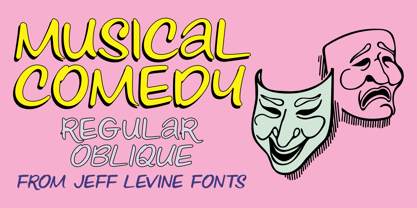
$29.99The original OCR B was designed for optical character recognition systems and was therefore monospaced. Designer Alexander Branczyk made a more typographically tuned and fitted version, with both regular and bold weights, and called it OCRBczyk™. - Musical Comedy JNL by Jeff Levine,
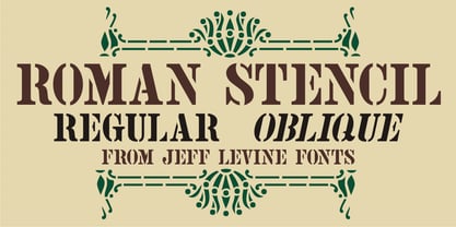
$29.00 - Roman Stencil JNL by Jeff Levine,
$29.00 - Galeb by Tour De Force,
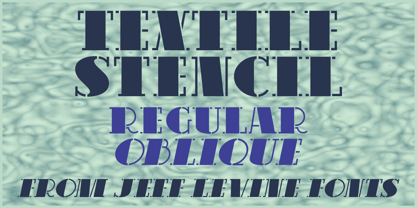
$25.00 - Textile Stencil JNL by Jeff Levine,
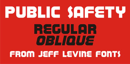
$29.00 - Public Safety JNL by Jeff Levine,
$29.00 - Abdo Screen by Abdo Fonts,
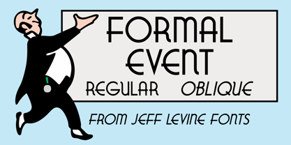
$49.50 - Formal Event JNL by Jeff Levine,
$29.00 - Stalker by Canada Type,
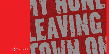
$24.95Stalker is one of those necessary fonts in a designer's toolbox: Grungy sans serif caps that are most useful for entertainment project chores. Originally made in the summer of 2003 for set and prop design of an Alliance film, Stalker is now available in retail form for those who are particular about their entertainment design or those who use broken letters in their design as means of social commentary or statement on style. - PAG Novembris by Prop-a-ganda,
$19.99Prop-a-ganda offers retro-flavored fonts inspired by lettering on retro propaganda posters, retro advertising posters, retro packages all the world over. This is perfect font for your retrospective project. PAG Novembris is narrow and serif font with art deco look. “A”, “G”, “H” and “M” have different letter form in uppercase and lowercase, and they give decorative accents on your typography. PAG Novembris is perfect font for your retrospective project. - Channel Surfing JNL by Jeff Levine,
$29.00In 1999, Jeff Levine released a freeware font called "Channel Tuning JL" scanned from drawings made with a felt tip marker and designed as if the letters were breaking up due to poor reception such as on pre-digital TV sets. Over a decade later, Jeff has totally reworked the font—giving it cleaner lines, an extended character set and renaming it Channel Surfing JNL to set it apart from the roughly-drawn original. - Janson Text by Linotype,
$29.99The Janson font was based on the matrices made for the typeface in the 17th century. It originated from the Dutch typeface designer Anton Janson and was cut by Nicholas Kis. The strong main strokes and fine hair strokes were influenced by the art of copper engraving. In 1983, Prof. Horst Heiderhoff led the expansion of the Janson into a font family with various stroke contrasts and gave it the name Janson Text. - Blackcurrant by Device,
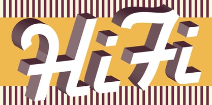
$39.00Lively, friendly and fun. Blackcurrant is derived from a poster campaign Rian Hughes designed for the youthful Japanese woman's outfitters, Yellow Boots. The original logo formed the basis of the Black version; the narrower Squash version was added fro the commercial release. The lower case was added two years later due to popular demand. In 2010 the font was further accessorised with extensive ligatures, made possible with the then-new Opentype technology. - HiFi by Pelavin Fonts,
$25.00HiFi is a geometric script whose genesis lies in drive-in movie theaters, vintage auto emblems and radio dials. It embraces the stylistic tenets of retro futurism and proposes that the evolution of design styles, rather than being linear, is a circular process, continually revisiting and reshaping itself. It evokes the 40s & 50s and pre-transistor electronics when you turned your radio on and waited patiently for the tubes to warm up. - Crowbar by Hanoded,
$15.00Technically a crowbar is a straight metal rod used for digging. The tool I had in mind when I named this font is called a jemmy or pry bar, but I guess I liked the name crowbar better. Crowbar font, like its namesake, is a very useful tool: its brush-like appearance fits any design, especially if you are aiming for the ‘scary’ look. Comes with a toolbox full of diacritics too! - Obliterate GRP by Grype,
$16.00Obliterate is a self destructing sans-serif typeface created from old rub off typography sheets brought back from the brink of becoming landfill fodder. It contains four sets of capitals and one alternate set of numerals for a randomized look. Here’s what’s included with Obliterate: 633 glyphs - including Capitals, Alternate Capitals (in lowercase slots), Numerals, Punctuation, two additional alternate Capitals sets and an extensive character set that covers multilingual support of latin based languages. (see the last graphic for a preview of the characters included) Ligatures Feature that auto-switches between Capitals & three other alternate Capitals glyphsets, as well as Numerals and Alternate Numerals for visual randomness. The ligatures feature will be automatically enabled for most with opentype compatibility, otherwise you can access the alternate glyphs via a Glyphs panel. (try typing below to watch it alternate between sets) Four Sets of Distressed Capitals each come complete with international accented characters for each version. Here’s why Obliterate is for you: You're into legible but distressed typestyles that imitate a random looking distress to it You're a fan of the band Inner Circle, whom the font was originally a tribute to You're a fan of old Letraset/Transfertype rub off lettering You're designing a modern horror movie poster and want a typeface with some tooth to it You just like to collect quality fonts to add to your design arsenal - Artis Sans by Wiescher Design,
$30.00»Artis« is the name for my latest art-project-font. Obviously I just chopped off the last »t«. Then I looked it up on Wikipedia and what do you know, it is of latin descent. »Ars Gratia Artis« which means »art for arts sake« or in French »l’art pour l’art«, a perfect font name. If I would cut off the »s« as well it would mean disambiguation and that in turn is, what I just did here. Enough disambiguation! »Artis« is a modern classical beauty with extreme contrast between up- and downstrokes that make it unique with a touch of art deco and showing Renaissance roots. But – »Artis« is a twin-font that has an elegantly decorated twin sister »Artis-Swing«. Between the 2 fonts you have endless possibilities for combination. I love these twins! It is a great everyday workhorse with seven weights from ExtraLight to Bold and all the necessary weights in between. Great for short copy and elegant headlines! With 879 Glyphs it is a truly European font designed for all Central European and Latin using countries. »Artis« has a set of Cyrillic that is – besides Russia – also good for Serbia, Macedonia and Ukraine. It has oldstyle- and lining-, tabular- and tabular-oldstyle-figures and many ligatures. »Artis« comes in Sans and Swing and is an elegant, playful and friendly font. Enjoy! - The font named Not Quite Right BRK by AEnigma is a distinctive and characterful typeface that embodies a unique blend of quirkiness and legibility. This semi-novelty font, designed by the prolific fo...
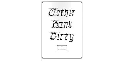
- Gothic Hand Dirty by TypoGraphicDesign,
$15.00 - Bluset Now Mono by Elsner+Flake,
$35.00Bluset Monospaced enlarges the re-worked and expanded text- and headline typeface family Bluest Now with 6 new cuts. The concept for Bluest Now was based, in its original form, on a corporate design typeface by Elsner+Flake in 2004, ordered by the Landor Agency for a large German energy corporation. Regularly re-worked and brought up to modern standards, the typeface is still used to this day. Because of its large x-height and its well-balanced appearance, Bluset Now Mono is also excellent for use in small typesizes. The three Roman cuts, Regular, Medium and Bold, and the corresponding obliques, allow a clear differentiation of base- and display applications for every typesize. The character complement has been created for 72 Latin-based language areas and thus allows a neutral text exchange across language borders. Translation Inga Wennik - Graffiti Classic by Robert Arnow,
$25.00Graffiti Classic is a graffiti font that blends the improvisational urban quality of graffiti with the smoothness and regularity of a typeface. Growing up in Brooklyn, graffiti appeared to me as an explosion of expression and color in a sea of concrete. Inspired, I became a graffiti artist and practiced in both notebooks and subway tunnels. While I moved on to somewhat more traditional art forms in future years, with Graffiti Classic I pay homage to my artistic roots in a calligraphy marker/tag font. Like my other fonts, the entire Graffiti Classic font is spaced letter to individual letter so that the spacing will work smoothly, in spite of the expressiveness and irregularity of the forms. The Graffiti Classic family also includes an ornaments font, “Taglets,” which has clouds, underlines, arrows, crowns, halos and more to add flavor to your designs. - Idealist Sans - 100% free
- Leokadia Deco - 100% free
- Spin Cycle 3D OT - Unknown license
- Art-Nouveau 1910 - 100% free
- Kingthings Petrock - Unknown license
- FlatPack - Unknown license
- Yanone Tagesschrift - Unknown license
- Cage - Unknown license
- TypographerGotisch Schatten S - Unknown license
- Vtks Relaxing Blaze - 100% free
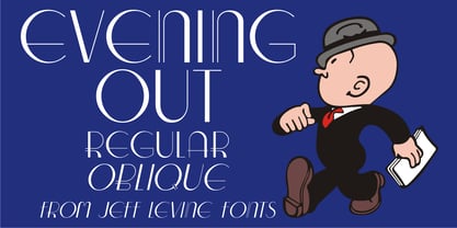
- Evening Out JNL by Jeff Levine,
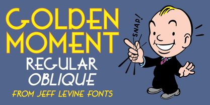
$29.00 - Golden Moment JNL by Jeff Levine,
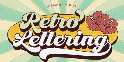
$29.00 - Retro Lettering by Nirmana Visual,
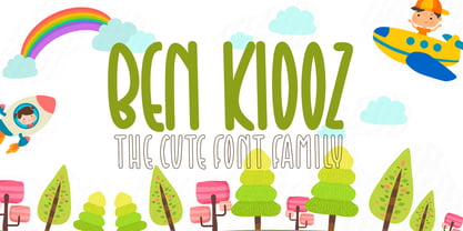
$19.00 - Ben Kidoz by Sipanji21,
$5.00 - Film Title JNL by Jeff Levine,
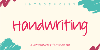
$29.00 - Handwriting by Cocodesign,
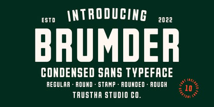
$10.00 - Brumder by Trustha,
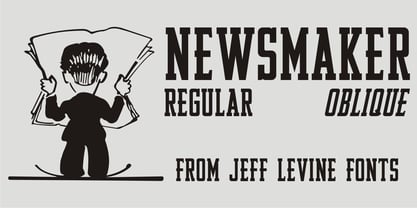
$17.00 - Newsmaker JNL by Jeff Levine,
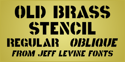
$29.00 - Old Brass Stencil JNL by Jeff Levine,
$29.00
