10,000 search results
(0.033 seconds)
- The "Janda Closer To Free" font, designed by Kimberly Geswein, embodies a perfect blend of casual charm and heartfelt emotion, making it stand out in the realm of typography. This font captures the e...
- Spotted Fever - Unknown license

- Glory Signature by Din Studio,
$29.00 Is your branding missing something that makes people amaze? Have you thought about how you can add that touch of magic to your branding and projects? What if we told you, you only need to change one element to engage and convert your clients? Introducing Glory Signature-A Modern Script Font Giving you a simple, yet gorgeous solution to your branding. This font is more than just another script font. It encapsulates the essence of elegance and modernity. With its clean script-type design and curved indentations, this font will take your projects to the next level! Use it for headings, logos, business cards, printed quotes, invitations of all sorts, cards, packaging, and your website or social media branding. Glory Signature includes Multilingual Options to make your branding globally acceptable. Features: Standard Ligatures Stylistic Sets Swashes Multilingual Support PUA Encoded Numerals and Punctuation Thank you for downloading premium fonts from Din Studio
 - Ginchiest by 38-lineart,
$15.00 We introduce our new font named Ginchiest. According to its name, the word ‘Ginchiest’ is slang for something interesting, the coolest, the hippest, the prettiest, the smartest, the most fun to be around. You’re the ginchiest! Maybe this is slang you have heard about; it represents Ginchiest font perfectly. The Ginchiest is a bold script font with retro vintage style. This font is perfect for you lettering lovers because we prepared lots of alternates and ligatures that are very eye-catching. And of course we also designate this font for branding; it's great in logos and logotypes. Bold style make your product look very confident to appear in the public market. For shadow effect, just relax, we have prepared it for free for you, so you don’t need waste time making shadow effects. For the tutorial how to make shadow effect please see this link: https://youtu.be/Bt_DqE0TQjc No doubt - its great choice for lettering and logotype. You’re the Ginchiest!
 - Yuk Ngexi by Product Type,
$17.00 Meet the Yuk Ngexi Font: Strong, Bold, and Fun in Gaming Style. Who says design has to be boring? With the Yuk Ngexi Font, you can bring a touch of power, thickness, and gaming style fun to your every project. The Yuk Ngexi font is the perfect solution for various projects that require a unique theme. Whether it's for movies, games, or streaming game events, this font provides unmatched appeal. This font is designed with a strong gaming touch, giving each character a bold and striking feel. The Yuk Ngexi font comes in four different style variants: Regular, Blury, Outline, and Shadow. This gives you the flexibility to bring in a variety of nuances in your designs. Yuk Ngexi also supports multiple languages, allowing you to connect with a global audience easily. With Yuk Ngexi Font, you don't just get a font, you get the key to bringing creativity, power, and fun to each of your designs. Download the Yuk Ngexi Font now and watch how your design turns into something extraordinary!
 - Zapf Essentials by Linotype,
$29.99Linotype Zapf Essentials is the modernized version of Zapf Dingbats and was also designed by Hermann Zapf himself. Over 372 characters and symbols are included within six fonts and make life a little more communicative, a little more informative, and a lot more interesting. The fonts contain symbols for both professional and everyday uses. With their markers, ornaments and arrows they are informative as well as versatile, timeless and lively. An interesting note to the story of Zapf Essentials: in 1977, Hermann Zapf created about 1000 sketches of signs and symbols. ITC chose those which became known around the world as Zapf Dingbats. For a typesetter, dingbats are the characters in the corner of the type box which can be used for just about anything. The last decade has seen the appearance of new symbols for e-mail, fax, mobile phones and other developments. These are now part of Linotype Zapf Essentials, just as they are now a part of everyday life. For a quick overview of the different Linotype Essentials variations, see the keyboard layout PDF in the Gallery section. It shows the keyboard layout of each font. A helpful hint from Hermann Zapf: Linotype Zapf Essentials should be used sparingly so that the characters retain their emphasis. - Nearvana by IKIIKOWRK,
$19.00 Proudly Present Nearvana - Classic Condensed Type, created by ikiiko. This special face type inspired by Nirvana, a famous band name with an iconic logotype, served as a source of inspiration for the classic condensed serif typeface. With thin forms and sharp lines, this typeface conveys a timeless, masculine and elegant look. Nearvana was developed with a unique decorative style, simple but without losing the distinctive character that evokes nostalgia and authenticity. This typeface is perfect for an luxury brand, classy stuff, magazine layout, fashion look book, book cover, poster, packaging, food & beverages and also good for quotes, or simply as a stylish text overlay to any background image. What's included? Uppercase & Lowercase Number & Punctuation Multilingual Support Works on PC & Mac
 - Cell by Type Minds,
$7.50 Cell is a sturdy, geometric typeface with many potential applications. Though it is best suited to display sizes, its construction is simple enough for use in smaller settings. Its octagonal, almost mechanical design is softened by rounded corners. The face is characterized by a single thick stroke in each letter, lending it a unique appearance. It also features an oblique counterpart with several italic-style glyphs. Both members of the family also include small capitals mapped to the Private Use Area. Cell was designed to be at once simple and unique. Its grid-based structure is enhanced by slight adjustments for optical consistency. Glyphs which are normally round instead have 45-degree angles at the corners, sticking to the grid system without losing legibility.
 - Klainy by Identity Letters,
$29.00 An unadorned Grotesque with a refreshingly personal touch. If “Grotesque” mainly means “industrial, mechanical, anonymous typeface” to you, Klainy might redefine your image of the genre. Yes, it’s a Grotesque—but with a contemporary look and a lot of personality. Klainy’s apertures are more closed at the top and more open at the bottom, creating an informal rhythm that sets Klainy apart: a confident, optimistic voice with a clean appearance. Terminals are subtly back-bent: these quaint “hooks” make Klainy a bit more personal, a bit friendlier. (You can find them in the a, c, f, and r.) Just like its old-style Grotesque ancestors, Klainy is optimized for display sizes and short texts. There, its unobtrusive quirks can be wholly appreciated. However, the familiar Grotesque appearance makes sure that the typeface is comfortable to read in smaller sizes, as well. Use Klainy whenever a basically classic sans-serif typeface with a modern and individual twist is called for. This font family comes in eight weights ranging from Thin to Black, each with a matching italic style. More than 500 glyphs and a bunch of Open Type Features make it a reliable companion for all of your projects. You can fine-tune the flavor of Klainy with Stylistic Alternates such as a one-story a and a two-story g. Their simple construction blends perfectly with the design concept of this typeface. Klainy is a seasoned blue-collar worker that surprises you with wit and team spirit. It’ll be a great addition to your font library.
 - Reactor A1 by Yautja is a font that embodies a futuristic, dynamic essence tailor-made for projects that aim to stand out with a bold, innovative aesthetic. Imagine letters that have been sculpted fr...
- Abril by TypeTogether,
$39.00 Conceived specifically for intensive editorial use, whether it is in newspapers, magazines or digital media, Abril is a font family of two worlds. The titling weights, based on a contemporary revamp of classic Didone styles, display both neutrality and strong presence on the page, attracting the reader’s attention with measured tension in its curves, good color and high contrast. It also features typographic niceties such as ornaments, borders, special dingbats and alternate letters and numbers that propose a broad palette of tools to the designer. The text weights are more closely inspired by both, 19th century slab serifs and scotch roman types. They maintain consistency with the headline styles, and at first glance may appear to have the same shapes only with lower contrast. However, in reality the letter forms of Abril Text were engineered from scratch to achieve a color, texture and overall width that allow using the font comfortably in the most challenging environments for continuous reading, such as newspapers. This also makes it a great font family for pocketbooks and magazines. Abril competes, in terms of economy of space, head to head with some newspaper classics such as Utopia or Nimrod, but featuring a more contemporary look and feel; and unlike them, includes a full set of small caps with numbers and punctuation. The four main text weights of Abril Text were also manually hinted which grants the possibility of a smooth transition from printed media to web platform. Abril consists of 8 text styles and 12 display styles, all of them containing the standard TypeTogether character set that supports over 50 languages including those from Central and Northern Europe.
 - Yorkten by insigne,
$- Clean and welcoming, the distinct look of Yorkten is remarkably satisfying to the eye. Straight to the point, Yorkton features a fashionable, geometric composition with angled main stems. There are no fewer than fifty-four fonts in the family, all of which are characterized by one of three widths – extended, normal or condensed. Each individual subfamily is equipped with eight weights from Thin to Black with respective Italics, giving Yorkten a breathtaking range of fonts to boast. The greater value for you, though, is its members’ ability to work well together. With a deep toolbox of weights and widths to choose from, this family provides you with significant value and a broad number of design solutions, making sure you have the tools you need for each challenge. So where should you use the font? Jeremy Dooley designed Yorkten’s underpinning structure to be compact. Combined with its superior features and terrific legibility, this versatile font can be used effectively for many jobs, whether in print or on screen. Use it freely for e-books and apps. Yorkten is particularly great for headlines, banners, posters, and websites. As with all insigne fonts, fonts that are well received by the market are expanded into future variants such as rounded or slab serif types. Yorkten’s later expansions will increase the versatility and functionality of the family. There’s no need to wait for these future releases, though. This new face already complements a number of other insigne faces, such as Grayfel, Look, or the Cabrito Superfamily. So what are you waiting for? Get Yorkten today and bask in the rich potential it offers! Get Yorkten and luxuriate in its straightforward multifunctionality!
 - Grafema LC by Letter Collective,
$30.00 Grafema LC was designed by Jacklina Jekova & Todor Georgiev and published by Letter Collective. Grafema LC contains 16 styles and family package options. This Font Family Features: • 578 glyphs in 7 variants – upright, italic, textured, filled, rough, traditional contrast and inverted; • Handwritten with a calligraphic flat brush in 2 brush angles – 35° and 85°; • Extended Latin and Extended Cyrillic; • Coverage of multiple OpenType features – ligatures, stylistic alternates, and contextual alternates; • Suitable for web, print, motion graphics, etc; • Perfect for headlines, posters, packaging and greeting cards, etc. Grafema LC is a system of display typefaces consisting of 7 variants – upright, italic, textured, filled, rough, traditional contrast and inverted. Grafema LC started off as handwritten calligraphic works using a flat brush and variable angles of writing – 35° and 85°. It supports Extended Latin and Extended Cyrillic – more than 120 languages all together. The balanced natural texture of Grafema LC with unique details makes it perfect for headlines, but also suitable for long text. It is perfect for graphic design projects, like packaging, posters, events, blogs, social media and greeting cards. Grafema LC comes with a range of OpenType features – including old-style numerals, typographic features such as ligatures, stylistic and contextual alternates. The typeface is suitable for web, print and motion graphics.
 - Syphon Spritz Pro by CheapProFonts,
$10.00 A free flowing and loose handwritten style, with the occasional double lines - and with quite elaborate and decorative initials. Feminine, but sloppy - an interesting combination. I have regularized the stroke thicknesses and modified a couple of the letterforms to make them less ambiguous. Some kerning and spacing completes the workover, together with our extensive language support. ALL fonts from CheapProFonts have very extensive language support: They contain some unusual diacritic letters (some of which are contained in the Latin Extended-B Unicode block) supporting: Cornish, Filipino (Tagalog), Guarani, Luxembourgian, Malagasy, Romanian, Ulithian and Welsh. They also contain all glyphs in the Latin Extended-A Unicode block (which among others cover the Central European and Baltic areas) supporting: Afrikaans, Belarusian (Lacinka), Bosnian, Catalan, Chichewa, Croatian, Czech, Dutch, Esperanto, Greenlandic, Hungarian, Kashubian, Kurdish (Kurmanji), Latvian, Lithuanian, Maltese, Maori, Polish, Saami (Inari), Saami (North), Serbian (latin), Slovak(ian), Slovene, Sorbian (Lower), Sorbian (Upper), Turkish and Turkmen. And they of course contain all the usual "western" glyphs supporting: Albanian, Basque, Breton, Chamorro, Danish, Estonian, Faroese, Finnish, French, Frisian, Galican, German, Icelandic, Indonesian, Irish (Gaelic), Italian, Northern Sotho, Norwegian, Occitan, Portuguese, Rhaeto-Romance, Sami (Lule), Sami (South), Scots (Gaelic), Spanish, Swedish, Tswana, Walloon and Yapese.
 - Trump Gothic Pro by Canada Type,
$39.95 Trump Gothic is a reconception of ideas from Georg Trump's seminal 1955 Signum typeface and its later reworking (Kamene) by Czech designer Stanislav Marso. Originally cobbled together for a variety of film projects in the late 1990s and early 2000s, the Trump Gothic family was made available for the general public in 2005. Shortly thereafter, it became a common sight in movie credits, on posters and magazine covers, in fashion branding and on corporate web sites. Though countless attempts have been made to emulate it, its unique totality and attractiveness to layout designers was never really topped. Its appeal is largely due to its double-duty toolbox: An economic functionality that allows it to pack large amounts of information in small spaces, and a clear, modular aesthetic that gives it the ability to emphasize short text in large sizes, all without sacrificing legibility or giving in to dated or over-rehashed industrial gothic forms. The typeface was redrawn, refitted, optimized and greatly expanded in 2013, and the result is Trump Gothic Pro, a multiscript family of six fonts, each containing over 1020 glyphs and a wealth of OpenType features, including small caps, caps-to-small-caps, stylistic alternates, unicase/monocase alternates, fractions, ordinals, class-based kerning, and support for Latin, Cyrillic and Greek locales.
 - OBO Classic by Juri Zaech,
$19.00 OBO Classic is the second installment of the OBO series, a type collection based on a square. Every character is mapped on a 1x1 ratio which allows for horizontal and vertical settings alike. Or mixed, like crosswords. OBO Classic is a display interpretation of a traditional Old-style Serif. The “distortion” which maps each character to a square creates unusual proportions to what we are used to from classic serif typefaces. The result is a monospaced font. While each individual letter feels conventional on its own, when brought together in words the result feels contemporary. Thanks to the square base vertical and horizontal – and mixed – settings are possible and easy to apply. There are a few exceptions for certain punctuation and special characters that are half the width for better spacing; and the word space’s width can easily be adjusted through OpenType stylistic sets. Talking about spacing, for strictly horizontal typesetting there is the option to turn on kerning for a number of characters to create a cleaner texture across words and phrases. OBO Classic is best set in large sizes and is most comfortable in editorial and display settings. A series of icons complete the character set. A selection comes as pixel graphics which adds further contrast to the traditional legacy of the typeface.
 - Skema Pro by Mint Type,
$40.00 Skema Pro is a versatile system of 6 serif typefaces - each bearing a distinct character and purpose. Together they form a huge superfamily of 84 fonts to fit any imaginable task. Skema Pro Livro is a low contrast, low x-height typeface with inclined axis. It is designed to work in books, where long ascenders and descenders along with increased line-spacing aid comfortable reading. Skema Pro Text has low contrast, medium x-height, and slightly tilted axis. Its neutrality along with modern feel makes it default choice for long texts of any nature. Skema Pro Omni features medium contrast, medium x-height, and slightly inclined axis. Being a more contrasted version of Skema Pro Text, it shares its intent of usage, however, creates a different texture with more formal look. Skema Pro News is a low contrast, large x-height typeface with vertical axis. Works best in newspapers and in screen applications. Skema Pro Title has medium contrast, large x-height, and vertical axis. Designed to work in larger text sizes, it offers contemporary detailing for pull-quotes and subheadings. Skema Pro Display is a typeface with high contrast, large x-height, and vertical axis. It shows its features in large text sizes, such as editorial headings.
 - Blowsters by Letterhend,
$17.00 Blowsters is a textured SVG Sans Serif typeface. Available in two types, solid version and transparent version. This type of font perfectly made to be applied especially in headlines which is need a standout font, and the other various formal forms such as invitations, labels, logos, magazines, books, greeting / wedding cards, packaging, fashion, make up, stationery, novels, labels or any type of advertising purpose. Features : Solid version and svg version numbers and punctuation multilingual ligatures PUA encoded We highly recommend using a program that supports OpenType features and Glyphs panels like many of Adobe apps and Corel Draw, so you can see and access all Glyph variations. How to access opentype feature : letterhend.com/tutorials/using-opentype-feature-in-any-software/ Email us to letterhend@gmail.com if you need something! Happy Designing!
 - Overnight Oats by Hanoded,
$11.00 I recently walked part of the South West Coast Path in the UK. A couple of days in the hike, I came across a small cafe and I decided to have an oat latte (I am lactose intolerant). Since it was early in the morning, the breakfast menu was out and one of the items I noticed was ‘Overnight Oats’. I normally cook my oats with some lactose free milk and water, but apparently you can soak them overnight, add fruit and nuts and eat it like that. I tried it, it’s ok, but I think I prefer the cooked version. Overnight Oats is a bit of an odd font: it is very higgledy piggledy, yet legible and unique. If you want something out of the ordinary, then this may be your font!
 - Sond by Eurotypo,
$34.00 Sond is a casual, modern and hand brushed font. I've designed Sond carefully with the intention to preserve in its glyphs the original tell-tale dry brush imperfections and a bouncy baseline for a more personalized effect even more authentic. As an exclusively Open Type release, with 519 glyphs and ornaments, it has special alternatives for all letters with lots of possibility an infinity of combinations. There are plenty of options to allow you to create something unique and special: standard ligatures, swashes and stylistics alternates for each letter, beginning and ending letters. This lovely fonts have already an extended character set to support Central and Eastern as well as Western European languages. Sond is a good choice for greeting cards, posters, labels, t-shirt design, logos, and more.
 - Galey by Prestigetype Studio,
$23.00 Galey is a modern and clean sans serif with a geometric and rounded style. Each style comes in 18 weights with italics + variable fonts, from thin to black, includes 592 glyphs in each weight. Each style has its unique characters include OpenType features and extended language support (+Cyrillic) to suit a different purpose. Designed with a modern minimalist in mind, Perfectly use for branding, display, logo, text, headline, web design, and many editorial design purposes. We highly recommend using a program that supports OpenType features and Glyphs panels like many Adobe apps and Corel Draw so you can see and access all Glyph variations. We hope you enjoy our font - please do let us know by emailing us at info@prestigetype.com or prestigetypestudio@gmail.com if you need something!
 - Albrecht Durer Gothic by Scriptorium,
$18.00While browsing through a sourcebook on historic calligraphy and antique type I came on an interesting sample of a gothic style attributed to the legendary artist Albrecht Durer. I had previously seen fonts based on the peculiar style of lettering Durer used on prints for his signature and some captions, but this style was radically different and much more characteristic of the lettering and early printed types of the 'Northern Renaissance' which Durer was a big part of. Whether it's authentically Durer's work or not is up in the air, but it's a very nice example of early gothic type. We've called the resulting font Albrecht Durer Gothic and it's a very striking face well suited to titles and other contemporary uses where you need something heavy and eye catching. - Clever Medicine by Olivetype,
$18.00 Some words just scream without any explanation needed. Clever Medicine is one of those types of fonts. It’s a hand-drawn brush typeface that feels like it was made with care and precision, just for you and your personal style. Inspired by the idea of natural medicine as something to help you feel better, this typeface has a mysteriously sweet and engaging quality to it. This typeface also has a pronounced vintage appeal that gives it an unmistakable charm no matter what you use this font for; social media posts, signage, posters, headings for your blog—the possibilities are limitless! So what’s included : Basic Latin Uppercase and Lowercase Numbers, symbols, and punctuations Multilingual Support. PUA Encoded and fully accessible without additional design software Simple Installations works on PC & Mac Thank You and Happy Designing!
 - Havin Delight by Letterhend,
$19.00 Havin Delight is a beautiful signature script based on manual hand writing. The natural flow make this font looks like a real hand writing. This type of font perfectly made to be applied especially in logo, and the other various formal forms such as invitations, labels, logos, magazines, books, greeting / wedding cards, packaging, fashion, make up, stationery, novels, labels or any type of advertising purpose. Features : uppercase & lowercase numbers and punctuation multilingual alternates and ligatures PUA encoded We highly recommend using a program that supports OpenType features and Glyphs panels like many of Adobe apps and Corel Draw, so you can see and access all Glyph variations. How to access opentype feature : letterhend.com/tutorials/using-opentype-feature-in-any-software/ Email us to letterhend@gmail.com if you need something! Happy Designing!
 - Grantland by Letterhend,
$19.00 Grantlad is a condensed hand drawn brush font which is purposely made for headline, display or logotype, and signature which need a standout appearing. This font is also suitable to be applied especially in logo, and the other various formal forms such as invitations, labels, logos, magazines, books, greeting / wedding cards, packaging, fashion, make up, stationery, novels, labels or any type of advertising purpose. Features : uppercase & lowercase numbers and punctuation multilingual alternates & ligatures PUA encoded We highly recommend using a program that supports OpenType features and Glyphs panels like many of Adobe apps and Corel Draw, so you can see and access all Glyph variations. How to access opentype feature : letterhend.com/tutorials/using-opentype-feature-in-any-software/ Email us to letterhend@gmail.com if you need something! Happy Designing!
 - Slime Yogurt by Letterhend,
$19.00 Slime Yogurt is a fun and playful font which is made by a natural hand writing. The bold stroke make this font looks stands out, very suitable to be applied especially for logo, title, headline, slogan / tagline and the other various formal forms such as invitations, labels, logos, magazines, books, greeting / wedding cards, packaging, fashion, make up, stationery, novels, labels or any type of advertising purpose. Features : uppercase & lowercase numbers and punctuation multilingual alternates & ligatures PUA encoded We highly recommend using a program that supports OpenType features and Glyphs panels like many of Adobe apps and Corel Draw, so you can see and access all Glyph variations. How to access opentype feature : letterhend.com/tutorials/using-opentype-feature-in-any-software/ Email us to letterhend@gmail.com if you need something! Happy Designing!
 - Karatone by Letterhend,
$19.00 Introducing, Karatone, An Elegant Serif. This typeface has many alternates with swashes that can make your lettering / logotype become more interesting. The clean and neat of a serif combined with the swirl swashes makes this font one of a kind! This font perfectly made to be applied especially in logo, and the other various formal forms such as invitations, labels, logos, magazines, books, greeting / wedding cards, packaging, fashion, make up, stationery, novels, labels or any type of advertising purpose. Features : uppercase & lowercase numbers and punctuation multilingual ligatures alternates swashes PUA encoded We highly recommend using a program that supports OpenType features and Glyphs panels like many of Adobe apps and Corel Draw, so you can see and access all Glyph variations. Email us to letterhend@gmail.com if you need something! Happy Designing!
 - Bonna by Eurotypo,
$28.00 Bonna and Bonna Bold is a casual calligraphy family Font with an original textured appearance that will allow you to create an effect even more authentic. It’s an exclusively Open Type release with 815 glyphs, 93 ornaments to combine with letters and decorate your text. There are plenty of options to create something unique and special with lots of possibility an infinity of combinations: standard and discretionary ligatures, several swashes and stylistics alternates for each letter, catchwords, tails that can be added to the beginning or end of each letter, and much more. These ravishing fonts have already an extended character set to support Central and Eastern as well as Western European languages. Bonna was designed to help your projects look more creative, wonderful and fascinating! Have fun with it!
 - Logirent by Letterhend,
$17.00 Logirent is a unique typeface which is speciality made for a logotype. The customized ligatures is what makes this font unique. This type of font perfectly made to be applied especially in logo, headline, signage and the other various formal forms such as invitations, labels, logos, magazines, books, greeting / wedding cards, packaging, fashion, make up, stationery, novels, labels or any type of advertising purpose. Features : numbers and punctuation ligatures multilingual alternates / swashes and ligatures PUA encoded We highly recommend using a program that supports OpenType features and Glyphs panels like many of Adobe apps and Corel Draw, so you can see and access all Glyph variations. How to access opentype feature : letterhend.com/tutorials/using-opentype-feature-in-any-software/ Email us to letterhend@gmail.com if you need something! Happy Designing!
 - Ah, the Riparo font! It's like diving into the world of quirky and eye-catching typography, a playground where creativity meets functionality. Crafted by the talented Vladimir Nikolic, Riparo doesn't...
- Neudoerffer Fraktur by Linotype,
$29.99Johann Neudörffer the Elder's 1538 writing manual fascinated the German designer Helmut Bomm for years. Together with Albrecht Dürer and Hieronymus Andreä, Neudörffer helped create Fraktur, perhaps the most Germanic of all the blackletter styles. As a tribute to this master, and bringing its letterforms to a 21st century public, Boom released the Neudoerffer Fraktur family through Linotype in 2009. Neudoerffer Fraktur's appearance is based very much in handwriting, and Bomm had already begun using letters from prototype versions of this typeface as early as the 1990s. For years, Neudoerffer Fraktur'sletters would appear secretly and seductively in design projects like historical sign restorations or heraldry pieces. The sources that Bomm used while drawing the typeface were images from Jan Tschichold's Treasures of Calligraphy" and Albert Kapr's "Schriftkunst." The Neudoerffer Fraktur family has four separate fonts. Any user of Adobe CS applications should consider licensing Neudoerffer Fraktur Regular (the font without any numeral suffixes). This font contains three different OpenType stylistic sets. Users can pick and choose which versions of the letters that they would like to set. Anyone using Quark XPress, Microsoft Word, or other applications without support for Stylistic Sets should license Neudoeffer Fraktur Regular 1, Neudoeffer Fraktur Regular 2, and Neudoeffer Fraktur Regular 3. Each of these three fonts has letters with slightly different style of flourish, and all three may be combined with each other. Neudoerffer Fraktur Regular 1 is optimal for longer texts; Neudoerffer Fraktur Regular 2 contains alternate letters, and well as more ornamented capitals; Neudoerffer Fraktur Regular 3's letters have a stronger calligraphic accent." - Symply by TripleHely,
$16.00 Hi there! Let me introduce Symply – a handwritten signature-style font. Symply is perfect for logos, branding, quotes, blog headlines, magazine and book design, product packaging, web design – or for any text on postcards and your favorite photos. Symply contains: a standard set of characters with wide multilingual support: Western-, Central- and Eastern-European, Baltic, Turkish, Latin-type Africans, and Asian (94 languages in total) 2 additional sets of alternative characters for lowercase letters 8 alternative characters for some initial letters 28 ligatures for double letters and frequent combinations a bonus font with 62 swashes and doodles Symply has two types of embedded auto-replacements: lowercase letters without connecting strokes (for a case of the last character of the word), and ligatures (for a case of two letters that do not pair well together). These features work well in many apps (even simple ones like Notepad/TextEdit), and if you need to customize their application – you could use programs that support OpenType features (for example, Adobe apps or CorelDraw). All these additional glyphs are PUA-encoded, so if your software does not support OpenType — you could access them through Character Map (Windows) or Font Book (Mac) Swashes and doodles come in a bonus font, Symply Swashes. To type them, please press keys with letters A – X, a – x, and numbers 0 – 9 I hope you will like Symply and create great designs with it! And if you have any questions, feel free to contact me via e-mail: triple.hely@gmail.com
 - Macklin by Monotype,
$50.99 Designed by Malou Verlomme of the Monotype Studio, Macklin is a superfamily, which brings together several attention-grabbing styles. Macklin is an elegant, high contrast typeface that demands its own attention and has been designed purposely to enable brands to appeal more emotionally to modern consumers. Macklin comprises four sub-families —Sans, Slab, Text and Display— as well as a variable. The full superfamily includes 54 fonts with 9 weights ranging from hairline to black. The concept for Macklin began with research on historical material from Britain and Europe in the beginning of the 19th century, specifically the work of Vincent Figgins. This was a period of intense social change--the beginning of the industrial revolution. A time when manufacturers and advertisers were suddenly replacing traditional handwriting or calligraphy models and demanding bold, attention-grabbing typography. Typographers experimented with innovative new styles, like fat faces and Italians, and developed many styles that brands and designers continue to use today, such as slabs, serifs, and sans serifs. Verlomme pays respect to Figgins’s work with Macklin, but pushes the family to a more contemporary place. Each sub family has been designed from the same skeleton, giving designers a broad palette for visual representation and the ability to create with contrast without worrying about awkward pairings. With Macklin, Verlomme shows us it’s possible to create a superfamily that allows for complete visual expression without compromising fluidity. Macklin™ font field guide including best practices, font pairings and alternatives. Featured in: Best Fonts for Websites
 - Death Markers by Figuree Studio,
$25.00 Everyone who lives will surely die Death Markers is a natural brush font, inspired by a vintage aesthetic sign painting. Made in combination with hand lettering, it comes with dramatic movement and it’s great for any next creative project that needs a retro vibe and horror touch. It comes with 2 styles: Clean and Drip effect. Ideal for logos, handwritten quotes, product packaging, header, poster, merchandise, social media & greeting cards. With your purchase you get: - All Caps - Numbers and Punctuation Marks - Support for MAC or PC - Simple installation for Adobe Illustrator, Corel Draw, Photoshop, or Procreate (New Updated) - Support Multilanguage I hope you make something cool with it. If you have any questions don't hesitate to ask!
 - Hermush by Letterhend,
$19.00 Hermush Display is a condensed unique typeface with unusual anatomy. This type of font perfectly made to be applied especially in logo, headline, signage and the other various formal forms such as invitations, labels, logos, magazines, books, greeting / wedding cards, packaging, fashion, make up, stationery, novels, labels or any type of advertising purpose. Features : numbers and punctuation multilingual alternates / swashes and ligatures PUA encoded We highly recommend using a program that supports OpenType features and Glyphs panels like many of Adobe apps and Corel Draw, so you can see and access all Glyph variations. How to access opentype feature : letterhend.com/tutorials/using-opentype-feature-in-any-software/ Email us to letterhend@gmail.com if you need something! Happy Designing!
 - Acies by Alexander Stephenson,
$26.00 Acies is a sharp sans with accented stroke width contrast and slightly condensed proportions. Its shapes are reduced to the bare minimum, conveying simplicity and sophistication. It has steep joins, aligning horizontal stroke endings and vertically ending ascenders and descenders, freely mixing typographic norms to create something refreshing and new. It is designed to function in a wide variety of environments, ranging from screen to print. Acies is available in 6 weights with matching obliques, that have the same pitch as their upright counterparts. With 690 Glyphs per font, it supports 100+ languages and offers a wide range of OpenType features like stylistic alternates, petite caps, old style figures, ligatures or case sensitive forms.
 - Chillday Script by Letterhend,
$19.00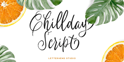 Introducing, Childay Script. A beautiful and unique modern calligraphy script typeface. This type of font perfectly made to be applied especially in logo, and the other various formal forms such as invitations, labels, logos, magazines, books, greeting / wedding cards, packaging, fashion, make up, stationery, novels, labels or any type of advertising purpose. Features : uppercase & lowercase numbers and punctuation multilingual swashes and ligatures alternates PUA encoded We highly recommend using a program that supports OpenType features and Glyphs panels like many of Adobe apps and Corel Draw, so you can see and access all Glyph variations. How to access opentype feature : letterhend.com/tutorials/using-opentype-feature-in-any-software/ Email us to letterhend@gmail.com if you need something! Happy Designing!
 - The Randi by Letterhend,
$19.00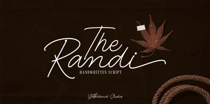 Introducing, The Randi - A monoline handwritten script with classy look. This type of font perfectly made to be applied especially in logo, and the other various formal forms such as invitations, labels, logos, magazines, books, greeting / wedding cards, packaging, fashion, make up, stationery, novels, labels or any type of advertising purpose. Features : uppercase & lowercase numbers and punctuation multilingual swash and ligature alternates PUA encoded We highly recommend using a program that supports OpenType features and Glyphs panels like many of Adobe apps and Corel Draw, so you can see and access all Glyph variations. How to access opentype feature : letterhend.com/tutorials/using-opentype-feature-in-any-software/ Email us to letterhend@gmail.com if you need something! Happy Designing!
 - Redberries by Letterhend,
$19.00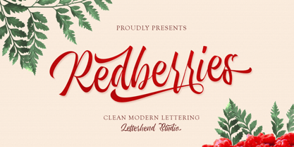 Introducing, Redberries Script. A beautiful and unique modern calligraphy script typeface. This type of font perfectly made to be applied especially in logo, and the other various formal forms such as invitations, labels, logos, magazines, books, greeting / wedding cards, packaging, fashion, make up, stationery, novels, labels or any type of advertising purpose. Features : uppercase & lowercase numbers and punctuation multilingual swashes and ligatures alternates PUA encoded We highly recommend using a program that supports OpenType features and Glyphs panels like many of Adobe apps and Corel Draw, so you can see and access all Glyph variations. How to access opentype feature : letterhend.com/tutorials/using-opentype-feature-in-any-software/ Email us to letterhend@gmail.com if you need something! Happy Designing!
 - Goodies Stencil by Sohel Studio,
$16.00 Say hi to “Goodies Stencil” Modern Stencil Serif . That has a unique style & luxurious look. This typeface is perfect for an elegant & luxury logo , classy editorial design, women's magazine, fashion brand , cosmetic brand, fashion promotion , modern advertising design, invitation card, art quote, home decoration , book/cover titles, special events, and much more. Goodies Stencil Features: · 2 Weights font (Regular,Italic) · Uppercase And Lowercase · Numerals & Punctuation · Accented characters · Multilingual Support · Unicode PUA Encoded While using this product, if you encounter any problem or spot something we may have missed, please don't hesitate to drop us a message. We'd love to hear your feedbacks in order to further fine-tune our products. Thanks and have a wonderful day
