10,000 search results
(0.019 seconds)
- ALS Direct by Art. Lebedev Studio,
$63.00 ALS Direct is an open and dynamic typeface with clear-cut letterforms that make it instantly readable. It lends text a neutral, yet agreeable and modern feel. Direct has nine font styles convenient for the purposes of navigation signage. Regular-style letterforms are rather wide, because direction signs are likely to appear before readers at an angle, so the type needs to withstand perspective distortions. And as signs and boards may vary in size, Direct was developed to include several width variations. Condensed fonts can be used where horizontal space is limited, allowing you to keep proper height and readability of the characters. A signage typeface must be easily readable from some distance away and have simple letterfoms with clear-cut features to quickly identify characters. Designing a type for a potentially wide range of purposes calls for a universal approach. If not destined to be used for navigation in a particular building, it shouldn’t incorporate any peculiar elements to agree with certain design or architecture. All of the above determined our choice of a sans serif with large apertures and definite features allowing readers to instantly recognize letters. Descenders are made compact not to interfere with the line below. And the low contrast between thick and thin strokes renders all elements equally perceptible. The x-height is significant, close to the cap height, which inhances readability of the lowercase type. There are two reasons why directions must not be set in all caps. Firstly, lowercase letters are more diverse and include ascenders and descenders identifying some of the letters in the line. And secondly, having learned to read, people recognize word shapes rather than individual letters, which makes lowercase text more readable. With Direct being a signage typeface, first to be developed were its width variations, and different weight styles and italics were added later. Another thing to be kept in mind was that signs often use dark background colors, and black type on a white background appears smaller than white type on a black background. Direct is the first Cyrillic typeface created for navigation purposes. Before that, designers could use the Cyrillic version of Frutiger (Freeset) developed by Adrian Frutiger for the Paris Charles de Gaulle International Airport, and a number of other, mostly body copy, neutral sans serif types. However, signs and boards were dominated by Arial, which Direct would be glad to replace offering elegance and lucidity of form instead of type bluntess. Direct was designed as a signage typeface, but its neutral style and clear-cut letterforms suggest various other ways of application.
 - Orelia Display by Orenari,
$20.00 Introducing our latest retro font design: Orelia Display font, a modern take on classic mid-century typography. Our simple retro font is designed to be humble yet eye-catching, with clean lines and simple shapes that evoke a sense of nostalgia while remaining relevant and contemporary. This font is perfect for projects that require a touch of retro charm without overwhelming the design. Its understated appearance makes it ideal for minimalist designs, logos, and branding, while the bold letterforms ensure that it still catches the eye. Crafted with care and attention to detail, our simple retro font is available in a variety of weights and styles, allowing you to customize your design and make it truly unique. Whether you're creating a retro-themed website, designing a product with a vintage twist, or simply want to add a touch of nostalgia to your work, our simple retro font is the perfect choice. With its timeless appeal and modern design, our simple retro font is sure to become a go-to choice for designers and creatives who appreciate the beauty of simplicity. Purchase now and add a touch of retro charm to your next project!
 - Loyolliams by Eyad Al-Samman,
$5.00 “Loyolliams” is my first designed Latin typeface which has special meanings and unforgettable memories for me. The font's name, Loyolliams, consists of two mixed syllables stand for two different names. The first syllable is derived from the name “Loyola” and the second syllable is derived from the last five letters of the name “Williams.” These two names are related to “Concordia University”—located in Montreal in Canada—where I studied at a short academic term and spent in a very special period of my life in the late 2005. This renowned Canadian academic institution was created following the 1974 merger of “Loyola College” (1896) and “Sir George Williams University” (1926). This conglomeration formed “Concordia University” and the name Concordia itself was taken from the motto of the city of Montreal, Concordia salus (meaning ‘well-being through harmony’). This font comes in two different weights; light and regular. “Loyolliams” is a square, geometric, techno, and modern font. It is suitable for T-shirts, books' covers, websites’ addresses, advertisement light boards, and titles in technical, artistic, and other types of magazines and signboards. “Loyolliams” can be used also in posters, surfaces of electrical and electronic tools, digital devices and chips, geometrical machines, trucks, tractors, calculators, mobile phones, watches, laptops, personal computers, power equipments, digital cameras, technical magazines, and other digital and electronic tools. This fonts can be effectively used in titles especially when its uppercase and lowercase letters are mixed together and when it is used in its italic mode. "Loyolliams" is suitable for writing and printing small textual paragraphs in cards, magazines advertisements, and also posters. The main characteristic of "Loyolliams" Typeface is its non-curve style in most of its alphanumeric letters. The characters are deliberately designed to have only angular and square shapes.
 - Ginbe by Twinletter,
$15.00 Ginbe, our newest display font, has lovely curves that give your designs a handcrafted, contemporary feel that’s cute and lovely. This design is perfect for any project that requires a simple and clean appearance. It will help you with all of your visual projects. of course, your various design projects will be perfect and extraordinary. Start using our fonts for your extraordinary projects.
 - Dialog by Linotype,
$39.00Dialog is my first sans serif. I had made some attempts earlier, but they didn't satisfy me. Dialog was, on the contrary, so inspiring that I made 19 different fonts of it, the most complete typeface for several years. I usually prefer typefaces with serifs, but I don't miss them in Dialog. The name needs no explanation. Dialog was released in 1993. - Lille Snemand by Hanoded,
$15.00 Lille Snemand, in Danish, means Little Snowman - like the Little Mermaid, but then colder… Lille Snemand is kin to the original Snemand font, which is an all caps typeface, but unlike its big brother, Lille Snemand comes with lowercase glyphs. It is a very legible font and has that 'unevenish' look - making it a great typeface for packaging and books.
 - Ribjoint by Chank,
$39.95 Created by Chank in 1992, Ribjoint was Chank’s first attempt at creating a Egyptian, cursive font on the computer. Writing cursive with a pencil sure is easy, but getting all the letters to link up correctly in computerized font format is a bit tricky. Not the most graceful script in the world, but it works good enough for a BBQ pit.
 - Lectores by Cuda Wianki,
$20.00 Lectores is based on 18th century chronicles of Benedictine monastery manuscript, so it is definitely oldish, rough but elegant. Thanks to many ligatures and alternate characters it is varied handwriting font. Lectores is decorative, it works nice with many occasional papers such as invitations, stationery and quotations. It is perfect not only for oldstyle and antique typography but also for modern designs.
 - Belgiano Serif by Skypia,
$15.00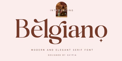 introducing our new "Belgiano" Modern Ligature with Elegant Style this is perfect for branding, logos, invitation, masterheads and more. Belgiano is also included full set of: uppercase and lowercase letters multilingual symbols numerals punctuation Alternates PUA Encoded Ligatures Wish you enjoy our font and if you have a question, don't hesitate to drop message & I'm happy to help :) Thank you, Skypia
 - Zekat by Twinletter,
$15.00 Introducing Zekat Arabic font. This premium Arabic style font is a great way to bring a new level of luxury to your designs. Whether you’re creating a logo for your website, magazine cover, packaging project, or other design work, our fonts are perfect for you. Our collection includes a wide variety of fonts from traditional to modern, with many different styles in between.
 - Centrifuge by Midwest Type,
$12.00 Originally inspired by manufacturer badges on old laboratory equipment, Centrifuge sports soft geometric shapes, wedge serifs, and sharply-angled terminals. Quirky but versatile, Centrifuge can appear anywhere from formal and elegant to funky and chunky depending on how it’s set. Centrifuge is suitable for short-form text and headlines but really sings in an all-caps setting with generous tracking.
 - Material Boy by PizzaDude.dk,
$15.00 Yes, it is a clear reference to one of my all-time favourite movies: “The Wedding Singer”, but it is also a handmade, rough, organic looking ALL CAPS font. The letters are simple and legible, but vary in roughness and because of the Contextual Alternates, you get 5 different versions of each letter - leaving the text more lively and organic!
 - Cool Crayon by Hanoded,
$15.00 Cool Crayon is a nice typeface I created with the black crayola from my 3 year old son's crayola box. It was broken (because he tends to throw them around), but I managed to get the glyphs onto a sheet of paper. Cool Crayon is similar to Crayon Crumble, but is rounder and thicker. Cool Crayon comes with extensive language support.
 - Kids Rule by PizzaDude.dk,
$13.00 Sometimes you need a lot of text, and that text needs a little bit extra something. Something sweet for the eye, but still legible and not too funky. Maybe that's where Kids Rule comes in. It's a bouncy, but super-legible handmade comic font. It has a lot of attitude, and I have added 5 different versions of each letter!
 - Astoria Classic Sans by Alan Meeks,
$45.00 The latest addition to the Astoria Range, Astoria Classic Sans has the same basic Characteristics as Astoria but with vertical stress. A sans-serif companion to Astoria Sans. Unlike Astoria, but like Astoria Classic, the Italics in form are old style yet with a modern look. Designed specificaly as a text face it still works very well as a headline font.
 - Rust Core by Salamahtype,
$19.00 Introducing our font called “RUST CORE” – display font with 4 styles included (Clean and Stamp/Textured). Perfect for branding projects, logos, labels and more. With texture like rust core, will make your design, product, logo or label more cool, unique and meaningful. Font: All caps characters (4 styles) Numbers, symbols, and punctuation Multilingual support Enjoy our cool font! Thank you.
 - Blackout by Blackout,
$20.00Blackout is the first and signature font to the Blackout Foundry. Inspired by gothic structures, but maintaining a constructive form. Everything in balance, simple, and straightforward. The font has hard corners on one end, and subtle curves on the other. It is intended for anyone wanting to have a moody appeal to their work, but still maintains a legible format. - Makwus by Twinletter,
$15.00 Introducing our newest font called Makwus, one of our newest premium fonts based on Arabic style. This elegant font has a targeted audience and is perfect for personal and professional projects, from social media ads to business cards to your logo and project headers. This Makwus font designed by experienced typographers can bring a beautiful new level of luxury to your designs.
 - Quelia by Piotr Łapa,
$30.00 Quelia is an experimental, display, all-caps typeface inspired by nature and organic shapes. It has a very expressive character. The letterforms are extraordinary but also elegant at the same time. Quelia is a great choice for fashion projects, branding, headlines, titles, posters, packaging, covers, and logotypes but it can also add a distinct character to your website or app.
 - Squat by BA Graphics,
$45.00 Squat may be vertically challenged but hey, even the vertically challenged need love too! And you know what? Squat is worth much more than Diddley Squat! It gets the tough jobs done in half the vertical space with its sturdy, low profile. Randy Newman may not care for it, but Squat shows that short fonts got plenty of reason to live! So there.
 - PAG Auto by Prop-a-ganda,
$19.99Prop-a-ganda offers retro-flavored fonts inspired by lettering on retro propaganda posters, retro advertising posters, retro packages all the world over. This is perfect font for your retrospective project. PAG Auto is an ultra black font, but it is readable. A fat typefaces, but is is boorish. It is recommended for use as all kinds of display typography. - Unhuman by AN Studio,
$22.90 Inspired by a futuristic cyberpunk and Neo-Tokyo vibe, UNHUMAN is a typeface that embodies the essence of technology and innovation. With its simple shapes and wide form featuring 45° cuts, this font brings a sleek and hi-tech aesthetic to your designs. Created by AN Górski, UNHUMAN is the perfect choice for projects that require a modern and cutting-edge look. **Uppercase
 - Suomi Sans by Suomi,
$25.00 There are many sans serif typefaces with calligraphic tendencies, but Suomi Sans is different: the outside forms are fairly basic, fairly narrow sans serif style, but the counter forms have a strong calligraphic flair with accented upper left and lower right hand corners. With six weights in Roman and italic, Suomi Sans works well for both headline and text use.
 - Vincente by Dharma Type,
$19.99 Vincente is a contemporary but Didone-look serif with condensed proportion. Inspired by vintage iron works and antique botanical pictorial book. Very simple and orthodox letter forms with some charming accent such as can be seen in "y". Sophisticated curves but they have human warmth as if they are hand-crafted. Consists of six weights and supporting almost all latin languages.
 - Trisquare by Davide Romito,
$41.00 Trisquare is an Experimental Display Typeface, which is inspired by the strokes of the Fraktur alphabet but developed through the composition of triangular and square shapes. It has a particular ancient soul with a digital taste but is not monospaced. Trisquare is good to use for Branding, Signage, Packaging, Advertising, Headlines, Magazines, Book titles, or everything you want to use it for.
 - Telka by BumbumType,
$39.00 Ideas are diverse and modern applications are complex. Telka is the typeface to answer this contemporary needs, following our studios approach in creating multi-dimensional tools. Characteristic for this typeface is the character-width variation. From the standard, neutral width collection to the wide collection, with its quirky details and strong personality. Telka is in our shop as variable font available.
 - Naive Sans by S&C Type,
$8.00 Naïve Sans is a sans serif handwritten font designed by Fanny Coulez and Julien Saurin in Paris. Our goal was to draw a font with finely irregular lines that give a human and whimsical feeling. We drew five finely balanced weights to assure a good readability whatever the size, with contrasting upstrokes and downstrokes to add an unusual, fancy touch. We also designed five shaked versions with different lowercases and uppercases, to improve your designs and bring a more organic and playful feeling. Mixed or not, both styles can be used for various purposes, such as headings, logos, posters, wedding invitations... This font is part of our Naïve superfamily that contains lot of variations: Line, Inline, Serif, Sans Serif, and a special Art Deco one. Just click on our foundry name to see them all! We hope you will enjoy our work. Merci beaucoup!
 - Naive Inline Sans by S&C Type,
$8.00 Naïve Inline Sans is a layered sans serif handwritten font designed by Fanny Coulez and Julien Saurin in Paris. Our goal was to draw a font with finely irregular lines that give a human and whimsical feeling. We designed three weights to assure a good readability whatever the size. They can be enhanced with five different interior patterns and three shadows to improve your designs and bring a charming and unusual feeling. To do so, you can simply superimpose the layers with a compatible software like Photoshop, the weight above and the pattern(s) below, then choose a color for each. This font is part of our Naïve superfamily that contains lot of variations: Line, Inline, Serif, Sans Serif, and a special Art Deco one. Just click on our foundry name to see them all! We hope you will enjoy our work. Merci beaucoup!
 - Chapman by James Todd,
$40.00 Chapman is the result of spending too many hours staring at the often all-capital engraver typefaces from long-gone foundries. The wide serifs, high contrast, and various widths seem to have so much character but also remain so neutral. From these references, Chapman began to emerge. It seemed natural that the lowercase would be based on a Scotch Roman model, much like the original all-capital faces. Chapman does not pull directly from any one source but from the genres themselves. It was, from the beginning, the goal to create a typeface that would be relatively neutral but not boring; an adaptable solution that works anywhere and, depending on the chosen width, can be squeezed or stretched to fit anywhere. The idiosyncrasies of the original designs are tamed in some places and turned up in others. The result is something familiar but unique and contemporary.
 - Albireo by Cory Maylett Design,
$25.00 Albireo is a typeface for those times when you have more to say than space to say it. It also looks fantastic spread out across the page as though space doesn’t matter. Expertly crafted with a high level of attention to detail, Albireo is an immensely practical and flexible typeface that’s neutral enough to be used almost anywhere a highly condensed, sans-serif face is needed. Despite its down-to-earth functionality, this is a typeface that definitely isn’t lacking in style. It really shines when used for headlines or subheadings in magazines, brochures, posters, newspapers, flyers or on the web. With 42 weights, widths and italics, there’s enough flexibility to make every word fit perfectly. You may buy one font at a time or save money by purchasing packages consisting of the 14 fonts in each width (Extra Condensed, Condensed or Semi Condensed). Save even more by purchasing the entire collection and, in addition to the 42 separate fonts, you'll receive two variable fonts (upright and italic) that cover all the weights, widths and everything in between. So where does the name come from? Well, look upwards at night. Albireo is a binary star in the constellation Cygnus. Through a backyard telescope, Albireo (the star) resolves into two brilliant component stars — one orange and one blue. The beginnings of the typeface were the result of me needing a newspaper feature headline about space exploration. I couldn’t find the right typeface, so I drew my own letters and eventually expanded it out into an entire mega-family. Given its origins, naming it after my favorite star seemed totally appropriate. Check it out. I think you’ll love it. Albireo deserves its place as a shining star in everyone’s font collection. It’s that good — really.
 - Swank by ITC,
$29.99Jill Bell's typefaces are energetic, highly decorative, and refreshingly unpredictable. Some are friendly and childlike, while others are rough and nervous. Her latest creation is ITC Swank, a connected script whose shabby-chic" sophistication communicates a worn elegance. Bell begins the design process "with black stuff on white paper," she explains, preferring to draw letters before she digitizes them. Often the inspiration for her typefaces comes from a piece of hand-lettering. "Bruno began as a reminder to buy cat food," she says, "and ITC Swank started out as a small bit of lettering for Wurlitzer Pianos." Bell finds that working with blocks of lettering is a good start for script typefaces. "If I'm drawing a script typeface, I have to write out sentences in the letters first," she explains. "Drawing each letter separately doesn't establish the flow and spontaneity that scripts deserve." Bell's newest design is ITC Swank. It's a somewhat tattered formal script with definite links to early copperplate scripts. Though probably not for wedding invitations, Swank's elegant underpinnings are evident, with its slightly narrow proportions and a baseline that can best be called "bouncy." Graphic designers will appreciate the abundance of swash letters, making it easy to create distinctive headlines and short blocks of copy. Bell has a fondness for the "open, genuine" quality of Chinese and Japanese calligraphy. "Eastern styles incorporate the natural flow of the hand," she says. "Natural, human qualities shine through. Mistakes are accepted, not scorned as in the 'white-out' Western culture." This philosophy is evident in Bell's own designs. Whether it's ITC Clover 's carefree spirit, the slightly spooky Hollyweird, Caribbean 's< rustic charm or the weathered elegance of ITC Swank, there is a natural honesty in her work." - Cabrito Sans by insigne,
$24.99 It's time to kick off your shoes and feel the "sans" between your toes. Like Cabrito Inverto , its stress-reversing cousin, the new Cabrito Sans serves up something nice and cool in the heat of the project. A quick recap: the original Cabrito is an insigne Design slab serif produced for the kid's book The Clothes Letters Wear. It's been pretty well-received--even more than I expected. I promised to grow the family with a free-standing inverted style that could pair well with Cabrito. (See Cabrito Inverto.) Now, I'm rounding out the family with this well-crafted sans. And so now, Sans is where it's at. Strip away the serifs of Cabrito, and you have a laid back, rounded sans serif alternative served up over easy. This handwriting-inspired creation--like its relatives--is definitely not uptight about its forms (though not afraid to show them off a little). Cabrito Sans' whole pack of alternates is accessible in any OpenType-enabled program. This kiddo consists of a workforce of alternates, swashes, and alternate titling caps to give the font a little extra sweetener to its flavor. Also bundled are swash alternates, old style figures, and compact caps. Check out the interactive PDF brochure to test out each these options. This font family members also consists of the glyphs for 72 various languages. Cabrito Inverto and Cabrito do pair nicely with Cabrito Sans (in case you doubted). Use Sans--or all three of these amigos--to express friendliness on just about anything: food, candy, toys, cars (if you're feeling bold). Don't wait, though. Purchase Cabrito Sans today, and bring a one-of-a-kind look to whatever your computer's next design party is.
 - Gothikka - Unknown license

- GauFontWhiteBase - Unknown license

- Shrapnel - Unknown license

- Dodgenburn - Unknown license

- Jet Plane - Unknown license

- JazzText - Unknown license

- PostIt - Unknown license

- Chatter by Jonahfonts,
$25.00 A free style specifically designed for Packaging but still works well for Greeting cards, Magazines, Posters and Advertising Ads.


