10,000 search results
(0.044 seconds)
- SL Titanes Pro by Sudtipos,
$25.00
- Evangeliaire Uncial by Intellecta Design,
$14.90 - Tobago by Emboss,
$24.95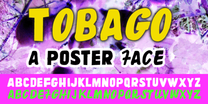
- Carcel by TeGeType,
$29.00
- Hebrew Dot II by Samtype,
$34.00
- Imperial by Bitstream,
$29.99 - The Star Series font, as its name vividly suggests, is an enchanting collection inspired by the boundless wonders of the night sky and the celestial bodies that grace it. It's a font family that draw...
- SF Proverbial Gothic, created by ShyFoundry, is a distinctive typeface that seamlessly marries the essence of traditional gothic design with contemporary flair, thus creating a versatile font suitabl...
- Burton's Nightmare is a captivating display font that appears as if sprung from the feverish dreams of a storyteller who dances on the edge of whimsy and the macabre. Its design pays homage to the go...
- Imagine wandering into a neon-soaked, nostalgia-fueled cinema alley from the golden era of blockbusters. There, amidst the scent of buttery popcorn and the echoes of cinematic triumphs, emerges the e...
- Imagine, if you will, sneaking into a bustling cityscape deep in the heart of a neon-lit night. Everywhere you look, shimmering lights dance against the dark, outlining shapes and letters with a glow...
- Ah, the Abysmal Gaze font - a creation that seems to hail from the depths of an artist's most intriguing nightmares, or perhaps, their most whimsical dreams. Crafted by the hands and imaginative geni...
- Victorian Initials One is a captivating font that immediately transports you back to the elegance and intricacy of the Victorian era. Created by Dieter Steffmann, a typeface designer known for his pa...
- Haunting Attraction is not a font that can be easily overlooked. Crafted with a masterful touch, it embodies a uniquely ethereal and captivating essence that seems to draw the eye and imagination int...
- Sure, let’s spin a web around the whimsically named font, Spiderfingers. Picture this: a typeface that crawled out of the dark, enchanting corner of a misunderstood arachnid’s lair, strutting its way...
- The font named TRUEblood, created by the designer known as SpideRaY, carries with it a level of artistry and inventiveness that makes it stand out in the world of typography. This font draws inspirat...
- The font "Lido STF" is an intriguing and versatile typeface that merits a close examination for its design, usability, and overall aesthetic appeal. Its design springs from a blend of old-style serif...
- Ah, diving into the world of fonts, are we? Necros isn't just another name in the vast sea of typography; it holds its ground with a distinctive aura and personality. Picture this: The essence of got...
- As of my last update in April 2023, there may not be a widely recognized or standardized font specifically named "Evil Cow" as it does not appear to be among the commonly referenced fonts in graphic ...
- Imagine a font that captures the essence of the 70s disco era, where the excitement of dance floors, glittering disco balls, and the revolutionary spirit of the time converge into a visual form. That...
- Elektrogothik is a typeface that encapsulates the spirit of two seemingly disparate worlds: the dark allure of gothic culture and the energized pulse of electronic music. This font is designed to bri...
- Blackout is a distinct and captivating font created by the talented designer Tyler Finck. It stands out for its bold and unconventional style, offering a dramatic departure from traditional typefaces...
- Areplos by Storm Type Foundry,
$53.00 - Captain Kidd Demo - Unknown license

- Norumbega™ - Unknown license

- Asphodelª - Unknown license

- Terpsichore™ - Unknown license

- Fatso - Unknown license

- Sláine - Unknown license

- Copperplate Alt by Wiescher Design,
$39.50
- Ginthamy by Krakenbox Studio,
$16.00
- Raytone by Nurf Designs,
$16.00
- Micro Fleurons by Intellecta Design,
$13.90
- Parisian Ornamentals by Celebrity Fontz,
$24.99 - Silly Treat by PizzaDude.dk,
$10.00
- Kenta by 4RM Font,
$12.00
- Scripty by Turtle Arts,
$20.00 - Ladies by Creaditive Design,
$12.00
- IC Havolane by Ironbird Creative,
$7.00
- Chamfer Serif JNL by Jeff Levine,
$29.00


