10,000 search results
(0.024 seconds)
- Hattori by Zane Studio,
$15.00 Elegant, graceful and timeless. Hattori is a versatile font with timeless classic appeal, over 50 alternatives & ligatures, multilingual support, (And we think this is our best work so far!) Each letter has been hand-drawn and made with great care. The variety of weights provides a variety of options that will help you find the best typographic character for your project. All 3 weights are perfect for big screen use and high impact headlines. The available binding and style alternatives offer a number of different options that give your logo or business card a unique look. This high-contrast serif typeface has a glyph and offers comprehensive language support. If you have any questions, just send us a message and we'll be happy to help! Stay sweet, Sweetest Stuff
 - Cyan Neue by Wilton Foundry,
$29.00 Cyan Neue is a substantial update variation to the original Cyan we launched in 2006. Most notably the contrast has decreased making it more contemporary. Many glyphs have been improved especially in the italics. The design of Cyan Neue was inspired by features found in classic Roman. It shows a preference for geometric Roman proportions while incorporating open centers (B,P,R) and compact serifs. The characters stay true to the same features as the capitals, resulting in an unusually distinctive style. There are many subtle details in Cyan Neue that become more interesting in display sizes, for instance the subtle curves in the serifs and the overall smoothness. Cyan Neue is a robust font that will exceed your expectations. Cyan Neue is clearly ideal for headlines, inscriptions, publications, annual reports, corporate identities, packaging.
 - Relation De Luxe by Prioritype,
$19.00 Relation De Luxe - Font Duo This paired font looks modern and classic. Charming with round and blurred effects. It is suitable for you to apply to logo designs, branding, magazine covers, social media posts, quotes, wedding invitation, packaging labels, business card and much more to be applied. Features: Uppercase, Lowercase, Numeral, Punctuation, Multilingual, Alternates, Ligatures, & PUA Encoded. Multilingual contained: Afrikaans, Albanian, Asu, Basque, Bemba, Bena, Breton, Catalan, Chiga, Cornish, Danish, Dutch, English, Estonian, Filipino, Finnish, French, Friulian, Galician, German, Gusii, Indonesian, Irish, Italian, Kabuverdianu, Kalenjin, Kinyarwanda, Luo, Luxembourgish, Luyia, Machame, Makhuwa-Meetto, Makonde, Malagasy, Manx, Morisyen, North Ndebele, Norwegian Bokmål, Norwegian Nynorsk, Nyankole, Oromo, Portuguese, Quechua, Romansh, Rombo, Rundi, Rwa, Samburu, Sango, Sangu, Scottish Gaelic, Sena, Shambala, Shona, Soga, Somali, Spanish, Swahili, Swedish, Swiss German, Taita, Teso, Uzbek (Latin), Volapük, Vunjo, Zulu. Thanks :)
 - Neue Hammer Unziale by Linotype,
$29.99Unzial typefaces consist of letter forms of the Capitalis Monumentalis and the majescule cursive. The origins of Unizial faces date back to the 5th century. The Neue Hammer Unziale was developed from the Hammer typeface, which was designed by Victor Hammer in 1921, cut by A. Schuricht and appeared with the font foundry Klingspor in 1923. In 1953, American Unizial was expanded to include some new figures, also designed by Hammer, and was rereleased by Klingspor with the name Neue Hammer Unziale. The forms are based on old scripts in books of antiquity and the early Middle Ages and the font is a new variation of a classic. Neue Hammer Unziale has been a favorite for certificates and diplomas and is recommended for headlines and shorter texts in a point size of 12 or larger. - Rig Sans by Jamie Clarke Type,
$25.00 Rig Sans is a streamlined geometric typeface, that speaks in a confident, affable tone. Its open, clean structure lends text a neutral, transparent quality. Distinct features enable Rig Sans to thrive, both in print and on screen: Minimalist Design Terminals clipped at 90º Generous x-height Wide apertures Distinct I,l,1 (uppercase i, lowercase L, Number 1) Rig Sans’ sturdy characters produce text settings with excellent clarity and readability. Their shape has been adapted from robust letterforms originally designed to withstand 3D distortions. This unique approach has resulted in an original sans serif rendition and an adaptive, durable type family. Rig Sans is comprised of eight weights and accompanying italics. Each weight contains 514 glyphs. OpenType features include: Alternate characters Three figure styles All caps punctuation Fractions Ordinals Superscript Subscript
 - Stack Braille by Echopraxium,
$5.00 This is a monospace font for the Braille alphabet. The idea came while exploring new ways to display the regular braille glyph ( 3 rows of 2 dots ). The glyph design is inspired by "stackable multiple board" games like the famous Vulcan chess (from Star Trek series) and the Qubic (3D tic-tac-toe). The stack is made from 3 levels, each level is a 3x3 grid with 2 "playable" cells (South-West and North-East). Each cell can be either empty, filled by a white square token or a black square token. The 3D effect is obtained by means of the classic isometric perspective. Lowercase letters use black tokens, while uppercase letters use white tokens. Most special characters (e.g. digits, *$#@, []{}() etc.. ) are also provided for special usages like program source code (see poster 5).
 - Sabon by Linotype,
$45.99 In the early 1960s, the German Master Printers’ Association requested that a new typeface be designed and produced in identical form on both Linotype and Monotype machines so that text and technical composition would match. Walter Cunz at Stempel responded by commissioning Jan Tschichold to design a new version of Claude Garamond’s serene and classical Roman. Its bold, and particularly its italic styles are limited by the requirements of Linotype casting machines, forcing the character widths of a given letter to match between styles, giving the italic its characteristic narrow f. The family’s name is taken from Jacques Sabon, who introduced Garamond’s Romans to Frankfurt. Sabon has long been a favorite of typographers for setting book text, due to its smooth texture, and in large part because Tschichold’s book typography remains world famous.
 - Parca by Vasava Fonts,
$30.00 Parca is a straightforward new take on the classic tradition of Grotesk sans, setting a new standard in the category. The letterforms are crafted with a gentle and careful drawing process that features small details like subtle tappering on the stems and optical corrections avoiding excessive geometry artefacts. Parca is indicated for design projects and branding when you are in the need of a neutral yet warm feeling allowing the content to be the focus and letting the forms to support it. A careful kerning and spacing features have been develop for the font, allowing it to be used either for small text or huge headlines. Parca is presented in a robust family of five weights plus matching italics and it supports most of the latin-based European languages.
 - Wink by Sudtipos,
$49.00 Wink has been created as the result of exhaustive research, trial and development. It is an OpenType set of fonts which appears in a friendly and fun way, with a new twist on what Joluvian has previously created. Full of personality, with a brave and strong creative line, it is intended to reflect authenticity when being used in all types of media and styles. The ornaments offered in this font work as a graphic resource that expand all the possibilities for Wink users. Although Wink is inspired by traditional calligraphic flourishes, its modern twist makes it elegant and simple at the same time. It’s not completely a brush type but it has been created with the same calligraphy base Joluvian usually works with. Wink also has a caps version with the same style of the script. Both versions could work perfectly, individually or together. As usual, the type has been developed with Ale Paul for Sudtipos, and the collaboration of Macus Romero has been essential to illustrate the style that Wink represents.
 - Costa Std by Typofonderie,
$59.00 A mediterranean style sanserif in 4 styles The original idea of Costa was to create a contemporary mediterranean typeface style. Costa is a synthesis of the purity, as found on Greek capitals, and softness, found in Renaissance scripts. First thing was the design concept that take its roots on the Chancery script. Such writing style appeared during Italian Renaissance. Later few typefaces have been developed from such cursive models. Today most serifed typeface italic take their roots on such triangular structure we can find on gylphs like the n, p, or d. The Costa capitals remains close to pure sanserif models when the lowercases features an ending serif on many letters like the a, n, d, etc. This ending serif being more like a minimal brush effect, creating a visual contrast and referencing the exoticness of the typeface. Knowing that the Costa typeface family began life in the 90s as a bespoke typeface for Costa Crociere, an Italian cruise company — it suddenly makes sense and explains well why Jean François Porchez focused so much on Italian Chancery mixed to a certain exotism. The curvy-pointed terminals of the Costa n can obviously get find on other glyphs, such as the ending of the e, c and some capitals. So, the sanserif looks more soft and appealing, without to be to pudgy or spineless. The general effect, when set for text, remains a sanserif, even not like Rotis Semiserif. Costa is definitly not a classical typeface, or serif typeface which convey past, tradition, historicism as Garamond does beautifully. Because of the Costa crocieres original needs, Costa typeface was designed to be appropriate for any uses. Anytime you’re looking for good mood, qualitative effects, informal tone, cool atmosphere without to be unconvential or blowzy, Costa will convey to your design the required chic and nice atmosphere, from large headlines sizes, brands, to small text sizes. It’s a legible typeface, never boring. A style without neutrality which doesn’t fit comfortably into any typeface classification! Does it proves the novelty of its design and guarantees as well as its originality? Its up to you to be convinced. Barcelona trip Originally not planned, this need appeared because of a trip to Barcelona at the time of the project, where Jean François was giving a lecture. He wanted to pay an homage to that invitation to create something special. So, he designed during his flight some variations of the Spanish Ch, following ideas developed by the Argentinian type designer Rubén Fontana for his typeface called Fontana ND (published by the Barcelona foundry Bauer). Then, he presented during his lecture variations and asked to the audience which design fit the best to their language. They selected the design you can find in the fonts today. Read more about pairing Costa Type Directors Club 2000 Typographica: Our Favourite Typefaces 2004
 - Gordita by Type Atelier,
$25.00 Gordita is a minimal sans serif typeface with a geometric foundation that has been built upon with modern details that result in an optically balanced, friendly typeface. When designing Gordita referring to features in Futura were influential as were the structural and harmonious strokes of Gotham. Forms have been optically compensated to appear natural and purely geometric. Joints are slightly tapered and ink traps feature in heavier weights with the purpose of achieving maximum legibility. Gordita has been tested in print and on screen in a wide range of point/pixel sizes. The family is equipped with OpenType features including alternate glyphs, fractions, case sensitive forms, small figures, arrows and symbols as well as old style and tabular figures. Now delivered in 7 weights with matching italics that slant at 15°. The italics are slightly lighter and narrower than the upright versions. The horizontal weighting in the italics have been reduced to compensate for the loss of vertical stroke thickness. With support for over two hundred languages with an extended Latin and Cyrillic character set, Gordita is ready to be put to work. Designed by Thomas Gillett, metrics and engineering by iKern (Igino Marini). The family has been recently updated to include two additional weights (Thin & Ultra + their matching italics) as well as slightly opened apertures for better legibility in the heavier weights, new glyphs and more opentype features.
 - Shàngó Chiseled by CastleType,
$59.00 Based on the elegant and somewhat delicate Shàngó "Classic", Shàngó Chiseled goes to the other extreme with a bold and emphatic design that continues the legacy of the beautiful classic proportions of Dr. Schneidler's original titling typeface. Warm, cheerful, open, and sensitively masculine, Shàngó Chiseled can give you the impact you need. Perfect for an embossed look, or of classic lettering in stone. A complete character set that supports most European languages. Shàngó Chiseled is a member of the extended Shàngó family (Classic, Chiseled, Sans, Gothic).
 - Norsen by Craft Supply Co,
$20.00 Introduction Meet Norsen – Classic Serif, where the vintage aura intertwines seamlessly with modern sophistication. Initially, its presence elevates designs with a unique classical elegance. Embodying Versatility Notably, Norsen is versatile, suiting various design necessities effortlessly. Also, it easily molds itself, fitting perfectly into different creative realms, ensuring each design shines uniquely. Classical Elegance Immersed in a classical charm, every letter in this font tells a story. Additionally, its serif details bring stories and messages to life with grace and depth, enhancing readability and visual appeal.
 - Siruca Pictograms by FSD,
$9.00Since 2008 the font Siruca has been enabled via the open source project Siruca Pictograms, and created by several international designers invited by the project. - Adage Script JF by Jukebox Collection,
$32.99 A warm script font with a down-home feel. Digitally revived from a vintage photo-typesetting face. The character set has been expanded and modernized.
 - Pixelar by Graviton,
$8.00 Pixelar font family has been designed for Graviton Font Foundry by Pablo Balcells in 2012. It is pixel display typeface. Pixelar consists of 4 styles.
 - Led by Graviton,
$8.00 Led font family has been designed for Graviton Font Foundry by Pablo Balcells in 2012. It is dotted display typeface. Led consists of 2 styles.
 - Anjelina by Nandatype Studio,
$12.00 Anjelina is a beautiful and romantic script font. It is PUA encoded which means you can access all of the glyphs and swashes with ease!
 - Tasmik by NamelaType,
$22.00 Tasmik literally means thickening, this font is thick like extrabold in wight, impressed firm but flexible, suitable for display text and the center of interest.
 - PL Fiorello by Monotype,
$29.99The PL Fiorello Condensed font has a Latin influence and has been used to set headings on novels and posters relating to suspense and crime. - Kurilian by Wooden Type Fonts,
$15.00 A very unusual type based on wooden type designs of the 19th century, lacking lower case which may not have been designed for this font.
 - Mariage by Linotype,
$40.99Morris Fuller Benton, the principal designer of the American Type Founders, designed Mariage in 1901. Mariage, which has been sold under a plethora of different names during the last century, is a blackletter typeface belonging to the Old English category. The term blackletter refers to typefaces that stem out of the historical printing traditions of northern Europe. These letters, called gebrochene Schriften, or "broken type" in German, are normally elaborately bent and distorted. Their forms often print large amounts of ink upon the page, creating text that leaves a heavy, black impression. The Old English style is a subset of blackletter type that dates back to 1498, when Wynken de Worde introduced textura style printing to England. Continental printers had been printing with textura style letters since Gutenberg's invention of the printing press fifty years earlier. Italian printers stopped using them around 1470. For northern Europeans, texturas remained the most popular form of typeface design until the invention of the fraktur style in Nuremberg. Mariage is heavily classicized sort of Old English type. During the Victorian era, designers admired the Middle Ages for its chivalric, community-based values and its pre-industrial lifestyle. Yet they also found the basic medieval textura letterform too difficult to read by present standards. They desired to modernize this old style. Today, this sort of update is often referred to not as "modernization" but as classicism. Benton's design for ATF builds upon earlier Victorian classicist interpretations of Old English/textura letters. For an example of what these Victorian designs looked like, check out the popular 1990 revival of the genre, Old English . Old English style types often appear drastically different from other blackletters. For contrast, compare Mariage to a classical German fraktur design, Fette Fraktur , a schwabacher style face, or the popular early 20th Century calligraphic gothic from Linotype, Wilhelm Klingspor Gotisch . Especially in the United States, classicist Old English typefaces are thought to espouse tradition and journalistic integrity. These features, together with the inherent, complex beauty of Mariage's forms, make this typeface a perfect choice for certificates, awards, and newsletter mastheads. - Bodoni Ultra by Wooden Type Fonts,
$15.00 A classic bold face.
 - Egmontian by Intellecta Design,
$23.90A fancy classic revival. - Francesca by 2D Typo,
$32.00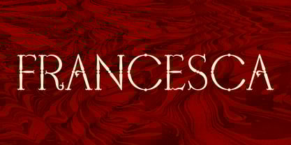 Refined elegant classic font.
 - Archive Petite Script by Archive Type,
$19.95Classical connected script font. - Cattle Drive JNL by Jeff Levine,
$29.00 Cattle Drive JNL is based on some examples of a classic condensed wood type. Lettering of this period lends itself well to themes of Western life, carnivals, circuses or classic broadside posters.
 - SF Big Whiskey SC - Unknown license

- HelenaDEMOVERSION - Personal use only

- PaddingtonSC - Unknown license

- 99 Names of ALLAH Complete by Islamic Calligraphy75,
$12.00 We have transformed the “99 names of ALLAH” into a font. That means each key on your keyboard represents 1 of the 99 names of ALLAH Aaza Wajal. The fonts work with both the English and Arabic Keyboards. We call this Calligraphy "complete" because this is the only calligraphy where the complete set of decorative letters have been used. The calligraphy is more on the traditional side, letters don't overlap, the "ye" at the end of the names doesn't have the two dots, and a decorative "ye" has been included. The first "Alef" doesn't have a "hamzit wasel" nor a "fatha", this indicates to skip the pronunciation of that first letter. So instead of saying "AR-RAHMAAN" you say "R-RAHMAN". (in the zip file you will find a pdf file explaining the differences in the "harakat", pronunciation and spelling according to the Holy Quran). In other calligraphy you don't usually find the decorative letters: "Dal, Ra & Ye" but we like them and we use them. Decorative letters used in this calligraphy: "Mim, Aain, Sin, HHe, He, Kaf, Tah, Dal, Ra, Alef, Ye & Saad". Purpose & use: - Writers: Highlight the names in your texts in beautiful Islamic calligraphy. - Editors: Use with kinetic typography templates (AE) & editing software. - Designers: The very small details in the names does not affect the quality. Rest assured it is flawless. The MOST IMPORTANT THING about this list is that all the names are 100% ERROR FREE and you can USE THEM WITH YOUR EYES CLOSED. All the “Tachkilat” are 100% ERROR FREE, all the "Spelling" is 100% ERROR FREE, and they all have been written in accordance with the Holy Quran. No names are missing and no names are duplicated. The list is complete "99 names +1". The +1 is the name “ALLAH” 'Aza wajal. Another important thing is how we use the decorative letters. In every font you will see small decorative letters, these letters are used only in accordance with their respective letters to indicate pronunciation & we don't include them randomly. That means "mim" on top or below the letter "mim", "sin" on top or below the letter "sin", and so on and so forth. Included: Pdf file telling you which key is associated with which name. In that same file we have included the transliteration and explication of all 99 names. Pdf file explaining the differences in the harakat and pronunciation according to the Holy Quran. Here is a link to all the extra files you will need: https://drive.google.com/drive/folders/1Xj2Q8hhmfKD7stY6RILhKPiPfePpI9U4?usp=sharing
 - Monotype Baskerville eText by Monotype,
$103.99The eText fonts from the Monotype Baskerville have been specially tuned by our type design experts for a better on screen readability for instance in PDFs. - Neographik by Monotype,
$29.99Neographic is one of the first fototype fonts that had been designed by Robert Barbour and produced from the Monotype UK office for the Photolettering machine - Hatcher by Letterena Studios,
$9.00 Hatcher is a stylish and distinct serif font. This font is PUA encoded which means you can access all of the glyphs and swashes with ease!
 - Flute by Typotheticals,
$5.00 Flute was a font that was released in 2006 now, in 2022, it has been updated to increase the number of faces, including a bold version.d.
 - RONDOS by Letterena Studios,
$10.00 Rondos is a squared lettered and robotic styled display font. This font is PUA encoded which means you can access all glyphs and swashes with ease!
 - Jadey by Graphicfresh,
$14.00 Jadey - The Classical Serif Font We tried to make different fonts. With a touch of the ethnic past. So that this font looks more classic and modern. Measuring each letter reminds us of the past in some works in Indonesia. Although it looks classic, this font is perfect when combined with today's design styles. Have fun being creative with this font.
 - The Roseberry by me55enjah,
$8.00 Introducing The Roseberry, a classic handmade serif. The Roseberry is a handmade serif display typeface, inspired by classic western poster. Imperfect lines and edges lead us to a classic look. In 3 different kind of style, The Roseberry can simply give a vintage vibe on your design. Features: * 3 different style: Roseberry Solid, Outline & Codet. * All caps, numbers and punctuation.
 - Baldufa Cyrillic by Letterjuice,
$66.00 Baldufa is a charming typeface with strong personality, which looks very comfortable in text. There is a search to obtain complicated curves and detailed features, which gives the typeface a touch of beauty and elegance. However, this is also a self-conscious design that claims through the rounded serifs and irregular vertical stems appreciation for quirkiness and human imperfection. The letterforms are inspired by the slight distortions and idiosyncrasies that came with old printing methods. It has distinct, features such as rounded serifs, irregular vertical streams, ink traps and extremely thin junctions. In the Italic, serifs have been removed to enhance movement and expressivity. These experiments in form have not come at the cost of legibility: The typeface remains suitable for both small and display text.
 - Baldufa Greek by Letterjuice,
$47.00 Baldufa is a charming typeface with strong personality, which looks very comfortable in text. There is a search to obtain complicated curves and detailed features, which gives the typeface a touch of beauty and elegance. However, this is also a self-conscious design that claims through the rounded serifs and irregular vertical stems appreciation for quirkiness and human imperfection. The letterforms are inspired by the slight distortions and idiosyncrasies that came with old printing methods. It has distinct, features such as rounded serifs, irregular vertical streams, ink traps and extremely thin junctions. In the Italic, serifs have been removed to enhance movement and expressivity. These experiments in form have not come at the cost of legibility: The typeface remains suitable for both small and display text.


