10,000 search results
(0.03 seconds)
- Cosbycorwin by Maulana Creative,
$11.00 "Cosbycorwin" is a slanted cursive script font. With light contrast stroke, fun character with a bit of ligatures. To give you an extra creative work. "Cosbycorwin" font support multilingual more than 100+ language. This font is good for logo design, Social media, Movie Titles, Books Titles, a short text even a long text letter and good for your secondary text font with sans or serif. Make a stunning work with "Cosbycorwin" font. Cheers, MaulanaCreative
 - Yuge by Hanoded,
$15.00 Yuge, apparently, is how New Yorkers pronounce huge. I have never been to New York, so I can’t tell if this is a fact. But I often hear a certain New Yorker pronounce it that way, so I guess it’s sort of true. Yuge is a handwritten font - made with a Sharpie pen. Believe me, it is a good font. It is fantastic. It is the best font ever. It is YUGE! ;-)
 - Ownttys by Maulana Creative,
$14.00 Ownttys is a handwritten script font, With fancy slanted and fun characters. It has Opentype features of ligatures, makes it a perfect choice for branding and digital designs. Use this font for logos, social media, websites, blogs, instagram, social media, business cards, branding, and more! Ownttys font support multilingual more than 100+ language. and good pair for your secondary text font with sans or serif. Make a stunning work with Ownttys script font. Cheers, MaulanaCreative
 - Oxyless by Maulana Creative,
$16.00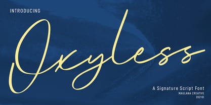 Oxyless is a Unique Script font. With regular contrast stroke, slanted and fun character with a bit of ligatures. To give you an extra creative work. Oxyless font support multilingual more than 100+ language. This font is good for logo design, Social media, Movie Titles, Books Titles, a short text even a long text letter and good for your secondary text font with sans or serif. Make a stunning work with Oxyless font. Cheers, MaulanaCreative
 - Woodstark by Maulana Creative,
$11.00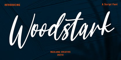 Woodstark is a Simply Script font. With regular contrast stroke, slanted and fun character with a bit of ligatures. To give you an extra creative work. Woodstark font support multilingual more than 100+ language. This font is good for logo design, Social media, Movie Titles, Books Titles, a short text even a long text letter and good for your secondary text font with sans or serif. Make a stunning work with Woodstark font. Cheers, MaulanaCreative
 - Taptalks by Maulana Creative,
$13.00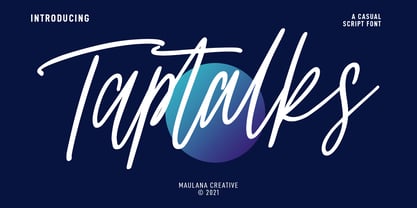 Taptalks is a slanted casual script font. With lights contrast stroke, fun character with many of natural ligatures. To give you an extra creative work. Taptalks font support multilingual more than 100+ language. This font is good for logo design, Social media, Movie Titles, Books Titles, a short text even a long text letter and good for your secondary text font with sans or serif. Make a stunning work with Taptalks font. Cheers, MaulanaCreative
 - Yourstrully Script by Maulana Creative,
$11.00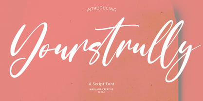 Yourstrully is casual script font, with clean contrast stroke, super slanted and fun character. It has Opentype features ligatures of character, To give you an extra creative work. Yourstrully font support multilingual more than 100+ language. This font is good for logo design, Social media, Movie Titles, Books Titles, a short text even a long text letter and good for your secondary text font with sans or serif. Make a stunning work with Yourstrully font.
 - Roxalose by Maulana Creative,
$14.00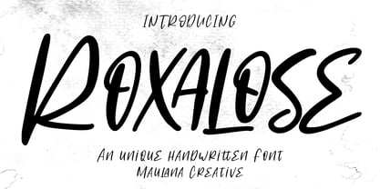 Roxalose is an expressive modern handwritten display font. With slanted regular contrast stroke, fun character. To give you an extra creative work. Roxalose font support multilingual more than 100+ language. This font is good for logo design, Social media, Movie Titles, Books Titles, a short text even a long text letter and good for your secondary text font with sans or serif. Make a stunning work with Roxalose font. Cheers, Maulana Creative
 - Bigteeth by Maulana Creative,
$13.00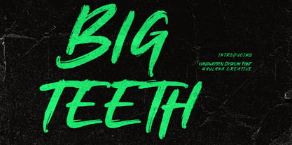 Bigteeth is a horror vibes handwritten font. With slanted medium rough brush stroke, fun character. To give you an extra creative work. Bigteeth font support multilingual more than 100+ language. This font is good for logo design, Social media, Movie Titles, Books Titles, a short text even a long text letter and good for your secondary text font with sans or serif. Make a stunning work with Bigteeth font. Cheers, Maulana Creative
 - Aflah Akbar by Studio Hello Good,
$12.00 Aflah Akbar is an elegant sans serif font with lots of ligatures in it, this font has 354 glyphs so it is perfect for those of you who want to use it as a logo or other design needs, whether it's for magazines, skincare, perfume, jewelry, stationary offices, newspapers, book covers. , web designing. The Aflah Akbar font has regular, smooth, slant, shadow, line and 3d options, the Aflah Akbar font itself can support 67 languages.
 - Jillstone by Maulana Creative,
$12.00 Jillstone is an Exspressive slanted signature script font. With regular felt-tip stroke, fun character with some of ligatures. To give you an extra creative work. Jillstone font support multilingual more than 100+ language. This font is good for logo design, Social media, Movie Titles, Books Titles, a short text even a long text letter and good for your secondary text font with sans or serif. Make a stunning work with Jillstone font. Cheers, MaulanaCreative
 - P22 Festiva by IHOF,
$29.95 Festiva is based on lettering found on a 1960s kitchen appliance catalog. It evokes ’60s TV and pop culture while still having a contemporary feel. The fun exuberant flavor of this face is perfect for parties and celebrations. The letters dance across the baseline and the lower case wants to be an upper case but just can’t quite make it. P22 Festiva Regular includes a full unicode European Character set (Western, CE, Turkish, Romanian, etc).
 - FS Shepton by Fontsmith,
$80.00 Handy Andy Andy Lethbridge had only just completed his graphic design BA at the University of Portsmouth when he was spotted by Jason, who’d seen Andy’s exquisite hand lettering at his degree show and on Instagram. Keen to push the handwritten theme further, having recently launched a digitally-created, chalky script font (FS Sammy), Jason offered Andy a job and the chance to develop a suite of more stylised, truly hand-drawn fonts. Andy duly got out his pads, pencils and pens, and started experimenting with styles and textures. Magic followed. Imperfection perfected Most ‘handwritten’ typefaces are created entirely digitally. Not FS Shepton. From the start, the intention was to create a collection of alphabets of similar character but different texture and style – 100% hand-drawn and purposely imperfect, with the kind of inconsistent, organic shapes and textures of market stall signs, dashed off in chalk or paint. FS Shepton Regular, drawn with a wet brush pen, is solid with a rough outer edge and a casual but controlled feel. The dry brush used to create FS Shepton Light gives it more inner texture and a more formal, slanted, calligraphic style. FS Shepton Bold, drawn using a wider, looser dry brush pen, has a woody grain in the middle of its broad strokes and greater solidity where the brush moves more slowly. Fresh as a daisy Think of FS Shepton not as a family of three weights of the same font so much as a collection of three fonts penned by the same author. All of them – the light, regular and bold – were created independently as display fonts that offer something different to labelling, packaging, point-of-sale and advertising. Lovingly crafted by hand, they’re a good match for products and settings that share the same artisinal qualities: organic foods, drinks and healthcare products, as well as premium chocolate, coffee and condiments.
 - Oo-la-la by Emboss,
$26.95 Inspired by old French poster art. This typeface was cut from an old rubylith.
 - Gulmer Cottage by Jinan Studio,
$12.00 Gulmer Cottage Font Duo embodies the essence of charm and whimsy, designed to infuse your creations with a delightful touch. This font duo features both a regular and slanted version, offering versatility for a myriad of designs. The script version boasts engaging ligatures while the display version is adorned with playful swashes, allowing for endless creative possibilities. Perfectly suited for quote designs, celebrations like Christmas and birthdays, heartfelt valentines, as well as branding endeavors and product packaging, Gulmer Cottage Font Duo radiates love, cute, and joy. Its multi-language support ensures its usability across diverse cultural landscapes, while its inherent cuteness and fun-loving nature elevate any project it graces. Infuse your designs with a dash of affectionate personality and spirited vibes using this endearing font duo." Features A set of uppercase and lowercase glyphs, Allcaps (display version) Number, symbol, and punctuation Multilingual Support Ligatures (script version) Swashes (display version) Slanted Version Type j_1 until j_12 to features swash, ligatures will automatically replace the standard letter pairs whenever available, when using any OpenType capable software.
 - Poetica by Adobe,
$29.00Poetica font was designed by Robert Slimbach in 1992 with particularly generous characters. The typeface family consists of 21 weights to allow for an unusual variety of design possibilities within one typeface family. Numerous swash letters, ornaments and ligatures remind one of the early Renaissance and its unforgettable masters, for example, Giambattista Palatino, who later gave his name to Hermann Zapf's creation. Slimbach used the Lettera Cancellaresca as a model for his typeface, the cultivated humanistic italic which later served as a point of departure for the development of italics of the Renaissance and thereafter. Lettera Cancellaresca is very legible, extremely harmonic and impressively beautiful. The early forms display two different compositional tendencies, namely the static of the simple vertical capitals and the italic dynamic of the slanted lower case alphabet, as shown in the weight Chancery 4. The capitals later conform to the slant of the lower case, as shown in the weights Chancery 1-3. Poetica font should be set according to the included suggestion in order to see the full benefit of its grace and beauty. - Caliche by Ahmad Jamaludin,
$13.00 Say hello to CALICHE! The font that's as vintage and handdrawn at the same time! CALICHE's typeface is inspired by the rustic charm of vintage craftsmanship, infused with the laid-back vibes of a tropical summer. This font brings you not one, but two families to choose from: Regular and Slant, offering versatility for your design projects. Whether you're aiming for a rugged look, modern vintage aesthetics, or the essence of summer, CALICHE has got you covered. It's the perfect companion for all your graphic design needs, crafted with care to bring that unique touch to your creations What's Included? Caliche Main File Regular and Slant version Instructions (Access special characters, even in Cricut Design) Unique Letterforms Works on PC & Mac Simple Installations Accessible in Adobe Illustrator, Adobe Photoshop, Microsoft Word even Canva! PUA Encoded Characters. Fully accessible without additional design software. Language Support: Danish, English, Estonian, Filipino, Finnish, French, Friulian, Galician, German, Gusii, Indonesian, Irish, Italian, Luxembourgish, Norwegian Bokmål, Norwegian Nynorsk, Nyankole, Oromo, Portuguese, Romansh, Rombo, Spanish, Swedish, Swiss-German, Uzbek (Latin)
 - View Roman Black - Personal use only

- Beatnik by Type Innovations,
$39.00 I was working at Bozell Worldwide, an advertising agency, on their yearly promotional pitch. An art director was looking for a condensed informal headline treatment to be used on one of the new ad campaigns. I took several different font designs and started to condense and scale the proportions in the hopes of finding several good solutions. They finally settled on a version of Times Roman, scaled horizontally to about 50 percent proportions. I liked the look so much that I later went back to the drawing board and refined the concept by adding slanted serifs and a varying alignment on all the letter forms giving the typeface a very casual and informal appearance. At about that time, I was reading a book by Jack Kerouac, and was so inspired by his writings on the ‘beat generation’ that I decided to name the font ‘Beatnik’. Afterwards, I added a set of true small capitals and old style figures. I'm currently working on additional weights and variations to expand this ‘hip’ new font series. Groovin' baby.
 - Caminito by JVB Fonts,
$15.00 This fontface is inspired on Argentinean classic and traditional art craft named as Fileteado Porteño. Caminito is available in 10 layered styles for compose with multi combinations and a extra of ornaments. Highly recommended to be used for colorized titles and display texts. Fileteado Porteño is a type of artistic drawing, with stylized lines and flowered, climbing plants, typically used in Buenos Aires, Argentina. It is used to adorn all kind of beloved objects: signs, taxis, lorries and even the old colectivos, Buenos Aires’s buses. Filetes (the lines in fileteado style) are usually full of colored ornaments and symmetries completed with poetic phrases, sayings and aphorisms, both humorous or roguish, emotional or philosophical. They have been part of the culture of the Porteños (inhabitants of Buenos Aires) since the beginnings of the 20th century. One of the most highlighted and recognized artists nowadays is Alfredo Genovese, who does a great job of teaching and claim this art and craft. The name Caminito reminds the emblematic and iconic Buenos Aires neighborhood immortalized by Carlos Gardel in music, in the tango.
 - Spectrum by Monotype,
$29.99Spectrum font is based on a design by Jan van Krimpen, who worked on his font from 1941 to 1943 for use in a Bible of the Spectrum publishing house in Utrecht. The bible project was later cancelled but the font was so beautifully formed and universal that the Monotype Corporation in London completed it. Distinctive are the reserved elegance and unmistakeable beauty of form. The italic was kept fine and is a wonderful complement to the other weights, making it perfect for emphasis in text. The form of the lower case italic g is reminiscent of van Krimpen's italic for Lutetia and Romanée. A similar font in form is the Perpetua from Eric Gill. It displays not only similar forms to those of Spectrum, both fonts also have uniquely designed old style figures. The 7 is particularly unusual with its slanted horizontal stroke and marked bend to the left in the lower third of the form. Spectrum is an extremely legible font even in smaller point sizes and is just as suitable for headlines as for long texts. - Wolpe Fanfare by Monotype,
$50.99 “Fanfare is such a fun typeface,” says Toshi Omagari, who revived the design for The Wolpe Collection. “It was my happiest discovery when I was digging through the Monotype archive. I came across it and had to check the designer’s name.” No wonder: Fanfare is modern, light and playful – not what you’d expect from an 80-year old design. From the original, very heavy weight design, Omagari started by creating a black weight, followed by four lighter weights for Wolpe Fanfare, preserving the character of the letterforms all the way down to a thin version. “I wanted to do more than digitize the original weight,” he says. “It’s surprisingly modern, and its skeleton, its basic structure, is so beautiful.” The new design packs more into a small space than most typefaces. It’s a natural for publication and advertising design. With displays capable of revealing fine details such as Fanfare’s subtly slanted baseline, its lovely forms will easily translate to mobile devices. With an extended European character set that includes Greek and Cyrillic language support, Wolpe Fanfare can speak in many languages.
 - Mangerica by Ndiscover,
$25.00This design incorporates different styles into a consistent look. A pinch of script, a little of geometric and some humanistic shapes as well create a very distinguishable sans-serif. It has an overall good feeling specially on the heavier weights that have intended contrast irregularities to create a 'cartoonish' look. On the intermediate weights the design will preform well on small font sizes because of its large counters, low contrast and large x-height, but as you go to the extremes you will see shapes full of personality that will pop out in large font sizes. The font is loaded with opentype features such as small caps, ligatures, alternates, old style figures, and much more. The italic version is deeply rooted in the calligraphic heritage of the Italics. This way the brush inspired strokes are emphasized as well as an overall calligraphic look. Far from being a mere slant, Mangerica Italic had every lowercase glyph redesigned as well as some uppercase, besides that, every glyph was optically adjusted to ensure not only aesthetics but functionality too. - Magnum Sans Pro by FontMesa,
$39.00 Magnum Sans Pro is a strong neutral sans serif consisting of eleven weights with true Italic, Oblique and an alt upright set called Alfa. The definition of Magnum is a large wine bottle that's twice the capacity of one 750ml bottle, today the name is used in any product offering double the capacity, Magnum Sans achieves this by offering two slanted and two upright versions plus a standard and pro set. Designed to be highly readable, Magnum Sans Pro is ideal for text, signage, headlines and media broadcasting or anywhere else quick readable lettering is needed. With the stylistic alternates and swash caps you can expand your creativity in logo designing. Sprinkle in an alternate letter or two makes for a dynamic appeal that's sure to get attention in advertising. This Pro set includes additional language support for Vietnamese, Pin Yin and Greek. Opentype features in the Pro set include, Alternate Fractions, Case Sensitive Forms, Denominators, Numerators, Discretionary Ligatures, Standard Ligatures, Old-style Figures, Tabular Figures, Proportional Figures, Ordinals, Scientific Inferiors, Superscript, Subscript, Stylistic Alternates, Swash Caps, Arrows and Enclosed Alphanumerics.
 - Kaizen by Colllab Studio,
$9.00 Presenting Kaizen! A Bold Handbrush Font in 2 Versions. This font made with the perfect combination of each character. You can combine with Extra to get a unique combination. It looks original and can be used for all your project needs. Each glyph has its own uniqueness and when meeting with others will provide dynamic and pleasing proximity. This font can be used at any time and in any project. You can see in the presentation picture above, Kaizen looks unique and Japanese style on design projects. So, Kaizen can't wait to give its touch to all your design projects such as quotes, poster design, personal branding, promotional materials, website, logotype, product packaging, etc. WHAT'S INCLUDED? 1. Kaizen Version One (Solid) • The first version comes with uppercase, lowercase, ligatures, numeral, punctuation, symbols, and Standard Latin Multilingual Support (Afrikaans, Albanian, Catalan, Danish, Dutch, English, French, German, Icelandic, Indonesian, Italian, Malay, Norwegian, Portuguese, Spanisch, Swedish, Zulu, and More). 2. Kaizen Version Two (Inline texture) • The first version comes with uppercase, lowercase, ligatures, numeral, punctuation, symbols, and Standard Latin Multilingual Support (Afrikaans, Albanian, Catalan, Danish, Dutch, English, French, German, Icelandic, Indonesian, Italian, Malay, Norwegian, Portuguese, Spanisch, Swedish, Zulu, and More). 2. Extra Swashes • Included 6 Underline Swashes. You can feature all with typing c_1 until c_6 (in both versions) A Million Thanks Colllab Studio
 - Sada by Arabetics,
$45.00 Sada is a text font designed with hand held devices and ebooks in mind. Glyphs are designed to be larger than usual and very clear with soft visual characteristics and many traditional Arabic calligraphic transitional features incorporated to improve legibility. The word “sada” means “echo” in Arabic. Even though Sada is a cursive style font it offers clearly distinguished and visually unified letter shapes in every position of a word. Sada supports all Arabetic scripts covered by Unicode 6.1, and the latest Arabic Supplement and Extended-A Unicode blocks, including support for Quranic texts. It comes with three weights, regular, bold, and ultra-light. Each weight has normal and left-slanted “italic” styles. The script design of this font family follows the Arabetics Mutamathil Taqlidi style and utilizes varying x-heights. The Mutamathil Taqlidi type style uses one glyph per every basic Arabic Unicode character or letter, as defined by the Unicode Standards, and one additional final form glyph, for each freely-connecting letter in an Arabic text. Sada includes the required Lam-Alif ligatures in addition to all vowel diacritic ligatures. Sada’s soft-vowel diacritic marks (harakat) are only selectively positioned with most of them appearing on similar lower or upper positions to emphasize they are not part of letters. Kashida is zero width glyph.
 - Brinca by In-House International,
$7.50 Brinca is an intrepid ‘full spectrum’ typeface with emotional range and a dynamic heart. Morphing sharp tight pleats that relax into office ready neutral sans, then plump into joyful bouncy letters with mesmerizing fluency, Brinca is ready to adapt to a wide variety of expressive needs. Named after its jumping extremes of the type’s styles; from coiled spring to stuffed and bouncy, Brinca is also a leap into new possibilities for display type design. Because of its chameleon-like range of styles, Brinca is a versatile workhorse. It’s a great choice for brand identities ready to embrace expressive range, and it’s perfect for fine-tuned packaging, events promotions, merch, product lines, and much more. WIth its very wide spectrum of options, It’s a single typeface that can be used to design a library’s worth of book covers. (We put it to the test!) About Brinca was designed by Alexander Wright and Rodrigo Fuenzalida with Michu Benaim Steiner for In-House Int’l foundry, the type foundry of brand consultancy In-House International. It was developed by Rodrigo Fuenzalida at FragType, and available through YouWorkForThem. In-House foundry offers bold, fearless, and expressive, display typefaces that tell a story. Its previous releases have been featured on Design Milk, DesignBoom, Slanted, PAGE. They’ve also been used to create standout work by designers around the world, and even won some awards.
 - Migae by Jolicia Type,
$25.00 Migae is a versatile and elegant display font designed to captivate and engage audiences across a wide range of design applications. With 14 distinct weight variants spanning from delicate Light to commanding Black, and complemented by a refined set of italics, Migae offers a harmonious balance of strength and elegance to fulfill your typographic needs. Key Features: 1. 14 Weight Variants: Migae's extensive weight range, including Light, Regular, Medium, Semi-Bold, Bold, Extra Bold, and Black variants, allows you to choose the perfect weight for your design, whether it's a subtle headline or a bold statement. 2. Italics: In addition to its standard upright styles, Migae boasts a comprehensive set of italics that adds versatility to your typography, conveying an air of sophistication and style. 3. Strong to Elegant Styles: Migae's design philosophy seamlessly combines strength and elegance. Its strong weights provide a bold and impactful presence, while the lighter weights exude an effortless elegance, making it suitable for a wide array of creative projects. 4. Modern Aesthetic: Migae's clean, contemporary lines and carefully crafted details make it an ideal choice for modern graphic and web design, editorial layouts, branding, and advertising. 5. Legibility: Migae prioritizes legibility across all weights and styles, ensuring that your messages are communicated effectively, regardless of the chosen variant. 6. Versatile Applications: From branding and packaging to posters, editorial design, and web headings, Migae adapts to various design contexts, making it a versatile choice for graphic designers, typographers, and creative professionals. Design Inspiration: Migae draws inspiration from the harmony of nature, where strength and elegance coexist. Its name, derived from the Korean word "미래" (miraee), meaning "future," reflects its forward-thinking design approach that is equally rooted in tradition and innovation. Ideal Usage: Migae is an ideal choice for those seeking a display font that can effortlessly transition between bold and delicate, exuding confidence and refinement in every style. It's perfect for branding, packaging, advertising, editorial layouts, and any design project where typography plays a pivotal role. Migae is more than just a font; it's a design companion that empowers creatives to achieve a perfect balance between strength and elegance in their visual communications. Explore the world of Migae and let your design projects shine with its captivating charm and versatility.
 - Desphalia Pro by Ingo,
$42.00 A classic “American” sans serif with a kink Desphalia belongs to the kind of sans serif fonts that were created in the 19th century. You could also name it “American Gothic”, a sans serif in the style of fonts like Franklin Gothic, News Gothic and similar. Above all, the high x-height characterizes this typeface style, as do the identical heights of uppercase and ascenders. However, I allowed myself a few peculiarities ;-) On the one hand, there is the gently sloping horizontal middle line on letters such as H, E, F, A and e. The M also got gently slanted sides. Some of the lower-case letters have an up- or down-stroke: a d m n p u. This "kink" on the shaft also serves to better distinguish the small l from the capital I — as can be seen clearly with the term »Illinois«. In keeping with the tradition of American typefaces, Desphalia does not have a true italic. Rather, the letters of the “Italic” have the same character forms as the normal upright variant, but in oblique — and so it is not called “Italic” but “Oblique”. Style Set 01: Another American peculiarity is the capital I with dashes above and below. It is included in the Desphalia as an alternate character form. An alternative small l with the “kink” in the ascender is also included — as is a y with the “kink” in the descender. Style Set 02: The corresponding “straight” forms a d l m n p u without the break are included as alternatives in a separate style set. Small caps are uppercase letters that are optically the same size as lowercase letters. They offer a very classy way of emphasis. Desphalia is available in the widths Condensed, Normal and Expanded, the weights include Thin, Light, Book, Bold, Black. Using the variable font, all intermediate levels can be freely selected. The figures are optionally available as tabular figures, proportional lining figures or old style figures.
 - Travelling by Ake,
$12.00 Travelling is a captivating display font designed to ignite wanderlust. Perfect for book covers, logos, and lettering, its bold and expressive design adds an enchanting touch to your creative projects. Embark on a typographic journey with "Travelling" and let your designs explore new horizons.
 - Bright Orchid by Balpirick,
$15.00 Bright Orchid is a Bold Handbrushed Font. Bright Orchid is perfect for product packaging, branding project, megazine, social media, wedding, or just used Bright Orchid has multilingual support. Enjoy the font, feel free to comment or feedback, send me PM or email. Thank you!
 - Grufy by Stefani Letter,
$12.00 Grufy is an awesome bold and fun display font that will look stunning on any poster flyer or print. It will put a modern twist on any design project with its urban charm. Use this font for your designs and explore its endless possibilities.
 - Dusky Pub by Gleb Guralnyk,
$14.00 Introducing a vintage typeface named Dusky Pub. It's a layered font set made in classic western style. Bold shape with slab serifs makes it perfect for various labels and product designs. Wide range of languages support is available, including west european and cyrillic characters.
 - James Paul by Fajardo,
$9.00James Paul is a versatile display font based on the designer's handwriting. The letterforms are legible even at small sizes. When set bigger, this bold script reveals hairline ink trails that add rhythm to its lively forms. James Paul contains alternate glyphs and ligatures. - Super Ground by Genetype,
$16.00 Introducing Super Ground Typeface : Expand Your Design Horizons A wide sans serif font designed to amplify your design impact. Its spacious letterforms provide a canvas for bold ideas, from captivating headlines to eye-catching logos. Embrace the power of width and redefine your designs
 - Marketing Stencil by Jeff Levine,
$29.00 Vintage (circa 1960s) packaging for Parker Cartridge Pen Erasers had the product description printed in bold stencil lettering featuring a squared look with rounded corners. This design has been recreated digitally as Marketing Stencil JNL, which is available in both regular and oblique versions.
 - Fun Trace by FunFont,
$17.00 FunTrace is font prepared to make it easier to teach children to recognize letters, numbers and practice writing. Designed to consist of 6 sub-families of fonts (Regular, Bold, Dashes, Directions, Outlines, and Guide Lines) supports the child's learning process in a fun way.
 - Paris ND by Neufville Digital,
$29.60 Paris was designed by Crous-Vidal in 1953 and is part of the Grafía Latina collection. Paris Bold originally had two alternative capital letters O, one with pronounced 45° stress; they are both incorporated in the ND version. París is a Trademark of BauerTypes SL
 - No Entry JNL by Jeff Levine,
$29.00 The hand lettered titles and credits from the 1958 war film “The Young Lions” command your attention with a bold block slab serif type style. This design has been digitally recreated as No Entry JNL, which is available in both regular and oblique versions.
 - Preferred Shares JNL by Jeff Levine,
$29.00 A bold, condensed slab serif face A July 9, 1935 trade paper ad for Paramount Pictures’ 1st quarter film releases sported hand lettering with chamfered slab serifs. This condensed type design is now available as Preferred Shares JNL in both regular and oblique versions.
