4,929 search results
(0.013 seconds)
- Mess Hall JNL by Jeff Levine,
$29.00Modeled from a set of individual painting stencils, Mess Hall JNL is named for the armed services cafeteria where thousands of enlisted men endured bland, boring meals day in and day out for years. - Rearview Mirror by Hanoded,
$15.00 Rearviewmirror (no space) is a Pearl Jam song and it happens to be my favourite! Rearview Mirror is a handmade tall & thin font. It comes in a regular and bold style with their italics.
 - KG Rise UP by Kimberly Geswein,
$5.00 Made in collaboration with my 14-year-old daughter, this font embodies her desire for people to rise up and resist injustice in this world. The font is neat, legible, and yet slightly playful.
 - Lamia by Atelier laia,
$50.00 The Lamia font is inspired by the work of the most famous calligrapher of the Basque Country, Jose Francisco de Iturzaeta Eizaguirre (Getaria1788-Madrid 1853). His writing method was compulsory in Spanish schools since 1835. His "unpolished Spanish font" tried to be more effective than the more commercial English version by avoiding embellishments and excessive rear tearing. More akin with the liberal values imported by the French, his offerings sought uniformity, speed and efficiency to ensure that those in the less-favored echelons of society had an effective communication tool. From his "general collection of characters of European Letters" published in Madrid in 1833, we have chosen the "lower case pancilla reformed" represented in one of the prints. We have tried to reinterpret it by keeping its essence but also ensuring that it is viable for potential contemporary uses which, thanks to its good readability and effectiveness in longer texts, basically means as a decorative or display font. The upper case was generated using the lower case as a reference.
 - Ouido by Hanken Design Co.,
$30.00 The Ouido typeface has tastefully narrow characters with enough default spacing for comfortable reading at small sizes. Equipped with features like letter-spaced small caps and conservatively drawn italics for emphasizing words that maintain the reading speed—providing the reader a pleasant overall experience. Ouido (pronounced as “widow”) is derived from the Portuguese word OUVIR which means to hear or to listen. Ouido refers to the ability to play a song on any musical instrument after listening to it a couple of times and without reading the notes. The Ouido typeface is a modernized nostalgia for music enthusiasts, a whimsical revamp of the classic serif font. It bears resemblance with printed classical music scores, characterized by each letter’s rounded strokes like how one drew clefs with passion. Each dot is a twin of the quarter note minus the stem, so weaving sentences together could feel like composing a melody. Inspired by the astounding phenomenon of absolute pitch, the visual appeal of this typeface may hone your imaginative ability to embellish your creation without needing a reference.
 - Samaritan Tall by Comicraft,
$49.00 Fifteen hundred years from now, a man will be selected to go back in time to prevent a catastrophic event which turned his world into a dystopia. Sent back in time, he was enveloped in empyrean fire, the strands of energy that make up time itself. Crash-landing near Astro City in late 1985, he learned how to master and channel the empyrean forces that had suffused his body -- finally learning to control his powers in time to prevent the destruction of the Space Shuttle Challenger, the event he had been sent to avert. He described himself to journalists as nothing more than "a Good Samaritan", and has continued to help his fellow man in Astro City ever since. John JG Roshell has also been struggling with the empyrean challenge of fitting all of Kurt Busiek's Astro City dialogue into balloons with the regular Samaritan font, so he created the Samaritan Tall font to help his fellow comic book letterers! It's kinda the same thing really. See the families related to Samaritan Tall: Samaritan &
 - Scion by Type Innovations,
$39.00 ‘Scion’ is an original design by Alex Kaczun. The inspiration for the typeface came from the Toyota SCION logo, which bears its name. In Alex’s own words, "I loved the simplicity, proportions and hi-tech look of the logo and decided to create an entire new design series based on its unique look". The fonts come in five flavors: thin, light, regular, bold and black. All the font weights were designed systematically on tabular widths so that the user can make adjustments to overall type color without changing the line length. In addition, Alex Kaczun has provided us with several alternate glyph substitions to further enhance the overall appeal of this contemporary new design. The large Pro font character set, which supports most Central European and many Eastern European languages, makes this typeface series ideally suited for display copy as well as text composition. In the near future, Alex plans to include a narrow, compressed and ultra expanded, along with true-drawn italic variations to further expand the possibilities of this great new display series.
 - LEGO BRIX - Personal use only

- Jangly walk - 100% free

- Happy Maggie by SIAS,
$29.90 The design of this font was created by a 13-year-old girl. The digitisation is faithful to the original drawings and keeps all of the wonderful special details which make this font absolutely unique.
 - Restaurant And Lounge JNL by Jeff Levine,
$29.00 Restaurant and Lounge is a casual, brush-style type face based on hand lettering found on a 1940s matchbook for the Park Avenue Restaurant (a popular dining spot during the golden years of Miami Beach).
 - Wintery Mix by DP Fonts,
$35.00 Wintery Mix contains a set of small winter and holiday illustrations collected from years of holiday cards I created. A winter scene or greeting can be created with the tap of an 'a' or 'B'.
 - Robot Teacher - Unknown license

- Thirsty Cream by PizzaDude.dk,
$20.00 Thirsty Cream is my handmade and slightly curly font. I had birthday greeting cards, invitations and products for kids. But I guess that it is useful for a good handful of other things. While the lowercase has it's curly moments, the UPPERCASE is quite steady and super legible
 - Brigade by Alan Meeks,
$45.00 In searching for a Roman to use, I found there were bits of Bembo, Times, Garamond, etc., that I liked and bits that I did not. So I set out to take the best bits of all my favorite Romans and tried to create the ultimate Roman Typeface.
 - Snoofer by Cool Fonts,
$19.95 Snoofer is a modern font that works for both display and text. It comes in 4 weights(Regular, Italic, Bold, Bold Italic). Snoofer was inspired by a character in stories my dad told me as a kid. Somehow they always ended with "... and they never left home again." Enjoy!
 - Fette Kanzlei by RMU,
$30.00 Fette Kanzlei is a beautiful mid-19th century blackletter font with a touch of calligraphy which has been brought back into life again. The long s can be reached by typing alt plus b or by activating the OT feature historical forms. This font also contains oldstyle numerals.
 - ITC Leawood by ITC,
$29.99 ITC Leawood was begun by designer Les Usherwood and finished by his talented staff at Typsettra in Toronto, Canada, after his untimely death. A similar calligraphic series to ITC Usherwood, following alternative options, the typeface features small, well-defined serifs which aid legibility and allow for close spacing.
 - Mix Stitch by Mix Fonts,
$13.00 Mix Stitch, is an embroidery lesson disguised as a font, fit for handmade and DIY themed projects. Can be used to emulate embroidery in images, or as a guide to teach kids how to write. So many uses for this fun font, I don't even know where to begin.
 - Sale Inline by Mvmet,
$10.00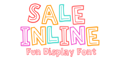 Sale Inline is a fun and playful inline font. You can use it for anything ranging from t-shirts, kids’ book designs, greeting cards, stickers, and posters, or anything that needs a casual touch. Fall in love with its incredibly versatile style and use it to create lovely designs!
 - Vierra Moon by Sarid Ezra,
$15.00 Vierra Moon is a quirky handwritten font that will make your design more cheerful! You can use this font for your brand, your cover book, kids event, or even your quote. This font also including double ligatures that will make this font more handy. This font also support multilingual.
 - Street Urban by Blankids,
$20.00 Our new product the name is Street Urban Graffiti Font inspired by graffiti style with a fun theme very good for graffity poster, Hip Hop music, kids poster, flyer, children book, cartoon, comic etc MULTILINGUAL ACCENT : ØÆøæ¢ÐŒœÁĂÂÀÄĄÅÃǼĆČÇĈĊĎÉĔĚÊËĖÈĘĞĜĢĠĤÍĬÎÏİÌĮĨĴĶĹĽĻĿŃŇŅÑÓŎÔÖÒŐǾÕŔŘŖŚŠŞŜȘ ŤŢÚŬÛÜÙŰŲŮŨẂŴẄẀÝŶŸỲŹŽŻáăâäàąåãǽćčçĉċďéĕěêëėèęğĝģġĥíîïìįĩĵķĺľļŀńʼnňņñóŏôöòőǿõŕřŗśšşŝșťţ ŭûüűùųůũẃŵẅẁýŷÿỳźžż FEATURES : Uppercase Lowercase Number Punctuation Multilingual PUA Encode Opentype
 - Neon Coughs by PizzaDude.dk,
$15.00 Neon Coughs - originally handdrawn, and then manually and digitally traced. That’s why this font appears super smooth, yet quote organic! Neon Coughs is super useful for kids products, posters, comics, cartoons or that design you’ve already made, but misses that extra boost! Of course there is multilingual support!
 - Junior Detective JNL by Jeff Levine,
$29.00 A 1930s kids' premium booklet from Post cereals called "Inspector Post's Junior Detective Corps Manual #2" offered up some great hand lettering in an Art Deco sans serif style. Bold, authoritative and perfect for headlines or titling, Junior Detective JNL now recreates this hand lettering in digital form.
 - Mares by Alex Camacho Studio,
$24.00 Mares is an unicase typeface inspired by the American psychedelic movement from the mid 1960’s where capitals and lowercase used to be mixed and distorted to become part of the image. Mares is a bold and modern psychedelic font for use on special occasions. The bigger the better.
 - BIG Alphabet Tracing by Beast Designer,
$15.99 Introducing the Big Alphabet Tracing Font – a font designed to help kids learn the alphabet in a fun way. The font looks friendly and playful, making learning feel like a game. It is perfect for teachers, parents, and anyone who wants to make learning the alphabet exciting and interactive.
 - Deco Moderne JNL by Jeff Levine,
$29.00 The model for Deco Moderne JNL was the hand lettered title on the sheet music cover of "Did You Ever See A Dream Walking" (from the 1933 Paramount musical "Sitting Pretty" starring Jack Oakie, Jack Haley and Ginger Rogers). The typeface is available in both regular and oblique versions.
 - Slim Kim by Wiescher Design,
$39.50 Slim Kim is the sister font of Julienne. It mixes perfectly with Julienn. So whenever you need an especially slim serif font this is it! Slim Kim has very spiky serifs, so I did not want to make an extra-slim version. Enjoy this spiky font, your Gert Wiescher.
 - Saw Mill Stencil JNL by Jeff Levine,
$29.00 A vintage metal stencil from a saw mill with the term "reusable skid" was the model for Saw Mill Stencil JNL. Although the original was what would be termed a semi-stencil (some letters did not have 'breaks' in them), the font was designed with a more traditional look.
 - Kidstar by Jos Gandos,
$14.00 Kidstar is a simple, fun and cute font for beautiful designs. Kidstar is great for branding design, kids product displays, logos, product packaging or simply quotes and design with stylish text overlay to any background image. It makes for a cute typeface with combination between uppercase and lowercase.
 - Alien Spaceship by Gassstype,
$29.00 introducing : Alien Spaceship Font ,come with powerful themes. We wanted to create the most unique character. It matches applies in some designs such as the gaming logo, logotype, brand, packaging, quotes, cute poster, kids shirt, cover book, birthday invitation and more custom design. Alien Spaceship Font is 3 style.
 - Verbatim by Monotype,
$25.99 This extensive 60-font type family was inspired by the best (and worst) of 1970s science fiction TV shows and movies. Verbatim aims to extract the essence of futuristic type from that era, add a dash of modern style and conjure a cinematic typeface for the 21st century. From the extremes of the thin condensed, all the way through to the black extended, Verbatim has the scope to add drama to your titles and headings, and finesse to your logo and branding projects. Distinguishing features include a large x-height and open counters that aid legibility. This typeface crosses a few boundaries of type specification in that it is both rounded and square, it is part geometric in construction with a touch of humanistic flair and stroke contrast – giving Verbatim a distinctive and confident air. Key features: • 6 weights in Roman and Oblique • 5 Styles – Condensed, Narrow, Regular, Wide, Extended • Small Caps and 7 Alternates • European Language Support (Latin) • 600 glyphs per font. See more detailed examples at the Verbatim microsite.
 - Salloon by Ingrimayne Type,
$8.95 The original version of Salloon was what has become Salloon-Wide. It was designed a year or two before 1990. The narrower version, which is now the regular version of the face, was constructed a few years later. There never has been a true lower-case set of letters for these fonts, but the narrower version introduced a second set of caps by removing the side bumps from the letters. Although Salloon may look like an old font, no historic font closely resembles it. Fonts with bold, thick stems such as Salloon invite interior decoration. The five striped versions and the shattered version of the font were produced a year or two after the construction of the narrower Salloon when the arrival of a font distortion program made it easy to cracked and stripe fonts. In 2019 an outline style and two highlighter styles were added to be used in layers with the Salloon-Regular and one highlighter style was added to be used with Salloon-Wide.
 - The font "Birth of a Hero" created by Last Soundtrack is a distinctive typeface that sets itself apart with its rugged, grungy appearance. Perfectly capturing the essence of a bygone era of heroism a...
- Hont by Remedy667,
$18.00 Hont, the original Haunted Font is here. We've captured the essence of an old-school horror film and now you can use it to create awesome-looking titles for all your projects. With its chunky appearance, this font is perfect for vintage poster designs, t-shirt designs, logos, or anything that needs a hint of spooky. Hont is the ultimate Haunted Font that looks amazing on all projects. Inspired by classic mid-century horror films, it will give your projects just the right amount of classic horror. Features Doubles Elimination gives you a more natural look. Inspired by classic mid-century horror films. Includes a Remedy667 Font Catalog PDF, all your favorite fonts in one handy catalog. Possibly haunted, may possess you to create awesome work.
 - Morning Cookie by Bogstav,
$17.00 Yet again, a font inspired by my work as a kindergarten teacher! The other day, I had a conversation with some of the kids, about what they ate for breakfast. Some had oatmeal, some bread and others yogurt. But this kid - he insisted that every morning, his mother would serve him cookies, “morning cookies”. It sounded too good to be true, and when I asked his mother, it turned out that “cookies” were actually bread, but to make it sound more appetising, they called it cookies! The letters are rounded and in some way quite naive, but still clear and legible. With an extreme ascender and descender, the font stands out with its oddities. I’ve added 3 different versions of each lowercase letter!
 - Sans Skript by Felitasari Rekso,
$25.00 Sans-Skript is a display typeface that is inspired by Javanese Script (or Sanskerta in Bahasa Indonesia). Javanese script is one of Indonesia’s many traditional scripts that were commonly used by Javanese people from mid-15th CE to mid-20th CE. Though not commonly used anymore, it is still taught and used in cities across East and Central Java. Sans-Skript translates the high-contrast, modular and organic features of the Javanese Script into the Latin alphabet. (Hence the not-script naming) The typeface is aimed to be used for large format prints, above 100 pt, and can be used alongside Javanese script. Typefaces that pair nicely mimic features of Javanese script, and Hatton by Pangram Pangram Foundry is an example.
 - Ongunkan Proto Canaanite by Runic World Tamgacı,
$75.00 Proto-Sinaitic (also referred to as Proto-Canaanite when found in Canaan, or Early Alphabetic) is found in a small corpus of c. 40 inscriptions and fragments, the vast majority from Serabit el-Khadim in the Sinai Peninsula, dating to the Middle Bronze Age. They are considered the earliest trace of alphabetic writing and the common ancestor of both the Ancient South Arabian script and the Phoenician alphabet, which led to many modern alphabets including the Greek alphabet. According to common theory, Canaanites or Hyksos who spoke a Canaanite language repurposed Egyptian hieroglyphs to construct a different script. The earliest Proto-Sinaitic inscriptions are mostly dated to between the mid-19th (early date) and the mid-16th (late date) century BC.
 - Contype by Wiescher Design,
$39.50 Once I had a young, very eager and interested designer in my employ. We got into talking about where our letterforms come from and the habits in perception we are used to. He did not quite believe me. So I said, let's try to design a typeface where everything is just the opposite of what we are used to. We really had a hard time, our habits crept up on us all the time. But after a couple of weeks we finally finished this typeface and wanted to call it crazytype, but my young apprentice who did most of the manual labor said Contype sounded crazier. So it became Contype and it's really crazy, with a small asian touch to it. Yours very crazy Gert Wiescher
 - Cheltenham Pro by SoftMaker,
$15.99 Where most typefaces are designed by just one individual, quite a few people have been involved in perfecting Cheltenham over the times. In 1896, the architect Bertram Grosvenor Goodhue created the initial design for Ingalls Kimball at the Cheltenham Press. Just a few years later, Morris Fuller Benton devised a full family of Cheltenhams for ATF. This is the basis of the design we have today. In 1975, Tony Stan revived this classic typeface and did what was customary at the time: increase the x-height and make the Cheltenham family more regular. SoftMaker updated the design yet again in 2012. The result is Cheltenham Pro, a typeface that is exceptionally readable and holds up even in adverse printing conditions. SoftMaker’s Cheltenham Pro typeface family contains OpenType layout tables for sophisticated typography. It also comes with a huge character set that covers not only Western European languages, but also includes Central European, Baltic, Croatian, Slovene, Romanian, and Turkish characters. Case-sensitive punctuation signs for all-caps titles are included as well as many fractions, an extensive set of ligatures, and separate sets of tabular and proportional digits.


