10,000 search results
(0.063 seconds)
- Kasmine by Fargun Studio,
$12.00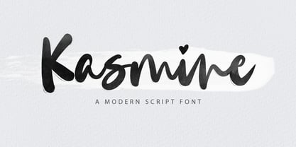 Kasmine is a handwritten stylish copperplate calligraphy font with a dancing baseline and a classic and elegant touch. Can be used for various purposes. such as headings, signature, logos, wedding invitations, t-shirts, letterheads, signage, labels, news, posters, badges etc.
 - Hard Lines Display Font by Sipanji21,
$16.00 Hard Lines - A Fun Display Font With Shadow Decoration inside. It will elevate a wide range of design projects to the highest level, be it branding, headings, wedding designs, invitations, signatures, logotype, wall art illustration, apparel, labels, and much more!
 - Groovy Night by Brown Cupple Typeface,
$15.00 Groovy Night is a retro groovy display font. The additional elements of blood dripping and bones-like letters make an ambiance of horror Invitations, postcards, posters, and headings for a Halloween event; this font can be used in every setting.
 - Five Star Final by Solotype,
$19.95Introduced by the American Type Founders Co. at the time of the Spanish American War and advertised as suitable for "War Scare Headlines"! Used by many papers for years after because the narrow type was suitable for narrow single column heads. - Sevoya by Jonahfonts,
$42.00 Sevoya a captivating robust script font designed with fat strokes for those strong brands and logos. Featuring short ascenders and descenders making it a bit more legible. Sevoya is perfect to create outstanding headings, logos, menus, graphics, and many more applications.
 - Alien Hunter by Sipanji21,
$18.00 Alien Hunter - A Fun Display Font With Shadow Decoration inside. It will elevate a wide range of design projects to the highest level, be it branding, headings, wedding designs, invitations, signatures, logotype, wall art illustration, apparel, labels, and much more!
 - Happy vibe by Brown Cupple Typeface,
$15.00 Happy vibe is a cool retro groovy decorative font. The additional elements of blood dripping and bones-like letters make an ambiance of horror Invitations, postcards, posters, and headings for a Halloween event; this font can be used in every setting.
 - SF Eccentric Opus - Unknown license

- Fonitek - Unknown license

- Quibel - Unknown license

- Neustyle - 100% free

- Goodfellow by Solotype,
$19.95Our font (circa 1895) of this old wood type was made by Hamilton of Two Rivers, Wisconsin, but we have been told that another identical font was made earlier by W. H. Page, Greeneville, Connecticut. Hamilton became the final home of many of the old wood type patterns as the early companies went out of business. - Epoca Pro by Hoftype,
$39.00 Epoca, designed in 2010, is a classic linear sans for text and display. It has economical proportions, a neutral appearance and a discreet elegance. While sturdy and robust, it is nonetheless a strong workhorse. The slightly angular shape of the round elements results in a quiet flow of the line which enables fatigue-proof reading even with large amounts of text. Epoca comes in eight styles and in OpenType format. All weights contain small caps, standard ligatures, proportional lining figures, tabular lining figures, proportional old style figures, lining old style figures, matching currency symbols, fraction- and scientific numerals.
 - Heffer - 100% free

- VTC-BadEnglischOne - Personal use only

- !Limberjack - Unknown license

- Plasmatica - Unknown license

- Covington - Unknown license

- Teen - Unknown license

- Baro B by Our House Graphics,
$15.00 Baro is a powerful, fun and expressive font, great for loud, cheerful and super-fat headlines and packaging for odd novelty toys. With its bold and distinctive stylized geometric forms, it is ideal for logos, heavy machinery and wacky party invites. Baro had its beginning in a handful of rigidly geometric uppercase letters from an unidentified 1960�s or 70�s era press-down lettering font, which in turn was possibly a revival of a 20�s era Art Deco font. The exercise quickly expanded into a complete typeface with 300+ characters, including several catch words (word glyphs), stylistic alternates, discretionary ligatures, multilingual support and both lining and old style numerals. Baro maintains much of the characteristic geometric rigidity of the original handful of letters, but � With the addition of just a little bit of flare, a bit of cheerfulness breaks through, like a wink and a smile on the face of a fat and otherwise stern policeman.
 - ITC New Winchester by ITC,
$29.99ITC New Winchester is a revival of a typeface that never really had a first release. The original Winchester was an experimental design created by the American type designer W.A. Dwiggins in 1944. Dwiggins was interested in improving the legibility of the English language by reducing the number of ascenders and descenders; to do this, he gave Winchester very short descenders and created uncial forms for a number of letters. The result was a distinctive text typeface that was occasionally used by Dwiggins and Dorothy Abbe in handset form. Fifty years later, Indiana type designer Jim Spiece has turned Dwiggins's experiment into a new family of digital text types. Spiece gave New Winchester a bold weight, as well as small caps (both roman and italic) and old style figures; he also created two forms of the lowercase f, one with and one without an overhang (in metal type, a kern), and a full set of f-ligatures. - Polyphonic by Monotype,
$31.99 Polyphonic is a highly versatile slab serif typeface comprising 60 fonts across 6 weights and 5 widths. It is a no-nonsense, clear and legible type family whose multiple voices will suit numerous typographic applications. Its overall personality is polite, understated and formal – there are no frills with this typeface, it conveys messages simply and efficiently without hyperbole. Polyphonic’s lighter weights are great for body text and its heavier weights the perfect complement for branding, titles, headings and logotype options. Small Caps are included with each font and available with one click, as are Old Style Figures, there is extensive language support too – European/Latin only. Key features: • 6 Weights in Roman and Italic • 5 Widths – Condensed, Narrow, Regular, Wide, Extended • Small Caps • Old Style Figures • European Language Support (Latin) • 600 glyphs per font. See more detailed examples at the Polyphonic microsite.
 - Brinar by Hackberry Font Foundry,
$24.95 I've been working on a usable sans serif for body copy since the mid-1990s (though I certainly did not know it at the time). This one works well. It started life back in the mists of time as a scan of an old German font by Carl Fahrenwaldt. It was developed fully as a synergized serif with strong traditional roots and released as Bergsland Pro. Now it finally makes it to where I was headed all along as a sans text font. This is a well modulated humanist, sans serif font family with many OpenType features and over 600 characters: Caps, lower case, small caps, ligatures, swashes, small cap figures, old style figures, numerators, denominators, accents characters, ordinal numbers, and so on. It is designed for text use in body copy. But it also works very well for elegantly stylized display.
 - Blacktones by Nathatype,
$29.00 Are you looking for a blackletter font? Do you dream of creating headings that stand out and inspire creativity, imagination, and endless fun? Wait no more, we will give you the best choice. Blacktones-A Blackletter Font Blacktones is a simple blackletter font with big loopy letters. Perfect for adding a touch of whimsy to your already amazing designs. A real head-turner for your presentation, designs, branding, quotes, invitation, website illustrations, and much more. Our font always includes Multilingual Support to make your branding reach a global audience. Features: PUA Encoded Numerals and Punctuation Thank you for downloading premium fonts from Natha Studio
 - Wellingborough by Greater Albion Typefounders,
$11.50 Wellingborough is a family of six late-Victorian inspired faces, principally for display work and headings but also including a text form suitable for use in ‘feature’ paragraphs and short documents. The regular, small capitals and italic forms provides good clear headings, with a modicum of individualism and flair about them, while the Flourish and capital faces carry the family to rather more elaborate-yet still readily legible- heights. The italic form also works well alone to suggest a sense of flow and movement. The whole family is ideally suited for poster and advertising work, as well as book and record covers and period themed signage.
 - Wolverton by Greater Albion Typefounders,
$10.00 The extensive Wolverton family was inspired by a turn of the 20th century luggage label designed by the London and North Western railway. The Wolverton family combines period flair and charm with respect for the modern need for legibility and purposefulness. The family has at its heart four Body text faces (regular, italic, bold and bold italic). These are complimented by three display text faces, offering upper and lower case letter forms, all offered in regular, oblique, bold and bold oblique forms. Four all-capital based display design are also included if offered in the same four style, making an extensive and flexible family suitable for a wide range of uses; everything from setting large amounts of text to large scale signage and poster work. Wolverton offers a unique blend of charm an modern flexibility, why not give it a try today? All faces include lining and old style numerals and are extensively kerned. Individual faces are all economically priced and substantial discounts offered for the purchase of larger sets of typefaces.
 - Kandide Upper Wide - Unknown license

- Kandide Unicase Wide - Unknown license

- Futurex Transmaat - Unknown license

- LT Eat - Personal use only

- Quintet by Lauren Ashpole,
$15.00 Quintet is a narrow, stylized sans serif font made up of thin, looping lines. This font tries to walk the line between retro and modern and to incorporate some hand drawn imperfections without being too obvious about it. I kicked off designing without any particular inspiration in mind but, as time went on, started associating it in my head with an old-timey, swingy jazz aesthetic. So hopefully it captures the spirit of the Jeeves and Wooster throwback theme song and opening credits, the music of Stéphane Grappelli and Django Reinhardt (who the name is a nod to), and countless album covers from that era.
 - Ten Mincho by Adobe,
$69.00Ten Mincho is a Japanese typeface design from Adobe Originals, designed by Ryoko Nishizuka and useful for a broad range of settings, such as advertising copy, book titles, and headings. As a traditional Mincho-style design the strokes are slightly heavy and rounded, and exhibit smaller counter spaces. Ten Mincho also features a full set of Latin glyphs, collectively known as Ten Oldstyle and designed by Robert Slimbach. This relatively feature-rich Latin subset includes OpenType features such as small caps and old-style figures. Finally, look for a small number of color emoji in an SVG table, some of which are accessible as alternates. - Lisboa Sans by Vanarchiv,
$35.00 This humanist sans-serif typeface was exhaustively designed, full-featured typeface family that reveals its character and distinctiveness in complex settings. It features a large complement of ligatures, lining and old-style figures, expert characters, dingbats (arrows, brackets, and symbols for both Regular weights). Lisboa Sans lacks the hook-head terminals, but its structure and proportions are the same. The simplicity of the sans weight created very strong readability at small sizes. After ten years from the first version publication, this new version (0.2) is available with Latin (Western, Central Europe) and Cyrillic alphabets. It was selected by Our Favorite Fonts of 2005 (Typographica).
 - Ames' Text by Greater Albion Typefounders,
$16.00 Ames’ text is designed for use in its own right and also as a complement to our Ames’ Roman family. Ames’ text is a ‘New-Style’ Didone family offered in three weights and three widths. It is designed to embody clarity combined with contrast between horizontal and vertical strokes, but with sufficient stroke width in both directions to display well at small point sizes. All typefaces include small capital forms, new and old style numerals (and ‘small capital’ numerals for consistency). Ames’ text is distinctive enough for use in headings and titles, but comes into it own as a text face. Keep a lookout for our forthcoming Ames Display faces…
 - Floridium Pro LV by No Bodoni,
$35.00 Floridium grew out of an affection for the old wood types of the 1800s. Painters Roman* was the initial inspiration. It was the source for the �banana� and �snake head� serifs. But the design�released by Adobe as Juniper�was too quirky to be useful. I tried to make it more sophisticated and modern while keeping the original personality of the 19th century types. The name resulted from a trip to Miami while the initial drawings were being made. Not the best way to name a typeface, but while we were in Miami Beach there was this tall blonde in a bright yellow bikini sitting on this bright yellow Porsche and...
 - Spoonbread by Hanoded,
$15.00 I originally wanted to call this font Instant Pudding. When I was a kid, we sometimes had instant pudding (the ‘add cold milk and rest in the fridge’ kind) for dessert. My brother and I loved the stuff, especially when some of the pudding powder had not dissolved and had turned into brightly coloured speckles! But this font, alas, did not ‘feel’ like instant pudding, so I hunted the internet for other, more obscure, puddings. I found Spoonbread. Apparently it is a pudding-like Southern American dish, made from cornmeal. I have never tasted it, nor do I particularly like corn (most of it is GMO anyway), but the font and the name became friends. And who am I to tear this beautiful relationship asunder? Spoonbread - use it for your packaging, your books, your posters and your games. And when you make Spoonbread, use organic cornmeal!
 - Visia Pro by Designova,
$12.00 VISIA Pro - Our flagship Geometric Sans-Serif typeface, a perfect blend of elegant, minimal and premium design aesthetics at it's level best. A perfect typeface for logotypes, headlines, branding, marketing graphics, corporate identities, all web & print purposes. This pack comes with a total of 14 fonts: 7 Weights (Extra Light / Light / Regular / Semi Bold / Bold / Extra Bold / Heavy) 7 Weights of Italic versions (Extra Light / Light / Regular / Semi Bold / Bold / Extra Bold / Heavy) Each weight includes extended language support including Western European & Central European sets. A total of 258 glyphs are included.
 - Puritan Swash - Personal use only

- Tabatha - Unknown license

- Puritan Alternate - Personal use only


