2,210 search results
(0.015 seconds)
- Mister Mustard by AdultHumanMale,
$12.00 MisterMustard is a chubby art deco style font, not thin or elegant, but plump and jolly. The font is available in two styles regular and italic. While it was designed to be playful, this font has both an uppercase and a lower case, so it works for practically everything (maybe not a headstone or obituary). It’s loaded with extra foreign glyphs so it gives you plenty of options. Buy. Install. Enjoy.
 - Quickly Brown by HIRO.std,
$14.00 Quickly Brown Bold Script Font This font describes about fun, bold, chubby, wide and easy to use. Quickly Brown inspired from Doodle and Junk Food. FEATURES - All Capital Bold - Numbering and Punctuations - PUA Encoded Characters - Multilingual Support - Works on PC or Mac USE Quickly Brown works great in any craft, logotype, magazine, quotes, social media and any projects that need all about Bold taste. Enjoy using! Thanks. HIRO.std
 - Gellaby by Asenbayu,
$15.00 Gellaby is a bold semi-serif display font with a unique and chubby shape. You can use this font in retro, vintage, modern and playful designs. This font is perfect for a variety of projects, such as branding, product label, poster displays, logo designs, magazine, headline, sticker and more. Gellaby font feature opentype, kerning, alternative style and ligature. Gellaby include uppercase letters, lowercase letters, numeral, punctuation and multilingual support.
 - Domestic Manners - Unknown license

- P22 Basel Roman by P22 Type Foundry,
$24.95 In mid 2001, P22 was approached by a Daniel Garrison, a Classics scholar at Northwestern University about possibly digitizing a long lost "Garamond" typeface. This font was used by Johannes Herbst (a.k.a. Ioannes Oporinus) in 1543 to publish Andreas Vesalius' "On the Fabric of the Human Body" (De humani corporis fabrica) in Basel. The story of the development of this font takes a few twists and almost becomes forgotten itself over time.Forteen years later it is available to the public.
 - Humpty Dumpling NF by Nick's Fonts,
$10.00This rollicking romp through the alphabet is based on an offering from the irrepressible M. Draim, seen in La Lettre dans le Décor & la Publicité Modernes, published by Monrocq Frères of Paris in 1932. Its animated and friendly demeanor will add personality to any headline it graces. Both versions of this font contain the Unicode 1252 (Latin) and Unicode 1250 (Central European) character sets, with localization for Romanian and Moldovan. - Cuthick by GuseType,
$12.00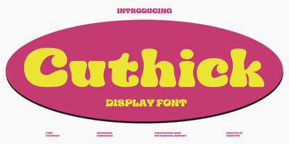 Cuthick is a display font that made based on thick lines, this font has a chubby and cute shape. You can use this font in playful, retro, and vintage style designs. This font can be use for a variety of projects or artwork such as sticker, headline, branding, product label, poster, logotype, magazine, and many more. Feature: - Kerning - Alternative Style and Ligature - Uppercase and Lowercase Letters - Numeral - Punctuation and Symbols - Multilingual Supports
 - El Abogado Loco - Unknown license

- Jeepney - Unknown license

- Portland Grotesk by QUADRAAT,
$35.00 Portland Grotesk is a grotesque sans serif typeface with chubby proportions in 5 weights Light - Regular - Medium - SemiBold - Bold and supports all latin languages. Easy to use and easy to read. The character set contains 1109 glyphs with a wide range of alternates characters and includes: - Small Capitals - Fractions - Superiors, denominators - Open type features such as case sensitive, standard ligatures and several stylistics sets Portland Grotesk fits perfectly for all types of communication (Books, magazines, posters)
 - Fun Time Nouveau JNL by Jeff Levine,
$29.00 “One Hundred Alphabets for the Show Card Writer” was published in 1919 to afford sign artists the ability to create signs and show cards in then-contemporary lettering styles. One such alphabet was big, bold and representative of the Art Nouveau stylings popular in the early part of the 20th Century. Most likely it was applied to store sales and public events that were casual and informal, for its letter forms are free of any constraints. This design is now available as Fun Time Nouveau JNL in both regular and oblique versions.
 - Ongunkan Armanen Runes by Runic World Tamgacı,
$50.00 The Armanen runes (or Armanen Futharkh) are a series of 18 runes, closely based on the historical Younger Futhark, introduced by Austrian mysticist and Germanic revivalist Guido von List in his Das Geheimnis der Runen (English: "The Secret of the Runes"), published as a periodical article in 1906, and as a standalone publication in 1908. The name Armanen runes associates the runes with the postulated Armanen, whom von List saw as ancient Aryan priest-kings. The Armanen runes continue in use today in esotericism and in currents of Germanic neopaganism.
 - Nouveau Techno JNL by Jeff Levine,
$29.00 The French publication “La Lettre Dans le Decor et La Publicite Modernes” (“The Letter in the Modern Décor and Advertising”) was a 24-page booklet showcasing the then-current trends of the time (circa late 1930s-early 1940s). On one page was found a squared, extra bold sans serif alphabet set with strong Art Nouveau influences, yet it was ahead of its time by taking on the look and feel of 1980s techno typography. They say “everything old is new again”, and Nouveau Techno JNL is now available digitally in both regular and oblique versions.
 - Ringlet - Unknown license

- Risoluto by Jawher Matmati,
$39.99 Risoluto is an italic font made to mimic the beautiful italic typefaces used in the 19th and 20th century by music publishers. It was based on an italic typeface found in a publication by Max Eschig from the 1950s. Hundreds of specimen for each glyph were studied and carefully drawn in a way to have a sharp rendering without losing any of the old charm. The oblique "g" is one of the characteristics of such old typefaces. Risoluto covers a large range of languages and symbols and offers stylistic alternates for numerals, contextual ligatures and music accidentals.
 - Tablet Gothic by TypeTogether,
$35.00 Graphic designers of any nationality and background know very well that the art of composing titles correctly is not easy, Especially when it comes to periodical publications where there is need for both flexibility and graphic coherence. Tablet Gothic was originally engineered as a titling type family, meant to help designers working on publications that require output as hard copies and a variety of digital platforms at the same time. As such, it is a grotesque sans serif that looks to the future of publishing with a clear understanding of its history, and reminiscences that go back to nineteenth century Britain and Germany. Tablet Gothic delivers the sturdy, straightforward and clean appearance expected from a grotesque, but it allows itself a good measure of personality to make it stand out on the page. Its 84 styles –six series of condensation and seven weights in each series plus obliques– guarantee that, whatever the publication format is, there's a Tablet Gothic font that will do the job and perform well both technically and aesthetically. Furthermore, the rounder styles, Tablet Gothic Wide, Normal and Narrow achieved amazing results at very small sizes, producing a beautiful texture and highly readable text blocks. Tablet Gothic fonts can be purchased individually, by series or as a complete bundle (best value!)
 - Cantarell - 100% free

- Choco Bro by Sipanji21,
$18.00 "Choco Bro" is a cute and chubby display font characterized by truncated or shortened characters. Fonts with truncated characters often feature letterforms where certain parts are cut off or abbreviated, giving them a unique and distinctive appearance. This font can be a delightful choice for various design projects, especially those targeting children's themes or playful designs. The truncated characters add a quirky and playful touch to the font, making it suitable for posters, invitations, children's books, or any project that aims for a fun and whimsical typographic style.
 - TXT Tough Love by Illustration Ink,
$3.00Add character to your paper crafts and publications. Download this cool Tough Love font to create lettering with a scratched or brush-stroke look. Design titles, captions, journaling and more, or simply give your publication an off-beat, handwritten appeal. - Deutsche Poster by Intellecta Design,
$19.95a naive font inspired in a vintage publicity poster - Saturn - Unknown license

- Toons One - Unknown license

- Bus by Volcano Type,
$19.00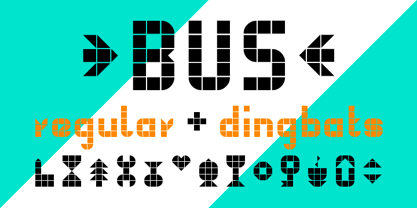 Another font idea inspired by a public transport information display.
 - Frank Ruhl1924 MF by Masterfont,
$59.00 The most common Hebrew typeface, based on Sefaradic tradition, used in most newspapers and publications. The main Hebrew typeface of the 20th century, designed in 1908 and was published by Berthold in 1924. OpenType Pro Excellent support for Niqqud (Vowels). All marks are programmed to fit each glyph's shape and width. OpenType Pro includes new advanced features like Dagesh Hazak, ShevaNa, Qamatz Katan, Holam Haser and wide letters. Best used with Adobe InDesign CC that support complex Hebrew text. Please check these advanced features in this link: https://tinyurl.com/ybgdsxme Font files were re-generated to get better online screen display, as well as refined OpenType features as kerning glyph substitution.
 - Ogre by Australian Type Foundry,
$30.00A funky, lively display font originally designed for a tourism publication. - Tuffy - 100% free

- Tuffy - 100% free

- Melts Script by Estudio Calderon,
$20.00 Melts Script from Estudio Calderón is a typeface based on Harlow Solid SB from Colin Brignall. It is made by round traces, with a simple design and a slightly “chubby” look. We wanted to propose a new version that works as an alternative of Harlow Solid, with connectors at the same heightand a complementary Font “Melts Sanscript” with sans serif capitals to be combined with lowercase scripts. Specimen Supporting 219 latin based languages, which are spoken in 212 countries. Psssss....It includes alternatives, swashes, ligatures and a version called Glint Glint, especially designed for those who want to highlight their works.
 - Brimley by Chank,
$49.00This slinky number will seduce you with its linking letters and special ligatures. Brimley's strokes are tight and sharp, and its characters are tied together with slender, whispy hooks. Although its elegance is timeless, this is a style that typifies lettering of last century's late '50s and early '60s. Chank Co. intern Tim Drabandt created Brimley with inspiration from antique type books. He named the font after Wilford Brimley. You know... the chubby old guy who tells you to check your blood sugar and eat your Grape Nuts and Quaker Oats. Haven't you ever seen Cocoon? - Livia - Unknown license

- old time radio - Unknown license

- Mister Earl by Bitstream,
$29.99Mister Earl, released by Bitstream in 1991, was designed by Jennifer Maestre. Inspiration came from a page in a ‘how-to’ book published in the 1930s. Later versions of Extra Light, Light and Bold were added by Jim Lyles, with the help of Wally Petty. Mister Earl is named in honor of Earl Biscoe, a Bitstream designer who retired in the mid-1980s because of illness. In the winter of 1994–1995, Richard Stetler accidentally left a copy of Mister Earl outside his Alaska home... In the spring, amazed to discover the unfortunate font was still just about alive, he decided to release the result to a wider public as Snow Cap. - Frenchute by Tipo Pèpel,
$22.00 France 1727, the book Le chemin Royal de la Croix is published. Centuries later the historical publication comes into the hands of Josep Patau, who uses its printed pages as a reference for a new digital typeface. Previously created for printing, those shapes adapt now to the screen and show the sophistication and authenticity of true Garalde types. Frenchute is a multipurpose typeface with 3 optical sizes. All the shapes were modified to cover different typographic needs. The diagonal axis and the moderate stroke contrast are taken further in the italics letterforms, where the design is far more expressive. The character set includes decorative forms and italic capitals with swashes, so the text looks prettier.
 - Tempora LGC Uni - 100% free

- Lichtner - Unknown license

- Lichtner Italic - Unknown license

- ArtlookinOneType - Unknown license

- Murrx - 100% free

- Railway Point by Melissa Lapadula,
$11.95This typeface has been influenced by the ongoing traffic congestion in Melbourne, and its lack of functional and reliable public transport as a possible solution. The font shapes are square-edged constrained angles, reflecting the way the Melbourne population feels when using the public transport system or roads. Use as headings and body copy in any graphic situation. - Trooklern - Unknown license


