10,000 search results
(0.033 seconds)
- Obligately by UICreative,
$23.00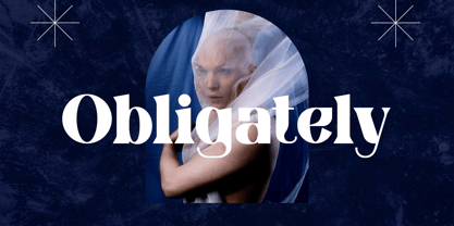 Introducing our new product the name Obligately Old Display Serif Font. Modern Serif font that beautiful classy, elegant, and modern. This font is perfectly suited for a wide variety of projects, such as signature, stationery, logo, wedding, typography quotes, magazine or book covers, website headers, clothing, branding, packaging design, and more. Also for fashion-related branding or editorial design and displays both masculine and feminine qualities.
 - CCS Neue Rinjani by Creative Corner Studio,
$29.00 Neue Rinjani is a all-caps sans serif with Wide Stretch contemporary typographic, vintage futuristic art-deco touch Streamline influence of the 1930s and 1940s. A mix from the old Euro-American signage/advertising letters and modern clean sans serif, carefully mousecrafted to bring you the genuine feel of the era. If you're into classic/vintage letter designs, then this typeface suits best for you.
 - Unger Script by profonts,
$39.99Unger Script is a script design which is obviously based on H. Matheis' Slogan typeface designed for Ludwig & Mayer in 1957. This very expressive script design is defined by its widely swinging upper case and its quite narrowly designed lower case characters. Ralph M. Unger redrew and digitized this font exclusively for profonts in 2001. His work is based on artwork taken from old font catalogues. - DF Zzzz by Dutchfonts,
$33.00 This typeface, in fact a bitmap font 'avant la lettre' is an interpretation of the Old Face condensed type. It is being used where space is scarce. Its skeleton is projected on the chain structure of a fly screen. Eventually your text lines fill the space as wide as hypothetical doors can be. In small sizes the text appears to be drawn with a pencil.
 - Titling Gothic FB by Font Bureau,
$40.00 Titling Gothic FB is an immense series of nearly fifty styles inspired by that century-old favorite ATF Railroad Gothic. Led by the Los Angeles Times and Gentleman’s Quarterly, U.S. publications are using David Berlow’s series to unify the structure of headlines from its wide spectrum of options. Titling Gothic FB started as a relative of Berlow’s Rhode family, but took its own direction; FB 2005
 - Kickbox by Ahmad Jamaludin,
$19.00 Introducing KICKBOX Fonts - Unleash the Power of Nostalgia and Captivate Pop Culture, Lifestyle, and Music and Film Branding Looking to infuse your brand with a burst of retro charm and a dash of pop culture? Say hello to our KICKBOX Fonts! Designed with 3 styles: Narrow, Regular, Wide to make your brand stand out in the realms of pop culture, lifestyle, music, and film branding. These fonts are an absolute game-changer. KICKBOX transports you to the golden era of the past, evoking a sense of nostalgia that resonates with pop culture enthusiasts. Seamlessly blending boldness and authenticity, they captivate the hearts of your audience, adding a unique and irresistible touch to your brand identity. KICKBOX has 3 widths on each type: Narrow - Regular - Wide so can be perfect for any retro project like logotype, branding, title, packaging, and many more Features: Kickbox Main File Has 3 Variable: Narrow - Regular - Wide Instructions (Access special characters, even in Cricut Design) Unique Letterforms Works on PC & Mac Simple Installations Accessible in Adobe Illustrator, Adobe Photoshop, Microsoft Word even work on Canva! PUA Encoded Characters Fully accessible without additional design software. Embrace the captivating allure of our KICKBOX today and unleash a world of endless possibilities! Enjoy Designing! Dharmas Studio
 - Dubster by 2D Typo,
$28.00 Strict and technocratic font of modular nature and with wide intensity gradation.
 - Freundschafts-Antiqua AR by ARTypes,
$35.00Freundschafts-Antiqua AR is based on a 20th-century German type design. Freundschafts-Antiqua (which was also called Chinesische Antiqua) was designed by the Chinese calligrapher Yü Bing-nan when he was a student at the Hochschule für Grafik und Buchkunst at Leipzig in 1960. It was cast in 1964 by VEB Typoart, Dresden, in 9-pt and 28-pt (Didot). The design combines the best German traditions with the Chinese bamboo pen. It is a unique, wholly modern, yet quiet and dignified typeface which is well suited for text-setting in many sizes. The original design was carefully crafted with all non-kerning letters (none of the letters overhangs its side-bearings); the lower-case f was designed so that no ligatures were needed. The AR fonts include the type's ch and ck logotypes, monetary signs and all the standard accents. The letterfit of the original design is retained and, as can be seen in the attached printable .pdf, text composed at normal sizes is very agreeable indeed. Freundschafts-Kursiv AR A features old-style (non-lining) figures and 'kerning' letters; Freundschafts-Kursiv AR B contains lining (cap-height) figures and all non-kerning letters following the original design of the face. - HUTagada by Heummdesign,
$15.00 "Disco Pang Pang" is the Korean name for Tagada rides. It is a characteristic typeface that is good to use when you want to make use of a unique and bouncy feeling. Light and Extrabold are made with the thickness of normal typefaces, but Left and Right have strange shapes with stroke thicknesses that are biased to one side. Its unique shape can make a strong impression on people.
 - Caleb Mono by Brenners Template,
$19.00Caleb Mono Font Family It is originally inherited from Caleb Grotesk. And, It is a reinterpretation of the proportional and grotesque sensibility of Glphs with a more modern and rarity feeling. Monospace fonts are a great choice for any designer who wants to create a retro, and minimalist feel. The disadvantages of ambiguous readability due to its wide width and mechanical placement are clearly present, but still attractive and elegant. To overcome these shortcomings, this font family gave variable side bearing values to each glyph and adjusted the width of the glyphs themselves. It is designed with a more human sensibility. - Supercard by Alphabet Agency,
$15.00 Supercard's creation is inspired by traditional athletic block lettering often only seem in uppercase form Supercard font family has captured the blue collar feel and expanded the range of this traditional look in six different weights all with uppercase, lowercase, numbers, punctuation and simple Latin international characters. The versatility of the different font weights allows for broader and fresh design possibilities in your work.
 - Hebrew Esther Tanach VF by Samtype,
$495.00 This is a font to build an Hebrew Bible (Tanach) or any Hebrew prayer book. This is a variable font with 5 styles! Hebrew Esther Tanach Variable has all Unicode Hebrew marks and others like ShevaNa, Dagesh Chazak, Qamats Katan, and Cholam Chaser. This font has a complex and exclusive Programmation of Opentype features. This font is very good to read even in small texts
 - Wormwood Gothic by Device,
$39.00 Retaining all the imperfections and irregularities of wood type, Wormwood Gothic is a gothic sans with all the naive and uneven character shapes typical of the period. The ‘capitals’ feature extended characters, while the ‘lower case ’ features capitals of squarer proportions. Freely mix the two in word settings or colour in red and black for a Dada collage, billposter, urban grit or antique Americana atmosphere.
 - Magalith by Samtype,
$39.95 This hebrew typeface is inspired in prayer books from the beginning of the XX century. Even in this Std version You can apply modern hebrew marks like Kamats Katan, Sheva Na, Dagesh Chazak and Cholam Chaser. It's a classic style with the most modern of a digital font technology and a easy lecture. The Caption versions is ideal for small size of texts and footnotes.
 - Vintage Price Tags JNL by Jeff Levine,
$29.00 Vintage Price Tags JNL comprises three sets of numbers in both ribbon, circle and star patterns which, when combined will produce point-of-sale price elements. The designs were re-drawn from examples found in an old wood type catalog, and are now collected in digital format. Ribbon-style numbers are found on the upper case keys. A through J have the large numbers, K through T are the smaller, underlined numbers. The remaining upper case keys contain the dollar sign, cents sign and the phrases "each", "for", "dozen" and "pair". On the lower case, the circle set of combination numbers are on the following keystrokes: The keys a through j are the left side semi-circle numbers and the "k" key is a blank left side semi-circle. The l through u keys are the right side semicircle numbers and the "v" keystroke is a blank right side semi-circle. The star set is on the standard numbers keys for the left side of the star, with the right side characters on the corresponding shift keystrokes for the number keys. In following the original design examples, a cents sign follows the numbers on the right side of the circle or star sets. The lower case w through z contain a left side star blank, a left side star with $1, a right side star blank and a right side star with small double zeros (to comprise a star shaped price tag for $1.00).
 - Clarenwood JNL by Jeff Levine,
$29.00 Based on some examples of a Clarendon-inspired wood type design, Clarenwood JNL is a bold and effective titling font which harkens back to old times and advertising on a grander scale.
 - Striptease JNL by Jeff Levine,
$29.00 Striptease JNL is the bold, brash, "your-name-in-lights" companion to Showgirl JNL, and was inspired by a scene in an old television show depicting a burlesque house of the 1930s.
 - Harsh language AC - Unknown license

- Greek House Fathouse - Unknown license

- Zodor JNL by Jeff Levine,
$29.00Zodor JNL is modeled from the packaging for injection-molded plastic letters used as a teaching toy for youngsters in the early 1960s. The hand-drawn alphabet on the sides of the package was quirky enough to merit being made into a digital font. - Black Corps by Pixesia Studio,
$23.00 Introducing Black Corps - Military Serif Font Black Corps is a military serif font that comes in four distinct styles - solid, inline, outline, and stencil. This versatile font is perfect for use in a wide range of design projects, including branding, advertising, and packaging. Its military aesthetic makes it suitable for use in official documents and military communications, and its four different styles allow you to create a wide range of looks. The solid style of Black Corps is bold and straightforward, making it perfect for use in headlines and titles. The inline style adds a touch of elegance, while the outline style is light and airy. And the stencil style is perfect for creating a rough, rugged look. FEATURES - Uppercase and Lowercase letters - Numbering and Punctuations - Multilingual Support - Works on PC or Mac - Simple Installation - Support Adobe Illustrator, Adobe Photoshop, Adobe InDesign, also works on Microsoft Word Hope you Like it. Thanks.
 - Mandira by Arterfak Project,
$24.00 Introducing Mandira, the ultimate serif font for those seeking a unique and sophisticated touch to their design projects. With its rounded curves shaped. Inspired by the modern retro, Mandira is the perfect choice for those seeking a minimalist yet stylish look. The font boasts a wide range of special characters, giving you the freedom to mix and match to create a truly personalized touch. Whether you’re a designer, blogger, or creative, this font is perfect for logos, headings, and branding, and its bold and fancy appearance to ease you make a masterpiece. With over 400+ glyphs to choose from, you can be sure that your work will stand out. Mandira is not only fashionable and casual, but it’s also versatile enough to be used in a wide range of design projects. So why wait? Try Mandira today and elevate your designs to the next level! What you’ll get : Uppercase Lowercase Numbers & punctuation Stylistic alternates Stylistic set 01-05 Ligatures Multilingual support Hope you enjoy the font!
 - Diverge Variable by Vishnu Sathyan,
$2.90 Introducing Diverge, a dynamic variable font with two axes - Weight and x-height. Inspired by the sleek and modern design of driveways in apartment complexes, Diverge is a font that stands out with its contemporary, yet sophisticated look. The Weight axis of Diverge ranges from Thin to Black, offering designers a wide range of options to choose from. The Thin weight is perfect for delicate and refined designs, while the Black weight commands attention with its bold and impactful appearance. The x-height axis of Diverge ranges from 420 to 800, giving designers greater control over the font's legibility and versatility. Whether used in body text or headings, Diverge's x-height axis allows for greater flexibility in design, making it a valuable addition to any designer's toolkit. Diverge's variable design is perfect for a wide range of applications, from branding and advertising to editorial design and web development. Its unique look and feel will make any design project stand out from the crowd.
 - Caridade by insigne,
$29.00 Caridade is a bold and powerful script face. It draws some inspiration from heavy brush drawn vintage hand lettering but its heavy weight is much thicker with plenty of impact and more contemporary letterforms. The face offers a wide array of weights, from the powerful Heavy weight to the graceful Thin. Caridade can get the job done for many unique design tasks. Caridade includes many useful OpenType features, including a set of non-connecting alternates, 40 ligatures, and two types of end letterforms. OpenType features include ornaments, swash endings, ending contextual alternates, discretionary ligatures, ligatures and three different stylistic sets filled with alternates. In total, there are over 60 alternate letterforms. Please see the sample .pdf to see these features in action. OpenType capable applications such as Quark or the Adobe suite can take full advantage of the automatically replacing ligatures and alternates. This family also includes the glyphs to support a wide range of languages.
 - Marat by Ludwig Type,
$45.00 Although originally conceived as a magazine face – with strong serifs and open character shapes for good legibility in small sizes, and compact letter forms optimized for narrow columns and tight headlines – Marat evolved into a comprehensive family for general use. This specific construction and the round forms of the letters create an elegant, soft and friendly appearance. The typeface suits a wide range of typography, e.g. editorial, brochures, packaging and corporate design. In particular, in bold weights it works surprisingly well, which is not always the case with serif faces. Marat includes oldstyle and lining figures (both proportional and tabular), a wide range of language support and various OpenType features (e.g. ligatures, case-sensitive forms, fractions, superiors and inferiors). It is the perfect companion for Marat Sans, a clean and lively sans serif typeface. Marat has been selected by the Type Directors Club of New York to receive the Certificate of Excellence in Type Design 2008.
 - Secca by astype,
$42.00 Secca is a fresh and versatile typeface series. With its workhorse qualities, Secca is perfectly suited for a wide range of applications - especially where legibility and economy are important factors. Secca is rooted in the tradition of early German Grotesk typefaces, but is tailored for the needs of today, with a wide language support and many typographic features and extras. » pdf specimen « The core family comes in nine weights from Thin to Ultra Black plus another three Hairline weights - each with italics, small caps and italic small caps. While the weights from Light to Bold perform well in text sizes, the more extreme styles give extra freedom for Headlines & Signage. For setting tables and charts, Secca offers tabular figures, fractions, currency signs and mathematic operators which share the same fixed width throughout the entire range of weights. This special feature is called “weight duplexing” and is a time saver for designers of annual reports and other figure-heavy texts.
 - Byra by Mariana Sousa,
$28.31 Meet Byra! A new approach to a decorative typeface. This typeface has asymmetrical terminals (round), which means than has serifs, but not in every side of the letterforms. The mix between both classic and modern elements, as terminals and the inverted contrast, gives the typeface a strong personality. Byra contains two weights, regular and bold, it’s a display typeface and great for headlines, branding and editorial proposes
 - Gimbo by Halbfett,
$30.00 Gimbo is bold. This heavy sans-serif design features thin counters. The interior spaces inside letterforms have been reduced as much as possible. Often, they seem abstract. There are three fonts in the Gimbo family: Black, Ultra, and Ultra Shadow. What do those terms mean? Well, Ultra is wider than Black. It takes up more pixels on-screen or brings more ink to the page.
 - Punch Pro by Produce,
$29.00 Punch was born because we wanted to create a stencil font. At first glance, Punch gives out an audacious persona with its bold shape and form. It’s softer side is revealed in it’s carefully cut stencil lines. The balance of heavy and refined gives the font family its very own charm. Punch Pro comes in six different weights; Slab, Bracketed, Wedge, Deco, Hairline and Sans.
 - Celesse by SG Type,
$16.00 Celesse - A classic serif font, perfect for creating bold & gorgeous designs. Pour yourself a glass of your finest wine and get classy with Celesse. This font is great for designing elegant logos, quotes, magazine covers, wedding cards, invitations, and brandings. Its stark contrasting lines are best used in headlines and projects with big type. Celesse adds timeless beauty, heavenly curves and a classic appearance to any project.
 - Lab Sans Pro by Vanarchiv,
$25.00 Lab Sans Pro is a geometric sans-serif typeface with a technological and minimalist look and is suitable for use in large sizes. It has eight versatile weights, (from Thin to Black) including true italics for each one, and a wide range of stylish alternate characters to improve its use in different graphic contexts. The name of this typeface was inspired by an experiment, mixing a structure with calligraphic influences and completely geometrical and structured drawings. Lab Sans Pro has a wide range of OpenType® features such as: small caps, old style/titling and small caps figures, fractions, superior and inferior scripts, scientific components and ligatures. Versatile but original, precise but lively, Lab Sans Pro is a carefully crafted technological typeface designed by Tiponautas.
 - Tazugane Gothic by Monotype,
$187.99 The Tazugane Gothic typeface family is the first original Japanese typeface created by Monotype. Designed by Akira Kobayashi, Kazuhiro Yamada and Ryota Doi of the Monotype Studio, the Tazugane Gothic typeface offers ten weights and was developed to complement the classic Latin typeface, Neue Frutiger. The design of the Tazugane Gothic typeface balances an original, humanistic style with elements of traditional Japanese handwriting. The two typefaces work together in a natural, seamless and adaptable manner so that Japanese and Latin texts can be used side-by-side for a wide range of applications, including in magazines, books and other print media; on digital devices; in branding and corporate identity systems; and in signage for buildings, highways and mass transit. Tazugane Gothic was updated to support the “Reiwa” new era symbol. Reiwa can be written as two kanji: 令和. This update to Tazugane Gothic includes Reiwa designed as a single ligature and is encoded as U+32FF. The inspiration for the Tazugane Gothic typeface is as elegant as its design. Since antiquity, cranes have been regarded in East Asia as auspicious birds for their noble appearance and elegance in flight. The typeface is named Tazugane Gothic in honor of the longevity of the crane, with the goal that it will be used for many years to come. The combination of the Tazugane Gothic typefaces’ traditional and humanistic elements, along with its intended ability to complement popular Latin typefaces, makes it one of the most uniquely flexible designs for applications where Japanese and Latin texts can be used together. The typeface family was created to have wide appeal, with a pleasing and consistent experience for readers, for use on screen, in print, in signage, packaging and advertising. Tazugane Gothic has 10 weights. The Light, Book, Regular, Medium and Bold weights are considered best for text sizes. The Ultra Light, Thin, Heavy, Black and Extra Black weights are recommended for headline sizes.
 - Zygo by Zang-O-Fonts,
$25.00A wide, square font, ZygoSE fits perfectly into a clean, dynamic design piece. - KG Change This Heart by Kimberly Geswein,
$5.00 Short, wide thin-stroked writing. Although handwritten, it is a very clean style.
 - Newmark by Jonahfonts,
$40.00 Very suitable for a wide range of applications including texts, packaging and headings.
 - Golden Record by Mans Greback,
$59.00 Golden Record is an elegant all caps sans serif typeface with a tall, classic, and high-quality feel. Its timeless design is perfect for adding a touch of sophistication to any project. The font's classiness evokes a sense of luxury and opulence, making it ideal for high-end branding and design applications. Golden Record is a versatile typeface family consisting of the styles Light, Regular, Bold, and Outline, each available in Italic, offering a wide range of creative possibilities. The idea for Golden Record came to life when Mans Greback was inspired by the elegance of vintage vinyl records and their iconic gold labels, merging classic aesthetics with modern design principles. Mans Greback is a Swedish typeface designer known for crafting high-quality fonts with a focus on versatility and aesthetics. He created Golden Records to provide designers with a unique and sophisticated typeface for upscale projects. Greback is committed to delivering exceptional quality in every font he designs, consistently pushing the boundaries of typography.
 - Blau by Wilton Foundry,
$19.00 Designed with a hand-chiseled feel, Blau’s sculpted characters add a refined personality to a wide range of brand, corporate, product and service applications. Highlighting the sculpted theme, inkwell treatment variations are prevalent throughout Blau, with several key glyphs that are stenciled for increased legibility. This sturdy, typographic workhorse shines when a slightly unorthodox typographic approach is required — a prime choice for distinctive and dynamic logotype use. The Blau family is available in Light, Light Italic, Regular, Italic, Bold and Bold Italic. The name Blau was chosen to celebrate the color Blue (or Blau in German, Blaauw in Dutch, Bleu French, Blå in Norwegian, Swedish & Danish, Blua in Esperanto, Blár in Icelandic) Blue is nature’s color for water, sky, mountains and glaciers. Blue is embraced as the color of heaven and authority, denim jeans and corporate logos. Surveys in the US and Europe show that blue is the color most commonly associated with harmony, faithfulness, confidence, distance, infinity, the imagination, and cold. In US and European public opinion polls, it is the most popular color, chosen by both men and women as their favorite color. Another very popular Wilton Foundry font in the “blue” family is “Cyan” and “Cyan Neue”.
 - Walking Broadway by IKIIKOWRK,
$17.00 Introducing Walking Broadway - Bold Type, created by ikiiko. Walking Broadway is a serif bold type, that inspired by typography from a vintage movie & newspaper at that era. This typeface is designed to give a formal yet old style look. Walking Broadway has a distinctive bold to light contrast shape. A style commonly used in movie, magazines, and signage in that era. This typeface is perfect for an formal layout, old movie poster, newspaper, magazine cover, and also good for vintage product, food & beverages, quotes, or simply as a stylish text overlay to any background image. What's included? Uppercase & Lowercase Number & Punctuation Alternates & Swashes Multilingual Support Works on PC & Mac Enjoy our font and if you have any questions, you can contact us by email : ikiikowrk@gmail.com
 - Schwenk by Kostic,
$40.00 Schwenk is a wide reversed-contrast typeface made to be used in display settings – headlines, logotypes, store windows. The Regular style is adjusted for smaller point size while the Thin is made in a higher contrast for large headlines. An alternative (wide) capital letter I is available via the Stylistic Set.
 - Brogado JNL by Jeff Levine,
$29.00Make room for Brogado JNL! This bold, yet squat slab serif font takes command when set into headlines. Although not thoroughly in the Western mold, Brogado JNL can still exude enough macho appeal to make its point strongly, yet clearly.

