10,000 search results
(0.022 seconds)
- Moskau Pattern by Letter Edit,
$49.00 The design of the typeface Moskau Grotesk and Moskau Pattern is based on the signage created for the Café Moskau in Berlin by the graphic artist Klaus Wittkugel in the beginning of the 1960s. The Café Moskau, across from the Kino International on Karl-Marx-Allee in Berlin Mitte was one of the prestige edifices of the former DDR (German Democratic Republic). Built in the early 1960s, it advanced over the years and changing social developments to a trademark building of the capital. The lettering display on the roof was created by the graphic artist Klaus Wittkugel (October 17, 1910 – September 19, 1985). He had been Professor at the School for Applied Arts in Berlin, and, in addition to the creation of many posters, book covers and postage stamps, he was responsible for the signage of the Kino International as well as for the complete graphic treatment for the Palace of the Republik. The signage for the Café Moskau with the words »RESTAURANT«, »CAFÉ«, »KONZERT« and »MOCKBA« set in capital letters, becomes the basis for the Moskau Grotesk which was developed by Björn Gogalla in 2013. This face should not be seen as an imitation. A few shortcomings were »fixed«. In favor of maintaining the core characteristics some unique features were, however, not relinquished. Lower case letters and the missing capital letters were designed from scratch. It is not surprising that the plain, unassuming geometrical direction of the basic character style forms a bridge to the architecture of the 1960s. Inspired by the then favored, diverse possibilities inherent in the architectural example and wall reliefs, two complimentary pattern fonts emerged.
 - Moskau Grotesk by Letter Edit,
$39.00 The design of the typeface Moskau Grotesk is based on the signage created for the Café Moskau in Berlin by the graphic artist Klaus Wittkugel in the beginning of the 1960s. The Café Moskau, across from the Kino International on Karl-Marx-Allee in Berlin Mitte was one of the prestige edifices of the former DDR (German Democratic Republic). Built in the early 1960s, it advanced over the years and changing social developments to a trademark building of the capital. The lettering display on the roof was created by the graphic artist Klaus Wittkugel (October 17, 1910 – September 19, 1985). He had been Professor at the School for Applied Arts in Berlin, and, in addition to the creation of many posters, book covers and postage stamps, he was responsible for the signage of the Kino International as well as for the complete graphic treatment for the Palace of the Republik. The signage for the Café Moskau with the words »RESTAURANT«, »CAFÉ«, »KONZERT« and »MOCKBA« set in capital letters, becomes the basis for the Moskau Grotesk which was developed by Björn Gogalla in 2013. This face should not be seen as an imitation. A few shortcomings were »fixed«. In favor of maintaining the core characteristics some unique features were, however, not relinquished. Lower case letters and the missing capital letters were designed from scratch. It is not surprising that the plain, unassuming geometrical direction of the basic character style forms a bridge to the architecture of the 1960s. Inspired by the then favored, diverse possibilities inherent in the architectural example and wall reliefs, two complementary pattern fonts emerged.
 - Gelato Script by Eclectotype,
$40.00 The original Gelato Script has been updated and improved, not once, but twice. This version is kept here for legacy and compatibility issues, but I would encourage new users to check out Gelato Luxe or Gelato Fresco instead. Gelato Script is a smooth-flowing typeface with an air of familiarity. Influenced by both formal scripts and mid-Twentieth Century hand lettering. The power of OpenType is used with precision in the Contextual Alternate feature to make sure letters connect seamlessly, t’s cross where they can and swashes don't crash into neighboring glyphs. 781 glyphs make up this font, which is capable of speaking in many different languages. Alternate forms are grouped into stylistic sets to make it easy to change the mood of the text. For example, ss01 makes droopable letters drop below the baseline to break it up a little if required. I recommend using it sparingly, one glyph at a time, but if you do enable it for a whole chunk of text, the clever OpenType programming ensures that it doesn't go overboard. Sets 2, 3 and 4 bring about alternate forms of S, s, B and Q. Set 5 changes AE and OE to some perhaps controversial Upper/lowercase ligatures. Engage ss06 for the underline feature. After a word, simply type two or more underscores and a line extends backwards under the word you just typed. Don't worry if you have to break for a descender, the OpenType programming will take care of making sure it connects properly to the preceding character. Sets 7 and 8 are for alternate ampersands, and ss09 swaps the script r for a regular shaped r. There are swash capitals available for most uppercase letters, and the OpenType programming makes sure there is room for them under or over the following letters. There’s also a good amount of ligatures thrown in. The localised forms feature can be set for Polish, where acutes get steeper and lslash takes on its script form; Dutch, where IJ and ij digraphs become cool ligatured combinations; and Romanian and Moldovan, where cedillas are subsituted for comma accents. The stylistic alternates feature groups together a few of the stylistic sets for users that can't get to them directly. Gelato Script is a highly usable, powerful typeface. Perfect for everything from food packaging to wedding invitations, sports team logos to magazine headings. Use it however you see fit. Just one thing - it’s not designed for all-caps settings, so avoid that at all costs!
 - Octin Stencil by Typodermic,
$11.95 In the world of graphic design, the selection of a typeface can often make or break a design. A font can evoke a range of emotions and set the tone for the entire piece. The Octin Stencil typeface is no exception. This font boasts a brawny and robust design, making it the perfect choice for designs that demand strength and resilience. With 7 weights to choose from, including light, book, regular, semi-bold, heavy, and black, the Octin Stencil typeface provides designers with an impressive range of options. Whether your design needs to convey a sense of authority or exude a no-nonsense attitude, Octin Stencil has you covered. This typeface is particularly well-suited for designs that require a tough, no-frills approach. Police, sports, prison, construction, school, or military themes can all benefit from the bold and commanding presence of Octin Stencil. Its stencil style and sturdy construction give the letters a sense of fortitude that is sure to grab attention and command respect. In summary, if you are looking for a typeface that exudes power and strength, Octin Stencil is the clear choice. Its burly and powerful design will make your message stand out and leave a lasting impression on your audience. Check out the rest of the Octin families: Octin Sports, Octin College, Octin Prison, Octin Vintage & Octin Spraypaint. Most Latin-based European writing systems are supported, including the following languages. Afaan Oromo, Afar, Afrikaans, Albanian, Alsatian, Aromanian, Aymara, Bashkir (Latin), Basque, Belarusian (Latin), Bemba, Bikol, Bosnian, Breton, Cape Verdean, Creole, Catalan, Cebuano, Chamorro, Chavacano, Chichewa, Crimean Tatar (Latin), Croatian, Czech, Danish, Dawan, Dholuo, Dutch, English, Estonian, Faroese, Fijian, Filipino, Finnish, French, Frisian, Friulian, Gagauz (Latin), Galician, Ganda, Genoese, German, Greenlandic, Guadeloupean Creole, Haitian Creole, Hawaiian, Hiligaynon, Hungarian, Icelandic, Ilocano, Indonesian, Irish, Italian, Jamaican, Kaqchikel, Karakalpak (Latin), Kashubian, Kikongo, Kinyarwanda, Kirundi, Kurdish (Latin), Latvian, Lithuanian, Lombard, Low Saxon, Luxembourgish, Maasai, Makhuwa, Malay, Maltese, Māori, Moldovan, Montenegrin, Ndebele, Neapolitan, Norwegian, Novial, Occitan, Ossetian (Latin), Papiamento, Piedmontese, Polish, Portuguese, Quechua, Rarotongan, Romanian, Romansh, Sami, Sango, Saramaccan, Sardinian, Scottish Gaelic, Serbian (Latin), Shona, Sicilian, Silesian, Slovak, Slovenian, Somali, Sorbian, Sotho, Spanish, Swahili, Swazi, Swedish, Tagalog, Tahitian, Tetum, Tongan, Tshiluba, Tsonga, Tswana, Tumbuka, Turkish, Turkmen (Latin), Tuvaluan, Uzbek (Latin), Venetian, Vepsian, Võro, Walloon, Waray-Waray, Wayuu, Welsh, Wolof, Xhosa, Yapese, Zapotec Zulu and Zuni.
 - Octin Prison by Typodermic,
$11.95 The Octin Prison font family is a veritable powerhouse of design, boasting seven different weights to choose from, each one exuding an air of rugged toughness that is sure to make a statement. Whether you’re looking to create designs for sports teams, schools, police departments, construction sites, or military units, Octin Prison is the perfect choice for projects that require a no-nonsense, utilitarian aesthetic. What sets Octin Prison apart is its ability to capture the essence of its namesake—the prison system—while also offering a versatility that makes it a great option for a wide range of design themes. The font’s thick, bold strokes and sharp, angular edges create a sense of solidity and permanence, while its sleek, modern lines give it a contemporary edge that is sure to grab attention. With weights ranging from light to black, Octin Prison is a font that can be used for a variety of design purposes. The lighter weights work well for smaller text, providing a clean, legible look, while the heavier weights make for an imposing headline font that demands attention. In conclusion, if you’re looking for a typeface that can capture the essence of ruggedness and durability, while also offering versatility and style, look no further than Octin Prison. It’s a font that is sure to make a statement and leave a lasting impression on anyone who sees it. Check out the rest of the Octin families: Octin Sports, Octin College, Octin Stencil, Octin Vintage & Octin Spraypaint. Most Latin-based European writing systems are supported, including the following languages. Afaan Oromo, Afar, Afrikaans, Albanian, Alsatian, Aromanian, Aymara, Bashkir (Latin), Basque, Belarusian (Latin), Bemba, Bikol, Bosnian, Breton, Cape Verdean, Creole, Catalan, Cebuano, Chamorro, Chavacano, Chichewa, Crimean Tatar (Latin), Croatian, Czech, Danish, Dawan, Dholuo, Dutch, English, Estonian, Faroese, Fijian, Filipino, Finnish, French, Frisian, Friulian, Gagauz (Latin), Galician, Ganda, Genoese, German, Greenlandic, Guadeloupean Creole, Haitian Creole, Hawaiian, Hiligaynon, Hungarian, Icelandic, Ilocano, Indonesian, Irish, Italian, Jamaican, Kaqchikel, Karakalpak (Latin), Kashubian, Kikongo, Kinyarwanda, Kirundi, Kurdish (Latin), Latvian, Lithuanian, Lombard, Low Saxon, Luxembourgish, Maasai, Makhuwa, Malay, Maltese, Māori, Moldovan, Montenegrin, Ndebele, Neapolitan, Norwegian, Novial, Occitan, Ossetian (Latin), Papiamento, Piedmontese, Polish, Portuguese, Quechua, Rarotongan, Romanian, Romansh, Sami, Sango, Saramaccan, Sardinian, Scottish Gaelic, Serbian (Latin), Shona, Sicilian, Silesian, Slovak, Slovenian, Somali, Sorbian, Sotho, Spanish, Swahili, Swazi, Swedish, Tagalog, Tahitian, Tetum, Tongan, Tshiluba, Tsonga, Tswana, Tumbuka, Turkish, Turkmen (Latin), Tuvaluan, Uzbek (Latin), Venetian, Vepsian, Võro, Walloon, Waray-Waray, Wayuu, Welsh, Wolof, Xhosa, Yapese, Zapotec Zulu and Zuni.
 - Lemon Salt by FadeLine Studio,
$18.00 Lemonsalt Script! This is a handwritten font made with care and sweetness. With upright calligraphy text form and dancing as well as some additional alternate characters will make it more interesting. Thanks!
 - Interoffice Memo JNL by Jeff Levine,
$29.00 Interoffice Memo JNL was inspired by an image of a plastic lettering template used for making mimeographed fliers in the days prior to the widespread use of photocopy machines. A classic Deco-style alphabet is on the upper case, with alternate A,E,F,L,M,N and W in the lower case set.
 - Snacko by Eko Bimantara,
$22.00 Snacko is one dope display font. It’s got that casual vibe mixed with some 70s soft serif styles, and a playful italic angle that’ll make your designs move and groove! This font is perfect for titling, branding, logos, and all kinds of digital or printed materials. It’s fun and playful, so it’s perfect for designs that are targeted at a younger crowd or need a fresh and modern feel. Snacko’s funky, soft, and cool design makes it the bomb for all kinds of design fields, from advertising to packaging to social media graphics. It’s got a style that’s all its own and can make your designs pop and stand out from the crowd. This font only comes in one style, but don’t trip, it’s versatile and can be used in all kinds of ways. It’s approachable and friendly with a softness that’s off the hook, but also funky and expressive with a unique personality that can take your designs to the next level. Bottom line, Snacko is one creative and versatile font that’ll bring a playful and fun energy to all your designs. It’s got a unique style that’s perfect for any designer’s font collection, so don’t sleep on this one!
 - Kidsfun by Balpirick,
$15.00 Kidsfun is a whimsical display font. It is perfect for product packaging, branding projects, magazine, social media posts and much more. Get creative with its childlike playfulness, and use it to brighten up any kids and school project!
 - Spring Display by Yoga Letter,
$14.00 "Spring Display" is a cute and unique display font. This font is equipped with uppercase, lowercase, numerals, punctuations, and multilingual support. This font is perfect for Easter, summer, winter, holidays, spring, back to school, mother's day, and more.
 - Akhilona by Yoga Letter,
$16.00 "Akhilona" is a very elegant and aesthetic handwritten brush font. This font is equipped with uppercase, lowercase, numerals, punctuation, and multilingual support. It is suitable for weddings, engagements, birthdays, photography, back to school, Christmas, parties, invitations, and others.
 - Broken Console by Arterfak Project,
$14.00 Proudly present "Broken Console", the geometric pixel font inspired by the old school game console which displaying pixel art in the game view. Broken Console created in 3 styles: Regular (one pixel), Bold (double pixels), and Shadow. This font is an all-caps font that is suitable for the contemporary era of graphic design nowadays. This font has a distinctive look in letterforms that makes it so unique, and suitable for specific themes like Techno, Digital, Retro, New Wave, Cyberpunk, Night, Gaming, Sporty, and much more! Font featured : All-caps alphabet Numbers Symbols & punctuation Multilingual support Thank you for visiting. Hope you like it!
 - Mateo by Linotype,
$29.99 Linotype Mateo is part of the Take Type Library, which features the winners of Linotype’s International Digital Type Design Contest from 1994 to 1997. Jürgen Ellenberger included three styles in his font, roman, bold and outline. The characters of Mateo consist exclusively of lines, giving the font an extremely angular look. However, Mateo retains a certain handwritten style somewhat reminiscent of the graffiti left on wooden grade school desks by previous classes. The bold and outline styles have emphasized stroke contrasts but keep the angular, consciously irregular look. The roman style is best for smaller texts and the bold and outlines styles for headlines.
 - Bouncer by Ingrimayne Type,
$6.95 The letters in Bouncer are round because they all begin as a ball and then have parts of the ball cut away. Bouncer was one of the earliest typefaces from Ingrimayne Type. Lower-case letters are smaller versions of the upper-case letters. BouncerTwo, designed twenty years after the original Bouncer, continues playing with the idea of making letters by cutting out parts of a circle, but in this case the circles are interlocking. All letters are upper-case but some of those on the lower-case keys differ from those on the upper-case keys. BouncerTwo is eye-catching but not highly legible.
 - Thimble Village by Shakira Studio,
$11.30 Thimble Village – Modern Serif Font Is a modern serif font it's a cool modern take on a retro classic, and it's ready to make a lasting impression on your merchandise, quote designs, header text, logos & branding, advertisements and much more. It's packed with plenty of alternates and ligatures to really bring it to life, and give you a wide range of customisation options. Features: · 2 Weights font (Regular,Italic) · Lowercase and Uppercase · Beautiful Alternates & Ligatures · Numerals & Punctuation · Accented characters · Multilingual HOW TO ACCESS ALTERNATE CHARACTERS Open glyphs panel: In Adobe Photoshop go to Window - glyphs In Adobe Illustrator go to Window - Type – glyphs I really hope you'll get pleasure using Thimble Village font and it will be perfect addition to your font collection! Contact me with an inbox message If you have any question. Thank you and enjoy!
 - Kavala by Sohel Studio,
$12.00 Kavala – Modern Serif Font Is a modern serif font it's a cool modern take on a retro classic, and it's ready to make a lasting impression on your merchandise, quote designs, header text, logos & branding, advertisements and much more. It's packed with plenty of alternates and ligatures to really bring it to life, and give you a wide range of customisation options. Features: · 4 Weights font (Regular,Italic,Bold,Outline) · Lowercase and Uppercase · Beautiful Alternates & Ligatures · Numerals & Punctuation · Accented characters · Multilingual HOW TO ACCESS ALTERNATE CHARACTERS Open glyphs panel: In Adobe Photoshop go to Window - glyphs In Adobe Illustrator go to Window - Type – glyphs I really hope you'll get pleasure using Kavala font and it will be perfect addition to your font collection! Contact me with an inbox message If you have any question. Thank you and enjoy!
 - Tambau by Tipogra Fio,
$30.00 Tambau is a display typeface crafted by Matheus “Fio” Gonçalves, a Brazilian design student, still in college, inspired by Brazilian concert urban posters and wood type that I saw at the Oficina Tipográfica São Paulo. The font was first made for a magazine project in design school, making it beautiful on giant pages headlines, billboards, signs, etc. There’s no lowercase, the character set is dramatic and objective. The uppercase is actually expanded letterforms causing some eyes and breathing paths to the very condensed and very modular glyphs, which creates a quite interesting striped texture between form, counterform and spacing. The lots of ligatures come to give it more closure between the letters, when they try to form blank spaces. So do the diacritics, fitting in the space given to them by the dynamic letterforms, making dense rectangular blocks. You may use Tambau as big as you can or do a high tracking to it and still it will be pretty. The titles can be dynamic, just condensed or just large. It’s on your own. Don’t be afraid to play with Tambau, it’s an alive typography. Curiosity: For the magazine in design school, the pilot project of Tambau was cut in a MDF board, to print it with texture and paint. Later was added more characters, languages and special glyphs to it. Set: Tambau is a singular font typeface, with extended and condensed characters, numbers, ligatures, punctuation and symbols for Basic, Western, Central and South Eastern Latin languages.
 - Modulus Pro by Arkitype,
$16.00 Modulus Pro, the extensive update to Modulus. This update was built around the original Modulus Font. This rounded sans-serif has a larger glyph set which covers many languages. Modulus Pro now comes in 8 weights from Extra-Light to Black. This updated version was designed with the designer in mind, you have many stylistic alternates to get creative with and make some really cool customised typography. A large range of examples have been designed to show just how versatile and creative you can get with this font family. It's fun but has a cool, edginess to it at the same time. Modulus Pro is not just another rounded sans-serif, you are going to want this in your font list.
 - Thunderboss by Haksen,
$16.00 Thunderboss is a strong modern sans style with upper and lowercase feel nice balanced. Its wide range of uppercase with alternates and ligatures allow versatile design options and works perfectly for headlines, logos, posters, packaging, T-shirts and much more. Font Features : Regular and Italic version Character set A-Z Ligatures in Uppercase Alternates in Uppercase Numerals & Punctuation Accented Characters Multiple Languages Supported Format File: OTF Recommended to use in Adobe Illustrator or Adobe Photoshop with opentype feature. Ligatures feature is default setting in Adobe Illustrator or Adobe Photoshop in Uppercase character. So when you want not to use the ligatures. Open glyphs panel : In Adobe Photoshop choose tool Window Character and then please klick fi symbol In Adobe Illustrator choose tool Window Type Open Type and then please klick fi symbol How to access Alternate Characters? Open glyphs panel : In Adobe Photoshop choose tool Window glyphs In Adobe Illustrator choose tool Type glyphs If you have questions, just send me a message and I’m glad to help. Have a great day, Haksen Std
 - Hidayatullah by ARToni,
$25.00 Hidayatullah is a bold and distinct display font, featuring Arabic influences. Expertly designed to make your creation look out of this world, this font has the potential to take your ideas far further.
 - Alhabsyi by ARToni,
$24.00 Alhabsyi is smooth, bold and distinct display font, featuring Arabic influences. Expertly designed to make your creation look out of this world, this font has the potential to take your ideas far further.
 - Scott McCloud by Comicraft,
$39.00 Whether you're Making, Understanding or Reinventing comics, you'll need a comic book font that makes your comic book—or comic book about making, understanding or reinventing comic books—look like a, um, comic book. Yes, it's all very well writing about the Invisible Art of Making Comics, but if you can't read about the Storytelling Secrets of Comics, Manga and Graphic Novels, they'll still be secrets, won't they? That's why Scott McCloud came to us to create the official "Making Comics: Storytelling Secrets of Comics, Manga and Graphic Novels" comic book font, or as we like to call it: McComicBookFont.
 - Collegiate - Unknown license

- Graduating Class JNL by Jeff Levine,
$29.00 Graduating Class JNL was inspired by the hand lettered titles found on a 1934 high school yearbook from Richmond Hill, NY called "The Senior Dome". This Art Deco era type design is available in both regular and oblique versions.
 - Aryana by melifonts,
$5.00 Aryana is young, fresh, and has arrived just in time for the back-to-school season! The perfect typeface for labeling notebooks and putting together poster projects. This handcrafted font is a casual and fun addition to your library.
 - Malikasthi by Yoga Letter,
$16.00 "Malikasthi" is an elegant and beautiful brushed handwriting font. This font is equipped with uppercase, lowercase, numerals, punctuation, and multilingual support. It is suitable for weddings, engagements, business branding, stickers, banners, branding, posters, valentines, back to school, and others.
 - Hell's Letters by FM Fonts,
$15.00 Basically my inspiration to create this font was located in the designs of old-school tattoo associated with wildlife Rockabilly and 70’s and 80’s. This font is perfectly applicable to typesetting for headlines, posters and art designs.
 - Butter Christmas by Yoga Letter,
$15.00 "Butter Christmas" is a very pretty handwritten font. This font is equipped with uppercase, lowercase, numerals, punctuation, ligatures, and multilingual support. It is very suitable for Christmas, Valentine, back to school, winter, autumn, birthday, wedding, engagement, and so on.
 - Nouveau Stencil Ornate JNL by Jeff Levine,
$29.00 A 1902 publication entitled "Lettering for Schools & Colleges" had an example of an ornate, hand drawn stencil alphabet in the Art Nouveau style. This is now available digitally as Nouveau Stencil Ornate JNL, in both regular and oblique versions.
 - CA Fourty Open by Cape Arcona Type Foundry,
$29.00 CA Fourty Open is another take on the idea of a double-line font. It reminds us of neon-sings, but lifts the 50s aesthetics to a contemporary level. Although it’s an all-caps font, upper and lower cases differ a little bit. The upper cases are more open. CA Forty Open has a full Central European letterset.
 - Pencil by Ingrimayne Type,
$9.95 Imagine that you had a bunch of pencils of various sizes and you wanted to make a set of letters with them. You would probably come up with something similar to one of these three typefaces. It is caps only, but some of the characters on the lower-case keys are different from those on the upper-case keys.
 - College Tantrum by David Engelby Foundry,
$28.00 College Tantrum is my take on the college font tradition – an edgy, hard working attitude and a proud statement. The font comes with both lower case and upper case letters – plus a bundle of ligatures, alternate glyph sets and college sport dingbats. It’s also versatile as a poster font, for websites and for infographics. Play ball!
 - Sketchino by Mvmet,
$14.00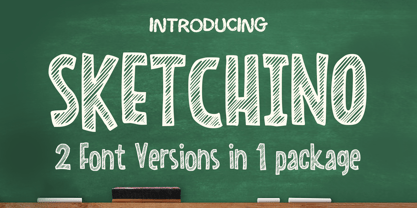 Sketchino is a cool and playful hand drawn font. The font is awesome for creating cool designs that scream for attention. It’s ideal for anything ranging from t-shirts, book designs, restaurant menu, blog writing, greeting cards to stickers, or anything that needs a casual touch. Fall in love with its incredibly cool style, and use it to create lovely designs!
 - Snowy Days by Mvmet,
$10.00 Snowy Days is a cool and playful snow-themed display font. The font is awesome for creating cool designs that scream for attention. It’s ideal for anything ranging from t-shirts, book designs, restaurant menu, blog writing, greeting cards to stickers, or anything that needs a casual touch. Fall in love with its incredibly cool style, and use it to create lovely designs!
 - Merrymakers JNL by Jeff Levine,
$29.00 A throwback design reminiscent of 1950s signage and print ads, Merrymakers JNL takes a previous release (Bluesman JNL) and places the letters and numbers inside parallelograms with ‘TV screen’ openings. Merrymakers JNL is available in both regular and oblique versions. The upper case A-Z characters have the taller side of the shape to the left, while the lower case a-z has the taller side to the right. To make a ‘fan fold’ or zig-zag message, simply alternate upper and lower cases as in this example: C-a-R D-e-A-l-E-r-S You can type spaces between words, but if you prefer blank connectors, use the following: Upper case solid black connector – left bracket key Lower case solid black connector – right bracket key Upper case ‘TV screen’ connector – left brace key Lower case ‘TV screen’ connector – right brace key There is a very limited set of punctuation available. The upper case ampersand, question mark, exclamation point, period, comma, single quote and double quote are all on their respective key positions, but to accommodate the lower case [smaller side] versions, those glyphs have been reassigned to other standard keyboard positions: Type @ to get & Type # to get ? Type $ to get ! Type ^ to get . Type * to get , Type - to get ’ Type = to get ” Additionally, to access the lower case [smaller side] versions of the numerals, type the following keys: Type % to get 0 Type ( to get 1 Type ) to get 2 Type + to get 3 Type / to get 4 Type : to get 5 Type ; to get 6 Type < to get 7 Type > to get 8 Type \ to get 9
 - Affluent by Typodermic,
$11.95 Looking for a typeface that exudes intelligence, sophistication, and technical know-how? Look no further than Affluent—the sleek, modern sans-serif typeface that blends cutting-edge technology with scientific elegance. One of the key features of Affluent is its unique mix of unconstrained vertical lines and perfectly flat, quantized near-horizontal lines. The result is a design that feels both dynamic and precise—perfect for conveying complex technical information with ease. Whether you’re designing materials for a military organization, a scientific research institute, or a cutting-edge technology company, Affluent is the font that will help you make your mark. With four distinct styles to choose from—Regular, Semi-Bold, Bold, and Italic—you can customize your design to perfectly match your brand’s personality and message. So why settle for a boring, generic font when you can choose Affluent and take your design to the next level? Try it out today and see the difference for yourself! Affluent comes in Regular, Semi-Bold, Bold, and Italic styles. Most Latin-based European, Greek, and some Cyrillic-based writing systems are supported, including the following languages. Afaan Oromo, Afar, Afrikaans, Albanian, Alsatian, Aromanian, Aymara, Bashkir (Latin), Basque, Belarusian (Latin), Bemba, Bikol, Bosnian, Breton, Bulgarian, Cape Verdean, Creole, Catalan, Cebuano, Chamorro, Chavacano, Chichewa, Crimean Tatar (Latin), Croatian, Czech, Danish, Dawan, Dholuo, Dutch, English, Estonian, Faroese, Fijian, Filipino, Finnish, French, Frisian, Friulian, Gagauz (Latin), Galician, Ganda, Genoese, German, Greek, Greenlandic, Guadeloupean Creole, Haitian Creole, Hawaiian, Hiligaynon, Hungarian, Icelandic, Ilocano, Indonesian, Irish, Italian, Jamaican, Kaqchikel, Karakalpak (Latin), Kashubian, Kikongo, Kinyarwanda, Kirundi, Komi-Permyak, Kurdish (Latin), Latvian, Lithuanian, Lombard, Low Saxon, Luxembourgish, Maasai, Macedonian, Makhuwa, Malay, Maltese, Māori, Moldovan, Montenegrin, Ndebele, Neapolitan, Norwegian, Novial, Occitan, Ossetian, Ossetian (Latin), Papiamento, Piedmontese, Polish, Portuguese, Quechua, Rarotongan, Romanian, Romansh, Russian, Sami, Sango, Saramaccan, Sardinian, Scottish Gaelic, Serbian, Serbian (Latin), Shona, Sicilian, Silesian, Slovak, Slovenian, Somali, Sorbian, Sotho, Spanish, Swahili, Swazi, Swedish, Tagalog, Tahitian, Tetum, Tongan, Tshiluba, Tsonga, Tswana, Tumbuka, Turkish, Turkmen (Latin), Tuvaluan, Uzbek (Latin), Ukrainian, Venetian, Vepsian, Võro, Walloon, Waray-Waray, Wayuu, Welsh, Wolof, Xhosa, Yapese, Zapotec Zulu and Zuni.
 - Atol by Type & Roll,
$30.00 Atol is a contemporary take on classic didone types. High contrast and modern proportions, combined with subtle details, makes it ideal for characteristic, bold, tightly-set headlines in magazines, branding, animated typography and more.
 - Fifteen36 by Grummedia,
$24.00Inspired by 16th century Venetian roman book texts, Fifteen36 has a traditional elegance and lots of character. Whether used at larger sizes for headings or at book sizes with plenty of leading Fifteen36 has a very attractive old school letterpress appearance. - Tenison by AVP,
$29.00 Tenison is a semi-formal script which echoes the way the designer was taught to write in school. It is not overly decorative and it is highly legible. All lowercase characters link with each other, just as we were taught.
 - Digitalika by PizzaDude.dk,
$15.00 Inspired by some scribbles I made as a young kid in the 80'ies at school - when I should have paid attention to the teacher! Comes with a complete multilingual set of letters with alternate versions of both upper- and lowercase
