648 search results
(0.014 seconds)
- Chick Chack by Almarkha Type,
$23.00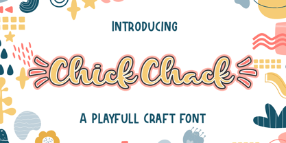
- Chalk And Cheese NF by Nick's Fonts,
$10.00 - Janda Curlygirl Chunky - Personal use only

- LD Charlie Clown by Illustration Ink,
$3.00 - Tallahassee Chassis JNL by Jeff Levine,
$29.00 - Chilli Bezeq MF by Masterfont,
$59.00 - LD Funky Chunky by Illustration Ink,
$3.00 - Charlies BarBQ JNL by Jeff Levine,
$29.00 - LD Charlie Chunk by Illustration Ink,
$3.00 - Charming Charlie PB by Pink Broccoli,
$14.00
- Chunky Nouveau JNL by Jeff Levine,
$29.00
- Hobo Symbols Chaulk by SymbolMinded,
$29.99
- Hacky Sack NF by Nick's Fonts,
$10.00 - Soccerboy by Chank,
$99.00
- Shaky Hand Some Comic by TypoGraphicDesign,
$19.00
- Kegger by Chank,
$59.00 - Woodrow by Chank,
$49.00 - Badoni by Chank,
$49.00 - Jawbox by Chank,
$49.00 - Thymesans by Chank,
$49.00 - Wordy Diva by Chank,
$99.00 - WalrusGumbo - Unknown license

- Ribjoint by Chank,
$39.95
- Coffeedance by Chank,
$49.00 - Fat Legs - Unknown license

- Chow Fun - Unknown license

- Snuggle Punk by PizzaDude.dk,
$17.00
- As of my last update in early 2023, "Chalkie" seems to evoke images of a font that would capture the essence and whimsy of hand-drawn letters, as though crafted by a seasoned artist using nothing but...
- Fatboy Slim BLTC 2 BRK - 100% free

- Stoutface - Personal use only

- Extreme by BA Graphics,
$45.00 - KG Red Hands by Kimberly Geswein,
$5.00
- Gambino by Monotype,
$15.99
- KG Makes You Stronger by Kimberly Geswein,
$5.00
- Mops - 100% free

- PANDA - Unknown license

- CarawayBold - Unknown license

- FATSOcaps - Unknown license

- Refrigeration - Unknown license

- Nocker - Unknown license


