709 search results
(0.038 seconds)
- Rocketman XV-7 NF by Nick's Fonts,
$10.00A Nick’s Fonts original, strongly influenced by the “futuristic” lettering styles of 1930s science fiction, most notably Flash Gordon and Buck Rogers. Both versions of this font contain the Unicode 1252 (Latin) and Unicode 1250 (Central European) character sets, with localization for Romanian and Moldovan. - Inline Square JNL by Jeff Levine,
$29.00 Inline Square JNL is modeled from the hand lettered title found on the 1935 sheet music for "Cielito Lindo (Beautiful Heaven)", and is available in both regular and oblique versions.
 - Manlychalk by Allouse Studio,
$16.00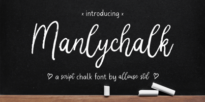 Proudly Presenting, Manlychalk A Script Chalk Font. Manlychalk is perfect for any titles, logo, product packaging, branding project, megazine, social media, wedding, or just used to express words above the background. Manlychalk also come with Multi-Lingual Support. Enjoy the font, feel free to comment or feedback, send me PM or email. Thank You!
 - Chalkvibes by Allouse Studio,
$16.00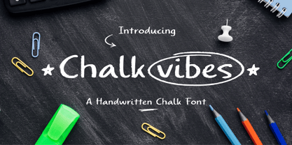 Proudly Presenting, Chalkvibes A Handwritten Chalk Font. Chalkvibes is perfect for any titles, logo, product packaging, branding project, megazine, social media, wedding, or just used to express words above the background. Chalkvibes also come with Multi-Lingual Support. Enjoy the font, feel free to comment or feedback, send me PM or email. Thank You!
 - Pennychalk by Allouse Studio,
$16.00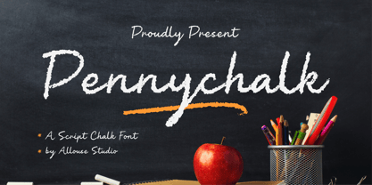 Proudly Presenting, Pennychalk A Script Chalk Font. Pennychalk is perfect for any titles, logo, product packaging, branding project, megazine, social media, wedding, or just used to express words above the background. Pennychalk also come with Multi-Lingual Support. Enjoy the font, feel free to comment or feedback, send me PM or email. Thank You!
 - Karara Shadow by Kufic Studio,
$20.00 Karara Shadow, a complete font set and additional font style of Karara. The word Karara means patience & steady. The style is achieved by practicing and studying the modern techniques to deliver high-end professional font. This specific font had a tint of wall chalking & texture. Carefully engraved and stenciled to delivery clean cuts and design.
 - Worldchalk by Allouse Studio,
$16.00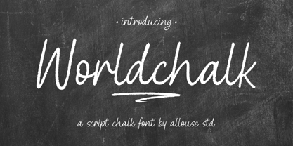 Proudly Presenting, Worldchalk A Script Chalk Font. Worldchalk is perfect for any titles, logo, product packaging, branding project, megazine, social media, wedding, or just used to express words above the background. Worldchalk also come with Multi-Lingual Support. Enjoy the font, feel free to comment or feedback, send me PM or email. Thank You!
 - Gradechalky by Allouse Studio,
$16.00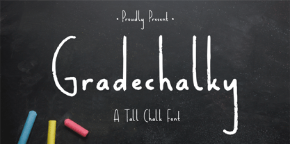 Proudly Present, Gradechalky A Tall Chalk Font. Gradechalky is perfect for any titles, logo, product packaging, branding project, megazine, social media, wedding, or just used to express words above the background. Gradechalky also come with Multi-Lingual Support. Enjoy the font, feel free to comment or feedback, send me PM or email. Thank You!
 - Onlychalk by Allouse Studio,
$16.00 Proudly Presenting, Onlychalk A Handmade Chalk Font Onlychalk is perfect for any titles, logo, product packaging, branding project, megazine, social media, wedding, or just used to express words above the background. Onlychalk also come with Multi-Lingual Support. Enjoy the font, feel free to comment or feedback, send me PM or email. Thank You!
 - Musical Prelude JNL by Jeff Levine,
$29.00 Musical Prelude JNL is a thin Art Deco typeface with some interesting character shapes, and was inspired by the hand lettering on the cover of the 1933 sheet music for "Blue Prelude" by Gordon Jenkins and Joe Bishop. It is available in both regular and oblique versions.
 - ZionTrain Basic by AndrijType,
$25.00Originally ZionTrain was built as a Cyrillic typeface for public transport navigation system. We wanted comprehensible, distinctive letterforms, that can help everybody on the way from Babylon to Zion. Here, on MyFonts, we present the ZionTrain STD versions with western latin including smallcaps and oldstyle figures in some faces in TrueType format; also western, central, baltic and turkish latin charsets, smallcaps, oldstyle numerals, few alternates, some arrows and fractions in ZionTrain OT OpenType format. - Hello Crimsons by Gilar Studio,
$16.00 HELLO CRIMSONS was inspired by a recent trip to London, England where I happened upon a bustling pub with beautiful typographic signage. HELLO CRIMSONS delivers a multitude of Opentype features, For a number of capital and lowercase letters, large swashes expand above and below the characters. Contextual swashes are also applied to some characters when placed at the beginning or end of a word. This font is made in a modern style with a very beautiful beginning and ending.elegantly,very casual and suitable for your various design needs I'ts.Perfect for logo,branding, tittle, social media posts, advertisements, product packaging, product designs, label, photography, watermark, special event,magazine,web design. Included: multilingual support beginning and ending swash Check my other Font here https://gilarstudio.com/
 - NewLibris by Hubert Jocham Type,
$39.00 The first version of Libris I designed in London in 1997 when I worked for Frank Magazine. Later Libris was used in the magazine for text and display. In 1999 Libris was chosen as the corporate typeface of Bally Switzerland. I also was involved in the design of the entire branding. NewLibris is the version that was published in my own shop. - What was the inspiration for designing the font? NewLibris is an elegant contemporary easy to read sans serif. It has a wide variety of weights and proportions that are easy to use in corporate branding and magazines. - What are its main characteristics and features? contemporary humanist legible sans serif - Usage recommendations: corporate branding and magazines and other publications
 - Rowan Oak NF by Nick's Fonts,
$10.00This “very elegant and British alphabet” was originally released in the 1920s as "Richmond Oldstyle" by the Blackfriars Type Foundry of London. Touted as highly artistic and graceful, it is exceptionally “at home” wherever style and charm are called for. Both versions of this font contain the complete Unicode Latin A character complement, with support for the Afrikaans, Albanian, Basque, Bosnian, Breton, Catalan, Croatian, Czech, Danish, Dutch, English, Esperanto, Estonian, Faroese, Fijian, Finnish, Flemish, French, Frisian, German, Greenlandic, Hawaiian, Hungarian, Icelandic, Indonesian, Irish, Italian, Latin, Latvian, Lithuanian, Malay, Maltese, Maori, Moldavan, Norwegian, Polish, Portuguese, Provençal, Rhaeto-Romanic, Romanian, Romany, Sámi, Samoan, Scottish Gaelic, Serbian, Slovak, Slovenian, Spanish, Swahili, Swedish, Tagalog, Turkish and Welsh languages, as well as discretionary ligatures and extended fractions. - Luke by The Northern Block,
$49.50 Luke is a contemporary adaptation of historic English Blackletter, inspired by the creativity of leading English type-creator: Caslon Foundry. Their highly unique 19th century Blackletter typeface provided the core elements of Luke, with the name paying tribute to the Caslon family tomb in the churchyard of St Luke Old Street in London. This modern and versatile type family offers a wide range of styles — from thin to thick contours, and with half-filling to complete — allowing it to work best for headlines, short text and branding. Details include twelve styles and 641 glyphs. Opentype features include superscript, denominators, numerators, scientific inferiors, ordinals, stylistic alternatives, case-sensitive forms, fractions, contextual alternates and discretionary ligatures. Luke supports 37 languages, covering South, East and Western Europe.
 - Capital Love by Harald Geisler,
$68.34 Capital Love just contains capital letters decorated with hearts. By pressing a lowercase button a alternative to the uppercase letter will appear. All shapes are drawn individually and do not oblige a geometrical system. The lighthearted vivid ductus remind me of a quality that can be found in the dynamics of Keith Haring drawings. Capital Love is a part of the Light Hearted Font Collection that is inspired by a recording of Jean Baudrillard with the title, "Die Macht der Verführung" (The Power of Seduction) from 2006. Further inspiration came from the article, "The shape of the heart: I'm all yours". The heart represents sacred and secular love: a bloodless sacrifice. by British writer Louisa Young printed in EYE magazine (#43) London, 2002.
 - Shentox by Emtype Foundry,
$69.00 During a visit to London in 2008 I fell in love with the square font used on the British car number plates. I was immediately inspired to start working on this font and have been developing it intermittently ever since. Several more trips to London and the project evolved before it finally took off and became Shentox. Despite the starting point being inspired by simple, everyday car plates, the font soon evolved into something fine and very rich in detail. Even though the square genre is very restrictive, Shentox is a highly legible contemporary font with a full range of weights, useable not only as a display family for headlines and posters, but as a distinct, clean font family for branding and general editorial use (Especially magazines). It has been carefully drawn paying extra attention to the details, high end finishes that makes Shentox a safe font for use in large scale work. For example, the curves of every individual corner have been adjusted character by character to avoid the common problems encountered with square fonts (Eg. darker corners between weights or a visually inconsistent radius between the Upper and Lowercases as a result of copy/paste). Shentox italic, which has a 12 degree slant, has been corrected to avoid distortion when slanted. The radius of the upper-right and lower-left corners are more pronounced, giving it a more fluid Italic feel. Shentox is available in Open Type format and includes ligatures, tabular figures, fractions, numerators, denominators, superiors and inferiors. It supports Central and Eastern European languages. This type family consists of 14 styles, 7 weights (Thin, UltraLight, Light, Regular, Medium, SemiBold and Bold) plus italics. Shentox PDF
 - Fat Ink by High Peak,
$20.00 This handwritten font is as juicy as the strokes from a fat marker! Unpredictable but harmonious, the lines and shapes give this font a fun, funky vibe. Perfect for creating logos, charts, pricing, and more. Full uppercase and lowercase, it supports several languages, lots of discretionary ligatures, and alternatives that combine with each other. Have fun! High Peak
 - Farmhouse Chalkboard by Allouse Studio,
$16.00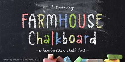 Proudly Presenting, Farmhouse Chalkboard A Decorative Chalk Font. Farmhouse Chalkboard is perfect for any titles, logo, product packaging, branding project, megazine, social media, wedding, or just used to express words above the background. Farmhouse Chalkboard also come with Multi-Lingual Support. Enjoy the font, feel free to comment or feedback, send me PM or email. Thank You!
 - Nautical Doodles by Outside the Line,
$19.00 Sail the seas with Nautical Doodles. This seaworthy font has 32 illustrations of water craft, anchors, star, compass, flags, whale, shark, birds, starfish, seahorse, rope etc. Even a mermaid... and the scripted word Ahoy! If you would like the character chart go to the Gallery Tab and print. (PDFs are no longer downloaded with the font.)
 - Uncertainty by Okaycat,
$25.50 Uncertainty 2010 Edition is an intensely textured typeface carefully rendered by hand. This font is faded with a chalk-like texture. Please be aware that working with this highly detailed font may slow some graphics software as it requires more memory. Uncertainty is extended, containing West European diacritics and ligatures, making it suitable for multilingual environments and publications.
 - P22 Hiromina 03 by IHOF,
$24.95 Hiromina03 is named after the wife of its designer, Hajime Kawakami. The three fonts in the set are based on Hiromi Kawakami's unique hand-lettering style. The distinctly feminine character of Hiromina03 is harmoniously integrated in all three writing systems, Katakana, Hiragana and Latin. The enclosed key charts give instructions for character placement in Katakana and Hiragana.
 - Okay Crayon by Okaycat,
$29.95 One waxy black crayon was used up, entirely down to the tiniest nub, by the making of this font. It’s fun! Perfect for creating crayon written text, or to get the look of chalk-board writing, conte, or charcoal. Okay Crayon is extended, containing West European diacritics & ligatures, making it also suitable for multilingual environments & publications.
 - MUNIficent - Unknown license

- Walls by Piñata,
$8.00 What do you use to write a price tag at a store or to design a wall menu in a cafe? What to choose – a marker or chalk? Now it makes no more sense to be torn apart by the choice – use both techniques for your design. Walls fontfamily allows to perfectly combine an eco-friendly style with contemporary motives. Walls fontfamily supports over 70 languages and consists of 10 typefaces in 5 popular weights (Thin, Light, Regular, Bold, Black). Initially we wanted to create a font that would imitate an inscription made by a square tip marker which is usually used to write price tags at supermarkets, shops and cafes. During the working process we've decided to extend the conceptual boundaries of the Walls fontfamily and added 5 rough typefaces that imitate the style of ecologic chalk writing
 - HU Garaetteok KR by Heummdesign,
$25.00 It is a cute headline font with straight strokes and rounded ends, giving it a rice cake feel. The initial and final consonants 'ㄹ' were designed differently to give a fun sense of rhythm, and the straight strokes and lively curves added personality to the writing. It contains Hangul, Korean.
 - Bogart by Zetafonts,
$39.00 All the nine weights of Bogart, as well the matching true italics forms, feature an extended charset of over 1600 glyphs, covering 219 languages using latin, cyrillic and greek alphabets, and sporting a complete set of Open type features. To add flexibility for editorial usage, a text-oriented Bogart Alternate set of nine weights was added to the family keeping the design more similar to its modern old style model and allowing for a heavy readable mid-weight range.
 - Ah, the distinguished PaddingtonSC, a font that carries an air of mystery, sophistication, and a touch of whimsy, much like a well-dressed gentleman who knows how to tell a captivating story. If font...
- Isonorm by Linotype,
$29.99Isonorm was created in 1980 by the International Standards Organization (ISO). The font's design is simple, clean, and geometric, with strokes that all have rounded ends. Isonorm is a font whose forms are very legible by both the human eye and machine readers. The font is also a good choice for drafting and architectural purposes, as well as for technical charts and graphics. - Skinny Pencil by Mvmet,
$16.00 Skinny Pencil is a skinny handwritten font with pencil or chalk texture that you can use it for anything ranging from t-shirts, book designs, packaging, and greeting cards to stickers and posters, or anything that needs a casual touch, it will be your perfect font to pick. Fall in love with its incredibly versatile style, and use it to create lovely designs!
 - English Engravers Roman by Smith Hands,
$38.00 English Engravers Roman is inspired by the beauty and eccentric detailing of British stone carved lettering. After observing many beautiful inscriptions around London and southern England, Robbie Smith decided to create a font family in homage to this rich heritage. English Engravers Roman features a set of beautifully balanced uppercase Roman, and a characterful lowercase alphabet with some endearing quirks. Included in the each font are two forms of lowercase 'q', one very similar to an uppercase 'Q' with a tail, and a traditional 'q'. Each font in the family features a comprehensive character set with many ligatures, added to enhance letter spacing. The fonts all feature an additional set of old style numerals. Many extra characters and ligatures can be accessed via the 'insert glyph' functions in graphic design software.
 - Arpona Sans by Floodfonts,
$49.00 Arpona Sans is a contemporary sans serif family inspired by the work of Edward Johnston and Eric Gill for London Underground. As well as its serif companion Arpona it is a symbiosis of different design concepts. Arpona Sans combines the esthetics of a geometric Sans with the usefulness of the humanist concept and the calm of the modernist proportions. Arpona Sans is a good choice for editorial design, branding, app design and web design – a workhorse well readable even in running text on screen. The family has nine weights, ranging from Thin to Black plus corresponding italics. Each style includes 590 glyphs supporting all western-, eastern- and central-european languages including four sets of figures and various currency symbols. If you want to go into details visit the microsite: https://www.floodfonts.com/arponasans
 - Marylebone by Los Andes,
$39.00 Marylebone is a font duo inspired by its namesake neighborhood, located in central London. Marylebone was designed to compose short text for advertisements, blackboards and shop windows in coffee shops, small bookstores, flower shops and local shops. The set is made up of a hand made brush script, composed of 519 characters including ligatures, initials and terminals; as well as a very clean, geometric unicase sans serif with some alternates and ligatures that can double as monograms, it also includes a hand-drawn floral dingbat set. Marylebone allows you to design beautiful compositions for packaging, advertising, quotes, wall art, branding, photography overlays, magazines, motion graphics, scrapbooking, planners, window art, tags, tote bags and much more, thanks to its irregular appearance that gives a unique personality to your design projects.
 - Gravesend Sans by Device,
$39.00 Smart, legible and elegant, Gravesend Sans is a based on the unique typeface used for the iconic grass-green signage for the Southern Railway. In existence from 1923 to 1948, when the network was nationalised, the Southern Railway linked London with the Channel ports, South West England, the South coast resorts and Kent. The same design was also used for the ‘hawkeye’ signs on the London, Midland and Scottish Railway, differentiated by black letters on a yellow background. Reference for each letter was taken from vintage ‘target’ station nameplates and other platform signage. The rarest letters were the Q, seen in Queens Road Battersea, the X, seen in East Brixton, and the Z, used in Maze Hill, site of an infamous train crash in 1958. Being hand-made, the letters often differ in width and thickness. There was no lower case. The Bluebell Railway, a heritage steam line, runs over part of the old Southern Railway network and uses a very similar type. The design of the numbers differed considerably, but here have been taken from the Device 112 Hours font Smokebox. As well identifying platforms, they were used on the front of the steam engine’s smokebox, hence the name, and stylistically are more in keeping with the letters than some of the squarer versions that can be seen in old photographs. William Caslon IV is credited with the first Latin sans-serif type, shown in a 1816 Caslon specimen book. ‘Two Lines English Egyptian’, as it was called, was caps-only, and there are several other correlations between that type design and this one. Includes a selection of authentic arrows and manicules, plus abbreviated ligatures such as ‘St.’ (Saint or Street) ‘Rd.’ (Road) and ‘Jn.’ (Junction). The Cameo version includes many graphic banner elements that can be freely combined.
 - Austin Antique by HiH,
$10.00 “More is better” may have been the motto of Richard Austin of Austin and Son’s Imperial Letter-Foundry on Worship Street at Finsbury Square in London when he designed and cut his Antique typeface. The year it was created is uncertain, but it is known to have appeared in a specimen book produced in 1827. At first glance, the upper case letters of Austin Antique look very much like Figgins Antique. But, upon examination, one will note that the Austin face is much darker. In general, the letters designed and cut by Richard Austin have fatter strokes, larger serifs and smaller counters -- more metal and less daylight. The premise was that the darker the letter, the more attention an ad using the typeface would receive. In old pictures of London and Paris one may see walls crowded with posters and “bills” -- competing for the attention of the passerby. Morris and Updike aside, the early nineteenth century marked the beginning of a commercial as well as industrial revolution. Patterns of commerce were changing. With new methods of marketing came the need for new typefaces to support the new methods. Foundries found the display types were very profitable and competed most energetically and creatively for the trade. There was a lot of trial-and-error. Some ideas faded away. Others, like the Antiques or Egyptians, were refined and developed. From them came the Clarendons that were to prove both popular and long lasting -- because they worked. Their job was to sell goods, not please the aesthetic sensibilities of the critics. They did their job well. Austin Antique has a full Western European character set, plus the following ligatures: ct, st, fi, fl, ff, ffi and ffl. Tabular numbers. Surprisingly readable.
 - ITC Bolthole by ITC,
$29.99I fell in love at the age of twelve in Wales, recalls Bernard Philpot. "My father brought me to a small graveyard in the Welsh hills to show me two headstones carved by the great Eric Gill. I instantly fell in love with the beauty of the carving and the perfection of the letterforms. I still go back to marvel at these works of art." However, the ITC Bolthole™ design, Philpot's first commercial typographic endeavor, is quite unlike the works of Eric Gill that first captured his heart. Bolthole is a craggy sans serif with a definite grumpy attitude. It's not terribly legible, and, if more than a few words are set in the design, it's not very readable. To round out its cranky personality, Bolthole does not like to be set in small sizes. Like Cheez Whiz® and bullfights, you either love or hate this typeface. But whichever emotion dominates, there is no denying that Bolthole has a personality to be reckoned with - one with ample magnetism to ensure reader attraction. If used to set brief blocks of display copy, the typeface makes a powerful statement. Bolthole was originally designed to complement a whimsical ad for the Royal Society for the Prevention of Cruelty to Animals. As Philpot recalls, "although the ad didn't win any awards, the type attracted some very positive comments for its original look and feel." Philpot studied graphic design and typography at the London School of Printing, and soon after graduation found himself working in a large advertising agency in London. According to Philpot, "After designing type for everything from packaging to ads, I thought it time to convert one of my designs into a complete font - and Bolthole was born." ITC Bolthole could very well be the Shrek™ of typeface design - which might not be such a bad thing." - Pincoya Black Pro by Latinotype,
$49.00 Pincoya Black Pro is a font based on lettering found on a poster from the Spanish Civil War, complemented with graphics developed in “La Unidad Popular” (Chilean political coalition) during the seventies. Pincoya has many alternate characters in Opentype format that provide multiple options when composing a text. It is an ideal font for high impact sentences, logotypes, magazine layouts, poster designs, etc. Languages include: Basic Latin, Western European, Euro, Catalan, Baltic, Turkish, Central European, Romanian and Pan Africa Latin.
 - Resistance Is by Comicraft,
$19.00 You will not move. You will not breathe. You will not think. You WILL buy this font. You are our prisoner. There is no escape... RESISTANCE IS FUTILE! Also Useless. RESISTANCE IS… was created for the voice of the evil robot Sentinels in X-MEN: AGE OF APOCALYPSE, and later used for the friendly robot in BATTLE CHASERS and robot police in ELEPHANTMEN. A font for all your robot needs! See the families related to Resistance Is Futile and Useless: Resistance is Lowered
 - ZionTrain by AndrijType,
$33.00 Originally ZionTrain was built as a Cyrillic typeface for public transport navigation system. We wanted comprehensible, distinctive letterforms, that can help everybody on the way from Babylon to Zion. Here, on MyFonts, we present the ZionTrain STD versions with western latin including smallcaps and oldstyle figures in some faces in TrueType format; also western, central, baltic and turkish latin charsets, smallcaps, oldstyle numerals, few alternates, some arrows and fractions in ZionTrain OT OpenType format. Look how people use it: http://use.type.org.ua/tagged/ziontrain
 - FS Sammy by Fontsmith,
$80.00 Chalky Spritely and full of personality, FS Sammy is a hand-drawn font with a chalky texture, available in one weight only. Give Sammy a run in branding, packaging or billboard advertising for a fresh, informal, honest personality. Calligraphic Too many script fonts have a rushed and thrown-together feel about them. It’s a deceptively complex feat to achieve forms that hold together neatly in text yet still have the breezy, natural air of real handwriting. That’s FS Sammy: considered and crafted. Pencil FS Sammy was originally drawn for a drinks manufacturer by Fontsmith’s calligrapher, Sehmi Satwinder, who made handwritten impressions with a large soft pencil on textured watercolour paper. The digital interpretation of Sehmi’s letters was pushed to its limits and, after a lot of experimentation, a balanced alphabet was achieved. Texture and spirit FS Sammy’s success and uniqueness within the script font category is down to its versatility. In the large text of billboard advertising or headlines, all of its texture comes to life, and small, on menus or booklets, it conveys all of the spirit and personality of a considered piece of handwriting.
