6,603 search results
(0.039 seconds)
- LTC Forum Title by Lanston Type Co.,
$24.95 Forum Title was originally designed by Frederic Goudy in 1911. It was intended to be the heading font used for a book set in Kennerley. Based on inscriptional Roman stone cut capitals, this face is true to the early Roman forms which did not have a lower case. Forum exemplifies the classic Roman letterform at its finest. If a lower case were desired, Forum Title can be paired with Goudy Oldstyle for a harmonious hybrid font.
 - Linotype Technical Pi by Linotype,
$40.99The Linotype Technical Pi font includes a variety of characters for technical areas, especially for the field of electrical engineering. Among other symbols are those for AC and DC, certifications, and a number of others which illustrate technical terms, warnings and information. Technical Pi also includes the modern symbols which have become a part of everyday life, like environmental and recycling characters. General characters like fax and telephone symbols complete the symbol palette of Linotype Technical Pi. - Jilliankrots by Maulana Creative,
$12.00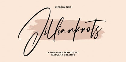 Jilliankrots is a signature script font, With fancy slanted and fun characters. It has Opentype features of ligatures, makes it a perfect choice for branding and digital designs. Use this font for logos, social media, websites, blogs, instagram, social media, business cards, branding, and more! Jilliankrots font support multilingual more than 100+ language. and good pair for your secondary text font with sans or serif. Make a stunning work with Jilliankrots signature script font. Cheers, MaulanaCreative
 - Miramar by Linotype,
$29.99Miramar font has elegance in every detail, which means that it isn't very easy to use. I like it very much, but would use it myself on rare occurencies, for very special tasks and even then in small portions. The name refers to the castle of Miramar just north of Trieste on the Adriatic coast, once the weekend resort of the Austrian imperial family. Now it is a museum with a marvellous park. Miramar was released in 1993. - Southern Clan by IKIIKOWRK,
$17.00 Proudly present Southern Clan - Retrotype, created by ikiiko. A expressive handwriting type with a 80's street graffiti shape. This type is very suitable for making a poster, t-shirt design, magazine header, brand logo, sleeve cover, party flyer, quotes, or simply as a stylish text overlay to any background image. What's Included? Uppercase & Lowercase Numbers & Punctuation Alternates & Stylistic Multilingual Support Enjoy our font and if you have any questions, you can contact us by email : ikiikowrk@gmail.com
 - VLNL Dream Meal by VetteLetters,
$6.00 Nowadays, everything is ‘In The Cloud’. So why not put information in clouds directly? Here it is: a happy dreamy cloudy font. It’s called Dream Meal. Don’t read, just dream away; about nice food and typographic sensations. You can set whole texts 'in the cloud'. Every character makes up a part of a cloud. The clouds can float to the left or to the right. It’s an Open Type font. Actually: This font is a dream!
 - Beaverist by Popskraft,
$18.00 The Beaverist belongs to the group of handwritten fonts and is inspired by the culture of small and cute villages located far from big cities, almost as a part of nature. Beaverist does not have the pompousness of calligraphic fonts, but it has the warmth and softness of natural forms that we rarely meet in our hectic life. So if you want a simple and easy-to-read handwritten font, don't hesitate, the Beaverist font is your choice.
 - Amorflavor by Maulana Creative,
$12.00 Amorflavor is a modern script font, With a clean stroke and fun character. It has Opentype features of ligatures, makes it a perfect choice for branding and digital designs. Use this font for logos, social media, websites, blogs, instagram, social media, business cards, branding, and more! Amorflavor script font support multilingual more than 100+ language. and good pair for your secondary text font with sans or serif. Make a stunning work with Amorflavor script font. Cheers, MaulanaCreative
 - Cowboy Lament JNL by Jeff Levine,
$29.00 A lament is a sad song, and the music of the cowboys of the Old West had their fair share of them. However, a vintage piece of sheet music from the early part of the 20th century with the title "The Dying Cowboy" brought at least one positive trait to its mournful song. The title lettering was drawn in a fashion that emulated lettering made with quick strokes of a paintbrush, and became the inspiration for Cowboy Lament JNL.
 - Ovane Regular by Tebaltipis Studio,
$13.00 Ovane a new fresh & modern Sans serif with a strong style, a dancing baseline! So beautiful on invitation like greeting cards, branding materials, business cards, quotes, posters, and more! Ovane Clean Display Typeface is the part of a strong and modern Bold display. This typeface both impressive at display sizes and easily readable in text size, while the sharp shapes of the triangular serif and the distinctive letter shapes show their strength in logo design and impressive editorial use.
 - Kiddo by EPtackArts,
$3.00 Kiddo is a whimsical, handwritten font family created for use along side children's media. It pairs nicely with Monterrat and other neat, rounded sans serif fonts. It looks great with brightly colored, soft illustrations to create lively layouts full of movement. The characters are simple and easy to read as to not compete with the semi-inconsistent baselines and stroke weights. The line variations add a lot of character to the typeface that really compliments a good story.
 - De Bambeet by Zamjump,
$17.00 De Bambeet is a serif font that has a little style compared to other serifs, with multiple languages, alternate and also ligature is quite cool and suitable to be paired in various media like a posters, wedding invitations, craft products, book covers, photography, t-shirts , product packaging and other media. By using De Bambeet, I am sure that your products will look elegant, classic and luxurious. Font Featured : Uppercase Lowercase Numbers Symbols Punctuations Sylistic alternates Discretionary Ligatures
 - Schnitz by Linotype,
$29.99Linotype Schnitz is part of the Take Type Library, selected from the contestants of Linotype’s International Digital Type Design Contests of 1994 and 1997. Designed by the Finnish artist Osmo Niemi, the characters seem to contain no round forms at all. Linotype Schnitz looks as though it were chiseled and has an angular, almost brittle feel. The restless and lively appearance makes Linotype Schnitz particular well-suited to headlines and shorter texts with point sizes of 12 and larger. - Dwiggins Deco by MADType,
$21.00 This typeface was originally designed in 1930 by W.A. Dwiggins as the cover for the book American Alphabets by Paul Hollister. Only the 26 letters of the alphabet were included on the cover, so the rest of the numbers, punctuation, symbols, and accented characters have been crafted in a matching style. This strongly geometric Art Deco lettering style has been lovingly revived and is now available as an OpenType font. Over 3,300 kerning pairs are included.
 - Alexandria Eschate by Factory738,
$15.00 Alexandria Eschate Font Duo is a contemporary pair of script and serif fonts. Its offers beautiful typographic harmony for a diversity of design projects, name card, headlines, branding visual identity, poster, logo, magazines and etc. 2 fonts (Script and Serif) Basic Latin A-Z and a-z Numerals & Punctuation Stylistic Alternates Multilingual Support for ä ö ü Ä Ö Ü ... OTF file format Free updates and feature additions Thanks for looking, and I hope you enjoy it.
 - Sofimaria by Qaratype,
$18.00 Sofimaria is a super unique ligature font that you wont forget! It’s a high contrast serif that has loads of style. A modern take on a Caslon style typeface, this font is ideal for those bold headings or wedding invitations. It’s got hundreds of characters and ligatures plus all those European letters! Sofimaria pairs perfectly with a light scripts font or minimal sans serif. Main Features: Uppercase & Lowercase letters Punctuation and special characters Multilingual support Ligatures & Alternate glyphs
 - Dinzy Minzy by The Printers,
$20.00 If you are looking for an expressive, witty and whimsical typeface, Dinzy Minzy will beckon to a change of pace for any designer looking to create space, time and lighthearted imagery. This typeface draws you into the message of the mind, lending fresh, new life to party, holiday and grand opening invitations. Whether it's a poster, a billboard, or the card in the mail, Dinzy Minzy will be sure to capture attention and turn on the senses.
 - Funky Retrovy by IbraCreative,
$17.00 Funky Retrovy is a groovy and energetic font that perfectly captures the essence of retro nostalgia. With its funky and whimsical letterforms, this typeface exudes a vibrant and carefree spirit reminiscent of the colorful era it celebrates. Each letter boasts bold and playful curves, inspired by the iconic designs of the past. Funky Retrovy adds a touch of fun and funkiness to any project, making it ideal for eye-catching posters, vibrant branding, and retro-themed party invitations.
 - Phaserwave by Mysterylab,
$22.00 Part of the wave of modern explorations expanding on the 50+ year-old traditions of groovy psychedelic typography, Mysterylab brings you Phaserwave. With an intriguing fusion of pillowy shapes and sharp stroke ends, this font cooks up a heady mélange of whimsical flow and high precision. We've applied our usual meticulous attention to great kerning, extensive character set, and seamless functionality, so this font's ready to rock your designs any way you might want to do it.
 - ReadMyHand by Linotype,
$29.99Linotype Read My Hand is part of the Take Type Library, selected from contestants in Linotype’s International Digital Type Design Contests of 1994 and 1997. It is the digitalized handwriting of its Dutch designer, Leon Hulst. As is common of handwriting fonts, the forms of the letters seem spontaneous and individual. Read My Hand is a dynamic font suitable for texts with point sizes larger than 12 and particularly good for documents which should have a personal touch. - Linotype Gneisenauette by Linotype,
$29.99 Linotype Gneisenauette is part of the Take Type Library, selected from the contestants of Linotype’s International Digital Type Design Contests of 1994 and 1997. The handwriting font was designed by Latvian artist Gustavs A. Grinbergs and is available in eight weights. Linotype Gneisenauette is a dynamic font which also reflects a bit of the optimistic spirit of the 1950s. The font is best used for headlines or middle length texts with a point size 12 or larger.
 - Baby Algutta by IM Studio,
$19.00 Baby Algutta is a modern, handwritten and modern calligraphy font. The shape is modern and unique and the writing style is very natural. The Baby Algutta features a varied baseline, smooth lines, beautiful glyphs, and amazing alternatives. Hand-drawn design elements allow you to create many beautiful typographic designs in an instant such as branding, web and editorial design, prints, crafts, quotes, It's great for logos, wedding invitations, romantic cards, labels, packaging, name spelling, and more. Thank you.
 - Salacious by PizzaDude.dk,
$18.00 Salacious is my soft/rough all-caps font, inspired by both comics and grafitti. The weight and width of the letters varies a bit. Not in a disturbing way, but more in a lively and organic way. I've added 5 (slightly) different versions of each letter (which automatically cycles as you type!) The letter shapes are a bit rough, due to the fact that they are handmade, and all corners are rounded, which gives a nice soft look!
 - Novaletra Sans CF by Connary Fagen,
$25.00 Smooth brushstrokes inform the construction of Novaletra Sans. As Novaletra Serif's sister typeface, Novaletra Sans shares its easy readability and excellent performance in a humanist design. Subtle flares and low stroke contrast provide warmth uncommon in sans-serif font families. Novaletra Sans CF pairs well with simple sans-serifs like Articulat® CF, or with detailed and airy display type like Quiverleaf® CF. All typefaces from Connary Fagen include free updates, including new features, and free technical support.
 - Calla Script by Great Lakes Lettering,
$30.00 Calla is a scripted typeface with an interesting personality. Each letter was created many times so you can get a truly distinctive look to your designs. Notice when you type with open type feature switched on, your letters will bounce around and change as you type? This feature ensures you get a new version of each letter throughout the words you use! Want to get even more custom? Pair all caps words with your lowercase words to create hierarchy!
 - Ah, Inspector 39! If fonts were guests at a soiree, Inspector 39 would saunter in with the mysterious allure of a noir detective, blending the charm of classic cinema with the intrigue of a whodunit....
- FHA Condensed French by Fontry West,
$25.00 FHA Condensed French One could speculate that FHA Condensed French probably started life as wood type for displays, headlines and posters. The exaggerated sharp serifs and condensed forms were not uncommon for that period. At some point, sign painters picked up Condensed French added their own character. At the end of the nineteenth century, Frank H. Atkinson included Condensed French in his samples of lettering for his book, ”Sign Painting, A Complete Manual.” This book became one of the definitive guides for signwriting and hand lettering. In 1999, Mike Adkins digitized Condensed to add to our Atkinson collection. For its re-release, Condensed French has been updated with more language support, ligatures, and OpenType alternates. It has true vintage character but still plays well in more modern designs. A font for all seasons, the condensed forms and sharp serifs fit in every layout from wildwest days posters and creepy film credits to Christmas ads and Mother’s Day cards. While I can’t really see FHA Condensed French as the font for phone aps or video game text, it will provide impact to logos, branding, and product labeling.
 - Mislab Std by Typofonderie,
$59.00 A brighter slab n’ sans in 18 styles Referred to as Egyptian’s in the early years of the nineteenth century, today slab serifs are primarily used in display sizes but seldom used in body text. With Mislab, Xavier Dupré has designed a brighter and more legible slab serif than most. Mislab aptly combines the strength of a slab serif with the lightness of a sans serif. Bold and thick serifs make for strong impact in display uses while performing extremely well under the most stressful body text conditions. A slight cursive feel adds spice to the text while its delicate rounded rectangular structure is naturally adapted to screen displays. The capitals have fully assumed serifs while the lowercases have more discreet versions. Notable features include sanserif endings on the lowercase a, c, e & s, inducing fluidity and enhanced readability. This highly versatile typeface brings clarity to headlines. Mislab will provide foolproof stability to your layouts. Mislab, a new design by Xavier Dupré Type Directors Club 2014 Tokyo TDC 2014 Communication Arts Typography Awards 2014 Club des directeurs artistiques, 45e palmarès Slanted: Contemporary Typefaces #25
 - Plethora by Sudtipos,
$49.00 A few years ago I've discovered the work of one of the most prolific typeface designers of the Bruce type Foundry in NYC during late nineteenth century. Browsing Julius Herriet's work I found a very unique kind of ligatures in his patented "Old Style Ornamented" type design. Some letters were designed with a little top tail that allowed them to connect to each other. After that, I found that he also designed a single italic weight of the same font 7 years later. Since the beginning of the Opentype days I’ve been deeply obsessed with exploring different ways to build ligatures, so that lead me up to this point where I felt the need to create “Plethora”, this new font inspired by Herriet’s work. Extrapolating weights, adding variable technology and playing with additional interconnected letters and alternates. Definitely, Plethora means a large or excessive amount of something, and this font tries to bring back this abundance of details two centuries later. Available in 9 weights, from roman to italic, and also as variable format, “Plethora” supports plenty of latin languages and is a perfect choice for today’s design tides.
 - Presley Slab by Sudtipos,
$49.00 The lightest weight of Presley Slab takes inspiration from a late nineteenth-century type specimen, but what began as a decorative and delicate contrasted serif stirred Alejandro Paul’s imagination to conjure voluptuous reverse contrasted letterforms. These became the heaviest weight of Presley Slab, which nods to the lacquered hairstyles from the birth of rock ’n roll with its idiosyncratic ball terminals. Its playful allure and swagger remains visible in the weights that stand between these two extremes but as the curls loosened, many things happened in the design process including the appearance of swashes and alternates. Presley Slab’s personality has breadth; it is a fun, confident and contemporary palette of letters that will perfectly perform for any job, from editorial design to branding. The Extra Bold and Black weights are a powerful option at large sizes for use on posters and billboards; the graceful Thin and Extra Light weights are delicate options for packaging design or fashion branding. Despite it conjuring images of mid-century music halls, Presley Slab is also staunchly European in it’s aesthetic, offering everything from good-humour to elegance with its unique touches.
 - ITC Pino by ITC,
$29.99The ITC Pino™ typeface family is Slobodan Jelesijevic’s second suite of commercial fonts. Although a small family of three weights, it is remarkably versatile. Like many typefaces, Pino grew out of a desire for a particular kind of design. Jelesijevic was creating a series of illustrations for a children’s magazine and needed a typeface that was lighthearted, legible and would complement his illustrative style. Unable to find exactly what he needed, he decided to make his own font. “I spent the better part of a day looking for just the right typeface,” he recalls. “Of course, the hard part was finding something that would harmonize perfectly with my drawings. A custom font was not part of the project brief or budget, but I thought that perhaps I could use it again.” The regular weight of Pino became the solution to Jelesijevic’s problem. Jelesijevic did use the font again, but quickly realized that the single weight needed companion designs. Pino Bold and Black followed in quick succession. Before licensing the designs to ITC, the three-weight family provided headlines, book cover titles and even short blocks of text copy in several of Jelesijevic’s design projects. Born in Gornji Milanovac, Serbia, in 1951, Jelesijevic graduated with a degree in graphic communication and lettering from the Faculty of Applied Arts in the University of Arts in Belgrade. Currently, in addition to typeface design, he is sought out as a graphic designer and illustrator. When not working on design projects, he teaches graphic communications at the Faculty of Art in the University of Niš, Serbia. Pino is a stressed sans of slightly condensed proportions. Pino’s generous x-height, clearly defined counters and distinctive character shapes enable it to fulfill a wide variety of typographic applications. Friendly without being sanguine, the Pino type family will communicate with charm and vitality. - Galderglynn 1884 by Typodermic,
$11.95 Introducing Galderglynn 1884, a font family that transports you back to the nineteenth century. With its refined expansion from the intentionally rustic Galderglynn Esquire, this typeface oozes old-world charm and sophistication. The condensed fonts are expertly squared off, paying homage to the typical condensed newspaper headline type of the era. Their weight and spacing are deliberately unrefined, just like the pre-twentieth century grotesques that inspired Galderglynn Esquire. Meanwhile, the extra-condensed “squeeze” fonts are completely flat-sided, reminiscent of the old wooden poster types and tight metal newspaper headline fonts. If you’re looking for a practical workhorse font family, Galderglynn 1884 is the perfect choice. It combines the pastoral design of Galderglynn Esquire with a polished finish that makes it easy to read and use. And if you’re after something extra special, you’ll love the three special effect fonts: all-capitals shadow, and engraved regular and condensed styles. Access tabular and lowercase (old-style) numerals with ease, thanks to the OpenType features available in this font family. Galderglynn 1884 is the perfect way to add a touch of old-fashioned charm to your designs. Try it today and transport your audience to a bygone era! Most Latin-based European, and some Cyrillic-based writing systems are supported, including the following languages. A Afaan Oromo, Afar, Afrikaans, Albanian, Alsatian, Aromanian, Aymara, Bashkir (Latin), Basque, Belarusian (Latin), Bemba, Bikol, Bosnian, Breton, Bulgarian, Cape Verdean, Creole, Catalan, Cebuano, Chamorro, Chavacano, Chichewa, Crimean Tatar (Latin), Croatian, Czech, Danish, Dawan, Dholuo, Dutch, English, Estonian, Faroese, Fijian, Filipino, Finnish, French, Frisian, Friulian, Gagauz (Latin), Galician, Ganda, Genoese, German, Greenlandic, Guadeloupean Creole, Haitian Creole, Hawaiian, Hiligaynon, Hungarian, Icelandic, Ilocano, Indonesian, Irish, Italian, Jamaican, Kaqchikel, Karakalpak (Latin), Kashubian, Kikongo, Kinyarwanda, Kirundi, Komi-Permyak, Kurdish (Latin), Latvian, Lithuanian, Lombard, Low Saxon, Luxembourgish, Maasai, Macedonian, Makhuwa, Malay, Maltese, Māori, Moldovan, Montenegrin, Ndebele, Neapolitan, Norwegian, Novial, Occitan, Ossetian, Ossetian (Latin), Papiamento, Piedmontese, Polish, Portuguese, Quechua, Rarotongan, Romanian, Romansh, Russian, Sami, Sango, Saramaccan, Sardinian, Scottish Gaelic, Serbian, Serbian (Latin), Shona, Sicilian, Silesian, Slovak, Slovenian, Somali, Sorbian, Sotho, Spanish, Swahili, Swazi, Swedish, Tagalog, Tahitian, Tetum, Tongan, Tshiluba, Tsonga, Tswana, Tumbuka, Turkish, Turkmen (Latin), Tuvaluan, Ukrainian, Uzbek (Latin), Venetian, Vepsian, Võro, Walloon, Waray-Waray, Wayuu, Welsh, Wolof, Xhosa, Yapese, Zapotec Zulu and Zuni.
 - Casa Sans - 100% free

- The Pincher Brothers by Larin Type Co,
$12.00 The Pincher Brothers is a beautiful vintage collection of fonts that consists of a script, a serif, a sans and also rough styles to help you create your project in a clean or rough style. Pay attention to the script as it has many swashes and alternates for uppercase and lowercase to that add personality to your design and make it unique.
 - Miyagi by Thinkdust,
$10.00 Miyagi brings the classic Yagi Link Double to the digital world, a modern form for a timeless typeface. Miyagi pays tribute to the decade it was created while pushing it into the boundaries of the future as well, a double image to match its double lines. Complex in design but easy to read, Miyagi embodies the stylistic ideas inherent in typeface design.
 - DOORLEY HAND by John Doorley & Associates Pty. Ltd.,
$25.00Doorley Hand is a unique new font based on the handwriting of Australian advertising man and creatist John Doorley. The font's character and personality sits somewhere between charming child-like handwriting and classic contemporary calligraphy. It pays homage to simpler times when more organic and personalised forms of communication reigned. A perfect counterpoint to the fast-forward, hi-tech world today. - Deco Spot Initials JNL by Jeff Levine,
$29.00 A set of rounded Art Deco initials set inside circular borders was found amongst the pages of the vintage French lettering book "Modèles de Lettres Modernes par Georges Léculier”. Now made into a digital font called Deco Spot Initials JNL, these classic letter forms are available in both the original white-on-black version and as a black-on-white alternate design.
 - Aldo - Unknown license

- Rabiosa - Personal use only

- Linotype Venezia by Linotype,
$29.99Linotype Venezia Initiale is part of the Take Type Library, selected from the contestants of Linotype’s International Digital Type Design Contests of 1994 and 1997. Designed by German artist Robert Kolben, the font is based on the classic forms of Roman writing in the 1st and 2nd centuries found chiseled on countless buildings and monuments. Linotype Venezia Initiale is a timeless, elegant font particularly well-suited to headlines or as initials in combination with other fonts, working especiall well with sans serif alphabets.


