9,013 search results
(0.025 seconds)
- Mardi Gras Improved by Solotype,
$19.95George Bruce's New York foundry had a remarkable number of decorative types, most of which were lost or destroyed when the firm was taken over by the American Type Founders Co. and closed down in 1906. Bruce catalogs are prized among collectors. - Iris by ITC,
$39.00Iris font was designed in the late 1930s for American Typefounders. It is an all capital sans serif typeface whose slender geometric letter forms suggest the Art Deco period without limiting its application potential. Iris font creates a look of refined elegance. - Olympik by The Northern Block,
$16.70 A multi-lined typeface digitally remastered from the 1970s Letraset font Optex. The font has gone through an exacting design program with over 100 hours in the production. Details include: three unique styles, a full character set, manually edited kerning and Euro symbol.
 - Eckhardt Speedletter JNL by Jeff Levine,
$29.00Eckhardt Speedletter JNL was named in honor of Al Eckhardt (1929-2005), a talented sign painter and good friend of font designer Jeff Levine. The font was inspired by hand lettering on a reproduction of a 1950s rock and roll show poster. - Sutton Place JNL by Jeff Levine,
$29.00 Named for a Manhattan neighborhood, Sutton Place JNL is based on a 1930s-era poster advertising training in the “Household Arts” that was produced by the Federal Art Project in Ohio; a segment of the larger Depression Era WPA (Works Progress Administration).
 - HT Orologiaio by Dharma Type,
$19.99 HT Orologiaio is made by sharp and thin lines with a retro mood. Holiday Type Project offers retro hand drawing scripts. Inspired by retro script on shopfront lettering, wall paint advertisements in Italy around 1950s. Check out the script fonts from Holiday Type!
 - Stencil Press JNL by Jeff Levine,
$29.00Stencil Press JNL was based on just a few existing sample punches from a 1920's stencil machine made by the Diagraph-Bradley company. Thanks to Neal Haynes at Diagraph for the samples and the ability to preserve this design in digital format. - Admira by FontForum,
$19.99 Coen Hofmann revives an original design by Germany type foundry Schriftguss from 1940: His digital Admira is expanded with an extensive open type character set and even provides full Cyrillic. The face is set to best use at point sizes above 24.
 - So Nouveau JNL by Jeff Levine,
$29.00 Three of the four letters of the name “Jane” on the cover of a vintage piece of sheet music inspired So Nouveau JNL. The free-form swoops emulating the pen lettering of the early 1900s adds a nostalgic charm to this typeface.
 - Liebestraum JNL by Jeff Levine,
$29.00 A Liebestraum, in German is a "dream of love" or "love dream". Based on the ornate sheet music title from a 1920s edition of Franz Liszt's composition, Liebestraum JNL captures and preserves the unique look and feel of this pen-on-paper lettering.
 - Trade Printer JNL by Jeff Levine,
$29.00Trade Printer JNL is another font design inspired by an old rubber stamp sign printing set. In this case, the lettering has a classic "wood type" look, reminiscent of the letterheads, billheads and fliers made by local printers of the 1880s-1920s. - Basic Stencil JNL by Jeff Levine,
$29.00 Basic Stencil JNL was inspired by a lettering stencil sold by Dymo around 1968 that featured a sans serif design with rounded corners and an overall square look to the characters. This bold stencil design is available in both regular and oblique versions.
 - Slutsker Script by ParaType,
$30.00Designed in 2003 by Isay Slutsker and Irina Smirnova. Based on the calligraphic typeface of mid-1980 by Moscow type designer Isay Slutsker (1924-2002). There is a free variation of flat nib pen calligraphy. For use in advertising and display typography. - ZionTrain Basic by AndrijType,
$25.00Originally ZionTrain was built as a Cyrillic typeface for public transport navigation system. We wanted comprehensible, distinctive letterforms, that can help everybody on the way from Babylon to Zion. Here, on MyFonts, we present the ZionTrain STD versions with western latin including smallcaps and oldstyle figures in some faces in TrueType format; also western, central, baltic and turkish latin charsets, smallcaps, oldstyle numerals, few alternates, some arrows and fractions in ZionTrain OT OpenType format. - Monotype Old English Text by Monotype,
$40.99Old English is a digital font that was produced by Monotype's design staff, circa 1990. But its roots go much further back: the face's design is based on that of Caslon Black, a Blackletter type cast by the venerable William Caslon foundry in England, circa 1760. This design has been popular throughout England for centuries. Its style of lettering, conveniently also called Old English, can be found all over the UK. Old English-style typefaces belong to the Blackletter category. They nicely combine the design attributes of both the medieval and Victorian eras. This is mostly because their Textura forms, which were born during the Middle Ages, became quite fashionable again in the late 1800s! This Old English font is very legible for a Blackletter face. Perhaps that is why it is more familiar to readers in the UK and North American than German Blackletter varieties, like Fraktur. A favorite once again today, Old English is ideal for certificates, diplomas, or any application which calls for the look of stateliness and authority. It's a sturdy and sure bet for newspaper banners, holiday greeting cards, and wedding announcements. - Colville by Canada Type,
$29.95 The Colville fonts began their existence in 2015 as a project-specific typeface, made to be used on a custom-made headstone commemorating Canadian artist Alex Colville (1920-2013) and his wife Rhoda Wright. For that purpose, some initial shapes were modelled after letters Colville himself had used on a Governor General gold medal he designed in the mid-1970s. From there started a year-long project that culminated in a set of four comprehensive fonts ranging in weight from Light to Bold, each containing over 750 glyphs to cover Pan European language support, stylistic alternates, five sets of figures, automatic fractions, and some ornaments rooted in Alex Colville’s art. These fonts exhibit a strong art deco aesthetic that has always been a favourite of architects, metal casters, and sign makers. This is a very humanist geometry alternating from the precisely calculated to the curvy and lithe, subtle contrast, flat stroke stops, and airy proportions that make for a counterspace built for accommodation and comfort. The breadth and timeless humanism of the Colville set makes fit in a variety of applications, from straightforward headlines, titles, and emphasis captions, to branding and packaging.
 - Old English by Monotype,
$40.99 Old English is a digital font that was produced by Monotype's design staff, circa 1990. But its roots go much further back: the face's design is based on that of Caslon Black, a Blackletter type cast by the venerable William Caslon foundry in England, circa 1760. This design has been popular throughout England for centuries. Its style of lettering, conveniently also called Old English, can be found all over the UK. Old English-style typefaces belong to the Blackletter category. They nicely combine the design attributes of both the medieval and Victorian eras. This is mostly because their Textura forms, which were born during the Middle Ages, became quite fashionable again in the late 1800s! This Old English font is very legible for a Blackletter face. Perhaps that is why it is more familiar to readers in the UK and North American than German Blackletter varieties, like Fraktur. A favorite once again today, Old English is ideal for certificates, diplomas, or any application which calls for the look of stateliness and authority. It's a sturdy and sure bet for newspaper banners, holiday greeting cards, and wedding announcements.
 - Old English (Let) by ITC,
$29.99 Old English is a digital font that was produced by Monotype's design staff, circa 1990. But its roots go much further back: the face's design is based on that of Caslon Black, a Blackletter type cast by the venerable William Caslon foundry in England, circa 1760. This design has been popular throughout England for centuries. Its style of lettering, conveniently also called Old English, can be found all over the UK. Old English-style typefaces belong to the Blackletter category. They nicely combine the design attributes of both the medieval and Victorian eras. This is mostly because their Textura forms, which were born during the Middle Ages, became quite fashionable again in the late 1800s! This Old English font is very legible for a Blackletter face. Perhaps that is why it is more familiar to readers in the UK and North American than German Blackletter varieties, like Fraktur. A favorite once again today, Old English is ideal for certificates, diplomas, or any application which calls for the look of stateliness and authority. It's a sturdy and sure bet for newspaper banners, holiday greeting cards, and wedding announcements.
 - Caltic by Ingrimayne Type,
$12.95 Caltic-Holiday, Caltic-Festival, and Caltic-Straight are three eye-catching, very bold typefaces that are suitable for posters and signage. Caltic-Holiday and Caltic-Festival base letter shapes on trapezoids with curved sides but with curves that are reversed going from one to the other. Caltic-Straight has letters based on trapezoids with straight sides. None are suited for text and with their built-in spacing will not work as all upper-case or all lower-case. All three come in two widths, regular and wide, giving the Caltic family six members. Caltic has nothing to do with Celts. The Calt refers to the calt or contextual alternative OpenType feature that makes this typeface work. When the letters on the upper-case keys alternate with the letters on the lower-case keys, they fit snuggly together. As long as the user has a word processor that supports the contextual alternatives feature, there is no need for the user to alternate letters; the calt feature does it automatically. Although the fonts seem similar to hand-drawn lettering that was done on posters and signs during the hippie era of the 1960s and 1970s, I can find nothing quite like them. My inspiration for them is older, in a newspaper from 1932 that led to the typeface family PoultySign. Caltic (and Lentzers) are the result of seeing what else I could do with the inspiration that sprang from that 1932 newspaper.
 - Ghoulish - 100% free

- Some's Style - Unknown license

- Eli 5.0b - Unknown license

- DT Decopolis Hotel by Dragon Tongue Foundry,
$9.00 DT Decopolis Hotel is a sharply stylised Sans Serif Art Deco font, crafted with a wide oval, dissected and contrasted against precision straight edges and pixel sharp corners. The Capitals have a raised centre line, aligning with the tall lowercase height. A nostalgic looking Art Deco font referencing the 1920's to 1940's during the Golden age of Hollywood, Art Moderne and the rise of luxury items from 100 years ago. Totally geometric with great variations in glyph widths designed to attract attention and create Headlines. DT Decopolis Hotel is a display font with clean simple lines, intended to create a sleek elegance that displays the sophistication of a by-gone era. With both upper and lower-case, this font is Great for Logotypes, Headlines, Strap-lines and smaller descriptive text to give that authentic Art Deco look and feel. Evoking the Art Deco Era of the Great Gatsby, glamorous Hotels and Movie Theatres of the period. Packed with over 500 glyphs, you will enjoy the uniqueness of this typeface! Inspired by 1920's Art Deco, Artisual Deco is a 2020's celebration dedicated to the hundred-year-old history of geometric design. This retro typeface will be the perfect fit for your logo designs or graphic project. DT Decopolis Hotel is a perfect choice for designs with a luxurious but minimalist look and feel. Useful in headlines, logos or product packaging it will match perfectly against sloped script fonts. The typeface works perfectly in both All-Caps or full Upper and lower case. Use with Contextual/Standard Ligatures turned on when possible. to allow the letters to match their neighbours. This will also enable larger Caps for the first letter of a new sentence.
 - Sicero by Konstantine Studio,
$12.00 Back in 1800 - 1900, the Serif fonts or known as Roman styles were very popular. Used in so many media, came from calligraphic technique and refined till it became a solid style even so many sign painters use this letter style back in that era. And today, these kinda style still got their fans who love the elegant yet clean solid style. That's what this came for. Please welcome, Sicero Duo Fonts. Its a dynamic duo fonts that came in Serif and Sans-Serif style which is perfectly fit to each other. Bring the old vibes instantly to your project with them :) Sicero Roman A Serif style font with implementations of old-era style, clean and done in click-by-click to fulfil your perfectionist personal. And it comes in Old Style Numbering too, to make the vibes stronger in the whole vintage design when using it. Sicero Sans A Sans-Serif font to make a good pair with Sicero Roman still holding those old vibes but a little bit modern touch in here to reach wider range of trends. Use it all alone is still good to go if you want something different with not pairing it with Sicero Roman as well. Available in OTF, TTF, and Webfonts. Enjoy it more. Have some fun with it, Oldsport :) Cheers, Konstantine Studio
 - The Chave font, designed by the talented Juan Casco, stands out as a distinctive and versatile typeface that harmoniously blends classic charm with modern sensibilities. It's a font that caters to bo...
- Fat Ink by High Peak,
$20.00 This handwritten font is as juicy as the strokes from a fat marker! Unpredictable but harmonious, the lines and shapes give this font a fun, funky vibe. Perfect for creating logos, charts, pricing, and more. Full uppercase and lowercase, it supports several languages, lots of discretionary ligatures, and alternatives that combine with each other. Have fun! High Peak
 - Farmhouse Chalkboard by Allouse Studio,
$16.00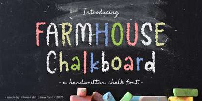 Proudly Presenting, Farmhouse Chalkboard A Decorative Chalk Font. Farmhouse Chalkboard is perfect for any titles, logo, product packaging, branding project, megazine, social media, wedding, or just used to express words above the background. Farmhouse Chalkboard also come with Multi-Lingual Support. Enjoy the font, feel free to comment or feedback, send me PM or email. Thank You!
 - Nautical Doodles by Outside the Line,
$19.00 Sail the seas with Nautical Doodles. This seaworthy font has 32 illustrations of water craft, anchors, star, compass, flags, whale, shark, birds, starfish, seahorse, rope etc. Even a mermaid... and the scripted word Ahoy! If you would like the character chart go to the Gallery Tab and print. (PDFs are no longer downloaded with the font.)
 - Uncertainty by Okaycat,
$25.50 Uncertainty 2010 Edition is an intensely textured typeface carefully rendered by hand. This font is faded with a chalk-like texture. Please be aware that working with this highly detailed font may slow some graphics software as it requires more memory. Uncertainty is extended, containing West European diacritics and ligatures, making it suitable for multilingual environments and publications.
 - P22 Hiromina 03 by IHOF,
$24.95 Hiromina03 is named after the wife of its designer, Hajime Kawakami. The three fonts in the set are based on Hiromi Kawakami's unique hand-lettering style. The distinctly feminine character of Hiromina03 is harmoniously integrated in all three writing systems, Katakana, Hiragana and Latin. The enclosed key charts give instructions for character placement in Katakana and Hiragana.
 - Okay Crayon by Okaycat,
$29.95 One waxy black crayon was used up, entirely down to the tiniest nub, by the making of this font. It’s fun! Perfect for creating crayon written text, or to get the look of chalk-board writing, conte, or charcoal. Okay Crayon is extended, containing West European diacritics & ligatures, making it also suitable for multilingual environments & publications.
 - Bodoniez by Huy!Fonts,
$19.00 Nice typographic experiment consisting of the progressive "bodonization" I have summarized in two steps, by a letter drawn with the same concentration and intensity with which Paris Hilton reading a book, to get something like the sketches that Mr. Gianbattista used to Wrap the sandwich.
 - Walls by Piñata,
$8.00 What do you use to write a price tag at a store or to design a wall menu in a cafe? What to choose – a marker or chalk? Now it makes no more sense to be torn apart by the choice – use both techniques for your design. Walls fontfamily allows to perfectly combine an eco-friendly style with contemporary motives. Walls fontfamily supports over 70 languages and consists of 10 typefaces in 5 popular weights (Thin, Light, Regular, Bold, Black). Initially we wanted to create a font that would imitate an inscription made by a square tip marker which is usually used to write price tags at supermarkets, shops and cafes. During the working process we've decided to extend the conceptual boundaries of the Walls fontfamily and added 5 rough typefaces that imitate the style of ecologic chalk writing
 - Deco Freehand by S. John Ross is an intriguing font that encapsulates the essence of Art Deco style while infusing it with a personal touch. This font is characterized by its distinctiveness; it's ne...
- Ronde Script by GroupType,
$19.00 Ronde Script (Ronde meaning "A kind of script in which the heavy strokes are nearly upright, giving the characters when taken together a round look.") is based on the original design named Parisian Ronde released in 1878 by the Chappelle Foundry in Paris. Other versions of this script include Inland French Script, French Script, French Plate, and Typo Upright. Different type foundries tied to the releases of this design include Mayeur (Paris), Stephenson Blake (London), Bernhardt Brothers & Spindler (Chicago), and ATF (Elizabeth, NJ). This style of script has been a very popular choice in designing wedding invitations and so many other formal announcements for over 130 years. Its very readable, formal and elegant with an antique or retro feel.
 - Mulier Moderne by HiH,
$8.00 Even though the phrase Art Nouveau originated in Paris at the shop of Siegfried Bing, the French preferred to call it Le style moderne. This very sinuous, very Art Nouveau typeface was designed by an E. Mulier around 1894, probably also in Paris. The organic, vine-like curve forms are frequently seen in the art of the period. Examples include the architecture of Victor Horta, the furniture of Henry van de Velde and the jewelry of Max Gradl. Mulier Moderne is an all-cap font with a full Western European character set plus ST and TH ligatures, an alternate ‘E’ and two glyphs of period printer’s cuts. Warning: do not use for extended text. Duh!
 - Trade Gothic Next by Linotype,
$97.99In 1948, Mergenthaler Linotype released the first weights of Trade Gothic, designed by Jackson Burke. Over the next 12 years Burke, who was the company’s Director of Typographic Development from 1948 through 1963, continued to expand the family. Trade Gothic Next is the 2008 revision of Jackson Burke’s design. Developed over a prolonged period of time, the original Trade Gothic showed many inconsistencies. Under the direction of Linotype’s Type Director Akira Kobayashi, American type designer Tom Grace, a graduate of the MA Typeface Design in Reading, redesigned, revised and expand the Trade Gothic family. Many details were improved, such as the terminals and stroke endings, symbols, and the spacing and kerning. Moreover, there are newly added compressed widths and heavy weights perfect for setting even more powerful headlines. Trade Gothic Next brings more features and better quality for today’s demanding typographers. Trade Gothic Next® font field guide including best practices, font pairings and alternatives. - Crypton by Type Innovations,
$39.00 Crypton is a modern geometric design by Alex Kaczun. It’s an alternate style variation based on his popular Contax Pro family of fonts. The look is clean, smart and sophisticated—the chiseled end strokes reflect the rage of the 1980s; lettering that represented something to do with electronics, computers and outer space. It’s a futuristic sans-serif exploration of shape and form. This display font is not intended for text use. It was designed specifically for display headlines, logotype, branding and similar applications. The entire font has an original look which is strong and dynamic—it can be widely used in publications and advertising. Crypton is a futuristic, techno-looking and expressive typeface with the appearance of machined-like parts—round geometric shapes and sharp edges. This attractive display comes in roman with lower case and lining figures. The large Pro font character set supports most Central European and many Eastern European languages.
 - ITC Officina Display by ITC,
$29.99When ITC Officina was first released in 1990, as a paired family of serif and sans serif faces in two weights with italics, it was intended as a workhorse typeface for business correspondence. But the typeface proved popular in many more areas than correspondence. Erik Spiekermann, ITC Officina's designer: Once ITC Officina got picked up by the trendsetters to denote 'coolness,' it had lost its innocence. No pretending anymore that it only needed two weights for office correspondence. As a face used in magazines and advertising, it needed proper headline weights and one more weight in between the original Book and Bold."" To add the new weights and small caps, Spiekermann collaborated with Ole Schaefer, director of typography and type design at MetaDesign. The extended ITC Officina family now includes Medium, Extra Bold, and Black weights with matching italics-all in both Sans and Serif -- as well as new small caps fonts for the original Book and Bold weights. - ITC Officina Sans by ITC,
$40.99When ITC Officina was first released in 1990, as a paired family of serif and sans serif faces in two weights with italics, it was intended as a workhorse typeface for business correspondence. But the typeface proved popular in many more areas than correspondence. Erik Spiekermann, ITC Officina's designer: Once ITC Officina got picked up by the trendsetters to denote 'coolness,' it had lost its innocence. No pretending anymore that it only needed two weights for office correspondence. As a face used in magazines and advertising, it needed proper headline weights and one more weight in between the original Book and Bold."" To add the new weights and small caps, Spiekermann collaborated with Ole Schaefer, director of typography and type design at MetaDesign. The extended ITC Officina family now includes Medium, Extra Bold, and Black weights with matching italics-all in both Sans and Serif -- as well as new small caps fonts for the original Book and Bold weights.


