5,470 search results
(0.042 seconds)
- ITC Blair by ITC,
$50.99 The ITC Blair™ typeface is a revival and reimaging of an early 20th century metal typeface of the same name. Even though only available as single weights of extended and condensed proportions, metal fonts of the face were sold well into the 1950s. In 1997, Jim Spiece resurrected the original extended design for digital imaging and, in the process, added two new weights. Almost 20 years later, he collaborated with Monotype type designers to extend the basic family again. The result was a new suite of three condensed designs and italic complements for all the roman weights. The family also benefits from a large set of alternative glyphs and many OpenType® features.
 - Old Sport JNL by Jeff Levine,
$29.00 The 1930s era French textbook on lettering "100 Alphabets Publicitaires déssinés par M. Moullet" featured a hand lettered chamfered alphabet with slab serifs reminiscent of sports lettering. Although intended for advertising and signage inspiration, only a partial lower case was illustrated along with the capitals and no numbers or other characters existed. These had to be created from scratch. The finished result is not only a bit of classic lettering from the past, but the font also doubles as a typeface with a sports look and feel. A traditional (rather than stylized) M and N are located on the solid bar key and the broken bar key respectively. Old Sport JNL is available in both regular and oblique versions.
 - Gertrud by T4 Foundry,
$21.00First place in a spelling-bee competition, a Harvard University diploma or the Nobel Peace Prize? You can't go wrong with this classic Swedish calligraphy font, created by veteran designer Bo Berndal. He named Gertrud after his better half, but was also inspired by old handwritten documents: "Gertrud is a calligraphic letter design from the 16th century. I used it when I engrossed diplomas with a flat-nibbed pen in the 1980's. When I got my Mac I generated the typeface in Fontographer." Gertrud (the typeface) comes in three weights, with roman and italic. It is an OpenType creation, for both PC and Mac. Swedish type foundry T4 premieres new fonts every month. Gertrud is our sixth introduction. - Clearface Gothic by Linotype,
$29.99 Clearface Gothic first appeared in 1910, designed by Morris Fuller Benton, the world-famously prolific typeface artist. In addition to Clearface Gothic, Benton also designed classics like Franklin Gothic, Century Expanded, and many other types. Clearface Gothic is a sans serif face with light forms displaying the Zeitgeist of the turn of the 20th century. Distinguishing characteristics are the open forms of the a" and "c," the arched "k," and the upward-tilting horizontal stroke of the "e." The relatively narrow typeface, with its open inner white spaces, is extremely legible even in small point sizes. There is no accompanying italic. This digital version of Clearface Gothic was made in 1984 by the Linotype Design Studio."
 - Architype Renner by The Foundry,
$99.00 The geometry of Paul Renner’s sans letterforms was tempered by optical correction to follow earlier typeface proportions, with capitals close to old-style forms, yet still retaining the spirit of the New Typography. His early experimental characters were included as alternatives in the sans which was to become the Futura released by Bauer in 1927–30. Unusually, old style figures also appeared in his early versions but they too were soon discarded. Foundry Architype Renner as a new four weight family has been developed from the original Renner Regular and Bold, created by The Foundry for the first Architype Collections in the early 1990s. This new family features the old style figures and the experimental elements.
 - Grosse Pointe Metro by GroupType,
$19.00GP Metro® is a faithful version of the Dwiggins 1930 urban classic: Metrolight, Metromedium, and Metroblack. In 1929, English type designer, William Addison Dwiggins, (WAD) was commissioned by the Merganthaler Type Foundry to design a warmer, more humanistic, and less mechanical sans to effectively compete with Futura, a highly-popular geometric sans designed by Paul Renner in 1927 and first released by Meganthaler's arch-rival, the Bauer Type Foundry in Germany. FontHaus has licensed from GroupType updated files with additional styles including 2 rough versions and a soft together with the classic Regular styles and weights. These new styles will offer designers a wider range of options to design with these amazing classics. - Gimbel Script by Stiggy & Sands,
$39.00 Monolinear Vintage Elegance The Gimbel Script typeface was inspired by a monoline, semi-connected script from a 1930's holiday greeting card. From its ascenders and descenders that stretch high and low to its gentle curviness Gimbel Script exudes the elegance of a bygone era while standing on a thin line between formal and casual lettering styles. See the 5th graphic for a comprehensive character map preview. Gimbel Script Opentype features include: - Swash Alternates for an alternate M and N. - Stylistic Alternates & SS01-SS06 Stylesets for 151 varying forms. - 219 Ligatures for a smoother typesetting experience, along with 181 initial, middle and final forms. - Full set of Inferiors and Superiors for Limitless Fractions. - Proportional, Tabular and Oldstyle figure sets.
 - Aloe by ROHH,
$29.00 Aloe is a characterful and friendly display font family inspired by headlines from 1930’s newspapers and calligraphy. The family consists of 9 weights, ranging from Thin to Heavy, with matching ornament fonts. It features a variable font with weight axis. Each weight has over 900 glyphs including advanced typographic features, such as vast number of stylistic alternates, swashes, titling and terminal forms, case sensitive forms, ligatures, symbols, ornaments as well as lining and old style figures, fractions, subscripts and superscripts. This original mixture of display typeface with calligraphy gives a versatile family great for all sorts of uses - from advertising, packaging, branding, wedding invitations, menu cards and other editorial uses to screen and web projects.
 - Splendor by profonts,
$41.99 Splendor was originally produced and released in 1930 by Schriftgu� AG, Dresden. The typeface was designed by Berlin designer Wilhelm Berg. Ralph M. Unger, who in the last few years has created a whole series of revivals and redesigns from the hot metal era, ?retrieved? this jewel of a typeface design, redesigning, complementing and digitally remastering it for profonts. Splendor is a broad nip, non-connecting handwriting script of timeless elegance, charm and beauty. It needs tight setting with plenty of space around it. The font contains a number of alternate characters: Two uppercase As, Ss (with descender); in addition, two uppercase Ms, Ns and Zs as well as two lowercase zs.
 - Triplex by Emigre,
$39.00 Although initially designed as a rational/geometric font, Triplex developed into one of Zuzana Licko's most intuitive typeface designs at the time. Its first extensive use was in Emigre magazine #14, a special issue devoted to Swiss designers published in 1990. Triplex was intended as a friendly substitute for Helvetica. The name Triplex refers to the three versions that make up the entire family; Triplex, Triplex Serif and Triplex Italic. Each version of the typeface comes in light, bold and extra bold. The italic was designed and drawn by type designer and sign painter John Downer, and was designed to work with both the serif and sans serif versions. See also Triplex Italic OT.
 - Airam by Linotype,
$29.99 Maria Martina Schmitt was born in Vienna, Austria in 1950. Since 1998, she has been working as a freelance designer, focusing on cultural collateral, economic publications, illustration, type design, and logo design. Airam blends contemporary legibility with historic blackletter forms, creating a contemporary text face that speaks to the old European past. Airam certainly appears darker than most other contemporary text faces. Airam’s letterforms are slightly broken, too. They display angled joints in lieu of smooth curves. This “broken” aspect actually aids legibility at smaller point sizes. While Airam may not be suitable for setting whole books or newspapers, this font will add a splendid touch to short tracts of small text. Additionally, Airam looks superb in large headlines.
 - Art Project JNL by Jeff Levine,
$29.00 A 1930s WPA (Works Projects Administration) poster advertising a play entitled “Abraham Lincoln, The Great Commoner” had the play’s name done in a hand-lettered Art Deco sans. This is the basis for Art Project JNL. According to Wikipedia, “the Works Progress Administration (renamed in 1939 as the Work Projects Administration; WPA) was the largest and most ambitious American New Deal agency, employing millions of unemployed people (mostly unskilled men) to carry out public works projects, including the construction of public buildings and roads. In a much smaller but more famous project, Federal Project Number One, the WPA employed musicians, artists, writers, actors and directors in large arts, drama, media, and literacy projects.”
 - Tiblisi by Simeon out West,
$18.00Tiblisi is a font designed to emulate the feel of modern Georgian Script, which is called Mkhedruli. In earlier periods of her history, the Georgian language had several other alphabets, notably the Asomtavruli alphabet and the Nuskha-khucuri alphabet. The first printed material in the Georgian language, in the Mkhedruli alphabet, was published in 1669. Since then the alphabet has changed very little, though a few letters were added in the 18th century, and 5 letters were dropped in the 1860s. The font was named Tiblisi in honor of the nation's captial city. Tiblisi comes with full punctuation, a complete character set for most Western European languages that are based on the Latin Alphabet, and full kerning. - Modern MT for Dior JP by Monotype,
$29.99Cut by Monotype between 1900 and 1902, the Monotype Modern font family was based on Miller & Richards News 23 and 28; slightly condensed news text types of the 1890s. Monotype Modern is a lively typeface, with long, fine hairlines and well rounded letterforms, representing the best of nineteenth century modern face design. A classic text face, and typical of the moderns that were produced in the United Kingdom at that time, being less extreme in its rendering than some of the models of purer form being produced elsewhere. Monotype Modern is an excellent text face for magazines, newspapers and books, the heavier and more condensed versions are useful in headlines and display. - Krimhilde by FDI,
$25.00 Krimhilde was originally designed by Albert Auspurg and released in 1933 with the type foundry Ludwig & Mayer. The design mixes elements of German blackletter typefaces and geometric sans-serif designs, which became popular in the 1920s in the movement known as New Typography. The FDI version of Krimhilde offers both original styles (regular and bold) as “version A” with a full Latin 1 character set. “Version B” has alternative shapes for some letters to make the design more legible for people who are not familiar with the German blackletter shapes. In addition, there are optional display styles available (outline, shadow and fill), which can be used separately or together to create a chromatic layout.
 - Lucky Lady by JVB Fonts,
$39.00 Lucky Lady was inspired by the old, classic art and craft of brush script lettering usually applied in ads of the WWII era and 1940s. The name of the font family refers to one of the most emblematic combat units of the US air force in WWII that were decisive in the victory of the allied forces. Lucky Lady can be mainly used in titles and display texts. It supports East Europe languages. It's highly recommend to use the combined shadow styles under the main regular basic style layer. Lucky Lady includes standard and discretionary ligatures, alternative style for uppercase, fractions, numerators and denominators, end and/or terminal forms and other OpenType features.
 - Modern MT for Dior KO by Monotype,
$29.99Cut by Monotype between 1900 and 1902, the Monotype Modern font family was based on Miller & Richards News 23 and 28; slightly condensed news text types of the 1890s. Monotype Modern is a lively typeface, with long, fine hairlines and well rounded letterforms, representing the best of nineteenth century modern face design. A classic text face, and typical of the moderns that were produced in the United Kingdom at that time, being less extreme in its rendering than some of the models of purer form being produced elsewhere. Monotype Modern is an excellent text face for magazines, newspapers and books, the heavier and more condensed versions are useful in headlines and display. - Delauney by Arterfak Project,
$17.00 Delauney is a display font, inspired by the Art Deco style from the 1920s. Delauney visualizes luxurious looks, elegance, and wealth. This font is an all-caps font designed with geometric shapes and firm strokes that gives a clear look and minimalist. Delauney also has some OpenType features and accented characters to give you many alternatives in your creative process. A great choice for your headline, title, label, editorial, logotype, quotes, typography, and more! Delauney provides three styles : Regular: The main style for display or headline Shadow: Secondary style that you can use to beautify the Regular one. Catchwords: Available in three languages; English, Spain & Bahasa. Complete your words to look more decorative. Thank you for visiting Happy designing!
 - Banished GRP by Grype,
$16.00 Banished was inspired by posters for the 1968 Cult Cinema Classic, “Astro Zombies”, but it exudes the rough and tumble, chewed up and spit out Old West era. Banished dives head first into all of the nostalgic clichés of the old west, as well as the cult classic that inspired it. Here's what's included with Banished: 388 glyphs - including Capitals, Lowercase (Alt. Capitals), Numerals, Alt. Numerals, Punctuation and an extensive character set that covers multilingual support of latin based languages. (see the 6th graphic for a preview of the characters included) Contextual Alternates that auto-switches between Capitals & Lowercase (Alt Capitals) glyphs, as well as Numerals and Alt Numerals for visual randomness. To access the Contextual Alternates feature, you will need to be using software with Opentype compatibility otherwise you can access the alternate glyphs via a Glyphs panel. Stylistic Alternates feature that swaps all default Numerals with their Alternates Numerals Font is provided in TTF & OTF formats. The TTF format is the standard go to for most users, although the OTF and TTF function exactly the same. Here's why Banished is for you: You're in need of a good rustic slab serif typestyle with a narrow width and gritty feel You're planning a Western themed party and need a unique western typeface You're a fan of the 1968 Cult Classic "Astro Zombies" as just have to have the font to match You've got one of those Old West photography studios and need a great Wanted poster font You just like to collect quality fonts to add to your design arsenal
 - URW Geometric Extended by URW Type Foundry,
$35.99 URW Geometric Extended is the matching complement for the URW Geometric, including 20 additional extended styles. URW Geometric is a sans serif typeface inspired by the German geometric typefaces of the 1920s but designed for modern usability. The character shapes have optimized proportions and an improved balance, the x-height is increased, ascenders and descenders are decreased. Special glyphs, which are often designed afterwards for the original geometric typefaces from the 1920s, are perfectly integrated in the URW Geometric. These design characteristics increase the usability and legibility tremendously. With its 10 weights ranging from Thin to Black, plus 10 additional oblique styles, it has a great versatility in mind. The extreme light styles shine bright in large sizes, the middle weights are perfect for body copy and the bolder variants for the use of emphasis information or bring a strong impact to headlines and information. The optically balanced styles are designed to work in perfect harmony together. URW Geometric is functional, strong, simple and harmonized in form, and at a glance appears as a modern variant of its predecessors. Apart from the basic characters the design has an extra focus on the special glyphs. These are designed for today’s needs. For example: the email glyph looks modern and unique, including a perfectly balanced spacing. The number sign, in modern use called “hashtag”, is space saving and optically balanced for body text. Additionally, various extra and alternate glyphs are designed to provide a friendly usability. Including a wide Latin language support and character sets, URW Geometric is perfectly designed for today’s requirements.
 - Manson by Linecreative,
$18.00 Manson font , created because it was inspired by the shape of colossal stone pillars, a unique shape where at the waist the font structure is curved and this gives a solid impression. This font perfect for vintage and poster designs as well as for your logo design, brand image, retro poster, handwritten quotes, product packaging, merchandise and more What you get dear, you will get :
 - Agrea Serif by Koray Özbey,
$12.00 Agrea is a serif typeface with 9 weights and italics and variable versions. It’s a typeface that combines the elegance of calligraphy with a modern twist. One of Agrea's defining features is its fluid strokes and deep ink traps, which add a touch of sophistication and uniqueness to your projects. Whether you're designing for natural, organic, or ecological content, Agrea is a nice choice.
 - Caldicote by Aah Yes,
$12.00Caldicote is a formal and conventional serif typeface, with slightly broadened verticals. The Tab version is the same as the ordinary version, EXCEPT the Tab version has monospaced numerals and zero kerning between numbers - useful where you might like columns of numbers all vertically aligned in a Tabular display. The zip files contain both OTF and TTF versions of the font - install one version only. - Wormwood Gothic by Device,
$39.00 Retaining all the imperfections and irregularities of wood type, Wormwood Gothic is a gothic sans with all the naive and uneven character shapes typical of the period. The ‘capitals’ feature extended characters, while the ‘lower case ’ features capitals of squarer proportions. Freely mix the two in word settings or colour in red and black for a Dada collage, billposter, urban grit or antique Americana atmosphere.
 - Agrea Sans by Koray Özbey,
$12.00 Agrea is a sans serif typeface with 9 weights and italics and variable versions. It’s a typeface that combines the elegance of calligraphy with a modern twist. One of Agrea's defining features is its fluid strokes and deep ink traps, which add a touch of sophistication and uniqueness to your projects. Whether you're designing for natural, organic, or ecological content, Agrea is a nice choice.
 - Ah, Olympus by Levi Halmos, the typeface that climbed out of the typography pantheon to grace us mere mortals with its divine presence! This font, much like the mythical abode it's named after, stand...
- Poliphili by Flanker,
$19.99 Hypnerotomachia Poliphili, which can be translated in English as “Dreaming Love Fighting of Poliphilus”, is a romance about a mysterious arcane allegory in which the main protagonist, Poliphilo, pursues his love, Polia, through a dreamlike landscape. In the end, he is reconciled with her by the “Fountain of Venus”. The author of the book is anonymous, however, an acrostic formed by the first, elaborately decorated letter in each chapter in the original Italian reads “POLIAM FRATER FRANCISCVS COLVMNA PERAMAVIT”, which means “Brother Francesco Colonna has dearly loved Polia”. Despite this clue, the book has also been attributed to many other authors. The identity of the illustrator is less certain than that of the author. It was first published in Venice, in December 1499, by Aldo Manutio. This first edition presents an elegant and unique page layout, with refined woodcut illustrations in an Early Renaissance style and a refined Roman font, cut by Francesco da Bologna, which is a revised version of the type used in 1496 for the De Aetna of Pietro Bembo. The print quality is very high for the time, but nevertheless it presents many inconsistencies and imperfections due to the non-ideal inking and adherence of the matrix to the paper. For that reason numerous samples of the original have been used to create every single glyph which will result in an appropriate reconstruction and not a mere and humble reproduction. Some letters like \J, \U and \W were extrapolated, because they are not part of the original alphabet of the period. Some letters like \Q, \X, \Y, \Z and \h have been updated to more modern variants, but the original shape is accessible by Stylistic Alternates Opentype Feature, which also changes the shape of the \V and the \v. The original numerals \zero, \one, \tree, \four and \six have been accompanied by reconstructions of the missing numbers and extended by modern figures. Finally, swashed lower cases and original scribal abbreviations were also included. The font has joined by a matching Italic variant, closely inspired from Aldo Manuzio's 1501 "Vergilius", the first book printed entirely in Italic type by Francesco da Bologna.
 - Celtic Spiral by Kaer,
$19.00 Hi! This is a new classic Celtic font. With spirals, knots and animals’ faces. СelticSpiral font is perfect for printing of graphic arts, posters, packaging and t-shirts. The font is presented in usual and color versions. Only uppercase letters from A to Z and numbers set (36 characters)
 - Saddlery by FontMesa,
$25.00Saddlery includes the first font that you can use alone or add the optional second fill font behind the first using different colors for a more decorative look. You will need an application that works in layers in order to use the fill fonts that come with FontMesa fonts. - Blow Up by HVD Fonts,
$25.00 Type designer Hannes von Döhren created a display typeface called "Blow Up". A bubbly, sweet font with nice light effects. Perfect for use in big sizes on posters or flyers. You can use Blow Up Sans & Blow Up Bling together to influence the color of the light effects.
 - Little Sooner by Dumadi,
$25.00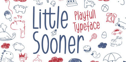 Little Sooner is a special handmade font using the Brush tool. This font is specially designed for children with a full-color style that will enhance the quality of your designs. very suitable for the design of children’s t-shirts, children’s youtube titles, children’s quotes, children’s web, and others.
 - AndrewAndyCollege by Ingrimayne Type,
$13.95 AndrewAndyCollege is an outlined font derived from the Ingrimayne font AndrewAndreas, a san-serif face. In 2018 the inside and the middle ring were separated out and made independent fonts. They can be used alone, or layered with the original to produce letters with two or three colors.
 - Baby Magpies by Sipanji21,
$10.00 this baby magpies font, Made with love and joy. Comic look, Bold, Thick, so it will make your design more beautiful, cute, fun, and colorful. you can use this font for any design, such as logo, poster, advertise, packaging, and much more. make your design awesome with our font.
 - Bodybuilder by Vozzy,
$5.00 Introducing a vintage look simple and minimalistic label font named "Bodybuilder". All available characters you can see at the screenshot. This font have 14 styles (including layered effect styles, rough and color version). This font will good viewed on any retro design like poster, t-shirt, label, logo etc.
 - Monosketch by GRIN3 (Nowak),
$20.00 Monosketch is a hand-drawn font inspired by monospaced fonts like Andale Mono. Monosketch Layer and Monosketch Black can be used together by layering Monosketch Layer above a differently colored Monosketch Black. Language support includes Western, Central and Eastern European character sets, as well as Baltic and Turkish languages.
 - Giecella Kids by Sipanji21,
$8.00 Say hello to Giecella Kids font. Made with love and joy. Comic look, so it will make your design more beautiful, cute, fun, and colorful Includes: Giecella Kids (OTF, TTF, WOFF) Bonus (Cute Background) Features: Character Set Numerals and Punctuation (OpenType Standard) I hope you can enjoy the font :)
 - Zebraw by Ingrimayne Type,
$6.95 This face was part of a continuing evolution of an almost unreadable typeface. There are two styles, one with stripes and one without. The striped style can be placed in a layer above the unstriped style to give the letters two colors. Zebraw was derived from the typeface Porker.
 - Tight Hug by Sipanji21,
$10.00 This Tight Hug font, Made with love and joy. Comic look, Bold, Thick, so it will make your design more beautiful, cute, fun, and colorful. you can use this font for any design, such as logo, poster, advertise, packaging, and much more. with swash and awesome alternates inside.
 - Komica Brought by Figuree Studio,
$18.00 Say hello to Komica Brought font. Made with love and joy. Comic look, so it will make your design more beautiful, cute, fun, and colorful. Features: Uppercase and Lowercase Numerals and Punctuation (OpenType Standard) Accents (Multilingual characters) PUA Encode I hope you can enjoy the font :) Regards Figuree Studio
 - Blumenkind by Catharsis Fonts,
$15.00 Blumenkind is a fresh, bright, humanist script font radiating boundless optimism and friendly enthusiasm. Its strokes are based on the rounded triangle, which lends it a dynamic bounce and a confident human touch. It shines in a wide range of display and editorial applications, but excels in particular in the context of art, creativity, food, social events, and spirituality. Blumenkind is inspired by an instance of metal-strip lettering found on the B�rgermeister Kornmesser Siedlung residential building complex in Berlin from the 1960s. The font name, being German for �flower child�, aims to capture the positive zeitgeist of that time evident in the letters. Blumenkind comes with extensive language support, tight kerning, attractive ligatures, and subtly varied alternate shapes for some of the most commonly doubled letters � and all that in three linear weights and one calligraphic weight. Furthermore, a complementary version of the font (Blumenkind Alternate) is available, in which the overlapping tittles and accent marks of the original are replaced with more traditional free-floating marks. This font is dedicated to the miracle of medical science. Thanks to Georg Seifert, Rainer Scheichelbauer, and Michael Wallner for technical aid.