3,312 search results
(0.031 seconds)
- Century No. 1 SB by Scangraphic Digital Type Collection,
$26.00 Since the release of these fonts most typefaces in the Scangraphic Type Collection appear in two versions. One is designed specifically for headline typesetting (SH: Scangraphic Headline Types) and one specifically for text typesetting (SB Scangraphic Bodytypes). The most obvious differentiation can be found in the spacing. That of the Bodytypes is adjusted for readability. That of the Headline Types is decidedly more narrow in order to do justice to the requirements of headline typesetting. The kerning tables, as well, have been individualized for each of these type varieties. In addition to the adjustment of spacing, there are also adjustments in the design. For the Bodytypes, fine spaces were created which prevented the smear effect on acute angles in small typesizes. For a number of Bodytypes, hairlines and serifs were thickened or the whole typeface was adjusted to meet the optical requirements for setting type in small sizes. For the German lower-case diacritical marks, all Headline Types complements contain alternative integrated accents which allow the compact setting of lower-case headlines.
 - Century Old Style EF by Elsner+Flake,
$35.00 - Century Old Style Pro by SoftMaker,
$14.99 Century Old Style Pro is one of the fonts of the SoftMaker font library.
 - Alpha Sentry - Unknown license

- Omega Sentry - Unknown license

- Gamma Sentry - Unknown license

- Enthra Centro by Akrtype Studio,
$19.00 Enthra Centro script is an elegant combination of a script . It is slender, feminine and classy, while still maintaining a friendly feel. Enthra Centro script is versatile and will work perfectly for e-commerce brands, wedding boutiques, initial name cards or any business that wants to appear upscale and chic. With its many varian stylistic character Enthra Centro script is perfect for creating original and functional designs. It has extensive language support and alternates, stylistic sets that add visual interest to every letter. You can use the Enthra Centro script for high-end logotypes and magazine headlines, but let’s not forget greeting cards, invitations, posters, ads and the various web and screen usages. The overall feel of the font is elegant, sophisticated with a touch of informal and it is ideal if you want to convey a sense of class and style.
 - XXII Centar by Doubletwo Studios,
$19.00 Centar Sans is a simple, modern, universal, powerful, invisible but not characterless, sans serif family. The family is designed for identities & corporate projects. Its wide range of styles covers lots of possibilities of use, from headlines to texts. It supports a lot of languages including cyrillic and comes along with 19 OpenType features - Small Caps, ligatures, alternates and many more. Regular styles are FREE! Extended detail here. or here.
 - Venture Point by Maulana Creative,
$14.00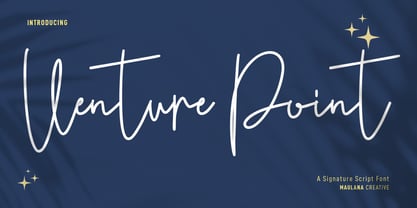 Venture Point is a modern signature script font. With upright consist mono-line stroke, fun character. To give you an extra creative work. Venture Point font support multilingual more than 100+ language. This font is good for logo design, Social media, Movie Titles, Books Titles, a short text even a long text letter and good for your secondary text font with sans or serif. Make a stunning work with Venture Point font. Cheers, Maulana Creative
 - Conture Script by Mans Greback,
$59.00 Conture Script is a classic script typeface with a thin contour. This high-quality font is drawn and created by Måns Grebäck during 2017. With its hundreds of glyphs, Conture Script supports a very wide range of languages.
 - Center Voyage by Letterhend,
$19.00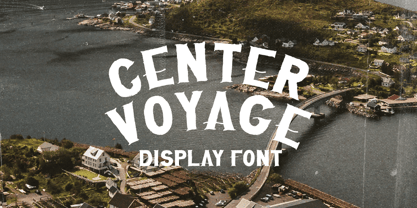 Introducing, Center Voyage - a Sans Serif typeface. This type of font perfectly made to be applied especially in headlines which is need a standout font, and the other various formal forms such as invitations, labels, logos, magazines, books, greeting / wedding cards, packaging, fashion, make up, stationery, novels, labels or any type of advertising purpose. Features : numbers and punctuation multilingual ligatures PUA encoded We highly recommend using a program that supports OpenType features and Glyphs panels like many of Adobe apps and Corel Draw, so you can see and access all Glyph variations.
 - Artistic Venture by Storictype,
$19.00 Artistic Venture Typeface, Inspirated those bold wide letters you see on. computer screen, movie futureistic with combine classic , Well, some of them have these strong or hooks on the ends of the letters. But, there's also this new style of font that's super cool and futuristic. It's called a Artistic Venture Typeface. There Include : All Caps Opentype Feature Alternate Character Ligature Multilanguage Thank You
 - Center Screen by Peterland,
$44.00 Center Screen is a universal font dedicated to making office documents in popular text editors. Due to the interesting disign it is also used for making websites and advertising for films and posters. Center Screen font also allows to create images of work in many forms of marketing due to its versatility and adaptability to many languages of the world. Creating images and text with Center Font Screen allows you to gain competitive edge by highlighting your brand and by bringing attention to the originality of the presentation and the readability of the message.
 - New Lincoln Gothic BT by Bitstream,
$50.99New Lincoln Gothic is an elegant sanserif, generous in width and x-height. There are twelve weights ranging from Hairline to UltraBold and an italic for each weight. At the stroke ends are gentle flares, and some of the round characters possess an interesting and distinctive asymmetry. The character set supports Central Europe, and there are three figure sets, extended fractions, superior and inferior numbers, and a few alternates, all accessible via OpenType features. Back in 1965, Thomas Lincoln had an idea for a new sanserif typeface, a homage of sorts, to ancient Roman artisans. The Trajan Column in Rome, erected in 113 AD, has an inscription that is considered to be the basis for western European lettering. Lincoln admired these beautiful letterforms and so, being inspired, he set out to design a new sanserif typeface based on the proportions and subtleties of the letters found in the Trajan Inscription. Lincoln accomplished what he set out to do by creating Lincoln Gothic. The typeface consisted only of capital letters. Lincoln intentionally omitted a lowercase to keep true his reference to the Trajan Inscription, which contains only magiscule specimens. The design won him the first Visual Graphics Corporation (VGC) National Typeface Competition in 1965. The legendary Herb Lubalin even used it to design a promotional poster! All this was back in the day when typositor film strips and photo type were all the rage in setting headlines. Fast forward now to the next millennium. Thomas Lincoln has had a long, illustrious career as a graphic designer. Still, he has one project that feels incomplete; Lincoln Gothic does not have a lowercase. It is the need to finish the design that drives Lincoln to resurrect his prize winning design and create its digital incarnation. Thus, New Lincoln Gothic was born. Lacking the original drawings, Lincoln had to locate some old typositor strips in order to get started. He had them scanned and imported the data into Freehand where he refined the shapes and sketched out a lowercase. He then imported that data into Fontographer, where he worked the glyphs again and refined the spacing, and started generating additional weights and italics. His enthusiasm went unchecked and he created 14 weights! It was about that time that Lincoln contacted Bitstream about publishing the family. Lincoln worked with Bitstream to narrow down the family (only to twelve weights), interpolate the various weights using three masters, and extend the character set to support CE and some alternate figure sets. Bitstream handled the hinting and all production details and built the final CFF OpenType fonts using FontLab Studio 5. - Engravers' Old English BT by Bitstream,
$29.99Designed by Morris Fuller Benton in 1907; an improved version of the familiar nineteenth century blackletter as he had executed it in his Wedding Text. - Iowan Old Style BT by Bitstream,
$40.99Iowan Old Style was designed for Bitstream in 1990 by noted sign painter John Downer. Iowan Old Style is a hardy contemporary text design modeled after earlier revivals of Jenson and Griffo typefaces but with a larger x-height, tighter letterfit, and reproportioned capitals. Iowan Old Style Titling was designed by John Downer and added to the Iowan Old Style family in 2002. The cap-only character set includes several ornaments and fleurons, broadening the appeal and functionality of the typeface family. Iowan Old Style was originally designed for Bitstream in 1990 by Downer, a noted sign painter. Iowan Old Style is a hardy contemporary text design modeled after earlier revivals of Jenson and Griffo typefaces but with a larger x-height, tighter letterfit, and reproportioned capitals. Expert and old style figure font sets were added in 2000. - Oz Handicraft BT WGL by Bitstream,
$50.99Oswald Cooper is best known for his emblematic Cooper Black™ typeface. Although he was responsible for several other fonts of roman design, Cooper never drew a sans serif typeface. But that didn’t stop George Ryan from creating one. Ryan saw a sans serif example of Cooper’s lettering in an old book and decided that it deserved to be made into a typeface. Ryan’s initial plan was to make a single-weight typeface that closely matched the slender and condensed proportions of the original lettering. While the resulting Oz Handicraft™ typeface proved to be very popular, Ryan was not satisfied with the limited offering. So, between other projects – and over many years – Ryan worked on expanding the design’s range. The completed family includes light, semi bold and bold weights to complement the original design, plus a matching suite of four “wide” designs, which are closer to normal proportions. Fonts of Oz Handicraft include a Pan-European character set that supports most Central European and many Eastern European languages. - Centric Serif SG by Spiece Graphics,
$39.00 Here is a boxy, extremely squared alternative to display designs like Eden or Glamour. In comparison, Centric Serif does not share the fragile and delicate nature of these old 1930s classics. Instead it is fairly robust with a splayed M and a simple flattop A. It is interesting to note that Centric Serif (unlike Centric Geo) sports serifs in exaggerated and curiously bizarre ways. Centric Serif is now available in the OpenType Std format. Some new stylistic alternates and historical forms have been added to this OpenType version. Advanced features work in current versions of Adobe Creative Suite InDesign, Creative Suite Illustrator, and Quark XPress. Check for OpenType advanced feature support in other applications as it gradually becomes available with upgrades.
 - Centric Geo SG by Spiece Graphics,
$39.00 Here is a boxy, extremely squared alternative to display designs like Eden or Glamour. In comparison, Centric Geo does not share the fragile and delicate nature of these old 1930s classics. Instead it is fairly robust with a splayed M and a simple flattop A. It is interesting to note that Centric Serif (unlike Centric Geo) sports serifs in exaggerated and curiously bizarre ways. Centric Geo is now available in the OpenType Std format. Some new stylistic alternates and historical forms have been added to this OpenType version. Advanced features work in current versions of Adobe Creative Suite InDesign, Creative Suite Illustrator, and Quark XPress. Check for OpenType advanced feature support in other applications as it gradually becomes available with upgrades.
 - No Entry JNL by Jeff Levine,
$29.00 The hand lettered titles and credits from the 1958 war film “The Young Lions” command your attention with a bold block slab serif type style. This design has been digitally recreated as No Entry JNL, which is available in both regular and oblique versions.
 - DH GENTRY (SIDE-B) - Unknown license

- PF Centro Serif Pro by Parachute,
$79.00 Centro Serif Pro is an award-winning typeface. It received a Gold Award from the European Design Awards 2008 and an Excellence Award from the International Type Design Competition 2009 as part of the Centro Pro type system. This large series of 40 fonts with 1519 glyphs each is composed of three superfamilies (serif, sans and slab), includes true italics and supports Latin, Greek and Cyrillic. According to the jury of the European Design Awards “...Centro Pro is an almost ‘invisible’ typeface with distinct personality, it has legibility as its main attribute and is ideal for a wide range of design works. It does not attract any unnecessary attention, but rather serves its purpose. A rare case of contemporary type family working across three alphabets. Centro Pro meets an ever-growing demand for such typefaces among pan-European companies and institutions”. Centro Pro has become very popular among printed media and is ideal choice for newspapers, magazines and corporate applications. Furthermore every font in this series has been completed with 270 copyright-free symbols, some of which have been proposed by several international organizations for packaging, public areas, environment, transportation, computers, fabric care and urban life.
 - PF Centro Slab Press by Parachute,
$75.00 Centro Slab Press: Specimen Manual PDF Ever since its first release, Centro Slab has been particularly popular with corporate applications, branding and print media. The new Centro Slab Press version was redesigned with narrower proportions which are better suited for publications such as magazines and newspapers as well as web applications. Centro Slab Press is a very clean and legible typeface even at heavier weights, a characteristic which is not often seen among slab typefaces. This is part due to the fact that Centro Slab Press is not overpowered by clumsy serifs. Instead it incorporates semi-slabs which provide comfortable reading without compromising its modern profile. The italics are narrower than the romans and incorporate beautiful cursive characteristics. Each style consists of 659 glyphs with several opentype features and an extended set of characters which support more that 100 languages such as those based on the Latin, Greek and Cyrillic alphabet. The family is composed of 16 styles from ExtraThin to UltraBlack along with their italics. All weights were meticulously hinted for excellent display performance on the web.
 - PF Centro Slab Pro by Parachute,
$79.00 Centro Slab Pro is an award-winning typeface. It received a Gold Award from the European Design Awards 2008 and an Excellence Award from the International Type Design Competition 2009 as part of the Centro Pro type system. This large series of 40 fonts with 1519 glyphs each is composed of three superfamilies (serif, sans and slab), includes true italics and supports Latin, Greek and Cyrillic. According to the jury of the European Design Awards “...Centro Pro is an almost ‘invisible’ typeface with distinct personality, it has legibility as its main attribute and is ideal for a wide range of design works. It does not attract any unnecessary attention, but rather serves its purpose. A rare case of contemporary type family working across three alphabets. Centro Pro meets an ever-growing demand for such typefaces among pan-European companies and institutions”. Centro Pro has become very popular among printed media and is ideal choice for newspapers, magazines and corporate applications. Furthermore every font in this series has been completed with 270 copyright-free symbols, some of which have been proposed by several international organizations for packaging, public areas, environment, transportation, computers, fabric care and urban life.
 - PF Centro Sans Pro by Parachute,
$79.00 Centro Sans Pro is an award-winning typeface. It received a Gold Award from the European Design Awards 2008 and an Excellence Award from the International Type Design Competition 2009 as part of the Centro Pro type system. This large series of 40 fonts with 1519 glyphs each is composed of three superfamilies (serif, sans and slab), includes true italics and supports Latin, Greek and Cyrillic. According to the jury of the European Design Awards “...Centro Pro is an almost ‘invisible’ typeface with distinct personality, it has legibility as its main attribute and is ideal for a wide range of design works. It does not attract any unnecessary attention, but rather serves its purpose. A rare case of contemporary type family working across three alphabets. Centro Pro meets an ever-growing demand for such typefaces among pan-European companies and institutions”. Centro Pro has become very popular among printed media and is ideal choice for newspapers, magazines and corporate applications. Furthermore every font in this series has been completed with 270 copyright-free symbols, some of which have been proposed by several international organizations for packaging, public areas, environment, transportation, computers, fabric care and urban life.
 - ITC Pacella by ITC,
$29.99Pacella was designed by Vincent Pacella and fashioned in the tradiation of Century Schoolbook, Corona and Nimrod. Pacella maintains high legibilty and exhibits a character and personality all its own. - Benton Modern by Font Bureau,
$40.00 Benton Modern was first prepared as a text face by Font Bureau for the Boston Globe and the Detroit Free Press. Design and proportions were taken from Morris Fuller Benton’s turn-of-the-century Century Expanded, drawn for ATF, faithfully reviving this epoch-making magazine and news text roman. The italic was based on Century Schoolbook. These display cuttings were prepared by Dyana Weissman and Richard Lipton; FB 2008
 - Acadami by Hackberry Font Foundry,
$24.95 Acadami is an experiment toward what will hopefully be my masterwork (probably named Hackberry). It's also the font used as I get used to FontLab 5. The serifs are stronger and sharper. It's modified with the feel of my memory of Century Schoolbook (without ever looking at CB for a reference.
 - Benton Modern RE by Font Bureau,
$40.00 Benton Modern was first prepared as a text face by Font Bureau for the Boston Globe and the Detroit Free Press. Design and proportions were taken from Morris Fuller Benton’s turn-of-the-century Century Expanded, drawn for ATF, faithfully reviving this epoch-making magazine and news text roman. The italic was based on Century Schoolbook. This version of the family is part of the Reading Edge series of fonts specifically designed for small text onscreen, having been adjusted to provide more generous proportions and roomier spacing, and having been hinted in TrueType for optimal rendering in low resolution environments.
 - Selectric - Unknown license

- Pulpo by Floodfonts,
$49.00 A friendly and comfortable typeface inspired by Century Schoolbook and Clarendon. Despite the strength and sturdiness of the design, each letter shape carries warmth and an echo of the human hand, concealing some nostalgia. The family is ideally suited for editorial, advertising and packaging as well as web and app design. A massive body combined with low stroke contrast, make it very suitable on screen and for small text sizes on newsprint paper. For more information visit the microsite.
 - AndironOutline - Unknown license

- PR8 London Ads - Unknown license

- American Dream - Unknown license

- Strike Swiss - Unknown license

- LudwigHohlwein - 100% free

- Jingle Condensed by ArFF,
$24.95I once tried to imagine what the children of Schoolbook and Bodoni would look like if they were married. I'm still trying to imagine that! In the meantime I drew the Jingles. - Jingle Wide by ArFF,
$24.95I once tried to imagine what the children of Schoolbook and Bodoni would look like if they were married. I'm still trying to imagine that! In the meantime I drew the Jingles. - Fiendstar by AVP,
$29.00Initially created as a less quirky alternative to GillSans Schoolbook, Fiendstar has been developed into a family of widths, weights and styles. High legibility makes it suitable for signs and school books, especially for readers with poor reading ability. - Underwood1913 - Personal use only


