3,312 search results
(0.038 seconds)
- Modakshar BT by Bitstream,
$50.99Modakshar was inspired by traditional Indic handwriting scripts which ‘hang’ from a common upper horizontal bar. Adapting this motif to Latin letterforms was challenging. The typeface was first conceived in the 1970's as a design project in school. The current digital design was completed in 2002. Basic motif was inspired by traditional Indic script handwriting. - Persia BT by Bitstream,
$50.99Masoud Nejabati has drawn upon his capable calligraphic skills to create this typeface. Persia represents his first latin-based design. This gentle and finely rendered script reveals Nejabati's extensive background in Islamic calligraphic art. The slight back slant further enhances the appearance of hand-scribed pen calligraphy. - Melanie BT by Bitstream,
$50.99 - Ryan BT by Bitstream,
$50.99 - Ambule BT by Bitstream,
$50.99Huxley Vertical meets Peignot in this stylized cap/lowercase hybrid design called Ambule. French designer Julien Janiszewski has created a clean, straightforward design that is strikingly effective in both text and display settings. Ambule Oblique and Ambule Outline complete the typeface family, extending its range of possible uses. - Richfont BT by Bitstream,
$50.99Based on Mr. Hubbard's own hand printing, Richfont Medium is an extremely casual design. Actually light in weight, it renders best at 14 point and above. Richfont Light and Bold are available from the designer. - Clarendon BT by Bitstream,
$50.99 The new Clarendon BT Pro typeface family features 450 glyphs in each font with expanded support for Central and Eastern European languages, and enhanced OpenType features including ligatures, diagonal fractions, superscript/subscripts and Case-Sensitive Forms. Clarendon BT is an updated revival of the square serif (also called Ionic or Egyptienne styles) with bracketed serifs, ball terminals and high xheights. These attributes give Clarendon BT a timeless appearance for a wide range of contemporary uses from websites, ads, publications and signage.
 - Melina BT by Bitstream,
$50.99Melina Plain and Melina Fancy are characterized by graceful lines, strong contrast and nostalgic overtones. These typefaces are patterned after two members of a type family named Greco, released by Fundición Tipográfica Richard Gans of Madrid, Spain, in the 1920s. Melina Plain is a refined version of Greco Bold, and Melina Fancy is based on Greco Adornado, with the notable addition of a lowercase, which was not a part of the original design. Melina is based on two typefaces (ca. 1920) from the Fundición Tipográfica Richard Gans in Madrid, Spain. Nick Curtis first found Greco Adornado in a type specimen at the Library of Congress. It was a cap only design. He made a cut of the original (Melina Fancy) and created his own lowercase, and many other characters to support contemporary character sets. Later he came across Greco Bold, which had a lowercase, but he chose not to use it and instead, adapted his Melina Fancy to create Melina Plain. - Tannarin BT by Bitstream,
$50.99Futuristic and spacey, Tannarin is a modular, cap-only typeface. Many letters are constructed of repeated components with the added twist of the round characters being shorter than the square characters. - EuroMachina BT by Bitstream,
$50.99The boss of extended typefaces, Brian Bonislawsky, has belted out this ultra wide design, EuroMachina, that looks like an odd meld of OCR-A, Microgramma and Bank Gothic. And if that wasn't enough, Brian then felt the need to distort it in various ways, creating Broken, Eroded and OverGreased. A little something for everyone. - Cooper BT by ParaType,
$30.00Bitstream Cooper was designed at Bitstream in 1986 by means of adding light, medium, and bold styles, with the corresponding italics, to the existing black ones. Based on Cooper Black, 1919, by Oswald Bruce Cooper, which was firstly released as a hand composition font in 1922 by Barnhart Brothers & Spindler of Chicago and later spread by ATF. Cooper Black is an extra bold face based on Cooper Old Style. Bitstream Cooper is an old style face with rounded serifs and tilted back ovals. For use both in text (normal weights) and in advertising and display typography (heavy weights). Cyrillic version was developed for ParaType in 2000 by Manvel Shmavonyan and based on TM Oswald face of TypeMarket, 1996, by Victoria Grigorenko. - Ingram BT by Bitstream,
$50.99Ingram BT might be described as Deco, or Arts & Crafts, in style. Created by Alex Marshall, it is a very condensed design with high-waisted uppercase glyphs that feature dots rather than straight lines for the middle hairlines. There are two sets of alternate glyphs accessible via stylistic and contextual OpenType features. The contextual alternates offer the most interesting glyph substitutions. There are also oldstyle and tabular figures, superiors and inferiors, as well as unlimited fractions. Ingram is a very handsome, casual typeface, with a slightly rough finish. The compact lowercase remains very readable at text sizes and it is a pleasure to turn on the earth tone colors and typeset left and right justified paragraphs! The extended character set supports Baltic and Central European languages. - Sketchley BT by Bitstream,
$50.99Ronna Penner's Sketchley is a 2001 winner of ATypI's bukva:raz! design competition, held recently in Moscow. Inspired by handwriting samples and unable to find a typeface to satisfy her needs, Ms. Penner decided to create her own. The result is this warm, casual script. The compliment of characters demanded the creation of two fonts. Sketchley is considered the base font and should be used for basic layouts. Sketchley Swash has numerous initial, medial and final swash characters that, when used thoughtfully with Sketchley, can recreate the look of hand drawn calligraphy. - Irakly BT by Bitstream,
$50.99Perhaps one of the more difficult typeface styles to space convincingly, Irakly, a serif-sans by Russian designer Oleg Karpinsky imparts an unfamiliar elegance. The odd mixture of superficial details such as the half serifs and the protruding horizontal strokes confuse your visual senses, yet the simple geometric roots of the letterforms are apparent and ultimately reassuring. Irakly Light and Bold make a great addition to any library. The OpenType versions have alternates that are more conservative in design and broaden the usefulness of the typefaces - Chianti BT by Bitstream,
$29.99 Chianti was designed at Bitstream by senior designer Dennis Pasternak in 1991 and initially released in 1995. The intent behind the design was to provide a humanist sanserif of high readability at a wide range of sizes and weights. Humanist sanserifs (others that fall into this category are Linotype’s Frutiger and Optima, and Monotype’s Gill Sans) are an attempt to improve the readability of sanserifs by applying classical roman structure to the letterforms. To enhance its versatility, Mr. Pasternak designed a wide variety of alternate characters, rare ligatures, ornaments and swashes. Chianti is a friendly sanserif useful for a broad range of typographic needs.
 - Islander BT by Bitstream,
$50.99The hand-hewn Islander looks like it could have been liberated from granite blocks.These demonstrative letter forms leave no doubt when it comes to conveying your message, yet they remain playful. - VeraCruz BT by Bitstream,
$50.99Introducing VeraCruz BT, a fanciful display typeface by Ray Cruz. A tasteful, flair serif design, VeraCruz BT is available as an OpenType font. By selecting the Contextual Alternates feature in OT savvy applications, many of the cap and lowercase characters will change automatically as you type to give the text an informal, animated look. There are also tabular and proportional figure sets, and the extended glyph set supports Central Europe. - Ecliptica BT by Bitstream,
$50.99Ecliptica is an extended family of five very condensed typefaces in a single bold weight. The creation of Australian designer Robert Bell. Ecliptica has a Sans, a Semi-Serif, a Serif and a single Cursive that can be used with any of the other three styles. As an added bonus, Robert also designed a modern Blackletter companion. The Ecliptica family is an unusual layout of styles and all work equally well with one another. The OpenType versions of the Ecliptica fonts support an extended Latin character set that includes a full array of fractions as well as additional ligatures. The Sans and Cursive fonts contain some cap and lowercase alternates. - Aphasia BT by Bitstream,
$50.99A meeting of Byzantine and Art Deco forms, Aphasia began as a series of handwritten captions to accompany drawings in the early 1990s. The drawings were abandoned to allow the lettering to become the real composition. Playfully set in blocks of verse with each line shaped through free-association, the only visual rule was that all the lines of capitals be of equal length. The challenge of the game required extensive abbreviations, ligatures, small caps, and superiors. With the advent of Letraset’s FontStudio program, the project moved into the typographic realm. - Centric by Scholtz Fonts,
$19.00Centric is a rounded and happy font. The circular design that covers the face of this font was inspired by the ripples made when a pebble is thrown into a pond. The outline shapes of the characters were derived from the Font Mafuta. Centric is doubly effective when used in conjunction with Mafuta. It is best used for headings and where you intend to make a strong impact, possibly with an African flair. - Centurion by Scriptorium,
$18.00 - Ventura by DSType,
$26.00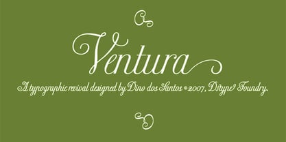
- Mentari by Surotype,
$35.00 Mentari a brush script typeface, bold and elegant, with several alternate characters in each letter to give you ease in accomplishing the work of typographic such as logotype, poster, headline, T-shirt and other creative projects.
 - Couturier by Latinotype,
$29.00 Couturier font is all about haute couture: classy ready-to-use characters for each project, perfectly drawn curved shapes and well-balanced counterforms. Elegantly embroidered ligatures, alternative glyphs and beautiful swashes give the font an extremely elegant look. Couturier comes in 4 weights, ranging from Regular to Black, with matching italics, resulting in a total of 8 fonts that help you achieve a strong composition in your publishing projects. Its true italics with a humanist feel give each design a chic personality. The font contains a set of more than 1,200 characters that support over 200 languages.
 - Centaur by Monotype,
$29.99 A refinement of Roman inscriptional capitals designed by Bruce Rogers as a titling design for signage in the Metropolitan Museum. Rogers later designed for the Monotype Corporation a lowercase based on Jenson’s work, turning the titling into a full typeface, Centaur, the most elegant and Aldine of the Jenson derivatives. Centaur® font field guide including best practices, font pairings and alternatives.
 - Gentry by Device,
$29.00 With its strong diagonal emphasis, Gentry is a humanised techno face that manages to also incorporate some strong calligraphic touches. Powerful in short and single-word settings.
 - Sentry by Solotype,
$19.95Here's a good old Victorian job printing font. Faithful to the original issued by Barnhart Bros. & Spindler about 1880. Nothing wildly decorative about it, yet it clearly looks old. - Venture by Linotype,
$29.99Venture Script reflects Hermann Zapf's handwriting. It was originally written with a Japanese feltpen. And like with Zapf's typeface Noris Script he wanted to preserve the rough outline of the handwritten form in the final drawings. - Venture by Michael Hill Design,
$6.00Venture is an all caps typeface inspired by the great outdoors. Also comes in 2 extra styles, great for that vintage print look! - Centers by Eurotypo,
$19.00
- 20th Century Font - Unknown license

- 20th Century German by Celebrity Fontz,
$24.99Ornamental initials superimposed on elaborate drawings of men and women in scenes from 20th Century German country life, with flowers, cottages, churches, and towns in the background. Includes one set of A-Z ornamental initials conveniently assigned to both the upper and lower case alphabet characters. - Century Old Style by URW Type Foundry,
$35.99 The Century Old Style font family was modeled on Century Expanded which had been cut in 1900. Similar weights and proportions were maintained but the letter shapes were made more elegant by the introduction of a number of old style characteristics. The Century Old Style font family is a useful text design that offers good legibility and economy.
 - Century Expanded SH by Scangraphic Digital Type Collection,
$26.00Since the release of these fonts most typefaces in the Scangraphic Type Collection appear in two versions. One is designed specifically for headline typesetting (SH: Scangraphic Headline Types) and one specifically for text typesetting (SB Scangraphic Bodytypes). The most obvious differentiation can be found in the spacing. That of the Bodytypes is adjusted for readability. That of the Headline Types is decidedly more narrow in order to do justice to the requirements of headline typesetting. The kerning tables, as well, have been individualized for each of these type varieties. In addition to the adjustment of spacing, there are also adjustments in the design. For the Bodytypes, fine spaces were created which prevented the smear effect on acute angles in small typesizes. For a number of Bodytypes, hairlines and serifs were thickened or the whole typeface was adjusted to meet the optical requirements for setting type in small sizes. For the German lower-case diacritical marks, all Headline Types complements contain alternative integrated accents which allow the compact setting of lower-case headlines. - ITC Century Handtooled by ITC,
$34.99 - Mid Century Sans by Dharma Type,
$19.99 Mid Century Sans (MCS) is composed of high-geometric shapes. László Moholy-Nagy —professor in the Bauhaus— said “Typography is a tool of communication. It has to be communication in its most intense form. The emphasis must be on absolute clarity since this distinguishes the character of our own writing from that of ancient pictographic forms.” As same as you can see in modern typefaces in the early twentieth century, MCS has very efficient, clear and minima letterforms. There are not any decorative parts in the skeleton of letters. At the same time, Mid Century Sans has one more feature. In the middle of the twentieth century, one big movement which was called Mid-century modern had occurred. The Mid-century modern movement in the U.S. was an American reflection of the International and Bauhaus movements and it was slightly more organic in form and less formal than the International Bauhaus-style. In other words, it was friendly and stylish. We added Mid-century-spices to the Bauhaus-modernism. The basic letter form is geometric yet it has very friendly strokes and human touch. Mid Century Sans consists of 8 weights and their matching Italics for a wide range of usages. Farther, Mid Century Sans is supporting international Latin languages and basic Cyrillic languages including Basic Latin, Western Europe, Central and South-Eastern Europe. Also MCS covers Mac Roman, Windows1252, Adobe1 to 3. This wide range of international characters expands the capability of your works. Lowercase "a" has OpenType stylistic alternates for advanced typography.
 - Century Gothic Paneuropean by Monotype,
$50.99Century Gothic™ is based on Monotype 20th Century, which was drawn by Sol Hess between 1936 and 1947. Century Gothic maintains the basic design of 20th Century but has an enlarged x-height and has been modified to ensure satisfactory output from modern digital systems. The design is influenced by the geometric style sans serif faces which were popular during the 1920s and 30s. The Century Gothic font family is useful for headlines and general display work and for small quantities of text, particularly in advertising. Century Gothic family has been extended to 14 weights in a Pan-European character set from Thin to Black and their corresponding Italics. The already existing 4 weights of Regular and Bold with their Italics are additionally still available in the STD character set. For international communication, the W1G versions offer the appropriate character set. They contain Latin, Greek and Cyrillic characters and thus support all languages and writing systems that are in official use in Western, Eastern and Central Europe. Century Gothic Variable is features two axes: Weight and Italic. The Weight axis has preset instances from Light to Black. The Italic axis is a switch between upright and italic. Looking for the perfect way to complete your project? Check out Aptifer™ Slab, ITC Berkeley Old Style®, FF Franziska™, Frutiger®, ITC Legacy® Square Serif or Plantin®. - Manuscript XIV Century by Intellecta Design,
$23.90 - Ninth Century MF by Masterfont,
$59.00 OpenType Pro Excellent support for Niqqud (Vowels). All marks are programmed to fit each glyph's shape and width. OpenType Pro includes new advanced features like Dagesh Hazak, ShevaNa, Qamatz Katan, Holam Haser and wide letters. Best used with Adobe InDesign CC that support complex Hebrew text. Please check these advanced features in this link: tinyurl.com/2fbkuy95
 - Century Old Style by Linotype,
$29.99In 1894, Linn Boyd Benton finished a commission for a new text typeface with the American periodical, Century magazine. Century is typical of the neorenaissance movement in typography at the end of the 19th century. Morris Fuller Benton drew a number of versions of the font for the font foundry, American Typefounders, and Century was later taken up by the firms Linotype, Intertype and Monotype.
