10,000 search results
(0.384 seconds)
- Myhota Hatched by Ingrimayne Type,
$7.00 Myhota is a condensed sans-serif face that has a bit of rawness to it. It is condensed and has a very high x-height, so it more useful for display than text. Myhota-Bold and Myhota-Light were designed in 1990 and the other seven weights were added in 2021 as were the italic and backslanted styles. There is rarely a use for backslanted type, but when it is needed, Myhota provides an option. Myhota-Hatched was an attempt to see if a readable text font could be hatched out of Myhota by lowering the x-height and widening the letters. The result is a face with rather squarish letters. The regular and bold were original styles with the medium and italic styles added in 2021.
 - Ample by Soneri Type,
$50.00 Ample is a display type family, optical mono linear and a bit squarish in nature. It has a smooth curve instead of sharp angles formed by the junction of two strokes, which is a prominent feature of its design. It is designed to be a little eye-catching yet legible. It has clear and distinguishable letterforms, which helps to elaborate and emphasise the message. It is graphically strong and commands viewer’s attention. The overall appearance of type is suitable in setting it as heading, title, headline, etc. The type family consists of six weights viz. Thin, ExLight, Light, Regular, Medium and Bold. Considering the nature of this type family, italics have been excluded. Ample is designed by Aakash Soneri in a period between 2013 and 2014.
 - Bradley Gratis - Unknown license

- MARIAMNE by Type Innovations,
$39.00 MARIAMNE is an original design by Alex Kaczun. It is an elegant, modern and traditional interpretation based on and modeled after his successful "Contax Pro" and "New Age Gothic" typeface series. As such, it has generous proportions with clean, crisp lines—ideally suited for easy reading and long lines of copy. Alex felt that the skeleton for "Contax" was perfectly suited to transform the design into a modern version of 'old-style', somewhat reminiscent of German Black Letter. Numerous modifications where made to the body proportions, stems and shapes. True 'old-style' serifs and unusual 'cross-strokes' where added for a touch of distinction. The 'cross-strokes' where added at exactly visual mid-point on the overall heights. This gives the typeface a romantic, female-like quality to the overall design. Strong, yet delicate. Visually stimulating in appearance and function. The result is a truly unique transitional and modern design. Unlike other typefaces, MARIAMNE incorporates uniform stems throughout the capitals, lower case and figures. This gives the design a uniform appearance in overall color and strength. There is a perfect visual balance between inter-letter spacing, stem weights and proportions. The accents are equally large, bold and command attention. This font includes a large 'Pro' character set, which supports most Central European and many Eastern European languages. As a result, the design is ideally suited for display copy as well as text composition. In the near future, Alex plans to expand the typeface series to include a light and heavy weight, along with true italics.
 - Keratine by Zetafonts,
$39.00 The letterforms that we now accept as the historical standard for printing latin alphabets were developed in Italy around the end of 1400. Deriving from Roman capitals and from italic handwriting, they soon replaced the blackletter letterforms that were used a few years before by Gutenberg for his first moveable types. Between these two typographical traditions there's an interesting and obscure middle ground of historical oddballs, like the Pannartz-Sweynheym Subiaco types, cut in Italy in 1462. Keratine is the result of Cosimo Lorenzo Pancini's exploration of that territory. Like our Kitsch by Francesco Canovaro it explores the impossible territory between antiqua and blackletter, not as a mere historical research, but rather as a way to re-discover and empower an unexpected and contemporary dynamism. Using contemporary digital aesthetics to combine the proportions of humanistic type with the gestural energy of Fraktur letterforms, Keratine develops a "digitally carved", quasi-pixelated appearance (clearly stressed in Keratine's italics) that allows an unexpected balance between small-size readability and display-size personality. Keratine also relies heavily on a variable identity as the letterforms change dynamically with weight, developing from a contrasted, text-oriented light range to more expressive and darker display range, for a total of 8 weights with italics. Open type features and glyph alternates further enrich the usage possibility of this typeface that embodies our contemporary swap culture by embracing the contradictory complexity at the crossroads between Gothic and Humanist styles, while playfully empathising with a digital, brutalist spirit.
 - Kingthings Spike Pro by CheapProFonts,
$10.00 You gotta love this extreme take on the "gothic" blackletter traditions! Roger Nelsson edited a few letters, drastically improved the spacing - and then gave it the usual large CheapProFonts character set. Fun! Kevin King says: "Kingthings Spike was made because Buffy has one, I made Willow... Xander is yet to come. Oh and because I hate Engravers Old English! Pugin, eat my shorts! Sorry!" Kingthings Spikeless is a toned down version of Kingthings Spike. Kevin King says: "Kingthings Spikeless was requested by those who actually want to read text... well I call that tedious, but if you must, here it is no flourishes, just my small homage to black-letter." ALL fonts from CheapProFonts have very extensive language support: They contain some unusual diacritic letters (some of which are contained in the Latin Extended-B Unicode block) supporting: Cornish, Filipino (Tagalog), Guarani, Luxembourgian, Malagasy, Romanian, Ulithian and Welsh. They also contain all glyphs in the Latin Extended-A Unicode block (which among others cover the Central European and Baltic areas) supporting: Afrikaans, Belarusian (Lacinka), Bosnian, Catalan, Chichewa, Croatian, Czech, Dutch, Esperanto, Greenlandic, Hungarian, Kashubian, Kurdish (Kurmanji), Latvian, Lithuanian, Maltese, Maori, Polish, Saami (Inari), Saami (North), Serbian (latin), Slovak(ian), Slovene, Sorbian (Lower), Sorbian (Upper), Turkish and Turkmen. And they of course contain all the usual "western" glyphs supporting: Albanian, Basque, Breton, Chamorro, Danish, Estonian, Faroese, Finnish, French, Frisian, Galican, German, Icelandic, Indonesian, Irish (Gaelic), Italian, Northern Sotho, Norwegian, Occitan, Portuguese, Rhaeto-Romance, Sami (Lule), Sami (South), Scots (Gaelic), Spanish, Swedish, Tswana, Walloon and Yapese.
 - Neuzeit Office by Linotype,
$50.99 The Neuzeit Office family is designed after the model of the original sans serif family Neuzeit S™ , which was produced by D. Stempel AG and the Linotype Design Studio in 1966. Neuzeit S itself was a redesign of D. Stempel AG’s DIN Neuzeit, created by Wilhelm Pischner between 1928 and 1939. Intended to represent its own time, DIN Neuzeit must have struck a harmonious chord. DIN Neuzeit is a constructed, geometric sans serif. It was born during the 1920s, a time of design experimentation and standardization, whose ethos has been made famous by the Bauhaus and De Stijl movements in art, architecture, and design. Upon its redesign as Neuzeit S in the 1960s, other developments in sans serif letter design were taken into account. Neuzeit S looks less geometric, and more gothic, or industrial. Separating it from typefaces like Futura, it has a double-storey a, instead of a less legible, single-storey variant. Unlike more popular grotesque sans serifs like Helvetica, Neuzeit S and especially the redesigned Neuzeit Office contain more open, legible letterforms. Neuzeit Office preserves the characteristic number forms that have been associated with its design for years. After four decades, Neuzeit has been retooled once again, and it is more a child of its age than ever before. Akira Kobayashi, Linotype’s Type Director, created the revised and updated Neuzeit Office in 2006. His greatest change was to retool the design to make its performance in text far more optimal. Additionally, he created companion oblique to help emphasize text.
 - Dapka by CBRTEXT Studio,
$16.00 Dapka is a unique typeface script. It offers beautiful typographic forms for a variety of design projects, including logos & branding, wedding designs, handwritten quotes, product packaging, headers, posters, merchandise, social media & greeting cards. social media posts, advertising & product design. So that it can help support your business. Dapka consists of 616 glyphs and supports 28 languages. OpenType features can be accessed using smart OpenType programs such as Adobe Illustrator, Adobe InDesign, Adobe Photoshop Corel Draw X version, and Microsoft Word. This font has provided a PUA Unicode (font with a special code).
 - Love Craft by Subectype,
$17.00 Love Craft is a Chic and Lovely Calligraphy font, described by an girly touch, perfect for your favorite projects. Fall in love with its incredibly distinct and timeless style and use it to create spectacular designs! This font is perfect for Wedding font, Fashion font, Invitation font, t-shirts font, websites font, Business font, Quotes font, headline font, branding font, advertising font, Signature Font, Social Media Font, Stationary Font, Product Packaging Font, Label Fonts, Photography signature, event font, poster font, party font, and various print and digital media with stylish touch.
 - Fox Kitty by Fox7,
$14.00 Fox Kitty is a cute and fun color font. This font is your go-to for crafting cute greeting cards that express affection and warmth. Whether you’re a designer, a social media influencer, or someone with a penchant for creative expression. Fall in love with its authentic feel and use it to create gorgeous invitations, beautiful stationary art, eye-catching social media posts, and cute greeting cards. Learn more about color font support on third-party apps here: https://www.colorfonts.wtf/ 🌺🌺 Please note that the Canva do not support color fonts! 🌺🌺
 - Kentrell Scripts by eyetype,
$14.00 Nigthfall a work that is purely a result of handwriting, has a natural characteristic. this is perfect for invitations, signatures, blogs, social media, business cards, product brands. Nigthfall a work that is purely handwritten, has its own characteristics with the style of monoline It is perfect for invitations, signatures, blogs, social media, business cards, product brands, also equipped with 52 ligature. OpenType features can be accessed by using OpenType smart programs such as Adobe Photo Shop, Adobe Illustrator, Adobe Indesign, Corel Draw and Microsoft Office. can also be accessed through the character map.
 - Plandscape by Akrtype Studio,
$19.00 Plandscape smooth monoline font is a beautiful and simple handwriting script font, contemporary and fashionable, Plandscape smooth monoline font looks elegant for a wide variety of designs. This elegant font can be read and looks good as a title or body text. This font will be perfect for many different designs for magazine headlines, social media, branding, wedding invitations, cards, etc. Plandscape smooth monoline font include ligatures, capital letters and alternate letters. They are easy to use and perfect for expressing your thoughts, posting quotes and simple daily updates on social media.
 - Lilith by Dawnland,
$13.00 Hand drawn shadow entities from the dark corners of Dawnland. Lilith X is ideal for: Initial characters - give your text a unparalleled facelift! Headlines - create a unique look for your posters, event graphics, book covers & music/media/game packaging. Preamble - reanimate the introduction... The main focus and usage of Lilith X are initial characters or headlines for posters, event graphics and music/media/game packaging. The bread text on the gallery images is written in Aeterna . Lilith X contain uppercase and small caps letters A-Z + swedish characters Å Ä Ö.
 - Darksite by Figuree Studio,
$18.00 Hello, this is Darksite - Urban Graffiti Font! This font was designed so that users can use it more easily and make graffiti designs easier. Darksite is very suitable for use in various media such as; packaging, logos, labels, posters, shirt designs, bulletins, typography, and many other media, especially with graffiti look. Features: All-caps PUA Encoded open Support for MAC or PC Simple installation for Adobe Illustrator, Corel Draw, Photoshop, or Procreate (New Updated) Bonus Swash That's it! If you have any questions don't hesitate to ask! Stay Classy!
 - Ravera by Putracetol,
$24.00 Revera is a font inspired european style and the only fonts with shapes and styles that exactly resemble the european characters & Revera is easy to read and can be applied to all media and all can use this font without exception Revera is suitable for your projects such as logo, wedding invitations, branding, landing pages, apparel, posters, headlines, greeting cards, invitation cards, social media, crafting, quote and more. Revera can be used and supported in various programs and OS, such as procreate, cricut, windows, macOS and others. This font is also support multi language.
 - Zieder Danger by Sipanji21,
$16.00 Hello, this is Zieder Danger modern Graffiti Font! This Fonts designed so that users can use it more easily and make graffiti designs easier. Zieder Danger is very suitable for use in various media such as; packaging, logos, labels, posters, shirt designs, bulletins, typography, and many other media, especially with graffiti look. Features: All Caps PUA Encoded open Support for MAC or PC Simple installation for Adobe Illustrator, Corel Draw, Photoshop, or Procreate (New Updated) Support Multilanguage That's it! If you have any questions don't hesitate to ask! Stay Classy!
 - Greatboyz by Figuree Studio,
$18.00 Hello, this is Graetboyz - Realistic Graffiti Tag Font! This font was designed so that users can use it more easily and make graffiti designs easier. Greatboyz is very suitable for use in various media such as; packaging, logos, labels, posters, shirt designs, bulletins, typography, and many other media, especially with graffiti look. Features: Uppercase & Lowercase PUA Encoded open Support for MAC or PC Simple installation for Adobe Illustrator, Corel Draw, Photoshop, or Procreate (New Updated) Bonus Swash That's it! If you have any questions don't hesitate to ask! Stay Classy!
 - Freitag Display by Zetafonts,
$39.00 Probably as a reaction to the pragmatism of modernist design, the seventies saw an explosion of buoyant, vivacious typography. Psychedelia fueled a return to the melting, lush shapes of Art Nouveau while Pop culture embraced the usage of funky, joyful lettering for advertising, product design and tv titling. New low-cost technologies like photo-lettering and rub-on transfer required new fonts to be expressive rather than legible, pushing designers to produce, bubbly, high-spirited masterpieces, where geometric excess and calligraphic inventions melted joyfully. Freitag is Cosimo Lorenzo Pancini's homage to this era and its typography. His starting point was the design of a heavy sans serif with humanist condensed proportions, flared stems and reverse contrast, that generated both the main family, and a variant display subfamily. The main typeface family slowly builds the tension and design exuberance along the weight axis - a bit like our desire for the weekend increases during the week. In Light and Medium weights the font shows a more controlled, medium-contrast design, tightly spaced for maximum display effect. The Book weight follows the same design but uses a more relaxed letter spacing to allow usage in smaller sizes and short body copy. As weight increases in the Bold weight the style becomes more expressive, with a visible reverse contrast building up and culminating in the Heavy weight with his clearly visible "bell bottoms" feel. In the display sub-family the design is pushed further by introducing variant letterforms that have a stronger connection to calligraphy and lettering. Also, the weight range becomes a optical one, with weights marked as Medium, Large, XLarge, as bringing the contrast and the boldness to the extreme creates smaller counterspaces that require bigger usage sizes. Another important addition of the display sub-family is the connected italics that sport swash capitals and cursive letterforms, developed with logo design and ultra-expressive editorial design in mind. To balance the extreme contrast in the XL weight, contrast of punctuation is reduced, creating a rich, highly-dynamic texture wherever diacritics and marks are used in the text. The full family includes 16 styles + 4 variable fonts, allowing full control of the design over its tree-hugging design space. All 20 fonts share an extended latin charset with open type features including case sensitive forms, single and double story variants and alternate glyphs. According to its creator, "Freitag is the typeface that sounds like an imaginary Woodstock where on the stage with Jimi Hendrix with Novarese, Motter, Excoffon and Benguiat playing onstage with Jimi Hendrix". Jeepers creepers!
 - VAG-HandWritten - 100% free

- Carmilla Demo, crafted by the notable typographer David F. Nalle, is a distinctive font that reflects a blend of timeless elegance and artistic flair, making it a standout choice for various design p...
- The KG Shadow of the Night font, designed by Kimberly Geswein, stands as an emblem of creativity that gracefully bridges the gap between whimsical charm and gothic elegance. Kimberly Geswein, known f...
- As of my last update in April 2023, "Skeleton Sketched" by Lauren Harrison may not be widely recognized under mainstream typographical resources or among the most popular font databases. However, let...
- Phoenica Std by preussTYPE,
$29.00 PHOENICA is a contemporary humanistic typeface family suitable for traditional high-resolution print purposes, office application and multi-media use. Of the creation formed the basis an idea which was developed for the first time by Lucian Bernhard approx in 1930 with the Berhard Gotic and was taken up in the last time by different written creators repeatedly: the repeated elimination anyway (in comparison to a Antiqua, e.g. Garamond) already very much diminished form Grotesque (as for example Helvetica) by systematic leaving out of the serifs. The horizontal direction of the writing is thereby stressed remarkably by which so-called »Rail effect« originates. The eyes can grasp the line to be read very well what is ordinarily left to a Serif-stressed font. By this desired effect is suited PHOENICA also for big text amounts. In numerous test runs Stems and tracking was compared to experienced fonts and was adapted. The experienced was taken over without renouncing, nevertheless, the modern and independent character PHOENICA. PHOENICA offers to you as a welcome alternative to the contemporary humanistic Sansserif. It is a very adaptable family for text and Corporate design uses. Several companies have discovered PHOENICA meanwhile as a Corporate font for themselves and use them very successfully. She provides a respectable typeface combined with refinement and elegance. Every PHOENICA family has at least six weights in each case in regular and italic. In addition more than three fine Haarline weights (Hairline 15, 25, 35). These are a total of 27 possibilities. Phoenica as well as Phoenica Condensed are excellently readable fonts, because they were optimised especially for amount sentence. Both basic styles (Regular and Condensed) are tuned on each other and follow the same form principle. The family is neither exclusively geometrical nor is constructed humanistically, the forms were sketched on quick and light Recognition effect of every single letter. The PHOENICA family design and logo is suited for all only conceivable uses like newspapers and magazines, for the book typography and Corporate Design.
 - The Kells SD font, designed by Steve Deffeyes, is a unique and intriguing typeface that finds its inspiration in the historical and ornate scripts of the past. Drawing from the rich heritage of the B...
- Bitstream Vera Sans - Unknown license

- Telephoto by Typodermic,
$11.95 In the world of graphic design, the right typeface can make or break a project. It’s not just about choosing a font that’s legible, but one that speaks to the essence of your brand or message. If you’re looking for a typeface that embodies classic charm and warmth, then look no further than Telephoto. Telephoto is a sans-serif typeface that harkens back to the twentieth century when analog was king. Its gentle, analog feel sets it apart from other typefaces on the market. When you use Telephoto, you’ll notice that it has a smooth personality that immediately injects classic ambience into your projects. But what really sets Telephoto apart are the subtle letter pair ligatures. These ligatures are a true testament to the attention to detail that went into creating this typeface. They break up the monotony of plainly repeating letters, creating a soft and organic feel that’s hard to find in today’s digital world. OpenType-savvy programs are where Telephoto truly shines, so make sure to turn off your application’s “standard ligatures” function to fully appreciate this effect. Telephoto is perfect for photographers, designers, and anyone who wants to bring a soft, analog feel to their work. Its delicate rendering is truly one-of-a-kind and adds a level of sophistication to any project. So why settle for a run-of-the-mill typeface when you can use Telephoto to make your work stand out? Give it a try and see the difference it can make. Most Latin-based European writing systems are supported, including the following languages. Afaan Oromo, Afar, Afrikaans, Albanian, Alsatian, Aromanian, Aymara, Bashkir (Latin), Basque, Belarusian (Latin), Bemba, Bikol, Bosnian, Breton, Cape Verdean, Creole, Catalan, Cebuano, Chamorro, Chavacano, Chichewa, Crimean Tatar (Latin), Croatian, Czech, Danish, Dawan, Dholuo, Dutch, English, Estonian, Faroese, Fijian, Filipino, Finnish, French, Frisian, Friulian, Gagauz (Latin), Galician, Ganda, Genoese, German, Greenlandic, Guadeloupean Creole, Haitian Creole, Hawaiian, Hiligaynon, Hungarian, Icelandic, Ilocano, Indonesian, Irish, Italian, Jamaican, Kaqchikel, Karakalpak (Latin), Kashubian, Kikongo, Kinyarwanda, Kirundi, Kurdish (Latin), Latvian, Lithuanian, Lombard, Low Saxon, Luxembourgish, Maasai, Makhuwa, Malay, Maltese, Māori, Moldovan, Montenegrin, Ndebele, Neapolitan, Norwegian, Novial, Occitan, Ossetian (Latin), Papiamento, Piedmontese, Polish, Portuguese, Quechua, Rarotongan, Romanian, Romansh, Sami, Sango, Saramaccan, Sardinian, Scottish Gaelic, Serbian (Latin), Shona, Sicilian, Silesian, Slovak, Slovenian, Somali, Sorbian, Sotho, Spanish, Swahili, Swazi, Swedish, Tagalog, Tahitian, Tetum, Tongan, Tshiluba, Tsonga, Tswana, Tumbuka, Turkish, Turkmen (Latin), Tuvaluan, Uzbek (Latin), Venetian, Vepsian, Võro, Walloon, Waray-Waray, Wayuu, Welsh, Wolof, Xhosa, Yapese, Zapotec Zulu and Zuni.
 - Uppercut Angle by Delve Fonts,
$39.00 Joachim Müller-Lancé's Uppercut is a rather sporting fellow, originally developed for the Krav Maga training center of San Francisco (Krav Maga is a simple and efficient self-defense system that has become equally popular in Hollywood and with law enforcement). Joachim has spent several years training, hitting things and people whenever he needs a break from kerning. Uppercut can be seen on the school's t-shirts and other articles. Despite bearing the same moniker as an upwards punch to the chin, the name actually fell together quite naturally as Uppercut is an all uppercase typeface, and the word "cut" is also historically used to describe a type style in hot metal type. For this slanted look, "Angle" felt just right (with thanks to Mia McHatton). The design idea sprang from pencil sketches for the center's new identity. Uppercut's shapes are not calligraphic or handwritten, more like lettering seen in comics or sports logos. Its brush movements are imaginary, not too literally brushy. During development, details were simplified and reduced until a bit of a cut-paper feel emerged, but more fluid like writing. The shapes are economical and efficient; simplicity makes the font versatile, holding up in small as well as big sizes. Uppercut is decidedly analog, muscular but not bulky, with the fluid but determined movements of a boxer or martial artist - not theatrical but powerful, fast, confident and dynamic. Well... it has punch. In the proportions, there is emphasis on a strong upper edge "keeping its guard up", while several stems protrude downward, giving the impression of leaping or being "light on the feet". Use Uppercut to pick up the pace, add snap, verve and drive - on movie posters for action and adventure, to advertise your dojo, rumble or prizefight, racing team or tuning shop, or invite friends to your barbecue with old time rock'n'roll and homemade hot pepper sauce.
 - Chillgangs by Patria Ari,
$15.00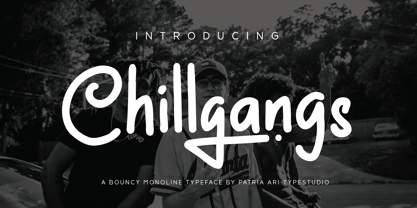 Chillgangs is a monoline display typeface inspired from graffiti culture, with alternative glyphs and swashes. Chillgangs is perfect for apparel, logo, social media posts, advertisements, product packaging, product designs, label, and many more.
 - Ditho by Mifiq,
$14.00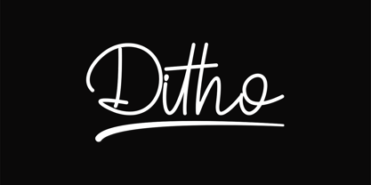 Ditho is an excellent handwritten script font. Ditho is suitable for social media posts, advertisements, logos & branding, invitations, product design, photography, watermarks, labels, wedding designs, product packaging, any event that requires a handwriting.
 - Priscilla by Rockboys Studio,
$26.00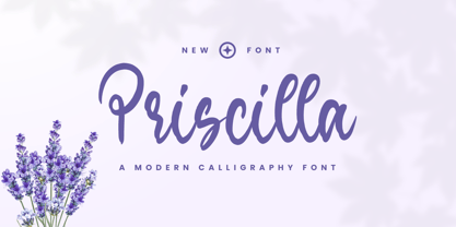 Priscilla is a beautiful and refined script font. It has a classy, elegant and modern look that can be used for logos, branding, invitations, stationery, wedding designs, social media posts, and much more!
 - Retro Vintage by Nirmana Visual,
$15.00 Retro Vintage , Inspired by 70s Design Era. Retro Vintage offers beautiful typographic harmony for a diversity of design projects, including logos & branding, social media posts, advertisements & product designs. Includes a shadow/extrude version.
 - Santup by Jadatype,
$15.00 Santup is a display font that comes with a playful style. suitable for posters, tshirt, branding, social media, and so on. contains standard English letters, numbers, punctuation, and several accents that support multilingualism.
 - Retro Sanderia by Nirmana Visual,
$19.00 Retro Sanderia, Inspired by 70s Advertising Design With 2 Style : Regular & Shadow Retro Sanderia offers beautiful typographic harmony for a diversity of design projects, including logos & branding, social media posts, advertisements & product designs.
 - Pitch Pipe by Aboutype,
$24.99Graphically drawn condensed bold style with abbreviated square serifs. PitchPipe was designed for all media and can be used in a wide range of point sizes. PitchPipe requires subjective display kerning and compensation. - Trostie Love by Lemonthe,
$9.00 Trostie Love is a handwritten font, cute and fun. This font is perfect for quotes, headings, blogs, logos, invitations, wedding, watermark, social media posts, product packaging, product designs, label, special events and more!
 - Retro Styla by Nirmana Visual,
$15.00 Retro Styla , Inspired by 70s Design Era , With 2 Style : Regular & Shadow, Retro Styla offers beautiful typographic harmony for a diversity of design projects, including logos & branding, social media posts, advertisements & product designs.
 - Bellowers by Aestherica Studio,
$12.00 Introducing a new handwritten script font by Aestherica Studio. Bellowers is perfect for product packaging, branding projects, magazines, social media, wedding, or just used to express words above the background. Enjoy the font.
 - Cybestpunk by Jadatype,
$15.00 Cybestpunk is a display font that comes with a cyber tech style. suitable for tshirt, branding, social media, and so on. contains standard English letters, numbers, punctuation, and several accents that support multilingualism.
 - Castonvilla by Rockboys Studio,
$19.00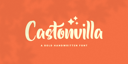 Castonvilla is a beautiful and refined script font. It has a classy, elegant and modern look that can be used for logos, branding, invitations, stationery, wedding designs, social media posts, and much more!
 - Hello Signature by Romie Creative,
$15.00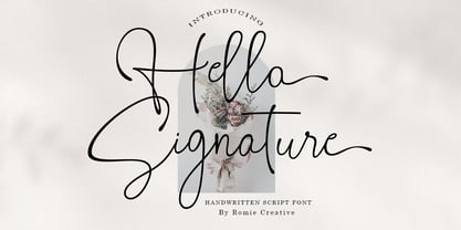 Hello Signature is a handwritten script font, this font is perfect for logos, invitations, stationery, wedding designs, social media posts, advertisements, product packaging, product design, labels, photography, watermarks, special events, or anything else.


