10,000 search results
(0.033 seconds)
- Twentieth Century by Pelavin Fonts,
$20.00 Twentieth Century was designed for the cover of 20th Century French Poetry and was drawn with pure geometric shapes. It is the distillation of a broad variety of styles loosely known as Art Deco but, also categorized under such terms as Moderne, Streamline, Machine Age, Futurist, 70s Art Deco, Memphis among others. If there were a source in particular that I would cite as my inspiration, however, it would definitely be the work of Frank Lloyd Wright. I mean, look at the "W" for cryin' out loud!
 - Prime Century by Letterhend,
$14.00 Prime Century is an organic hand drawn font duo consist of a script paired with a sans serif with a touch of classic look and feel. This type of font perfectly made to be applied especially in logo, headline, signage and the other various formal forms such as invitations, labels, logos, magazines, books, greeting / wedding cards, packaging, fashion, make up, stationery, novels, labels or any type of advertising purpose. Features : Uppercase & lowercase Numbers and punctuation Alternates & Ligatures Multilingual PUA encoded
 - Monotype Century by Monotype,
$29.99 - Bolded by We Make Font,
$16.00 Bolded is a new complete type family, designed and developed by creative professionals. Contains geometric and rounded features, optimized for both long texts and small screens and texts. The complete family offers seven weights divided between the basic, italic, condensed and condensed italic family. Created in 2022, Bolded has a modern and functional look, designed for the most diverse uses and projects. Bolded is a geometric rounded family that can meet the needs of the most varied professionals looking for a clean and elegant font family with a wide set of Latin characters.
 - Bolde by Figuree Studio,
$18.00 Bolde is a powerful sans serif font family with modern touches. A balance of hard lines and smooth curves makes them able to stand on their own dynamically Features: five all caps font, Numbers & Punctuation / Extensive Language Support Bolde works great in any branding, logos, magazines, film. The different styles give you the full range to explore a whole host of applications. Thanks for having a peek at Bolde. As always, if you have any questions just send me a message!
 - Megaton Extras - 100% free

- Extra virgin - Unknown license

- Megaton Extras - 100% free

- Devroye Extra - Unknown license

- Zapfino Extra by Linotype,
$103.99 Today's digital font technology has allowed renowned font designer and calligrapher Hermann Zapf to realize a dream he first had more than fifty years ago: to create a typeface that would come very close to the freedom and liveliness of beautiful handwriting. The basic Zapfino font family, released in 1998, consists of four alphabets with many additional stylistic alternates that can be freely mixed together to emulate the variations in handwritten text. In 2003, Zapf completed Zapfino Extra, a large expansion of the Zapfino family. Designed in collaboration with Akira Kobayashi, Zapfino Extra has a cornucopia of new characters. It includes exuberant hyper-flourishes, elegant small caps, dozens of ornaments, more alternates and ligatures, index characters, and a very useful "forte" (bold) version. Use Zapfino to produce unusual and graceful advertisements, packaging, and invitations. Featured in: Best Fonts for Logos, Best Fonts for Tattoos
 - Extra C by Tipastype,
$28.00 It is an Extra Condensed, Extra Light, Extra experimental and Extra display font. Extra C is a fun font that doesn't take itself too seriously. Ideal for those who need a font with great character and personality but at the same time a delicate touch in their graphic pieces. EXTRA C has 4 static weights in addition to a variable version.
 - FF Extra by FontFont,
$41.99 American type designer Paul H. Neville created this display FontFont in 1995. The family contains 2 weights: Condensed and Black and is ideally suited for editorial and publishing and poster and billboards. FF Extra provides advanced typographical support with features such as ligatures. It comes with proportional lining figures.
 - Extra Crunchy by Bogstav,
$18.00 Extra Crunchy is my handwriting when I am eating cookies while drawing! No, it's true! I did eat a whole box of cookies while drawing this font! :) The letters are a bit jumpy, and have no steady x-height, however, your text may look a bit off, but it is clear and legible. Fits perfect for a children's book, a postcard/poster design or something else that needs that extra crunch :)
 - Exelancer Extra by Popskraft,
$9.00 Introducing the cutting-edge Excelancer Extra font, a modern masterpiece born from the rich heritage of classic sci-fi typography. Our inspiration? The boundless allure of outer space. And bestseller — the Excelancer font! https://www.myfonts.com/collections/exelancer-font-popskraft Excelancer Extra font is a harmonious blend of sleek, contemporary design, drawing from the timeless elegance of its predecessor. What sets Excelancer Extra apart is its captivating fusion of bold, ornate uppercase characters with meticulously crafted lowercase letters that maintain exceptional readability, even in extensive text. With Excelancer, you possess an all-encompassing font toolkit, designed to tackle every facet of forward-looking design. But that's not all. This font isn't just for intergalactic tales; it's also a striking choice for anything related to technology, innovation, progress, and even the world of sports. In essence, Excelancer embodies the pure essence of the future—an infusion of dynamism that knows no bounds!
 - Extra MF by Masterfont,
$59.00 Geometric forms make this elegant font a great choise for invitations and signs, indoor and outdoor.
 - Gothic Gothic by Typeco,
$29.00Gothic Gothic is a fusion of old and new that is both Gothic and Gothic. In typography Gothic can refer to German Blackletter or Old English styles. Gothic can also mean block or sans serif style lettering. By combining and balancing the elements from both of these ideas we have created a contemporary extended block letter typeface. The Gothic Gothic family contains 2 companion fonts. Gothic Gothic Text is a more minimal variation that has a more roman looking style while still retaining some Blackletter feel. Gothic Gothic Black is a bolder version designed to tend more toward the Blackletter style of Gothic with more contrast of stroke and a few of the more unusual Blackletter forms thrown in for flavor. Gothic Gothic has been honored with an award of Excellence in Type Design from Association Typographique International (ATypI) in 2001. Typeco has updated this font and has released it as an expanded family. Gothic Gothic is a crepuscular family of 3 fonts - OL Gotham Gothic by Dennis Ortiz-Lopez,
$40.00 - Xtra - Unknown license

- Centric by Scholtz Fonts,
$19.00Centric is a rounded and happy font. The circular design that covers the face of this font was inspired by the ripples made when a pebble is thrown into a pond. The outline shapes of the characters were derived from the Font Mafuta. Centric is doubly effective when used in conjunction with Mafuta. It is best used for headings and where you intend to make a strong impact, possibly with an African flair. - Centurion by Scriptorium,
$18.00 - Ventura by DSType,
$26.00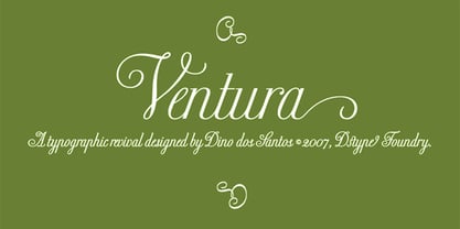
- Mentari by Surotype,
$35.00 Mentari a brush script typeface, bold and elegant, with several alternate characters in each letter to give you ease in accomplishing the work of typographic such as logotype, poster, headline, T-shirt and other creative projects.
 - Couturier by Latinotype,
$29.00 Couturier font is all about haute couture: classy ready-to-use characters for each project, perfectly drawn curved shapes and well-balanced counterforms. Elegantly embroidered ligatures, alternative glyphs and beautiful swashes give the font an extremely elegant look. Couturier comes in 4 weights, ranging from Regular to Black, with matching italics, resulting in a total of 8 fonts that help you achieve a strong composition in your publishing projects. Its true italics with a humanist feel give each design a chic personality. The font contains a set of more than 1,200 characters that support over 200 languages.
 - Centaur by Monotype,
$29.99 A refinement of Roman inscriptional capitals designed by Bruce Rogers as a titling design for signage in the Metropolitan Museum. Rogers later designed for the Monotype Corporation a lowercase based on Jenson’s work, turning the titling into a full typeface, Centaur, the most elegant and Aldine of the Jenson derivatives. Centaur® font field guide including best practices, font pairings and alternatives.
 - Gothic by Red Rooster Collection,
$45.00Digitally engineered by Steve Jackaman. Ludlow, circa 1939. - Gothic by Wooden Type Fonts,
$15.00 Gothic Bold Condensed, first shown in 1889 by Hamilton wooden type founders. With lowercase. Gothic Bold Expanded.
 - M Gothic Gold HK by Monotype HK,
$523.99 M Gothic Gold HK is a modulated style Traditional Chinese typeface. Modulated font designs have apparent thick-thin contrast at the strokes, and often include special design characteristics at entry, finial and transitional points of the strokes. Modulated Traditional Chinese font design category includes traditional Song, Ming or Fang Song style typefaces which are popular for continuous reading.
 - M Gothic Gold PRC by Monotype HK,
$523.99 M Gothic Gold PRC is a modulated style Simplified Chinese typeface. Modulated font designs have apparent thick-thin contrast at the strokes, and often include special design characteristics at entry, finial and transitional points of the strokes. Modulated Simplified Chinese font design category includes traditional Song, Ming or Fang Song style typefaces which are popular for continuous reading.
 - P22 Gothic Gothic by IHOF,
$24.95 The name says it all. Gothic from the old literary style and/or current subculture genre. And Gothic meaning a block or sans serif style of lettering. The concept was to take the classic German style lettering and create a contemporary extended block letter typeface. The result is a fusion of old and new.
 - Iwata Gothic Old Pro by IWATA,
$199.00 ?????????????????????????????????? ???????????????????????????????????????????????
 - Iwata Gothic Old Std by IWATA,
$149.00 活字書体「岩田呉竹体」のデザインを引き継ぐ、伝統あるゴシック体です。 起筆、終筆部の活字特有のアクセントが力強さを伝えます。大見出しから本文まで幅広く対応できます。
 - Gentry by Device,
$29.00 With its strong diagonal emphasis, Gentry is a humanised techno face that manages to also incorporate some strong calligraphic touches. Powerful in short and single-word settings.
 - Sentry by Solotype,
$19.95Here's a good old Victorian job printing font. Faithful to the original issued by Barnhart Bros. & Spindler about 1880. Nothing wildly decorative about it, yet it clearly looks old. - Venture by Linotype,
$29.99Venture Script reflects Hermann Zapf's handwriting. It was originally written with a Japanese feltpen. And like with Zapf's typeface Noris Script he wanted to preserve the rough outline of the handwritten form in the final drawings. - Venture by Michael Hill Design,
$6.00Venture is an all caps typeface inspired by the great outdoors. Also comes in 2 extra styles, great for that vintage print look! - Centers by Eurotypo,
$19.00
- 20th Century Font - Unknown license

- 20th Century German by Celebrity Fontz,
$24.99Ornamental initials superimposed on elaborate drawings of men and women in scenes from 20th Century German country life, with flowers, cottages, churches, and towns in the background. Includes one set of A-Z ornamental initials conveniently assigned to both the upper and lower case alphabet characters. - Century Expanded SH by Scangraphic Digital Type Collection,
$26.00Since the release of these fonts most typefaces in the Scangraphic Type Collection appear in two versions. One is designed specifically for headline typesetting (SH: Scangraphic Headline Types) and one specifically for text typesetting (SB Scangraphic Bodytypes). The most obvious differentiation can be found in the spacing. That of the Bodytypes is adjusted for readability. That of the Headline Types is decidedly more narrow in order to do justice to the requirements of headline typesetting. The kerning tables, as well, have been individualized for each of these type varieties. In addition to the adjustment of spacing, there are also adjustments in the design. For the Bodytypes, fine spaces were created which prevented the smear effect on acute angles in small typesizes. For a number of Bodytypes, hairlines and serifs were thickened or the whole typeface was adjusted to meet the optical requirements for setting type in small sizes. For the German lower-case diacritical marks, all Headline Types complements contain alternative integrated accents which allow the compact setting of lower-case headlines. - Century Schoolbook EF by Elsner+Flake,
$35.00


