3,224 search results
(0.028 seconds)
- Centurion by Scriptorium,
$18.00 - Ventura by DSType,
$26.00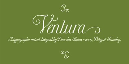
- Mentari by Surotype,
$35.00 Mentari a brush script typeface, bold and elegant, with several alternate characters in each letter to give you ease in accomplishing the work of typographic such as logotype, poster, headline, T-shirt and other creative projects.
 - Couturier by Latinotype,
$29.00 Couturier font is all about haute couture: classy ready-to-use characters for each project, perfectly drawn curved shapes and well-balanced counterforms. Elegantly embroidered ligatures, alternative glyphs and beautiful swashes give the font an extremely elegant look. Couturier comes in 4 weights, ranging from Regular to Black, with matching italics, resulting in a total of 8 fonts that help you achieve a strong composition in your publishing projects. Its true italics with a humanist feel give each design a chic personality. The font contains a set of more than 1,200 characters that support over 200 languages.
 - Centaur by Monotype,
$29.99 A refinement of Roman inscriptional capitals designed by Bruce Rogers as a titling design for signage in the Metropolitan Museum. Rogers later designed for the Monotype Corporation a lowercase based on Jenson’s work, turning the titling into a full typeface, Centaur, the most elegant and Aldine of the Jenson derivatives. Centaur® font field guide including best practices, font pairings and alternatives.
 - Gentry by Device,
$29.00 With its strong diagonal emphasis, Gentry is a humanised techno face that manages to also incorporate some strong calligraphic touches. Powerful in short and single-word settings.
 - Sentry by Solotype,
$19.95Here's a good old Victorian job printing font. Faithful to the original issued by Barnhart Bros. & Spindler about 1880. Nothing wildly decorative about it, yet it clearly looks old. - Venture by Linotype,
$29.99Venture Script reflects Hermann Zapf's handwriting. It was originally written with a Japanese feltpen. And like with Zapf's typeface Noris Script he wanted to preserve the rough outline of the handwritten form in the final drawings. - Venture by Michael Hill Design,
$6.00Venture is an all caps typeface inspired by the great outdoors. Also comes in 2 extra styles, great for that vintage print look! - Centers by Eurotypo,
$19.00
- 20th Century Font - Unknown license

- 20th Century German by Celebrity Fontz,
$24.99Ornamental initials superimposed on elaborate drawings of men and women in scenes from 20th Century German country life, with flowers, cottages, churches, and towns in the background. Includes one set of A-Z ornamental initials conveniently assigned to both the upper and lower case alphabet characters. - Century Old Style by URW Type Foundry,
$35.99 The Century Old Style font family was modeled on Century Expanded which had been cut in 1900. Similar weights and proportions were maintained but the letter shapes were made more elegant by the introduction of a number of old style characteristics. The Century Old Style font family is a useful text design that offers good legibility and economy.
 - Century Expanded SH by Scangraphic Digital Type Collection,
$26.00Since the release of these fonts most typefaces in the Scangraphic Type Collection appear in two versions. One is designed specifically for headline typesetting (SH: Scangraphic Headline Types) and one specifically for text typesetting (SB Scangraphic Bodytypes). The most obvious differentiation can be found in the spacing. That of the Bodytypes is adjusted for readability. That of the Headline Types is decidedly more narrow in order to do justice to the requirements of headline typesetting. The kerning tables, as well, have been individualized for each of these type varieties. In addition to the adjustment of spacing, there are also adjustments in the design. For the Bodytypes, fine spaces were created which prevented the smear effect on acute angles in small typesizes. For a number of Bodytypes, hairlines and serifs were thickened or the whole typeface was adjusted to meet the optical requirements for setting type in small sizes. For the German lower-case diacritical marks, all Headline Types complements contain alternative integrated accents which allow the compact setting of lower-case headlines. - ITC Century Handtooled by ITC,
$34.99 - Mid Century Sans by Dharma Type,
$19.99 Mid Century Sans (MCS) is composed of high-geometric shapes. László Moholy-Nagy —professor in the Bauhaus— said “Typography is a tool of communication. It has to be communication in its most intense form. The emphasis must be on absolute clarity since this distinguishes the character of our own writing from that of ancient pictographic forms.” As same as you can see in modern typefaces in the early twentieth century, MCS has very efficient, clear and minima letterforms. There are not any decorative parts in the skeleton of letters. At the same time, Mid Century Sans has one more feature. In the middle of the twentieth century, one big movement which was called Mid-century modern had occurred. The Mid-century modern movement in the U.S. was an American reflection of the International and Bauhaus movements and it was slightly more organic in form and less formal than the International Bauhaus-style. In other words, it was friendly and stylish. We added Mid-century-spices to the Bauhaus-modernism. The basic letter form is geometric yet it has very friendly strokes and human touch. Mid Century Sans consists of 8 weights and their matching Italics for a wide range of usages. Farther, Mid Century Sans is supporting international Latin languages and basic Cyrillic languages including Basic Latin, Western Europe, Central and South-Eastern Europe. Also MCS covers Mac Roman, Windows1252, Adobe1 to 3. This wide range of international characters expands the capability of your works. Lowercase "a" has OpenType stylistic alternates for advanced typography.
 - Century Gothic Paneuropean by Monotype,
$50.99Century Gothic™ is based on Monotype 20th Century, which was drawn by Sol Hess between 1936 and 1947. Century Gothic maintains the basic design of 20th Century but has an enlarged x-height and has been modified to ensure satisfactory output from modern digital systems. The design is influenced by the geometric style sans serif faces which were popular during the 1920s and 30s. The Century Gothic font family is useful for headlines and general display work and for small quantities of text, particularly in advertising. Century Gothic family has been extended to 14 weights in a Pan-European character set from Thin to Black and their corresponding Italics. The already existing 4 weights of Regular and Bold with their Italics are additionally still available in the STD character set. For international communication, the W1G versions offer the appropriate character set. They contain Latin, Greek and Cyrillic characters and thus support all languages and writing systems that are in official use in Western, Eastern and Central Europe. Century Gothic Variable is features two axes: Weight and Italic. The Weight axis has preset instances from Light to Black. The Italic axis is a switch between upright and italic. Looking for the perfect way to complete your project? Check out Aptifer™ Slab, ITC Berkeley Old Style®, FF Franziska™, Frutiger®, ITC Legacy® Square Serif or Plantin®. - Manuscript XIV Century by Intellecta Design,
$23.90 - Ninth Century MF by Masterfont,
$59.00 OpenType Pro Excellent support for Niqqud (Vowels). All marks are programmed to fit each glyph's shape and width. OpenType Pro includes new advanced features like Dagesh Hazak, ShevaNa, Qamatz Katan, Holam Haser and wide letters. Best used with Adobe InDesign CC that support complex Hebrew text. Please check these advanced features in this link: tinyurl.com/2fbkuy95
 - Century Old Style by Linotype,
$29.99In 1894, Linn Boyd Benton finished a commission for a new text typeface with the American periodical, Century magazine. Century is typical of the neorenaissance movement in typography at the end of the 19th century. Morris Fuller Benton drew a number of versions of the font for the font foundry, American Typefounders, and Century was later taken up by the firms Linotype, Intertype and Monotype. - Century PS Pro by SoftMaker,
$14.99 Century PS Pro is a serif typeface published by SoftMaker.
 - 19th Century Retro by Matthias Luh,
$35.00 19th Century Retro is a re-design of an official German font style (called ‘Fraktur’) which was used in official documents in the 19th and early 20th century. There is an alternative small letter ‘s’ which you generate by typing the @ sign. This alternative letter was the original small letter s which was printed in the middle and at the beginning of a word originally (for example in the words ‘slightly’ and ‘best’). However, if the s was at the end, the normal small letter s was used (for example in the words ‘it's’ and ‘columns’). For readability reasons I decided to put the normal small letter s onto the s-key on your keyboard.
 - Century Nova SB by Scangraphic Digital Type Collection,
$26.00 Since the release of these fonts most typefaces in the Scangraphic Type Collection appear in two versions. One is designed specifically for headline typesetting (SH: Scangraphic Headline Types) and one specifically for text typesetting (SB Scangraphic Bodytypes). The most obvious differentiation can be found in the spacing. That of the Bodytypes is adjusted for readability. That of the Headline Types is decidedly more narrow in order to do justice to the requirements of headline typesetting. The kerning tables, as well, have been individualized for each of these type varieties. In addition to the adjustment of spacing, there are also adjustments in the design. For the Bodytypes, fine spaces were created which prevented the smear effect on acute angles in small typesizes. For a number of Bodytypes, hairlines and serifs were thickened or the whole typeface was adjusted to meet the optical requirements for setting type in small sizes. For the German lower-case diacritical marks, all Headline Types complements contain alternative integrated accents which allow the compact setting of lower-case headlines.
 - Century Expanded EF by Elsner+Flake,
$35.00 - Century New Style by Red Rooster Collection,
$45.00Designed by Les Usherwood. Digitally engineered by Steve Jackaman. This beautiful version of Century Old Style by Les may be superior to any existing versions. - LTC Twentieth Century by Lanston Type Co.,
$49.95 Twentieth Century was Lanston Monotypes answer to Futura. In fact Saul Hess's redrawing of Futura is so close that this new digital revival includes alternates of the long lost original letterforms originally designed by Paul Renner for Futura, but were left out of the released version that has become so popular. 20th Century is a modern sans serif with apparent geometry yet still a certain warmth in its design. The OpenType version of LTC Twentieth Century incorporates the alternate Renner glyphs with two sets of alternate lowercase characters. The font also includes oldstyle numerals and a full Western and Central European character set.
 - XX Century Ornaments by Wiescher Design,
$19.50 XX-Century-Ornaments are another trouvaille. Great looking ornaments, columns, eagles and lions by Gert Wiescher
 - Century Expanded LT by Linotype,
$29.99In 1894, Linn Boyd Benton finished a commission for a new text typeface with the American periodical, Century magazine. Century is typical of the neorenaissance movement in typography at the end of the 19th century. Morris Fuller Benton drew a number of versions of the font for the font foundry, American Typefounders, and Century was later taken up by the firms Linotype, Intertype and Monotype. - Couturier Poster by Latinotype,
$29.00 Elegance flows through Couturier Poster soul. The new cousin of early launched Couturier, brings higher contrast and an extended family, perfect for big sizes. Inspired by the didones from the 18th century, its design its heavily influenced by contemporary ideas makes it suitable to use for almost anything you can think of. Equipped with swashes, ligatures, small caps and alternates, this typography is very versatile and allows you to set a big range of compositions with discretion or personality. Couturier Poster comes in six weights and matching true italics, from thin to black. It's a good choice to pair with Couturier for smaller sizes and Couturier Poster for the big titles. It has a set of 1248 characters that cover more than 200 languages derived from latin.
 - Senja Mentari by Ahmad Jamaludin,
$15.00 Senja Mentari is elegant modern calligraphy font inspired by delicate inky hand lettering, gorgeous wedding calligraphy and trending minimal branding designs. This beautiful font is for those who are needing of elegance and stylish for their designs and particularly well suited for wedding invitations, cards and feminine branding. I have wanted to create such combination a long time and can’t believe that it is here. I’m super excited and hope you’ll estimate it too. Now all you need for perfect wedding invitation design is in one product. I think this decision will help you to save your time! What's included? More than 100 beautiful swashes in this font Accessible in the Adobe Illustrator, Adobe Photoshop, Adobe InDesign, even work on Microsoft Word. PUA Encoded Characters - Fully accessible without additional design software. Multilingual Support : à á â ã ä å æ ç è é ê ë ì í î ï ñ ò ó ô õ ö ø ù ú û ü ý ÿ š fl fi ž œ ı ç ø š ž æ œ À Á Â Ã Ä Å Æ È É Ê Ë Ì Í Î Ï Ñ Ò Ó Ô Õ Ö Ø Œ Ù Ú Û Ü Ý Ÿ Š Š ŽŁ Ð Ç
 - Centrio Typeface by Joelmaker,
$20.00 *About the Product* **Centrio Typeface** Retro with an artistic touch elegant modern yet vintage the as well as a unique blend of ligatures a letter, so that the authors compose it with a and little swirly embedding, so that a modern font is formed and ready to make a statement by adding elegant and unique flair to your next design project. **Centrio Typeface** can be used for various purposes such as Magazine Title, Poster, Logo, T-Shirt, Sub Title, Business cards, Magazines, Book Covers, Wedding Invitations,Templates Instagram Story Post, Greeting Cards, Quotes, etc. These letters are embedded into the font file and easily accessible in programs such as photoshop and illustrator. You can access these in more basic design programs but you will need to use your character map or font book Come on..let's style and pamper your next design with **Centrio Typeface**
 - The Centurion by Creativework Studio,
$18.00 The Centurion is a gothic blackletter. It feels classic and artistic. Add this beautiful font to each of your creative ideas and notice how it makes them stand out! The Centurion is perfect for Band logos & branding, product designs, label, product, movie, book tittle, product packaging, t’shirt design
 - Italian Cursive, 16th Century - Unknown license

- 20th Century ExtraBold Extended by Wooden Type Fonts,
$20.00 A version of Futura, but very bold, ideal for modern advertising.
 - 19th Century American Initials by Celebrity Fontz,
$19.9919th Century American Initials is a collection of beautiful Art Deco letters surrounded by swelling, sinuous, stylized natural forms of flowers, scrolls, spirals, rosettes, waves, and rain drops. This curvy artistic font Includes one set of A-Z ornamental initials conveniently assigned to both the upper and lower case alphabet characters. Perfect for starting off the beginning of paragraphs in artistic publications, storybooks, fairy tales, and texts conveying the feel of the Art Deco period. - Century Old Style SH by Scangraphic Digital Type Collection,
$26.00Since the release of these fonts most typefaces in the Scangraphic Type Collection appear in two versions. One is designed specifically for headline typesetting (SH: Scangraphic Headline Types) and one specifically for text typesetting (SB Scangraphic Bodytypes). The most obvious differentiation can be found in the spacing. That of the Bodytypes is adjusted for readability. That of the Headline Types is decidedly more narrow in order to do justice to the requirements of headline typesetting. The kerning tables, as well, have been individualized for each of these type varieties. In addition to the adjustment of spacing, there are also adjustments in the design. For the Bodytypes, fine spaces were created which prevented the smear effect on acute angles in small typesizes. For a number of Bodytypes, hairlines and serifs were thickened or the whole typeface was adjusted to meet the optical requirements for setting type in small sizes. For the German lower-case diacritical marks, all Headline Types complements contain alternative integrated accents which allow the compact setting of lower-case headlines. - Century Gothic Paneuropean Variable by Monotype,
$209.99 Century Gothic™ is based on Monotype 20th Century, which was drawn by Sol Hess between 1936 and 1947. Century Gothic maintains the basic design of 20th Century but has an enlarged x-height and has been modified to ensure satisfactory output from modern digital systems. The design is influenced by the geometric style sans serif faces which were popular during the 1920s and 30s. The Century Gothic font family is useful for headlines and general display work and for small quantities of text, particularly in advertising. Century Gothic family has been extended to 14 weights in a Pan-European character set from Thin to Black and their corresponding Italics. The already existing 4 weights of Regular and Bold with their Italics are additionally still available in the STD character set. For international communication, the W1G versions offer the appropriate character set. They contain Latin, Greek and Cyrillic characters and thus support all languages and writing systems that are in official use in Western, Eastern and Central Europe. Century Gothic Variable is features two axes: Weight and Italic. The Weight axis has preset instances from Light to Black. The Italic axis is a switch between upright and italic. Looking for the perfect way to complete your project? Check out Aptifer™ Slab, ITC Berkeley Old Style®, FF Franziska™, Frutiger®, ITC Legacy® Square Serif or Plantin®.
 - Monotype Century Old Style by Monotype,
$29.99The Century Old Style family was modeled on Century Expanded, which had been cut in 1900. Similar weights and proportions were maintained, but the letter shapes were made more elegant by the introduction of a number of old style characteristics. The Century Old Style family is a useful text design that offers good legibility and economy. - XVI Century Shaw Woodcuts by Intellecta Design,
$18.90
- Century Old Style SB by Scangraphic Digital Type Collection,
$26.00Since the release of these fonts most typefaces in the Scangraphic Type Collection appear in two versions. One is designed specifically for headline typesetting (SH: Scangraphic Headline Types) and one specifically for text typesetting (SB Scangraphic Bodytypes). The most obvious differentiation can be found in the spacing. That of the Bodytypes is adjusted for readability. That of the Headline Types is decidedly more narrow in order to do justice to the requirements of headline typesetting. The kerning tables, as well, have been individualized for each of these type varieties. In addition to the adjustment of spacing, there are also adjustments in the design. For the Bodytypes, fine spaces were created which prevented the smear effect on acute angles in small typesizes. For a number of Bodytypes, hairlines and serifs were thickened or the whole typeface was adjusted to meet the optical requirements for setting type in small sizes. For the German lower-case diacritical marks, all Headline Types complements contain alternative integrated accents which allow the compact setting of lower-case headlines.

