10,000 search results (0.044 seconds)
  1. SF Cosmic Age - Unknown license
  2. SF Willamette Extended - Unknown license
  3. SF Port McKenzie - Unknown license
  4. Independant - Small Caps - Unknown license
  5. SF Groove Machine - Unknown license
  6. Punk Kid - Personal use only
  7. SF Synthonic Pop - Unknown license
  8. SF Baroquesque Extended - Unknown license
  9. Textan - Square - Unknown license
  10. SF Laundromatic Extended - Unknown license
  11. SF Zero Gravity - Unknown license
  12. Scrawny Kids - Unknown license
  13. SF Baroquesque Condensed - Unknown license
  14. Spinach - Unknown license
  15. Blast Beat - Personal use only
  16. Eldar Runes - Unknown license
  17. futurama dingbats - Unknown license
  18. Stays In The Cave! - Unknown license
  19. SF Speedwaystar Condensed - Unknown license
  20. Bandoliers by PintassilgoPrints, $19.90
    Dusty and charmingly rustic, Bandoliers is a hand-drawn family of eight loud speaking fonts. Not quite sure which one to pick? Ask the dust... Or just take them all! (Be sure to put your earplugs in!)
  21. Z-Rex by Cool Fonts, $24.00
    Z-Rex looks like the copies I was getting from a lousy copier before I threw it out. You might think it has been eaten by a T-Rex, or maybe it looks like swiss cheese blech.
  22. Floralissimo by Wiescher Design, $39.50
    Floralissimo are flowery embellishments that I found in several old publishing books dating back over a hundred years. I thought they might be useful for some of you, so I digitized them. Your digitizing typedesigner, Gert Wiescher
  23. Westin Black by Miller Type Foundry, $19.00
    Westin Black is a great alternative to Cooper Black. Heavily influenced by clarendon typefaces, Westin Black also has a slight humanistic touch. It comes with open type features like old style figures, tabular figures and some ligatures.
  24. Himeka by Nirmalagraphics, $14.00
    Himeka features a handwritten style with a revised, unique look. This font is suitable for a variety of uses including logos, clothing and anything that might compliment a feminine touch. It includes ligatures and multi-lingual support.
  25. Danger Girl Hex by Comicraft, $19.00
    A dangerous charm. A death hex. A summoning. An Invocation. An enchantment. An incantation to raise the dead. A supernatural chant. Be careful what you spell out with this font, you might get what you wish for...
  26. JASON PERSONAL USE - Personal use only
  27. BARBEDWIRE PERSONAL USE - Personal use only
  28. Elliott is a font that exudes a friendly and approachable charm, marrying simplicity with a touch of distinctiveness that sets it apart from other typefaces. At first glance, Elliott might seem somew...
  29. Miama - 100% free
  30. As of my last update in 2023, "Drebiek" isn't a widely recognized or established font within major typographic collections or font libraries. However, the imaginary essence of "Drebiek" allows us to ...
  31. FS Untitled Variable by Fontsmith, $319.99
    Developer-friendly The studio has developed a wide array of weights for FS Untitled – 12 in all, in roman and italic – with the intention of meeting every on-screen need. All recognisably part of a family, each weight brings a different edge or personality to headline or body copy. There’s more. Type on screen has a tendency to fill in or blow so for each weight, there’s the choice of two marginally different versions, allowing designers and developers to go up or down a touch in weight. They’re free to use the font at any size on any background colour without fear of causing optical obstacles. And to make life even easier for developers, the 12 weight pairs have each been designated with a number from 100 (Thin) to 750 (Bold), corresponding to the system used to denote font weight in CSS code. Selecting a weight is always light work. Easy on the pixels ‘It’s a digital-first world,’ says Jason Smith, ‘and I wanted to make something that was really functional for digital brands’. FS Untitled was made for modern screens. Its shapes and proportions, x-height and cap height were modelled around the pixel grids of even low-resolution displays. So there are no angles in the A, V and W, just gently curving strokes that fit, not fight, with the pixels, and reduce the dependency on font hinting. Forms are simplified and modular – there are no spurs on the r or d, for example – and the space between the dot of the i and its stem is larger than usual. The result is a clearer, more legible typeface – functional but with bags of character. Screen beginnings FS Untitled got its start on the box. Its roots lie in Fontsmith’s creation of the typeface for Channel 4’s rebrand in 2005: the classic, quirky, edgy C4 headline font, with its rounded square shapes (inspired by the classic cartoon TV shape of a squidgy rectangle), and a toned-down version for use in text, captions and content graphics. The studio has built on the characteristics that made the original face so pixel-friendly: its blend of almost-flat horizontals and verticals with just enough openness and curve at the corners to keep the font looking friendly. The curves of the o, c and e are classic Fontsmith – typical of the dedication its designers puts into sculpting letterforms. Look out for… FS Untitled wouldn’t be a Fontsmith typeface if it didn’t have its quirks, some warranted, some wanton. There’s the rounded junction at the base of the E, for example, and the strong, solid contours of the punctuation marks and numerals. Notice, too, the distinctive, open shape of the A, V, W, X and Y, created by strokes that start off straight before curving into their diagonal path. Some would call the look bow-legged; we’d call it big-hearted.
  32. FS Untitled by Fontsmith, $80.00
    Developer-friendly The studio has developed a wide array of weights for FS Untitled – 12 in all, in roman and italic – with the intention of meeting every on-screen need. All recognisably part of a family, each weight brings a different edge or personality to headline or body copy. There’s more. Type on screen has a tendency to fill in or blow so for each weight, there’s the choice of two marginally different versions, allowing designers and developers to go up or down a touch in weight. They’re free to use the font at any size on any background colour without fear of causing optical obstacles. And to make life even easier for developers, the 12 weight pairs have each been designated with a number from 100 (Thin) to 750 (Bold), corresponding to the system used to denote font weight in CSS code. Selecting a weight is always light work. Easy on the pixels ‘It’s a digital-first world,’ says Jason Smith, ‘and I wanted to make something that was really functional for digital brands’. FS Untitled was made for modern screens. Its shapes and proportions, x-height and cap height were modelled around the pixel grids of even low-resolution displays. So there are no angles in the A, V and W, just gently curving strokes that fit, not fight, with the pixels, and reduce the dependency on font hinting. Forms are simplified and modular – there are no spurs on the r or d, for example – and the space between the dot of the i and its stem is larger than usual. The result is a clearer, more legible typeface – functional but with bags of character. Screen beginnings FS Untitled got its start on the box. Its roots lie in Fontsmith’s creation of the typeface for Channel 4’s rebrand in 2005: the classic, quirky, edgy C4 headline font, with its rounded square shapes (inspired by the classic cartoon TV shape of a squidgy rectangle), and a toned-down version for use in text, captions and content graphics. The studio has built on the characteristics that made the original face so pixel-friendly: its blend of almost-flat horizontals and verticals with just enough openness and curve at the corners to keep the font looking friendly. The curves of the o, c and e are classic Fontsmith – typical of the dedication its designers puts into sculpting letterforms. Look out for… FS Untitled wouldn’t be a Fontsmith typeface if it didn’t have its quirks, some warranted, some wanton. There’s the rounded junction at the base of the E, for example, and the strong, solid contours of the punctuation marks and numerals. Notice, too, the distinctive, open shape of the A, V, W, X and Y, created by strokes that start off straight before curving into their diagonal path. Some would call the look bow-legged; we’d call it big-hearted.
  33. As of my last update in April 2023, "Math Donuts" appears to be a fictional or highly specialized font, not widely recognized in mainstream typography circles. However, inspired by the playful and in...
  34. Edge Of Madness, crafted by the whimsically named designer Darrell Flood, is a font that refuses to take itself too seriously. Picture this: the letters are holding a wild party, and sanity was defin...
  35. Kfontz by 066.FONT, $9.99
    Kfontz is a display font that simulates the appearance of typewritten text. Each letter in Kfontz has been carefully designed to resemble the effect you get with a typewriter. This effect adds a sense of nostalgia to the text, as if it were from a bygone era, adding an authentic charm to the designs. Kfontz retains its varied and extravagant style, giving the text a lightness and a certain nonchalance. Remastered in 2023.
  36. Fredy Youth by Mightyfire, $14.00
    Introducing Fredy Youth - Multilingual Handwritten Font. The characters of this handwritten font exude a subtle charm, maintaining a delicate balance between sophistication and simplicity. Each letter is carefully crafted with a light touch, capturing the essence of handwritten notes while maintaining a modern and refined aesthetic. The absence of unnecessary embellishments allows the font to convey a sense of clarity and purity, making it a versatile choice for a wide range of design projects.
  37. Sanchez by Latinotype, $-
    CHECK OUT Sánchez Niu (new, nova, neue, next) Sánchez, designed by Daniel Hernández, is a serif typeface belonging to the classification slab serif, or Egyptian, that bears a strong resemblance to the iconic Rockwell, but with rounded edges— offering contrast and balance to the square structure. Sánchez & Sánchez Condensed comprises 12 variants, ranging from extra light to black, each of the same x-height. Regular and Italic variants are available for free. Download specimen pdf
  38. Bermula by Typehill Studio, $25.00
    Bermula is a Contemporary, Classy, and Warm Serif typeface. Bermula has a Clean and Smooth details. The design was intended to improve upon the Legibility. Bermula included 16 Fonts. Regular and matching Italic, from Light to Black weight. Also included Variable Font support. OpenType features allow for the implementation of typographic such as Ligatures. and added Latin Language support. It’s a perfect choice for Branding, Magazines, Posters, Advertising, Print, Packaging, Headlines, Logos, Web Design etc.
  39. Megista Display by Great Studio, $19.00
    Megista display is a modern serif font with a unique ligature style, a high contrast and light font perfect for feminine logo signs, fashion heads & editorial designs, branding projects, Clothing Branding, packaging, magazine headings, advertising, T-shirts, postcards and much more. Megista display is also included full set of: Uppercase and lowercase letters Automatic ligatures Multilingual characters Numerals Punctuation If you have any questions, don't hesitate to contact me. Thank you, Great Studio
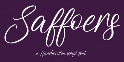
  40. MC Saffoers by Maulana Creative, $13.00
    Saffoers is a fancy handwritten script font. With light contrast stroke, fun character with a bit of ligatures. To give you an extra creative work. Saffoers font support multilingual more than 100+ language. This font is good for logo design, Social media, Movie Titles, Books Titles, a short text even a long text letter and good for your secondary text font with sans or serif. Make a stunning work with Saffoers font. Cheers, Maulana Creative
Looking for more fonts? Check out our New, Sans, Script, Handwriting fonts or Categories
abstract fontscontact usprivacy policyweb font generator
Processing