10,000 search results
(0.023 seconds)
- Nd Tupa Nova by Notdef Type,
$29.00 Tupã is a Brazilian indigienous god of thunder. This typeface is a geometric Sans Serif based on vertical and diagonal strokes. The heavy weights are great for impact layouts and the light weights are perfect to make sutil and strong messages. Tupã has a wide character set, including Cyrillic, with Small Caps, Ligatures, regular and tabular numbers and a lot of alternates. This Font is great for tight leading, including when diacritics are involved, there are alternates and case sensitives symbols to make all blocked. And yes!, there's a Variable Font too.
 - Retroma Vibes by Arterfak Project,
$24.00 Try something different, we proudly present our new exploration named "Retroma Vibes" a mixed font inspired by retro collage art and clipping of old newspapers. Feel the old school taste with this block font mixed of sans serif, condensed serif, blackletter, handwriting, and old typewriter style, combined into a chaotic collage style. You can also mix and match the letter by using the alternates characters or switching with the lowercase which gives you a more attractive design. What you'll get : Uppercase Lowercase Numbers & punctuation Stylistic alternates Multilingual support Hope you enjoy this font!
 - P22 Woodcut by P22 Type Foundry,
$24.95 P22 Woodcut features the look of letters carved out artists' printing blocks, as seen in the Expressionist woodcuts of Heckel, Schiele, Kirchner and Munch. P22 Woodcut Sans has the exact same spacing as Woodcut, but is featured without the distinctive top and bottom bracket lines. P22 Woodcut Extras is a collection of 64 decorative embellishments designed to complement the Woodcut fonts or to be used with other fonts. Modern "dingbat" imagery has also been integrated into this set which includes ancient symbols and a sampling of useful illustrations.
 - Snowflake Drop Caps by Celebrity Fontz,
$15.99The Snowflake Drop Caps font is a set of highly ornate block letters with rich embedded snowflake designs, perfect for winter and holiday themes and publications or any text where you want to add some texture, pizzazz, and depth to make your message stand out. This one-of-a-kind font has the feel of a homemade embroidered or quilted design and comes with both upper and lower case letters to give you more design flexibility. (Numbers, special characters, and punctuation are a neutral sans serif typeface and are included for convenience only.) - Aphasia BT by Bitstream,
$50.99A meeting of Byzantine and Art Deco forms, Aphasia began as a series of handwritten captions to accompany drawings in the early 1990s. The drawings were abandoned to allow the lettering to become the real composition. Playfully set in blocks of verse with each line shaped through free-association, the only visual rule was that all the lines of capitals be of equal length. The challenge of the game required extensive abbreviations, ligatures, small caps, and superiors. With the advent of Letraset’s FontStudio program, the project moved into the typographic realm. - Stadium JNL by Jeff Levine,
$29.00 Block-style typefaces make excellent sports-themed fonts, and Stadium JNL is no exception-- but this lettering style is also filled with nostalgia for decades past. Modeled from one of the many classic designs found in the Speedball® Lettering Textbook, this style of alphabet was quite popular in signage of the 1920s and 1930s. Stadium JNL fills the bill either way-- a font that is just as much at home on a gridiron or baseball diamond, or as lettering for a garage, warehouse or attention-getting ad copy.
 - BIG is, as its name suggests, enormous, because with just three letters, it says more than others on a full line. It's an ultra-wide, ultra-black, and ultra-expressive typeface, designed to occupy ...
- FF Kaytek Slab by FontFont,
$50.99 Kaytek™ Slab is a fresh take on the correspondence typefaces of the 90s - which were originally designed for the demands of office environments. Just like its predecessors, this text typeface is robust and hard-working - meaning it works well in challenging design or printing environments - but it’s not without personality. Look closer at the lowercase g and a, especially in the italic, and you can see some unexpected elements of subversiveness within the design. This blend of sturdiness and quirkiness means it’s just as relevant for information-heavy projects, such as annual reports, as it is in more expressive environments. Although first and foremost designed for text, Kaytek Slab’s details shine through in its heavier weights and larger sizes, meaning it also has display potential. Every style of the typeface takes up exactly the same amount of space, thanks to the way Radek Łukasiewicz created the design. He based the entire typeface on a single, master set of proportions. This means designers can switch between styles without the text being reflowed, making it particularly useful in magazines, where space might be limited, and also on the internet, where hover links appear in a different style. As well as its roots in the office, Kaytek Slab draws on a little bit more 90s nostalgia. It’s named for the first and only Polish walkman, and embodies the same solid, no-nonsense shapes that made the analogue technology of the era so charming. Kaytek Slab is robust and solid. Kaytek Slab comes in 12 weights, from Thin to Black Italic, and offers multi-language support. Kaytek Sans, Kaytek Headline and Kaytek Rounded, are also available.
 - Chiq by Ingo,
$36.00 The name suggests it: the Chiq is based on a well-known system font from Apple's classic Mac OS operating system. By revamping and expanding good old “Chicago“, I want to make that 90s tech charm available for the future. The model consisted of just a single style and inspired me to create “Chiq Bold,” which later became the starting point for the entire font family. The shapes of the Chiq are constructed according to a very simple principle. The contrast of stems and hairlines becomes more pronounced towards the bolder cuts. A few basic shapes form the framework for all characters. The shapes are very regular and sometimes form somewhat unusual figures, which has a negative effect on readability and makes the font rather unsuitable for long passages of text, but results in a very even typeface. This is particularly true for the extra-wide “UltraExpanded,” which is so wide that you can no longer recognize word images but literally have to spell them out. In this way, words are turned into letter bands with a great decorative effect. With variants from “Light” to “Black”, from “Normal” to “Ultra Expanded” and the italics, Chiq reaches beyond its archetype. This opens up a wide range of uses. It is even clearer, even more sober, and to a certain extent speaks an even more modern formal language. Chiq is also a variable font!
 - Wolby by LetterMaker,
$16.00 Wolby is a rough and organic hand drawn typefamily which draws inspiration from a variety of sources such as sign painting, hand lettering, comic books, cartoons, health food, sticks and stones to name a few. The letter shapes were all originally created by writing with a pointed brush. The use of one writing tool results in an aesthetical harmony between the very different styles making them all fit together. The family consists of eight styles; upright and slanted caps in regular and bold, a layered block style in fill, outline and shadow styles and a lively script. Wolby is capapble of creating very different moods depending on which style you choose to highlight. Because of it’s aesthetics, range of styles and extensive language support, Wolby is especially suitable for use in advertising, packaging design and gritty branding & fashion design. When using the layered block styles you’ll get the best result by placing the shadow layer on the bottom, the fill in the middle and the outline layer on top. These can also be combined freely so you can use just shadow + fill, shadow + outline or fill + outline. The script style is armed with a set of ligatures and swash capitals which allow you to supercharge your designs.
 - Forgotten Futurist by Typodermic,
$11.95 Are you ready to travel back in time? To a world of neon lights, high-tech logos, and a retro-futuristic style that defined an era? Then you’re ready for Forgotten Futurist. This industrial typeface is the perfect blend of old and new, with a vintage feel that still looks cutting-edge. Its letterforms are inspired by the 1960s and 1970s, when technology was just starting to take off and the world was full of possibilities. But Forgotten Futurist is more than just a tribute to the past. Its rounded technical corners and sleek lines are timeless classics, just as relevant today as they were decades ago. And with ten different styles to choose from, including Ultra-Light, Extra-Light, Light, Book, Regular, Semi-Bold, Bold, Heavy, Black, and italics, you’ll have all the flexibility you need to create a truly unique design. So if you want to add some retro-futuristic flair to your next project, look no further than Forgotten Futurist. It’s the typeface of the future, inspired by the past. Most Latin-based European writing systems are supported, including the following languages. Afaan Oromo, Afar, Afrikaans, Albanian, Alsatian, Aromanian, Aymara, Bashkir (Latin), Basque, Belarusian (Latin), Bemba, Bikol, Bosnian, Breton, Cape Verdean, Creole, Catalan, Cebuano, Chamorro, Chavacano, Chichewa, Crimean Tatar (Latin), Croatian, Czech, Danish, Dawan, Dholuo, Dutch, English, Estonian, Faroese, Fijian, Filipino, Finnish, French, Frisian, Friulian, Gagauz (Latin), Galician, Ganda, Genoese, German, Greenlandic, Guadeloupean Creole, Haitian Creole, Hawaiian, Hiligaynon, Hungarian, Icelandic, Ilocano, Indonesian, Irish, Italian, Jamaican, Kaqchikel, Karakalpak (Latin), Kashubian, Kikongo, Kinyarwanda, Kirundi, Kurdish (Latin), Latvian, Lithuanian, Lombard, Low Saxon, Luxembourgish, Maasai, Makhuwa, Malay, Maltese, Māori, Moldovan, Montenegrin, Ndebele, Neapolitan, Norwegian, Novial, Occitan, Ossetian (Latin), Papiamento, Piedmontese, Polish, Portuguese, Quechua, Rarotongan, Romanian, Romansh, Sami, Sango, Saramaccan, Sardinian, Scottish Gaelic, Serbian (Latin), Shona, Sicilian, Silesian, Slovak, Slovenian, Somali, Sorbian, Sotho, Spanish, Swahili, Swazi, Swedish, Tagalog, Tahitian, Tetum, Tongan, Tshiluba, Tsonga, Tswana, Tumbuka, Turkish, Turkmen (Latin), Tuvaluan, Uzbek (Latin), Venetian, Vepsian, Võro, Walloon, Waray-Waray, Wayuu, Welsh, Wolof, Xhosa, Yapese, Zapotec Zulu and Zuni.
 - TT Bricks by TypeType,
$29.00 TT Bricks useful links: Graphic presentation | Customization options Do you love the early Soviet visual culture as much as we do? We’ve tried going back a hundred years and rethinking the constructivist era. We’ve created an extensive font family that consists of the simplest triangle and rectangle forms. TT Bricks font family includes 16 typefaces: Hairline, Thin, Light, Regular, Medium, Bold, ExtraBold, Black and Italics. Regardless of its Soviet past, TT Bricks is a very fresh and visually powerful font family that perfectly fits the contemporary media landscape. TT Bricks is perfect for mobile apps and corporate websites, as well as for printed press layout. Thanks to the exaggeratedly simple forms of all signs, TT Bricks looks great in very small type sizes. FOLLOW US: Instagram | Facebook | Website TT Bricks language support: Acehnese, Afar, Albanian, Alsatian, Aragonese, Arumanian, Asu, Aymara, Banjar, Basque, Belarusian (cyr), Bemba, Bena, Betawi, Bislama, Boholano, Bosnian (cyr), Bosnian (lat), Breton, Bulgarian (cyr), Cebuano, Chamorro, Chiga, Colognian, Cornish, Corsican, Cree, Croatian, Czech, Danish, Embu, English, Erzya, Estonian, Faroese, Fijian, Filipino, Finnish, French, Friulian, Gaelic, Gagauz (lat), Galician, German, Gusii, Haitian Creole, Hawaiian, Hiri Motu, Hungarian, Icelandic, Ilocano, Indonesian, Innu-aimun, Interlingua, Irish, Italian, Javanese, Judaeo-Spanish, Kalenjin, Karachay-Balkar (lat), Karaim (lat), Karakalpak (lat), Kashubian, Khasi, Khvarshi, Kinyarwanda, Kirundi, Kongo, Kumyk, Kurdish (lat), Ladin, Latvian, Laz, Leonese, Lithuanian, Luganda, Luo, Luxembourgish, Luyia, Macedonian, Machame, Makhuwa-Meetto, Makonde, Malay, Manx, Maori, Mauritian Creole, Minangkabau, Moldavian (lat), Montenegrin (lat), Mordvin-moksha, Morisyen, Nahuatl, Nauruan, Ndebele, Nias, Nogai, Norwegian, Nyankole, Occitan, Oromo, Palauan, Polish, Portuguese, Quechua, Rheto-Romance, Rohingya, Romanian, Romansh, Rombo, Rundi, Russian, Rusyn, Rwa, Salar, Samburu, Samoan, Sango, Sangu, Scots, Sena, Serbian (cyr), Serbian (lat), Seychellois Creole, Shambala, Shona, Slovak, Slovenian, Soga, Somali, Sorbian, Sotho, Spanish, Sundanese, Swahili, Swazi, Swedish, Swiss German, Tagalog, Tahitian, Taita, Tatar, Tetum, Tok Pisin, Tongan, Tsonga, Tswana, Turkish, Turkmen (lat), Ukrainian, Uyghur, Vepsian, Volapük, Võro, Vunjo, Xhosa, Zaza, Zulu.
 - Roman Morrissey by madeDeduk,
$19.00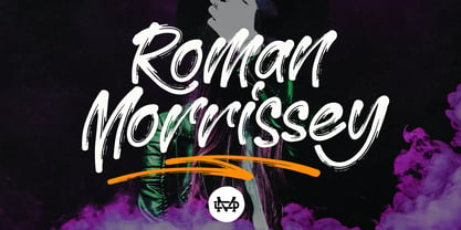 Roman Morrissey is a handwritten brush script. This font is perfect for poster design, book covers, merchandise, fashion campaigns, newsletters, branding, advertising, magazines, greeting cards, album covers, quote designs, and more. Feature: - UPPERCASE - lowercase - Number & Symbol - International Glyphs - Alternative Uppercase - Alternative lowercase - Ligature - Swash and Splash If you need anything else please contact me by dedukvic@gmail.com
 - Budhayanti by madeDeduk,
$14.00 Budhayanti is a duo with both a script and sans-serif. This font perfect for poster design, book covers, merchandise, fashion campaigns, newsletters, branding, advertising, magazines, greeting cards, album covers, and quote designs and more. If you need anything else just shoot me an email at: dedukvic@gmail.com Find more previews on my Instagram here : https://www.instagram.com/acekelgondolayu/
 - Little Brownie by The Ocean Studio,
$10.00 Little Brownie is playful font family which puts a smile on your projects and will inspire you to create something fun and memorable. It is perfect for headings, flyer, greeting cards, product packaging, book cover, printed quotes, logotype, apparel design, album covers, etc. Features: – Multilingual Support – PUA Encoded – Numerals and Punctuation Thank you for downloading from Ocean Stud.
 - Catty Funny by Yoga Letter,
$15.00 Catty Funny is a cute and unique type of display font. The decoration in this font is very easy to use, because it has been specially designed so that it is easy to use. This font is perfect for promoting pet food, for writing posters, mugs, t-shirt designs, comic covers, book covers, logos, branding, banners, and more.
 - Medisans by Inumocca,
$20.00 Medisans is A Retro Font, come from 70s style era Exellent typeface to use for covering your Project, like Branding, Movie Title, Headline Letter, Bookcover or Book Content, Magazine cover, Poster, Quotes Lettering, Logos, and more your project design. - Unique glyphs - Multilingual Characters Support - UPPERCASE - Lowercase - Numeric - Symbol - Punctuation Character - Stylistic Set (ss01) - PUA encoded inumoccatype
 - Poster Linear by Jehansyah,
$9.00 Poster Linear Natural sans serif font is simple but looks very futuristic and very stylish, it adds to your confidence to make your designs look bolder and modern. Perfect for stickers, media posts, social media statuses, magazines, books, covers, game covers, banners, wall magazines, sports shades, and more, plus a few families you can incorporate into your designs.
 - Devans by Ronny Studio,
$19.00 Devans is a high-contrast blackletter typeface, it adds a bold touch to your projects and will inspire you to create something unique and modern. This font also comes with alternative characters, and multi-language support. This font is ideal for titles, flyers, book covers, printed quotes, logotypes, clothing designs, branding and album covers. Files include:
 - Monthly Issue JNL by Jeff Levine,
$29.00 An Art Nouveau, hand lettering on a Good Housekeeping magazine cover from the 1920s inspired Monthly Issue JNL, which is available in both regular and oblique versions. Prior to the 1940s, it was not unusual to find the covers of many popular magazines hand lettered with either their names and/or content information; often in different type styles.
 - Deco Pen JNL by Jeff Levine,
$29.00 Hand lettering found across the sheet music cover of 1931's "Bend Down, Sister" [from the Eddie Cantor film "Palmy Days"] covered a couple of varying Art Deco styles; both made with a round-tipped pen nib. Deco Pen JNL combines the best of both styles into one design that's available in both regular and oblique versions.
 - Gisbon by madeDeduk,
$22.00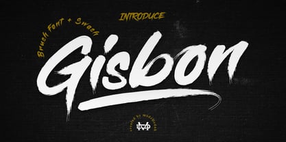 Gisbon is a modern brush typeface. This font is perfect for poster design, book covers, merchandising, fashion campaigns, newsletters, branding, advertising, magazines, greeting cards, album covers, quote designs and more. Includes: - Uppercase - Lowercase - Numbers & Symbols - International Glyphs - Alternative Uppercase - Alternative lowercase - Swash If you need anything else or you require an upgraded license please contact dedukvic@gmail.com
 - ITC Photoplay by ITC,
$29.99ITC Photoplay is another gem from Nick Curtis. Unearthed from the 1927 edition of Samuel Welo's Studio Handbook for Artists and Advertisers, the design's original suggested use was for title and caption cards for silent movies. A monoweight design that bridges the gap between turn-of-the-century decorative type and Art Deco, ITC Photoplay is both casual and stylish. And, yes, the cap S" is supposed to look that that. To expand this already handy typeface's versatility, a Black weight has been added to the original design. Curtis has also created an array of alternate characters, a couple of conjunctions, and a handful of "bishop's fingers" to help make your point. ITC Photoplay is eminently suitable for all those occasions when you need to say, "Unhand that fair damsel, you dastardly cad!", and really mean it." - Boxy Code by Just My Type,
$15.00In the late 60’s, one of the best art publications in the country was Motive magazine, published (amazingly) by the United Methodist Church. Filled to the brim with poetry, essays, line drawing and woodcuts, it also featured some cutting-edge typography. Boxy/Code is based upon my memories of woodcut typography from that great magazine. Since Boxy/Code ’s lowercase consists of the uppercase’s negative spaces, it’s easy to combine the two with Layer Styles in Photoshop in order to achieve the effect I used in one poster above. It also works great if you use a well-known text as a background. This new version is totally redrawn and features all the Latin-accented letters. Uppercase consists of black capitals in boxes; lowercase features the negative spaces of those boxed capitals. Uppercase and lowercase line up exactly for 2-color effects. - Jakarta Culture by Black Studio,
$19.00 Introducing Jakarta Culture, Thank you for visiting Jakarta Culture! A very fun yet elegant script font with lots of energy, it lets you create beautiful handcrafted typography in an instant. With extra curves & twists, Jakarta Culture is guaranteed to make your text stand out - perfect for logos, printed quotes, invitations, cards, product packaging, headers, weddings and anything else you can imagine. What's really awesome is that Jakarta Culture comes with a full set of lowercase alternatives, which allow you to create more authentic custom-feel texts. This type has become the work of true love, making it as easy and fun as possible. I can't wait to see what you do with Jakarta Culture! Feel free to use the #Black Studio tag and the #Jakarta Culture font to show what you've been up to, I really hope you enjoy it! Thank you!
 - Mezalia by Arrière-garde,
$9.00 Mezalia is a one of a kind typeface. Its shapes were strongly influenced by bastarda scripts of high medieval times. Unlike most fonts sharing similar origin, Mezalia is not just another blackletter but a fully functional text typeface, blending medieval poise and character with modern sensibilities. Stroke widths, imitating a broad nibbed pen of a scribe, fluctuate constantly giving paragraphs a characteristic vibrating texture. Despite it's strong character Mezalia is very legible and will be an excellent choice for a book or an elegant magazine. Mezalia has two distinct styles: straight and cursive (true italic if you will, although the word is not really correct here), which come in seven weights, from thin to black. Each weight contains a set of old-style figures, lining figures, small caps and ligatures. A separate style containing drop-cap initials is also available.
 - Linotype Aspect by Linotype,
$29.99The letters in the Linotype Aspect Family fonts seem to be experiments in the handcrafting of letters with just a few basic geometric forms. For instance, the bowls of the letters C, D, and G in Linotype Aspect Intro are all made up of narrow half circles. Features like this make Linotype Aspect Intro perfectly suited for headlines and short passages of text. Its quirkiness is sure to lend a smile to the faces of your readers. For shorter headlines with larger point sizes, try setting your text in Linotype Aspect Regular, the second member of the Linotype Aspect family. Linotype Aspect Regular uses the same basic letterforms as Linotype Aspect Intro, but reverses them out in white, and places them over bulbous black shapes. The Linotype Aspect family was developed by German designs Hans-Jürgen Ellenberger in 1999. - Chaco by Tipo,
$69.00 The idea behind the font called Chaco originated after testing the deficiency shown in road signs in Latin America. The design began after a long documenting period. Throughout the various stages of the work, there were several tests and checks conducted of the formal solutions implemented which, based on the results, would gradually be changed until we finally reached, in this way, its definite design. The original project for the font features three steps, namely: regular, light and bold, yet by making progress in the development, it was possible for us to perceive that by enlarging the black and thin variances, the family with 5 different weights could offer very good results in mass media, such as newspapers, magazines and television. In order to expand its possibilities of utilization, the set was completed with italics and small capitals.
 - Pais by Latinotype,
$39.00 "País" is a contemporary and modern grotesque sans serif, inspired by the grotesques of the early 20th century, but more geometric and with a wider x-height than its referents; making it ideal for the current times. "País" comes in 2 versions, each with 9 weights, from thin to black, and matching italics, for a total of 36 fonts. The standard sans serif version is fresh, clean, and more ideally neutral. It's a perfect choice for editorial design, branding, headlines, or any other piece of graphic design. The "País Alt" version has more expressive and modern characters, with some giving it a much more playful image. It is ideal for logos, packaging, web and television use. País contains a total of 682 characters that make it possible to write in more than 200 Latin languages and basic Cyrillic.
 - Sun Beautiful by Black Studio,
$15.00 Introducing Sun Beautiful, Thanks for checking out Sun Beautiful! A very fun yet elegant Signature font with lots of energy, it lets you create beautiful handcrafted typography in an instant. With extra curves & twists, Sun Beautiful is guaranteed to make your text stand out - perfect for logos, printed quotes, invitations, cards, product packaging, headers, weddings and anything else you can imagine. What's really awesome is that Sun Beautiful comes with a full set of lowercase alternatives, which allow you to create more authentic custom-feel text. This type has become the work of true love, making it as easy and fun as possible. I can't wait to see what you do with Sun Beautiful! Feel free to use the #Black Studio tag and the #Sun Beautiful font to show what you've been up to, I really hope you enjoy it! Thank you!
 - Ongunkan Wakanda Runic by Runic World Tamgacı,
$50.00 Wakandan is an alphabet designed by Hannah Beachler, and used in the 2018 film Black Panther. It is based on Nsibidi symbols. In the film it is used to transliterate English text in the credits and other on-screen text. Another script used in the film was developed by Oluwaseun Osewa and inspired by Nsibidi, a system of symbols used in southeastern Nigeria between about 400 and 1400 AD. In addition, the symbols of several different ancient languages were also used for the alphabet. Like Old North Arabia, Old Tifinagh. I did not draw for this font, except for a few letters. I transferred the sound values from the ancient writing languages fonts that I had made before to the Wakanda font, so I did not take much time, I finished it in 4-5 hours.
 - Kairos Sans by Monotype,
$50.99 Kairos Sans, designed by Terrance Weinzierl, is an octagonal sans serif influenced by 19th Century Grecians, with the weights and widths of a contemporary palette. The bold simplicity radiates in headlines and sub-heads, with suitable performance in text. Of course, it pairs perfectly with the slab serif companion, Kairos . Kairos Sans is available in 48 styles; 8 weights in 3 widths, all with matching italics. Condensed, Regular and Extended widths range from Thin to Black. There are 4 Rough styles as well, bringing the whole family to a total of 52 styles. It comes in Latin, Greek and Cyrillic scripts. It also comes with some extras and OpenType features: Small capitals, proportional and tabular figures, superscript and subscript figures, support for fractions, ornaments, arrows and Stylistic Alternates. It often looks athletic, industrial, and stern. Kairos Sans is stout, but has energy.
 - Comply Slab by Arkitype,
$12.00 Comply Slab is inspired by action and extreme sports, Comply gets it's name from the well known skate trick the “No Comply”. This type family doesn't mess about! With 9 weights from thin to black, Comply Slab will give you some great options to use. This font family will “kill it” in both print and digital, in headlines for editorial, posters, banners, websites, apparel, packaging, logos or magazines just to name a few. If you want to make a statement that gets the message across in a slick way with some cool looking glyphs Comply Slab is the font! There is an alternate R and S so you can choose to go with the cool default sharp glyphs or swap them for a more traditional chamfered corner version. Each of the 9 weights has an italic version to add even more action.
 - Antoine Drop Caps by Kaer,
$19.00 These initials set I collected from “Tristan of the Round Table”, published approximately in 1513, by Antoine Verard. Antoine drop caps font family has Regular, Light and Colored styles. It's all you need to precisely imitate medieval style text. Use this font as a decorative element at the beginning of a paragraph or section, other part of the paragraph should be in regular black letter font. You’ll get Drop Caps & Numbers set. --- *You can use color fonts in PS CC 2017+, AI CC 2018+, ID CC 2019+, macOS 10.14 Mojave+ * *Please note that the Canva & Corel & Affinity doesn't support color fonts!* *Please download this test file with only A letter ( https://www.dropbox.com/s/lpzmdikw0ewxozx/AntoineDropCaps-Test.otf?dl=0 ) to check your app & system.* --- Please feel free to request any help you need: kaer.pro@gmail.com Best, Roman.
 - Briliond by Ardyanatypes,
$15.00 Briliond has an aesthetic style, and the serif-type tagline is modern and elegant. This font is equipped with ten levels of thickness, from thin to black suits your needs. Briliond is also equipped with the latest professional characteristics that can present an elegant and attractive identity for your company or project for business purposes. It goes well with modern serifs, and scripts depicted or stand firm as a title and brand representative for an elegant look. Briliond also comes with multiple languages, making it easy for any country and language use. It also comes with alternative Ligatures and styles to make your designs more attractive. Briliond is suitable for branding projects and various design purposes such as business cards, name tags, and uniforms as a brand enhancement. Advertisements, posters, invitations, branding, logos, magazines, merchandise, presentations, etc.
 - Valenteena by Ingrimayne Type,
$9.95 Valenteena is in the spirit of the 19th century, but there are no other typefaces quite like it. It is geometric, using distorted hearts to form the letters. The lower-case letters are smaller versions of the upper-case letters. The overlay variant is derived by breaking ValentinaContour into its parts: the inner letter, the white inner border, and the black outer border. To use them one must have a program that allows layers of letters. Type in and format the inside variant to get the message you want. Also select the color you want this layer to have. Copy this layer twice, formatting one to the medium and and the other to outside. Color each of them in the colors you want and them combine the three layers, placing them so the letters exactly align. You will get letters with three colors.
 - HS Almisk by Hiba Studio,
$50.00 HS Almisk is a display typeface. It can be used for titles, logos and graphic projects, which support Arabic and. It has been created based on modern kufi style. It enjoys flexibility between sharp and curved lines in the structure of characters. This supports with a beautiful appearance and wonderful geometric structure. The sharp endings in the bottom of character also give an aesthetic addition to the character. (8) Weights has been created for this typeface between the Light weight and Black weight. Besides, those three additional weights which can be used in headline, has baseline parts are thicker than the vertical parts. One has a regular form and the others has a stencil form in the middle using various styles. This typeface with its diversity of (8) weights is intended to be an attempt for a good addition to Arabic typography.
 - ITC Elan by ITC,
$29.99 ITC Élan combines a gothic simplicity with elegance in a distinctive yet subtle typeface design. There is also a feeling of architectural strength which is derived primarily from an optically even line-weight and a sense of vertical stress. The small, almost Latin, serifs add distinction at both display and text sizes. The large x-height, minimum stroke variance, and open counters are ideal design traits for typeface legibility. Additional characteristics which distinguish ITC Élan are the splayed M" and bowls which do not quite close in the "a," "b" and several other letters. In contrast to the roman, there is almost a calligraphic playfulness to the italic. ITC Élan is the second ITC typeface from Albert Boton of France, who also designed ITC Eras. ITC Élan comes in four weights, book, medium, bold, and black, each with a corresponding italic."
 - Elvira Serif by Sudtipos,
$39.00 Elvira Serif is a typeface family that proposes to make the use of display serifs a little more fun, including in its anatomy some sharp points, ink traps implanted in some glyphs, and the formality of a traditional serif. All of these elements make Elvira Serif a great option that balances the contemporary with traditional touches. Elvira Serif has 9 weights, as well as true italics, which gives it dimension and versatility in its use. It can be used for a wide variety of purposes: it works well on the web, headlines and especially designed for book publishing at small sizes. Elvira Serif has the ability to look robust and imposing in its black weight, and subtle and elegant in its light weight. Enjoy it, it is made with a lot of passion and fun by Sudtipos and Vástago.
 - Kaligawe by Locomotype,
$19.00 Introducing Kaligawe, the perfect font for designers looking to make a bold statement with their work. This display sans font boasts a unique blend of mediaeval and sans-serif characteristics that will give your designs a distinct edge. With nine weights available, from Thin to Black, you'll have plenty of options to choose from when it comes to creating eye-catching posters, attention-grabbing headlines, captivating movie titles, and stylish packaging. What sets Kaligawe apart from other fonts is its ability to combine old-world charm with modern style. Its mediaeval touches provide a classic, timeless feel, while its strong sans-serif characteristics give it a contemporary edge. The result is a font that can be used for a wide range of design projects, whether you're creating something with a vintage vibe or a more modern look.