10,000 search results
(0.027 seconds)
- Bloomer by Hanoded,
$15.00 A Bloomer is a crusty loaf of bread with rounded ends. I don’t know why I chose this name, but it may have to do with the fact that my wife signed up for a bread baking course. Bloomer is a rounded, hand made cartoon-ish font. It will look especially good on product packaging, but any design in need of some authenticity could do with a bit of Bloomer! Comes with ligatures and a light dusting of alternates.
 - Rookys by Maulana Creative,
$11.00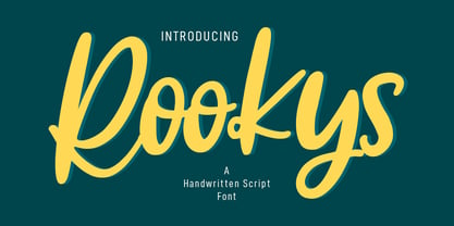 Rookys is a cartoon-is vibes handwritten display font. With bold stroke, slant and Unique Upper and lower characters with bit of ligatures. To give you an extra creative work. Rookys font support multilingual more than 100+ language. This font is good for logo design, Social media, Movie Titles, Books Titles, a short text even a long text letter and good for your secondary text font with sans or serif. Make a stunning work with Rookys font. Cheers, MaulanaCreative
 - Happy Boy by Niznaztype,
$15.00 Happy Boy is a handwritten sans typeface that has a rounded corner in each glyph. Inspired from speech bubble for comics, illustrations and kid writing. Happy Boy is perfect for comics, illustrations, cartoons and very suitable for speech bubble text. It is fun, easy communication and an eye catching style. You can use it for cover book, tagline, poster, branding, advertising, wallpainting letter, graphic design, and more. Happy Boy comes in 4 styles, regular, italic, bold and bold italic.
 - Salmonillo by Maulana Creative,
$10.00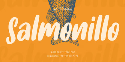 Salmonillo is a Cartoon-is natural handwritten feel font. With marker stroke, slanted and fun character with a bit of ligatures. To give you an extra creative work. Salmonillo font support multilingual more than 100+ language. This font is good for logo design, Social media, Movie Titles, Books Titles, a short text even a long text letter and good for your secondary text font with sans or serif. Make a stunning work with Salmonillo font. Cheers, MaulanaCreative
 - Billsville by Chank,
$49.00Billsville is a fun font that mixes the casual sassy flair of an old Flintstone cartoon with the upright legible nature of a classic serif font to create something entirely new. Although based primarily on straight lines and simple letterforms, Billsville has got softly rounded corners that make everything seem softer. A friendly, versatile display font named after Williamstown, MA, home of a website called Tripod who originally commissioned this font for their members in 1997. - Fido Pro by Canada Type,
$29.95Fido Pro is the official font of dog owners everywhere. Woof! When the original Fido font was published in 2009, it became an instant hit with cartoon channels, comic book artists, toy makers, cereal packagers and game developers. Now, more than a decade later, we decided to pick it up and give it the Pro treatment. This new version boasts more than 800 glyphs, including 117 interlocking ligatures, plenty of alternate glyphs, and and Pan-European language support. - Doubledecker by Hanoded,
$15.00 I love riding English double decker buses! I haven’t been on one lately, but for some reason I had an image of a red double decker bus in my head when I made this font. Doubledecker is a bold, cartoon-like, handmade font. It comes in regular and dots, plus a bonus doodle font called Doubledecker Stuff. Use it for any design that needs a tad of loud, a pinch of unusual and a wee bit of polka.
 - Boxtoon by Mofr24,
$15.00 Introducing Boxtoon, a lively comic font with a bold, modern-retro twist. Bursting with fun, it seamlessly blends the nostalgia of classic cartoons with a contemporary edge. Boasting 16 versatile styles, this multilingual marvel supports Cyrillic characters. Perfect for dynamic displays, comics, posters, book covers, and playful designs like t-shirts, games, and digital crafts. Embrace the whimsical charm that Boxtoon brings to kid's books and beyond—an all-in-one font for your creative adventures! **Uppercase
 - Edit Serif Pro by Atlas Font Foundry,
$49.00 The Edit Collection is a brand new super family designed to create multi-platform brand and editorial typography. The Renaissance construction allows the typeface to handle long texts in small, medium and large sizes, balancing its astonishing and recognisable details with high legibility. The Edit Collection with its rational, clean aesthetics and great versatility is best suited for complex typography programs. Edit Serif Pro is a modern multilingual multi purpose typeface and the first release of Atlas’ next super family. Its humanist contrast combined with modern details makes Edit Serif Pro suitable for headlines and texts that need to distinguish themselves — while still expressing rational and clean aesthetics. Each style comes with 1.540 glyphs, many features and alternative character sets. As the well known Heimat Collection and Novel Collection already are, Edit will soon become a huge superfamily like all typefaces published by Atlas Font Foundry. Designed by Christoph Dunst for Atlas Font Foundry between 2012 and 2017.
 - Sunlight JNL by Jeff Levine,
$29.00Sunlight JNL takes the classic wood type from Jeff Levine's Twelve Oaks JNL and shatters it with bursts of light for a novelty effect. Limited to a very basic character set, it's best used for short words and phrases in headlines. - Seriatim by David Thometz Design,
$24.95 As seen on Typophile.com, DTD Seriatim is a new and innovative take on the geometric sans-serif, with a wide variety of alternate characters and elegant ornaments to make it a highly versatile type for display or more discreet text use.
 - Journal Hand by Typadelic,
$9.95 Journal Hand was inspired by a 45-year-old travel diary I bought at an estate sale. The carefully constructed all-uppercase letters indicated that this traveler cared about style and legibility. Each picture, postcard and brochure that was glued into the diary had a neatly written caption and I admired the care this day tripper took to record his European trek. While the pages are now yellowed and falling apart, the handwriting is still legible and stylish. Because his handwriting totally suits today's uses, I re-created it in modern journalistic style that looks like it was written with a technical pen. Use this typeface when you need a neatly handwritten style. Uppercase only!
 - Grandheron Sans by André Simard,
$11.99 If you are looking for a font with very good readability, even with its square appearance and condensed design, Grandheron is for you. You should find attractive the design of some glyphs like those one: a,f,k,l,v,y and also AJKMNVXY to name a few. Grandheron could be use as well in small size as in huge size. You will certainly like its Thin or Light font which give an awsome effect for titles, subtitles, caption for magazines related to fashion, architecture or even cultural in general. You could easily mix Grandheron with serif typeface as Harfang Pro. There is no limit to create great designs with this large typeface family, so enjoy!
 - Roclette Pro by FoxType,
$25.00 Roclette Pro Display is a Brand Elegant Typeface from Roclette powerful font family. It has a dependable and uncompromising style, with controlled letterforms and modern touches. It looks amazing in logos, magazines, and movies. Roclette Font would be perfect for branding, headlines, Captions, paragraphs, and posters. The various weights allow you to experiment with a wide range of applications. It's created to make an impression without sacrificing its beauty and readability. It's shown a clean, minimalist, warmth, quirky, yet still purposed to be versatile The Typeface includes Eight Weights - Thin, ExtraLight, Light, Regular, Medium, SemiBold, Bold and ExtraBold Numerals and extended punctuation (200+ Glyphs). Expert kerning and quality crafting. Normal, Italics, Outline and Outline Italics Included.
 - Zornale by Eurotypo,
$20.00 The "Zornale", is an original manuscript that contains a large amount of data, providing a daily record of the books acquired by the Venetian bookseller Francesco de Madiis, between 1481 and 1488. Zornale is a family of text fonts in five weights that can be combined with the variant Caption with short ascenders and descendants. The family is completed with true italics in two weights (light italics and italics) specially designed for use in reading texts. These fonts have been designed with precise kerning and full OpenType features: Small caps, old-style numbers, Swashes, stylistic and contextual alternates, ligatures and case-sensitive forms. Each font contains 549 glyphs for complete control and enhance typographic refinement.
 - Knitting And Sewing Doodles by Outside the Line,
$19.00Knitting & Sewing Doodles are just that. If you type all caps you get 15 knitting icons and lower case is 15 sewing doodles. Knitting items include yarn, knitting, needles, ball winder, spinning supplies, stitch counter, etc. Sewing machine, buttons, thread, pin cushion, bobbin, thimble and needles, scissors, label, tape measure, darning egg, zipper, seam ripper, and pins, all in the Outside the Line style. - Hawking by Latinotype,
$39.00 Hawking is a slab typeface with slightly squarish shapes and a rational, modern look. The font has a minimal modulation, generous counterforms and relatively large x-height with lowercase ascenders extending above the cap-height for more legibility. Serifs are composed of curved and straight lines, which give the font a robust appearance and strong personality. Hawking was specially designed for use in scientific publications (hence its name), but it can also be used with other type of continuous text, such as journalistic, technical or literary texts. Its heavier weights make it also well-suited for any display use (e.g. headlines) Hawking comes in 8 styles: 4 weights plus matching true italics. The font also includes ligatures, proportional oldstyle figures, and tabular and lining figures. The family comes with the Latinotype’s standard character set that supports 213 different languages.
 - Edita by TypeTogether,
$49.00 Edita is a gentle typeface, humanistic in concept yet with a contemporary feel, where softness and fluidity play a very important role. This can be seen especially in its italics, which are loosely based on handwriting. This book typeface family is intended to be used in books where text is set together with photographs and other graphic elements. However, Edita is a general book typeface, versatile enough to be used in many other contexts, from novels to promotion material. Edita’s large character set, covering most languages which use Latin script, and styles give the designer the possibility to work with a big typographic palette, allowing complex typesetting with several levels of information. This is further enhanced by the two optically corrected weights Edita Small and Small Italic. They have been particularly designed for their use in very small type sizes, such as in captions and notes. They differ in having a slightly bigger x-height, heavier stems, reduced contrast, and carefully drawn ink-traps to ensure legibility at sizes as small as 5 pt. Additionally, their extenders are shorter to save space which allows text to be set with tighter leading.
 - Bayamo by Monotype,
$29.99 Emil Bertell's Bayamo is a contemporary, digital take on the brush script tradition. It echoes the loose forms and energetic personality of sign painted letters, tapping into the current nostalgia for hand-drawn type. “I think most script fonts nowadays are either some kind of modern calligraphy, or synthetic/mechanical scripts,” says Bertell. “This one leans more towards a classic American sign painting tradition.” Contextual alternates ensure that lowercase characters change depending what's next to them, mimicking the more varied word shapes created by sign writers. Well suited for branding projects, packaging and headlines, Bayamo also pairs well with strong sans serif, and other typefaces with angular forms.
 - Shinn Kickers JNL by Jeff Levine,
$29.00 Conrad X. 'Cobb' Shinn (Sept. 4, 1887- Jan. 28, 1951) was a Fillmore, Indiana-born post card illustrator who sold a series of successful novelty postcard lines which included (among others) Charlie Chaplin, automobiles and the Dutch culture in the beginning years of the 20th Century. After serving in World War I, Shinn found the market for novelty postcards dwindling, and he also lent his artistic skills to cartoon features and illustrating many children's books [including his own, under the nickname 'Uncle Cobb'] which taught easy step-by-step drawing methods. Some time in the 1920s, he eventually migrated into the field of supplying electrotypes and stereotypes of 'stock cuts' of photos and line art to the printing trade. In the days of letterpress printing, this was the forerunner of paper clip art and its successor, electronic clip art. Purchasing many of his designs from 'journeyman' artists of the time, the diversity of Cobb Shinn's stock cuts library grew with the passing years, reflecting changing times, styles and topics. Some of the illustrators whose signed works were presented in Shinn's 'CUTalogs' [as he called his stock cuts catalogs] include Mary Clemmitt, Louis H. Hippe, E.C. Klinge, Nelson White, Harvey Fuller, Bess Livings, Lois Head, Harvey Peake and Van Tuyl. Upon his passing in 1951, it's not known how long the Indianapolis-based company existed before finally closing its doors. One of the more popular series of cartoons were the line illustrations of men and women affectionately called 'little big head guys' by many modern fans of these cuts because the heads of the characters were drawn somewhat larger than the rest of their bodies. Shinn Kickers JNL is a collection twenty-six of these illustrations, and just like a kick in the shin (as the pun in the name implies), these charming cartoons get your attention.
 - Conrad by Linotype,
$29.00The award-winning Conrad was created by Japanese type designer Akira Kobayashi. Its design was based on the fifteenth-century type by Conrad Sweynheym and Arnold Pannartz, two German printers active in Rome at that time. They produced a unique, slightly unbalanced yet attractive type. Kobayashi says of his typeface, “I have designed a couple of typefaces inspired from the past, but this time the original print acted merely as a reference. The distinctive lowercase ‘a’ and some other letters were inspired by Sweynheym and Pannartz’s second roman type, but I revived the type in a more informal way. Here I used the historical type as a springboard. The resulting type looks different, taking on a rather temporary and lively look. I assume that the Conrad is the first revival of the Sweynheym and Pannartz type, though it does not closely resemble the original.” Conrad won first prize for the text typeface category in Linotype’s Third International Typeface Design Contest (2000) as well as the Certificate of Excellence in Type Design from the Type Directors Club (2001). - Cooper Nouveau by House Industries,
$33.00 Few fonts reach cult status. Despite its ubiquity—and perhaps because of its lack of subtlety—for a hundred years Cooper continues to draw the faithful. It’s even come to define an entire typographic genre and recently starred in its own documentary. Cooper Nouveau is Dave West’s imaginative contribution to the Cooper oeuvre. Drawn in 1966, Nouveau refreshes Oswald Cooper’s original italic with an energetic pitch, simplified contours, and a plump friendly figure. Uniform strokes and generous curves push the font’s playful personality and springy silhouette even further. A selection of swashed characters and ligatures offers options for lively logos and strong captions. While Cooper Nouveau looks laid-back and easy-going, it’s more than capable of pulling it’s own typographic weight. Put it to work where relaxed needs to project confident. Set Nouveau large for eye-magnet posters, packaging, and advertisements. Maximize its youthful energy for kids’ themes, craft action, and apparel bounce. Or set it alongside a master like Benguiat Buffalo or Chalet to show how Cooper Nouveau can communicate on paper and screens with an inherent ability to speak the language of style in many tongues. But like any cult icon: beware! Cooper has a way of setting the needle, and Nouveau just may become your go-to design fix. FEATURES ALTERNATES: Cooper Nouveau contains several alternate characters, which add flair to your designs and can help solve spacing issues LIGATURES: Many letter combinations in Cooper Nouveau form a ligature to solve spacing issues and produce more pleasing designs. COOPER NOUVEAU CREDITS Typeface Design: Dave West Digitization: Dave Foster Typeface Direction: Ben Kiel, with Ken Barber Like all good subversives, House Industries hides in plain sight while amplifying the look, feel and style of the world’s most interesting brands, products and people. Based in Delaware, visually influencing the world.
 - Impacta by Linotype,
$29.99Linotype Impacta is part of the Take Type Library, which features the winners of Linotype’s International Digital Type Design Contest from 1994 to 1997. Dutch artist Marc Lubbers designed Impacta with little contrast between strokes, rather, he depended on the slope of the strokes to give his font character. Impacta can be used in small or large point sizes and its constructed forms bring a modern feel to graphic design. - Escript by Linotype,
$29.99Linotype Escript is a part of the Take Type Library, which features winners of Linotype’s International Digital Type Design Contest. Hans-Jürgen Ellenberger designed this handwriting font with fresh, lively forms. Each letter has a slightly different character, yet all fit well together and this lack of concrete rules gives the font a spontaneous feel. Escript is well-suited to headlines, smaller texts, and initials when combined with constructed typefaces. - Indus by Linotype,
$29.99Linotype Indus is part of the Take Type Library, which features winners of Linotype’s International Digital Type Design Contest from 1994 to 1997. Designed by P.H. Hashin from India, Indus finds its historical roots in inscriptions found on ancient Indian graves. Thus Indus has a unique look and is versatile in point sizes from middle to headline. The font combines well with sans serif and slab serif typefaces. - Linotype Dot by Linotype,
$29.99Linotype Dot is part of the Take Type Library, featuring the winners of Linotype’s International Digital Type Design Contest. Designed by Lucy Davies, the figures are composed of a combination of white and black dots and the contrast makes the font look like points of light and darkness. The general impression of Dot lies somewhere between ornamental and technical. It combines well with sans serif and calligraphy fonts. - Hoosegow JNL by Jeff Levine,
$29.00Sagebrush John, your bank robbin' days are over. I'm throwin' you in the hoosegow! Hoosegow JNL isn't a small town jailhouse, but it is Jeff Levine's take on a classic wood type that brings out the Old West in any design layout. The beauty of many of these vintage wood type alphabets is their "imperfect" letter forms - giving your work a touch of the old days of letterpress printing. - Linotype Rory by Linotype,
$29.99Linotype Rory oblique is part of the Take Type Library, selected from contestants of Linotype’s International Digital Type Design Contests of 1994 and 1997. The font was designed by Canadian Tad Biernot with strictly constructed forms. The similarly formed figures seem mechanically created and their light slant gives the impression of strenght and dynamism. Linotype Rory oblique should only be used in the shorter texts of headlines in larger point sizes. - Classroom JNL by Jeff Levine,
$29.00A set of old die-cut cardboard letters and numbers used by teachers directly on bulletin boards or for tracing was the inspiration for Classroom JNL. In turn, these letters take their cue from typefaces such as Franklin and earlier wood type designs. - Linotype Belle by Linotype,
$29.99Linotype Belle is a casual script face. Created in 1999 by the Swiss designer Isabelle Stutz, the letters in this design have a light, informal nature, and appear as if they were written out quickly, using a writing instrument similar to a ballpoint pen. Linotype Belle has two fonts to offer: Linotype Belle Plain and Linotype Belle Bonus. Linotype Belle Bonus contains more extravagant, swash-like capitals than Linotype Belle Plain's characters; when used together, these two fonts can create a varied, lively impression. Linotype Belle was a prizewinner in Linotype's Third International Type Design Contest. Additionally, the design is part of the innovative Take Type Library, and can be purchased as part of the Take Type 3.1 CD collection. The typeface works excellently when used to set magazine or newsletter headlines, and as text for greeting cards." - Didot LP by LetterPerfect,
$39.00 Didot LP is a very elegant rendition of the 18th-century French typeface -- Didot. This design took the earlier Italian neo-classical model (Bodoni) to a new level of refinement, with fully rationalized shapes and delicate hairlines. Didot LP accentuates these qualities, providing a classical text face with a clear and modern voice. The companion face -- Didot LP Display -- optimizes the proportions, spacing and hairlines for use at very large sizes.
 - Causten by Trustha,
$25.00 Causten is a geometric sans serif font family with maintains rationality in designing each form. With use the sharpness of the eyes, and remain logical, so that balance is maintained in each form. So, it will get a clean, neat, and perfect shape. Causten comes with 9 weights and matching oblique, making it 18 styles. It makes perfect for all creative projects. Also, some alternative glyphs will be an attractive choice.
 - Manganese by Comicraft,
$29.00The entire Headquarters Building of Active Image Comicraft has been ripped from the ground by a giant lizard monster which has unexpectedly risen from the sea! It has the power of bodily transformation! By merely willing it, it can transform its atomic structure into any form and shape. It is completely hostile. It regards our entire island nation as its enemy. Run! RUN! Run from the Giant Monster! - Youther by Letterhend,
$15.00 Youther is a font duo with layered style. Yes, you can make a fancy typography only with these fonts, and without any plugin or action. This font family contain the fabulous script and also comes with caps font. Youther is perfect to be used as logotype, badges and labels! This has many OpenType features like ligature, stylistic alternate, contextual alternate, swash, and more, as well as and support for multiple languages.
 - Nastaleeq Asc by Ascender,
$155.99Nastaleeq (Nasta?l?q) ASC is a script font supporting Urdu. Urdu is the nation language of Pakistan. The Nastaleeq ASC font is Unicode encoded. The Nastaleeq ASC font requires an application program which supports Arabic fonts (right-to-left composition). Urdu is also spoken in Afghanistan, Bahrain, Bangladesh, Botswana, Fiji, Germany, Guyana, India, Malawi, Mauritius, Nepal, Norway, Oman, Qatar, Saudi Arabia, South Africa, Thailand, the UAE, the UK and Zambia. - Cirulis Display by Asketic Design Studio,
$40.00 Cirulis is a display sans family of two weights. Inspired by the lettering of Ansis Cīrulus (1883-1942) one of the first Eastern European designers. The artist’s heritage is characterized by letters with asymmetric widths, sliced cuts and various intrinsic features. By carefully studying forms and origins of the letters Asketic designed a new typeface that in a contemporary fashion relives early 20th century national romanticism of Eastern Europe.
 - Cantiqe by XdCreative,
$25.00 Cantiqe the rational serif with a circular/ball terminal and strong vertical contrast and fine horizontal hairlines, This makes Cantique a blend of elegant and beautiful. Cantiqe Incredibly versatile is perfect for fashion branding or editorial designs. this font fits a wide pool of designs, elevating them to the highest levels. Add this font to your favourite creative ideas and notice how it makes them come alive! Thank You _xdCreative
 - Hartsinger by Maulana Creative,
$12.00 Hartsinger is a fancy handwritten font. With cartoon vibes or notes on the book scratch, had a fun character with a bit of ligatures and fun swashes. To give you an extra creative work. Hartsinger font support multilingual more than 100+ language. This font is good for logo design, Social media, Movie Titles, Books Titles, a short text even a long text letter and good for your secondary text font with sans or serif. Make a stunning work with Hartsinger font. Cheers, MaulanaCreative
 - Halau by Vintage Voyage Design Supply,
$7.00 Halau is a clear, elegant and fun upright font for sunny Spring/Summer projects. More fun & sun for your typo- design! I really love this Retro Cartoon style in the 60s and 70s advertising or Hawaii style posters. Combine different width/styles for outstanding typography designs. Some alternates (A, E, K, R, Y, a, g, l, k) will give you more interesting result for your project. Also, you get Hawaii style illustrations set as letters and numerals alternates (36 Total).
 - Off Yer Trolley by Hanoded,
$10.00 I really like the UK and I quite enjoy the British slang. Off Yer Trolley is one such expression. It means ‘behaving in an unusual way or doing something silly’. It just popped in my head when I was looking for a name for this rather silly font. Off Yer Trolley is a handmade cartoon or kids font. As the name implies, this font certainly behaves in an unusual way and you can use it for something silly as well!