10,000 search results
(0.026 seconds)
- Gainsborough by Fenotype,
$30.00 Gainsborough - a clean-cut display pack. Gainsborough is a display combo pack of three styles and extra swooshes. Gainsborough fonts are straightforward with characteristic clarity. All the three fonts are designed to play together. Gainsborough is very easy to use. Gainsborough Pen is a clear script inspired by handwriting with pigment pen but polished clean to be legible and inviting. It’s equipped with Contextual Alternates and Standard Ligatures for smooth flow and connections between letters. In addition there’s Stylistic and Swash Alternates for standard characters. Gainsborough Sans is a sturdy street-sans ready for action. It’s has zero contrast and angular geometric shapes. It’s great for bold headlines. Gainsborough Serif follows pretty much the same proportions but with the serifs and a little bit of contrast and round shapes. Try combining Gainsborough Swooshes with Gainsborough Pen - type one character with Swooshes in the end of a word typed with Pen and you’ll have an ending swash reaching below the word. There’s different shapes and length swooshes + a couple of center balanced ornaments.
 - Agent Orange - Unknown license

- Bionic Comic Exp Italic - Unknown license

- Carrington - Unknown license

- Mail Ray Stuff - Unknown license

- rhino dino - Unknown license

- Family Guy - Unknown license

- Sergeant SixPack - Personal use only

- KR Katlings - Unknown license

- Maketa IT - Personal use only

- MEORU GEND by Twinletter,
$17.00 Meoru Gend is a display font that presents superhero strength, courage, and modernity in every action. With a strong, bold, and futuristic style, this font is the perfect solution for creating action-packed and epic gaming experiences. In every letter, Meoru Gend brings life to your display with electrifying energy. From bold, sharply contoured typefaces to seamlessly blended modern elements, this font will bring immense visual power to your game projects. Meoru Gend offers not only impressive styles but also creative features that enrich your work. With the available ligatures and alternates, you can create unique and interesting variations of your style. Also, with multilingual support, this font can be used in multiple languages to reach a global audience. If you’re looking for a strong, bold, modern, and action-packed font for your game projects, Meoru Gend is the right choice. With benefits that include an impressive look, futuristic style, and creative features such as ligatures and alternates, this font will quickly catch the attention of your potential customers and bring you an extraordinary gaming experience in no time. What’s Included : File font All glyphs Iso Latin 1 Alternate, Ligature Simple installations We highly recommend using a program that supports OpenType features and Glyphs panels like many Adobe apps and Corel Draw so that you can see and access all Glyph variations. PUA Encoded Characters – Fully accessible without additional design software. Fonts include Multilingual support
 - Garamond Premier by Adobe,
$35.00Claude Garamond (ca. 1480-1561) cut types for the Parisian scholar-printer Robert Estienne in the first part of the sixteenth century, basing his romans on the types cut by Francesco Griffo for Venetian printer Aldus Manutius in 1495. Garamond refined his romans in later versions, adding his own concepts as he developed his skills as a punchcutter. After his death in 1561, the Garamond punches made their way to the printing office of Christoph Plantin in Antwerp, where they were used by Plantin for many decades, and still exist in the Plantin-Moretus museum. Other Garamond punches went to the Frankfurt foundry of Egenolff-Berner, who issued a specimen in 1592 that became an important source of information about the Garamond types for later scholars and designers. In 1621, sixty years after Garamond's death, the French printer Jean Jannon (1580-1635) issued a specimen of typefaces that had some characteristics similar to the Garamond designs, though his letters were more asymmetrical and irregular in slope and axis. Jannon's types disappeared from use for about two hundred years, but were re-discovered in the French national printing office in 1825, when they were wrongly attributed to Claude Garamond. Their true origin was not to be revealed until the 1927 research of Beatrice Warde. In the early 1900s, Jannon's types were used to print a history of printing in France, which brought new attention to French typography and the Garamond" types. This sparked the beginning of modern revivals; some based on the mistaken model from Jannon's types, and others on the original Garamond types. Italics for Garamond fonts have sometimes been based on those cut by Robert Granjon (1513-1589), who worked for Plantin and whose types are also on the Egenolff-Berner specimen. Linotype has several versions of the Garamond typefaces. Though they vary in design and model of origin, they are all considered to be distinctive representations of French Renaissance style; easily recognizable by their elegance and readability. Garamond Pemiere Pro was designed by Robert Slimbach, and released in 2005." - Baskerville by Linotype,
$40.99John Baskerville (1706-1775) was an accomplished writing master and printer from Birmingham, England. He was the designer of several types, punchcut by John Handy, which are the basis for the fonts that bear the name Baskerville today. The excellent quality of his printing influenced such famous printers as Didot in France and Bodoni in Italy. Though he was known internationally as an innovator of technique and style, his high standards for paper and ink quality made it difficult for him to compete with local commercial printers. However, his fellow Englishmen imitated his types, and in 1768, Isaac Moore punchcut a version of Baskerville's letterforms for the Fry Foundry. Baskerville produced a masterpiece folio Bible for Cambridge University, and today, his types are considered to be fine representations of eighteenth century rationalism and neoclassicism. Legible and eminently dignified, Baskerville makes an excellent text typeface; and its sharp, high-contrast forms make it suitable for elegant advertising pieces as well. The Linotype portfolio offers many versions of this design: ITC New Baskerville® was designed by John Quaranda in 1978. Baskerville Cyrillic was designed by the Linotype Design Studio. Baskerville Greek was designed by Matthew Carter in 1978. Baskerville™ Classico was designed by Franko Luin in 1995." - Baskerville Classico by Linotype,
$29.99John Baskerville (1706-1775) was an accomplished writing master and printer from Birmingham, England. He was the designer of several types, punchcut by John Handy, which are the basis for the fonts that bear the name Baskerville today. The excellent quality of his printing influenced such famous printers as Didot in France and Bodoni in Italy. Though he was known internationally as an innovator of technique and style, his high standards for paper and ink quality made it difficult for him to compete with local commercial printers. However, his fellow Englishmen imitated his types, and in 1768, Isaac Moore punchcut a version of Baskerville's letterforms for the Fry Foundry. Baskerville produced a masterpiece folio Bible for Cambridge University, and today, his types are considered to be fine representations of eighteenth century rationalism and neoclassicism. Legible and eminently dignified, Baskerville makes an excellent text typeface; and its sharp, high-contrast forms make it suitable for elegant advertising pieces as well. The Linotype portfolio offers many versions of this design: ITC New Baskerville® was designed by John Quaranda in 1978. Baskerville Cyrillic was designed by the Linotype Design Studio. Baskerville Greek was designed by Matthew Carter in 1978. Baskerville™ Classico was designed by Franko Luin in 1995." - Baskerville LT by Linotype,
$40.99 John Baskerville (1706-1775) was an accomplished writing master and printer from Birmingham, England. He was the designer of several types, punchcut by John Handy, which are the basis for the fonts that bear the name Baskerville today. The excellent quality of his printing influenced such famous printers as Didot in France and Bodoni in Italy. Though he was known internationally as an innovator of technique and style, his high standards for paper and ink quality made it difficult for him to compete with local commercial printers. However, his fellow Englishmen imitated his types, and in 1768, Isaac Moore punchcut a version of Baskerville's letterforms for the Fry Foundry. Baskerville produced a masterpiece folio Bible for Cambridge University, and today, his types are considered to be fine representations of eighteenth century rationalism and neoclassicism. Legible and eminently dignified, Baskerville makes an excellent text typeface; and its sharp, high-contrast forms make it suitable for elegant advertising pieces as well. The Linotype portfolio offers many versions of this design: ITC New Baskerville® was designed by John Quaranda in 1978. Baskerville Cyrillic was designed by the Linotype Design Studio. Baskerville Greek was designed by Matthew Carter in 1978. Baskerville™ Classico was designed by Franko Luin in 1995."
 - Monotype Baskerville by Monotype,
$29.99 John Baskerville (1706-1775) was an accomplished writing master and printer from Birmingham, England. He was the designer of several types, punchcut by John Handy, which are the basis for the fonts that bear the name Baskerville today. The excellent quality of his printing influenced such famous printers as Didot in France and Bodoni in Italy. Though he was known internationally as an innovator of technique and style, his high standards for paper and ink quality made it difficult for him to compete with local commercial printers. However, his fellow Englishmen imitated his types, and in 1768, Isaac Moore punchcut a version of Baskerville's letterforms for the Fry Foundry. Baskerville produced a masterpiece folio Bible for Cambridge University, and today, his types are considered to be fine representations of eighteenth century rationalism and neoclassicism. Legible and eminently dignified, Baskerville makes an excellent text typeface; and its sharp, high-contrast forms make it suitable for elegant advertising pieces as well. The Linotype portfolio offers many versions of this design: ITC New Baskerville® was designed by John Quaranda in 1978. Baskerville Cyrillic was designed by the Linotype Design Studio. Baskerville Greek was designed by Matthew Carter in 1978. Baskerville™ Classico was designed by Franko Luin in 1995."
 - Baskerville LT Cyrilic by Linotype,
$29.99John Baskerville (1706-1775) was an accomplished writing master and printer from Birmingham, England. He was the designer of several types, punchcut by John Handy, which are the basis for the fonts that bear the name Baskerville today. The excellent quality of his printing influenced such famous printers as Didot in France and Bodoni in Italy. Though he was known internationally as an innovator of technique and style, his high standards for paper and ink quality made it difficult for him to compete with local commercial printers. However, his fellow Englishmen imitated his types, and in 1768, Isaac Moore punchcut a version of Baskerville's letterforms for the Fry Foundry. Baskerville produced a masterpiece folio Bible for Cambridge University, and today, his types are considered to be fine representations of eighteenth century rationalism and neoclassicism. Legible and eminently dignified, Baskerville makes an excellent text typeface; and its sharp, high-contrast forms make it suitable for elegant advertising pieces as well. The Linotype portfolio offers many versions of this design: ITC New Baskerville® was designed by John Quaranda in 1978. Baskerville Cyrillic was designed by the Linotype Design Studio. Baskerville Greek was designed by Matthew Carter in 1978. Baskerville™ Classico was designed by Franko Luin in 1995." - Sponger by Mans Greback,
$49.00 Spongy is a rubbery sans-serif typeface. It has round, soft shapes but a stiff and funny character. A quirky, clowny font, Spongy's highlighted cartoon letters looks like levitating balloons. Drawn and created by Mans Greback in 2021, this comic lettering has a satirical style and a light-hearted personality. It is provided as Highlighted, Bold, Light, Solid and Outlined! The combination of these jolly jelly fonts makes for the perfect set of party and birthday types. The font is built with advanced OpenType functionality and has a guaranteed top-notch quality, containing stylistic and contextual alternates, ligatures and more features; all to give you full control and customizability. It has extensive lingual support, covering all Latin-based languages, from North Europe to South Africa, from America to South-East Asia. It contains all characters and symbols you'll ever need, including all punctuation and numbers.
 - Plinc Kerpow by House Industries,
$33.00 Inspired by the hand-lettered sound effects found in comic books, Dave West takes a three-dimensional deep dive into the genre with his extensive onomatopoeic alphabet originally designed for Photo-Lettering, Inc. The sonorous voice of Kerpow’s caps captures “cartoon” brilliantly, while the accompanying lowercase provides options for broader applications. Turn to Kerpow for eye-catching children’s book covers, fast casual restaurant marketing, or family fun centers, and…BAM!…all eyes will be on your design. Originally drawn in the late 1960s, Kerpow was digitized by Allen Mercer in 2011. Please note that the shaded version of the typeface is composed by layering the Regular font and a separate Drop Shadow font. Some assembly required. Like all good subversives, House Industries hides in plain sight while amplifying the look, feel and style of the world’s most interesting brands, products and people. Based in Delaware, visually influencing the world.
 - Quasaria by Linotype,
$29.99Linotype Quasaria is part of the Take Type Library, selected from contestants of Linotype’s International Digital Type Design Contests of 1994 and 1997. The font was designed by German artist Armin Retzko and the characters are composed of disjointed pieces. The eye tries to complete the symbols into the forms they are used to. Linotype Quasaria with its unique forms is intended exclusively for headlines and displays. - Linotype Cerny by Linotype,
$29.99Linotype Cerny is part of the Take Type Library, selected from the contestants of Linotype’s International Digital Type Design Contests of 1994 and 1997. Dutch artist Mark van Wageningen designed an alphabet consisting exclusively of capital letters. The font’s most distinguishing characteristic is its irregular outer contour, almost as though they were ripped out of paper. Linotype Cerny is intended exclusively for headlines in larger point sizes. - Linotype Konflikt by Linotype,
$29.99Linotype Konflikt is part of the Take Type Library, which features winners of Linotype’s International Digital Type Design Contest from 1994 to 1997. Designer Stefan Pott was inspired by the conflict between the appearance of a typeface in print and on a computer screen. Out of this conflict came a font in which every character has aspects of both flowing handwriting and angular pixel-like strokes. - Linotype Supatropic by Linotype,
$29.99Linotype Supatropic is part of the Take Type Library, chosen from the entries of the Linotype-sponsored International Digital Type Design Contests of 1994 and 1997. This fun font from German designer Isabell Laxa is generously decorated with delicate flower silhouettes which are reminiscent of Asian flower chains and subtropical flora. Linotype Supatropic is meant exclusively for headlines in point sizes of 18 or larger. - Yukas by Alex Camacho Studio,
$25.00 Yukas is a funky and sexy typeface where the proportions are based on the optical balance between black strokes and white shapes. Ideal to enjoy on a large scale. It takes its references from the psychedelic movement, old-school western movie posters, and mid-19th century American wood type with those big, heavy capital letters. Includes several Open Type alternatives to customize your design however you want.
 - Madurai Slab by insigne,
$24.00 Chennai’s market-tested type styles have taken new form once again. The geometric forms of Chennai and its derivant Madurai, both successful in web-based applications and logotypes, have now been adapted for the superfamily Madurai Slab, a potent, square slab serif ideal for headlines and posters. Under the surface of Madurai Slab’s straightforward geometric structure, the font’s exaggerated vertical serifs provide the face with an extra chunk that commands the reader’s attention and gives the font more impact in its heavier styles. The extra-fortified forms are anything but monotonous, though. The bolder structure of the slab is instead rational, diligently thought-out, with minimally contrasting strokes, making the sturdier look particularly legible in shorter textual content blocks. This child of Madurai contains a comprehensive range of nine weights--slender to black--and features condensed and extender selections for a complete set of fifty-four fonts. All users of the Madurai Slab collection can access numerous OpenType alternates. Madurai Slab is furnished for experienced typographers, together with alternates, compact caps and many alts like “normalized” capitals and lowercase letters that come with stems. The typeface also contains a range of numeral sets, together with fractions, old-style and lining figures with superiors and inferiors. OpenType-capable programs including Quark or the Adobe suite allow quick changes to ligatures and alternates. Previews of these options can be found in the .pdf brochure. Madurai Slab also features the glyphs to enable all Central, Eastern and Western European languages. In all, Madurai Slab supports around forty languages that utilize the prolonged Latin script, making it an excellent option for multi-lingual publications and packaging. This richness of options makes this the best slab serif family for websites as well as for print, motion graphics, logos, t-shirts and the like. Madurai Slab is a great choice when looking for a Neo-Grotesque slab serif font. In the hands of a learned designer, this new slab offers the potential for beautiful and well-blended layouts. With its widths adjusting to compact and extended content blocks, this typeface is perfect for the headings, captions and other brief, immediate messages that you need to drive your message home.
 - P22 Parrish by P22 Type Foundry,
$24.95 Maxfield Parrish (1870-1966), whose career spanned nearly ninety years, holds a unique place in American art and culture. He was enormously accomplished and successful in both fine art and commercial endeavors. Parrish's hand-drawn letters were a significant part of his works, which bridged the familiar with a startling otherworldliness. P22 has created the Parrish font set in cooperation with the National Museum of American Illustration.
 - Gaisma Latin by Lamatas un Slazdi,
$29.00 Art Nouveau typeface "Gaisma Latin" ("Light" in Latvian) draws inspiration from Vienna Secession movement and Nordic National Romanticism. The work on the design started as drawings of several characters for the graphic standard for the Jugendstil museum in Riga. It contains characters for all the European languages as well as a huge set of contextual and stylistic alternates and historical characters to replicate texts of the era.
 - Grosser by Leo Colalillo,
$35.00 The design of Grosser* is inspired by the northern european modern architecture with it's rational shapes. The font was born for posters and to be used on large formats, the geometric shapes and the solid structure makes it a very good choice to do posters and graphics where you need an extra bold font with sharp lines. *Grosser (Größer) is a german word, which means "bigger/larger".
 - Adis Ababa by Simeon out West,
$20.00 Adis Ababa is a font based on an ancient Ge'ez script. The Ge'ez alphabet is the written language of the ancient ancestors of the Ethiopian and Eritrean nation. It is not a Latin or Greek based alphabet and I have striven in this font to present a readable Latin alphabet that visually reminds me of some of the examples of the writing that I have seen.
 - Thunder Kingdom by Dumadi,
$25.00 An elegant and charismatic look is a very suitable nickname given to this font. Thunder Kingdom is a character All-caps font, that comes with variations on Uppercase making this font perfect, comes with ligatures and Multilingual support for use in multiple languages. This font is perfect for fantasy, action, and adventure genre film titles like the picture above. I hope you like this one work.
 - Nationale by Greater Albion Typefounders,
$15.00 Nationale is inspired by the lettering of early 20th century share certificates and bonds. It includes a complete set of stylistic alternates for all letter forms, and two sizes of numerals. National speaks of the steam age, and the age of traditional design and engineering, when aesthetic concerns mattered just as much as function. Bring a touch of the elegant past to your work with Nationale.
 - Chronic by PintassilgoPrints,
$24.00 Chronically strong, yet pacific. Chronically bold, yet friendly. This font was at first inspired by a HAP Grieshaber work and soon incorporated elements from pieces by Willem Sandberg, two astonishing artists who lived through two world wars. They had to struggle for freedom and consistently manifested, with words, works and actions, their absolute love of liberty. Both were chronically free. As this font intends to be.
 - LHF Chicago Script by Letterhead Fonts,
$46.00 This Charles Borges' script takes full advantage of the Open Type format with several automatic ligatures that occur as you type for a nicer fit. Plus, the manual stylistic alternates allow you to choose the letters you prefer. Alternates occur automatically as you type in supported programs when you have "Ligatures" or "Stylistic Alternates" turned on. If your program does not support automatic ligatures and substitutions, you may still access the alternates manually using the printable keyguide or using Character Map (Windows) or Font Book (Mac).
 - Boberia by Linotype,
$29.99Linotype Boberia is part of the Take Type Library, which features winners of Linotype’s International Digital Type Design Contest. Designed by Bo Berndal, its historical roots lie in the neoclassicism of the turn of the 20th century. The slender letters with a large x-height and marked stroke contrast give the font an elegant character. The nostalgic, flowing forms are typical of Art Deco fonts and allow designers a number of possibilities for the font’s use. Boberia includes regular, italic and bold type styles. - SK Yok Deve by Salih Kizilkaya,
$9.00 SK Yok Deve is a handwritten font. It is designed for use in cartoons, comics or illustrations. Special kerning settings have been made for easy reading in small areas such as speech bubbles. It offers full support for the Latin alphabet and contains many typographic elements. In this way, you can easily use it in your designs. This font family includes 8 fonts and 2656 glyphs. In this way, it contains many typographic materials you will need.
 - Ragrots by Maulana Creative,
$14.00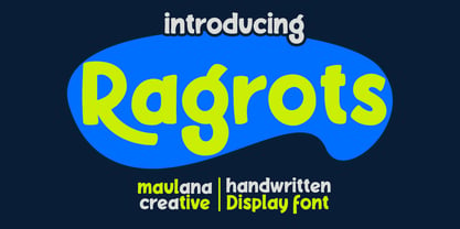 Ragrots is a cartoon-is handwritten display font. With bold bounce stroke, fun character with a bit of alternates. To give you an extra creative work. Ragrots font support multilingual more than 100+ language. This font is good for logo design, Social media, Movie Titles, Books Titles, a short text even a long text letter and good for your secondary text font with sans or serif. Make a stunning work with Ragrots font. Cheers, Maulana Creative
 - Lemonade Peach by Letterhend,
$19.00 Introducing, Lemonade and Peach, a fresh display typeface. As you can see, this typeface has playful and fun look which is perfectly made to be applied especially in storybook cover, comics, cartoon characters, kids theme design, etc. Features : uppercase & lowercase numbers and punctuation multilingual alternates PUA encoded We highly recommend using a program that supports OpenType features and Glyphs panels like many of Adobe apps and Corel Draw, so you can see and access all Glyph variations.
 - Comica Brush by Letteralle,
$23.00 Introducing, Comica Brush! An attractive, bold, and playful display font. Inspired by comic books and cartoons. This font gives a charming and strong impression. Comica Brush datang dengan dua versi (textured and solid), serta multilingual support dan underline swash. Untuk mengakses underline swash anda hanya perlu mengetik _1 - _4. So simple. Comica Brush is very suitable for various design needs such as merchandise, packaging, social media, ads, T-shirts, logos, events, and many more. Enjoy Designing. Thank you!
 - Cowboy Burt by Cool Fonts,
$25.00 Cowboy Burt was once a cowboy, but now he's a carnie at who runs the tilt-a -whirl. This hand drawn font was designed for use in a skate-punk layout, but will be quite at home in the old west, the circus, or underground cartoons. There are two versions Regular, and Extrude which work together or apart. There are even some goofy dingbats scatter throughout. You'll have hours of fun with Cowboy Burt...Where's my waitress?
 - Skull Toys by Mvmet,
$12.00 Skull Toys is a cool rough retro-looking display font with halloween twist, you’ll love it if you want to create something with fun halloween theme. It will elevate a wide range of design projects to the highest level. You can use this font for many design ideas such as stickers, t-shirt designs, amazing logo designs, magazine or book covers, comics, cartoon drawings, and many more. This font will add a cool touch to your designs!


