10,000 search results
(0.043 seconds)
- FF Real Head by FontFont,
$50.99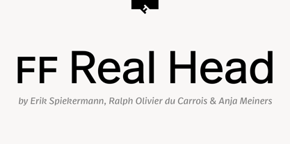 FF Real is a convincing re-interpretation of the German grotesque style from between 1998 and 1908, but with much more warmth and improved legibility as well as a hint towards the warmer American grotesques. Later on, not just slanted styles, but a “proper” italic version was added inspired by the way Roman and Italic are distinguished in traditional serif faces. NEW: a specially created set of obliques were added in 2018 to give designers more design flexibility, for those looking for a less calligraphic look. In 2020 the family was extended with matching condensed weights. FF Real was originally conceived by Erik Spiekermann as one text weight and one headline weight to be used as the only faces in his biography ‘Hello I am Erik’, edited by Johannes Erler, published in 2014. While Spiekermann drew the alphabets, he passed on the font data to Ralph du Carrois and Anja Meiners who cleaned it up and completed it. In the meantime, FF Real has been extended to a family of two styles and 65 weights each. The design of FF Real is rooted in early static grotesques from the turn of the century. Several German type foundries – among them the Berlin-based foundries Theinhardt and H. Berthold AG – released such designs between 1898 and 1908. The semi-bold weight of a poster-size typeface that was lighter than most of the according semi-bolds in metal type at the time, gave the impetus to FF Real’s regular weight. In the words of Spiekermann, the historical example is “the real, non-fake version, as it were, the royal sans serif face“, thus giving his new typeface the name “Real” (which is also in keeping with his four-letter names, i.e. FF Meta, FF Unit). FF Real is a convincing re-interpretation of the German grotesque style, but with much more warmth and improved legibility. With a hint towards the warmer American grotesques, Spiekermann added those typical Anglo-American features such as a three-story ‘g’ and an ‘8’ with a more defined loop. To better distinguish characters in small text sizes, FF Real Text comes in old style figures, ‘f’ and ‘t’ are wider, the capital ‘I’ is equipped with serifs, as is the lowercase ‘l’. What’s more, i-dots and all punctuation are round.
 - Branding Autumn by Rotterlab Studio,
$14.00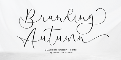 Branding Autumn introducing our new "Branding Autumn" Modern Calligraphy Script in Modern Elegant Style perfect for branding, logos, invitations, master heads and more. Branding Autumn Features: - Many languages - Alternative - PUA encoded - Ligature - Very easy to use in any software (Included Instructions) - No special software installation required. Compatible with Windows and Mac OS. Supported by Microsoft Word, Paint, Adobe, Corel draw, Cricut and other applications. Thank you...
 - SG Mikura by Studio Gulden,
$20.00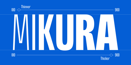 Introducing SG Mikura: Redefine Possibilities with Typography. Elevate your designs with the perfect blend of variability and versatility offered by our brand new font. With 9 meticulously crafted weights and over 600 meticulously designed glyphs, your creativity knows no bounds. From elegant finesse to bold statements, let SG Mikura be the cornerstone of your visual masterpiece. Discover the art of expression through typography today.
 - Rainy Stars by Mans Greback,
$59.00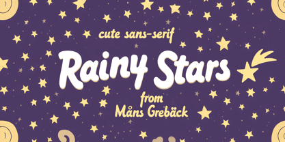 Rainy Stars is an irresistibly adorable, naive sans-serif font that captures the magic of a child's imagination. With its round, cute, and cartoon-like letterforms, this font adds a touch of whimsy and playfulness to your designs, perfect for projects aimed at children, nature, or rustic themes. The soft, bold strokes and charming personality of Rainy Stars make it a delightful choice for comic books, illustrations, and any creative work that aims to evoke the innocent joy of a toddler's world. The Rainy Stars font family includes six delightful styles to suit various design needs: The weights Light, Regular and Bold for balancing and impact, as well as each thickness as Italic for a touch of movement. Use asterisk * to make a star. Use multiple asterisks to make different space symbols. Example: Magic**Planet (Download required) Built with advanced OpenType functionality, Rainy Stars ensures top-notch quality and provides you with full control and customizability. It includes stylistic and contextual alternates, ligatures, and other features to make your designs as unique and enchanting as the font itself. Rainy Stars offers extensive lingual support, covering all Latin-based languages, from Northern Europe to South Africa, from America to South-East Asia. It contains all the characters and symbols you'll ever need, including all punctuation and numbers.
 - HeummSwifthongcha142 - Unknown license

- HeummPostcard132 - Unknown license

- Arhaic Romanesc - Unknown license

- Waterhole - 100% free

- Blue Highway Condensed - Unknown license

- RabbitEars - Unknown license

- Cheatin - Unknown license

- SnowFont - Unknown license

- gigabyte07 - Unknown license

- Rishgular by ffeeaarr,
$10.00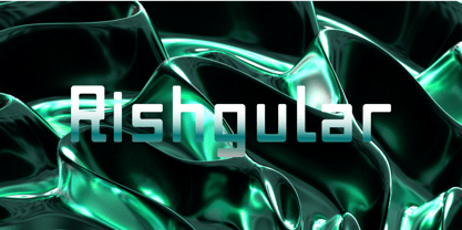 rishgular is inspired by a regular weight, is a unique sans serif font with display character. rishgular is include with tech characters
 - DavidFarewell by Ingrimayne Type,
$9.95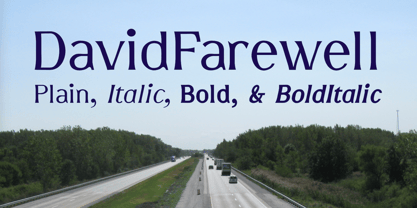 David Farewell is a decorative flare-serif typeface family with medium contrast. It has four styles: regular, bold, italic, and bold italic.
 - Cherry Hill by Robert Petrick,
$19.95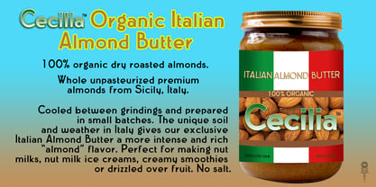 Cherry Hill Regular is based on a late 20’s font modernized for the digital age- but still retaining it’s nostalgic glory!
 - Benjamin by Wilton Foundry,
$29.00Wilton's "Benjamin-Regular" is a delightful twist on a classic - reminiscent of Franklin Gothic, Helvetica and Frutiger with it's own contemporary twist. - Tushi by Hiekka Graphics,
$35.00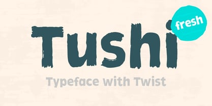 Tushi is a handmade fontface with twist in two styles: regular and italic. Tushi is recommended for use as a display typeface.
 - Newsreel Text JNL by Jeff Levine,
$29.00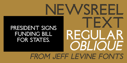 Intertitle cards from a 1942 newsreel inspired the like-named Newsreel Text JNL, which is available in both regular and oblique versions.
 - Bubble Shine - Personal use only

- Metrika by Fidan Fonts,
$21.50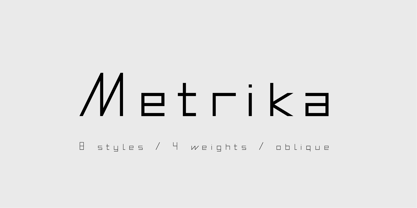 Metrika is a sans serif font inspired by the trends of technology. It's works perfectly for headlines, logos, posters, packaging, T-shirts, postcards and many more. It includes full set of uppercase and lowercase basic characters, multilingual symbols, numerals and punctuation (check the previews in order to see them all). Weight: extra light (200 pt), regular (400 pt), bold (700 pt), outline (400 pt). Style: plain, oblique. Latin-based Language Support (You can check your language typing characters in text box below). A summary of what's included: Metrika extra light (otf) Metrika extra light oblique (otf) Metrika regular (otf) Metrika regular oblique (otf) Metrika bold (otf) Metrika bold oblique (otf) Metrika outline (otf) Metrika outline oblique (otf) Happy creating!
 - Tacoma - Unknown license

- Sitcom by GroupType,
$19.00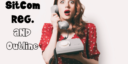 If there was an American Typeface Hall of Fame, Bank Gothic, designed by the great Morris Fuller Benton would hold a place of special distinction considering this design has survived so many trends in typographic fashion since being introduced in 1930. It's just as desirable today as it was over eighty years ago; arguably more. Today, Bank Gothic is a very popular choice as a titling face for science fiction books, posters and countless television and movie titles. It is also a popular typeface for use in computer games and digital graphics. GroupType’s 2010 revival of this American classic is true to the design, the period, and Benton’s aesthetic. GroupType worked with some of the most talented and experienced type designers that were historically grounded and sensitive to this design project. Fortunately, Mr. Benton has left us a large selection of other great typefaces for insight and guidance. GroupType’s new revival includes the original three weights in regular and condensed style but also a new small cap and lowercase in each font necessary for 21st century typography.
 - Kpop Vibes by Ronny Studio,
$19.00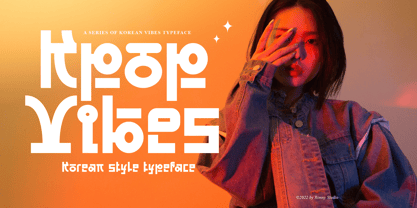 Inspired by the emerging Korean culture that grabbing the worldwide actuation in so many realms of the industry. To bridge the vibes and to make it easier to consume, we found the gap to fill with simple things in life that are useful for it, and yes, it's a new day it's a new font. So without any further ado, please welcome Kpop Vibes. series of Korean vibes typefaces. It's a sans-serif font with bold and strong vibes to catch up with today's graphic design trends. 2 Font Style: - Regular - Italic Kpop Vibes Features: - Uppercase - Lowercase - Numbers & Punctuation - Alternate Style - Multilingual Support - Simple installation All features and special characters of this font are included in one file. So that it is easily accessible by using a program or software that supports opentype such as Adobe Illustrator, Adobe Photoshop, and Adobe Indesign). This font is also very easy to use as it is compatible for all supported software even for non-opentype. Please comment us if you have any questions Thank you and have a nice day. Thank You
 - Frambuesa by Sudtipos,
$39.00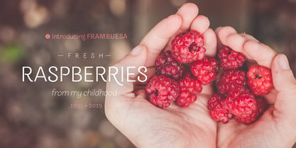 Organic versus geometric are two different universes that converges on nature systems and has its reflection on this new sans serif typeface. Frambuesa is a half humanist-half geometric sans that merges decorative curves with straight lines looking for a balance. The result: a solid but somewhat romantic, nostalgic type program that go ahead harmoniously, dancing to the rhythm of a naturally imperfect melody. Frambuesa can’t hide its family genetics. Structure and proportions come from Elisetta, her older sister they so both have a really good text performance. Regular variables and italics feel comfortable in a lot of contexts and are useful for little words or big title compositions. All seven weights are carefully adjusted to achieve soft transitions between one and the other resulting in high readability levels on program combinations and complex uses. This new font family name is a tribute to Lucia’s childhood, a very happy one. Frambuesa honors this sweet intense red fruit that her grandpa’s Coco gave to his grandchildren every Sunday in the summer.
 - Battista by preussTYPE,
$29.00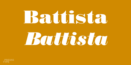 The BATTISTA typeface stands in the long tradition of the designs developed by Giambattista Bodoni, who made his famous typefaces in the end of the eighteenth century. Similar designs can be found on various specimen books e.g. Alexander Wilson, John Bell, Edmund Fry and Alexander Thibaudeau. One of the best italics was available by Stephenson Blake & Co. foundry form Sheffield, England. In the end of the nineteenth century an unknown punch cutter at the German type foundry Schelter & Giesecke made an very bold cut of this Bodoni design. He brought both designs, the regular and the italic to an new level of harmony. Compared to the original Bodoni designs the new typeface was a lot bolder, which was well taken by the audience in this time. The BATTISTA typeface is an remarkable design, assembled of ultra bold and very fine shapes, but in all, the spirit of Bodonis design was well preserved. BATTISTA is a classic display design. The fine details are best shown on larger text sizes.
 - Futura PT by ParaType,
$30.00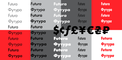 Futura is a classic geometric sans serif, one of the crucial typefaces of the 20th century. It remains relevant today and is widely used in logos, headings, web and print. Futura was designed by Paul Renner for Bauersche Gießerei (Bauer) in 1927. The typeface is based on simple geometric forms and is close in the aesthetics to 1920s-30s constructivism and the Bauhaus. Futura PT is the most complete Cyrillic version of Futura. It’s a type system of 25 styles: 16 regular and 9 narrow, from Thin to Extrabold. Futura PT has linear and old style figures, subscripts and fractions. The typeface supports more than 100 languages: Western and Central European Latin and the Cyrillic-extended. The Cyrillic version of Futura was designed by Vladimir Yefimov in 1991–1995. He partially redesigned the typeface in 2007, making it a wholesome consistent system, and Isabella Chaeva added new styles. The typeface was released under the name Futura PT. Isabella Chaeva returned to work on Futura in 2022. The typeface has three new styles, old style figures and extended Cyrillic support.
 - Corporative Sans by Latinotype,
$26.00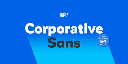 Corporative Sans typeface is developed by Latinotype Team. Corporative Sans is the new version of Corporative. This font has a marked personality and distinctive traits, what makes it suitable to be used at large text sizes. Since it is a condensed font, it can also be used in smaller sizes. Corporative comes with the Latinotype’s standard set of 350 characters, making it possible to use the font in 128 different languages. Corporative provides users with a wide range of characters, weights and widths for every project. By combining different variants, designers can achieve the best results. The family consists of 64 fonts: a basic family that includes 8 weights plus italics, an alternative family of 8 weights with matching italics and 2 condensed families, one regular and one alternative, both with italics. Latinotype has added new faces to its team. Latinotype Team now comprises: Rodrigo Fuenzalida, César Araya, Bruno Jara, Luciano Vergara and Daniel Hernández. Corporative was created by Latinotype Team and developed by Javier Quintana, Rodrigo Fuenzalida and César Araya, under the supervision of Luciano Vergara and Daniel Hernández.
 - Bebas Neue Pro by Dharma Type,
$14.99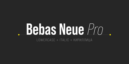 Thank you for waiting. Finally, Bebas Neue has got lowercases! Bebas Neue is a world wide, the most popular font family with all caps released in 2010. Bebas Neue has been used from by big companies to by startup designers for many projects. In spite of the fact that Bebas Neue has only Uppercases, it became very popular font for these 10 years. At the same time, we received many requests for adding lowercases. To be honest, we had been developing whole new Bebas Neue with lowercases secretly for long time. Thinner Uppercase from thin to regular weights were redesigned for Pro. New lowercases were designed to match the Uppercases very carefully. You can access Tabular figures by using OpenType tnum features. Almost all European languages are supported by Pro. One more big thing is... Bebas Neue Pro has Italics! Please don't use sloped Bebas Neue. Pro has proper Italics! Bebas Neue “Pro” can extend your possibilities. Be the first to use this professional and premium Bebas Neue!
 - Boxy Code by Just My Type,
$15.00In the late 60’s, one of the best art publications in the country was Motive magazine, published (amazingly) by the United Methodist Church. Filled to the brim with poetry, essays, line drawing and woodcuts, it also featured some cutting-edge typography. Boxy/Code is based upon my memories of woodcut typography from that great magazine. Since Boxy/Code ’s lowercase consists of the uppercase’s negative spaces, it’s easy to combine the two with Layer Styles in Photoshop in order to achieve the effect I used in one poster above. It also works great if you use a well-known text as a background. This new version is totally redrawn and features all the Latin-accented letters. Uppercase consists of black capitals in boxes; lowercase features the negative spaces of those boxed capitals. Uppercase and lowercase line up exactly for 2-color effects. - Peach Comix_PersonalUseOnly - Personal use only

- Magnificent Serif - Personal use only

- Bouncy PERSONAL USE ONLY - Personal use only

- Olivia & Kevin - Personal use only

- Old Hero - Unknown license

- Tangled - Personal use only

- KG Payphone - Personal use only

- Jetmix - Unknown license

- Stroke Dimension - Personal use only

- Cactus Sandwich Plain - 100% free


