10,000 search results
(0.029 seconds)
- Pakenham - Unknown license

- Omicron Zeta - Unknown license

- PR8 London Ads - Unknown license

- Brothers of Metal - Unknown license

- Heavy Rotation - Unknown license

- Lumio - Unknown license

- HIPTRONIC - 100% free

- Kovacs - Unknown license

- American Dream - Unknown license

- Staggering Bob - Unknown license

- Prussian Brew - Unknown license

- NeverSayDie - Unknown license

- Impact by URW Type Foundry,
$35.99 Impact As its name suggests, Impact, a bold sans serif, is designed to make an impression on the reader. Obviously a display font, Impact makes use of its thick strokes and blocked style, to catch and hold the eye. Because Impact is so striking, it is best placed in plenty of white space so that it does not overwhelm any accompanying text.
 - Nexus Typewriter Pro by Martin Majoor,
$49.00 Nexus (2004) consists of three matching variants – a serif, a sans and a slab – which makes it a highly versatile typeface. Nexus started as an alternative to Seria, a typeface Majoor had designed some 5 years earlier. But soon the design developed into a new typeface, with numerous changes in proportions and in details and with a redrawn italic. Besides the three connected versions (Nexus Serif, Nexus Sans, Nexus Mix) Majoor designed a monospaced version called Nexus Typewriter. The Nexus family is a workhorse typeface system like Scala, with features such as small caps in all weights, four different sorts of numbers and an extensive set of ligatures. All fonts in the Nexus family come in regular, italic, bold and bold italic. Free bonus: there are more than 100 elegant Swash italics and dozens of arrows and other icons. The Nexus family was awarded the First Prize at the Creative Review Type Design Awards 2006.
 - Nexus Mix Pro by Martin Majoor,
$49.00 Nexus (2004) consists of three matching variants – a serif, a sans and a slab – which makes it a highly versatile typeface. Nexus started as an alternative to Seria, a typeface Majoor had designed some 5 years earlier. But soon the design developed into a new typeface, with numerous changes in proportions and in details and with a redrawn italic. Besides the three connected versions (Nexus Serif, Nexus Sans, Nexus Mix) Majoor designed a monospaced version called Nexus Typewriter. The Nexus family is a workhorse typeface system like Scala, with features such as small caps in all weights, four different sorts of numbers and an extensive set of ligatures. All fonts in the Nexus family come in regular, italic, bold and bold italic. Free bonus: there are more than 100 elegant Swash italics and dozens of arrows and other icons. The Nexus family was awarded the First Prize at the Creative Review Type Design Awards 2006.
 - Nexus Sans Pro by Martin Majoor,
$49.00 Nexus (2004) consists of three matching variants – a serif, a sans and a slab – which makes it a highly versatile typeface. Nexus started as an alternative to Seria, a typeface Majoor had designed some 5 years earlier. But soon the design developed into a new typeface, with numerous changes in proportions and in details and with a redrawn italic. Besides the three connected versions (Nexus Serif, Nexus Sans, Nexus Mix) Majoor designed a monospaced version called Nexus Typewriter. The Nexus family is a workhorse typeface system like Scala, with features such as small caps in all weights, four different sorts of numbers and an extensive set of ligatures. All fonts in the Nexus family come in regular, italic, bold and bold italic. Free bonus: there are more than 100 elegant Swash italics and dozens of arrows and other icons. The Nexus family was awarded the First Prize at the Creative Review Type Design Awards 2006.
 - Lucida Grande Mono by Monotype,
$50.99 Lucida Grande Mono is a humanist, sans-serif, monospaced font with a large x-height, clear letterforms, and space-saving economy. Its easy reading qualities make it legible for printing and screen displays even down to small sizes. Lucida Grande Mono matches the weight, vertical proportions and look of Lucida Grande but with fixed-width functionality that has made its design popular in a wide range of practical applications, including programming, terminal emulation, and typewriter styling for business or personal correspondence on-line or print. Lucida Grande Mono is part of the Lucida superfamily of fonts from Bigelow & Holmes. Lucida is highly regarded for legibility and its extensive range of type styles. The Lucida Grande Mono has four fonts: Regular, Italic, Bold and Bold Italic. Each font has 685 glyphs and supports the W1G character set. This includes Latin, Greek and Cyrillic alphabets to support many languages in Europe, the Americas, and worldwide.
 - Covington Exp - Unknown license

- Covington Cond - Unknown license

- HVD Comic Serif - Unknown license

- Covington SC - Unknown license

- CoughingNails by Ingrimayne Type,
$12.95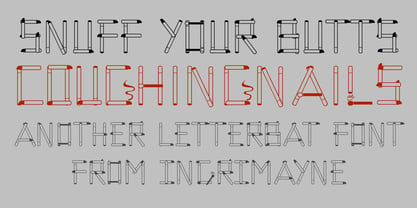 CoughingNails is a letterbat font composed of cigarettes and an occasional match.
 - Technical Rounded VP by VP Type,
$24.00 The initial inspiration for the typeface came from examining precisely machined labels on tools of various kinds, from cameras to cars, which need to be perfectly legible at all sizes. Such processes create a distinctly streamlined, clean look that feels both robust and stylish - universal and unique. Technical Rounded VP includes ten diverse styles, offering great versatility. All styles in this family include an extensive Latin character set, the Greek alphabet, multiple sets of numerals, a large set of punctuation marks, and other symbols. With 1120 glyphs in each style, it guarantees full support for all Latin languages. To make the family even more powerful, twenty OpenType features are included, such as multiple vertical positions, diagonal fractional forms, optional slashed zeros, separate old-style and lining figures, small capitals, and contextual alternates. If you are looking for similar typefaces, note that Technical Rounded VP is the soft counterpart of Technical Standard VP. A stenciled version is also available. They can be used either on their own or together seamlessly.
 - Teleprinter - Unknown license

- Silkscreen - Unknown license

- Paneuropa 1931 by ROHH,
$19.00 Paneuropa 1931™ is a faithful recreation of XX-century Polish classic, made by Idzikowski foundry in Warsaw, 1931. Original Paneuropa was a renowned and highly popular typeface in XX-century Poland, and was widely used in all kinds of design, editorial use and printed materials for decades. Paneuropa is a geometric, clean and versatile font family inspired by Paul Renner's famous Futura - it is a bit narrower, with different proportions and details in drawing, completely different figures and punctuation shapes than Futura. It is an interesting and refreshing alternative to Futura with its own distinct personality and a subtle authentic vintage flavour. Paneuropa 1931 contains separate styles for display and large sizes as well as styles for small text sizes - differing in spacing and the softness of letterforms. The family features an original Paneuropa Double font - a beautiful inline style for headlines and display use. The whole family is completed with added missing inbetween styles as well as italics. The original subfamily set is available for purchase and it contains solely the original Paneuropa styles (Thin, Regular, Bold, Text Regular, Text Italic, Double). Paneuropa 1931 characteristics: letter shapes and proportions are very faithful to the original, keeping its idiosycrasies and inconsistencies spacing and kerning are carefully adjusted in order to achieve the colour of the original fonts, keeping maximum possible consistency - a compromise between authentic vintage feel and legible consistent text colour (for hardcore users: just turn off the kerning) weights precisely matching the original (Thin, Regular, Bold, Text Regular, Text Italic, Double), inbetween weights were added (Light, Demi Bold, as well as missing italic styles) italic angle faithful to the original (8 degrees) softened corners help achieving the character of old imprecise printed display styles for big sizes are sharper and have tight spacing, text styles have softer shapes (recreating small print imperfect print) and broader spacing for use in paragraph text (spacing in both display and text styles matches the original as well) original style names in Polish for devices with Polish set as their primary language The family is very versatile. The Inline style as well as bold and thin weights are perfect for headlines and display use, other styles works wonderfully as paragraph text. Paneuropa 1931 consists of 18 fonts - 5 display weights with corresponding italics + 3 text weights with corresponding italics + 2 inline styles (for big and small print sizes). It has extended support for latin languages, as well as broad number of OpenType features, such as case sensitive forms, fractions, superscript and subscript, ordinals, currencies and symbols.
 - CROWD PERSONAL USE - Unknown license

- Accia Moderato by Mint Type,
$39.00 Accia Moderato is a contemporary serif typeface with moderate contrast and large x-height. It will become a great choice for primary body copy. The font family contains 8 weights from Thin to Extra Bold, with matching true italics. It supports extensive language support including Cyrillic, as well as numerous OpenType features such as small caps, ligatures, several sets of figures, case-sensitive punctuation, ordinals. Accia Moderato is a member of Accia Type System. It encompasses five typefaces ranging from sans-serif to expressive serif, giving you the possibility to create sophisticated cohesive designs. Accia Type system consists of Accia Sans, Accia Flare, Accia Piano, Accia Moderato, and Accia Forte.
 - Piggy Bank by Missy Meyer,
$12.00 PIGGY BANK is a casual handwriting font, smoothed and cleaned for cutting and crafting, but also sharp and crisp for print projects! It contains two uppercase sets of letters, so you can mix and match for a hand-written look. It's useful for everything from kids' designs to branding, from book covers to product packaging! The PIGGY BANK family contains two weights - regular and bold - so you have options that will be easy to read no matter how large or small your design will be. Plus, it has my usual 500+ glyphs, including tons of punctuation and over 300 accented characters for language support!
 - Sirichana Thai by Linotype,
$40.99Sirichana is a monolinear Thai typeface with Light and Bold weights. The modern design is characterized by its traditional proportions but with almost geometric construction. Originally released by Linotype for digital photocomposition, it is now in OpenType format. This makes it possible to dynamically and precisely position the various levels of superscript and subscript vowel signs and tonal marks. In addition to this, the complete Unicode page range for Thai is covered to ensure flawless conversion between other OpenType fonts using Unicode. The accompanying Latin design matches well in scale and texture and supports most Western European languages making it ideal for setting bilingual texts. - Mortice by ArtyType,
$24.00 I set out to create a solid, bold, strong, rugged font, one that would lend itself to any industrial type of use, and by that I mean industry in general, but probably sectors that would still be considered male preserves such as carpentry or metalwork. I thought specifically of mortice & tenon joints, whilst toying with shape and form for this self imposed challenge. I was also visualizing a router tool used for producing most wood joints nowadays. I think the general premise worked out well; in the end I settled on the name Mortice, referring to the slots or negative spaces that the matching part, or tenon would fit into.
 - Pop Cubism by K-Type,
$20.00 The Pop Cubism fonts are inspired by Roy Lichtenstein who combined the strong outlines and benday dots of Pop Art with the fragmented viewpoints and facet line divisions of Cubism. The bold letterforms are derived from a variety of styles, both serif and sans, angular and rounded. Pop Cubism is available in two packages: Pop Cubism Shaded is a single font which contains the lines and dot tones for use in a single color. The Pop Cubism Color Kit contains three matching fonts (Pop Cubism Outline, Pop Cubism Halftone Underlay and Pop Cubism Color Underlay) for overlaying different colors of lines, dot tones, and background color.
 - Baskvrl Club by Youthlabs,
$17.00 Introducing Baskvrl Club Family - A Brand Display Serif font with cursive path, Baskvrl Club font come with variation weight thin, regular, bold that can be used to make contrast to your design. Baskvrl Club font come with More Opentype Feature, and variable font WHAT'S YOU GET ? Unique Letterforms Works on PC & Mac Simple Installations Accessible in the Adobe Illustrator, Adobe Photoshop, Microsoft Word even work on Canva! Fully accessible without additional design software. I really hope you'll get pleasure using Baskvrl Club font and it will be perfect addition to your font collection! Contact me with an inbox message If you have any question. Thank you! Happy Creating.
 - Binario Soft by Tarallo Design,
$14.99 Binario Soft is a friendly typeface with rounded edges, offering a warm and soft impression. It comes in three weights with matching obliques. Drawn with subtle references to Art Deco, this type is ideal for a clean, warm, and modern look in branding, posters, magazines, and screen-based projects. The light weight is good for short body text. The regular weight exudes confidence, making it suitable for both body and heading text. For impactful headlines, the bold weight is excellent. The clear weight distinction make it easy to create organized text. Binario Soft is a gently rounded version of Binario, which is also available on this vendor’s website.
 - NorB TypeWriter by NorFonts,
$35.00 NorB TypeWriter is my emulation of the IBM Selectric 'Light Italic' ball witch was used by my grand-brother for his correspondance during the 70’s and 80’s. It's however a slanted mono-spaced looking typewriter font. You may want to use this font with any word processing program for text and display use, print and web projects, apps and ePub, comic books, graphic identities, branding, editorial, advertising, scrapbooking, cards and invitations and any casual lettering purpose… or even just for fun! NorB TypeWriter features 677 glyphs, OpenType features and comes in 8 weights each with their matching italics and in a Thin, Light, Normal and Bold version.
 - CA Cape Rock by Cape Arcona Type Foundry,
$39.00 CA Cape Rock, first released in 2007 and now reissued and expanded, is an impressive display typeface. Designed with a fat Clarendon and wood type in mind, the typeface’s bold and distinctive forms add spice and personality to any design that requires a strong display aesthetic. CA Cape Rock is particularly enjoyable for use in headlines and ideal for highlighted text. With already two dozen existing ligatures and many OpenType swashes, the new edition also received letters for use in the Central European and South Eastern European area. Cleaned and harmonized paths, a completely new kerning as well as a newly added Italic (Slanted) style are also among the new features.
 - The Ralston by Gloow Studio,
$13.00 Introducing The Ralston, A Retro Bold Script font. It was inspired by retro typography designs in 70's. There are more than 432 glyphs in this font including Multilanguage Support. OpenType features with Stylistic Alternates, Contextual Alternate and ligatures in some characters that allows you to mix and match pairs of letters to fit your design. The Ralston is perfectly suitable for made to be applied especially in logo, and the other various formal forms such as invitations, labels, logos, magazines, books, greeting / wedding cards, packaging, fashion, make up, stationery, novels, labels or any type of advertising purpose. Files Include: Multilanguage Support Thank You very much, hope you enjoy this fonts !
 - Wildrace by Din Studio,
$29.00 Get ready to be bold and elegant at the same time. It’s time to see Wildrace, a display font created in capital letters with the racing theme. The font’s character is the thick letters formed similar to rectangles to give strong impressions. Therefore, it will be more noticeable and match the large-sized texts. Wildrace also provides interesting features to enjoy. Features: Multilingual Supports PUA Encoded Numerals and Punctuation Use Wildrace for any design projects such as posters, banners, logos, book covers, headings, printed products, merchandise, social media, etc. Find out more ways to use this font by taking a look at the font preview. Purchase now. Happy designing.
 - Beauty Culture by Letterhend,
$17.00 Beauty Culture is a pair of font that brings the modern and luxury feel. The Bold sans combined with the natural hand writing script are the perfect match for you who needs a typeface for headline, logotype, apparel, invitation, branding, packaging, advertising etc. Features : 2 fonts (sans serif and script font) uppercase & lowercase numbers and punctuation multilingual alternates & ligatures PUA encoded We highly recommend using a program that supports OpenType features and Glyphs panels like many of Adobe apps and Corel Draw, so you can see and access all Glyph variations. How to access opentype feature : letterhend.com/tutorials/using-opentype-feature-in-any-software/
 - Altone by Eko Bimantara,
$29.00 Altone was created in a pursue of regularity and conventional geometric sans serif typeface which tend to be easy to receive by it's reader, broad usage possibility, shown a simple, bold and strong personality. The letterforms are more likely associated with Grotesk rather than the original classical Bauhaus style, formed in moderate and proportional width, flat apex, closed aperture with straight cuts stroke ends. Consist of 9 weight from Thin to Heavy with each matching Obliques. Contain several OpenType features: Stylistic Alternates, Figures Variation (fraction, tabular lining, numerator, denominator), and also covered broad latin languages. Provided also variable fonts in two styles; Upright and Oblique


