10,000 search results
(0.013 seconds)
- Silk Script by Canada Type,
$29.95Silk Script is a revival and elaborate expansion of a 1956 Helmut Matheis script called Primadonna, which strangely remained a metal face and never made the leap into the film age. Silk Script has the unmistakable high contrast and elegance of formal scripts, yet both its majuscules and minuscules show much more complex and visually appealing art than traditional copperplate or Spencerian calligraphy. When set properly, it adds just the needed extra touch of artistic flair to designs that are not visually satisfying with the usual high-contrast elegant scripts. Silk Script comes in two styles, with the Alt font containing form variations on almost every letter, allowing for flexibility and precision in choice typesetting. Plenty of more alternates are available throughout the character sets of both fonts. Both styles also boast expanded character sets that include support for Central and Eastern European languages, as well as Baltic, Celtic, Esperanto, Maltese and Turkish. Silk Script Pro unifies both styles in one font, for 550 characters of sheer elegance and handy OpenType features including stylistic alternates, discretionary ligatures and class-based kerning. - Magical Story by Gilar Studio,
$16.00 Magical Story a Handwritten Display Font With 3 Style (Regular,Outline and Shadow) You Can Mix And Match for Your Awesome Project This fonts is ideal for crafting, branding and decorate your any project. This fonts are perfect for wedding invitation or your blog. Also with their help, you can create a logo or beautiful frame for your home. Or just use for your business, book covers, stationery, marketing, magazines and more. FEATURES : Uppercase & Lowercase Number & Punctuation More than 240 of glyphs PUA Encode 14 Ligatures Alternate 8 OpenType features were detected in the font (aalt dlig frac liga ordn salt sups kern) Support for 67 languages detected The alternative characters were divided into several Open Type features can be accessed by using Open Type savvy programs such as Adobe Illustrator, Adobe InDesign, Adobe Photoshop Corel Draw X version, And Microsoft Word. And this Font has given PUA unicode (specially coded fonts). so that all the alternate characters can easily be accessed in full by a craftsman or designer. Check my other Font here https://gilarstudio.com/
 - Boisterous Fun by Missy Meyer,
$12.00 Have you ever been drawing out the letters for a font, then you start making some multi-letter ligatures? Then you think up some more to make, and you make those too? And you keep making them, until you have over a hundred of them? No? Just me? Boisterous Fun is a font that started out simple -- a nice handwriting style with a single stroke width. But add in the ligatures, plus a dozen single-letter alternates and my usual crowd of accented characters for language support, and this baby has grown to over 600 characters total. It's a great casual font for branding or packaging, but it's also smoothed so it's easy for cutting. Boisterous Fun includes: - The usual A-Z, a-z, 0-9, and lots of punctuation; - Over 300 extended Latin characters for language support; - 140 alternates and ligatures for variety, all PUA-encoded for easy use! I had a ton of fun making it, and I hope you have a ton of fun using it!
 - Rollik by Alit Design,
$19.00 Presenting the ✨Rollik Typeface✨ by alitdesign. Inspired by music posters of the 70s and 80s, the Rollik font was created in a calm and simple style but still gives it a uniquely retro and playful feel. Besides that, combined with a dynamic serif style makes the Rollik font more stylish and retro elegant, especially if the design to be made uses swash on alternative fonts for creativity, for example lettering or logotypes designed to make your design look cool and different. The Rollik font is very suitable for making designs with retro concepts, simple and playful designs, for example making magazine cover designs, music covers, YouTube thumbs, text headers, logotypes and so on with an elegant retort theme. Besides that this font is very easy to use both in design and non-design programs because everything changes and glyphs are supported by Unicode (PUA). The Rollik font has a total of 940 glyphs including symbol, multilingual and alternative glyphs. We really enjoyed the process of making the Rollik font, we hope you are also happy when using the Brolike font.
 - Cookogram by Jure Kožuh,
$19.00 Cookogram is a package of 50 pictograms which have been drawn in two styles - outline & solid. The pictogram set consists of cooking and eating utensils, pots, pans, glasses, bottles and crockery.
 - Greatest Hits JNL by Jeff Levine,
$29.00Greatest Hits JNL is Jeff Levine's serif version of his 50s style font, Doowop JNL... complete with the same fun look and "good-time-rock-and-roll" feeling as the original! - Postea by TypeTogether,
$47.00 The Postea font family is Veronika Burian and José Scaglione’s take on German geometric typefaces, reshaped with the right attributes for setting paragraphs and headings, and perfect for branding and text use. Some typefaces are a rough tool, like a pumice rock: abrasive to the senses, unforgiving, and unhelpful for most reading situations. Postea is an obsidian: smooth and classy, with attractive nuances in any light. The classic curves and purposeful details keep its individuality intact while allowing it to fit an incredible range of geometric font needs. Because of these qualities, Postea makes normal reading in paragraphs a cinch and your branding memorable. Compared to midcentury attributes of restraint and a sparse appearance, Postea’s deliberate play between character widths injects life and distinctiveness into its personality. The default ‘t, f’ have lyrical doses akin to a robust evening drink and are rounded out with a serpentine ‘s’ and rotund ‘o, g, b’. Another nice surprise awaits: spacing for the Hairline weight is tighter for optimal use in large headings and titles, while the regular weights have the expected, slightly looser spacing for text. Setting the test word ‘bogarts’ brings all this together nicely, invoking a balance between a constructed and human feel while brushing away the dust from a century of derivatives. Postea is opinionated and its modern stylistic sets allow it to be accommodating with softer, specially-designed alternative characters. SS01 replaces ‘b, f, M, m, t’, while SS02 changes only the lowercase ‘a’ to the round style, and SS03 swaps out the angled ‘y’ for a straight version. The fourth and sixth stylistic sets are packed with wallpaper-worthy geometric patterns, ornaments, arrows, and symbols aplenty. Postea’s 14 styles (seven upright and italic) and two variable fonts are accompanied by an all-new family of icons in three weights, which we developed a new, easy way to activate. Simply bookend the desired icon name with colons (:arrowUp: :chargingStation: :aid: :firstAid:), making sure to capitalise each word after the first word, then highlight and activate SS05. Icons include wayfinding, social interface, sanitary precautions like face masks, thermometers, and hand washing, and much more. Postea is resilient in the number of ways the family can be used, and its recognisable characters make it a prime selection for branding, signage, corporate typefaces, and magazines. Beginning with midcentury virtues, Postea is the rational response for text — a lyrical take on geometric sans serifs.
 - Flourishes & Ornaments by Outside the Line,
$19.00 50 hand-drawn fresh, contemporary flourishes and ornaments that work with all the Outside the Line alphabet and doodle fonts. Add a bit of pretty adornment to cards, invitations and gift tags.
 - Tylbor by Typoforge Studio,
$29.00 Tylbor was inspired by vernacular German typography but mostly by handwritten signs found on the archive photographs from the late 40s of the 20th century. Tylbor contains 14 styles in 7 weights.
 - Cyrillic Old Face - Unknown license

- Motor Mouth by T4 Foundry,
$31.00Motor Mouth provides racy type, oozing of high octane gasoline and selfconfidence. Designer Martin Fredrikson CORE, graffiti artist turned typeface designer and car paint expert, combines his sense of speed with raw power lettering. Sloped and cocky, Motor Mouth is an original design in the great tradition of Nascar and Indy 500 and makes you think of roaring muscle cars and hot asphalt. Swedish type foundry T4 premiere new fonts every month. Motor Mouth is our fourth introduction. - P22 Dada by P22 Type Foundry,
$24.95 The original idea of the Dada font and randomness was given new life with the introduction of OpenType programming. P22 Dada Pro includes over 500 glyphs of letters and images and can be used to create Dada inspired typography by simply selecting various OpenType features. P22 Dada Pro was released in 2006 as "Dada Special Edition" to coincide with the "First Major International Dada Museum Exhibition in The United States" at the National Gallery of Art.
 - Virtuose by Ckhans Fonts,
$34.00 Virtuose family consists of 18 styles (9 weights, 9 Italics), in each of which there are more than 543+ glyphs. In the typeface, each weight includes extended language support, fractions, tabular figures, ligatures, arrows and more. Perfectly suited for graphic design and any display use. Support for 28 languages: Afrikaans Albanian Catalan Croatian Czech Danish Dutch English Estonian Finnish French German Hungarian Icelandic Italian Latvian Lithuanian Maltese Norwegian Polish Portugese Romanian Slovak Slovenian Spanisch Swedish Turkish Zulu
 - Gravitica Compressed by Ckhans Fonts,
$34.00 Gravitica Compressed family consists of 18 styles (9 weights, 9 Italics), in each of which there are more than 543+ glyphs. In the typeface, each weight includes extended language support, fractions, tabular figures, ligatures, arrows and more. Perfectly suited for graphic design and any display use. Support for 28 languages: Afrikaans Albanian Catalan Croatian Czech Danish Dutch English Estonian Finnish French German Hungarian Icelandic Italian Latvian Lithuanian Maltese Norwegian Polish Portugese Romanian Slovak Slovenian Spanisch Swedish Turkish Zulu
 - Bitthai Script by Amarlettering,
$15.00 Bitthai Script come with 530+ glyphs. The alternative characters were divided into several OpenType features such as Swash, Stylistic Sets, Stylistic Alternates, Contextual Alternates. The OpenType features can be accessed by using Open Type savvy programs such as Adobe Illustrator, Adobe InDesign, Adobe Photoshop Corel Draw X version, and Microsoft Word. This Font has given PUA unicode (specially coded fonts) so that all the alternate characters can easily be accessed in full by a craftsman or designer
 - Santa Fe by profonts,
$51.99 Santa Fe is a profonts script typeface family supplied in the new OpenType Pro font format. Santa Fe contains six styles as light, medium, bold and the corresponding italics. The character set covers about 500 glyphs for the complete Latin character set (West, East, Baltic, Turkish, Romanian), and a large number of handmade ligatures and alternates to make it a perfect OpenType Pro connecting script. Santa Fe is a very distinguished, elegant and versatile, intentionally non-slanted script font.
 - Neon Summer by Adorae Types,
$25.00 Neon Summer is a monoline script font: modern, warm, fun and lovely. It's a family of 7 styles, some of which are layerable and ready to play with! This typeface offers opentype features such as ligatures, alternates, swashes, and multilingual support with over 500 glyphs. With all of these features and options, it makes a good choice for a more modern, yet warmer and funnier approach in texts, display, posters, book covers, quotes, branding, social media, packaging and more...
 - Rosmatika by Ali Hamidi,
$29.00 Rosmatika is a contemporary Didone Serif with many ligature. This font is a display font with high contrast so it is suitable for use in branding projects, logos, wedding designs, social media posts, product packaging, labels, watermarks, invitations, advertisements and projects that require bold fonts and are easy to read. Rosmatika has more than 500 glyphs that support extended latin language and feature features such as standard and discretionary ligature, language specific forms, and manual alternate access.
 - Novecento Slab by Synthview,
$22.00 Novecento Slab is the “slab serif” companion of Novecento Sans , a font family inspired on european typographic tendencies between the second half of 19th century and first half of the 20th. This font face is designed to be used mostly for headlines, visual identities or short sentences, both in big and small sizes. Novecento Slab family comes in 32 styles, speaks 76 latin based languages, has 590 glyphs and 16 stylistic opentype features for advanced typography.
 - Far Fetch by Kijiji Hub,
$20.00 Farfetch is inspired by the serif typefaces used in editorial media and magazines. Farfetch is a contemporary typeface sans-serif typeface designed to give a fresh extended look. This typeface is ideal for display purposes like logos and big, bold headlines with extended language support (+ Cyrillic), fractions, tabular figures, arrows, ligatures and more. here are over 547 glyphs that allow you endless customizations It comes in 2 different weights with 1 styles in each weight (Standard & Slanted).
 - Brans by Ckhans Fonts,
$34.00 Brans family consists of 18 styles (9 weights, 9 Italics), in each of which there are more than 543+ glyphs. In the typeface, each weight includes extended language support, fractions, tabular figures, ligatures, arrows and more. Perfectly suited for graphic design and any display use. Support for 28 languages: Afrikaans Albanian Catalan Croatian Czech Danish Dutch English Estonian Finnish French German Hungarian Icelandic Italian Latvian Lithuanian Maltese Norwegian Polish Portugese Romanian Slovak Slovenian Spanisch Swedish Turkish Zulu
 - Thourenz by Azzam Ridhamalik,
$10.00 Introducing Thourenz, a monoline vintage typeface combining with the modern typography style. Thourenz comes with 6 style (Regular, Inked, Rough, Stamp, Outline, Outline Rough). It is perfect to create a beautiful vintage typography on your any project like t-shirt, merchandise, logo, label, poster, magazine, packaging, quotation and more. Thourenz is all-caps font, has 500+ glyphs including many openType features and underlines that you can mix and match each character to get the more playful vintage design
 - P22 Torrone by IHOF,
$29.95 Precursors to Torrone, the fonts are found among the type experiments of Art Deco artists in 1930’s Europe. Fonts of this type with chunky, geometry-driven lower case letters combined with somewhat flamboyant, brush-influenced upper case can be found in the logotypes for Mignon Chocolate Factory in Germany and Baci bon-bons still in use today by Italy’s Perugina Candies. Torrone includes alternate lower case characters and full Central European glyph sets with over 550 characters included!
 - Gunar by The Northern Block,
$39.00 A geometric sans serif with a square chiseled appearance. Precise curves are met with straight lines and tapered angles to produce a fresh, technical typeface. It’s large x-height and neutral width give it good legibility at small point sizes. These refined rectangular features make it ideally suited to a wide range of modern applications. Details include 550 characters with alternative lowercase a, e, g and y. 5 variations of numerals, manually edited kerning and Opentype features.
 - Street Explorer by Putracetol,
$24.00 Street Explorer - Graffiti Font. Street Explorer A Graffiti Style Font. Inspired by the graffiti art on the city streets, so I made it into a font. So that it will make it easier for you to make graffiti writing or designs. There are 54 ligatures that will make this font even cooler. so enjoy it! Suitable for many design project, branding, packaging, logo, wall art, headline, template, banner, poster, and so much more! The alternative characters were divided into several Open Type features such as Swash, Stylistic Sets, Stylistic Alternates, Contextual Alternates, and Ligature. The Open Type features can be accessed by using Open Type savvy programs such as Adobe Illustrator, Adobe InDesign, Adobe Photoshop Corel Draw X version, And Microsoft Word. This font is also support multi language.
 - Nt1972 by Harvester Type,
$20.00 NT1972 is a display font from the future. Font in the era of cyborgs and cyberpunk. This is a sharp, brutal font with futuristic shapes. It combines style and functionality, so the font will look great in your futuristic design in any environment, be it a logo or a merchandize. The angle of inclination in each glyph is 50 degrees, all glyphs also have the same stem sizes to create a good font system. All this is done to get a good futuristic cyberpunk font that will give style to your design, be it a logo, poster, banner, merchandize, title, packaging or product design. In addition to all this, there is support for many languages and alternative characters. In case of any questions, problems or suggestions, please email: bunineugene@gmail.com
 - Decoral Soft by Totem,
$30.00 Decoral Soft depicts the character of Art Deco period typography and reinterprets it into modern approaches. This typeface is a friendly and flexible family that is fun to use. It comes with a set of 670 characters per weight, supporting over 50 different languages using the Latin alphabet. Decoral Soft also comes with special stylistic sets and swash characters that allow the user to be creative and playful with the type, helps enhance many different possibilities that certainly will spice up your design. Decoral Soft will satisfy all your typographic needs, from book jackets to monograms to packaging, logos, and even wedding invitations—timelessly elegant, with a distinctive flair that exudes Art Deco typography in a fresh, modern way. The wide selection of titling alternates and ligatures make copyfitting a delight.
 - LiebeRuth by LiebeFonts,
$29.90 LiebeRuth is your 100 percent hand-made organic type. She absolutely loves to be typeset in large *and* small sizes, because Legibility is her middle name. (Yes, we know it’s not a typical girl’s name.) She is friendly and polite, but she also has a few quirks. Her friends are impressed with how natural she manages to look every day. Her four weights ensure that Ruth has the right boldness for any context: birthday invitation, personal correspondence, photo album, or billboard ad. During the creation of this font, her designer ate plenty of healthy, organic foods. We think this is the reason why Ruth looks so fresh and lively. And of course Ruth has been designed with lots of Liebe (which is German for “love”—and she speaks many other languages, too). One more thing Ruth is marvelous at: showing off her curly-swirly swashed alternative letterforms that can be activated via OpenType. (Please make sure your software supports OpenType if you wish to use the advanced features.) Each style contains more than 560 gluten-free glyphs—now that is great value! If you like this font, you may want to look at LiebeRuth’s bolder sister LiebeDoni and our best-sellers LiebeErika and LiebeKlara. Or add in some LiebeOrnaments to prepare a curly-licious feast. By the way: LiebeRuth also gets along great with our wide range of illustrative fonts, including LiebeCook, LiebeFish, and LiebeTweet.
 - Lotustail by Letterhend,
$9.00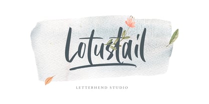 Lotustail is a handwritten font that includes many OpenType features. It also includes alternates and ligatures. This font also comes with numbers, symbols, punctuation and multi-lingual characters. It is also PUA Encoded.
 - Marujo by PintassilgoPrints,
$15.00 Marujo is a highly decorative typeface inspired by painted pieces of Arthur Bispo do Rosário, a striking Brazilian artist who lived for 50 years in a psychiatric institution. Besides its spirited Regular and Light cuts, Marujo family brings nifty eye-catching variations adorned with dots and stripes. It also brings complementary fonts to spice things up even more: there are 2 shadow options and yet a picture font packed with doodles, mostly on nautical subjects (which are strongly present on Bispo do Rosário, a former seaman apprentice.) Bispo do Rosário's works employs a multitude of materials and are often very intricate. Words are everywhere, painted or embroidered at most. He produced a vast amount of works, and is now - posthumously - widely recognized in Brazilian art scene. The psychiatric institution in which he lived is now a museum dedicated exclusively to his work. Marujo draws inspiration not only from Bispo's works, but also from this man's potency, a persistent man who produced amazing art locked in such a tough environment for a life-long. Marujo fonts are positively adventurous and will safely navigate through a sea of feelings, reaching free spirits everywhere. To navigate is precise...
 - Optima Cyrillic by Linotype,
$65.00Many typefaces are distinctive or attractive at the expense of legibility and versatility. Not so the Optima® family. Simultaneously standing out and fitting in, there are few projects or imaging environments outside of its range. Although Optima is almost always grouped with sans serif typefaces, it should be considered a serifless roman. True to its Roman heritage, Optima has wide, full-bodied characters – especially in the capitals. Only the E, F and L deviate with narrow forms. Consistent with other Zapf designs, the cap S in Optima appears slightly top-heavy with a slight tilt to the right. The M is splayed, and the N, like a serif design, has light vertical strokes. The lowercase a and g in Optima are high-legibility two-storied designs. Optima can be set within a wide choice of line spacing values – from very tight to very open. In fact, there are few limits to the amount of white space that can be added between lines of text. Optima also benefits from a wide range of letter spacing capability. It can be set quite tight, or even slightly open – especially the capitals. If there are any guidelines, Optima should be set more open than tight. It’s not that readability is affected that much when Optima is set on the snug side; it’s just that the unhurried elegance and light gray typographic color created by the face are disrupted when letters are set too tight. Optima is also about as gregarious as a typeface can be. It mixes well with virtually any serif design and a surprisingly large number of sans serif faces. The Optima family is available in six weights, from roman to extra black, each with an italic counterpart. In addition, the family is available as a suite of OpenType® Pro fonts, providing for the automatic insertion of small caps, ligatures and alternate characters, in addition to offering an extended character set supporting most Central European and many Eastern European languages. When you’re ready to find its perfect pairing, browse these fantastic matches: Monotype Century Old Style™, Dante®, Frutiger® Serif, Joanna® Nova, Malabar™, and Soho®. - Optima by Linotype,
$45.99 Many typefaces are distinctive or attractive at the expense of legibility and versatility. Not so the Optima® family. Simultaneously standing out and fitting in, there are few projects or imaging environments outside of its range. Although Optima is almost always grouped with sans serif typefaces, it should be considered a serifless roman. True to its Roman heritage, Optima has wide, full-bodied characters – especially in the capitals. Only the E, F and L deviate with narrow forms. Consistent with other Zapf designs, the cap S in Optima appears slightly top-heavy with a slight tilt to the right. The M is splayed, and the N, like a serif design, has light vertical strokes. The lowercase a and g in Optima are high-legibility two-storied designs. Optima can be set within a wide choice of line spacing values – from very tight to very open. In fact, there are few limits to the amount of white space that can be added between lines of text. Optima also benefits from a wide range of letter spacing capability. It can be set quite tight, or even slightly open – especially the capitals. If there are any guidelines, Optima should be set more open than tight. It’s not that readability is affected that much when Optima is set on the snug side; it’s just that the unhurried elegance and light gray typographic color created by the face are disrupted when letters are set too tight. Optima is also about as gregarious as a typeface can be. It mixes well with virtually any serif design and a surprisingly large number of sans serif faces. The Optima family is available in six weights, from roman to extra black, each with an italic counterpart. In addition, the family is available as a suite of OpenType® Pro fonts, providing for the automatic insertion of small caps, ligatures and alternate characters, in addition to offering an extended character set supporting most Central European and many Eastern European languages. When you’re ready to find its perfect pairing, browse these fantastic matches: Monotype Century Old Style™, Dante®, Frutiger® Serif, Joanna® Nova, Malabar™ and Soho®.
 - Doowop JNL by Jeff Levine,
$29.00The good old days of rock and roll... Kids hanging out under the streetlights singing four-part harmony... Relive those days with Doowop JNL - a fun and playful font with a decidely 50s flair! - Astralaga by SG Type,
$19.00 Elegant, graceful, and timeless. Astralaga is a versatile font family with a timeless, classic appeal, over 50 alternates & ligatures and multilingual support. Every letter has been hand-drawn and crafted with the upmost care. The variety of weights provide a range of choices that will help you find the best typographic character for your project. All 5 weights are well-suited for large display uses and high impact headlines. The available stylistic alternates and ligatures offer a number of different options that give your project a unique look. This high contrast serif typeface features a total of 1850 glyphs and offers comprehensive language support. THE 5 WEIGHTS OF ASTRALAGA Astralaga Light – very delicate and elegant Astralaga Regular – a classic beauty with gorgeous shapes Astralaga Medium – a great midground between lights and bolds Astralaga Semibold – high contrast and high impact Astralaga Bold – pure boldness and elegance FEATURES 5 weights High contrast 40 ligatures per weight 11 alternate glyphs per weight 1850 glyphs Comprehensive language support OpenType features: Access All Alternates, Discretionary Ligatures, Fractions, Kerning, Standard Ligatures, Stylistic Alternates, Stylistic Set 1, Superscript
 - Hot Rush by Set Sail Studios,
$16.00 Prepare yourself for a wild retro ride with Hot Rush – 80s nostalgia is about hit you harder than a DeLorean at 88 miles per hour. This Sans & Script font duo were simply meant to be together; the unmistakeable clean & condensed sans is complimented perfectly by the long, fast, textured strokes of the script. It’s the ideal font pairing for retro-inspired high impact display text, merchandise design, logos, packaging & more. The Hot Rush font family consists of; Hot Rush Script • A fast, textured script font hand-made with a marker pen. Hot Rush Script contains uppercase-only characters, however a full alternate set of uppercase letters is available when you switch to lowercase. Supports a full set of numerals & punctuation. Hot Rush Sans • A condensed sans-serif font with a big impact, containing uppercase-only characters. Supports a full set of numerals & punctuation. Hot Rush Sans Striped • A second version of Hot Rush Sans, with vertical stripes running through each letter for added retro style. Italic Versions • For Hot Rush Sans & Hot Rush Sans Striped are also included as separate fonts. Extra Stuff; End Forms For Hot Rush Script are available for the letters A, C, E, F, G, H, K, L, R & T. These have elongated horizontal strokes and look great as the last letter of a word. Simply turn on ‘Stylistic Alternates’ with any Opentype capable software to access these characters. 4 Swashes For Hot Rush Script are available, these are great for underlining your text for extra style. Simply type any of the square brackets [ ] { } in the Hot Rush Script font to access the swashes. Language Support; All fonts support English, French, Italian, Spanish, Portuguese, German, Swedish, Norwegian, Danish, Dutch, Finnish, Indonesian, Malay, Hungarian, Polish, Turkish, Slovenian
 - Ebony by TypeTogether,
$35.00 Some typefaces need time to ripen; Burian and Scaglione made the first sketches for Ebony back in 2008, but it took a few years of maturing in a drawer to be developed into a multi-functional type family. While keeping in tune with TypeTogether’s focus on complex typographic structures needed for magazine, newspapers and books —whether printed or digital—, Ebony goes far beyond editorial use and promises great performance in branding and advertising. The range of dark weights with taut and powerful curves can boost any headline, while the lighter styles create an approachable and clean feel in blocks of continuous text. Ebony does not fall short on aiding legibility either; letterforms have a distinct direction of ductus and features like the top serif on ‘l’ help making them clearly distinguishable from each other. It is a type family that cleverly seeks a balance between the openness and legibility of humanist sans serifs and the striking and more regularised character of grotesques. The letter-shapes feature generous counters and open terminals with crisp angles, and daringly grow both in colour and width as the fonts get bolder. Infused with this strength, Ebony also shows a quirky side in some of her shapes; the vertical fractions, the at-symbol, the old-style numbers, … The predominantly slanted style of the italics is broken up in some letterforms, such as ‘a e f l’, that are more in line with a classic cursive appearance. This, together with a forceful italic angle, ensure a change in texture within a block of text, despite sharing the same letter weight and width with the uprights. With 18 styles, tending towards the heavier part of the weight-spectrum, this face has a powerful quality!
 - Eksja by Protimient,
$29.00 Eksja is a modern slab serif available in four weights, each with a corresponding italic. All the fonts in the family have small caps, the extended latin character set, diacritical f-ligatures, enclosed numerals (numbers in circles) and case-sensitive punctuation. The general design of the typeface has been with a strong human touch in mind. The ends of the serifs have been given a subtle rounding, just enough to take the edge off which, when coupled with the largely humanist structure of the design, creates an open, friendly and approachable design, abandoning the usual geometric severity commonly associated with slab serif typefaces. Eksja contains quite a comprehensive numerals system. Obviously, each font has the standard proportionally and tabularly spaced lining and old-style figures but, crucially, the tabular numerals share the exact same width in each font variant. That means that you can choose to use the thin, regular, bold, black and their italic forms all in the same setting and they will always line up. In addition to the 'normal' numerals there are super-script and sub-script numerals and OpenType fractions that can be automatically composed as you type. There are also the enclosed numerals, numbers inside a circle, that are useful for numerically listing items and, thanks to the wizardry of OpenType, they can contain any number of digits (typically, enclosed numerals are precomposed single digits, only encompassing the 0–9 range, the enclosed numerals in Eksja can go to double digits, triple digits or, in fact, any number of digits*). *The automation of the enclosed numerals is accessed via either "Stylistic Set #1" or "Stylistic Alternates" which requires the use of an application that supports OpenType stylistic sets or stylistic alternates, such as Adobe's InDesign or Photoshop.
 - Defense by Reserves,
$49.00 Defense is an unyielding rectangular slab-serif stencil face designed with consistently balanced letterforms and a refined finish. It’s extremely angular geometric form commands attention in display settings, yet is also legible in short text blocks. The stencil mark width varies accordingly with each weight, helping to further define each style. Numerous alternate character sets allow room for customization, while the expanded ligatures push letter combinations to the limit. Stylistically, Defense’s almost crude, sharp-cornered construction is balanced by it’s sophisticated finish and attention to detail, often unrealized in similar faces of this genre. The upright weights are complimented by pairings of true italics, completely rebuilt, slightly narrower in width with modified letterforms, increasing their contrast and flow. Features include: Precision kerning Standard Ligatures set including 'f' ligatures (fi, fl, ff, fh, fj, ffl, ffi, ffj) Discretionary Ligatures set including (ft, rt, ae, oe, st, ft, ct, oc, oo, ry, AE, OE, AL, TH, HE, AK, AN, TT, HD, AM, AP, AR, NF, NE, NH, NL, NB, FL, ND, FE, AB, OB, OD, OF, OG, OH, OK, OL, OM, ON, OO, OP, OQ, OR, OU, AH, UE, UF, UB, UD, UH, UK, UL, UM, UN, UP, UR, UU, MP, XY, YX, KY, WY, VY, AF, FF, FI) Alternate characters (O, o, S, s, a, h circumflex, @, ®, ™, ¶, $, &, _, and various ligature alternates) Case forms (shifts various punctuation marks up to a position that works better with all-capital sequences) Capital Spacing (globally adjusts inter-glyph spacing for all-capital text) Slashed zero Full set of numerators/denominators Automatic fraction feature (supports any fraction combination) Extended language support (Latin-1 and Latin Extended-A) *Requires an application with OpenType and/or Unicode support.
 - Lava-Lava - Unknown license

- Fantazija - Unknown license


