10,000 search results
(0.062 seconds)
- Stranger Blue by PizzaDude.dk,
$15.00 Stranger Blue is a soft-edged and playful comic font with bouncy ligatures. Multilingual support and legible at even small sizes
 - Irina by ParaType,
$25.00 Designed at ParaType in 1995 by Tagir Safayev. Based on informal handwriting (caps-only). For use in advertising and display typography.
 - AB One by AB Studio,
$23.99 AB One is a captivating sans-serif font family that effortlessly blends modern aesthetics with a dynamic, fluid formality inspired by the world of architecture. This versatile typeface offers three distinct weights, each carefully crafted to cater to a range of design needs. Key Features: Dynamic Fluidity: AB One embodies the dynamic essence of architectural forms, showcasing a graceful flow and a sense of movement. The font's letterforms possess an inherent flexibility that adds a touch of vibrancy to your designs, making it an excellent choice for contemporary projects that demand energy and liveliness. Sleek and Modern: The light weight of AB One radiates a modern, minimalist charm, perfect for creating a sleek and refined impression in your design projects. Its clean lines and well-balanced proportions ensure readability while evoking a sense of cutting-edge sophistication. Three Distinct Weights: The AB One font family offers three carefully crafted weights to provide versatility in your design work. Sans-Serif Elegance: As a sans-serif typeface, AB One represents a harmonious marriage of legibility and style. Its straightforward, elegant letterforms make it suitable for a wide range of applications, including branding, advertising, editorial design, and web interfaces. Inspired by Architecture: Drawing inspiration from the world of architecture, AB One captures the essence of structural elegance and sophistication. This font is an ideal choice for projects that require a touch of architectural finesse. Versatile Application: AB One's adaptability allows it to excel in a variety of design contexts. It seamlessly integrates with other design elements, providing a harmonious and engaging visual experience. AB One is a typeface that thrives on the principles of sleek modernity and architectural inspiration, making it a go-to choice for designers who seek to infuse their projects with a touch of dynamic fluid formality.
 - Gemini Type Fontpack by Chank,
$49.00 INTRODUCING THE GEMINI TYPE FONTPACK, an industrial-strength OpenType font bundle inspired by and optimized for dimensional type. Chank Co is proud to introduce the new “Gemini Type Fontpack,” a collection of ten fonts available for use on your desktop computer or web pages, but also optimized for use as exterior cast-metal signage in bronze or aluminum in collaboration with Gemini, a family-owned industry leader in the wholesale manufacture of dimensional letters, logo and plaques based in Cannon Falls, MN. Gemini collaborated with Chank Co to assemble a line of fonts that would work well as dimensional, cast-letter signage for use on the sides of buildings, in stores, and other public spaces. The fonts included in the “Gemini Type Fontpack” are reinterpretations of previous Chank Fonts, now optimized for dimensional signage display, but then also repackaged and presented for your use as an OpenType desktop computer font collection: GT-Adrianna DemiBold GT-Adrianna Bold GT-Adrianna ExtraBold GT-Fairbanks GT-Forward Thinking GT-Hydropower ExtraCondensed GT-Kegger GT-Shopaganda GT-Shopaganda Condensed GT-Timeless Geometric. This is a multi-purpose collection of heavy-lifting fonts to convey your message strong and clearly, full of legibility and clarity, but also displaying personality and distinction. You can purchase and download these fonts in OpenType format for your desktop computer right now via MyFonts. Get it today and you'll also get a great introductory special sale price. These exclusive typefaces are also available as dimensional letters, manufactured by Gemini in bronze or aluminum, from 6" tall up to 18" tall, with a variety of finish options, for use in public signage and wayfinding systems. Gemini manufacture their products in 20 plants through out the US, Canada and Mexico, and all their products are backed by a lifetime guarantee. Chank Co is excited to offer these ten strong, industrial font designs in durable cast metal format via Gemini. ----- More about the fonts in the Gemini Type Fontpack: GT-Adrianna DemiBold, Bold, and Adrianna ExtraBold Clear, invisible, no-nonsense, multi-purpose. A versatile sans-serif heavy-lifting font family. GT-Fairbanks Vintage, silent film, speedball, old-timey, old-fashioned, retro. Based upon the lettering in the 1914 silent film, “The Good Bad Man.” GT-Forward Thinking Futuristic, semi-serif, clean, distinctive, contemporary, idiosyncratic. A font for tomorrow and the future. GT-Hydropower ExtraCondensed Extra-condensed, compressed, strong, rigid and concise. GT-Kegger Strong, sporty, collegiate, athletic. Nothing says “GO TEAM” quite like a big, bold slab-serif font. GT-Shopaganda and GT-Shopaganda Condensed Industrial, geometric, constructivist, propaganda, oh there’s so much to love about the strength and clarity of these two fonts. Based on Chank’s Liquorstore and Nicotine fonts, which have been married and unified here, with a few new twists and turns to their letterforms. GT-Timeless Geometric Bauhaus, anyone? The geometric and minimalist alphabet here is about as clean and straight-forward as a semi-condensed sans can get. ----- All of the fonts in this package are available individually, or save money when you purchase all ten of them as a collection. Download this digital font package from MyFonts today and you'll receive both OpenType and TrueType formats in your download for your desktop computer. Webfont format is also available. (If you'd like to use these fonts as cast-metal letters for exterior, architectural purposes, visit the Gemini website to learn more about how you can find a signage retailer near you.)
 - Legendary Legerdemain by Comicraft,
$29.00 Are you watching closely? We know what you're looking for -- the secret. Comicraft’s magic formula, our Legendary Legerdemain. But you won't find it because of course, you're not really looking. You don't really want to work it out. You want to believe in the magic. Every great Comicraft font consists of three parts. The first part is called “The Pledge”. Comicraft shows you an ordinary looking font: A through Z, nothing more than the letters of the alphabet, unaltered, normal. But of course... they aren't. The second part is called “The Turn”. Comicraft takes the ordinary letters of the alphabet and makes them look extraordinary. Now you are peering closely -- you convince yourself you're looking for the secret... even though you really don't want to know. You want to be fooled. And you are! But don't applaud yet. Because making something extraordinary isn't enough... That’s why every Comicraft font has a third part, the hardest part, what we call “The Prestige”. That''s when we have to SELL the font. And that’s the real trick. See the families related to Legendary Legerdemain: Legendary Legerdemain Leggy.
 - Hello Mellogia by IM Studio,
$18.00 Hello Mellogia is a modern vintage serif font packaged in a modern and classy style, complete with access your OpenType features to access a large selection of alternative fonts and bindings, Choose the font you like from large and small font variations for a luxurious and elegant look. A unique, fun and versatile serif family with 26+ binders and 100 alternatives to perfect any design you love. This font is perfect for branding projects, Logo design, Apparel Branding, packaging, magazine titles, advertisements, T-shirts, postcards and more. This typeface has been enriched with additional alternate characters of up to 350 glyphs. Hope it helps to capture the soul of any design. Finally, there are no words to say other than "Success and enjoy. Hello Mellogia is encoded with PUA Unicode, which allows full access to all additional characters without having to design any special software. Mac users can use Font Book, and Windows users can use Character Map to view and copy any additional characters to paste into your favorite text editor/app. How to access all alternative characters using Adobe Illustrator: https://www.youtube.com/watch?v=XzwjMkbB-wQ
 - Shampoerna Betoel by Taznix Creative,
$9.00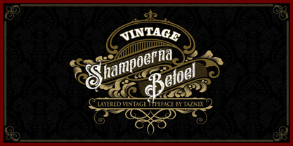 Shampoerna Betoel is an elegant and classic blackletter font. Fall in love with its incredibly versatile style and use it to create spectacular designs! Shampoerna Betoel Typeface includes a full set of character A-Z, as well as multi-lingual support, currency figures, numerals, and punctuation. What's Included : Standard glyphs Ligature Works on PC & Mac Simple installations Accessible in the Adobe Illustrator, Adobe Photoshop, Adobe InDesign, even work on Microsoft Word. PUA Encoded Characters - Fully accessible without additional design software. Fonts include multilingual support for; ä ö ü Ä Ö Ü ß ¿ ¡
 - Best Moment by Subectype,
$15.00 Best Moment is a Chic and Lovely Calligraphy font, described by a Love touch with natural handwritten style, perfect for your favorite projects. Fall in love with its incredibly distinct and timeless style and use it to create spectacular designs! "Best Moment" includes a full set of lovely uppercase and lowercase letters, multilingual symbols, numerals, punctuation and ligatures. Also it includes: Alternates letter for lowercase beginning and ending swashes, lowercase ending ribbon swashes, which serve to connect two words or letters (This is so perfect for invitations, monograms) What's Include : Multilingual Support Thank You, Subectype
 - Ace Crikey - Unknown license

- Forest Hill by PeachCreme,
$20.00 Meet our brand new script font - Forest Hill! It is a modern casual font with a full set of easygoing letters, numerals, and punctuation. The main feature of this font is that the letters are not separated. Just look how all the letters connect one by one and form one whole piece of writing. Featuring fabulous beginning and ending lowercase swashes, Forest Hill was inspired by clean handwriting with a natural flow and works well for various designs from wedding stationery to Instagram quotes, modern logos, packaging, websites, and many more.
 - Rockner by Linotype,
$29.99Rockner is a family of fraktur typefaces designed by the calligrapher/designer Julius de Goede. Like all Blackletter styles, fraktur evolved out of Northern Europe's medieval manuscript tradition. Fraktur was the most used Blackletter variety between the sixteenth and twentieth centuries. Unlike many similar fraktur font families, Rockner is available in three weights: Regular, Medium, and Bold. This flexibility allows for richer design possibilities. The OT fonts contain the many alternate characters, such as the long s and historical ligatures, which are often necessary for the setting of historical documents. - Insignia by Linotype,
$40.99 Brody’s fonts borrow elements from both Art Deco and non-Western styles. His designs received international recognition for their innovative, computer-oriented style, reaching almost cult status. Four original Brody fonts are available from Linotype Library GmbH: Insignia, Industria-Solid, Industria Inline and Arcadia. For your convenience, we have gathered all four into one package. Insignia has the basic forms of constructed grotesque fonts and was influenced by the New Typography of the Bauhaus during the 1930s. Its image reflects the Zeitgeist of that age, suggesting technology and progress.
 - K-Block by HiH,
$10.00 K-Block was inspired by a hand-lettered sign by a young lady by the name of Kristina Lee. It captures a light-hearted, youthful feeling and is not intended to be taken too seriously. It was drawn for fun and is fun to use. Its very inconsistency insists on being casual and relaxed. Probably better for a birthday party announcement than a bank letterhead. Can you imagine a Just-For-Fun National Bank? K-Block Solid compliments K-Block and provides a stronger presence when required. For two-color work, K-Block can be layered on top of K-Block Solid to provide a different color outline for a very effective presentation. Full Western European character set plus alternate g and y, as well as a Th ligature. If you have a drawing program like Corel Draw, you can easily convert the alternate g and y to curves and stretch out the tails to underline an entire word. The zip package of each font includes two versions. There is an OTF version which is in Open PS (Post Script Type 1) format and a TTF version which is in Open TT (True Type)format. Use whichever works best for your applications. K-Block and K-Block Solid are sold separately.
 - Galix by Eclectotype,
$40.00 Galix is a technical sans designed to look futuristic without any of the retro appearance often found in this genre. It has a squarish, slightly condensed anatomy, and is characterized by thin joints and deep ink traps that add a sparkle to the otherwise monoline typeface. In the italic styles, these cuts are accentuated even more which creates a feeling of speed in the letterforms. Galix is optimized for display typography (the ascender height is the same as the cap height, and the spacing is somewhat tight) but the middle weights are very readable at smaller sizes, where I'd recommend adding a little tracking. OpenType features include ft and tt ligatures, stylistic sets/alternates, automatic fractions, tabular, superscript and subscript figures, case sensitive forms. Perfect for websites, apps, infographics, magazines and logotypes, Galix is technical but with a warmth and personality that is often missing from this genre.
 - Unitext by Monotype,
$50.99 Created with the needs of branding design in mind, Jan Hendrik Weber's Unitext is a crisp, clean typeface that functions well across print and online use. It blends humanist and grotesque qualities, adopting a style that the designer describes as “neo grotesque”. Narrow spacing is what sets this typeface apart, however it also uses open counters and angled details to boost readability. “The ideal font should work at every touchpoint,” says Weber. “And designers shouldn’t need an introduction or a set of rules on how to handle this typeface. Unitext allows designers to work without explanation.” The Unitext family includes 7 weights, spread across 14 fonts with extensive Western, Central and Eastern European language support. Unitext Variables are font files which are featuring one axis and have 14 names instances: Hairline, Hairline Italic, Extralight, Extralight Italic, Light, Light Italic, Regular, Italic, Semibold, Semibold Italic, Bold, Bold Italic, Black, Black Italic
 - BD Megatoya by Balibilly Design,
$25.00 Overview of BD Megatoya Consists of 41 fonts, including nine upright, nine italics, nine extended, nine extended italics, all in nine weights from thin to black. 4 outline version in black weight. 1 variable with three axes (weight, width, slant). 1,470 glyphs in each font. Opentype features include small caps, stylistic alternates, ligatures, complete numeral figures, ordinal, case-sensitive forms. language support: Western European, Central European, and Southeastern European. About BD Megatoya Taking a geometric sans serif approach, we designed the letterform with details on round characters to pursue harmony and leave a slightly boxy feel to the extended style. The stylistic alternate is one of our concentrations to make them versatile yet still preserve consistency in stem and metrics to provide good readability in small text. Overall, the various treatments for each character will encourage each other to dynamic colours, flexible, and functional impressions in their application. Slicing edges The edge of the letter slice in 45 degrees will give the impression of a sparkle of light when you look at them for the first 2 seconds (our experience). This is what we did a few years ago when working on automotive branding. The word-mark logotype with slicing form gives an exclusive and different impression from its crowds. If you agree with us, does BD Megatoya deserve to be called a problem solver in branding projects? Jump over to .ss07, .ss08, .ss09, and .ss10 to find them! The Features BD Megatoya font family includes 41 great fonts in nine weights, an extended character set of over 1400 glyphs, multilingual support such as Southeastern Europe, Central Europe, Western Europe. Also advanced & useful open-type features: case-sensitive forms, small caps, standard and discretionary ligatures, stylistic alternates, ordinals, fractions, numerator, denominator, superscript, subscript, circled number, slashed zero, old-style figure, tabular and lining figure. Use BD Megatoya BD Megatoya is very suitable for branding projects and many designs purpose like advertising, posters, invitations, branding, logos, magazines, merchandise, presentations, etc. It's a FREE Get one weight from the BD Megayoya family for Free! Apply to your amazing projects and enlarge your creative tools by adding the complete BD Megatoya family to your font library.
 - City Tour by Jehansyah,
$9.00 City Tour This theme font is very beautiful when used as wall hangings or as your trade product, make logos, symbols, and several other design works, there are several families that you can choose and adjust to your design, make sure this will change the way you see the font design more modern
 - Flat10 Art Deco by Dharma Type,
$14.99 This 8-bit pixel font is designed with respect for 80s game designers and the pixel font pioneers in middle 90s. Use at size 10 pixels or multiples of 10 and anti-alias off is recommended. List of our Pixel Font Project. ·Flat10 Antique ·Flat10 Artdeco ·Flat10 Arts&Crafts ·Flat10 fraktur ·Flat10 Holy ·Flat10 Holly ·Flat10 Segments ·Flat10 Stencil ·Flat20 Gothic ·Flat20 Headline ·Flat20 Hippies ·Flat20 Streamer ·Behrensmeyer Vigesimals ·Civilite Vigesimals
 - Flat20 Streamer by Dharma Type,
$1.00 This 8-bit pixel font is designed with respect for 80s game designers and the pixel font pioneers in middle 90s. Use at size 10 pixels or multiples of 10 and anti-alias off is recommended. List of our Pixel Font Project. ·Flat10 Antique ·Flat10 Artdeco ·Flat10 Arts&Crafts ·Flat10 fraktur ·Flat10 Holy ·Flat10 Holly ·Flat10 Segments ·Flat10 Stencil ·Flat20 Gothic ·Flat20 Headline ·Flat20 Hippies ·Flat20 Streamer ·Behrensmeyer Vigesimals ·Civilite Vigesimals
 - Didot LP by LetterPerfect,
$39.00 Didot LP is a very elegant rendition of the 18th-century French typeface -- Didot. This design took the earlier Italian neo-classical model (Bodoni) to a new level of refinement, with fully rationalized shapes and delicate hairlines. Didot LP accentuates these qualities, providing a classical text face with a clear and modern voice. The companion face -- Didot LP Display -- optimizes the proportions, spacing and hairlines for use at very large sizes.
 - Flat10 Antique by Dharma Type,
$9.99 This 8-bit pixel font is designed with respect for 80s game designers and the pixel font pioneers in middle 90s. Use at size 10 pixels or multiples of 10 with anti-alias off is recommended. List of our Pixel Font Project. ·Flat10 Antique ·Flat10 Artdeco ·Flat10 Arts&Crafts ·Flat10 fraktur ·Flat10 Holy ·Flat10 Holly ·Flat10 Segments ·Flat10 Stencil ·Flat20 Gothic ·Flat20 Headline ·Flat20 Hippies ·Flat20 Streamer ·Behrensmeyer Vigesimals ·Civilite Vigesimals
 - Flat20 Hippies by Dharma Type,
$14.99 This 8-bit pixel font is designed with respect for 80’s game designers and the pixel font pioneers in middle 90’s. Recommended use at 20 pixels or multiples of 20 and anti-alias off. List of our Pixel Font Project. ·Flat10 Antique ·Flat10 Artdeco ·Flat10 Arts&Crafts ·Flat10 fraktur ·Flat10 Holy ·Flat10 Holly ·Flat10 Segments ·Flat10 Stencil ·Flat20 Gothic ·Flat20 Headline ·Flat20 Hippies ·Flat20 Streamer ·Behrensmeyer Vigesimals ·Civilite Vigesimals
 - Flat10 Arts And Crafts by Dharma Type,
$9.99 This 8-bit pixel font is designed with respect for 80s game designers and the pixel font pioneers in middle 90s. Use at size 10 pixels or multiples of 10 and anti-alias off is recommended. List of our Pixel Font Project. ·Flat10 Antique ·Flat10 Artdeco ·Flat10 Arts&Crafts ·Flat10 fraktur ·Flat10 Holy ·Flat10 Holly ·Flat10 Segments ·Flat10 Stencil ·Flat20 Gothic ·Flat20 Headline ·Flat20 Hippies ·Flat20 Streamer ·Behrensmeyer Vigesimals ·Civilite Vigesimals
 - Spinosa BT by Bitstream,
$50.99Stephen Chick, of In Your Typeface Productions (IYTP) foundry, has created this rather prickly type design. Although for display, it is surprisingly legible at smaller point sizes. There is an Inline version, and also an Inline Extra version, which has only the inner contours of the Inline itself, which can be combined with the Regular to create cool two-color effects. The extended glyph set supports Central Europe. - Unblocker by IKIIKOWRK,
$17.00 Proudly present Unblocker - Headline Type Unblocker emanates a bold personality that draws the eye and demands attention. Each letter strikes a perfect blend of boldness and finesse. The finely weighted strokes offer a sense of stability, making it an excellent choice for imposing headlines, titles, and banners that need to make an impact. Get a good offer & FREEBIE at www.ikiiko.com if you have any questions, you can contact us ikiikowrk@gmail.com
 - Flat20 Headline by Dharma Type,
$1.00 This 8-bit pixel font is designed with respect for 80’s game designers and the pixel font pioneers in middle 90’s. Recommended use at 20 pixels or multiples of 20 and anti-alias off. List of our Pixel Font Project. ·Flat10 Antique ·Flat10 Artdeco ·Flat10 Arts&Crafts ·Flat10 fraktur ·Flat10 Holy ·Flat10 Holly ·Flat10 Segments ·Flat10 Stencil ·Flat20 Gothic ·Flat20 Headline ·Flat20 Hippies ·Flat20 Streamer ·Behrensmeyer Vigesimals ·Civilite Vigesimals
 - Flat20 Gothic by Dharma Type,
$14.99 This 8-bit pixel font is designed with respect for 80s game designers and the pixel font pioneers in middle 90s. Use at size 20 pixels or multiples of 20 with anti-alias off is recommended. List of our Pixel Font Project. ·Flat10 Antique ·Flat10 Artdeco ·Flat10 Arts&Crafts ·Flat10 fraktur ·Flat10 Holy ·Flat10 Holly ·Flat10 Segments ·Flat10 Stencil ·Flat20 Gothic ·Flat20 Headline ·Flat20 Hippies ·Flat20 Streamer ·Behrensmeyer Vigesimals ·Civilite Vigesimals
 - Gradechalky by Allouse Studio,
$16.00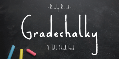 Proudly Present, Gradechalky A Tall Chalk Font. Gradechalky is perfect for any titles, logo, product packaging, branding project, megazine, social media, wedding, or just used to express words above the background. Gradechalky also come with Multi-Lingual Support. Enjoy the font, feel free to comment or feedback, send me PM or email. Thank You!
 - Metro Office by Linotype,
$50.99The Metro Office family is designed after the model of the original sans serif family – Metro No.1 – produced by W.A. Dwiggins and Mergenthaler Linotype’s design studio during the late 1920s and 1930s. A distinctly new interpretation of the sans serif idea, Metro was a thoroughly “American” sans serif when it was released. However, over the ensuing decades, it became a favorite the world over. Moreover, it is one of the first “humanist” sans serif typefaces designed. While redesigning Metro in 2006, Linotype’s Type Director Akira Kobayashi drew from his own knowledge of humanistic letterforms. The result is a redefined Metro; a typeface that is finally ready for heavy text setting. The original Linotype Metro No.1 never had italic variants. Kobayashi has created oblique variants, extending its use in document setting. A double-storey a and g, as well as a wider w were features of Dwiggins’ original Metro design that were filtered out by Mergenthaler Linotype in the 1930s. Kobayashi remedied this historical slight, retooling Dwiggins’ original forms and optimizing their legibility. Kobayashi has additionally retooled some of Metro’s more troublesome letters, which has black elements that became too dense. By opening up the troublesome joins (like that on the Q), Kobayashi has given his new Metro a more even color in text, improving its legibility while retaining its original spirit. - Emory by Typodermic,
$11.95 Welcome to the world of Emory, the typeface that packs a gritty punch. With its sandpaper-like texture, Emory is perfect for those looking to add a tactile quality to their message. This easy to grip typeface is designed to be comfortable to use, yet its coarse texture will make your words stand out. Every letter has been crafted with care to ensure a unique look that will make your text truly one-of-a-kind. In addition to its distinctive texture, Emory also features bespoke combos that will automatically be substituted for common character sequences. This feature adds an extra layer of roughness to your text, ensuring that your message will truly stand out. Emory is available in four distinct variants: Regular, Italic, Bold, and Bold-Italic. Whether you’re looking for a subtle touch of texture or a bold statement, Emory has you covered. So why settle for a plain, boring typeface when you can add a touch of grit and texture to your message? Choose Emory and experience the power of grit! Most Latin-based European writing systems are supported, including the following languages. Afaan Oromo, Afar, Afrikaans, Albanian, Alsatian, Aromanian, Aymara, Bashkir (Latin), Basque, Belarusian (Latin), Bemba, Bikol, Bosnian, Breton, Cape Verdean, Creole, Catalan, Cebuano, Chamorro, Chavacano, Chichewa, Crimean Tatar (Latin), Croatian, Czech, Danish, Dawan, Dholuo, Dutch, English, Estonian, Faroese, Fijian, Filipino, Finnish, French, Frisian, Friulian, Gagauz (Latin), Galician, Ganda, Genoese, German, Greenlandic, Guadeloupean Creole, Haitian Creole, Hawaiian, Hiligaynon, Hungarian, Icelandic, Ilocano, Indonesian, Irish, Italian, Jamaican, Kaqchikel, Karakalpak (Latin), Kashubian, Kikongo, Kinyarwanda, Kirundi, Kurdish (Latin), Latvian, Lithuanian, Lombard, Low Saxon, Luxembourgish, Maasai, Makhuwa, Malay, Maltese, Māori, Moldovan, Montenegrin, Ndebele, Neapolitan, Norwegian, Novial, Occitan, Ossetian (Latin), Papiamento, Piedmontese, Polish, Portuguese, Quechua, Rarotongan, Romanian, Romansh, Sami, Sango, Saramaccan, Sardinian, Scottish Gaelic, Serbian (Latin), Shona, Sicilian, Silesian, Slovak, Slovenian, Somali, Sorbian, Sotho, Spanish, Swahili, Swazi, Swedish, Tagalog, Tahitian, Tetum, Tongan, Tshiluba, Tsonga, Tswana, Tumbuka, Turkish, Turkmen (Latin), Tuvaluan, Uzbek (Latin), Venetian, Vepsian, Võro, Walloon, Waray-Waray, Wayuu, Welsh, Wolof, Xhosa, Yapese, Zapotec Zulu and Zuni.
 - Capsule by Eclectotype,
$40.00 Capsule is a reverse-stress, high-contrast, rounded sans-serif font with two distinct personalities. An all-caps face, there are however variations of some letters in the lowercase slots. The lowercase variants are more playful, with more bulbous elements that riff on phototype faces like Amelia and Data 70, but all can work together and be mixed and matched to your heart's content. Capsule boasts a bunch of esoteric discretionary ligatures to play around with, and stylistic alternates for 4, 7 and £. The language support is extensive enough to set essays in most Latin-based languages, even though that's the last thing you should be doing with this font! Capsule should be set large. The fit is tight and the kerning is aggressive. It's not what you'd call a workhorse, but Capsule is an All-Caps you'll (see what I did there?!) want to use for impactful headlines, cutting edge logos and post-modern layouts.
 - Artios Pro by DBSV,
$70.00 There are a lot of narrow passages... like the Straits of Gibraltar, Hormuz, of Malacca, of Thermopylae, the Dardanelles, the Dervenakion, Magellan, Rentina of Naruto, Kerch etc. I tried to pass into mine closely with the name «Artios Pro". Walking on the same considerations as the previous series (Khamai/Aeolus/Corset) I tried to give some sense of diversity for narrow passages of the letters. These twelve style are the result. And here, the "Rail" engage with "Semi Bold" in the same way as the previous series. This series is composed and includes 12 fonts with 625 glyphs each, with true italics and supports Latin, Greek and Cyrillic.
 - Yalla Pro by Borutta Group,
$39.00 Yalla PRO was inspired during a trip Mateusz Machalski took to Cairo (Egypt). The vast array of strong Arabic headline type, geometric forms working in interesting ways and contrasting with smooth, calligraphic details fed the design. Due to the same proportions and heights, Yalla works great together with Afronaut. Yalla was extended in 2024 by Mateusz Machalski & Małgorzata Bartosik with new weights.
 - Haunted House by HiH,
$8.00 Halloween lends itself to graphic images: witches, ghosts, bats, jack-o'lanterns and haunted houses. When we think of a haunted house, we generally think of a large, abandoned, derelict Victorian wood-frame house. The style is usually Second Empire or Queen Anne. There tends to be a lot of decoration. There is usually a porch or two with decorative spindle work. There is probably a tower, either square with a mansard roof such as one might see in Paris or round with a conical roof borrowed from a Loire Valley chateau. These houses were generally built in the United States between 1860 and 1900, products of the exuberance of a time before income tax. It took at least three servants to maintain such a house and was very expensive. Few can afford them today. That is why so many were converted to professional offices, multi-family dwellings or simply abandoned. HAUNTED HOUSE is our typographical contribution to Halloween. Based on our font PETRARKA ML, it features decorative capitol letters that utilize the silhouette of a Second Empire style house complete with a dead tree and a full moon. The font includes 8 ornaments suitable for flyers and party invitations. Revision 2.000 eliminates dual encoding, harmonizes metrics, adds new glyphs, and adds open type features. The zip package includes two versions of the font at no extra charge. There is an OTF version which is in Open PS (Post Script Type 1) format and a TTF version which is in Open TT (True Type)format. Use whichever works best for your applications.
 - Novera by René Bieder,
$29.00 The Novera family is a sharp geometric sans in ten weights plus matching italics, available in two versions – Modern and Classic. It has a contemporary, approachable and multifunctional yet characteristic design, that comes with an extensive glyphs set of 1000+ glyphs per font, meeting all typographic demands. The Design Vertical terminals, circular shapes and angular apexes – Novera truely breathes geometry! But the concept goes beyond the application of rational geometry. The intension was to create a highly legible family suitable for every day usage inspired by the work of Paul Renner, Eric Gill or Jakob Erbar, combining the geometric with the human and the functional with the unconventional. Although Novera is inspired by the past, its appearance is unmistakingly modern. Modern vs Classic Novera is available in two versions - Modern and Classic - born from the same source file but with different characters set as default. This creates subtle but effective distinctions such as the double-storey a (Novera Modern) which is optimized for legibility in longer text paragraphs, as opposed to the single-storey a (Novera Classic) which allows a purely geometric appearance. Another distinguishing feature are the ascenders on Novera Mondern, which extend above the cap height for an elegant presence, compared to the ascenders on Novera Classic, ending at the cap height, for a compact and helvetica-flavored look. Novera Modern was intended for usage in body copy, whereas Novera Classic was planned for headlines, short paragraphs or logos, but both versions can be used vice versa too, of course. Alternate Characters To maintain neutrality and a modern appearance, the standard character set largely dispenses with idiosyncratic forms. This is in contrast to the alternative forms with the gill-like lowercase letters g and t as well as a traditional shape of S and the German ligature t/z, which traces back to old German spellings. Also inspired by German poster designs from the early 20th century are the elongated i-dots and dieresis-dots that can create eye-catchers in headlines or logos. By the way, both versions, Novera Modern and Classic, can be created via stylistic set 1, 17 and 18. Opentype Features and Symbols The family comes with many opentype features to support modern typesetting. This includes ligatures, different number sets or alternative shapes for texts set in all caps. If you like arrows and other shapes, you will love Novera! The family has a built-in extensive symbols-set including 48 different arrows and various geometric shapes or icons. Weights With its 40 styles and 1000+ glyphs per font, the Novera family covers all thinkable design scenarios from branding to web, app or editorial usage. It blends in perfectly in text heavy paragraphs with its mid-weights like Light, Regular, Medium or Bold or stands out like a monument in headlines and posters with its extreme weights like Thin, ExtraLight, Black or Ultra. Testfonts If you like to test the fonts before buying the full version, please follow the link below. Please note, all test fonts are available for evaluation purposes only and contain a limited character set! A commercial license for the full version must be purchased separately. Please send a mail to contact@renebieder.com for more information. Download the test fonts here: https://www.renebieder.com/test-fonts
 - AL Hermaiona by Aluyeah Studio,
$90.00 Bonjour! Hermaiona a royal and lux display font. This font was carefully crafted and inspired by luxury fashion in the world. It creates a luxurious, rich, exclusive and elegant look in design. Coming to you with 100+ rich and luxury alternate to create a perfectly beautiful, classy, rich, elegant, and luxurious design. Use this font for your luxury brand, fashion brand, resort, cosmetics, invitations, wedding, branding, packaging, magazines, boutique, social media, restaurant, spa, greeting cards, headers, headline and many more. Features: OpenType support Multilingual support (15 languages) PUA Encoded Super Easy to Use alternates - It's OpenType support but you can easily call alternates character using special combination like A.2 B.2 a.2 a.5 b.3 etc so you dont need special software You will receive: Al_Hermaiona.otf Al_Hermaiona.ttf Thanks for checking out my font. I really hope you enjoy using it! If you have any questions I'd be more than happy to answer them, just send me a message! linggarsundoro@gmail.com Stay Healthy & Stay Strong
 - Cheer Forever by Ditatype,
$29.00 Cheer Forever is a delightful display font that merges the timeless simplicity of a sans serif with playful brush-style accents. With its uppercase letterforms and unique design, this typeface adds a touch of cheerfulness and character to your projects. The defining feature of Cheer Forever lies in its combination of a clean and geometric sans serif base with brush-inspired accents. The uppercase letters maintain a sleek and straightforward appearance, while the brush-style elements bring an element of spontaneity and liveliness. This fusion of styles creates a harmonious balance, resulting in a font that is both contemporary and playful. Inspired by the joyful nature of brush calligraphy, Cheer Forever captures the essence of creativity and self-expression. The brush-inspired accents add a touch of whimsy and personality to each letter, as if they were hand-drawn with a brushstroke. This unique style injects a sense of fun and positivity into your designs. Enjoy the various features available in this font. Features: Ligatures Multilingual Supports PUA Encoded Numerals and Punctuations Cheer Forever fits in logos, titles, headlines, and any design that aims to make a bold statement with a touch of playfulness. It is also particularly well-suited for designs related to children's products, event promotions, and any theme that calls for a touch of creativity. Find out more ways to use this font by taking a look at the font preview. Thanks for purchasing our fonts. Hopefully, you have a great time using our font. Feel free to contact us anytime for further information or when you have trouble with the font. Thanks a lot and happy designing.
 - Tailgates by Ditatype,
$29.00 Introducing Tailgates, a script font that exudes a robust and inviting charm. This typeface showcases a substantial weight, offering your text a bold and captivating presence. Tailgates is characterized by its rounded letterforms, contributing to a friendly and approachable aesthetic. With consistent proportions and a relatively high contrast, it achieves a dynamic and eye-catching design. What sets Tailgates apart are the captivating swinging ends that adorn select letters. These elegant flourishes add a sense of whimsy and grace to your text, creating a visual experience that is both lively and engaging. The combination of round shapes and these decorative elements adds a unique touch to your designs. In addition, enjoy the features here. Features: Ligatures Stylistic Sets Swashes Multilingual Supports PUA Encoded Numerals and Punctuations Tailgates fits in headlines, logos, posters, flyers, branding materials, print media, editorial layouts, and many more designs. Find out more ways to use this font by taking a look at the font preview. Thanks for purchasing our fonts. Hopefully, you have a great time using our font. Feel free to contact us anytime for further information or when you have trouble with the font. Thanks a lot and happy designing.
 - Thistle Balloons by Ditatype,
$29.00 Thistle Balloons is the right script font for natural, casual, personal displays because the letters are in forms of real cursive handwritings connected to each other to create togetherness and continuity nuances. This script font has low letter contrasts to show a more casual, friendlier display and a variety of letter heights. Some letters may look higher than the other ones to make them more interesting and dynamic, and such inconsistent letter sizes can enhance the natural, personal nuances to the font itself. Additionally, it is better to apply this font for big text sizes and you may also enjoy the outstanding features available here. Features: Ligatures Multilingual Supports PUA Encoded Numerals and Punctuations Thistle Balloons fits best for various design projects, such as brandings, quotes, invitations, name cards, greeting cards, printed products, merchandise, social media, etc. Find out more ways to use this font by taking a look at the font preview. Thanks for purchasing our fonts. Hopefully, you have a great time using our font. Feel free to contact us anytime for further information or when you have trouble with the font. Thanks a lot and happy designing.
 - Tombo Brush by Ditatype,
$29.00 Tombo Brush is an interesting font that combines brush font’s artistic and organic characteristics with even line edges which are clear and firm. Furthermore, the capital letters express more modern, simple impressions by following the brush script font’s characteristics of the soft and smooth brush wipes, yet the even smooth lines on the edges show clearer, firmer nuances. Bright and contrast colors can show interesting, dynamic nuances on designs with this font. The even edge lines will ease the application of colors and show clearer visual effects separated from the background. You can apply this font for big text sizes for a legibility reason and also enjoy the available features here. Features: Multilingual Supports PUA Encoded Numerals and Punctuations Tombo Brush fits best for various design projects, such as brandings, quotes, printed products, merchandise, social media, etc. Find out more ways to use this font by taking a look at the font preview. Thanks for purchasing our fonts. Hopefully, you have a great time using our font. Feel free to contact us anytime for further information or when you have trouble with the font. Thanks a lot and happy designing.
