10,000 search results
(0.024 seconds)
- Manifold CF by Connary Fagen,
$35.00 Manifold® CF is a utilitarian typeface inspired by the precision of a computer terminal, softened by contemporary design and rounded corners. Manifold's unified letterforms and tall x-height are great for user interfaces, or track it out for a sophisticated look. Manifold also offers wide language support, including Cyrillic script, Vietnamese, and Pinyin Romanization. Manifold® CF excels as a headline or display typeface, and pairs well with contrasting simple serifs like Artifex CF and Artifex Hand CF. All typefaces from Connary Fagen include free updates, including new features, and free technical support.
 - Kutilang by Allouse Studio,
$16.00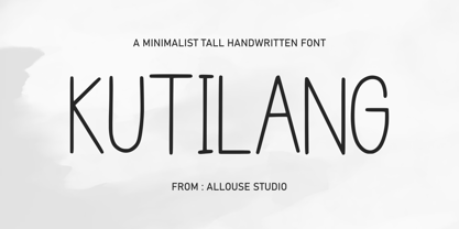 Proudly Present, Kutilang a Minimalist Tall Handwritten Font. Kutiling come along with Multi-Lingual Support to fulfill your need. We highly recommend using a program that supports OpenType features and Glyphs panels like many of Adobe apps and Corel Draw, so you can see and access all Glyph variations. Kutilang is perfect for any tittle, product packaging, branding project, megazine, social media, wedding, or just used to express words above the background. Enjoy the font, feel free to comment or feedback, send me PM or email. Thank You!
 - Escrow RE by Font Bureau,
$40.00 The Wall Street Journal commissioned the original version of Escrow. Cyrus Highsmith designed forty-four styles in this new Scotch series, which sets the tone of the front page of the Journal, envy of the newspaper industry. This version of the family is part of the Reading Edge series of fonts specifically designed for small text onscreen, having been adjusted to provide more generous proportions and roomier spacing, and having been hinted in TrueType for optimal rendering in low resolution environments.
 - Hellschreiber by Jörg Schmitt,
$35.00 The birth of the monospaced types dates back to the past. There was a need for the creation of typesets for typewriters. The difficulty was to align the different glyphs in the same width. This led to particular problems with letters like “M” and “l”; the former seemed to be squeezed into the same width of all letters and the second one appeared way too streched. Despite – or perhaps because of – the impression of the typewriter is still popular with Graphic Designers. Nowadays there are even monospaced versions of primarily proportional types; for example the the Sans Mono designed by Lucas de Groot or the DIN Mono. Then again, why not the other way round?! In the first half of the Nineties, Erik Spiekermann developed a proportional type named ITC Officina based on the Letter Gothic. According to a survey on the 100 best fonts of all time conducted by FontShop, ITC Officina is in an eighth place, far ahead of its forerunner. This was the reason for me to create a wider design with a Serif and a Sans Serif based on the queen of all monospaced types – the Courier.
 - TessieStandingBirds by Ingrimayne Type,
$13.95 A tessellation is a shape that can be used to completely fill the plane—simple examples are isosceles triangles, squares, and hexagons. Tessellation patterns are eye-catching and visually appealing, which is the reason that they have long been popular in a variety of decorative situations. These Tessie fonts have two family members, a solid style that must have different colors when used and an outline style. They can be used separately or they can be used in layers with the outline style on top of the solid style. For rows to align properly, leading must be the same as point size. Shapes that tessellate and also resemble real-world objects are often called Escher-like tessellations. This typeface contains Escher-like tessellations of birds. A number of years ago I decided to see how many of the 28 Heesch types of tessellations I could use to make birds standing on the backs of other birds. I found standing bird patterns for all 17 of the types that had either translated or glided edges. The TessieStandingBirds typefaces contain the standing-bird shapes that I discovered. At first glance they seem to be quite similar, but small differences matter in how they fit together. Most of the patterns require more than one character. The sample file here shows how pieces fit together to give tessellating patterns. (Earlier tessellation fonts from IngrimayneType, the TessieDingies fonts, lack a black or filled version so cannot do colored patterns.)
 - Amherst by Linotype,
$29.99Amherst is a family of blackletter-inspired typefaces. This family, created by British designer Richard Yeend in 2002, is unique in that it mains the feel of blackletter/medieval type without relying directly on historical forms. Amherst is split into two different sub-families, Amherst and Amherst Gothic. Amherst is very geometric interpretation of Fraktur. Fraktur was a style of German type very popular in central Europe from 1517 until the early 20th Century. Its letters appear "broken" at certain angles and joints. Still, we recommend using it primarily for display purposes. Amherst is available in three weights: Regular, Bold, and Heavy. Amherst Gothic is very loosely inspired by late medieval letterforms, often called Texturas or Gothics. However, the letterforms of Amherst Gothic seem just as inspired by the Art Deco movements of the 1920s and by contemporary sans serif type design as anything else. Nevertheless, certain letters in this typeface do appear more "gothic" than others, especially A, D, M, Y, d, r, and x. Amherst Gothic is made up of three fonts, Amherst Gothic Split, Amherst Gothic Split Alternate, and Amherst Gothic Italic. Amherst Gothic Split has in-lined characters, and appears very ornamented. The alternate characters in Amherst Gothic Split Alternate are quite medieval in their appearance. Amherst Gothic Italic is the least medieval-looking of the set; its characters are very round, and more geometric. All six styles of the Amherst Family are OpenType format fonts, and include old style figures. - Jazz Gothic by Canada Type,
$24.95Jazz Gothic is a digitization and expansion of an early 1970s film type from Franklin Photolettering called Pinto Flare. This type became an instant titling classic with jazz and soul album designers; then it caught on wildly with film and television designers. Blue Note and Motown would not have been the same without this face. Jazz Gothic is a simple geometric idea, quite likely originally inspired by the heavier display weights of Futura. The resulting product is a versatile message-driver that stands quite strong and cherishes the limelight, yet shows a playful and artistic side within its curvy thick swashes and rebellious unicase forms. In the hands of a good designer, Jazz Gothic eliminates any doubt about the delivery of the message or the attractive purposeful way it is delivered. It is the kind of typeface that loves a design program's bells and whistles. Knock it out of dark or light backgrounds, shade it, mask-alize it, roughen it, stretch it, squeeze it, and the message will still stand larger than life. Jazz Gothic comes in two fonts, a main one with a full character set to accommodate the majority of Latin-based languages, and a second one that contains about 50 alternates and swashed forms. The OpenType version is a single font that has all the alternates and swashes at the disposal of the buttons of OT-savvy program palettes. - Pinel Pro by URW Type Foundry,
$39.99 The characteristic ‘French face’ was originally made in 1899 under the supervision of Joseph Pinel. Thus, what was originally French 10 pt. Nº 2, got its present name. The Frenchman Joseph Pinel called himself a "typographical engineer", but was at the time employed as a type draughtsman at the Linotype Works in Altrincham. It appears that this and some other faces that he supervised, were, except for use on the Linotype, also meant for manufacturing matrices for the Dyotype. This composing machine was an invention of Pinel. The Dyotype was a rather complicated machine and consisted, like the Monotype, of two separate contraptions, a keyboard which produced a perforated paper ribbon and a casting machine which produced justified lines of movable type. Unlike the Monotype which has a square matrix carrier, the Dyotype had the matrices on a drum (in fact two drums, hence the name of the machine). A Pinel Diotype company was founded in Paris and a machine was built with the help of the printing press manufacturer Jules Derriey. As is often the case, a lack of sufficient capital prevented the commercializing of this ingenious composing machine. Coen Hofmann digitized the font from a batch of very incomplete, damaged and musty drawings, which he dug up in Altrincham. He redrew all characters, bringing up the hairstrokes somewhat in the process. The result is a roman and italic, while the roman font also includes Small Caps
 - Classification JNL by Jeff Levine,
$29.00 Sometimes it's easy to find a name to fit a font design, other times it's a struggle because of the sheer number of digital fonts available and the number of names already taken. Classification JNL stretches a point to arrive at its name. The attractive sans design was found as a hand-lettered title on a piece of vintage sheet music called "My Hawaiian Souvenirs". During the 1940s, the popular mode of travel to other countries was by steamship. Steamship passengers were assigned their accommodations by the type of passage they booked (such as First Class and Tourist), thus they were in various levels of classification. This aside, Classification JNL is a nice alternative to "standard" condensed fonts for design projects.
 - Kalix by Linotype,
$29.99I have a notation that the summer of 1994, when I worked with Kalix, was a warm one. I had no special typeface in mind when drawing the characters of Kalix, but many typefaces contributed to it, e.g. my own Omnibus from which I borrowed the looks of the smal case g. I think it is a lovely typeface whose use is mainly for books and magazines. Kalix is the name of a northern Swedish town situated along a river called Kalixälven. Its name is of sami origin, *káles, meaning cold. There comes the connection to the warm summer of 1994! But even the Latin word for chalice, calix, has something to do with my choice of name. Kalix was released in 1994. - 1431 Humane Niccoli by GLC,
$38.00 Niccolo Niccoli (1364-1437) was a wealthy bibliophile and an acclaimed scribe, in Florence (Italy). He was one of the most important Italian calligrapher in this early time of rediscovering Roman script. Of rare accomplishment was his adaptation of the so called Italian humanistic minuscule script. We were inspired from his late work to create this present Font. We have added a lot of accented and other characters (U/V, I/J...) who was not existing in the original and replacing "long s" by a small "s" for a modern use. The OTF encoding was used for intelligent alternates, permitting to use different forms of the same lower case or capital in a single word, reproducing easily the charming variety of a real manual scripture.
 - Ruca by URW Type Foundry,
$49.99 Since my first contact with blackletters in 1999, I became more and more fascinated by these artistic looking typefaces. It all started in the USA at the age of 16, when I took an art class. I decided to trace some blackletter typefaces because they looked very interesting. From this point on I was intrigued by blackletter fonts from all over the world. I studied their different body structures and their cultural background as well as the type designers behind it. Full of information and inspiration I started to draw my own blackletter typeface in 2006. While studying in Hamburg I got in touch with the studio of URW++, where I got skilled in type software and development. Creating a type takes an eye for detail and patience but also lots of time and so it took almost 4 years until the project was finished. And so Ruca was born. Ruca is a refined and expanded typeface. When you look at the spines, the tails or the flags you can see the detailed drawing, which makes the font also extremely good looking in very tall letters. The full character set contains over 400 characters, many ligatures, two number sets and all important currency symbols. Over 300 kerning pairs and many OTF-features make the font easy in use for professional type applications. The typeface is very well applicable for strong headlines and mastheads. Because of its unique appearance, Ruca is perfectly suitable professional graphic applications such as fashion design or branding.
 - Sprig by Scholtz Fonts,
$19.00 Sprig is a dynamic font that combines in-your-face chutzpah with contemporary brushstrokes. The character shapes are contained, yet give a feeling of casual, off the cuff ease. In some, subtle ways it pays its respects to the sign painters of the 30s and 40s The font comes in three styles: - Display, with extravagant upper case characters and some opentype features - Text, with more contained upper case characters (suitable for "all caps" use) and some opentype features - Professional, where OpenType features include alternative upper case characters (both the TEXT the DISPLAY caps), as well as a number of ligatures. (For use in applications that access OpenType features.) What this means is that Sprig Pro combines all the characters of Sprig Text and Sprig Display in one font and it also has additional ligatures. Sprig Pro contains over 283 characters, while all styles of Sprig contain a full upper and lower case character set, punctuation, numerals, symbols and accented characters for both all characters that they contain. It has all the accented characters used in the major European languages. The Sprig User Guide provides you with more information on how to use Sprig Pro.
 - ATF Alternate Gothic by ATF Collection,
$59.00 ATF Alternate Gothic is a new, significant digital expansion of Morris Fuller Benton’s classic 1903 type design. Originally available in one bold weight, the metal typeface came in three slightly different widths for flexibility in copy-fitting layouts. ATF Alternate Gothic has impact at any size. Its letterforms are instantly familiar: Benton’s original metal type family was used throughout the 20th century in newspapers, magazines, and advertising, providing “strong and effective display” in a compact space. Monotype issued its own metal version for machine typesetting, and Alternate Gothic likely served as inspiration for Linotype’s ubiquitous Trade Gothic® Bold and Bold Condensed. ATF Alternate Gothic expands on the characteristics that perhaps made Trade Gothic so popular, providing a wider range of weights and widths to address the needs of today’s designers and technologies. The space-saving clarity of ATF Alternate Gothic brings readability to the world of advertising typefaces. With its finely graded range of ten weights, with four widths of each weight (40 fonts total), this extensive type family can be used to pack a lot into a narrow space, and the range makes it easy to create variations of an advertisement or announcement for different formats and media. The tall x-height and narrow proportions, combined with a relatively low waist and springy, tension-filled forms, make ATF Alternate Gothic strong and effective in display. All ten weights have been carefully spaced for readability, caps and lowercase work well together, while attention-grabbing all-caps settings are clear and never crowded, no matter how narrow.
 - VTCSuperMarketSaleTallTilt - Unknown license

- VTCSuperMarketSaleSC - Unknown license

- VTC ScreamItLoudSliced - Unknown license

- VTCBelialsBlade3d - Unknown license

- VTCSuperMarketSaleDisplayWired - Unknown license

- VTCSuperMarketSale - Unknown license

- Shelter Me - Personal use only

- VTCSuperMarketSaleTall - Unknown license

- VTC NightOfTheDrippyDead - Unknown license

- VTCSundaykomix - 100% free

- VTCSuperMarketSaleItalic - Unknown license

- VTCSwitchbladeRomanceSD - Unknown license

- VTCSuperMarketSaleOpenDisplay - Unknown license

- GEIST KNT - Unknown license

- VTCSwitchbladeRomanceDrunk - Unknown license

- VTCBelialsBladeShadow - Unknown license

- VTCSundaykomixcaps - Unknown license

- VTCSundayKomixTallOutline - Unknown license

- VTC LiquorCrystalDisplay - Unknown license

- VTCSuperMarketSuperSale3DTilt - Unknown license

- VTCBelialsBladeItalic - Unknown license

- VTCSwitchbladeRomanceSloppyD - Unknown license

- VTCSuperMarketSaleODS - Unknown license

- GEIST RND - 100% free

- VTCSwitchbladeRomance - Unknown license

- VTCSundaykomixcaps - Unknown license


