5,959 search results
(0.009 seconds)
- 1726 Real Española by GLC,
$42.00
- Brass Rail JNL by Jeff Levine,
$29.00
- FF Real Head by FontFont,
$50.99
- Real One Specific by Sulthan Studio,
$8.00
- Rail Service JNL by Jeff Levine,
$29.00
- Arial Windows compatible by Monotype,
- FF Spoken Trial - Personal use only

- FF PQR Trial - Personal use only

- FF Comma Trial - Personal use only

- Vatican Rough Letters, 8th c. - Unknown license

- British Block Flourish, 10th c. - Unknown license

- D3 DigiBitMapism type C wide - Unknown license

- Ongunkan Cypriot Linear C Sylla by Runic World Tamgacı,
$100.00
- GA Clock Dial Round - Unknown license

- SF Arch Rival Extended - Unknown license

- SF Arch Rival Extended - Unknown license

- SF Arch Rival Extended - Unknown license

- Child's Play Trial Version - Unknown license

- Killer Ants Trial Version - Unknown license

- SF Arch Rival Extended - Unknown license

- Rail Route Stencil JNL by Jeff Levine,
$29.00
- Arial for Ortho Clinical by Monotype,
$45.99 - Gotham Rail Company NF by Nick's Fonts,
$10.00 - Faqro Extended Wide Trial - Personal use only

- Faqro Extended Expand Trial - Personal use only

- Fear Logo Fires Trial - Personal use only

- Angel Tears - Personal use only

- Ink In The Meat - Personal use only

- BN-Old Fashion - Unknown license

- BN-Outer Line - Unknown license

- BN-Blurry Day - Unknown license

- ZRex - Unknown license

- airbrush - Unknown license

- Pleasure Point by Comicraft,
$39.00
- Gusto Black by BA Graphics,
$45.00 - Yaroslav - Unknown license

- Albany by Monotype,
$29.99 - LE Genoss by Attype Studio,
$18.00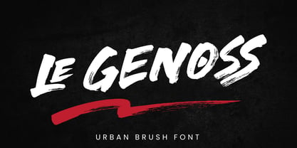
- BOSS M - 100% free

- Throws by Tomatstudio,
$10.00


