10,000 search results
(0.033 seconds)
- Empire by Font Bureau,
$40.00 In 1937, Morris Fuller Benton designed Empire, titling capitals that became the headline style for Vogue magazine. In 1989, David Berlow revived it for Publish magazine, adding an italic and a lowercase, both unavailable in the original. He revisited Empire in 1994 with Kelly Ehrgott Milligan, adding two heavier weights, small caps, and an elegant set of Art Deco–flavored oldstyle figures, ultimately expanding it to a seven-part series; FB 1989–94
 - Poynter Gothic by Font Bureau,
$40.00 Morris Fuller Benton’s drawings at the Smithsonian show a creative concern for effects of scale on typeface design. Tobias Frere-Jones began with 4pt ATF Franklin Gothic drawings, modifying proportions to mix with Poynter Oldstyle and Benton Gothic, and adjusting ends of the curved strokes of C G S a c e r s to suit news printing conditions. Poynter Gothic Text excels as subheads used with Poynter Oldstyle Text; FB 1997–99
 - Raccoon Coat JNL by Jeff Levine,
$29.00 A piece of hand lettered sheet music from the era of the "Roaring Twenties" served as a model for Raccoon Coat JNL. It was a time of Prohibition, bathtub gin, flappers and college boys decked out in beanies and raccoon coats. College pennants, ukuleles and "23 Skidoo" were all part of the youth culture during this period; which gave us such dances at the Charleston, the Black Bottom and the Lindy Hop.
 - Bold Fashion by Mans Greback,
$59.00 Bold Fashion is a heavy slab-serif font of the disco era. Its funk-style design, coupled with soft, rounded serifs, embodies the soul of retro, bringing forth memories of neon lights, bell-bottoms, and roller discos. Each letter is profoundly heavy, yet they prance with a bouncy, comfy rhythm, akin to catchy 70s beats. The swashes adorning the uppercase letters add flair, reminiscent of iconic burger joint signs and groovy vinyl covers.
 - Wedding Text by Monotype,
$40.99Wedding Text was designed by Morris Fuller Benton in 1901 for American Type Founders (ATF). The face was so popular that its forms soon began appearing with other font foundries under different names, Elite Kanzlei with D. Stempel AG, Comtesse with C.F. Rühl, Linotext with Linotype, etc. Its ornamental forms are not considered very legible by today's standards; therefore it should be used for headlines and short texts in point sizes 12 or larger. - ZenoPotion AOE by Astigmatic,
$19.95ZenoPotion is a geometric styled typeface influenced by alien stories and nostalgia. It carries a techno look with a regular lined top and dipped thick bottom throughout, highly readble, though not best for large bodies of text. Use the alien technology, let ZenoPotion be the type for your designs and stories. From the far reaches of space, another lifeform sent a message, now you can use their typestyle to convey your own! - Suffiya NF by Nick's Fonts,
$10.00The Boston Type Foundry called the pattern for this elegant typeface "Moslem," suggesting the exotic appeal of faraway lands. The face succeeds in fulfilling its promise, with remarkably little extraneous fussiness. The font's name suggests that it's a wise choice for headlines which tout the lure of distant charms. Both versions of the font include complete Latin 1252, Central European 1250 and Turkish 1524 character sets, with localization for Moldovan, Romanian and Turkish. - Lateral Incised NF by Nick's Fonts,
$10.00Gravure was designed by Morris F. Benton in 1927 for American Type Founders and was also released in 1929 by the London foundry of C. W. Shortt. This luminous face has a slightly naïve charm seldom found in incised typefaces. Ornamental and engaging, it’s a perfect choice for headlines with warmth and grace. Both versions of the font include 1252 Latin and 1250 CE (with localization for Romanian and Moldovan) character sets. - Sitcom by GroupType,
$19.00 If there was an American Typeface Hall of Fame, Bank Gothic, designed by the great Morris Fuller Benton would hold a place of special distinction considering this design has survived so many trends in typographic fashion since being introduced in 1930. It's just as desirable today as it was over eighty years ago; arguably more. Today, Bank Gothic is a very popular choice as a titling face for science fiction books, posters and countless television and movie titles. It is also a popular typeface for use in computer games and digital graphics. GroupType’s 2010 revival of this American classic is true to the design, the period, and Benton’s aesthetic. GroupType worked with some of the most talented and experienced type designers that were historically grounded and sensitive to this design project. Fortunately, Mr. Benton has left us a large selection of other great typefaces for insight and guidance. GroupType’s new revival includes the original three weights in regular and condensed style but also a new small cap and lowercase in each font necessary for 21st century typography.
 - Bank Gothic by GroupType,
$29.00 If there was an American Typeface Hall of Fame, Bank Gothic, designed by the great Morris Fuller Benton would hold a place of special distinction considering this design has survived so many trends in typographic fashion since being introduced in 1930. Its just as desirable today as it was over eighty years ago; arguably more. Today, Bank Gothic is a very popular choice as a titling face for science fiction books, posters and countless television and movie titles. It is also a popular typeface for use in computer games and digital graphics. GroupType’s 2010 revival of this American classic is true to the design, the period, and Benton’s aesthetic. GroupType worked with some of the most talented and experienced type designers that were historically grounded and sensitive to this design project. Fortunately, Mr. Benton has left us a large selection of other great typefaces for insight and guidance. GroupType’s new revival includes the original three weights in regular and condensed style plus two new distressed fonts. All have a new small cap and lowercase in each font necessary for 21st century typography.
 - Ultra Brush by Garisman Studio,
$15.00 Ultra Brush was born from the interest of the maker of display fonts that are currently present. By using a natural dry brush, Ultra Brush was born to meet the needs of designers to make posters, tshirt, quotes, branding, packaging, logos, advertise, and etc. What will you get? - Support 20 languages and Multilanguage - More +50 swash styles - Simple Installation - Ligature Support We hope you can experiment and explore with Ultra Brush. Thank you very much for visiting
 - Ah, KG Seven Sixteen, a font that confidently saunters into the world of typography, tipping its hat with a cheeky grin. Crafted by the whimsical wand of Kimberly Geswein, it's as if this font was sp...
- SwishButtons by Nick Curtis is a charming and captivating typeface that effortlessly weaves the whimsy of art deco inspirations with the playfulness of modern design sensibilities. Created by the tal...
- Bunbury by Monotype,
$15.99 For playfulness and something a little less ordinary, Bunbury is a wonderful script that’s packed with personality. Created using a felt marker and available as an all capitals display font, SC Bunbury’s style is sort of awkward and a lot of fun, with defined outlines and uneven line thicknesses that make for letters packed with hand drawn quirks.
 - Dreamy Doodles by Typebae,
$12.00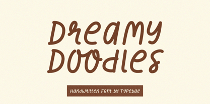 Dreamy Doodles is a stylish and joyful that captures the essence of a modern handwritten marker. It exudes a delightful and lively vibe, perfect for those seeking a refreshing and vibrant aesthetic. This font effortlessly conveys a cool and fashionable impression, making it an excellent choice for those looking to create eye-catching and trendy designs.
 - Urban Tags by Tomatstudio,
$15.00 Inspired from tagging graffiti marker in the streets and my real experiences in graffiti scenes, Urban Tags comes with iconic rounded tip marker, this style often used by several graffiti artist around the world because the style is very unique, very fun to write in markers. Perfect if you want realistic Street art style or hip hop for your designs, poster, props etc. Because this is real graffiti fonts, "urban Tags" is different like other fonts, the space letter is shorter, for perfect result the Kerning you can adjust manually, because it's impossible to setting kerning like other regular fonts. I put extra glyphs for make the fonts looks more street art, use "åß∂ƒ©˙∆˚¬Ω≈ç" you can see in the preview.
 - P22 Barabajagal by IHOF,
$29.95 P22 Barabajagal is a unique take on the display fat face by way of doodling fun. Somewhat informed by the shapes of an early 1970s film type called Kap Antiqua Bold, this font’s aesthetic is the stuff of boundless energy and light humour, where an uncommon “peak” angle drawing perspective results in sturdy trunks, fat bottom curls, and active ascenders eager for mobility in space. This is the kind of font that makes you wonder whether it was drawn with rulers, protractors and compasses, or just by a mad doodler’s crazy-good free hand. Regardless, Barabajagal easily turns the geometry of modern forms into an exercise in sugar-loaded fun. It’s a very good tool to use in design geared at kids and young adults, such as food and toy packaging, books, animation, cartoons and games. Barabajagal comes with over 550 glyphs, lots of alternates, and a few ligatures and swash caps. It also contains extended support for Latin languages.
 - FWD Egyptian Tower by Fontwright Design,
$39.99 FWD Egyptian Tower is a designers stack-able Display family best purchased as one package. The four versions can be manipulated in your favorite graphics or sign making application to achieve the different effects as shown in the font family ad designs. All fonts are tightly spaced and are very often intentionally overlapped creating a balance for each very unique wider bottomed character. Being stack-able, the designer can duplicate the original text layer and by changing the font on the lower of the two layers to another of the family can then add another available effect. This can be repeated to add other of the available effects. Then by converting the text of the lower text layers to curves or outlines and welding the characters of the words together, the overlaps can be eliminated. This process is fairly common practice for a graphic designer and quite easy once done a few times.
 - Croft by Stiggy & Sands,
$24.00 Historical typography makes a comeback. A revival of one of the most popular of a number of rugged typefaces used around the turn of the century, Croft revives the creation of Lewis Buddy III, known as "Roycroft" in 1912 ATF catalogs. It also, according to ATF, was designed "partly" by Morris Benton, around 1898. The original typeface might be considered an early form of grunge fonts. This typestyle maintains historical flavor, while also being relevant today. It has been expanded to have more discretionary ligatures and numerals sets for versatility, and maintains the original stylistic alternates and standard ligatures. See the 5th graphic for a comprehensive character map preview. Opentype features include: Full set of Inferiors and Superiors for limitless fractions. Tabular, Proportional, and Oldstyle figure sets. A small collection of Discretionary & Standard Ligatures. Stylistic Alternates for variations of several characters such as R, u, t, etc. Approx. 482 Character Glyph Set: Croft comes with a glyphset that includes standard & punctuation, international language support, and additional features.
 - Bihext by Ingrimayne Type,
$10.00 The letters of Bihext fit into the trapezoids formed by bisecting hexagons from the top corner to the bottom corner. Because these trapezoids have two orientations, there are two sets of characters and the typeface was designed assuming that the user would want to alternate these two character sets. The alternating of characters is done automatically with the OpenType feature of contextual alternatives (calt) in applications that support it. The typeface is monospaced with very tightly letter spacing. If the letter spacing seems too tight, consider alternating colors to make the individual letters stand out as an alternative to loosening the letter spacing. Almost certainly the user will need to adjust line spacing if more than one line of text is used. The family includes an outline style that can be used in a layer above the filled style. A decorative, display face, Bihext is too difficult to read to be used for long text.
 - Hero Sandwich Pro by Comicraft,
$19.00 As comic book readers know all too well, team ups are every super hero’s bread and butter... when the brave and the bold are in a pickle, and super villains are running onion rings around them, here’s how they roll: They Meat! They Team-Up with your taste buds! They Fight Hunger! Our original Hero Sandwich font has become a go-to for video game and app graphics, due to its easy readability and friendly demeanor. The new Pro version adds nine weights from Thin to Heavy, with matching italics, plus a versatile Variable Font to dial in your preferred combination of weight and italic slant. Each weight includes four numbering options and support for 222 languages, including Cyrillics. So take a footlong bite out of crime, and make the subways safe again with our mouthwatering Hero Sandwich! Prepared with care and plastic gloves by those awfully nice chaps at the Comicraft deli.
 - Cookie Crumble by Hanoded,
$10.00 I like cookies. Especially butter cookies and ginger nuts. The word cookie comes from the Dutch word ‘koekje’ - which means exactly the same. Cookie Crumble is a cute little font that I made on a rainy day. I just needed something that looked and sounded happy and I guess it applies to this font. Cookie Crumble comes with a bunch of alternates, a full set of diacritics and a bit of sunshine to chase away your rainy day.
 - Agency FB by Font Bureau,
$40.00 ATF Agency Gothic was designed by Morris Fuller Benton in 1932 as a lone titling typeface. In 1990, David Berlow saw potential in the squared forms of the narrow, monotone capitals. He designed a lowercase and added a bold to produce Font Bureau Agency, an immediately popular hit. Sensing its potential to be than just a useful condensed face, Font Bureau developed Agency into a major series offering five weights in five widths; FB 1990-95
 - Eaglesport by QubaType,
$12.00 Eaglesport is an all-caps display typeface with octagonal design. Eaglesport supports many Latin-based languages including: Afrikaans, Basque, Breton, Catalan, Danish, Dutch, English, Finnish, French, Gaelic, German, Indonesian, Irish, Italian, Norwegian, Portuguese, Sami, Spanish, Swahili and Swedish. Also we add Cyrillic glyphs for supporting Russian, Ukrainian and Belarusian. Eaglesport comes three styles and includes italics. This typeface works great for logos, packaging and other display settings, it's perfect for sports logos, branding, posters, apparel design.
 - Manufactory JNL by Jeff Levine,
$29.00 Manufactory JNL and its oblique counterpart were re-drawn from examples of a now-antique typeface used within many advertisements found throughout the pages of The American Stationer magazine, circa 1879. The term ‘manufactory’ was popular during this era; the word being a more archaic form of ‘factory’. There is a bit of Western flavor to this type design, as the spurred serifs and the top and bottom strokes are heavier than the vertical and mid-point stroke weights.
 - Badlands JNL by Jeff Levine,
$29.00 A vintage piece of sheet music for "Waitin' at the Gate for Katy" (from the 1934 movie "Bottoms Up") provided the hand-lettered, Western-influenced lettering which is now available as Badlands JNL. Some of the characters originally had overly-thick vertical strokes which stood out from the rest of the letters, so they were "standardized" in order to provide a more aesthetically pleasing overall design. Available in both regular and oblique versions to fit your design needs.
 - Rubas by QubaType,
$12.00 Rubas is an all-caps display typeface with octagonal design. Rubas consists of a solid basic font (Athletics) and its eleven inline variants. With its bold and confident appearance, it's perfect for sports logos, branding, posters, apparel design. Rubas supports many Latin-based languages including: Afrikaans, Basque, Breton, Catalan, Danish, Dutch, English, Finnish, French, Gaelic, German, Indonesian, Irish, Italian, Norwegian, Portuguese, Sami, Spanish, Swahili and Swedish. Also we add Cyrillic glyphs for supporting Russian, Ukrainian and Belarusian.
 - Filibuster NF by Nick's Fonts,
$10.00The Ayes have it! The 1909 specimen catalog from the H. C. Hansen Type Foundry of Boston contained a lovely decorative face named Congress, which is the pattern for this font. It's a winning choice for distinctive headlines, and the uppercase letters are also suitable by themselves for use as decorative initials. The PC Postscript, Truetype and Opentype versions contain the complete Latin language character set (Unicode 1252) plus Central European (Unicode 1250) languages as well. - Reliquaire AOE by Astigmatic,
$24.95 Historical elegance finds its place in the digital era with Reliquaire AOE. Reliquaire AOE is the historical revival and elaboration of the "Memorial" typeface created by Boston Type Foundry in January of 1881. What began as a basic character set of Capitals, lowercase, numerals, and a small handful of punctuation characters has been expanded to a full character set including unlimited fractionals, superiors & inferiors, ordinals, tabular & proportional figures, and an expanded language glyph set. History has found new life.
 - Idle Fancy NF by Nick's Fonts,
$10.00This elegant yet playful offering is based on the typeface Domino designed by Alfred Riedel for the German foundry Ludwig & Mayer in 1954. Its large x-height and subtly sinuous curves make it a natural choice for headlines which are both warm and compelling. Both versions of the font include 1252 Latin, 1250 CE (with localization for Romanian and Moldovan). - Born Ready by Nicky Laatz,
$20.00 Get ready to make a statement with “Born Ready” - A dry marker handwritten font with textured lines and multiple personalities. Born Ready comes in various styles — Regular, Slanted and Upright — each with its own unique personality to suit the look you need. A handy set of alternate lowercase letters and ligatures allows you to get the perfect look you need for your design.
 - Lazare Grotesk by Nootype,
$40.00 A dynamic and strong new Grotesk, Lazare Grotesk is a family of 21 styles. The family comprises seven weight, from UltraThin to Black, with not only italic but with backslanted too, which allows to make fun and cool layout. In the black weight the font is particularly contrasted. This family contains many OpenType features, such as Alternates, Proportional Figure, Tabular Figures, Old Styles Figures, Numerators, Superscript, Denominators, Scientific Inferiors, Subscript, Ordinals and Fractions, which make that typeface useful in various projects. The fonts have an extended characters set to support Central, Eastern and Western European languages. Lazare Grotesk supports Latin and Cyrillic, all these languages are covered: Latin language support: Afar, Afrikaans, Albanian, Asturian, Azeri, Basque, Bosnian, Breton, Bulgarian, Catalan, Cornish, Corsican, Croatian, Czech, Danish, Dutch, English, Esperanto, Estonian, Faroese, Filipino, Finnish, Flemish, French, Frisian, Friulian, Gaelic, Galician, German, Greenlandic, Hungarian, Icelandic, Indonesian, Irish, Italian, Kurdish, Latin, Latvian, Lithuanian, Luxembourgish, Malagasy, Malay, Maltese, Maori, Moldavian, Norwegian, Occitan, Polish, Portuguese, Provençal, Romanian, Romansch, Saami, Samoan, Scots, Scottish, Serbian, Slovak, Slovenian, Spanish, Swahili, Swedish, Tagalog, Turkish, Walloon, Welsh, Wolof Cyrillic language support: Adyghe, Avar, Belarusian, Bulgarian, Buryat, Chechen, Erzya, Ingush, Kabardian, Kalmyk, Karachay-Balkar, Karakalpak, Kazakh, Komi, Kyrgyz, Lak, Macedonian, Moldovan, Mongol, Permyak, Russian, Rusyn, Serbian, Tatar, Tofa, Tuvan, Ukrainian, Uzbek
 - Strawberry Swirl by Krafted,
$10.00 Imagine a world filled with swirls of strawberry, pops of pink, and pure joy to go around for everyone... Are you trying to make an elegant, sweet, and stylish statement with your invitations, social media, website, or printed materials? Then grab some cotton candy, crack a smile, and get ready for a swirly day of wonders! Introducing Strawberry Swirl - A Modern Script Font. This gorgeous & stylish font can be used for a host of different content needs and projects. Use it for your headings, logos, business cards, printed quotes, invitations (wedding, birthday, engagement, etc.), packaging, resumes, and even your website or social media branding. Enchant & delight your audience, clients, or guests with this versatile, stylish, and elegant font. What you’ll get: - Multilingual & Ligature Support - Full sets of Punctuation and Numerals Compatible with: - Adobe Suite - Microsoft Office - KeyNote - Pages Software Requirements: The fonts that you’ll receive in the pack are widely supported by most software. In order to get the full functionality of the selection of standard ligatures (custom created letters) in the script font, any software that can read OpenType fonts will work. We hope you enjoy this font and that it makes your branding sparkle! Feel free to reach out to us if you’d like more information or if you have any concerns.
 - ATF Poster Gothic by ATF Collection,
$59.00 ATF Poster Gothic is an expansion of a typeface designed in 1934 by Morris Fuller Benton for American Type Founders. The one-weight design was a slightly condensed display companion to Benton’s ubiquitous Bank Gothic family. This new family of aggressively rectilinear headline types expands the design’s possibilities, offering 30 fonts. The all-cap design sports square corners in the counters, creating tension between angular and curved details; this feature, and the generally rectangular shape of the whole alphabet, makes ATF Poster Gothic distinctive on the page or screen, while its relationship to Bank Gothic makes it seem somehow familiar. Vertical strokes on the C, G, J, and S, as well as on several of the numerals, are cut off at an angle, which suggest the curves those strokes might typically display if the characters were less boxy in design and more along the lines of late-19th-century headline faces. Certain weights also recall the style of lettering used on athletic team jerseys, television crime dramas, action & adventure movie titles, and engraved stationery. With three widths and five weights, ATF Poster Gothic is distinctive and versatile at the same time. The full family is also available in a “Round” version, with corners subtly rounded for a softer, more “printed” feel.
 - Edo Pro by CheapProFonts,
$10.00 A free-flowing brush script with only uppercase letters. Now with a professional and multilingual character set! Vic Fieger says: "The letters in Edo were hand-drawn using a thick black permanent marker with a flat head. The head was chopped up using a box cutter to create a "brush" effect. The entire font was made while watching Bobobo-bo Bo-bobo. Edo has been used by video game-makers UbiSoft in their game adaptation of the 2007 animated film Surf's Up, as well as ads for the Fuse 2006 Warped Tour. More recently, it has turned up in such places as the cover for the US release of the manga Teru Teru x Shonen, and the logo for A&E's program, "The Cleaner." ALL fonts from CheapProFonts have very extensive language support: They contain some unusual diacritic letters (some of which are contained in the Latin Extended-B Unicode block) supporting: Cornish, Filipino (Tagalog), Guarani, Luxembourgian, Malagasy, Romanian, Ulithian and Welsh. They also contain all glyphs in the Latin Extended-A Unicode block (which among others cover the Central European and Baltic areas) supporting: Afrikaans, Belarusian (Lacinka), Bosnian, Catalan, Chichewa, Croatian, Czech, Dutch, Esperanto, Greenlandic, Hungarian, Kashubian, Kurdish (Kurmanji), Latvian, Lithuanian, Maltese, Maori, Polish, Saami (Inari), Saami (North), Serbian (latin), Slovak(ian), Slovene, Sorbian (Lower), Sorbian (Upper), Turkish and Turkmen. And they of course contain all the usual "western" glyphs supporting: Albanian, Basque, Breton, Chamorro, Danish, Estonian, Faroese, Finnish, French, Frisian, Galican, German, Icelandic, Indonesian, Irish (Gaelic), Italian, Northern Sotho, Norwegian, Occitan, Portuguese, Rhaeto-Romance, Sami (Lule), Sami (South), Scots (Gaelic), Spanish, Swedish, Tswana, Walloon and Yapese.
 - WolfieBoy - Unknown license

- Monotype Goudy by Monotype,
$40.99Over the course of 50 years, the charismatic and enterprising Frederic W. Goudy designed more than 100 typefaces; he was the American master of type design in the first half of the twentieth century. Goudy Old Style, designed for American Type Founders in 1915-1916, is the best known of his designs, and forms the basis for a large family of variants. Goudy said he was initially inspired by the cap lettering on a Renaissance painting, but most of the flavor of this design reflects Goudy's own individualistic style. Recognizable Goudy-isms include the upward pointing ear of the g, the diamond-shaped dots over the i and j, and the roundish upward swelling of the horizontal strokes at the base of the E and L. The italic was completed by Goudy in 1918, and is notable for its minimal slope. Goudy Bold (1916-1919) and Goudy Extra Bold (1927) were drawn not by Goudy, but by Morris Fuller Benton, who was ATF's skillful in-house designer. Goudy Catalogue was drawn by Benton in 1919-1921 and was meant to be a medium weight of Goudy Old Style. Goudy Heavyface was designed by Goudy for Monotype in 1925, and was intended to be a rival to the successful Cooper Black. Goudy Modern was designed by Goudy in 1918; its small x-height, tall ascenders and shorter caps impart a spacious and elegant feeling. Benton designed Goudy Handtooled, the shaded version that has just a hairline of white through its bold strokes. The Goudy faces, especially the bolder weights, have long been popular for display and advertising design. They continue to pop up all over the world, and still look reassuring to our modern eyes." - Goudy Ornate MT by Monotype,
$29.99Over the course of 50 years, the charismatic and enterprising Frederic W. Goudy designed more than 100 typefaces; he was the American master of type design in the first half of the twentieth century. Goudy Old Style, designed for American Type Founders in 1915-1916, is the best known of his designs, and forms the basis for a large family of variants. Goudy said he was initially inspired by the cap lettering on a Renaissance painting, but most of the flavor of this design reflects Goudy's own individualistic style. Recognizable Goudy-isms include the upward pointing ear of the g, the diamond-shaped dots over the i and j, and the roundish upward swelling of the horizontal strokes at the base of the E and L. The italic was completed by Goudy in 1918, and is notable for its minimal slope. Goudy Bold (1916-1919) and Goudy Extra Bold (1927) were drawn not by Goudy, but by Morris Fuller Benton, who was ATF's skillful in-house designer. Goudy Catalogue was drawn by Benton in 1919-1921 and was meant to be a medium weight of Goudy Old Style. Goudy Heavyface was designed by Goudy for Monotype in 1925, and was intended to be a rival to the successful Cooper Black. Goudy Modern was designed by Goudy in 1918; its small x-height, tall ascenders and shorter caps impart a spacious and elegant feeling. Benton designed Goudy Handtooled, the shaded version that has just a hairline of white through its bold strokes. The Goudy faces, especially the bolder weights, have long been popular for display and advertising design. They continue to pop up all over the world, and still look reassuring to our modern eyes." - Goudy Handtooled by Monotype,
$40.99Over the course of 50 years, the charismatic and enterprising Frederic W. Goudy designed more than 100 typefaces; he was the American master of type design in the first half of the twentieth century. Goudy Old Style, designed for American Type Founders in 1915-1916, is the best known of his designs, and forms the basis for a large family of variants. Goudy said he was initially inspired by the cap lettering on a Renaissance painting, but most of the flavor of this design reflects Goudy's own individualistic style. Recognizable Goudy-isms include the upward pointing ear of the g, the diamond-shaped dots over the i and j, and the roundish upward swelling of the horizontal strokes at the base of the E and L. The italic was completed by Goudy in 1918, and is notable for its minimal slope. Goudy Bold (1916-1919) and Goudy Extra Bold (1927) were drawn not by Goudy, but by Morris Fuller Benton, who was ATF's skillful in-house designer. Goudy Catalogue was drawn by Benton in 1919-1921 and was meant to be a medium weight of Goudy Old Style. Goudy Heavyface was designed by Goudy for Monotype in 1925, and was intended to be a rival to the successful Cooper Black. Goudy Modern was designed by Goudy in 1918; its small x-height, tall ascenders and shorter caps impart a spacious and elegant feeling. Benton designed Goudy Handtooled, the shaded version that has just a hairline of white through its bold strokes. The Goudy faces, especially the bolder weights, have long been popular for display and advertising design. They continue to pop up all over the world, and still look reassuring to our modern eyes." - Goudy by Linotype,
$39.00Over the course of 50 years, the charismatic and enterprising Frederic W. Goudy designed more than 100 typefaces; he was the American master of type design in the first half of the twentieth century. Goudy Old Style, designed for American Type Founders in 1915-1916, is the best known of his designs, and forms the basis for a large family of variants. Goudy said he was initially inspired by the cap lettering on a Renaissance painting, but most of the flavor of this design reflects Goudy's own individualistic style. Recognizable Goudy-isms include the upward pointing ear of the g, the diamond-shaped dots over the i and j, and the roundish upward swelling of the horizontal strokes at the base of the E and L. The italic was completed by Goudy in 1918, and is notable for its minimal slope. Goudy Bold (1916-1919) and Goudy Extra Bold (1927) were drawn not by Goudy, but by Morris Fuller Benton, who was ATF's skillful in-house designer. Goudy Catalogue was drawn by Benton in 1919-1921 and was meant to be a medium weight of Goudy Old Style. Goudy Heavyface was designed by Goudy for Monotype in 1925, and was intended to be a rival to the successful Cooper Black. Goudy Modern was designed by Goudy in 1918; its small x-height, tall ascenders and shorter caps impart a spacious and elegant feeling. Benton designed Goudy Handtooled, the shaded version that has just a hairline of white through its bold strokes. The Goudy faces, especially the bolder weights, have long been popular for display and advertising design. They continue to pop up all over the world, and still look reassuring to our modern eyes."
