9,053 search results
(0.03 seconds)
- Diaper Bag by Bellafonts,
$25.00 Diaper Bag is a ding bat font providing images related to baby: bottles, pacifiers, rattles, cribs, bassinets, safety pins, and some random things like umbrellas (for a baby shower), expecting moms, storks, baby feet, teddy bear, rubber duckey, booties, teething ring, etc. You can use these to make baby shower invites, baby announcements, and anything you can customize with your own design. Bellafonts' user license allows for commercial use so you can make products for re-sale, including services offering graphic design.
 - Sketchy-Biz by Throndsen,
$10.00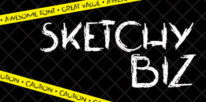
- Shape Bit by ahweproject,
$12.00 This font is inspired by ancient games that still use pixel displays. This font can be used for various designs as needed, especially pixel-themed designs. In addition, the Shape Bit font can also give a retro feel to your designs.
 - Goodie Bag by Hanoded,
$15.00 The correct spelling, apparently, is Goody Bag. But I like it with an ‘ie’ ending. Goodie bag is a 4 member display font family. Use it for your book designs, magazines or websites - maybe even for the goodie bag you want to hand out!
 - Frisky Bug by Bogstav,
$16.00 Say hello to my multi-layered handmade sans font - not as frisky as the name, but frisky enough for most designs that needs that extra twist! Mix the 3 layers as you wish for great results!
 - Bim Runger by madeDeduk,
$14.00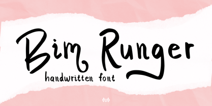 Introducing Bim Runger is a realistic handwritten font come with alternative and ligature and will be perfect for book, title branding, product packaging, invitation, quotes, label, poster, logo etc. Feature Uppercase & Lowercase Number & Symbol International Glyphs Multilingual support Alternative Ligature Thanks so much for checking out my shop and feel free to drop us a message any time and follow my shop for upcoming updates
 - Friz Biz by studiocharlie,
$24.00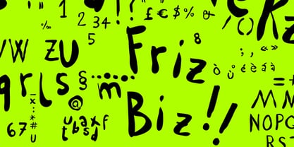 Friz Biz is an handwritten font; your designs will be really funny and fancy!
 - Bio Sans by Dharma Type,
$29.99 Bio Sans is a super neutral sans-serif family for text designed by Ryoichi Tsunekawa and the whole family consists of 6 weights from ExtraLight to ExtraBold and their matching Italics. The basic concept of this family is the same as Bebas Neue which is our most popular free font and used all over the world, that is to say, Neutral, Natural, Minimal, Harmless, Super-flat, Transparent and Legible. The basic skeleton of their letterform was designed geometrically and the sophisticated design gives them universality, neutrality and sense of unity for the use in all media, all purposes and their large x-heights makes this family legible and readable even on small size screen. Bio Sans supports almost all European languages: Western, Central, South Eastern Europeans and afrikaans. And proportional figures, superior figures, inferior figures, denominators, numerators, fractions, ordinals and case-sensitive-forms can be accessed by using OpenType features.
 - Sweet Fig by Din Studio,
$29.00 Sweet Fig is a bold script. This font is suitable for any design like branding especially for food packaging, quotes, printing, etc. The design can elevate your design project. Features: Beautiful Ligatures Stylistics Set Many Swashes Multilingual Support Numerals and Punctuation
 - Linotype Bix by Linotype,
$29.99Linotype Bix Plain, from Argentinian designer Victor Luis Garcia, is part of the Take Type Library, chosen from the entries of the 1999 International Digital Type Design Contest for inclusion on the Take Type 3 CD. The font is composed exclusively of capital letters. The figures have constructed basic forms and show the influence of the advertisement types of the 1920s, with all their well-mannered details. The lower sections of the graceful letters are white and set against a black background, the upper sections are black on white. This makes the overall picture look as though written on stripes and gives the delicate letter stability. The nostalgic-modern Linotype Bix Pleain is best for headlines in point sizes of 18 or larger. - Fig Bun by PizzaDude.dk,
$20.00Fig Bun is a slightly curly font with a cute attitude. When used in CAPS only, Fig Bun is is suitable for text in comics! - Rough Bits by Matthias Luh,
$15.00 Some old broken characters. It reminds me of old labels on walls, streets or on tanks.
 - Love Bug by PizzaDude.dk,
$20.00Yet another one of those romantic looking fonts. The lowercase looks pretty ordinary, while the uppercase swings around with a mixture of tagging / grunge / comicscript and casual handwriting. It works out extremely well with letters and stuff!. For fun, try writing in uppercase only...looks swell!! - Candy Bits by Bitstream,
$30.99Candy Bits was originally designed at Bitstream as a custom project for a large printer manufacturer. Released in 1997, Candy Bits was designed by Jim Lyles. The typographic characters were fashioned after a well known American candy. The balance of the characters in the font are designed to enhance the 3D illusion by appearing to recede into the page. Soon after its completion, Mr. Lyles joined a local health club. - Rig Shaded by Jamie Clarke Type,
$15.00 Rig Shaded is an award-winning 3D type family with a geometric sans serif at its heart. As its name suggests, Rig is designed as a framework to support a range of striking 3D effects. It has four versatile weights including a unique ‘zero’ weight. Each has two grades of distinctive halftone shading, Fine and Coarse, which emphasises Rig’s solid appearance. Rig developed from my quest to find ideal letter shapes for a shaded typeface while retaining their geometric principles and legibility. Each character has been designed to ensure maximum clarity and harmony when combined with 3D effects. The extrude and shaded styles have been handcrafted to produce a consistent weight and tone. Rig’s character set includes 230 glyphs, supporting 198 languages, including all Western, Central and South Eastern European languages. You can buy individual weight packs of Rig Shaded or the entire family for a discounted cost. See the full specimen for Rigs design features, additional examples and tips on using the typeface. Note: Rig’s shading styles have a high level of detail so may process more slowly in some applications.
 - Rig Sans by Jamie Clarke Type,
$25.00 Rig Sans is a streamlined geometric typeface, that speaks in a confident, affable tone. Its open, clean structure lends text a neutral, transparent quality. Distinct features enable Rig Sans to thrive, both in print and on screen: Minimalist Design Terminals clipped at 90º Generous x-height Wide apertures Distinct I,l,1 (uppercase i, lowercase L, Number 1) Rig Sans’ sturdy characters produce text settings with excellent clarity and readability. Their shape has been adapted from robust letterforms originally designed to withstand 3D distortions. This unique approach has resulted in an original sans serif rendition and an adaptive, durable type family. Rig Sans is comprised of eight weights and accompanying italics. Each weight contains 514 glyphs. OpenType features include: Alternate characters Three figure styles All caps punctuation Fractions Ordinals Superscript Subscript
 - Pesky Bug by PizzaDude.dk,
$16.00 Pesky Bug is a clean comic and kids font. Initially drawn by hand, but cleaned up digitally, leaving a fresh look - which makes it perfect for anything that has to do with kids products, sports, toys, clothing etc. The x-height, width of strokes and variating baseline are off here and there, and that leaves this active look!
 - Pig Scratch by KTEN Fonts,
$10.00 Need some Pig Scratch to go with your chicken scratch? This is a full fat font with a side of delicious glyphs. Perfect for merch, school lessons, invitations.
 - Rig Solid by Jamie Clarke Type,
$20.00 Rig Solid extends your typography toolkit with a range of energetic 3D fonts. Add dynamism to headlines and logos 13 styles across four weights Solid and gradient 3D designs Clean ‘unbreakable’ geometric shapes Rig Solid follows the award-winning design of its big brother, Rig Shaded. Each style can be used individually, making it even easy to achieve eye-catching 3D effects in print and on the web. The striking halftone styles add texture to your typography, while the hardy solid styles give your designs a visual punch and remain prominent when used over photography and patterned backgrounds. The family includes the unshaded style, ‘Bold Solo’, to perfectly compliment the shaded styles or be used on its own. Rig Solid does not require professional design software to use and is compatible with Microsoft Word.
 - Bix Bats by Linotype,
$29.99The Bix Bats symbol family was developed in 2003 by Argentinean designer Victor Garcia to complement his display text font Bix Plain. Bix Bats contains four different symbol fonts. Most of the characters in these fonts have their lower halves reversed out. Typing a line of text in these symbol fonts, or mixing these symbol fonts with Bix Plain, will create a very interesting text effect: the bottom half of your lines of text will be reversed out, on top of a colored bar. Bix Bats Arrows contains numerous possible arrow combinations, from archery references to the American recycling symbol. Bix Bats Funny includes all of the symbols needed for a party, from beer steins to bunny rabbits! Bix Bats Shiny has enough starbursts to light up a night sky, and in Bix Bats Wired you will find all of the technological accessories needed to be in the now. All four fonts are included in the Take Type 5 collection from Linotype GmbH." - DB Bugs by Illustration Ink,
$3.00DoodleBat Bugs brings fun, creepy crawly bugs inside your home, but don't worry they won't crawl off the page. - Stan Bugs by Dingbatcave,
$15.00 - Bix Metric by S6 Foundry,
$20.00 Bix Metric is a stylistic display font developed within a set grid. The mono-spaced first set of the family comes in 3 styles in both upper and lowercase glyphs allowing mixing of infinite combinations. Perfectly suited for headlines, large-format prints, brand identities, social media, advertising, editorial design, posters, magazines, logos, headings, digital and more. With multi-language support.
 - Odense by Linotype,
$40.99Franko Luin, Odense's designer, on this typeface: With Odense I entered the field where Optima reigns in royal majesty. The first question I received was, in fact, why I designed another Optima. Look closely: Odense has as much in common with Optima as Garamond with Baskerville. Am I right? Odense Neon is a special variant that can be used for logos or single words. I had the idea for it when I noticed that the neon tubes in a sign over a store only partially followed the characters. The name comes from the Danish town Odense, the town of the famous storyteller Hans Christian Andersen, author of, e.g., 'The Little Mermaid.' Odense is also the place where the first book in the Nordic countries was printed, the 'Breviarium Ottoniense', in 1482. - Turban Hey NF by Nick's Fonts,
$10.00The “Moorish arch” treatment of certain letters on a 2001 book on Dutch design, executed by René Knip, provided the inspiration for this exotic unicase typeface. The font also includes arabesque designs in the brace, florin and section mark positions. Both versions of the font include 1252 Latin and 1250 CE (with localization for Romanian and Moldovan) character sets. - Contenu EBook by Hackberry Font Foundry,
$19.95 Because ebooks will not normally accept .otf fonts, and they don't support Opentype features, this font family was designed to be used for the ebook conversions of print books. It uses old style figures. The italics are slanted a bit more. And Heavy is a little bolder than the bold in Contenu Book.
 - Content Creator by Dumadi,
$20.00 Content Creator – Playful Typeface is a comic themed font that can be used for your design needs. as the title suggests, this font is specifically for content creators to improve the quality of the designs and projects you are working on. Content Creator is perfect for design, logos, social media, brands, advertising, product design, handwritten quotes, product packaging, headers, posters, merchandise, and other designs. What’s Included : + Standard glyphs + Ligature + Web Font + Multilingual Accent + Works on PC & Mac, Simple installations Accessible in Adobe Illustrator, Adobe Photoshop, Adobe InDesign, even work on Microsoft Word. PUA Encoded Characters – Fully accessible without additional design software. Fonts include multilingual support + Image used: All photographs/pictures/vectors used in the preview are not included, they are intended for illustration purposes only. Thanks
 - Nonsense Note by Bogstav,
$19.00 There really is no nonsense in this font - but the name comes from my original sketches, where I drew a lot of nonsense! Actually, I couldn't figure out what letters to use from the sketches, so I picked them all!!! That's why each letter has 10 different versions! And what is cool is that they automatically cycles as you type. All you have to do is turn on Contextual Alternates, and the rest is magic!
 - Contenu Book by Hackberry Font Foundry,
$24.95Because Contenu is designed for text use, it is spaced for body copy in the 9-12 point range. That is far too much spacing for heads, subheads, and the like. So I made the display version of Contenu Book to use for headers. In the process of tightening the spacing at the very large sizes, I also made some minor modifications to the glyph shapes to make this version a little more elegant. Contenu Opentype has two Opentype families for print design. Contenu Book has five fonts: Regular, Italic, Bold, Bold Italic, and Display. Contenu has Medium, Medium Italic, Black, and Black Italic. The name is French for content and this is what the family is designed for: text, body copy, and book layout. If it has a style, it is a modern take on oldstyle serif font using Jenson as a mask. There are no plans for display versions of the bolder weights or the italics. If you want them, use Contenu Medium, Book Bold, Contenu Black, or any of the four italics and tighten the tracking. - Conversation Hearts by Harald Geisler,
$- Conversation Hearts are inspired by the sweethearts and conversation hearts that can be found all over the US and Britain, but not in Germany. A source of endless fun and surprise. As a typographer to me they are also a surprising document of written communication. Most people complain that nowadays the inscriptions are not as sweet as they used to be. While they used to held romantic and promising inscriptions like “Be True” “Sweet Talk”, today they carry “Tweet me” “Ur Hot” and “Party Girl”. So i took this as a motivation to work with conversation sweetheart on a conceptial inspirational and typographical level. The obvious: every letter pressed on the keyboard brings out a conversation heart that starts with the letter - i.e. L = Loverboy, H = Heartless but what to write? Since i didn't want to reproduce the old “Fax me” and “Email me” I had to come up with something new. Something with a personal relation and of course something that I Love - what else could i write in the shape of the heart? So I tried to access my upper subconsciousness and looked for two words for every letter in the alphabet. One for the capital letter pressed and one word for the lowercase letter. Resulting in a Kurt Schwitters worthy assemblage of vocables "Post-office" “Internship” “Zebra” “Answers” etc. It is not easy to read a text set in Conversation Hearts but easier as a text set in Zapf-Dingbats. To sparkle the visual appearance uppercase letters are filled hearts with “carved” inscription, while lowercase letters are an outlined heart with written inscription. Conversations Hearts is a part of the Light Hearted Font Collection that is inspired by a recording of Jean Baudrillard with the title, "Die Macht der Verführung" (The Power of Seduction) from 2006. Further inspiration came from the article, "The shape of the heart: I'm all yours". The heart represents sacred and secular love: a bloodless sacrifice. by British writer Louisa Young printed in EYE magazine (#43) London, 2002.
 - Caldense Stencil by Tiago Cândido,
$20.00 The typeface was baptized as “Caldense" in order to honor the city of Caldas da Rainha, a small city in Portugal, the typography's birth place. It has three weights, Regular, Demi Bold and Bold and it is a stencil font, sans serif and grotesque. Each character was based on a grid and was built in modules, having round edges and straight finishes. The font is best used in titles.
 - Aracne Ultra Condensed Regular - Personal use only

- SF Movie Poster Condensed - Unknown license

- SF Movie Poster Condensed - Unknown license

- SF Chrome Fenders Condensed - Unknown license

- PF Tempesta Seven Condensed - Unknown license

- SF Diego Sans Condensed - Unknown license

- SF Espresso Shack Condensed - Unknown license

- SF Eccentric Opus Condensed - Unknown license

- PF Tempesta Five Condensed - Unknown license


