6,600 search results
(0.019 seconds)
- Artis Sans by Wiescher Design,
$30.00 »Artis« is the name for my latest art-project-font. Obviously I just chopped off the last »t«. Then I looked it up on Wikipedia and what do you know, it is of latin descent. »Ars Gratia Artis« which means »art for arts sake« or in French »l’art pour l’art«, a perfect font name. If I would cut off the »s« as well it would mean disambiguation and that in turn is, what I just did here. Enough disambiguation! »Artis« is a modern classical beauty with extreme contrast between up- and downstrokes that make it unique with a touch of art deco and showing Renaissance roots. But – »Artis« is a twin-font that has an elegantly decorated twin sister »Artis-Swing«. Between the 2 fonts you have endless possibilities for combination. I love these twins! It is a great everyday workhorse with seven weights from ExtraLight to Bold and all the necessary weights in between. Great for short copy and elegant headlines! With 879 Glyphs it is a truly European font designed for all Central European and Latin using countries. »Artis« has a set of Cyrillic that is – besides Russia – also good for Serbia, Macedonia and Ukraine. It has oldstyle- and lining-, tabular- and tabular-oldstyle-figures and many ligatures. »Artis« comes in Sans and Swing and is an elegant, playful and friendly font. Enjoy!
 - Goudy Text by Monotype,
$29.99The word Text" in Goudy Text™ is short for Textura, and textura is the style of blackletter or gothic writing developed in Northern Europe in the middle ages. The use of space in blackletter is quite different from what we know about Roman letterforms. Lowercase forms in blackletter writing and typefaces must be evenly textured with black and white elements, like the texture of weaving or fabric. Capital letters can provide either an integration of the even texture (by the use of decoration in their construction) or, if they are wide and open and filled with white, they provide bright spots of visual emphasis. Goudy, despite being an American in the twentieth century, understood well the fundamental texture of medieval blackletter and the importance of both density and light. He designed Goudy Text in 1928 for Lanston Monotype after studying the type in Gutenberg's 42-line bible; still one of the best models for designers of blackletter typefaces. The lowercase of Goudy Text has impact and medieval authenticity. The standard caps have some Victorian eccentricities but are mostly well drawn. The alternate, or "Lombardic" caps are spectacular - they set beautifully with the lowercase letters, providing the proverbial shafts of light through the Gothic cathedral's stained glass windows. Use this potent font in sizes 14 point or larger, for Christmas greetings, certificates, wedding invitations, advertising, or music collateral pieces." - FHA Broken Gothic by Fontry West,
$15.00 More than a century ago, Frank H. Atkinson presented this hand lettered style as Broken Poster. It was one of a hundred styles he demonstrated in his manual on sign painting. Even before his book was published (and certainly after), Broken Poster was a favorite with sign painters and letterers. It has graced show cards and movie posters, signs and windows displays, and advertisements of all varieties. We presented the our first digital revival of this classic in 2000. It is long overdue for an upgrade. Broken Gothic expands the basic Broken Poster to four weights, two specialty formats and some cool layed effects. The language base includes Greek, Cyrillic, Latin A, and some of Latin B and Latin Extended. There are also some nice alternates and ligatures. All weights are quite suited to posters, headlines, display copy, web headers, etc. At first glance, Broken Gothic may seem to have limited uses. Give it a chance and it will surprise you. Broken shouts out that there is a sale, a giant monster or the end of the world. Broken Gothic is comfortable in a wide range of themes and applications from zombie movie titles to salsa jar labels. While I can't recommend it for text, Broken is great for headers, banners, signs, titles, product presentation and other display applications. When you need a rough customer, Broken Gothic fills the bill.
 - JT Collect by OGJ Type Design,
$35.00 JT Collect is a hybrid sans-serif typeface for the 21st century that takes a playful approach to the type design heritages of Germany and Switzerland. Confidently built on a geometric structure and infused with elements from traditional grotesque typefaces, it hits the sweet spot between geo and grot. I developed JT Collect purely digitally, drawing from years of experience with analog type design. The letters aren’t based on one particular source but seek to merge different type genres from the first half of the 20th century and lift them to a contemporary quality level. JT Collect is less reserved than strictly geometric designs and brings some industrial workmanship and honesty into the game. The six weights plus three optical sizes of JT Collect offer what you need to make an impact. While cool and elegant in the Light weight, the fonts show more presence on the page as they grow bolder. To this end, I drew the letterforms with a slightly unrefined, brawny air in the bolder weights. This sets them apart from the perceived purity of more geometric designs. The Book weight is ideal for short texts and medium-length copy, and the forceful Bold makes wordmarks look crisp and lets headlines radiate cosmopolitan self-confidence. JT Collect is suitable as a primary typeface for branding, advertising, packaging, stationery, posters, documents, and websites from trades and industries as diverse as food & fashion, media & makers, culture & creators, games & gems, sports & startups. Use JT Collect for film titles or watch faces, for leaflets or store signs, for business cards or billboards: this font family is as adaptable as a chameleon (and like a chameleon, it’s never boring). Try it in different contexts. You won’t be disappointed. Its adaptability also makes JT Collect a great starting point for poised and persuasive font combinations. Even a sans/sans pairing is possible due to hybrid nature of JT Collect—something that’d be hard to achieve with most other sans-serif typefaces on the market. You can add to it a heavy slab from the OGJ library, like Temper Wide. You might go for a geometric or a grotesque typeface as secondary (text) typeface. Or you could set your body copy in a classic serif typeface such as Caslon, Sabon, or Plantin. That’s right: JT Collect is a true team player. Whether you need a grotesque or a geometric sans: try JT Collect. You can get the best of both worlds.
 - Carlton by ITC,
$29.99Carlton is based on a typeface designed by Prof. F. H. Ehmcke. In 1908, Ehmcke released his Ehmcke-Antiqua design through the Flinsch typefoundry in Germany. Ehmcke-Antiqua was later distributed by the Bauer typefoundry in Frankfurt am Main. The Caslon Letter Foundry in England discovered the design and released their own typeface based upon the model, which they named Carlton. Carlton entered the Stephenson Blake program after they acquired the Caslon Letter Foundry in the late 1930s. As hot and cold metal typesetting became outdated technologies, Carlton and Ehmcke-Antiqua fell out of general use. In the 1990s, Letraset revived this classic design, distributing it under its English name, Carlton. Carlton's clean and generous capitals, as well as its understated yet detailed lower case, have found popularity again in recent years. The elegance of Carlton is best used for displays with large letter and word spacing. Carlton shows all of the hallmarks of a delicate serif typeface design; its forms capture a distinct moment that was common within Central European type design during the first third of the 20th Century. Carlton is similar to several other expressive typefaces from the early 1900s, including Bernhard Modern, Koch Antiqua, Locarno, and Nicolas Cochin." - NOH Squadra by OhType!,
$30.00 SQUADRA is a serif typeface with more than 220 characters, framing a perfect union between typefaces of his style and unconventional shots from the calligraphic pen; Its strong and imposing appearance, the pronounced contrast between his strokes and changes in traditional aesthetics provide you with elegance and distinction to differentiate over other types of the same class. Easy modifiable and great graphic content to small and large format SQUADRA is able of generating a clear and direct message, suit almost any topic and perfect for use in posters, logos and editorial headlines. Infinitely versatile typeface that evokes both the beauty and finesse of the plants as power its thorns and its deadly poison.
 - Chicago Moonshine by Roland Hüse Design,
$15.00 CHICAGO MOONSHINE is an Art Deco serif All Caps display font. Please note that this is primarily for headlines, logos posters in large size. The character set contains Western and Eastern European latin languages, basic symbols and punctuation. The Capital letters has geometric patterns and in place of lowercase letters there are filled in Capitals. Inquiries, feedback, customisation requests and/or extra characters please contact@rolandhusedesign.com or via rolandhuse.com * * * Background image (taken from Unsplash) credits: Chicago at night : Prafulla Chandra https://unsplash.com/@prafulla90 Moon I photoshopped onto the night skyline: Jason Darrell https://unsplash.com/@zebedeerox Moonshine Enjoy & Cheers : bartender holding a shot of liquor by Joel Herzog from unsplash https://unsplash.com/@joel_herzog Street Sign: Bruno Martins https://unsplash.com/@brunus
 - Sweet Tea PW by Patty Whack Fonts,
$24.00 Sweet Tea is a thin, handwritten and simplistic font reminds me of the simple, yet serene days on the front porch swing with a Summer breeze. Sipping an ice cold glass of sweet tea on a hot, sunny day -- there's nothing better.
 - Orangina by TypeThis!Studio,
$45.00 What can be better than releasing a hot summer font in winter time! Honestly - all the images are ice blue or white. Christmas stuff is everywhere and 'Jingle Bells' torment your ears! But here it comes to catch you: Bold and orange! www.typethis.studio
 - Reactor A1 - Personal use only

- A Fire Inside The Walls - 100% free

- Citaro Voor (Dubbele hoogte, breed) - 100% free

- JD Gina - 100% free

- Ghastly Panic - Unknown license

- Mount Hills by Ergibi Studio,
$20.00 Mount Hills, this typeface has been made carefully to make sure its premium quality and luxury feel. The many alternate character on serif makes this typeface unique and stands out rather than the regular sans font, perfectly for headlines, logos, posters, packaging, T-shirts, coffee shops, restaurants, magazine's headers, signs or gift/post cards, cafe's and weddings or any type of advertising purpose.
 - Wood Type Grotesk JNL by Jeff Levine,
$29.00 Wood Type Grotesk JNL was re-drawn from a set of vintage wood type purchased from a closed rubber stamp shop. Although the style of lettering is referred to in old type catalogs as a "grotesk" face, in truth the lettering has charm and effectively gets the printed point across to the reader. This typeface is available in both regular and oblique versions.
 - Great Sage NF by Nick's Fonts,
$10.00This pseudo-Egyptian fantasy originally was named Karnac, and was unearthed in the pages of the 1888 American Type Founders Specimen Book. This version derives it name from a continuing character from Johnny Carson's stint on the Tonight show. Both versions of this font include the Unicode Latin 1252 and 1250 Central European character sets, with localization for Moldovan and Romanian. - Blackbarry NF by Nick's Fonts,
$10.00Deutsch Black, designed by Barry Deutsch for VGC in 1966, provided the inspiration for this extrabold exercise in heavy ink coverage. A number of variants, in lowercase slots, were added to offer flexibility to your headline designs. Both versions include the complete Latin 1252, Central European 1250 and Turkish 1254 character sets, as well as localization for Moldovan and Romanian. - BookCover by Tipo Pèpel,
$32.00 BookCover is a typeface designed with extreme spot to hit when used in headlines. The contrast of the outer curved shapes with internal rectangular counterforms that bring freshness to the results and a contemporary look. Contains an extensive character map for use in most Latin-based languages. BookCover will help you create eye-catching headlines, posters or book covers to name a few.
 - Delvon Family by madeDeduk,
$15.00 Delvon is a modern sans serif font family. It is suitable to create text for branding, product packaging, invitations, quotes, t-shirts, labels, poster, logos and more. Features: Uppercase Lowercase Numbers & Symbols International Glyphs Ligatures If you need anything else just shoot me on email at: dedukvic@gmail.com or find more previews on my Instagram here : https://www.instagram.com/acekelgondolayu/ Hope you enjoy it.
 - Groove Thang NF by Nick's Fonts,
$10.00An interesting, unusual and righteously funky variation on the classic “Barnum” style of lettering, this typeface was originally named "Dado". As any woodworker knows, dado is also the name of a slot ploughed, chiseled or cut in wood: in other words, a groove thang. Both versions of the font include 1252 Latin and 1250 CE (with localization for Romanian and Moldovan) character sets. - Jesterday by Jelloween,
$19.00 Jesterday is a four weight - light, regular, medium and bold - type family that’s suitable for headlines but works great in informal body-copy as well. Even at a very small size it’s still very much legible. For added fun, Jesterday has been subtly enhanced with OpenType ligatures. Can you spot them? Download the demo version to try Jesterday for free.
 - Good Sport JNL by Jeff Levine,
$29.00 Good Sport JNL has nothing to do with any of the major sports activities such as baseball, football, basketball or soccer. Instead, the typeface gets its name from the sport of camping, as the lettering was spotted on an image of an old ad for the Colonial Forest-Master boy’s pocket knife. Good Sport JNL is available in both regular and oblique versions.
 - Komsomol by Hanoded,
$15.00 Komsomol (short for Kommunisticheskii Soyuz Molodyozhi) was the youth division of the Communist Party of the Soviet Union. Komsomol font was modeled on several Soviet propaganda posters which all had one thing in common: a very loud message in a very clear typeface. Komsomol is an all caps typeface which comes with extensive language support in order to educate the masses.
 - Quartz Grotesque by Hustle Supply Co,
$18.00 Quartz was originally published on the shop Font Forestry, but they are planning on closing - So now Quartz will live on Hustle Supply Co. Quartz is a minimalist All-Caps Sans Serif typeface that comes in 7 different weights. It's perfect for projects looking for that minimalist / clean aesthetic. Quartz includes regular, oblique, thin, bold & outlined versions. Western European Characters are included. Thanks!
 - Morphica by Shinntype,
$39.00 This critique of the utilitarian is a perverse and disjunctive mash-up of thematic devices: sans mixed with serif, stroke contrast applied to techno armature, body parts displaced and elided. We are asked to admire the virtuosity that conjures the sweet spot where everything blends together into some semblance of legibility, but contemplation is disturbed by the transgressive nature of the proposition.
 - TE Alnaskh Quraan by Tharwat Emara,
$10.00 It is known as the Alnaskh Quraan Font for its extensive use in the copying and transmission of books because it helps the writer to write more quickly than any other font since the Islamic times and then Alnaskh Quraan font wrote the "Quran"And the advantages of Alnaskh Quraan font are clarifying the letters and show their beauty and splendor.
 - Doorn by Scholtz Fonts,
$12.00 In its loose, angular forms, it is reminiscent of thorn bushes dotting the immense Kalahari desert. Spiky and freeform, Doorn calls to mind the irregular hand-drawn lettering found on wooden signs outside small shops in tiny African villages. The font contains all upper and lower case characters, punctuation, numerals and mathematical operators, as well as all accented characters used in European languages.
 - Sport Lines by Kaer,
$19.00 Typeface for sport labels, business headlines, finance posters, delivery cards etc. Letters made of two parallel lines. I hope you enjoy this font. Follow my shop to receive updates of products and the very hottest news! If you have any question or issue, please contact me: kaer.pro@gmail.com Please request to add additional characters and glyphs if you need! Thank you!
 - Chicken Feet by BA Graphics,
$45.00An irresistible design by my (11 year old) Granddaughter; it brings that child innocence to font design. When she first showed it to me I was so impressed I could not resist I had to make it into her very own font. Alexandra is also the designer of the font flag and says she is working on new font ideas. - Swagg by Miller Type Foundry,
$29.00 Swagg is a unique and friendly sans that looks great at any size. Originally starting as a branding project, Swagg is now a full fledged family with 5 weights. Swagg is loaded with goodies like old style figures, tabular figures, true italic, arrows and much more. Most proudly Swagg shows off a Greek alphabet, making it an ideal workhorse family for your collection!
 - Alight Slab by Eclectotype,
$40.00 Alight Slab is, wait for it... A light slab! Designed to be set large, in headlines or subheads and (very) short paragraphs of running text. It has slightly super-eliptical forms and crisp details, giving it a contemporary look. Alight Slab features automatic fractions, a discretionary ct ligature, and a capital sharp s. Anultra Slab is an ultra bold accompanying typeface.
 - Eterna by Wiescher Design,
$39.50 Eterna is a very beautiful font with diverse uses. In small sizes it acts like it was a Sans typeface, the swings and points tend to be overlooked. In bigger sizes it works as a very elegant embellished typeface, showing off the rich forms. The capital letters can also successfully be used as Initials. Your designer of very versatile fonts Gert Wiescher
 - Zipline by Device,
$39.00 Zipline is a geometric sans built from a folded line or ribbon. Contemporary and stylish, with a certain decorative flair. There are three variants that can can be freely mixed for effect - a solid version, a decorative lined version, and a half-solid version. Most effective used in short words or phrases at larger sizes, where the details can be appreciated.
 - Pin Spotter JNL by Jeff Levine,
$29.00 It’s Art Deco “thick and thin”… It’s wide… It’s quirky… It’s a hand lettered sign over the lanes of the Bryant-Lake Bowl – a landmark bowling alley in Minneapolis, Minnesota… and it was spotted in an amazing YouTube video from a “drone tour” of the facility! The sign inspired the font Pin Spotter JNL which is available in both regular and oblique versions.
 - Nagissta by madeDeduk,
$11.00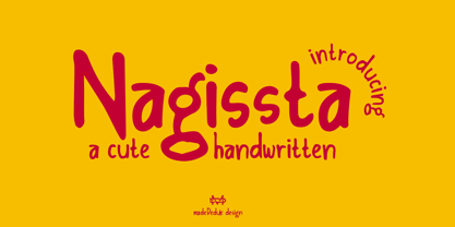 Introducing Nagissta is a cute handwritten font with a matching script and regular will be perfect for book, title branding, product packaging, invitation, quotes, t-shirt, label, poster, logo etc. Feature Uppercase & Lowercase Number & Symbol International Glyphs Multilingual support Ligature Feel free to drop us a message any time and follow my shop for upcoming updates Hope you enjoy it.
 - Miragem by Vanarchiv,
$55.00 This serif typeface was designed to be simple and neutral on text sizes, there descender proportions are short and the x-height is large. The lowercase italics contain different structure from roman characters, but the most differentiation detail is the fact the ascender and descender strokes don’t contain serifs. Italics characters are slightly more narrow and condensed than roman letterforms.
 - Cal Fraktur Brush by Posterizer KG,
$19.00 Cal Fraktur Brush is one more font from the PKG “Cal” (Calligraphic) group. This time, we used a wide brush instead of the calligraphic pen for the sketches. This font is widely used in the typographic creation of shorter text forms such as headlines, tattoo and graffiti quotes, book covers, t-shirt designs, logos, posters, movie spots, banners, labels... Enjoy!
 - Majolica by Hanoded,
$15.00 If you've ever visited Spain or Portugal, you would have seen some beautiful Majolica (glazed tile) murals - often signage for long forgotten bakeries, butchers and clothing shops from the interbellum. Majolica font was named in honor of the artists who created these gorgeous glazed displays. Majolica font is an all caps, sans serif typeface with a 'streamlined' look. It comes with all diacritics.
 - Necia by Graviton,
$20.00 Necia font family has been designed for Graviton Font Foundry by Pablo Balcells in 2014. It is a modular, geometric and slightly condensed typeface which has been conceived to be primarily a display typeface, but given its clarity it can also be used for composing short and intermediate length texts. Necia consists of 8 styles. Each containing small caps and several alternate characters.


