10,000 search results
(0.057 seconds)
- Nusaibah by Eyad Al-Samman,
$20.00 “Nusaibah” is the first name of an early convert woman to Islam, and the first female to fight in defense of the Islamic religion. Her full name is Nusaibah bint Kaíab Al-Maziniyyah and she took part in the Battles of Uhud, Hunain, Yamama and the Treaty of Hudaibiyah with Islam’s prophet Muhammad (pbuh). Nusaibah is best known for her brave and heroic feat during the Battle of Uhud - fought on March 19, 625 - when she entered the battle carrying a sword and a shield to protect the prophet Muhammad (pbuh) from the arrows of the enemy, and she accordingly received several wounds while fighting and these wounds were not healed until the following year. The prophet Muhammad (pbuh) mentioned her distinct courage by saying that in whichever direction he turned in the battlefield, he could see her defending and protecting him. "Nusaibah" is a modern, geometric, and headline Arabic display typeface. The main trait of this typeface is the novel symmetrical design of its letters which renders it as one of the modern stylish typefaces used for headlines and titles. This is can be noticed in its letters such as “Theh”, “Jeem”, “Ain”, “Sheen”, and others. Moreover, “Nusaibah” font has a character set which supports Arabic, Persian, Urdu, and Latin letters and numerals with a limited range of specific Arabic and Latin ligatures. This font comes in two weights (i.e., regular and bold) with nearly 643 distinctive glyphs. Due to its geometric and linear design, “Nusaibah” typeface is appropriate for heading and titling in Arabic, Persian, and Urdu magazines, posters, and surfaces of different equipment. It is also elegantly suitable for signs, books’ covers, advertisement light boards, products’ and services’ names, and titles of flyers, pamphlets, novels, and books of children. “Nusaibah” typeface is one of the Arabic typefaces that has a novel and modern-day design which can be used in versatile graphic, typographic, and artistic works in different languages for diverse cultures.
 - Besley Clarendon by HiH,
$12.00 Besley Clarendon ML is our version of the Clarendon registered by Robert Besley and the Fann Street Foundry in 1845. Besley Clarendon ML represents a significant change from the slab-serif Antiques & Egyptians that had become so popular in the prior three decades. Like Caslon’s Ionic of 1844, it brackets the serifs and strongly differentiates between the thick and thin strokes. Besley Clarendon is also what today is considered a condensed face, as a comparison to the various contemporary Clarendons will show. Robert Besley’s Clarendon was so popular that many foundries quickly copied it, a fact that caused him to complain vigorously. The reason it was so widely copied is simple ó it was extremely useful. It provided the attention-getting boldness to highlight a word or phrase, yet at the same time was compact and easier to read than the fat faces and antiques of the period. It wasn't until sixty years later that the concept of a typeface family of different weights was developed with DeVinne and Cheltenham. Until then, Clarendon served as everyone’s all-purpose bold face. It can be used for ads, flyers, headers or even short text. Don't leave home without it. Besley Clarendon ML includes the following features: 1. Glyphs for the 1250 Central Europe, the 1252 Turkish and the 1257 Baltic Code Pages. Added glyphs to complete standard 1252 Western Europe Code Page. Special glyphs relocated and assigned Unicode codepoints, some in Private Use area. Total of 353 glyphs. 158 kerning pairs. 2. OpenType GSUB layout features: pnum, salt, liga, dlig, hist and ornm. 3. Inclusion of tabular (std) and proportional (opt) numbers. 4. Kreska-accented letters.
 - Offroad by Grype,
$16.00 Geometric typefaces can harken back and visually tie themselves to so many genres, from constructivist posters, to techno club flyers, to raw industrial era power. The Offroad family finds its origin of inspiration in the O’Neal MX logo for their motocross division, represented in its truest form in the MX styles of this family, and expanded to a type megafamily. Offroad grabs hold of that unique pseudo-unicase style and runs with it to create a range of widths and weights that are perfect for historical through modern use. It embodies the hardcore motocross rigidity from the limited inspiration of the original logotype and expands to include a full and expansive glyphset, and a comprehensive range of widths and weights, creating a straightforward, uncompromising collection of typefaces that lend a solid foundation and a broad range of expression for designers. Here's what's included with the Offroad Collection bundle: 382 glyphs per style - including Capitals, Lowercase (Unicase Style), Numerals, Punctuation and an extensive character set that covers multilingual support of latin based languages. (see the 6th graphic for a preview of the characters included) 45 fonts in 6 width subfamilies: Extra Condensed, Condensed, Standard, Expanded, & Wide. 5 weights per subfamily with obliques: Light, Book, Regular, Bold, & Black. Fonts are provided in TTF & OTF formats. The TTF format is the standard go to for most users, although the OTF and TTF function exactly the same. Here's why the Offroad Collection is for you: You're in need of a geometric pseudo-unicase family with a big range of weights and widths You're a die-hard motocross fan, and want to design anything within that genre You're a club flyer designer, and need a kick-ass techno style font family You're totally into constructivist design, and want to create designs within that genre You just like to collect quality fonts to add to your design arsenal
 - Bomboloni by Goodigital13,
$20.00 will be great for any projects including : branding, logo, stationery, business card, signage, flyer, brochure etc. Almost all industries will be match for this typeface: wedding, events, rmakeup artist, travel, hotel, musician etc, food
 - Inlove by Sudtipos,
$29.00 Ideal for magazines, posters or flyers, Inlove is a modern take of Ariel Di Lisio’s passion for geometric and very contrasted typefaces. Because the strong influence over his work, Ariel was invited during 2009 to be part of the Herb Lubalin Exhibition at New York. Designed by Ariel Di Lisio and digitized by Ale Paul.
 - Pista by Typedepot,
$14.00 Pista is a unique decorative typeface which is applicable for web, print especially for magazines, brochures, posters, flyers and motion graphics. Pista has six weights - regular, bold, outline, rounded, rounded bold and rounded outline. The weights are perfect for logos - regular size has an elegant look, the bold and outline gives a unique feel.
 - Horse Belonk by Arterfak Project,
$16.00 Introducing "Horse Belonk" a western style font. Designed well and inspired by cowboy, rodeo, texas, and vintage designs. This font is based on serif form and reversed contrast, featuring strong looks with the spurs in the middle. Horse Belonk is a display font with an additional Extrude style that you can apply to get a 3-Dimensional typographic design. It's bold, brave, and elegant to use on title or headline, poster, flyer, stickers, vintage logos, signboards, packaging, and more! Packed with extra special characters that allow you to create more magnificent designs. Here what you'll get : Uppercase Smallcaps Numbers & punctuation Ligatures Stylistic alternates Catchwords : And, Or, Is, The, By, On, Be, To, Out, End, In, Will, With, Of, No, For, From, At, Am, Pm. Thank you for watching! Cheers
 - Dirty Bubble Gum Grunge by TypoGraphicDesign,
$15.00 The character of the rough, rugged and raw handmade typeface has a very unique sticky atmosphere. Letters lovingly decorated with chewing gum. Warmth, love, handmade. For support of human warmth. CONCEPT/ CHARACTERISTICS Experimental analog handwritten style. Handwritten in ink in a conventional roll-on deodorant. The dirty, grimmy Grunge-Look and the sloppy, rough Handwritten-Look script character, gives the typeface a high recognition value and uniqueness. The motto is handmade, rough & experimental. APPLICATION AREA The rough, ink-like, handwritten look of the handmade font „dirty deo hand ink“ would look good at logos, display size for poster, flyer, comics and graphic novel lettering, headlines in magazines or websites, packaging, music covers or webbanner etc. TECHNICAL SPECIFICATIONS Headline Font | Display Font | Raw Trash Script Font „dirty deo hand ink“ OpenType Font with & 282 glyphs & 1 style (regular). Symbols and ligatures (with accents & €)
 - Ukiyo Mind by Kitchen Table Type Foundry,
$15.00 By chance I stumbled upon an unfinished font in my fonts folder (while looking for something else). It had a stupid working name, but when I opened it, the font looked really nice! I have no idea why I never finished it. I renamed it Ukiyo Mind, because the font looked a bit like Japanese brush strokes. Ukiyo is a Japanese term which roughly translates as ‘the fleeting/transient world’. In mediaval Japan, the word was associated with Buddhism, but later it was used to describe the urban lifestyle and the pleasure seeking aspects of it. Nowadays it refers to a ‘living in the moment’ state of mind. Ukiyo Mind is a really nice brush font, which I probably made using Chinese ink and a brush. It comes with extensive language support and a set of alternates for the lower case glyphs.
 - XXII Yonia by Doubletwo Studios,
$59.99 XXII Yonia most of all likes packaging, headlines on posters and flyers, and it really loves to be a logo for something with food or toys. It comes along with a lot of alternate letters so you can customize the look with swashes and alternates here and there. For further details click here or download the pdf in the gallery.
 - Ragnar by Linotype,
$29.99Ragnar can be called a typeface for compact typography. It is loosely related to the Saga typeface in many ways, even including its name. During discussing on what Saga should be called, the name "Ragnarök" (Twilight of the Gods) was humorously suggested. "Ragnarök" would of course have been unsuitable, since it uses a letter with a diacritic sign, and in many computer systems, that is a deadly sin. But the shorter form, Ragnar, was kept in mind, and later used for this typeface. Additionally, Ragnar is a common male Scandinavian name. - Aurelia by Linotype,
$29.99The design for Aurelia is based on the forms of Jenson, an Old Style typeface developed by Nicolas Jenson in 1470 which still influences type design today. Zapf gave Aurelia a bit of his own personal style and adapted it to the demands of modern technology. The family of typefaces was originally designed for use with the typesetting machines produced by the German company Dr.-Ing Rudolf Hell GmbH which was later merged with Linotype. The name Aurelia is a nod to the Roman emperor Aurelianus (214–275), who built the Via Aurelia in Italy. Aurelia is a robust and classic font, suitable for both text and headlines. - Azbuka by Monotype,
$29.99 The Azbuka™ typeface family has its roots in a fairly pedestrian source. “The idea came in part from an old sign in London that read ‘SPRINKLER STOP VALVE’,” says Dave Farey, designer of the typeface. Like all good sign spotters, Farey took a photograph of the sign and filed it away for possible use in a lettering or typeface design project. In Prague a number of years later, the street signs reminded Farey of the London signage - and his camera came out again. Comparing the two back in his studio, he realized that the signs from London and Prague were not as similar as he initially thought. However, they were enough alike to serve as the foundation for a no-frills, 21st century sans serif typeface family. “I wanted to draw a wide range of weights, italic and condensed designs all in one go,” recalls Farey, “rather than add on to the family later.” His goal was to create a family that could be used for text and display copy, with sufficient weights to provide a broad typographic palette. Indeed, the completed design, created in collaboration with fellow type designer Richard Dawson, consists of twenty typefaces in eight weights ranging from extra light to extra black. The five mid-range designs have complementary italics. Seven condensed designs round out the family. Azbuka’s lighter weights perform remarkably well in blocks of text composition. “They’re clean and legible - and perhaps a little boring,” says Farey, “but they are perfect for copy with a down-to-earth, yet contemporary flavor.” The heavier weights are equally well suited for a variety of display uses. The designs are authoritative but not overbearing and will readily make a strong statement without calling attention to themselves. The condensed weights of Azbuka are ideal for those instances where you have a lot to say - and not much room to say it. The name Azbuka? It’s Russian for “alphabet.” And what more appropriate name could there be for this utilitarian, industrial-strength type family than alphabet? The Azbuka family is available as a suite of OpenType Pro fonts. Graphic communicators can now work with this versatile design while taking advantage of OpenType’s capabilities. The Azbuka Pro fonts also offer an extended character set that supports most Central European and many Eastern European languages
 - Priori Serif by Emigre,
$59.00 After the popular successes of Exocet and Mason, Emigre has once again teamed up with Jonathan Barnbrook to bring you his latest venture into type land. Priori is a logical progression from Mason, a typeface he designed around ten years ago. Where Mason was designed purely for display purposes and featured only caps, Priori includes lower case, companion serif and sans serif versions, alternates and, according to its creator, is shooting for text face status - a bold claim from a designer who loves to wear his influences on his sleeve and who has little use for typography that aspires to be "neutral" or "transparent." Like many of Barnbrook's typeface designs, Priori is based on his interest in British typography of the early 20th century. It is inspired by the work of famous British typographers, such as Eric Gill and Edward Johnston. But it also embraces all of the signage and lettering that Barnbrook observes in the streets, cathedrals, and public buildings of his London neighborhood. This mixing of native influences with a contemporary pop culture intent is what gives Barnbrook's types a distinct and unique flavor. Like its creator, Priori is a one of a kind.
 - Priori Sans by Emigre,
$59.00 After the popular successes of Exocet and Mason, Emigre has once again teamed up with Jonathan Barnbrook to bring you his latest venture into type land. Priori is a logical progression from Mason, a typeface he designed around ten years ago. Where Mason was designed purely for display purposes and featured only caps, Priori includes lower case, companion serif and sans serif versions, alternates and, according to its creator, is shooting for text face status - a bold claim from a designer who loves to wear his influences on his sleeve and who has little use for typography that aspires to be "neutral" or "transparent." Like many of Barnbrook's typeface designs, Priori is based on his interest in British typography of the early 20th century. It is inspired by the work of famous British typographers, such as Eric Gill and Edward Johnston. But it also embraces all of the signage and lettering that Barnbrook observes in the streets, cathedrals, and public buildings of his London neighborhood. This mixing of native influences with a contemporary pop culture intent is what gives Barnbrook's types a distinct and unique flavor. Like its creator, Priori is a one of a kind.
 - 1066 Hastings by GLC,
$38.00 In 1066, William, duke of Normandy, was invading England. He was demanding the crown for himself, against King Harold the Saxon. He killed Harold and reached the crown at Hastings, the well-known battlefield. A few years later, in Bayeux (Normandy, French)was displayed a large tapestry (almost 70 m long) who was telling the story of the conquest. Along the tapestry was written a comment in Latin, using Roman capitals influenced a little by English or Scandinavian style (as it is visible in the Eth character). We have created the font, inspired from this design, adapted for contemporary users, making difference between U and V, I and J, which has not any relevance for ancient Latin scribes, and naturally with Thorn, Oslash, Lslash... and usual accented characters did not exist at the time. We also have reconstructed the K, German double s and Z, always using patterns of the time. We have scrupulously respected the poetic irregular and distressed original forms with two or three alternate for each characters, including reconstructed numerals.
 - Evensong by Typodermic,
$11.95 Welcome to the world of Evensong—the perfect art deco geometric typeface for those who want to make a statement. With its dramatic and unusual contrast, this font is sure to catch the eye of anyone who sees it. One of the things that sets Evensong apart from other typefaces is its extreme thick/thin letters. But it’s not just that—it’s the way Evensong makes dramatic choices with its contrast that really makes it stand out. With Evensong, you can deliver your message with a stylistic flair that’s sure to get noticed. Whether you choose to use the Solid and Hollow styles independently or stack layers of Solid and Fill, you have the flexibility to experiment with different color combinations and layers to create the perfect retro-fashion look. Embrace the boldness of Evensong and make a statement that’s impossible to ignore. This font is perfect for those who want to stand out from the crowd and make a lasting impression. Try it out today and see how this one-of-a-kind typeface can take your design to the next level! Most Latin-based European, Vietnamese, Greek, and most Cyrillic-based writing systems are supported, including the following languages. Afaan Oromo, Afar, Afrikaans, Albanian, Alsatian, Aromanian, Aymara, Azerbaijani, Bashkir, Bashkir (Latin), Basque, Belarusian, Belarusian (Latin), Bemba, Bikol, Bosnian, Breton, Bulgarian, Buryat, Cape Verdean, Creole, Catalan, Cebuano, Chamorro, Chavacano, Chichewa, Crimean Tatar (Latin), Croatian, Czech, Danish, Dawan, Dholuo, Dungan, Dutch, English, Estonian, Faroese, Fijian, Filipino, Finnish, French, Frisian, Friulian, Gagauz (Latin), Galician, Ganda, Genoese, German, Gikuyu, Greenlandic, Guadeloupean Creole, Haitian Creole, Hawaiian, Hiligaynon, Hungarian, Icelandic, Igbo, Ilocano, Indonesian, Irish, Italian, Jamaican, Kaingang, Khalkha, Kalmyk, Kanuri, Kaqchikel, Karakalpak (Latin), Kashubian, Kazakh, Kikongo, Kinyarwanda, Kirundi, Komi-Permyak, Kurdish, Kurdish (Latin), Kyrgyz, Latvian, Lithuanian, Lombard, Low Saxon, Luxembourgish, Maasai, Macedonian, Makhuwa, Malay, Maltese, Māori, Moldovan, Montenegrin, Nahuatl, Ndebele, Neapolitan, Norwegian, Novial, Occitan, Ossetian, Ossetian (Latin), Papiamento, Piedmontese, Polish, Portuguese, Quechua, Rarotongan, Romanian, Romansh, Russian, Rusyn, Sami, Sango, Saramaccan, Sardinian, Scottish Gaelic, Serbian, Serbian (Latin), Shona, Sicilian, Silesian, Slovak, Slovenian, Somali, Sorbian, Sotho, Spanish, Swahili, Swazi, Swedish, Tagalog, Tahitian, Tajik, Tatar, Tetum, Tongan, Tshiluba, Tsonga, Tswana, Tumbuka, Turkish, Turkmen (Latin), Tuvaluan, Ukrainian, Uzbek, Uzbek (Latin), Venda, Venetian, Vepsian, Vietnamese, Võro, Walloon, Waray-Waray, Wayuu, Welsh, Wolof, Xavante, Xhosa, Yapese, Zapotec, Zarma, Zazaki, Zulu and Zuni.
 - De Rotterdam by Roland Hüse Design,
$20.00 This font is a clean, modern sans serif bold. Named after “De Rotterdam”* this huge and super cool building (read the story below). Great for headlines, Posters, Flyers but also well legible at small size in large texts. Contains All European language accents and characters. --- The Story --- *This complex is located in the Kop Van Zuid district of Rotterdam, on Wilhelminapier. I was lucky to see this building from the beginning (2009) growing up (2013) That time when I was working and living here. I was always amazed by the design and how huge it is every time I took a look at it while driving or walking on the Erasmus Bridge. When I was going to work or just hiking around the city. It has a special meaning and message for me: I started creating fonts in my free time in 2010 when I came to this city to work. I was factory worker, dishwasher etc. I grew together with this amazing construction from brick to brick, step by step. By the time its construction finished, I was able to quit my day job and become a full time freelance designer.
 - Tessie Some More by Ingrimayne Type,
$12.00 A tessellation is a shape that can be used to completely fill the plane without gaps or overlaps—simple examples are isosceles triangles, squares, and hexagons. Tessellation patterns are eye-catching and visually appealing, which is the reason that they have long been popular in a variety of decorative situations. TessieSomeMore has two family members, a solid style that must have different colors to be useful and an outline style. They can be used separately or they can be used in layers with the outline style on top of the solid style. For rows to align properly, leading must be the same as point size. To see how patterns can be constructed, see the “Samples” file here. Shapes that tessellate and also resemble real-world objects are often called Escher-like tessellations. Most of the shapes in TessieSomeMore are Escher-like. Over half are either bug-like and bird-like shapes. There are also a few animal and other object shapes as well as some geometric or abstract shapes that have visual appeal.
 - Hijrnotes by Mans Greback,
$59.00 Hijrnotes is a quick, handwritten and monolined script font. Big uppercase with a very small lowercase, but it is still elegantly readable. Very good for autography design, name cards, neon signs and quote typography posters and flyers.
 - Goldshine by Uncurve,
$30.00 If you like old style type, ephemera or victorian era, you must be collect this font , its combination of old and modern touch ,it so adaptable and thats make an eye catching design. This unique and classic font for signage, label, poster, gold leaf, sign painting, branding and the other graphic design made. Gold shine inspired of vintage advertising and sign shop around the world. Goldshine comes with tons of alternates characters to make more eye cacthy . It is suitable for authentic logos, headings, sign painting, posters, letterhead, branding, magazines, album covers, book covers, movies, apparel design, flyers, greeting cards, product packaging, and more. To make everyone enjoyed Goldshine give you one extras font including ornament and traditional badge. If you use Goldshine with you imagination, you just combine with the another font like script , serif or san serif font and adding some effect finally BOOM..!! you get a great design for your project.
 - Transcribed JNL by Jeff Levine,
$29.00 The term "transcribed" takes on many definitions. In sheet music (the source of this type face design) it means to set down onto paper. In the formative days of radio, and until the advent of the tape recorder, radio stations depended on 16 inch wide recordable discs known as transcriptions. These discs were generally aluminum base with a soft lacquer coating that was cut with a heated stylus. This was the only way a program could be recorded and preserved for later broadcast or copied for syndication. Transcribed JNL is a hand lettered sans in the chamfer style of block lettering, based on vintage sheet music displaying the name and address for Zenith Music Publications.
 - Denalova by Almarkha Type,
$29.00 Denalova is a modern calligraphy font with a handwritten, sophisticated flow. It is perfect for branding, wedding invites and cards. Denalova includes full set of uppercase and lowercase letters, multi-lingual symbols, numerals, punctuation and ligatures. It also includes: short lowercase, beginning and ending swashes, lowercase ending swashes, long lowercase beginning and ending swashes. The font has smooth texture, so would be perfect for all types of printing techniques, as well as embroidery, laser cut, gold foil, and more.
 - Howl Castel by Inumocca,
$20.00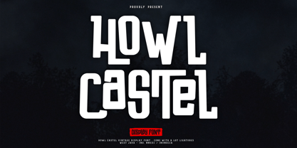 Howl Castel is Vintage and Modern Display Font, Handlettering Bold Font, Powerfull and has a very Strong Character, Great for expressing a summer,The Typeface comes with Stylistic Alternates and Ligature Combinations Exellent typeface to use for covering your Project, like Branding, Headline Letter, Flyer, Signage, Quotes, Poster Typography, Bookcover, Magazine cover, Poster, Quotes Lettering, Logos, and more your project design. - Unique glyphs - Multilingual Characters Support - UPPERCASE - Lowercase - Numeric - Symbol - Punctuation Character - Ligature - Stylistic Alternates inumocca type Studio
 - Mindline Script by Creative Lafont,
$8.00 Mindline Script is a unique blend of classic modern calligraphy font with contemporary, sophisticated accents. It is perfect for wedding, event, invitation, escort card, table number, header menus, display, logos, slider blog, custom address, stamps, packaging, greeting card, etc. Mindline Script comes with a complete set of standard characters, eastern diacritic symbols, consist 505 glyphs in total. The alternative characters were divided into several OpenType features such as Ligature and Stylistic Sets. You can create an attractive message by using the alternate characters in your design. In order to use the beautiful swashes, you need a program that supports OpenType features such as Adobe Illustrator CS, Adobe Photoshop CC, Adobe Indesign and Corel Draw. This font support Latin Pro accent letters of Central Europa, Western (À Â Æ È Ë ã ä æ è...) Thanks and have a wonderful day!
 - Vinyle by Lián Types,
$37.00 Bold, rounded and super cool. Those are the attributes of my latest font “Vinyle”, french for vinyl. In this epoque where all fields of Design are giving a lot of importance and attention to Typography and Lettering, I felt it was my duty to contribute with something that could really stand alone and ‘say something else’ that just words to be read. I've found that lately in the world, regarding a finished piece of design, the role of Typography (and of letters in general) went from being secondary, (like a minor player or a supporting actor) to the most important one. People are starting to understand the beauty of a well-done letter: they want their storefronts with unique scripts, they want to drink coffee surrounded by lettered blackboards, they want to buy books with astonishing covers with swashes ‘por doquier’. I'm more than happy to be alive in a present where even the most unimaginable friends of mine, (who couldn't spot differences between comic sans and helvetica before) are now conscious of the importance of a letter, or let’s say: Of the ‘voice’ of Typography. With Vinyle I tried to make a font with power. Following the nowadays trend of, let me say, “the vintage sans renaissance”. This time I put my brushes and nibs aside and experimented with something new. It wasn't easy, if you will pardon, for me to see swashes all over the place withouth the classic calligraphic ‘thick and thins’, but with after some weeks of work I started to love them. Like I already showed you in other creations (1) let me finish with the phrase: GEOMETRY IS SEXY! TIPS Vinyle has a lot of attitude, it shouts “here I am!” it really can ‘design an entire piece’ for you with just a word or two: It was designed with a 10 degree slant on purpose so the user may rotate it (like on the posters) that amount of degrees in order to see better results. Use Vinyle with the ‘fi’ standard ligatures activates for better kerning and ligatures! NOTES (1) See my font Selfie , the ‘little sister’ of Vinyle.
 - Baseface by Attractype,
$9.00 Baseface is a sans serif font family with a basic shape, simple and clean design. With a choice of six font styles, it is suitable for various typography designs, general text, text effects, logos, web pages, lettering, laser cutting, t-shirt design and others.
 - Fun Club by Designova,
$9.00 FunClub - the lovey & playful handwritten fonts inspired from kids doodles & sketchbooks, completely handmade and developed with perfection The typeface is actually simple in design but with a touch of uniqueness, it can be perfectly useful for designing posters, flyers, cartoons, comics, graphics, logotype, web and display usage. Please see the examples shown above to get an idea about the capability of this typeface. FunClub comes with Extended Latin character sets including Western European, Central European and South Eastern European character sets having support for 19 languages: Afrikaans, Albanian, Catalan, Croatian, Danish,Dutch, English, Estonian, Finnish, French, German, Italian, Lithuanian, Norwegian, Portugese, Slovenian, Spanisch, Swedish, Zulu. The typeface comes with single weight but 6 variants (Regular, Italic, Outline, Outline Italic, Script and Script Outline.
 - Candy Pop! - Personal use only

- Whimsical Musical by Harald Geisler,
$34.56 Whimsical Musical is a vivid, hand drawn font with 405 alternate letters, all caps. Developed from a lighthearted drawing in my sketchbook saying the German word “MUSIK” cheerfully over and over in twenty vivid variations. Next to it was the date “6th April 2007”. This initial idea has burst into a font that is full of surprises and whimsical turns. It is dynamically suggestive, like music, and humorously chaotic, as in Dada. Each uppercase letter is enriched with ten stylistic alternates (OpenType stylistic sets) to create a heap of playful variations amounting to a mountain of possibilities. Recommended for display usage: gonzo headlines, fantastical picturesque covers, extravagant quirky flyers, chichi posters, individual labels and fun logos.
 - Victorian Supremacy by Burntilldead,
$14.00 With over a year of design and development, Victorian Supremacy is ready to help you and your clients make a statement by adding elegance and unique flair to your next design project. Victorian Supremacy inspired by letterheads from the late 1800's and early 1900's. Set includes four major styles and layered version (gradient, outline & extrude). Victorian Supremacy offers an expansive set of options, making it the perfect choice for books, magazines, packaging, branding and signage. From period style and Victorian to modern and elegant, Victorian Supremacy is strong and stately, yet elegant and decorous.
 - Doublethink by Barnbrook Fonts,
$30.00 Doublethink was developed from lettering drawn in the 1960s by Vinko Ožić-Pajić and used on the shop fronts of Yugoslavian state-owned clothes company Standard Konfekcija. The original design has been reinterpreted and expanded and is offered as a two weight typeface—Doublethink Medium and Doublethink Bold Inline. Standard Konfekcija was established first as a military fabric company and later became the premier fashion brand outlet in the Communist state of Yugoslavia. It is famous for being the first shop in the country to offer plastic bags (Standard Konfekcija stores ceased trading after the fall of Communism).
 - Duvall by John Moore Type Foundry,
$19.95 Duvall is an idealization created from the Edward J. Duvall lettering. Mr. Duvall was a teacher in lettering, who was well known for his book “Modern Sign Painting” in the late 40s and early 50s. Duvall cursive script is presented in five weights, Duvall 1, as a light version, to Duvall 5 as a bold version, and Duvall Style a decorative typeface with Inline, ideal for set in color layers combined with Duvall 5. Duvall is a Script font with low contrast, not intended to be used as a type of reading, but is however well adapted to small sizes because its simple form is easy to read. It is advisable to use this font for large to medium sizes. Duvall is ideal for composition, ordinal, superior and inferior numbers, and thanks to the OpenType features you can compose with alternate characters, old style numbers and with a complete set of glyphs for Eastern and Western European languages. The Duvall set comes with a font called Duvall Ribbons, a dingbats font with which you can create interesting headlines with the taste of the advertising of the 50s. Duvall FunWords is a dingbats playing with funny words in English, French and Spanish phrases. Duvall is ideal for packaging, signs, banners, branding and graphic design in general and can be combined harmonically with your favorite sans fonts.
 - Wood Nouveau JNL by Jeff Levine,
$29.00 The hand cut wood type which was the inspiration for Wood Nouveau JNL conjures up images of the artistic period between the Victorian Era and 1920s Moderne, as well as the hippie counterculture active in the later part of the 20th Century. During the late 1960s and early 1970s, rock posters, fliers, store signs and other printed ephemera of "the love generation" borrowed heavily from the Art Noveau style in both art and typography. An Alphonse Mucha-inspired flower girl could adorn a concert poster that also combined both vintage wood type and hand-lettered elements. Although this particular type design might well have preceded the actual start of the Nouveau period, the softer, rounder lines of each character lent themselves well to this emerging style.
 - Colmcille by Monotype,
$29.99Colmcille was designed by a Gaelic scholar, typographer and printer, and first released by Monotype for composition casting in 1936. The design intention was to provide a Gaelic looking type which worked well as a roman text face. The digital version of the Colmcille font family has been made in collaboration with the designer's son, Dara O Lochlainn. A number of changes have been made, including a new set of figures and the addition of a bold weight. Although originally designed as a text face, Colmcille can be used for advertisements, flyers, in fact wherever a touch of Gaelic charm is required. - Jingle Bells by Girinesia,
$13.00 Hello guys... We proud presenting our new font. Jingle Bells is playfull font, display bold font. Jingle Bells would perfect for kids poster, flyer , cover children book, cartoon, comic , cristmast invitation, new year party and etc. Features: Standard glyphs Uppercase and Lowercase Numerals & Punctuations Multilanguage Works on PC & Mac
 - Ongunkan Varna Vinca by Runic World Tamgacı,
$50.00 The Vinča script is a cache of symbols found belonging to the Vinča culture of the central Balkans over 7000 years ago. The symbols have been a topic of debate amongst historians. The Tărtăria tablets are three tablets discovered in 1961 in the village of Tărtăria(Hungarian: Alsótatárlaka). This is about 30 km (19 mi) from Alba Iulia in Romania.The tablets, dated to around 5300 BC, have symbols inclay: the Vinča symbols. Some claim they are a yet undeciphered language. If this is so, they would be the earliest known form of writing. In 1908 similar symbols were found during excavations, by Miloje Vasić (1869–1956) in Vinča. This is a suburb of Belgrade (Serbia), some 300 km from Turdaș. Later, more were found in another part of Belgrade. Since 1875 over one hundred and fifty Vinča sites have been found in Serbia alone. Many, including Vinča itself, have not been fully excavated. The culture of the whole area is called the Vinča culture. Although some of these symbols look exactly the same as some letters in Etruscan, Greek, and Aramaic, they are generally regarded as a an original, independent development.
 - Hayollan by Alit Design,
$22.00 Presenting the Hayollan Signature Script font from alitdesign. The Hayollan Signature Script font is inspired by spontaneous and dynamic signature strokes with an ink texture that makes the Hayollan font look real. The Hayollan font looks unique and charming which makes designs using the Hayollan font look more prominent and cool. The Hayollan font is perfect for a collection of new fonts on your computer, tablet and smartphone for making unique designs or lettering. Hayollan Signature Script font is perfect for magazine cover designs, brochures, flyers. Instagram ads, Canva Design and so on with unique and modern concepts. besides that this font is very easy to use both in design and non-design programs because everything changes and glyphs are supported by Unicode (PUA). The Hayollan Signature Script contains 719 glyphs with many unique and interesting alternative options. Language Support : Latin, Basic, Western European, Central European, South European,Vietnamese. In order to use the beautiful swashes, you need a program that supports OpenType features such as Adobe Illustrator CS, Adobe Photoshop CC, Adobe Indesign and Corel Draw. but if your software doesn't have Glyphs panel, you can install additional swashes font files.
 - Deadfall by Mofr24,
$11.00 Discover Deadfall, the ultimate horror display font that will send shivers down your spine! What sets Deadfall apart is its unique blend of fear-inducing aesthetics and multilingual capabilities. This Monospace typeface exudes a captivating dripped and splash style, adding an extra layer of terror to your designs. Notably, Deadfall supports the Cyrillic alphabet, making it an ideal choice for a global audience. Deadfall offers both regular and italic variations, granting you even more creative possibilities. Whether you're designing posters, crafting marketing materials, conjuring chilling movie titles, creating Death metal logotypes, or working on Halloween-themed crafts, Deadfall will infuse your projects with a bone-chilling atmosphere. To ensure versatility, consider pairing Deadfall with related font families or other typefaces that complement its macabre charm. Its functional aspects include an extensive character set and special features, making it suitable for a wide range of applications. The design concept behind Deadfall revolves around the idea of capturing the essence of horror. The font's distinctive dripped and splash style adds a sense of chaos and unease to any composition, immersing the viewer in a world of terror. The inclusion of the Cyrillic alphabet reflects our commitment to providing a font that caters to diverse audiences, bringing fear to every corner of the globe. We created Deadfall to meet the demand for a truly spine-tingling font that conveys a sense of horror and foreboding. Whether you're a graphic designer looking to evoke fear or a Halloween enthusiast seeking to amplify the spooky atmosphere, Deadfall is here to unleash terror in your designs. Get ready to embrace the darkness with Deadfall - the ultimate font for all things haunting and macabre!
 - Dark Angel by Alphabet Soup,
$60.00 Selected as one of “Our Favorite Typefaces of 2013” by Typographica.org, Dark Angel is the first completely new take in decades on the traditional “blackletter” font style. It began its journey towards the light years ago when this style was born as a sketch for a new logo for the California Angels baseball team (renamed shortly thereafter the Anaheim Angels). The Angels logo never happened, but that sketch has risen from the dead and become the basis for this brand new font design—and was also the source for the name. It’s kind of blackletter in feel, but as a display font it’s so much more. It is far more legible than most “Old English” or “Gothic Script” styles, and incorporates many features never before seen in them, such as swashes, tails and a plethora of ligatures. Dark Angel can be purchased in its regular solid form, or as Dark Angel Underlight—a handtooled font. If these two fonts are purchased together, the Family package will contain a third font—Dark Angel Highlight. With this font layered over the basic font, you can achieve two–color typesetting when the highlight and the base font are assigned two different colors. Dark Angel has enough language support to make the builders of Babel envious—its 1,163 glyphs can be used to set copy in 59 different languages. From A to Z: Afrikaans, Albanian, Basque, Bemba, Bosnian, Catalan, Cornish, Croatian, Czech, Danish, Dutch, English, Esperanto, Estonian, Faroese, Filipino, Finnish, French, Galician, Ganda, German, Hungarian, Icelandic, Indonesian, Irish, Italian, Kalaallisut, Kamba, Kikuyu, Kinyarwanda, Lithuanian, Luo, Malagasy, Malay, Maltese, Manx, Morisyen, North Ndebele, Norwegian Bokmål, Norwegian Nynorsk, Nyankole, Oromo, Polish, Portuguese, Romansh, Sango, Shona, Slovak, Slovenian, Somali, Spanish, Swahili, Swedish, Swiss German, Turkish, Welsh, and last (but not least) Zulu. PLEASE NOTE: Dark Angel is a cross-platform font which depends to some extent on certain advanced OpenType features, therefore it can be used to its full potential only with programs that support those features. ADDITIONALLY: When setting Dark Angel one should ALWAYS select the “Standard Ligatures" and “Contextual Alternates” buttons in your OpenType palette. Please see the “Read–Me–First!” file in the Gallery section.
