10,000 search results
(0.183 seconds)
- Hayfork JNL by Jeff Levine,
$29.00
- Lost Forever - Unknown license

- Gothic No.13 by Bitstream,
$29.99 - Ordin by Robert Corseanschi,
$24.99
- Class Project JNL by Jeff Levine,
$29.00 - Spund, as it sounds, might evoke the idea of a font that is playful and perhaps rounded, suggesting a certain whimsy and casualness in its design. As there isn't a widely recognized typeface by this ...
- Vintage Designs JNL by Jeff Levine,
$29.00 - Montreal Architect Px by Letradora,
$15.00
- Alright, picture this: a font that decided it wanted to be the cool uncle of the comic book world, showing up at family gatherings with a leather jacket and a slight lean to one side. That, my friend...
- LetterOMatic!, crafted by the renowned font foundry Blambot Fonts, is an epitome of creativity and functionality meshed into one captivating typeface. Blambot Fonts, known for its extensive collectio...
- Ah, Monster Paparazzi! Imagine for a moment, deep in the wild underbrush of creativity, lurks a font so captivating that it could only be dubbed Monster Paparazzi. Crafted by the illustrious duo, Kev...
- Ah, diving into the fun world of fonts, aren't we? Alright, let me introduce you to the whimsical world of the "Poke" font, crafted by the talented Ray Larabie. This particular font is like the bubbl...
- Stereobytes by Stereo Type Haus,
$10.00
- Exotica by Studio K,
$45.00
- Rotham Industria by Greater Albion Typefounders,
$18.00
- Meduza Collection FJ by Frncojonastype,
$30.00
- Vtg Stencil France No3 by astype,
$28.00
- Handegypt by MADType,
$21.00
- Medieval Caps BA by Bannigan Artworks,
$19.95 - Stampede by FontMesa,
$25.00 - Vtg Stencil France No5 by astype,
$28.00
- Cardboard Cutouts JNL by Jeff Levine,
$29.00 - That Stuff JNL by Jeff Levine,
$29.00 - Rennie Mackintosh Hillhouse by CRMFontCo,
$20.00 - Militta Reguler by Four Lines Std,
$12.00
- Monsters Attack! - Unknown license

- Acadian by Scriptorium,
$12.00 - Letterpress Pieces JNL by Jeff Levine,
$29.00
- Party Invite JNL by Jeff Levine,
$29.00
- Zerno by Pepper Type,
$25.00
- Kartoon Kutz NF by Nick's Fonts,
$10.00 - Miss Scarlett by FontMesa,
$25.00 - Southern Colonialist by Intellecta Design,
$19.90 - Breeze by Linotype,
$29.99 - Lycaner by Otto Maurer,
$19.00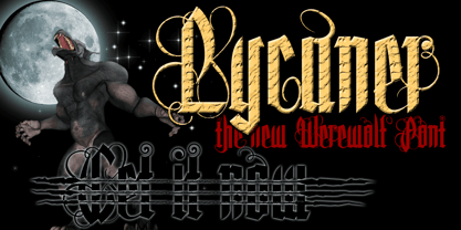
- Lansbury - 100% free

- Handbill JNL by Jeff Levine,
$29.00 - Xylo Sans by PintassilgoPrints,
$19.00
- Cartelle Inline by Stereo Type Haus,
$30.00
- Crumpled Parchment by Celebrity Fontz,
$19.99


