4,349 search results
(0.017 seconds)
- Hagen Kids by Heypentype,
$20.00 Hagen Kids is a great font for your fun design project. Supports most Latin-based languages and comes with standard and discretionary ligatures. This font is packed with alternates that you can play with. Hagen kids is suitable for long text writing, subhead, or headlines for your content. This font gives a sense of informality, friendly and personal feel to your design. You can apply this fonts onto text books aimed at children. Try it for yourself.
 - ITC Santangeli by ITC,
$29.99ITC Santangeli is based on an eighteenth century manuscript by Italian writing master Benedetto Santangeli. Giuseppe Errico's design exudes the elegance and patina of a baroque sculpture. The capitals have verve, and the richly flowing ascenders and descenders enhance the vintage panache of the design. Errico has even included alternate characters and ink splotches to enable a realistic reproduction of antique lettering. Whether for large display copy or short blocks of text, Santangeli speaks with resonance and grace. - Saraya by Flawlessandco,
$9.00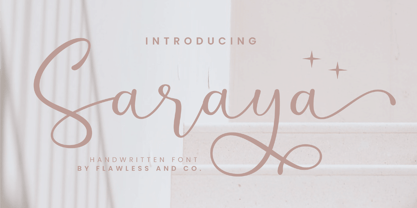 Saraya is a beautiful script handwritten font that exudes sweetness and girly charm. An Original typeface that suitable for any graphic designs such as branding materials, t-shirt, print, business cards, logo, poster, t-shirt, photography, quotes .etc This font support for some multilingual. Modern Sweet Retro that contains uppercase A-Z and lowercase a-z, alternate character, numbers 0-9, and some punctuation. If you need help, just write me! Thanks so much for checking out my shop!
 - The Bold Street by Putracetol,
$21.00 Introducing The Bold Street. A Graffiti Style Font. Inspired by the graffiti art on the city streets, so I made it into a font. So that it will make it easier for you to make graffiti writing or designs. There are 54 ligatures that will make this font even cooler. so enjoy it! Suitable for many design project, branding, packaging, logo, wall art, headline, template, banner, poster, and so much more! This font is also support multi language.
 - Alvenda by Flawlessandco,
$9.00 Alvenda is a handcrafted script, that gives a feel of girly font type. An Original typeface that suitable for any graphic designs such as branding materials, t-shirt, print, business cards, logo, poster, t-shirt, photography, quotes .etc This font support for some multilingual. Handcrafted Script that contains uppercase A-Z and lowercase a-z, alternate character, numbers 0-9, and some punctuation. If you need help, just write me! Thanks so much for checking out my shop!
 - Megattor by Letterhend,
$14.00 Introducing: Megattor typeface! This font is beautifully made to look like natural hand writing. As you can see, the flow of the bold and thin lines creates a realistic hand lettering just by typing on your keyboard! It has many OpenType features like ligatures, stylistic alternate, and lots of Stylistic Set, also support many languages. This typeface is based on handwriting which is very suitable for any design needs you have especially for script logotype project.
 - Ribuah Sans by LetterMuzara,
$20.00 Ribuah Sans is a sans serif font with high contrast, inspired by the font "Bodoni" and the architecture of brutalism. Ribuah Sans consists of three styles (light, regular, bold) and includes several writing systems such as Latin (supporting all European languages and Turkish), Cyrillic (supporting all Cyrillic-based alphabets), Greek and Hebrew. By it's modern, geometric and strict nature this font will immediately draw attention to your design, thereby becoming a perfect option for heading and advertising.
 - Cuttie Beary by Good Java Studio,
$18.00 Introducing Cuttie Beary - Fun Handwritten Font Cuttie Beary is the perfect font for all your fun designs. The main font file is equipped with ordinary characters. Everything is made with a funny brush so you can be sure all leters will work well together! It is suitable for you to use in making t-shirt design, quote, labels, packaging, logo types, or long writing because we have compiled kerning and matrices that are tailored to your needs.
 - Simply Grotesk JNL by Jeff Levine,
$29.00 Up until the advent of vinyl plotters, computers and a myriad of other typesetting and printing changes the world has experienced over the past few decades, the art of hand lettering flourished. An early 1900s book on show card writing displayed a nice example of a Grotesk typeface (a popular style of sans serif of the time). This has been redrawn digitally as Simply Grotesk JNL and is available in four varieties - regular, oblique, condensed and condensed oblique.
 - Calentine by Flawlessandco,
$9.00 Calentine is a handcrafted script, that gives a feel of girly font type. An Original typeface that suitable for any graphic designs such as branding materials, t-shirt, print, business cards, logo, poster, t-shirt, photography, quotes .etc This font support for some multilingual. Handcrafted Script that contains uppercase A-Z and lowercase a-z, alternate character, numbers 0-9, and some punctuation. If you need help, just write me! Thanks so much for checking out my shop!
 - Old Times American by Baseline Fonts,
$29.00The Old Times American Family is derived from several letterpress books from the 1880s in the midwest. The fonts were painstakingly compiled from over 100 pages of text and optically balanced for optimum results. Old Times American is part of the Grit History Series A font set. The set encompasses serif and sans-serif fonts in varying weights to meet the needs of designers. The less-than-perfect letterforms evoke a sense of the non-digital. - Matty Salde by Negara Studio,
$19.00 Introducing Matty Salde! Is a script font. Written with a marker dipped in ink. With 33 ligatures. We write at a moderate speed so as to produce a solid brush effect. Matty Salde Features: Upper & lowercase characters, numerals, a large range of punctuation and Language Support. 33 ligatures are included for lowercase letters (see image). Matty Salde great for use on larger sizes. I just wanted to let you know that Matty Salde is our first script font. ~ Anugerah
 - Kinslee by Flawlessandco,
$9.00 Kinslee is a handcrafted script, that gives a feel of girly font type. An Original typeface that suitable for any graphic designs such as branding materials, t-shirt, print, business cards, logo, poster, t-shirt, photography, quotes .etc This font support for some multilingual. Handcrafted Script that contains uppercase A-Z and lowercase a-z, alternate character, numbers 0-9, and some punctuation. If you need help, just write me! Thanks so much for checking out my shop!
 - Lemon Milk Pro by Marsnev,
$16.99 Wait no more. Meet Lemon Milk Pro™, your new go-to typeface. After a long journey, the widely known Lemon Milk has now became pro fonts. It finally has lowercases, covering extended Latin, Cyrillic, and Greek. Moreover, developed from the original version in 2014, it is now future proof: more opentype features + variable fonts. With such styles, this famous geometric typeface with sharp edges is perfect for every display! Lemon Milk Pro: Beyond a typeface, it's a culture.
 - Danki by Twinletter,
$15.00 Danki, our newest font, is a display typeface created with natural hand strokes and a joyful and playful background. This typeface has two alternates for each character, making it simple to select the appropriate character for each of your unique projects. This font is ideal for usage in a variety of unusual graphic projects, including games, book titles, outdoor activities, posters, banners, quotes, branding, and other unique projects. So, what are you waiting for? Get this font now!
 - Cat Finger by TypoGraphicDesign,
$9.00 The typeface Cat Finger is designed from 2021 for the font foundry Typo Graphic Design by Manuel Viergutz × Carmen Thiemer. The display font based on the human hand. Started analog with acrylic paint, a finger and a white paper. After scanning, a digital brush was created. With the help of a touch tablet, this brush was used as a writing tool. One font-stlye written with the left hand (left) and one with the right hand (right).
 - JP2 by Linotype,
$40.99JP2 has some special roots being inspired by the actual handwriting of Pope John Paul II. Franciszek Otto took this source material and transformed it into a high quality font. The result is a rough, but intelligent, design with letters that slightly bounce along the baseline to mimic typical writing. Their short x-height, long extenders, and unique capital letters make this a very beautiful and distinctive typeface. Try it out for greetings, invitations, or posters! - Jeenull by Twinletter,
$15.00 Jeenull is a distinctively appealing typeface with a thick character that gives a distinct impression ideal for a variety of serious and casual applications. What are you waiting for? Get this font and enjoy the beauty of letter combinations in words that you may use in a variety of projects. This font is perfect for games, sporting events, branding, banners, posters, movie titles, book titles, quotes, logotypes, and more. Start using our fonts for your amazing projects.
 - Yeti by Glyphon,
$10.00 Yeti is tall and hand-drawn with a hint of calligraphy. It is quite possibly influenced by a yeti’s penmanship, but even that cannot be proven. Whether you enjoy writing or designing in all-caps or not, this font has something for you. Something furry. Yeti supports multiple languages and includes graphics and web icons to help get those creative juices flowing. Naturally, yetis love Easter egg hunts and being superstitious. This font is no exception.
 - Sanford by Flawlessandco,
$9.00 Introducing "Sanford" - A Modern Display Sport Font. Sanford is the ultimate choice for designers seeking a bold and contemporary display font to make a lasting impact. There's some connected letters and some alternates that suitable for any graphic designs. This font support for some multilingual. Also contains uppercase A-Z and lowercase a-z, alternate character, numbers 0-9, and some punctuation. If you need help, just write me! Thanks so much for checking out my shop!
 - Monkey Rhumble by WingBuk Studio,
$27.00 Monkey Rhumble is an exclusive piece made with a touch of darkness, featuring a heavy and death metal feel to compliment your design. Monkey Rhumble is very easy to use in any variation or writing combination with extra custom bracket, also perfect for metal band logos, merchandise, clothing, apparel, or anything else that calls for a metal feel. Here is tutorial how to use it : https://youtu.be/ezNu7hCqV-w Recomended Software to use: Corel Draw Adobe Photoshop Adobe Illustrator
 - Katuku by Twinletter,
$15.00 Katuku is an Arabic Style Font based on the exquisite Arabic calligraphy style, which means that the writing style is highly decorative and highly variable. Arabic style fonts will give your designs a genuine Middle Eastern feel. Use this font in your super projects to grab everyone’s attention. Not only is it perfect for logos and headlines, but it adds an elegant Arabic touch to the design and will give you a real edge over your competitors’ designs.
 - Baby Algutta by IM Studio,
$19.00 Baby Algutta is a modern, handwritten and modern calligraphy font. The shape is modern and unique and the writing style is very natural. The Baby Algutta features a varied baseline, smooth lines, beautiful glyphs, and amazing alternatives. Hand-drawn design elements allow you to create many beautiful typographic designs in an instant such as branding, web and editorial design, prints, crafts, quotes, It's great for logos, wedding invitations, romantic cards, labels, packaging, name spelling, and more. Thank you.
 - Sassoon Handwriting Starter by Sassoon-Williams,
$45.99 Sassoon fonts package for handwriting starters The three upright "infant" fonts developed to meet the demand for letters to produce pupil material for handwriting as well as for reading. Letters have extended ascenders and descenders ideal on screen and print. They facilitate word recognition. The exit strokes link words together visually, also crucially, they space the letters for improved legibility. The "joined" font puts the skills gained into practice producing joined-up handwriting. Together these typefaces provide a valuable resource for Teachers to create consistent material across the curriculum. Sassoon Infant Tracker B font: This font with its direction arrows helps pupils to start in the correct place. Motor movements can be refined by keeping inside the line. When starting and direction is no problem, the arrow font can be dropped and the Dotted font used. Sassoon Infant Dotted B font: Writing over the dots of this font refines motor skills. The aim here is to give confidence by reinforcing starting points, exits and to now encourage fluidity. Sassoon Infant font: With some words in this font and a baseline beneath to copy onto, pupils can use their learned starting points and exit strokes to write freely along the baseline - still unjoined. Once learned, this leads to spontaneous joins along the baseline leading logically to a joined-up hand. Sassoon Joined font: Having learned to write letters with correct starts and exits, this is when the joined font for teaching handwriting can be used. With some words in this font and a baseline beneath to copy onto, pupils can use their learned starting points and simply extend their exit strokes to make joined-up writing. The default joins the font provides are recommended, however there are alternative letterforms that are so important for some Teachers which can be accessed. Create ‘pen lifts’ anytime too! NOTE: Fonts display unjoined by default on this website and are delivered that way - joining is controlled by your text editing application such as Word or TextEdit, read more for instructions… Free to download PDF resources: Stylistic Sets and how to access the alternative letters feature in these OpenType fonts. Using the separate letter fonts Using the joined font Teachers copybooks using these fonts: How to teach pre-cursive Copybook How to teach cursive handwriting Copybook
 - Givry by TypeTogether,
$49.00 The bâtarde flamande is a style of writing used predominantly in France and present-day Belgium in the 15th century. The style shares an ancestry with other writing styles traditionally grouped as blackletter— fraktur, textura, rotunda, and schwabacher. It had evolved, however, into an æsthetic far removed from its relatives. While high-contrast in nature, the bâtarde flamande is more delicate and dynamic than the austere and condensed fraktur and textura. Quick curves lack the rigidity of the schwabacher and rotunda. Flair through swashes is thematic, as are the variations in letterforms. The flowing rhythm, achieved through a letterform axis that is overall slightly rightward, is most noticable in the hallmark f and long s. Round forms are fused together for economy of space. It is a writing hand that, with its syncopation and fluidity, produces a vibrance uncharacteristic of other blackletters. Givry has been created in the spirit of the bâtarde flamande. It melds the particular traits compiled from the works of the style’s prominent scribes—Jean Fouquet, Loyset Liédet, and Jean Bourdichon. While suitable as an elegant and energetic display face, Givry was conceived for setting continuous text. The result of many refinements and adjustments is the preservation of the style’s irregular nature, as well as a consistency that continuous-text typography requires. Carefully researched and developed in OpenType format for a wealth of typographic features and support for more than forty languages, Givry is neither derivative nor experimental, but historically accurate. Of the many blackletter digital typefaces available, fraktur and all its connotations have become representative. In contrast, the bâtarde flamande is essentially non-existent in digital form, and has until now been overlooked. Givry provides designers and anyone searching for typographic expression a lively, delicate, and striking side to blackletter.
 - Diesel Rudolf by Ingo,
$82.00 Write like the inventor of the diesel engine — it’s possible with the Diesel Rudolf Script (patterned after the original handwriting of Rudolf Diesel)... In 2008 the city of Augsburg and the MAN Group celebrated the 150th birthday of Rudolf Diesel, inventor of the diesel engine which was named after him. With the help of a few preserved original letters, it was possible to create a convincing digital version of Rudolf Diesel’s personal handwriting. The engineer and inventor Rudolf Diesel was born in Paris in 1858 and also went to school there. In1870 his family moved to England and Rudolf was sent to relatives in Augsburg where he continued going to school. Later, after completing his studies in Munich, he began working as an engineer in the machine factory Linde. Alone this part of his life makes clear why Rudolf Diesel’s handwriting was so ”jerky,“ hesitant and inconsistent. He learned to write according to the French style, that is, Latin cursive — completely different from the very correct and neat German handwriting taught at that time which he had to learn at 13 years of age. These circumstances explain why his handwriting is ”messy“ (especially for those days) with its mixtures of letter forms within a text, even within individual words. Plus, he obviously did not attach much importance to ”pretty writing.“ Sometimes the characters are wide, then narrow, sometimes large and clear and then again crammed and primitive. The individuality is emphasized with characteristics derived from quill and ink. The diversified images of the font Diesel Rudolf Script make more than 80 ligatures and stylistic alternates possible which can be selected with help from the OpenType functions Ligatures and Discretional Ligatures.
 - Ah, Inspector 39! If fonts were guests at a soiree, Inspector 39 would saunter in with the mysterious allure of a noir detective, blending the charm of classic cinema with the intrigue of a whodunit....
- FS Ostro by Fontsmith,
$80.00 Cosmopolitan Elegance Named after a southerly wind that blows over the Mediterranean Sea, FS Ostro breathes warmth into letterforms with their roots in colder, stark Modern typefaces. FS Ostro is a typeface imbued with balanced and sophisticated elegance. It’s discerning and sensitive, self-assured but understated. One for the well-travelled reader. Thoughtful contrast FS Ostro draws inspiration from a wide range of sources, such as 19th century British Scotch Roman designs, Italian modern style typefaces and highly contrasted display Spanish examples. Its text version offers a consistent rhythm and robust texture that is easy on the eye. This elegant, cosmopolitan typeface is characterised by its thoughtfully modulated contrasts between thick and thin, sharp angles, and sophisticated curves. Exaggerated touches in display “What is more restrained and sober in text, becomes purposefully prominent and more detailed in display,” says Fontsmith designer Alessia Mazzarella. These exaggerated details for the display version can be seen in the letter terminals, such as those in the ‘a’ and ‘g’ and the tail of the ‘Q’, as well as in the set of numerals, fractions, arrows, borders and ornaments, which can be used to build decorative framing elements. Fluid italics The less rigid and curvaceous italics of modern style typefaces were the inspiration for FS Ostro’s own subtle, flowing italic styles. The letterforms are confident and fluid, creating an overall sense of refinement and modernity.
 - Akagi Pro by Positype,
$29.00 Akagi Pro is a complete rebuild and expansion of my popular Akagi typeface. Contemporary, clean, simple and friendly continue to serve as the adjectives for an expansion that includes 250+ additional characters per weight, many new ligature options, expanded stylistic alternates, 4 sets of figures, new symbols, case-sensitive punctuation, superscripts, subscripts, ordinals, expanded language support and two new styles that provide even more flexibility within the lighter weights of the family. When I designed Akagi in 2007, I wanted this new sans serif to "smile" at you — with this new expansion, I hope you smile back. Akagi Pro is economical while keeping a distinctive, expressive personality on the page that distinguishes it from among many of the mechanical/rigid/emotionless sans out there without becoming cliché. Perfect for the page and the screen, the flexible weights available allow for pinpoint selection at whatever size. Each style of Akagi Pro has a robust character set made even more functional with expansive OpenType features. A typesetter's dream — case-sensitive punctuation, tabular and proportional variants of lining and oldstyle numerals, true italics, small caps, expansive language support, an alternate 'g' and 'y', highlight a wealth of features of the typeface. This versatility infused within Akagi Pro will allow it to assume both roles of the utilitarian workhorse and light-hearted go-to typeface — and make the user happy.
 - PF Bague Sans Std by Parachute,
$39.00 Bague Sans is an award-winning monoline typeface with a distinct and eye-catching personality. Despite its inspiration from early 20th century geometrics, it diverts from the mechanical rigidity of those typefaces by incorporating humanist characteristics, such as subtle variations in stroke width and open counter shapes with vertical endings. This is a very clean and legible typeface with a warm and well-balanced texture which is ideal for intense editorial use in magazines and newspapers. The most remarkable feature of Bague Sans is its vast array of uppercase alternates and ligatures which truly shine when set at display sizes. This typeface is automatically transformed into a flexible, charming and stylish typeface with strong modern aesthetics. Explore its dual personality, switch from Humanist to Geometric and vice versa by using alternate characters such as the single-storey a and single-storey g. From classic to modern, from excessive to neutral, Bague Sans is a multipurpose typeface which offers enormous possibilities and variations for editorial design, branding and corporate identity while it performs amazingly well on web. This superfamily includes 18 weights from Hairline to Ultra Black with a consistent and well-refined structure. It supports extended Latin such as Central European, Baltic, Turkish, Romanian and includes numerous alternates and ligatures for unlimited text variations. You may also want to check out Bague Sans Pro which supports Cyrillic and Greek as well.
 - Hibernica by SIAS,
$39.90 Hibernica is a new genuine Irish sans in the classical modern style. With Hibernica it is possible to express Irishness in an up-to-date fashion rather than the traditionalist way. The design of Hibernica is based on my Lapidaria family. With Lapidaria it shares the classic appearance and coolness, stroke pattern, proportions and dimensions. Therefore Hibernica and Lapidaria are a perfect couple for bilingual text editing, e.g. Irish–English (not to forget the Greek parts of Lapidaria!). All fonts contain the full set of dotted ḃ ċ ḋ ḟ ġ ṁ ṗ ṡ ṫ in upper- and lowercase and an additional set of a dozen celtic ornaments. Hibernica also ows its “Minor-Medior” concept to Lapidaria, that is a special uncial-style variant set for lowercase letters. Choose from the six Hibernica fonts which suits your needs best! The Minor fonts are performing elegantly even in longer text bodies, whereas the Medior sorts offer a brillant and entirely new typographic look for headings and captions. Use Hibernica for outstanding designs – for a contemporary Irish understatement in typography. Wether you’re designing menus or shop signs, banners or ads, wether you do textwork upon historic topics or create T-shirts for St Patrick’s day – Hibernica is your new friend! For more new wonderful Irish fonts look at Ardagh and Andron Gaeilge!
 - Metro Office by Linotype,
$50.99The Metro Office family is designed after the model of the original sans serif family – Metro No.1 – produced by W.A. Dwiggins and Mergenthaler Linotype’s design studio during the late 1920s and 1930s. A distinctly new interpretation of the sans serif idea, Metro was a thoroughly “American” sans serif when it was released. However, over the ensuing decades, it became a favorite the world over. Moreover, it is one of the first “humanist” sans serif typefaces designed. While redesigning Metro in 2006, Linotype’s Type Director Akira Kobayashi drew from his own knowledge of humanistic letterforms. The result is a redefined Metro; a typeface that is finally ready for heavy text setting. The original Linotype Metro No.1 never had italic variants. Kobayashi has created oblique variants, extending its use in document setting. A double-storey a and g, as well as a wider w were features of Dwiggins’ original Metro design that were filtered out by Mergenthaler Linotype in the 1930s. Kobayashi remedied this historical slight, retooling Dwiggins’ original forms and optimizing their legibility. Kobayashi has additionally retooled some of Metro’s more troublesome letters, which has black elements that became too dense. By opening up the troublesome joins (like that on the Q), Kobayashi has given his new Metro a more even color in text, improving its legibility while retaining its original spirit. - FS Ostro Variable by Fontsmith,
$119.99Cosmopolitan Elegance Named after a southerly wind that blows over the Mediterranean Sea, FS Ostro breathes warmth into letterforms with their roots in colder, stark Modern typefaces. FS Ostro is a typeface imbued with balanced and sophisticated elegance. It’s discerning and sensitive, self-assured but understated. One for the well-travelled reader. Thoughtful contrast FS Ostro draws inspiration from a wide range of sources, such as 19th century British Scotch Roman designs, Italian modern style typefaces and highly contrasted display Spanish examples. Its text version offers a consistent rhythm and robust texture that is easy on the eye. This elegant, cosmopolitan typeface is characterised by its thoughtfully modulated contrasts between thick and thin, sharp angles, and sophisticated curves. Exaggerated touches in display “What is more restrained and sober in text, becomes purposefully prominent and more detailed in display,” says Fontsmith designer Alessia Mazzarella. These exaggerated details for the display version can be seen in the letter terminals, such as those in the ‘a’ and ‘g’ and the tail of the ‘Q’, as well as in the set of numerals, fractions, arrows, borders and ornaments, which can be used to build decorative framing elements. Fluid italics The less rigid and curvaceous italics of modern style typefaces were the inspiration for FS Ostro’s own subtle, flowing italic styles. The letterforms are confident and fluid, creating an overall sense of refinement and modernity. - Serapion by Storm Type Foundry,
$39.00Another variation on the Renaissance-Baroque Roman face, it extends the selection of text type faces. In comparison with Jannon, the contrast within the letters has been enhanced. The dynamic elements of the Renaissance Roman face have been strengthened in a way which is illustrated best in the letters "a", "b" and "s". These letters contain, in condensed form, the principle of this type face - in round shapes the dark stroke invariably has a round finial at one end and a sharp one at the other. Another typical feature is the lower-case "g"; the upper part of this letter consists of two geometrically exact circles, the inner of which, a negative one, is immersed down on the right, upright to the direction of the lower loop and the upright knob. The vertical strokes slightly splay out upwards. Some details of the upper-case letters may seem to be too daring, but they are less apparent in the text sizes. It has to be admitted that typographers tend to draw letters in exaggerated sizes, as a result of which they stick to details. Serapion Italic are italics inspired partly by the Renaissance Cancelleresca. This is obvious from the drop-shaped finials of its lower-case descenders. The type face is suitable for illustrated books, art posters and short texts. It has a rather ugly name - after St. Serapion. - Minigap by Gravitype,
$19.90 Minigap is a geometric sans serif family that has a minimal height difference between upper and lower case. In other words for those who are into typography, it has a very high x-height. The choice was made to finally have a typeface that could appear very neat, reducing ascending and descending parts of the glyphs (b, d, g, j, l, ...) that could interfere with the lines above and below. All of that without going to extremes in a unicase style but also without renouncing to a great legibility. This aesthetic, in fact, translates into a pleasant visual effect that creates well-defined lines and enhances the layout, looking excellent also on small screens. The pointed corners of capital letters and numbers have been kept even in the heavier styles, to give consistency to the family. Stylistic alternates are included: “i” and “j” can be set to the x-height, to have a more common aesthetic; by default they are set in the lower version, fitting better the purpose of this typeface. the two-story “a” is also available, to give you one more customizable option and extend the range of use. Minigap is available in 14 styles (7 uprights + matching italics), has OpenType features and supports multiple languages. The Regular weight is offered for free, try it!
 - Picture this: you're cruising through the cosmic expanse of fonts, navigating the nebula of serifs and the black holes of sans, when suddenly, out of the playful void, JptBubbles by Jpt Design Studio...
- Linotype Venezia by Linotype,
$29.99Linotype Venezia Initiale is part of the Take Type Library, selected from the contestants of Linotype’s International Digital Type Design Contests of 1994 and 1997. Designed by German artist Robert Kolben, the font is based on the classic forms of Roman writing in the 1st and 2nd centuries found chiseled on countless buildings and monuments. Linotype Venezia Initiale is a timeless, elegant font particularly well-suited to headlines or as initials in combination with other fonts, working especiall well with sans serif alphabets. - Classic Notes by Balpirick,
$15.00 Introducing by Balpirick Studio Classic Notes is a Quotable Slab Serif Typeface Font. This font captures the essence of vintage typewriters, with a distinct and easily recognizable aesthetic. This font is perfect for projects that require a vintage touch, such as vintage-inspired branding, editorial designs, and book covers. Embrace the nostalgia of analog writing with our typewriter fonts, a tribute to the timeless art of typography. - also multilingual support Enjoy the font! Feel free to comment or feedback! Thank you!
 - S&S Amberosa by Spencer & Sons Co.,
$35.00 Distinctively Americana with a touch of Arts & Crafts, Amberosa is a typographic gem from the late nineteenth century, this undulating and organic typeface is a versatile and refreshing alternative to many of the font designs on the market today. Recapture the elegance of traditional flourished sign writing and make and provide ideal lettering for period inspired design work such as posters, signage, labels and book covers. You’ll find ligatures, 400+ stylistic alternates in keeping with the spirit of this pretty, old-fashioned typeface.
 - Tecna Dark Down Triangle BNF by Descarflex,
$30.00 The Tecn@ Dark&Light Triangle Background Nomenclature Font family is differentiated by the direction of the triangle tip in the 4 cardinal points. The family were designed to head, enumerate, indicate or highlight writings or design plans, for this reason, the characters are available only in capital letters and some signs or symbols that can serve such purposes. A triangle or empty character is included so that the user can use it overlaying any character of his choice or to be used alone.