10,000 search results
(0.033 seconds)
- Megot by Brainware Graphic,
$12.00 Megot is a modern fancy display font with playful feel. Comes with opentype features, Megot also supports multilingual covering Latin based language (Latin Extended Additional)
 - Christmas Dingbats 2 by HVD Fonts,
$25.00 Christmas Dingbats 1 and Christmas Dingbats 2 are two Christmas fonts with different styles. Each font contains more than 90 Christmas icons, borders and ornaments.
 - Hello Arsenio by Figuree Studio,
$18.00 Say hello to Hello Arsenio font. Made with love and joy. Kids look, so it will make your design more beautiful, cute, fun, and colorful.
 - Barbed Wire by Monotype,
$29.99Andrew Smith played with his pencil and scetched an alphabet with several strokes. and as he made come cross strokes it lokes like barbed wire. - Clairdelune by Maulana Creative,
$14.00 Give your designs an authentic handcrafted feel. Clairdelune is perfectly suited to stationery, logos and much more. File includes: - Ligatures - Multilingual Support MaulanaCreative Many Thanks!
 - Belliza by Rockboys Studio,
$26.00 The Belliza is a natural handwritten brush font. It’s ideal for branding and decorating your projects, creating wedding invitations, book covers, marketing, and much more!
 - Allnoob by Skiiller Studio,
$20.00 Allnoob Typeface is one of the elegant decorative fonts neatly arranged and cool, you can also use it for business, clothing, movie titles, and more
 - Alovetha by Rockboys Studio,
$26.00 The Alovetha is a natural handwritten brush font. It’s ideal for branding and decorating your projects, creating wedding invitations, book covers, marketing, and much more!
 - Scripty Style by MaxnorType,
$15.00 Scripty Style is a handwritten signature font. It has a natural handwritten style and is perfect for logos, branding, business cards, watermarks, and much more!
 - Baby Fun by Beary,
$12.00 Baby Fun is inspired by the playfulness of hand lettering. This font can be used for comic design, children's books, preschool name tag and more.
 - Zenith by Glyphobet,
$9.99 Chinese characters have simplifed and more complex, "traditional" variants. Zenith imagines what an un-simplified, traditional version of the Latin alphabet might have looked like.
 - Dondolare by Tour De Force,
$25.00 Dondolare is simple hand-drawn font family. Squarish looking and ready for typography cooking, comes in 2 weights with support for extended Latin character set.
 - Aghitta by Rockboys Studio,
$26.00 The Aghitta is a natural handwritten brush font. It’s ideal for branding and decorating your projects, creating wedding invitations, book covers, marketing, and much more!
 - Minnie by Lebbad Design,
$24.95 Minnie is a clean monoline upright script. This fun-loving font is great for headline display and text use. It comes with numerous alternate characters.
 - Cohoba by Illuminaut Designs,
$10.00 Cohoba is a chunky condensed sans serif. Cohoba is loud and proud. It comes with a handful of discretionary ligatures. Cohoba is fun and versatile.
 - Modesfa by Almarkha Type,
$33.00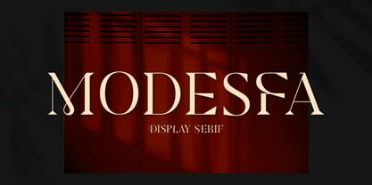 Introducing Modesfa – Modern Display Serif inspired by the famous minimalist logo perfect for the purposes of designing templates, brochures, videos, advertising branding, logos and more.
 - Quinger by Almarkha Type,
$33.00 Introducing Quinger - Unique Sans Display inspired by the famous minimalist logo perfect for the purposes of designing templates, brochures, videos, advertising branding, logos and more.
 - Happy Wednesday by Epiclinez,
$18.00 Happy Wednesday is a cute and lovable handwritten font. It is suitable for your crafting projects, but also for logos, quotes and so much more.
 - NBAres by Nicola Burgarella,
$9.00 This new font family full fit all your comic balloons, onomatopoeia and... SCREAMS! Comes with Regular, Italic and Bold Italic with a great organic look.
 - Swagstie by Forberas Club,
$16.00 Swagstie is handwriting style. This font create and nice to application for memo, tees design, cover, writing text, home decor, wall art and many more.
 - Luxoorea by Almarkha Type,
$25.00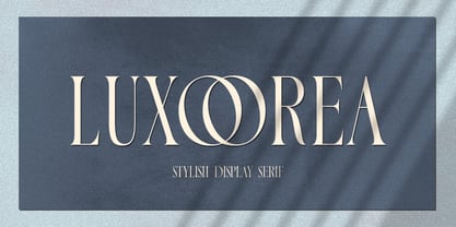 Introducing Luxoorea – Stylish Display Serif inspired by the famous minimalist logo perfect for the purposes of designing templates, brochures, videos, advertising branding, logos and more.
 - Chalkier by Balpirick,
$15.00 Chalkier is a fun & quirky handwritten font. It’s the perfect choice for product packaging, branding project, magazines, social media posts, wedding invitations and much more!
 - Delaproza by Almarkha Type,
$29.00 Introducing Delaproza – Modern Serif font inspired by the famous minimalist logo perfect for the purposes of designing templates, brochures, videos, advertising branding, logos and more.
 - Agenor by Graphite,
$17.00 Agenor is an all caps display typeface family. It comes in five weights and is suitable for headlines, headings, branding, posters, packaging, titles and logos.
 - South Louisville by Sarid Ezra,
$15.00 South Louisville is an applicable handwritten font that contains uppercase, lowercase, number and symbol, also comes with ligatures and underline. This font support multi language!
 - Rachel Karlie by Salamahtype,
$17.00 Rachel Karlie – Calligraphy Font is perfect for branding projects, logo, wedding designs, product packaging, product designs, label, invitation, social media posts, advertisements, merchandise and more!
 - Runsten by Fontron,
$35.00Adapted from Ronsten to make an acceptable chunky, more normal serif font retaining the serif alignment with the letter curves. An Italic is also available. - Architec by Monotype,
$29.99This caps only hand lettering could have come from an architect. Speedy written on a 45 degree slope with a bold felt pen or brush. - Sangira by Almarkha Type,
$29.00 Introducing Sangira - Modern Ligature Serif inspired by the famous minimalist logo, perfect for the purposes of designing templates, brochures, videos, advertising branding, logos and more.
 - Glamorez by Almarkha Type,
$35.00 Introducing Glamorez - Luxury Display Serif inspired by the famous minimalist logo perfect for the purposes of designing templates, brochures, videos, advertising branding, logos and more.
 - Aztec Day Signs by Deniart Systems,
$15.00 Contains the 20 Days of the Mexican Calendar Stone in outline and silhouette mode NOTE: this font comes with an interpretation guide in pdf format.
 - SwirlityText by Ingrimayne Type,
$9.95 SwirlityText is a fussy, over-the-top calligraphic typeface with lots of curves and wiggles. It comes in two weights, each with an oblique style.
 - Gusto by Device,
$39.00Gusto comes in three related variants that go from hot-dog to melted chocolate, a gastronomic combination not to be passed up (or thrown up). - Mr Eaves Modern by Emigre,
$59.00 Mr Eaves is the often requested and finally finished sans-serif companion to Mrs Eaves, one of Emigre’s classic typeface designs. Created by Zuzana Licko, this 2009 addition to the Emigre Type Library expands the versatility of the original Mrs Eaves with two complimentary families: Mr Eaves Sans and Mr Eaves Modern. Mr Eaves was based on the proportions of Mrs Eaves, but Licko took some liberty with its design. One of the main concerns was to avoid creating a typeface that looked like it simply had its serifs cut off. And while it matches Mrs Eaves in weight, color, and armature, Mr Eaves stands as its own typeface with many unique characteristics. The Sans version relates most directly to the original serif version, noticeably in the roman lower case letters a, e, and g, as well as in subtle details such as the angled lead in strokes, the counter forms of the b, d, p, and q, and the flared leg of the capital R, the tail of the Q. The distinctly loose-fitting letter spacing of Mrs Eaves was applied also to the Sans version. This, together with generous built-in line spacing due to a small x-height and extended ascenders and descenders, renders the same kind of lightness and airiness when setting text that is so characteristic of Mrs Eaves. Deviations from the original Mrs Eaves are evident in the overall decrease of contrast, as well as in details such as the flag and tail of the f and j, and the finial of the t, which were shortened to maintain a cleaner, sans serif look. And the lower case c had to be balanced out differently after it lost its top ball terminal. And with the loss of serifs, Mr Eaves set width is slightly narrower. Mr Eaves Italic also carries over many forms from its Mrs Eaves model, most notably the v, w, and z, which are unusually flamboyant for a sans italic design. It also utilizes lead in and terminal tails that are reminiscent of the serif italic. The biggest departure here is the width of the characters. The extra narrow gauge and delicate features seemed more appropriate for the Serif than the Sans. To allow for a comfortable fit, Mr Eaves Italic has a more robust design and wider character width. Meanwhile, the Modern family provides an overall less humanistic look, with simpler and more geometric-looking shapes, most noticeably in the squared-off terminals and symmetric lower case counters. This family has moved furthest from its roots, yet still contains some of Mrs Eaves’ DNA. The Modern Italic is free of tails, and overall the Modern exhibits more repetition of forms, projecting a cleaner look. This provides stronger differentiation from the serif version whenever a more contrasting look is desired. Each version (Sans and Modern) contains its own set of alternates providing unique options for applications such as headlines, word logos, letterheads, pull quotes, and other short text settings. Both the Sans and Modern come in six weights. The simpler forms of a sans-serif provide the opportunity of more weights than do serif letter forms, which are more complex in structure, making it difficult to accommodate additional weight without distortions. Regular and Bold match the original Mrs Eaves weights, while the Heavy provides an additional weight for extra emphasis.
 - Mr Eaves Sans by Emigre,
$59.00 Mr Eaves is the sans-serif companion to Mrs Eaves, one of Emigre’s classic typeface designs. Created by Zuzana Licko, this 2009 addition to the Emigre Type Library expands the versatility of the original Mrs Eaves with two complementary families: Mr Eaves Sans and Mr Eaves Modern. Mr Eaves was based on the proportions of Mrs Eaves, but Licko took some liberty with its design. One of the main concerns was to avoid creating a typeface that looked like it simply had its serifs cut off. And while it matches Mrs Eaves in weight, color, and armature, Mr Eaves stands as its own typeface with many unique characteristics. The Sans version relates most directly to the original serif version, noticeably in the roman lower case letters a, e, and g, as well as in subtle details such as the angled lead in strokes, the counter forms of the b, d, p, and q, and the flared leg of the capital R, the tail of the Q. The distinctly loose-fitting letter spacing of Mrs Eaves was applied also to the Sans version. This, together with generous built-in line spacing due to a small x-height and extended ascenders and descenders, renders the same kind of lightness and airiness when setting text that is so characteristic of Mrs Eaves. Deviations from the original Mrs Eaves are evident in the overall decrease of contrast, as well as in details such as the flag and tail of the f and j, and the finial of the t, which were shortened to maintain a cleaner, sans serif look. And the lower case c had to be balanced out differently after it lost its top ball terminal. And with the loss of serifs, Mr Eaves set width is slightly narrower. Mr Eaves Italic also carries over many forms from its Mrs Eaves model, most notably the v, w, and z, which are unusually flamboyant for a sans italic design. It also utilizes lead in and terminal tails that are reminiscent of the serif italic. The biggest departure here is the width of the characters. The extra narrow gauge and delicate features seemed more appropriate for the Serif than the Sans. To allow for a comfortable fit, Mr Eaves Italic has a more robust design and wider character width. Meanwhile, the Modern family provides an overall less humanistic look, with simpler and more geometric-looking shapes, most noticeably in the squared-off terminals and symmetric lower case counters. This family has moved furthest from its roots, yet still contains some of Mrs Eaves' DNA. The Modern Italic is free of tails, and overall the Modern exhibits more repetition of forms, projecting a cleaner look. This provides stronger differentiation from the serif version whenever a more contrasting look is desired. Each version (Sans and Modern) contains its own set of alternates providing unique options for applications such as headlines, word logos, letterheads, pull quotes, and other short text settings. Both the Sans and Modern come in three weights. The simpler forms of a sans-serif provide the opportunity of more weights than do serif letter forms, which are more complex in structure, making it difficult to accommodate additional weight without distortions. Regular and Bold match the original Mrs Eaves weights, while the Heavy provides an additional weight for extra emphasis.
 - Lady Copra - Unknown license

- Lady Copra Alternate - Unknown license

- Heidorn Hill - Unknown license

- Moondog Fifteen - Unknown license

- Amerika - Unknown license


