10,000 search results
(0.02 seconds)
- Inbadge by Blankids,
$30.00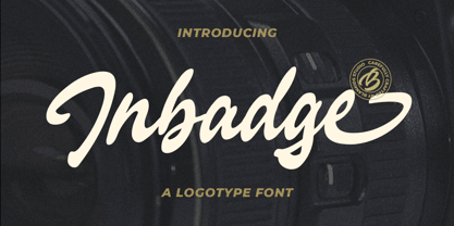 Hello, Are you looking for a modern trandy script font? Do you want of creating Something that stand out and inspire creativity, imagination, and endless fun? Wait no more, we will give you the best choice. Inbadge a Branding Logotype Font Inbadge a Branding Logotype Font, Inspiring from brush lettering style typography. This font is perfect for a design that makes it more attractive and playful. made with a very good level of aesthetics making this font suitable for book cover, poster, packging, merchandise, logotype and much more. Inbadge font includes Multilingual Support, among others : Afrikaans, Albanian, Asu, Basque, Bemba, Bena, Breton, Catalan, Chiga, Cornish, Danish, Dutch, English, Estonian, Faroese, Filipino, Finnish, French, Friulian, Galician, German, Gusii, Indonesian, Irish, Italian, Kabuverdianu, Kalenjin, Kinyarwanda, Luo, Luxembourgish, Luyia, Machame, Makhuwa, Meetto, Makonde, Malagasy, Manx, Morisyen, North Ndebele, Norwegian Bokmål, Norwegian Nynorsk, Nyankole, Oromo, Portuguese, Quechua, Romansh, Rombo, Rundi, Rwa, Samburu, Sango, Sangu, Scottish Gaelic, Sena, Shambala, Shona, Soga, Somali, Spanish, Swahili, Swedish, Swiss German, Taita, Teso, Uzbek (Latin), Volapük, Vunjo, Zulu FEATURES : Uppercase Lowercase Number Punctuation Multilingual PUA Encode Opentype
 - Sifrand Script by Areatype,
$10.00 Sifrand script is a new, very interesting brushed font. This font family is perfect for branding projects, logos, product packaging, posters, invitations, greeting cards, news, blogs, everything including personal charm and more. Sifrand offers OpenType features, some ligatures and swashes, initial and terminal letters, and International support for most Western Languages. To enable the OpenType Stylistic alternates, you need a program that supports OpenType features such as Adobe Illustrator CS, Adobe Indesign & CorelDraw X6-X7, Microsoft Word 2010 or later versions. How to access all alternative characters, using Windows Character Map with Photoshop: https://www.youtube.com/watch?v=Go9vacoYmBw How to access all alternative characters using Adobe Illustrator: http://youtu.be/iptSFA7feQ0nn Sifrand is coded with PUA Unicode, which allows full access to all the extra characters without having special designing software. Mac users can use Font Book , and Windows users can use Character Map to view and copy any of the extra characters to paste into your favorite text editor/app. Thanks so much for looking and please let me know if you have any questions.
 - Astage by Fran Studio,
$16.00 Astage is a new, very interesting brushed font. This font is perfect for branding projects, logos, product packaging, posters, invitations, greeting cards, news, blogs, everything including personal charm and more. Astage offers OpenType features, some ligatures and swashes, initial and terminal letters, and International support for most Western Languages. To enable the OpenType Stylistic alternates, you need a program that supports OpenType features such as Adobe Illustrator CS, Adobe Indesign & CorelDraw X6-X7, Microsoft Word 2010 or later versions. How to access all alternative characters, using Windows Character Map with Photoshop: https://www.youtube.com/watch?v=Go9vacoYmBw How to access all alternative characters using Adobe Illustrator: http://youtu.be/iptSFA7feQ0nn Astage is coded with PUA Unicode, which allows full access to all the extra characters without having special designing software. Mac users can use Font Book , and Windows users can use Character Map to view and copy any of the extra characters to paste into your favorite text editor/app. Thanks so much for looking and please let me know if you have any questions.
 - Kit Cloudkicker by Anastasia Kuznetsova,
$19.00 I present to you the universal everyday font 'Kit Cloudkicker'!! This font is very versatile and can be used in various styles of projects where a fast relaxed handwritten font is required. Filled with fun and energetic brush strokes, this font will undoubtedly add a touch of playfulness to your text - perfect for greeting cards, branding, merchandise, invitations and handmade quotes! The 'Kit Cloudkicker' font is so easy to use and create completely unique, hand-made words every time. It looks so great!! Font Features A-Z; a-z character set; 1 language (English); numbers and punctuation marks, symbols. A font containing uppercase and lowercase letters, numbers, and a wide range of punctuation marks. Fonts can be opened and used in any software that can read standard fonts, even in MS Word. No special software is required, and to get started. It is recommended to use it in Adobe Illustrator or Adobe Photoshop Made with love and magic ♡ Thanks for checking it out, and feel free to drop me a message if you had any queries! ~ Anastasia
 - Wink by Sudtipos,
$49.00 Wink has been created as the result of exhaustive research, trial and development. It is an OpenType set of fonts which appears in a friendly and fun way, with a new twist on what Joluvian has previously created. Full of personality, with a brave and strong creative line, it is intended to reflect authenticity when being used in all types of media and styles. The ornaments offered in this font work as a graphic resource that expand all the possibilities for Wink users. Although Wink is inspired by traditional calligraphic flourishes, its modern twist makes it elegant and simple at the same time. It’s not completely a brush type but it has been created with the same calligraphy base Joluvian usually works with. Wink also has a caps version with the same style of the script. Both versions could work perfectly, individually or together. As usual, the type has been developed with Ale Paul for Sudtipos, and the collaboration of Macus Romero has been essential to illustrate the style that Wink represents.
 - Reglest by Blankids,
$25.00 Hello, Are you looking for a modern Natural handlettering script font? Do you want of creating Something that stand out and inspire creativity, imagination, and endless fun? Wait no more, we will give you the best choice. Reglest a Natural Handlettering Font Reglest a Natural Handlettering Font, Inspiring from brush lettering style typography. This font is perfect for a design that makes it more attractive and playful. made with a very good level of aesthetics making this font suitable for book cover, poster, packging, merchandise, logotype and much more. Reglest font includes Multilingual Support, among others : Afrikaans, Albanian, Asu, Basque, Bemba, Bena, Breton, Catalan, Chiga, Cornish, Danish, Dutch, English, Estonian, Faroese, Filipino, Finnish, French, Friulian, Galician, German, Gusii, Indonesian, Irish, Italian, Kabuverdianu, Kalenjin, Kinyarwanda, Luo, Luxembourgish, Luyia, Machame, Makhuwa, Meetto, Makonde, Malagasy, Manx, Morisyen, North Ndebele, Norwegian Bokmål, Norwegian Nynorsk, Nyankole, Oromo, Portuguese, Quechua, Romansh, Rombo, Rundi, Rwa, Samburu, Sango, Sangu, Scottish Gaelic, Sena, Shambala, Shona, Soga, Somali, Spanish, Swahili, Swedish, Swiss German, Taita, Teso, Uzbek (Latin), Volapük, Vunjo, Zulu FEATURES : Uppercase Lowercase Number Punctuation Multilingual PUA Encode Opentype
 - Antero by Fran Studio,
$16.00 Antero is a new, very interesting brushed font. This font family is perfect for branding projects, logos, product packaging, posters, invitations, greeting cards, news, blogs, everything including personal charm and more. Antero offers OpenType features, some ligatures and swashes, initial and terminal letters, and International support for most Western Languages. To enable the OpenType Stylistic alternates, you need a program that supports OpenType features such as Adobe Illustrator CS, Adobe Indesign & CorelDraw X6-X7, Microsoft Word 2010 or later versions. How to access all alternative characters, using Windows Character Map with Photoshop: https://www.youtube.com/watch?v=Go9vacoYmBw How to access all alternative characters using Adobe Illustrator: http://youtu.be/iptSFA7feQ0nn Antero is coded with PUA Unicode, which allows full access to all the extra characters without having special designing software. Mac users can use Font Book , and Windows users can use Character Map to view and copy any of the extra characters to paste into your favorite text editor/app. Thanks so much for looking and please let me know if you have any questions.
 - Weisy by MIX.Jpg,
$12.00 Weisy Signature is a modern calligraphy font that is light, smooth, modern with original pen strokes. This script includes holes or spaces in strokes, because all handwritten strokes with brushes use the ink flow structure. Suitable for branding, signatures, wedding invitations, and cards. Weisy Signature includes a complete set of upper and lower case letters, numbers, various punctuation marks and binders. All lowercase letters include the beginning and end of swash, giving a realistic handwriting style. All uppercase letters include the beginning of swash, which makes the font look great! If you don't have the Glyph panel to use swash, don't worry. You can type -1 instead of swash. For example, if you type -1A, the initial "A" swash appears and the "a" swash ends. If you type-1, the initial "a" swash will appear. PLEASE NOTE: With a Standard License you are NOT permitted to sell digital goods using fonts in editable software such as Templates. Please, contact me for a license extension. Thank you and enjoy MIX.Jpg
 - Black History by Ditatype,
$29.00 Black History is a handwriting script font to express personal, artistic nuances and is made in brush designs to produce casual and natural displays. The thick letter weight will show bolder impressions and emphasize the desired elements in the design. Combination of low contrasts, when the bright and the dark parts of the letters are not very significant, will create smooth effects. Unlike the other handwriting fonts, Black History’s letters are not always interconnected to each other. Furthermore, you can apply this font for big text sizes to be greatly legible and also enjoy the available features here. Features: Multilingual Supports PUA Encoded Numerals and Punctuations Black History fits best for various design projects, such as brandings, headings, magazine covers, quotes, printed products, merchandise, social media, etc. Find out more ways to use this font by taking a look at the font preview. Thanks for purchasing our fonts. Hopefully, you have a great time using our font. Feel free to contact us anytime for further information or when you have trouble with the font. Thanks a lot and happy designing.
 - Westblue by Ditatype,
$29.00 Westblue is a captivating sans-serif display font. Crafted in bold style and intricate brushwork, this font is a versatile choice for designers seeking a perfect combination of impact and creativity. The characters in Westblue command attention with their substantial size and clean, sans-serif lines. What sets this font apart is the meticulously added brushed details, which bring an organic and handcrafted touch to each letter. These details create a sense of dynamism, making Westblue ideal for projects that demand both modernity and a hint of artistic flair. In addition, enjoy the features here. Features: Multilingual Supports PUA Encoded Numerals and Punctuations Westblue fits in headlines, logos, posters, flyers, branding materials, greeting cards, print media, editorial layouts, and many more designs. Find out more ways to use this font by taking a look at the font preview. Thanks for purchasing our fonts. Hopefully, you have a great time using our font. Feel free to contact us anytime for further information or when you have trouble with the font. Thanks a lot and happy designing.
 - Senorita Cyrillic Script by Ira Dvilyuk,
$16.00 The hand-drawn script Señorita was handwritten with a dry brush and will look great on branding design, posters, apparel, logotype, website header, fashion design, wedding card design, and more. Hand-drawn script font Señorita contains a full set of uppercase letters and 2 full sets of lowercase letters and 43 ligatures - which can be used to create a handwritten calligraphy look. Use alternate lowercase and double-letter ligatures to create a perfect hand-painted look in your creations. The Cyrillic part of the font contains the uppercase letters and lowercase letters and 17 ligatures, giving a realistic hand-lettered style. Multilingual Support for 32 languages: Latin glyphs for Afrikaans, Albanian, Basque, Bosnian, Catalan, Danish, Dutch, English, Estonian, Faroese, Filipino, Finnish, French, Galician, Indonesian, Irish, Italian, Malay, Norwegian Bokmål, Portuguese, Slovenian, Spanish, Swahili, Swedish, Turkish, Welsh, Zulu. And Cyrillic glyphs support for Russian, Belorussian, Bulgarian, Ukrainian, and Kazakh languages. (Does font support more Cyrillic languages just type a message in the text box below and see if all characters you’ll need are there.)
 - Blade by Haksen,
$12.00 Blade A rustic, dapper handwritten font with a personal charm. With quick dry strokes and a brush style, Blade is perfect for branding projects, homeware designs, product packaging - or simply as a stylish text overlay to any background image. Blade includes 2 font files: Blade - A handwritten script font containing upper & lowercase characters, numerals and a large range of punctuation. Blade Swashes - A set of 26 hand-drawn swashes, the perfect finishing touch to underline your Blade text. Simply install this as a separate font, select it from your font menu and type any A-Z uppercase a-z lowercase and number 0-9 character to create a swash. Ligatures are also available for several lowercase characters (double-letters which flow more naturally). These are only accessible via software with opentype capability or a glyphs panel, e.g. Photoshop/Illustrator. That's it! I really hope you enjoy it - please do let me know what you think, comments & likes are always hugely welcomed and appreciated. More importantly, please don't hesitate to drop me a message if you have any issues or queries.
 - Rapsodia by Andinistas,
$59.00 @andinistas presents Rapsodia, an uncommon roman caps font with serif and high contrast, designed by #carlosfabiancg. Rapsodia was inspired by Stunt Roman, Speedball Textbook for Pen & Brush Lettering by Ross F. George. Rapsodia has a high and sweetened amount of contrast between thin and thick with drop-shaped finishes, reminiscent of Didot, Baskerville and Bodoni. Its artistic accent translates into Tuscan letters drawn with a flexible tip pen. In that order, Rapsodia combines the visual theatricality of an art nouveau corset, with creative historical classics such as Liza Minnelli, Gene Simmons and Freddie Mercury. Its calligraphic curlers full of Mannerist virtuosity are unnatural in Roman caps typefaces with serif. That is why its internal vein in ascending and descending flourishes protrudes with Chicano circus details like triangular diamonds located in vertical strokes. Rapsodia serves to design words and phrases in fine publications, for this reason most of its upper and lower case letters communicate feelings with classic and luxurious sensation through substitutes, ligatures and alternatives for beginning, middle or end of word, functioning as initials and terminals.
 - Bentley Script by dotHK Studio,
$25.00 Bentley Script Font is a casual dry brush font with a bunch of letter variations to make that perfect and unique design. Ideal for the header, logos, handwritten quotes, product packaging, poster, merchandise, social media & greeting cards. Bentley Script This font has been equipped with OpenType features and has many glyphs. and of course by having many of these glyphs will be able to choose the letters according to your liking, lots of variations and options for each letter, so you can customize your design choices and also have other languages supported This font is perfect for use with programs that support OpenType features like Adobe Photoshop Cs / Adobe Photoshop CC, Adobe Illustrator CS / Adobe Illustrator CC, Adobe Indesign and Corel Draw and many more programs that support OpenType, and I've also included a special alternative so you can use any program, this font can be used by everyone. if you have any question, please feel free to contact me by email. Thanks and congratulations designing :-) ariefmoenandar2@gmail.com
 - Liesel by Magpie Paper Works,
$26.00 What happens when historical calligraphy and modern lettering kiss? Liesel! This six-font, hand-lettered family is loosely based on traditional letterforms. Used alone, Liesel Regular reflects a warm, antique aesthetic. But when you pair her with Brush, Pencil, and Shadow - all of which were designed for layering - a modern, artistic look emerges! Experiment with textures, overlays and blending modes to create realistic water colored text. Both Liesel Printed & Liesel Shadow Printed are highly detailed, distressed versions of their solid counterparts, and can be layered to recreate an authentic letterpress or screen printed effect. Opentype features programmed into each text font include contextual alternates, stylistic alternates, swashes, true fractions, and old style numerals. Each Liesel font features PUA coding so all characters, including swashes and alternates, can be accessed with Character Viewer (Mac), Character Map (PC) or PopChar. For more information, including a complete PUA code listing, please review our user guide. We recommend pairing Liesel with Quimbly. Please note: because its outlines are complex & highly detailed, Liesel Printed and Liesel Printed Shadow may process slowly in some applications.
 - Farfa by Eurotypo,
$44.00 The Farfa fonts were designed for institutional use, commissioned by the City of Fara in Sabina, Italy. This project started from the study of the manuscripts found in the Abbey of Farfa, penned in a variant of the lower case of “Carolingian” typical style of that area. The Capital, ligatures and Small Caps, however, are based on the uncial writing that often appears in those codes and manuscripts. Farfa Abbey is a territorial abbey in northern Lazio, central Italy. It is one of the most famous abbeys of Europe. It belongs to the Benedictine Order and is located about 60 km from Rome, in the commune of Fara Sabina The origin of the Abbey is still unknown. Archaeological discoveries seem to prove that the first monastic establishment was built on the ruins of a pagan temple. The Vandals destroyed the first monastery in the fifth century. Only a few documents from the sixth-century prove the early presence of the monastic community. It had the heritage of Charlemagne (S VIII), the Lombard chiefs, and later the Carolingians, succeeded in withdrawing Farfa from obedience to the Bishops of Rieti, and in securing many immunities and privileges for the monastery. Farfa was at this period the most important monastery in Italy both from the point of view of worldly possession and ecclesiastical dignity.
 - Lust Sans by Positype,
$39.00 Lust Sans is the penultimate exploration of producing a high-contrast sans wholly influenced by its bracketed ancestor. The aspect of this endeavor I enjoyed the most was finding sneaky ways to infuse warmth and whimsy into the letterforms when you least expect it. The result, however, is subtle and uniquely balances against Lust and Lust Didone without becoming cold and overbearing. To accomplish this, Lust Sans has 6 weights. What I found during development was, based on any setting where Lust or Lust Didone were in the same layout, the amount of contrast shown with Lust Sans needed to be adjusted. Expanding the weight offering, produces opportunities for Lust Sans to modulate the rhythm of the layout comfortably while keeping contrast—this is even more obvious with the Italics. I love those. You will too. If you don’t, you do not have a soul. Not sorry. The Lust Collection is the culmination of 5 years of exploration and development, and I am very excited to share it with everyone. When the original Lust was first conceived in 2010 and released a year and half later, I had planned for a Script and a Sans to accompany it. The Script was released about a year later, but I paused the Sans. The primary reason was the amount of feedback and requests I was receiving for alternate versions, expansions, and ‘hey, have you considered making?’ and so on. I listen to my customers and what they are needing… and besides, I was stalling with the Sans. Like Optima and other earlier high-contrast sans, they are difficult to deliver responsibly without suffering from ill-conceived excess or timidity. The new Lust Collection aggregates all of that past customer feedback and distills it into 6 separate families, each adhering to the original Lust precept of exercises in indulgence and each based in large part on the original 2010 exemplars produced for Lust. I just hate that it took so long to deliver, but better right, than rushed, I imagine.
 - Ysobel by Monotype,
$29.99 The Ysobel™ typeface family is not only elegant; it is also exceptionally legible and space economical. A collaborative design effort between Robin Nicholas, as lead designer and project director, Delve Withrington and Alice Savoie of Monotype Imaging, the project had the primary design goal of creating a typeface family for setting text in newspapers and periodicals. The result, however, is also ideal for any application that requires quick and easy assimilation of text. According to Nicholas, “The idea for the design started when I was asked to develop a custom version of Century Schoolbook. I wanted to give the design a more contemporary feel, although the client ultimately decided to keep their typeface closer to the original. The project nevertheless gave me ideas for a new design. Since designing Nimrod, some 30 years ago, I had wanted to make a more modern typeface family for newspapers and magazines – this seemed the ideal candidate.” Ysobel (pronounced “Isabel”) has the soft, inviting letter shapes of Century Schoolbook but contrasts these with more incised serifs and terminals. Its capitals are also narrower than those of Century Schoolbook, and care was taken to ensure that they harmonize perfectly with the lowercase. Ysobel’s x-height is full-bodied without disrupting lowercase proportions. In addition, curved terminals, such as those in the “C,” “c” and “e,” were drawn more open as an aid to legibility and readability in text copy. Weight stress is near vertical, and hairlines are robust to ensure character fidelity in small point sizes. Development began with the text version of the family, which has four weights, each with an italic companion. All weights feature lining and old style numerals, fractions, superiors and extended Latin language coverage. Small caps are also available in the Roman Regular design. Ysobel Display is a completely redrawn version of the typeface; it is narrower, and has a slightly smaller x-height, thinner hairlines and subtle design changes to improve its appearance when set at large sizes. The Display Italic received particular attention to make it ideal for setting headlines, subheads and short blocks of copy. Changes include a slightly greater italic angle and more cursive treatment of some letter shapes. Alternative styles of capital “J” and “Q,” to provide variation, are available in all weights.
 - Qualitype by Bülent Yüksel,
$19.00 QUALITYPE + VARIABLE FONT FAMILY "QualiTYPE" font extends its use by providing weights from "Thin" to "Black". Natural curves, ridges, and curved bodies grow in character as the font gains weight. "Qualitype" is an exciting serif font with contemporary twists. It has a distinctive sound that preserves the simplicity and elegance of classic "serif" fonts with a fresh, stylish rework. Her personality is bold and fills the space without shouting, she looks elegant and confident. The low X-height provides a great amount of visibility at all weights and is optically corrected for better readability. In the process of working on "Qualitype" we wanted to expand the functionality of the typeface a bit more, so after a few tries two different fonts were born: "Old", "Neo" and "italics" versions. "Qualitype" is perfect for use in magazines, in the fashion industry, in the branding of premium goods and services. "Qualitype" is quite versatile and suitable for use both in headings and in text arrays. In addition, we have done manual hinting in the typeface, and now it can be used with a clear conscience in the web and applications. “Quality” typeface consists of 56 styles: 2 style, 2 Shining, 7 weights and italics. Each typeface style consists of 860+ glyphs (except for the decoratives). “Qualitype” supports over 80+ languages. A variant version of the basic styles has been prepared for the most demanding users. Using the variability slider, you can adjust and select the individual thickness regardless of the current weight distribution. An important clarification - not all programs support variable technologies yet, you can check the support status here: https://v-fonts.com/support/. OPENTYPE FEATURES aalt, dnom, onum, pnum, tnum, lnum, numr, frac, zero, sing, sups, subs, case, c2sc, smack, salt, hist, titl, holing, dig, liga, ss01, ss02, ss03, ss04, ss05, ss06, ss07, ss08, ss09, ss10, kern FEATURE SUMMARY: - 4 Axes: 2 Style: Old and Neo. 7 weights: Thin, Light, Book, Regular, Medium, Bold and Black. 2 Shining: Dark and Lamp. Matching italics (12º) for all weights and style . - Matching small caps for all weights and widths. - Lining and old style figures (proportional and tabular). - Alternate characters (a, d, g, m, n, p, q, r, u, y). - Unlimeted fractions. - 24 Dingbats. - Extended language support. - Extended currency support. You can contact me at buyuksel@hotmail.com, pre-purchase and post-purchase with questions and for technical support. You can enjoy using it.
 - Migae by Jolicia Type,
$25.00 Migae is a versatile and elegant display font designed to captivate and engage audiences across a wide range of design applications. With 14 distinct weight variants spanning from delicate Light to commanding Black, and complemented by a refined set of italics, Migae offers a harmonious balance of strength and elegance to fulfill your typographic needs. Key Features: 1. 14 Weight Variants: Migae's extensive weight range, including Light, Regular, Medium, Semi-Bold, Bold, Extra Bold, and Black variants, allows you to choose the perfect weight for your design, whether it's a subtle headline or a bold statement. 2. Italics: In addition to its standard upright styles, Migae boasts a comprehensive set of italics that adds versatility to your typography, conveying an air of sophistication and style. 3. Strong to Elegant Styles: Migae's design philosophy seamlessly combines strength and elegance. Its strong weights provide a bold and impactful presence, while the lighter weights exude an effortless elegance, making it suitable for a wide array of creative projects. 4. Modern Aesthetic: Migae's clean, contemporary lines and carefully crafted details make it an ideal choice for modern graphic and web design, editorial layouts, branding, and advertising. 5. Legibility: Migae prioritizes legibility across all weights and styles, ensuring that your messages are communicated effectively, regardless of the chosen variant. 6. Versatile Applications: From branding and packaging to posters, editorial design, and web headings, Migae adapts to various design contexts, making it a versatile choice for graphic designers, typographers, and creative professionals. Design Inspiration: Migae draws inspiration from the harmony of nature, where strength and elegance coexist. Its name, derived from the Korean word "미래" (miraee), meaning "future," reflects its forward-thinking design approach that is equally rooted in tradition and innovation. Ideal Usage: Migae is an ideal choice for those seeking a display font that can effortlessly transition between bold and delicate, exuding confidence and refinement in every style. It's perfect for branding, packaging, advertising, editorial layouts, and any design project where typography plays a pivotal role. Migae is more than just a font; it's a design companion that empowers creatives to achieve a perfect balance between strength and elegance in their visual communications. Explore the world of Migae and let your design projects shine with its captivating charm and versatility.
 - Rotis II Sans by Monotype,
$50.99 Developed over several years by the late Otl Aicher and first released in the late 1980s, the Rotis® typeface has become a timeless classic. ROTIS II SANS HISTORY Aicher was a renowned German designer and corporate image consultant. He created the four basic designs of Rotis – sans serif, semi sans, semi seif and serif – within an extended typeface family concept, wherein all designs share a common cap height, lowercase x-height, basic stem weight and general proportions. While each version is part of the large, integrated family, each was also designed to function on its own as a distinctive typestyle. The result is that all members of the Rotis family combine smoothly with each other. Aicher, however, did not design the Rotis family with the weights and proportions normal for more contemporary releases. Rotis Sans Serif, for example, was drawn with just six weights and only two italics. Starting in 2010, Robin Nicholas, senior designer for Monotype Imaging in the UK, and freelance designer Alice Savoie collaborated to bring Rotis Sans Serif up to current standards. The result is Rotis II Sans, a completely new addition to the Rotis family. “We devised our approach together,” recalls Savoie, “deciding which weights to start with, what kind of alterations to make to the original Rotis, etc. I went to work on the typefaces, regularly submitting proofs to Robin. We would then decide in tandem on the next steps to take.” Nicholas elaborates, “We revisited the range of weights and added matching italics so that the new additions to the family offer increased versatility. We optimized the outlines, corrected the weight of several letters and re-examined overall spacing and kerning. In addition to a new set of numerals, with a height similar to the capitals, we also drew case-sensitive punctuation.” ROTIS II SANS USAGE The new Rotis II Sans suite comprises 14 typefaces: seven weights, ranging from extra light to black, each with a companion italic. The designs are available as OpenType® Pro fonts, allowing for automatic insertion of ligatures and fractions. Pro fonts also offer an extended character set supporting most Central European and many Eastern European languages. Aicher’s original Rotis designs were widely used for branding and advertising. With the addition of Rotis II Sans, the family is again poised to become a powerful communicator.
 - Droid Serif is a contemporary serif typeface family commissioned by Google and designed by Steve Matteson of Ascender Corporation. Unveiled in 2007 as part of the Droid family of fonts, it was crafte...
- Old Labels JNL by Jeff Levine,
$29.00 Old Labels JNL was inspired by the red and white gummed labels that were used for shipping parcels long before self-adhesive materials and desktop publishing rendered the older labels obsolete. The fifty-two glyphs include a generous supply of phrases such as ‘Air Mail’, ‘Do Not Bend’, ‘Rush’, etc. along with a number of blank label backgrounds and decorative frames. NOTE: Commercial replication of the images within this font for any resale purposes (including, but not limited to labels, t-shirts, stock designs, et al) requires a separate license which may be obtained by contacting the designer via the email address found within the End User License Agreement.
 - Redcurrant by Hanoded,
$15.00 My family and I recently moved to a ‘fixer upper’ farm from the 1930’s. It came with a slightly run down barn, 4000 square metres of land and a LOT of redcurrant bushes. I can’t really say that I am overly fond of them. I find them a bit too tart. As a kid, I used to smother them in sugar, but I can’t do that any longer, since I am a responsible dad… ;-) Redcurrant is a slightly wonky, slightly crazy handmade font. It can be used for book covers or post cards, but feel free to use it for whatever. Comes with cute little swashes as well.
 - Serial by TYPEHEIST,
$12.00 Serial: a killer font takes influence from the Son of Sam letters. Depicting an unstable mind and ill motives, this font is as erratic and discomforting as its author. Containing two similar but discernible font styles, you can mix and match to create your own story. Serial Regular is neater and more thoughtful. It is controlled and has an obvious flow. Serial Alternates illustrates a very different frame of mind - it is turbulent and rushed with little to no consistency. Serial Regular contains a secondary A-Z set, and a latin character set. Serial Alternates contains over 60+ ligatures (which gives it its natural handwriting style).
 - FF Scuba by FontFont,
$62.99 German type designer Felix Braden created this sans FontFont in 2012. The family has 16 weights, ranging from Thin to Black (including italics) and is ideally suited for advertising and packaging, editorial and publishing, logo, branding and creative industries, poster and billboards, wayfinding and signage as well as web and screen design. FF Scuba provides advanced typographical support with features such as ligatures, alternate characters, case-sensitive forms, fractions, super- and subscript characters, and stylistic alternates. It comes with a complete range of figure set options – oldstyle and lining figures, each in tabular and proportional widths.In 2013, FF Scuba received the CommArts award and was also selected as one of Typographica’s favorite typefaces of 2012.
 - Aspen by Ludwig Type,
$39.00 Aspen is a refreshing and resilient typeface for text of any kind. Functional but not faceless, Aspen derives a very distinctive character from an unusual pedigree. It is loosely influenced by early American and European grotesques, but with more warmth and improved legibility. And where these historical models were rigid and bulky, Aspen’s curves have a gentle sway that makes for very comfortable reading. Relatively generous ascenders and descenders allow the typeface to feel spacious even when set with tight leading. These amiable qualities are matched with a lively italic based on cursive writing. The family consists of nine weights, and is intended for both text and display usage. Visit this minisite to see Aspen in action.
 - Schnebel Slab Pro by URW Type Foundry,
$35.99 The refreshingly clear Antiqua Schnebel Slab is a refreshingly clear and strong interpretation of a contemporary Antiqua with subtle contrast and firm serifs, which offer excellent readability at very small size, and, at the same time, provide a lot of expression for use in headlines. The italics, drawn specifically for this purpose, contribute to a harmonious picture, which never loses creative tension, thanks to its aesthetics. The careful addition of ligatures, small caps, and proportional and old-style figures allows for well-proportioned typesetting. The condensed and expanded variants, which also come in 6 weights each, offer plenty of freedom to design with numerous combinations. Schnebel Slab Pro combines especially well with Schnebel Sans Pro.
 - Thrifty by Typogama,
$19.00 Thrifty is a clean, contemporary typeface family created for branding and communication design. With a narrow form and clear letter forms, this family is both suited for display and title settings while equally remaining legible in smaller point sizes. Through it’s nine weights and accompanying italics plus a large glyph set that covers the majority of Latin based languages, Thrifty aims to offer a versatile and functional design. Thanks to the implementation of OpenType features, this family includes different sets of numerals, from tabular, hanging or scientific, it equally includes ligatures and free form fractions. Each weight equally offers a complete set of arrows and 99 different pictograms focused on themes of mobility and transport.
 - Decary Sans by Mans Greback,
$49.00 Decary Sans is a new vintage typeface. A sans-serif lettering provided in the styles Light, Regular and Bold, and each weight as Italic. Perfect for a logotype or headline, use this modern retro type to express genuine tradition while keeping the design up-to-date. The font is built with advanced OpenType functionality and has a guaranteed top-notch quality, containing stylistic and contextual alternates, ligatures and more features; all to give you full control and customizability. It has extensive lingual support, covering all Latin-based languages, from Northern Europe to South Africa, from America to South-East Asia. It contains all characters and symbols you'll ever need, including all punctuation and numbers.
 - Quinie SS by Sensatype Studio,
$15.00 Quinie is Modern Retro Fancy Font is a well-balanced contemporary font with a fancy, unique, and versatile vintage serif, font that you can combine to get any variations and unique shapes easily just in seconds with choose alternates of them. It is a serif display font with moderate contrast that perfect for branding projects, logo, wedding designs, social media posts, advertisements, product packaging, product designs, label, photography, watermark, invitation, stationery, and any projects, it makes with a high level of legibility. What's Included: Character set A-Z Normal & Italic Style Numerals & Punctuation Accented Characters (West Europe) Stylistic alternates Works on PC & Mac Recommended using Adobe Illustrator or Adobe Photoshop. Wish you enjoy our font. :)
 - Librada Pro by Typehead Studio,
$12.00 Librada Pro is a Sans-serif style font.librada pro font has 9 variants of style weight, ranging from Thin, Regular, Bolt, Outline Style and Texture Style. Each variation has 2 types of styles Regular and italic. Librada Pro Font is suitable for any design needs, invitation design, branding, Cover Book design, advertising design, Art Quote, Home decor, Book Title, special events, birthday, custom mug, pillow, t-shirts, any handwriting signature style needs and more. Librada Pro Font supports the following languages : Albanian, Basque, Breton, Chamorro, Dutch, English, Finnish, Frisian, Galician, German, Italian, Malagasy, Portuguese, Spanish, Swedish. Thank you for your watching! Hope you Like it and you're having fun with Librada Pro ! Happy creating! Thanks. Typehead Studio
 - Caros by cretype,
$20.00 Caros Family is a modern sans-serif typeface that is clean, simple and highly readable. Letters in this type family are designed with geometric shapes without any decorative distractions. The spaces between individual letter forms are precisely adjusted to create the perfect typesetting. Caros is a versatile type family of 18 fonts. Caros family consists of 9 weights (Thin, ExtraLight, Light, Regular, Medium, Bold, ExtraBold, Heavy & Black) with their corresponding italics. The Open Type fonts contain complete Latin 1252, Cyrillic, Central European 1250, Turkish 1254 character sets. Each font includes proportional figures, tabular figures, numerators, denominators, superscript, scientific inferiors, subscript, fractions and case features. We highly recommend it for use in books, web pages, screen displays, and so on.
 - Koorkin by Monotype,
$29.99 “I originally drew the primary characters with a felt tip marker, scanned them and then proceeded to noodle on the computer,” says George Ryan of his new typeface, Koorkin. “Over the years, I’ve designed many original typefaces, but Koorkin has become one of my favorites. I’ve worked on hundreds of highly structured text faces. For the most part, the roots of all of them can be found in the handwritten letterforms we learn as children. I enjoy going back to these shapes whenever the opportunity presents itself. ”The happy result of Ryan‘s felt tip marker sketches and his love of simple letterforms is a new family of upright and italic scripts in medium and bold weights.
 - Lite On Condensed by Factory738,
$15.00 LiteOn Condensed is the perfect font family for designers who want to achieve a sleek and refined look. This sans serif font is both lightweight and elegant, with a smooth and contemporary feel that is sure to make any project stand out. With a variety of weights to choose from, LiteOn Condensed provides ample options to suit any design need. Choose LiteOn Condensed for your next project and take your design to the next level! 6 Weights 2 Styles (Regular and Italic) Basic Latin A-Z and a-z Numerals & Punctuation Stylistic Ligatures and Alternate glyps Multilingual Support for ä ö ü Ä Ö Ü … Thanks for looking, and I hope you enjoy it.
 - Rundigsburg by Ingrimayne Type,
$9.95 Is Rundigsburg a calligraphic face morphing into sans serif or sans serif reverting back to a medieval, calligraphic face? The letters are angular and some retain traces of older letter forms, but the ornamentation is gone. Rundigsburg is decorative but also very legible, suitable for both display and some text purposes. The family has four weights, each with an italics style. There are two shadowed versions and each has an "inside" style designed for uses in layers with its shadowed style to add color. These "inside" style are similar to the light style but the spacing matches its shadowed complement. Among Rundigburgs OpenType features are a few basic fractions and some alternative letter forms.
 - Zeit by Fenotype,
$35.00 While fashions come and go, style is eternal. True to its name, Zeit is an ageless serif font family, distinct yet reassuringly familiar and trustworthy. From magazines to mobile apps, branding to advertising, Zeit covers everything with poise. The font family is equipped with many handy and carefully thought features. Small capitals and small capital figures, old style figures, subscript and superscript figures and fractions are intrinsic to the design. For a bit of flair, look for the swash alternates included in the italics – along with variants of the characters g and y. Look no further, Zeit is rigorously designed from head to toe – as only true quality can stand the test of time.
 - FF Alega by FontFont,
$59.99German type designer Siegfried Rückel created this display and sans FontFont in 2002. The family has 6 weights, ranging from Light to Bold (including italics) and is ideally suited for advertising and packaging, logo, branding and creative industries, poster and billboards as well as sports. FF Alega provides advanced typographical support with features such as ligatures, small capitals, alternate characters, case-sensitive forms, and stylistic alternates. It comes with a complete range of figure set options – oldstyle and lining figures, each in tabular and proportional widths. As well as Latin-based languages, the typeface family also supports the Greek writing system. This FontFont is a member of the FF Alega super family, which also includes FF Alega Serif. - Balega by Linotype,
$29.99 Balega is stencil-like display font, created by German designer Jürgen Weltin in 2002. Balega's letters are very bold, and have a slight italic slant. While some of the uppercase forms appear somewhat sharp, the lowercase is definitively round and friendly. Text set in Balega has a very forward moving motion, as the slant makes all of the letters seem to be lunging toward the right. This gives the typeface a very dynamic feel. Because the counterforms in and between the letters are very narrow, we recommend using Balega in posters and other larger displays, where its design may be truly appreciated. Balega is part of the Take Type 5 collection, from Linotype GmbH."
 - Fontanella by Latinotype,
$29.00 Fontanella is a typeface designed by Coto Mendoza, which emerged from calligraphy and manual drawing exploring the skeleton and classic proportions of Roman capital letters. This initial process later gave rise to a sans serif family composed of 8 pesos and its italic variants. It also includes small caps, old numbers and width variants in the set of alternates. The slightly enlarged x-height makes it perfect for composing short texts in editorial, fashion, branding, magazine, television, window display and other media projects. Fontanella a classic spirit reinterpreted in a contemporary language. We especially thank Alfonso García for his impeccable work on the digital edition and Nicolás Tobar for the art direction on the specimens.