10,000 search results
(0.055 seconds)
- Konnect by Adam Ladd,
$25.00 Konnect is a geometric sans serif featuring a blend of modern, classical, and playful characteristics. The simple, clean forms and classically-inspired proportions give it a timeless quality and interesting rhythm. A large x-height, closed apertures, and horizontal/vertical terminals create a distinct appearance. It includes a wide range of weights, from fine and functional Hairline to hefty and confident Black, each with italics, all ideal for branding, advertising, logos, magazines, and more.
 - Gramary by Maulana Creative,
$14.00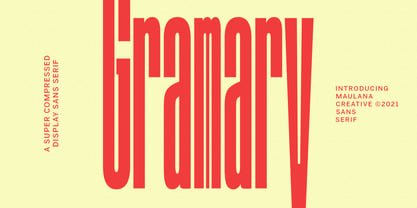 Gramary is a Super Compressed display font. With bold weight stroke, upright and fun character with a bit of ligatures. To give you an extra creative work. Gramary font support multilingual more than 100+ language. This font is good for logo design, Social media, Movie Titles, Books Titles, a short text even a long text letter and good for your secondary text font with script. Make a stunning work with Gramary font. Cheers, MaulanaCreative
 - JennerikInformal by Ingrimayne Type,
$9.95 JennerikInfml is a friendly, casual typeface family that has the appearance of neat hand printing. It began as the italics to Jennerik, but I ended up separating it and giving it a different set of upper-case letters. Although its lower-case letters were designed as italics, it was originally published in 1992 with three weights as upright letters without a slant or skew. The revision of 2020 added the oblique or slanted styles.
 - Secretary Typewriter by Ana's Fonts,
$16.00 Secretary Typewriter is a typewriter font in a lighter, softer weight that makes it perfect for more delicate designs. Use it in long or short texts, in digital collages, branding and packaging, social media posts, logotypes, etc. Secretary Typewriter includes: Contextual alternates. Each letter and number has 3 slight variations that appear "randomly" for extra realism. Underline version of the font. For a grungier look. New! Jumpy version of the font, based on contextual alternates.
 - Anguita Sans by Latinotype,
$29.00 Anguita Sans is a condensed sans serif font family of 8 weights with matching italics- 16 styles in all. The font is characterized by rounded terminals, a large x-height and a condensed structure, which allows you to create a good vertical rhythm. Anguita Sans is a stylish and versatile typeface perfectly suitable for a wide range of applications- especially titles and short lines of text, in both print and digital media.
 - Whiskey State by Mans Greback,
$59.00 Whiskey State strides onto the canvas like a cowboy entering a saloon: Tall, confident, and impossible to ignore. The font boasts an impressive height, stretching upwards with the same vigor as plumes of smoke rising from a smoldering campfire. Every letter stands upright and proud, imbued with the spirit of the Old West, yet exuding a contemporary coolness and innovativity. Its serifs aren't just appendages; they are expressions, giving the typeface its unique, assertive character.
 - Nullomis by Kulturrrno,
$5.00 Nullomis is a modern display font inspired by Soviet Period, anti-utopia and Ancient Rome (I don't know why). It was originally planned to create an ultracondensed headliner, but now it’s a flexible font set with 49 styles or just one Variable Font with all capabilities. Best using for posters, headlines and tags. Extended latin glyph set 7 weights 3 widths Alternate crossbar heights or all of this and more in one Variable font
 - Valdo by Larin Type Co,
$16.00 Valdo is an elegant and contrast serif font family, and a great fashionable solution for your project. It includes upright and Italic style, each of them has eight weights from thin to extrabold. This is a multi-purpose and classic font that is perfect for fashion project, it is contrasted, modern and easy to read. With it, you can create logos, banners, use in advertising, packaging, book covers and magazines, headings, descriptions and much more.
 - King Throne by Nathatype,
$29.00 King Throne is a regal display font that exudes an air of grandeur and elegance. With its high contrast characters and distinctive swinging letter ends, this typeface commands attention and captivates the viewer with its majestic presence. The high contrast design of this font creates a striking visual impact. The stark difference between the thick and thin strokes adds a sense of drama and sophistication to each letter, making them stand out with a commanding presence. The font's weight distribution captures the eye and draws focus to the exquisite details of its letterforms. What sets King Throne apart is the captivating swinging ends of the letters. With a gentle curve and a flourish, these decorative elements add a touch of movement and grace to the font. The swinging letter ends contribute to the font's regal aesthetic, evoking images of royal script and elegant calligraphy. They elevate the font's overall appearance, transforming it into a true symbol of authority and power. For the best legibility you can use it in the bigger text. Enjoy the available features here. Features: Stylistic Sets Ligatures Multilingual Supports PUA Encoded Numerals and Punctuations King Throne fits in headlines, logos, attention-grabbing titles, product packaging, branding materials, editorial layouts and website headers. Find out more ways to use this font by taking a look at the font preview. Thanks for purchasing our fonts. Hopefully, you have a great time using our font. Feel free to contact us anytime for further information or when you have trouble with the font. Thanks a lot and happy designing.
 - Quiroga Serif Pro by TipoType,
$29.00 Quiroga Serif began in 2007 with the name Quadratta Serif. This typography was designed for continuous text, legible at medium and small sizes, with great saving of space, optimized for 6, 8, 10 and 12 points. The morphology is a mix between tradition and innovation; it has a vertical axis, thick serifs, tall x-height, light modulation and a lot of internal space between letters: key to improve legibility at small sizes. Formally, my idea was to make a serif type that had a unique color, this is visible due to the light modulation. This is also complemented with the incorporation of not common, alternative signs. Some parts of the letters that are usually curb or diagonal where made horizontal (for example: a, q, p, etc.), this makes the eye of each character to be wide and unique. The serifs (wedge type) suffered diverse variations during the process. At the begining they where thicker and ended vertically, but this caused a great deal of printing errors. And so we decided to modify them by giving them an angle to avoid visible errors in medium and small sizes. The ch, and ll ligatures where rescued because they are a part of our current spanish alphabet. The historic ligatures and stylistic alternates give different options to users who want different alternatives within a text. The accentuation signs were composed in a middle line above all signs to avoid visual shock. We also gave plenty of importance to small caps numbers, mathematical signs and currency signs so that the could interact well.
 - Castile by Eyad Al-Samman,
$3.00 Castile is a central region of Spain that formed the core of the Kingdom of Castile, under which Spain was united in the 15th and 16th centuries. "Castile" is a Kufic modern Arabic typeface. It is suitable for books' covers, advertisement light boards, and titles in magazines and newspapers. It is very distinctive when used in black and white printout. It decorates colored pages and makes artworks more attractive. This font comes in three different weights. I adore Spain and the historical achievements of the Islamic civilization existed there in the past. By designing "Castile" Typeface, I wanted to refer to the Islamic civilization that Muslims had in Spain and especially in Andalusia. Today the name of Castile survives in two autonomous regions of Spain: Castile-La Mancha (capital city is Toledo) and Castile-Leon (capital city is Valladolid). The main characteristic of "Castile" Typeface is in its modern open-end style for some of its Arabic characters such as "Sad", "Dad", "Seen", "Sheen", "Qaf", "Faa", "Yaa" and others. The shape of the characters' "dot", "dots", and "point" is innovative; a triangle with a semi-circle shape. "Castile" Typeface is suitable for books' covers, advertisement light boards, and titles in magazines and newspapers. Its charactersí modern Kufic styles give the typeface more distinction when it is used also in posters, greeting cards, covers, exhibitionsí signboards and external or internal walls of malls or metroís exits and entrances. It can also be used in titles for Arabic news and advertisements appeared in different Arabic and foreign satellite channels.
 - Rizado Script by Kostic,
$40.00 Rizado Script is a classy one-weight script typeface, made with “dolce vita” in mind. Its high contrast and pointy tone are recalling the fine nib handwriting of a meticulous and decisive person that hasn’t got free time to spare but surely knows how to enjoy his life. No quick and dry strokes, but rather wide, elegant and strong-minded temper that will bring a long-lasting touch to your packaging layouts. Sure, if you are looking for a good fit for some more ephemeral design such as a weekend high-class cocktail promotion, or a wedding invitation – this handy display typeface won’t let you down for a second. If you happen to go to Venice and enjoy their popular Aperitivo, you’ll be asked to choose between three types of bitter-reddish base drink. Rizado will bring you the same amount of pleasure, authority and uniqueness while you pick out one of the three ampersands or other alternate characters. According to the concept of Fellini’s lifestyle, “la dolce vita” is a luxury lifestyle full of cheerful worldly pleasure. But don’t let yourself be fooled by this moto, because Italians are famous for their modesty and sagacity as well. That’s why you’re always supposed to turn on the Contextual Alternates (to activate extra positional forms — isolated, initial and final) and keep your voice down and never set this typeface in all Capital letters. There are 391 total glyphs made to support West European, Central European and South East European languages.
 - Distinct Style by Set Sail Studios,
$14.00 Get stylish with Distinct Style, a fashionable and contemporary pair of signature & sans fonts designed to perfectly compliment one another. With a fast-flowing script font and a two-weight modern sans serif, the Distinct Style duo offers typographic harmony for your professional design projects, including; logos, branding, magazines, blog posts, social media, advertisements & product designs. Distinct Style includes 4 font files, designed to work as perfect companions or simply as strong standalone typefaces; 1. Distinct Style Script • A classy fast-flowing signature font containing upper & lowercase characters, numerals and a large range of punctuation. 2. Distinct Style Script Alt • This is a second version of Distinct Style Script, with a completely new set of upper & lowercase characters. If you wanted to avoid letters looking the same each time to recreate a custom-made style, or try a different word shape, simply switch to this font for an additional layout option. 3. Distinct Style Sans Light • A stylish, modern sans-serif font containing uppercase only characters, numerals and a large range of punctuation. Creates a perfect pairing contrast with the Disticnt Style Script fonts. 3. Distinct Style Sans Bold • A bolder version of the Distinct Style Sans font. Add some contrast to your text by pairing this with the Sans Light version, or use at smaller sizes. Distinct Style Script contains 64 Ligatures, accessible by turning on 'Discretionary Ligatures' with any software supporting OpenType features. Fonts include multilingual support for; English, French, Italian, Spanish, Portuguese, German, Swedish, Norweigen, Danish, Dutch, Finnish, Indonesian, Filipino, Malay.
 - Enchanted Love by VP Creative Shop,
$20.00 Introducing Enchanted Love - Elegant Sans Serif Typeface - 8 weights Enchanted Love is classic yet creative typeface loaded with 8 fonts, alternate and ligature glyphs to make you typography truly unique! Language Support : Belarusian, Bosnian, Bulgarian, Chechen, Macedonian, Russian, Serbian, Afrikaans, Albanian, Asu, Basque, Bemba, Bena, Breton, Chiga, Colognian, Cornish, Czech, Danish, Dutch, Embu, English, Estronian, Faroese, Filipino, Finnish, French, Friulian, Galician, Ganda, German, Gusii, Hungarian, Indonesian, Irish, Italian, Jola-Fonyi, Kabuverdianu, Kalenjin, Kamba, Kikuyu, Kinyarwadna, Litvian, Lithuanian, Lower Sorbian, Luo, Luxembourish, Luyia, Machame, Makhuwa-Meetoo, Makonde, Malagasy, Maltese, Manx, Meru, Morisyen, North Ndebele, Norwegian Bokm ål, Norwegian Nynorsk, Nyankole, Ormo, Polish, Portuguese, Quechua, Romanian, Romansh, Rombo, Rundi, Rwa, Samburu, Sango, Sangu, Scottish Gaelic, Sena, Shambala, Shona, Slovak, Soga, Somali, Spanish, Swahili, Swedish, Swiss German, Taita, Teso, Turkish, Ukrainian, Upper Sorbian, Uzbek (Latin), Volap ük, Vunjo, Walser, Welsh, Western Frisian, Zulu FEATURES Uppercase, lowercase, numeral, punctuation & Symbol -Hairline, Extra light, Light, Regular, Bold, Extra Bold, Black and Heavy versions Cyrillic support ligature glyphs alternates Multilingual support - 95 languages No special software is required to type out the standard characters of the Typeface. How to access alternate glyphs? To access alternate glyphs in Adobe InDesign or Illustrator, choose Window Type & Tables Glyphs In Photoshop, choose Window Glyphs. In the panel that opens, click the Show menu and choose Alternates for Selection. Double-click an alternate's thumbnail to swap them out. Feel free to contact me if you have any questions! Mock ups and backgrounds used are not included. Thank you! Enjoy!
 - Spleeny by Galapagos,
$39.00A gentle breeze on a warm summer's day. A cozy gathering of friends and family around a crackling fire. The sweet aroma of freshly baked cinnamon bread. A slow walk in the autumn woods, light sparkling down through the multi-colored leaves. Billowing white clouds against a stark azur sky, leisurely floating past the tops of palm trees. What do these idyllic scenes all have in common? A: Most people can never find the time to enjoy any of them. B: These are just some of the things you would never try to describe using a crankish font like Spleeny Decaf GD. Just as ITC Fontoon was designed to be used with the many critters that populate the "Toonie" series of fonts, Spleeny Decaf GD was created by Steve Zafarana for use in the balloned dialogue portions of a new panel cartoon feature currently under development. Spleeny Decaf GD is the first completed font in a family that ranges from the jittery san serif Spleeny Espresso GD to the sedate and serifed Spleeny Asleep GD. Each font in the series appears a little more relaxed and staid than its predecessor. None of them however, will find themselves being used for the text of any legal documents. Spleeny Decaf GD is the perfect font to use when the weight of the message is leaning towards the light and jocular side of things. So remember, if your documents are starting to put you on edge, it may be time to switch to decaf. Spleeny Decaf GD that is. - Liszthius-Alkimista - 100% free

- Rippen - Unknown license

- Macaroni Sans by Type Associates,
$30.00 Macaroni Sans evolved from our search for an extended font family consisting of a range of weights in both uprights and obliques, with a contemporary appeal. The desired character was to be sympathetic with a range of high-tech consumer products so a friendly, soft approach was called for. The resulting mix of geometric shape, rounded terminals, subtle italic angle of just six degrees and a few quirky stroke endings met with an enthusiastic response. As its subject product line exhibits brilliant color and imagery, a style was called for that conveyed contemporary appeal and readability but would not compete with the savvy products. We arrived at a clean, modern, sociable look that would suit a broad subject field in either text, semi display or signage. Its simple lines and monoline strokes fit well with logo usage or screaming posters, enhancing letterheads or websites, for foodstuffs to autos, insurance to swimming pools, lawfirms to babyfood. Macaroni Sans is the perfect typeface for branding, logotypes, may even flatter challenging viewing conditions. Rounded types have been around (pardon the pun) for centuries; numerous examples can be seen on old wood type posters, which in a small way prompted the name: in fashion Macaroni was a term used in mid-eighteenth century Europe to describe a dandy, a chap who displayed flamboyance in dress and hairstyle and spoke outlandishly or in an effeminate manner. Hence the term macaronic verse.
 - Leuk by Wilton Foundry,
$29.00 The Dutch word “leuk" translates loosely to English as pleasant, jolly, funny, witty, clever, nice, sweet, kind, nice, amusing, entertaining, and funny. Leuk, the font, is a small, highly legible font with a witty, sociable personality that engages it’s readers. My challenge in designing Leuk was to find a unique feature to set apart the font without losing the fundamentals of type design. In the process of doing so, I created a virtual font “smile and wink” in the “o” upper and lowercase with integrated stencil-connecting strokes within the “a,e, k, z, o, ß” to reveal Leuk’s calligraphic roots. Legible and friendly, Leuk is designed for use in advertising, brochures, promotion, book cover design, packaging, and the like. The Leuk family consists of Leuk Light, Leuk Light Italic, Leuk Regular, Leuk Italic, Leuk Bold, Leuk Bold Italic, Leuk Black, Leuk Black Italic in Opentype format.
 - Sweet Revenge PS by pentagonistudio,
$14.00 Sweet Revenge Is A Modern Family Font Serif Including 8 Font Style. Font Features : Sweet Revenge Thin OTF/TTF/WOFF/WOFF2 Sweet Revenge Extra Light OTF/TTF/WOFF/WOFF2 Sweet Revenge Light OTF/TTF/WOFF/WOFF2 Sweet Revenge Regular OTF/TTF/WOFF/WOFF2 Sweet Revenge Medium OTF/TTF/WOFF/WOFF2 Sweet Revenge Semi Bold OTF/TTF/WOFF/WOFF2 Sweet Revenge Bold OTF/TTF/WOFF/WOFF2 Sweet Revenge Extra Bold OTF/TTF/WOFF/WOFF2 SOFTWARE REQUIREMENTS : Fonts and alternate : No special software required they may be used in any basic program /website apps that allows standard fonts That's it folks! You can go ahead and get cracking :) Follow My Shop For Upcoming Updates Including Additional Glyphs And Language Support. And Please Message Me If You Want Your Language Included or If There Are Any Features or Glyph Requests, Feel Free to Send me A Message. Have a Good Day !
 - Sponger by Mans Greback,
$49.00 Spongy is a rubbery sans-serif typeface. It has round, soft shapes but a stiff and funny character. A quirky, clowny font, Spongy's highlighted cartoon letters looks like levitating balloons. Drawn and created by Mans Greback in 2021, this comic lettering has a satirical style and a light-hearted personality. It is provided as Highlighted, Bold, Light, Solid and Outlined! The combination of these jolly jelly fonts makes for the perfect set of party and birthday types. The font is built with advanced OpenType functionality and has a guaranteed top-notch quality, containing stylistic and contextual alternates, ligatures and more features; all to give you full control and customizability. It has extensive lingual support, covering all Latin-based languages, from North Europe to South Africa, from America to South-East Asia. It contains all characters and symbols you'll ever need, including all punctuation and numbers.
 - Benida by Craft Supply Co,
$20.00 Introduction to Benida Serif Font Benida, an elegant serif font, offers a high-contrast serif design. Its unique style is perfect for various applications. The font’s design is both bold and refined, making it versatile. Ideal for those seeking a mix of elegance and assertiveness, Benida is a great choice. Design Features Benida features high-contrast serifs, adding sophistication to its look. The wedges in the serif are carefully crafted. These elements combine to create a distinct, impactful appearance. The font’s structure balances strength with grace, making it stand out. This balance ensures that Benida is suitable for both formal and creative uses. Usability and Applications Benida’s design makes it highly readable. It’s perfect for headings, logos, and editorial work. The font’s elegant nature suits wedding invitations and upscale branding. Its assertive qualities make it ideal for professional presentations. Benida truly shines in both digital and print formats, demonstrating versatility.
 - Superb by Resistenza,
$49.00 Superb is a new typeface based on real brush pen script and also influenced by lettering shapes from the sixties and seventies. The font includes various swashes with volume and curls.. Superb’s letters got high contrast and some psychedelic curves. This font includes negative figures and a full alphabet set with cut out shapes. Take a look at the Superb Video https://vimeo.com/94062611 It’s designed with high contrast and enhanced legibility regardless its artistic look. Superb’s original letterforms are a beautiful piece of art and elegance no matter you observe them as separate symbols or as words, text paragraphs etc. Their appropriate use could be found therefore in many different aspects – from decorative greeting card, fresh packaging or expressive headline, to artistic t-shirt design, poster or distinguished brand name. Superb has a lot more to show when you access its OpenType features.
 - Mix Sonic by Mix Fonts,
$13.00 MIX SONIC is a font pair inspired by the night sky. You get a round, bouncy and plump decorative san serif in MIX SONIC MOON and an all-uppercase and moon and stars dingbat hybrid in MIX SONIC STAR. The shapes of these glyphs capture the various phases of the moon, and how it lights up eerily lights up the night sky at each phase. MIX SONIC MOON and MIX SONIC STAR are great additions to your font collection. Make it a go-to font for all your projects of the mystic, astrology, magic, zodiac, elemental, witchcraft or divine variety. Use together, or separately, both font sets are sure to delight! MIX SONIC MOON comes with the following glyphs: ABCDEFGHIJKLMNOPQRSTUVWXYZ abcdefghijklmnopqrstuvwxyz 0123456789 !@#$%^&*()`~♥♥✿•· ÷×+−±≈=≠≥≤[]<>:;’”,.\|/?{}“”‘’-–—_… ©®™‹›«»°¹²³ªº¡¿₱¢€£¥½¼¾¶§№† ÁÀÂÄÃÅĂĀĄÆĆĈČÇÐĐÉÈÊËĖĒĘĜĤIÍÌÎÏĪĮĴŁŃÑŇÓÒÔÖÕŌŐ ØŒŔŘŚŜŠŞȘŤȚÚÙÛÜŮŰŬŪŲẂẀŴÝŶŸŹẐŽŻÞẞ áàâäãåăāąæćĉčçðđéèêëėēęĝĥıíìîïīįĵłńñňóòôöõōő øœŕřśŝšşșťțúùûüůűŭūųẃẁŵýŷÿźẑžżþß MIX SONIC STAR comes with the following glyphs: ABCDEFGHIJKLMNOPQRSTUVWXYZ abcdefghijklmnopqrstu-vwxyz 0123456789 !@#$%^&*()`~+= []<>:;’”,.\|/?{}“”‘’-_‹›₱¢€£¥ Fellow witches, enjoy!
 - Magneta by Positype,
$25.00 To describe what inspired Magneta would be to add a little Dwiggins, throw in some Benton with a hint of Austin, wrap it up in a crisp, contemporary package and serve. The skeleton of the family is a Garalde (like my earlier Epic) but with a desire to produce something much more transitional and contemporary, I sought to simplify, simplify, simplify. Cap and ascenders share the same height, the x-height is slightly larger than expected which should make a functional typeface for editorial, headlines or where more visually complex systems are needed. The modulation is much more intentional than historical and creates some interesting interactions between the various weights. There are both Normal and Condensed widths available with 6 different weights and matching italics, small caps, oldstyle figures, swashes, stylistic and discretionary ligatures (that includes some fun majuscule ligatures in the roman styles), there is no lack of typographic goodness for the designer. To add some spice, a set of Decorative Ornaments have been created that include geometric, floral, curvilinear patterns and much more.
 - Magneta Condensed by Positype,
$25.00 To describe what inspired Magneta would be to add a little Dwiggins, throw in some Benton with a hint of Austin, wrap it up in a crisp, contemporary package and serve. The skeleton of the family is a Garalde (like my earlier Epic) but with a desire to produce something much more transitional and contemporary, I sought to simplify, simplify, simplify. Cap and ascenders share the same height, the x-height is slightly larger than expected which should make a functional typeface for editorial, headlines or where more visually complex systems are needed. The modulation is much more intentional than historical and creates some interesting interactions between the various weights. There are both Normal and Condensed widths available with 6 different weights and matching italics, small caps, oldstyle figures, swashes, stylistic and discretionary ligatures (that includes some fun majuscule ligatures in the roman styles), there is no lack of typographic goodness for the designer. To add some spice, a set of Decorative Ornaments have been created that include geometric, floral, curvilinear patterns and much more.
 - Entendre by Wordshape,
$30.00 Entendre is a stately, commanding and handsome sans serif typeface family that pulls reference from Trajan capitals, the history of English calligraphy, and a variety of other sources to summon a sense of warmth, consideration, trust and authority. Entendre spans 22 weights and styles including Regular and Condensed versions. The large x-height and refined characteristics of the family lend the family a sober and sophisticated appearance that is suitable for both print design and on-screen use. Entendre includes Central and Eastern European language support as well as Western European language support, including Greek and Cyrillic. Entendre’s generous x-height and medium-length ascenders and descenders offer pronounced readability, making the family useful for text typesetting both in print and on screen. Within, humanist elements are tempered with monumental construction, making the heavier weights go-tos for display design work. All of the Entendre family of typefaces feature Western, Eastern and Central European language support alongside nuanced Greek and Cyrillic. Entendre pairs well with our rounded sans serif family Elpy, sharing similar proportions and spacing.
 - News Gothic No. 2 by Linotype,
$40.99News Gothic No. 2 is an enhanced version of News Gothic produced by the D. Stempel AG type foundry in 1984. It added more weights to the News Gothic family than were available in other versions, increasing its use in contemporary design and communication. The lighter weights of the original News Gothic were designed by Morris Fuller Benton in 1908 for American Typefounders (ATF). News Gothic typeface is quite similar to Benton's other sans serifs from the early twentieth century, including Franklin Gothic and Lightline Gothic. The bold weights were added to the News Gothic scheme in 1958. The capital letters in News Gothic No. 2, just like those found in News Gothic, have a similar visual width to each other. The lowercase is compact and powerful. These design attributes contributed to Benton's strong handle on the sans serif genre, and for years his types have been popular for newspaper headlines and many other uses. Still a popular presence on the font charts, News Gothic has proven its ability to get the job done right. - Oh, the Kanna-W4 font by Flop Design is like the chameleon of the design world, smoothly blending into its surroundings while still managing to stand out, much like a ninja in a tuxedo at a high scho...
- Sofachrome by Typodermic,
$11.95 Introducing Sofachrome—the epitome of the modern, the pinnacle of the sleek, and the embodiment of high-tech design. Its extended futuristic letterforms will take your project to the next level, while its streamlined, industrial contours will give your work a feeling of durability and strength. This typeface is not just any ordinary typeface. It has been specifically designed to evoke a sense of futuristic innovation, with its bold thick and thin stroke contrast that provides a striking impact. Its sleek and polished finish will leave an unforgettable impression on anyone who lays their eyes on it, making it perfect for designs that demand a high-speed and technical efficiency. With five sleek weights and italics, Sofachrome is versatile enough to use in a variety of projects. Whether you’re creating a high-tech ad campaign, designing a futuristic poster or even creating an eye-catching logo, this typeface will help you achieve the desired impact. Sofachrome is not just a font, it’s a statement—a statement of quality, precision, and sophistication. So why settle for anything less when you can elevate your designs to the next level with Sofachrome? Choose Sofachrome for your next design project and see the future of design unfold before your very eyes. Most Latin-based European writing systems are supported, including the following languages. Afaan Oromo, Afar, Afrikaans, Albanian, Alsatian, Aromanian, Aymara, Bashkir (Latin), Basque, Belarusian (Latin), Bemba, Bikol, Bosnian, Breton, Cape Verdean, Creole, Catalan, Cebuano, Chamorro, Chavacano, Chichewa, Crimean Tatar (Latin), Croatian, Czech, Danish, Dawan, Dholuo, Dutch, English, Estonian, Faroese, Fijian, Filipino, Finnish, French, Frisian, Friulian, Gagauz (Latin), Galician, Ganda, Genoese, German, Greenlandic, Guadeloupean Creole, Haitian Creole, Hawaiian, Hiligaynon, Hungarian, Icelandic, Ilocano, Indonesian, Irish, Italian, Jamaican, Kaqchikel, Karakalpak (Latin), Kashubian, Kikongo, Kinyarwanda, Kirundi, Kurdish (Latin), Latvian, Lithuanian, Lombard, Low Saxon, Luxembourgish, Maasai, Makhuwa, Malay, Maltese, Māori, Moldovan, Montenegrin, Ndebele, Neapolitan, Norwegian, Novial, Occitan, Ossetian (Latin), Papiamento, Piedmontese, Polish, Portuguese, Quechua, Rarotongan, Romanian, Romansh, Sami, Sango, Saramaccan, Sardinian, Scottish Gaelic, Serbian (Latin), Shona, Sicilian, Silesian, Slovak, Slovenian, Somali, Sorbian, Sotho, Spanish, Swahili, Swazi, Swedish, Tagalog, Tahitian, Tetum, Tongan, Tshiluba, Tsonga, Tswana, Tumbuka, Turkish, Turkmen (Latin), Tuvaluan, Uzbek (Latin), Venetian, Vepsian, Võro, Walloon, Waray-Waray, Wayuu, Welsh, Wolof, Xhosa, Yapese, Zapotec Zulu and Zuni.
 - Sofia Pro Condensed by Mostardesign,
$25.00 A geometric sans for space saving typography Sofia Pro Condensed is the condensed version of the popular Sofia Pro font family. This typeface was completely drawn with the look of the original normal-width version. Sofia Pro Condensed contains 16 styles from Ultra Light to Black (Ultra Light, Extra Light, Light, Regular, Medium, Semi Bold, Bold and Black) with an alternative glyph set to improve its use in different graphic contexts. This typeface will be suitable for many projects such as titles, subtitles, long editorials, brand building, mobile applications, ebooks, websites or company signage. Its contemporary aspect and its condensed style will also be suitable for editorial projects who needs to save space. Sofia Pro Condensed also has many powerful OpenType features such as case sensitivite forms, old style and tabular figures, ligatures, capital spacing, fractions and alternative characters to give personality to graphic design projects. Designed also for complex editorial content, this typeface has a powerful home kerning system called “Pro Kerning”. With more than 1500 pairs of glyphs in many languages, Pro Kerning optimizes headlines, subtitles, texts as well as long paragraphs in real time. In addition to all the features of its kind, Sofia Pro Condensed is part of a very complete “type system” with style variants such as the normal-width-version (Sofia Pro), the soft version (Sofia Soft) or the rough version (Sofia Rough). With all these typefaces, you have more than 40 styles to make your own vibrant and professional graphics or web creations while maintaining consistency in your creations. The OpenType features of Sofia Pro Condensed have an extended character set to support Central and Eastern European as well as Western European languages, Cyrillic and Greek. For more info about the powerful opentype features and the complete character map of Sofia Pro Condensed, download the PDF specimen to get a detailed view of all features.
 - Evoque Text by Monotype,
$40.00 Evoque Text is a humanist serif type family specifically designed for a comfortable reading experience. This has been achieved by optically adjusting the regular weights from my original Evoque family (released November 2021). You will notice a significantly reduced x-height and longer ascenders and descenders, complemented by adjustments to weight and spacing. This makes Evoque Text a perfect choice for any long passages of text. All OpenType features have been retained from Evoque. A plethora of swash alternates and discretionary ligatures enhance Evoque Text, giving you the opportunity to embellish your typography. Simply activate Stylistic Sets to start adding these flourishes to your text. Other useful features include Small Caps at the click of a button, and Old Style Figures are an option to the default proportional figure style. There are 14 fonts altogether over 7 weights in roman and italic, you can also avail of two variable fonts which allow you to fine tune the weight to your exact liking. Evoque Text has an extensive character set (900+ glyphs) that covers every Latin European language. Key features: 7 weights in both roman and italic 80 Alternates 26 Ligatures Small Caps Variable fonts included with full family Full European character set (Latin only) 900+ glyphs per font.
 - Hontana - Personal use only

- Futurex Deco - Unknown license

- Futurex Embossed - Unknown license

- Futurex Engraved - Unknown license

- As of my last update in April 2023, there isn't a widely recognized or specific font named "Paramount" that has established itself within the typography community or the broader design world. However...
- PF DIN Serif by Parachute,
$36.00 DIN Serif: Specimen Manual PDF The DIN Type System: A Comparison Table This is the first ever release of a true serif companion for the popular DIN typeface. DIN Serif originated in a custom project for a watchmaking journal which required a modern serif to work in unison and match the inherent simplicity of DIN. As a result, a solid, confident and well-balanced typeface was developed which is simple and neutral enough when set at small sizes, but sturdy and powerful when set at heavier weights and bigger sizes. It utilizes the skeleton of the original DIN and retains its basic proportions such as x-height, caps height and descenders, whereas ascenders were slightly increased. DIN Serif makes no attempt to impress with ephemeral nifty details on individual letters, but instead it concentrates on a few modern, functional and everlasting novelties which express an overall distinct quality on the page and set it apart from most classic romans. This is a low contrast typeface with vertical axis and squarish form which brings out a balance between simplicity and legibility. Its narrow proportions offer economy of space which is critical for newspaper body text and headlines. At small sizes the text has an even texture, it is comfortable and highly readable. The serifs are narrow at heavy weights and when tight typesetting is applied at large sizes, the heavier weights become ideal for headlines. DIN Serif was inspired by late 19th century Egyptian and earlier transitional roman faces. Bracketed serifs were placed on the upper part of the letterforms (this is where we mostly concentrate our attention when we read) whereas small clean square serifs were placed on and under the baseline to simplify the letterforms. In order to reduce visual tension at the joins and make reading smooth and comfortable, a slight hint of bracketed serif was added at the joins in the form of a subtle angular tapered serif, which softens the harsh angularity. These angular tapered serifs tend to disappear at smaller sizes (or smooth out the joins) but stand out at bigger sizes exuding a strong, modern and energetic personality. What started out as a custom 2 weight family, it has developed into a full scale superfamily with 10 styles from Regular to ExtraBlack along with their italics. Additional features were added such as small caps, alternate letters and numbers as well as numerous symbols for branding, signage and publishing. All weights were meticulously hinted for excellent display performance on the web. Finally, DIN Serif supports more that 100 languages such as those based on the Latin, Greek and Cyrillic alphabet.
 - REMARK - Personal use only

- So Narrow - Unknown license


