6,021 search results
(0.022 seconds)
- Space Rave, crafted by the imaginative Darrell Flood, is a font that doesn't just communicate; it invites you into a universe where typography meets the frontier of imagination. Its design principles...
- Ah, FellFel, the font! If fonts were characters at a grand dinner party, FellFel would be that intriguing guest who captures attention the moment they step through the door. You might not find FellFe...
- The "Whatever" font by AEnigma is a unique and expressive typeface that embodies a blend of casual flair and creative whimsy. Created by the British font designer Brian Kent, the talent behind AEnigm...
- Imagine a font that decided one day to get out of bed, stretch its limbs to the sky, and perform an impromptu dance routine. That's Kicking Limos for you. Created by the typographic maestro Ray Larab...
- As of my last knowledge update in April 2023, the font named OXIDISASTER, crafted by Billy Argel, embodies a distinct artistic flair and unique character that sets it apart in the realm of typography...
- Tertius by Scholtz Fonts,
$21.00 Tertius, with its high ascenders and clubbed serifs, is a modern interpretation of the classic Carolingian style (7th - 9th centuries AD). There was no capital form in the Carolinian hand and Roman square capitals were originally used with it. The Carolingian hand began, after a while, to develop more cursive tendencies as people looked for a way to speed up the writing process. I have “capitalized” on this trend and have devised an appropriate and dramatic set of flowing capitals for this family. With its elegant swashes and bold letter shapes, Tertius embodies the romance of medieval life, of knights, castles, and chivalry. Tertius comes in four styles:- -- Regular: with elegant, smoothly penned characters; -- Crenellated: written with a scratchy pen over rough parchment -- many drops of ink and blotches have been left on the parchment (“Crenellated” means battlements -- the rough protrusions on the top of castle walls); and -- Romantic: the capitals have been loosely overwritten generating a contemporary version of illuminated capitals. -- Illuminated: richly decorated illuminated capitals for use with Tertius Regular (28 characters) All fonts have been carefully crafted, letterspaced and kerned and contain full character sets of 237 characters.
 - Northills by LetterStock,
$25.00 Northills Font This pair was inspired by the great lettering poster design that i saw on some coffee shop, It was crafted by hand specially to add natural handmade feeling in its brand identity than i make it clean with pentool. Opentype features Northills font has 215 character set Northills is very good looking in labels, retro logo design, product packaging, invitations, advertising and others. Rough lettering is always have a good retro vibes and give your design authentic and good looking, it’s perfect for branding or even poster design. If you looking for rough retro font for your logo or even lettering design, this font is a great choice to make your design authentic and good looking This fonts works with folowing languages: Afrikaans, Albanian, Asu, Basque, Bemba, Bena, Chiga, Cornish, Danish, English, Estonian, Filipino, Finnish, French, Friulian, Galician, Gusii, Indonesian, Irish, Italian, Kabuverdianu, Kalenjin, Kinyarwanda, Low German, Luo, Luxembourgish, Luyia, Machame, Makhuwa-Meetto, Makonde, Malagasy, Malay, Manx, Morisyen, North Ndebele, Norwegian Bokmål, Norwegian Nynorsk, Nyankole, Oromo, Portuguese, Romansh, Rombo, Rundi, Rwa, Samburu, Sango, Sangu, Scottish Gaelic, Sena, Shambala, Shona, Soga, Somali, Spanish, Swahili, Swedish, Swiss German, Taita, Teso, Vunjo, Zulu Thank you for using this font. LS
 - Pliego by Huy!Fonts,
$35.00 Pliego is a textface designed to offer a comfortable continuous reading, with humanist proportions, an even texture, and informal calligraphic details noticeable only at big sizes, that gives it a contemporary feeling. Pliego has been named after Pliegos de Cordel, the Spanish word for the popular books that were common during the XVI, XVII and XVIII centuries. These were rough, cheap books that basically consisted in a folded sheet attached to a string, hence the name. Their content was varied, from popular tales to ballads and songs, but also crimes and mysteries. They were cheaply made, roughly printed and bound. The name Pliego evokes the idea of a rough look, angular edges, informal taste, but classical look. To cover today’s needs, Pliego includes five weights with matching italics. Designed and engineered for continuous reading, the Book, Regular and Medium weights will perform at their best under 14 points. However, don’t be scared to use for headlines and titles: because of its quirky details and calligraphic flavour, Pliego’s personality is accentuated when enlarged. With an extensive Latin character set, Pliego covers a wide amount of Latin-based languages, including Latin Plus encoding and Vietnamese support.
 - Wood Type DIY by TypoGraphicDesign,
$19.00 The typeface Wood Type DIY is designed from 2016–2022 for the font foundry Typo Graphic Design by Manuel Viergutz. The display font based on the original wood letter from flea market. The font started from 50 wood letters (analog) and was finally digitalize and extended to 300+ glyphs (digital). 4 font-styles (Rough, Clean, Mix, Impact) with 320 glyphs incl. decorative extras like icons, arrows, dingbats, emojis, symbols, geometric shapes (type the word #LOVE for ❤️ or #SMILE for 🙂 as OpenType-Feature dlig) and stylistic alternates (9 stylistic sets). For use in logos, magazines, posters, advertisement plus as webfont for decorative headlines. The font works best for display size. Have fun with this font & use the DEMO-FONT (with reduced glyph-set) FOR FREE! Font Specifications ■ Font Name: Wood Type DIY ■ Font Styles: 4 (Rough, Clean, Mix, Impact) + DEMO (with reduced glyph-set) ■ Font Category: Display for headline size ■ Font Format:.otf (Mac + Win, for Print) + .woff (for Web) ■ Glyph Set: 320 glyphs incl. extras like icons (decorative extras like arrows, dingbats, emojis, symbols) ■ Design Date: 2016–2022 ■ Type Designer: Manuel Viergutz
 - Rapsed Vintage by Craft Supply Co,
$20.00 Introduction to Rapsed Vintage – Stamp Font Rapsed – Vintage Font is a unique serif font, embodying a retro and vintage feel. It features a grunge, stamped, rough appearance, ideal for nostalgic designs. This font captures the essence of a bygone era, making it perfect for projects seeking a classic display. Design and Texture Rapsed’s design boasts large, prominent serifs, giving it a bold and distinct look. Its textured, rough edges simulate a stamped effect, adding an authentic vintage character. This grunge aesthetic is not only eye-catching but also adds depth to the font, enhancing its retro appeal. Versatility in Use Rapsed is versatile for various design applications, from branding to poster creation. Its vintage style is perfect for thematic restaurants, event flyers, and historical projects. Additionally, its distinct appearance makes it suitable for book covers and merchandise that require a touch of nostalgia. Accessibility and Appeal Designed to be user-friendly, Rapsed appeals to a wide range of audiences. Its simplicity in design ensures readability, while its unique character captures interest. This font is a valuable asset for designers aiming to infuse a vintage feel in their work, bridging the gap between past and present design trends.
 - Abraham by Sabrcreative,
$15.00 Discover the versatile and stylish Abraham Font Family at MyFont. With 8 unique styles, including Regular, Italic, Rough, Stamp, Shadow, Outline, and Rounded, this modern sans-serif modular family offers endless creative possibilities. Perfect for a wide range of design projects, Abraham is suitable for logos, greeting cards, quotes, posters, branding, business cards, stationary, blog headers, and more. Each style of the Abraham Font Family features both uppercase and lowercase letters, ensuring flexibility in your designs. Additionally, it includes stylistic alternates, standard ligatures, and numerals & punctuations in OpenType format for seamless typography. Enhance your artwork with the multilingual support of the Abraham Font Family, which includes a wide range of accents and characters to accommodate various languages. The font family is PUA encoded, allowing for easy access and usage across different platforms and software. With the Abraham Font Family, you'll receive the following fonts: Abraham Regular, Abraham Regular Italic, Abraham Outline, Abraham Outline Italic, Abraham Rough, Abraham Stamp, Abraham Shadow, and Abraham Rounded. Whether you're designing greeting cards, package designs, brand identities, or art projects, Abraham Font Family will add a touch of sophistication and creativity to your work.
 - Capsule by Eclectotype,
$40.00 Capsule is a reverse-stress, high-contrast, rounded sans-serif font with two distinct personalities. An all-caps face, there are however variations of some letters in the lowercase slots. The lowercase variants are more playful, with more bulbous elements that riff on phototype faces like Amelia and Data 70, but all can work together and be mixed and matched to your heart's content. Capsule boasts a bunch of esoteric discretionary ligatures to play around with, and stylistic alternates for 4, 7 and £. The language support is extensive enough to set essays in most Latin-based languages, even though that's the last thing you should be doing with this font! Capsule should be set large. The fit is tight and the kerning is aggressive. It's not what you'd call a workhorse, but Capsule is an All-Caps you'll (see what I did there?!) want to use for impactful headlines, cutting edge logos and post-modern layouts.
 - Very Frank by Up Up Creative,
$16.00 Meet Very Frank, a font that won’t feed you any lines or tell you any lies. Straight and tall and lacking in all but the subtlest softening details (look at the leg on that uppercase K, though…). Very Frank is a condensed sans serif display font (in regular and italic) with tall, straightforward lines and subtle curves to soften things up. It includes a ton of standard and discretionary ligatures and two stylistic sets to spice things up and add some fun. It's perfect for headlines, editorial design, monograms, branding, logos, poster design, and more. Very Frank includes approximately 540 glyphs and more than 75 standard and discretionary ligatures. Additional OpenType features include character variants, stylistic sets, and multilingual support (including multiple currency symbols). The OpenType features can be very easily accessed by using OpenType-savvy programs such as Adobe Illustrator and Adobe InDesign. (To access these awesome features in Microsoft Word, you'll need to get comfortable with the advanced tab of Word's font menu.)
 - Warna by IKIIKOWRK,
$19.00 Proudly present Warna - Bohemian Font, created by ikiiko. With a design that is both fun and retro-inspired, Warna perfectly embodies that character. The font in question moves to the beat of your imagination. Each figure has a distinctive, hand-crafted quality, as though they were lovingly and enthusiastically created on a worn-out journal from the 1960s. "Warna" is more than simply a typeface; it's a lively storyteller who tells old tales with a contemporary twist. Its vibrant and youthful appeal makes it ideal for branding with a bohemian or retro aesthetic. The letters serve as your artistic friends, encouraging you to express your ideas with bold strokes that evoke the liberation of a joyful party. This font is very suitable for making a bohomian stuff, vintage boho brand, poster, magazine layout, fashion design, quotes, or simply as a stylish text overlay to any background image. What's Included? Uppercase & Lowercase Numbers & Punctuation Multilingual Support Works on PC & Mac
 - Eurobrush by profonts,
$41.99 Eurobrush Pro is a new handwriting script designed by German type designer Ralph M. Unger. He produced not only the standard Western character complement, but added all of the Eastern European Latin glyphs and, on top of that, even the complete Cyrillic characters. Born and grown up in Th�ringen, former East Germany, Unger has a fair knowledge of Polish and also Russian (Cyrillic). Eurobrush Pro is a very beautiful, casual, informal and modern handwriting in `brush-style of a contemporary type designer. Even though a digitized handwriting, it keeps a very natural and pleasant look, at the same time being generous and well-readable. The individual characters combine quite easily and perfectly with no need for extra variants (although Unger included a number of ligatures). Eurobrush Pro is well-suited for plenty of applications, e.g. personal correspondence, invitations, greeting cards, headlines etc. Eurobrush Pro is supplied in the complete Latin character set (West + East) including ligatures, plus Cyrillic.
 - Saracen by Hoefler & Co.,
$51.99 Saracen is the Latin (wedge serif) member of The Proteus Project, a collection of four interchangeable type families designed in different nineteenth century styles. The Saracen typeface was designed by Jonathan Hoefler in 1992. Saracen is a design in the ‘latin’ style, characterized by wedge-shaped serifs, a genus of type that emerged in the mid-nineteenth century. A part of The Proteus Project, the typographic theme-and-variations based on related Regency styles, Saracen was created for Rolling Stone, in whose pages the typeface first appeared in 1993 . From the desk of the designer: Though the wedge serif printing type is a nineteenth century innovation, Saracen does not resemble any font from this era. It’s mysterious that typefounders of the Victorian age who sought the extreme and fanciful in their work — exploring all manner of serif treatments, and creating extra-condensed and super-expanded designs — never made a latin font of this straightforward proportion. <
 - Roundup by Ingrimayne Type,
$10.00 The Roundup family was inspired by fonts from the late 19th century, though it is not based on any one of them. Roundup-Caps was the first of the group to be constructed. It has two sets of upper-case letters that have minor differences. It has reverse contrast, that is, the verticals are thinner than the horizontals. Unlike most of the "Old-West" fonts with reverse contrast, the serifs are not square but have an odd, rounded shape. Roundup-Regular replaced the second set of caps with lower-case letters. A bold style strengthens the vertical elements so that it no longer has reverse contrast. Both the regular and bold styles have matching oblique styles. Finally, there is a hollow version with a shadow to the lower right. This shadowed style has had its inside taken out, creating RoundUp-ShadowInside. The spacing is the same as RoundUpShadowed so it can be layered over RoundUpShadowed to easily create two-colored lettering.
 - OCR B by Linotype,
$40.99OCR A and OCR B are standardized, monospaced fonts designed for Optical Character Recognition" on electronic devices. OCR A was developed to meet the standards set by the American National Standards Institute in 1966 for the processing of documents by banks, credit card companies and similar businesses. This font was intended to be "read" by scanning devices, and not necessarily by humans. However, because of its "techno" look, it has been re-discovered for advertising and display graphics. OCR B was designed in 1968 by Adrian Frutiger to meet the standards of the European Computer Manufacturer's Association. It was intended for use on products that were to be scanned by electronic devices as well as read by humans. OCR B was made a world standard in 1973, and is more legible to human eyes than most other OCR fonts. Though less appealingly geeky than OCR A, the OCR B version also has a distinctive technical appearance that makes it a hit with graphic designers. - Hadriano by Monotype,
$29.99When traveling in Paris, American designer Frederic W. Goudy did a rubbing of a second century marble inscription he found in the Louvre. After ruminating on these letterforms for several years, he drew a titling typeface in 1918, all around the letters P, R, and E. He called the new face Hadriano" as that name was in the original inscription. Robert Wiebking cut the matrices, and the Continental Typefounders Association released the font. Goudy designed a lowercase at the request of Monotype in 1930, though he didn't really like the idea of adding lowercase to an inscriptional letterform. The lowercase looks much like some of Goudy's other Roman faces. Compugraphic added more weights in the late 1970s, and made the shapes more cohesive. Hadriano has nicely cupped serifs and sturdy, generous body shapes. Distinctive individual letters include the cap A and Q, and the lowercase e, g, and z. Hadriano™ is an excellent choice for impressive headings and vigorous display lines." - Aviano Silk by insigne,
$22.00 A premier product from insigne, the powerful Aviano redefines its classic lines for the contemporary elegance of Aviano Silk. This modern development of a timeless font, part of insigne's annual tradition in adding to the Aviano family, was elected the clear leader in a poll of insigne design's social media followers. Aviano Silk refers to the smooth flowing feel that the negative space gives the font. This particular example is sort of a hybrid between the stencil and a centerline. It has a certain amount of velocity to it. Extended characters lend formality and a sense of wealth and power. Due to the modifications required for the new look, the Silk family cannot work as an overlay for Aviano, though it pairs nicely with it. There are also 12 Aviano families that work well with Silk. Aviano Silk is particularly suited to high-end luxury applications and especially branding projects. Use Aviano Silk to lend refinement and luxurious elegance to your design.
 - 1863 Gettysburg by GLC,
$38.00 This script font was inspired by a lot of autographs, notes and drafts, written by President Abraham Lincoln, mainly the Gettysburg address, first draft and copies, but also the emancipation proclamation. It is an attempt to offer a typical manual script from this American period, not to propose the exact writing from A. Lincoln himself. This font is a little fat and monotone, maybe Abraham Lincoln used a smooth or rounded pen, but some letters I have consulted were written obviously with a sharp one, so, in the future, I will certainly produce a slim version of this font. It is used as variously as web-site titles, posters and fliers design or greeting cards, all various sorts of presentations, menus, certificates, letters. This font supports enlargement as well as small size, though the original size was about 18 to 24 pts. When printed, it remain perfectly legible from 10 to 12 pts.
 - Higery by Craft Supply Co,
$20.00 Higery – Serif Typeface: Uniquely Engaging Distinctive Tapered Details: Higery – Serif Typeface stands out with its unique tapered serifs. These details add a sophisticated charm. This font is ideal for captivating visual displays. Perfect for Visual Displays: Higery’s elegant tapering makes it perfect for eye-catching displays. It excels in adding an artistic touch to posters, ads, and more. Its uniqueness ensures your design stands out. Versatility in Design: Though unique, Higery remains versatile for various design needs. It seamlessly fits into digital and print media. This adaptability makes it a valuable tool for designers. Ease of Use for All: Higery is designed with user-friendliness in mind. It’s easy to use for designers of all skill levels. This approachability makes it a popular choice in the design community. Elevating Aesthetic Appeal: Incorporating Higery into your projects can significantly enhance their aesthetic appeal. Its distinctive serifs and elegant design elevate any content. Higery isn’t just a typeface; it’s a visual experience.
 - Size by SD Fonts,
$34.00 Retro style is hip, so are early 20th century poster fonts. Size is based on these extra condensed letter forms. In the 19th century the need to communicate commercial messages on limited poster space brought up extremely condensed fonts creating a new typographical look. Since not really legible in small sizes these fonts nearly disappeared with the change in the commercial communication in the 20th century. For a couple of years now, these extra condensed fonts have a revival copying the exact historical appearance of its predecessors. Size, though also seeking the inspiration in the historical draft, furthermore aims to interpret this compressed look in a more vivid way by not closing in on the open counters of the round letters, but having its stroke endings slightly curved. Since other characters are defined by straight strokes, Size displays a look more vital and candid, but still distinct, compared to its historical predecessors.
 - Capitolina by Typefolio,
$39.00 Capitolina is a family of 10 typefaces with a contemporary design style, based on different historical models. The original shape of serifs was a reference to 19th century’s Clarendon types though this inspiration remains as a subtle feature of the final design. Even subtler are the calligraphic influences, better noticed in the italics. The result is a set of typefaces that look more ‘constructed’ than ‘written’, referring to a rationalist style. However, it has a distinct approach to the aesthetic treatment of typographic forms that resembles the humanist tradition. Available in five weights of roman and italic types, Capitolina has a wide glyph palette that contains 800 glyphs in each font. Besides supporting basic Latin, western, central, and southeastern European sets, it has several OpenType features, such as case-sensitive forms, small capitals, ligatures, localized forms, number forms, fractions and more. Capitolina is, therefore, a great choice for projects in editorial design and other related applications.
 - Hipster Script Pro by Sudtipos,
$79.00 Hipster Script is another of my habitual attempts at trying to reduce the divide between manual and digital. In this case, I try to articulate brush lettering, try to get the computer to emulate continuous painting. The process wasn't that different from my work with Feel Script's shot at computerized commercial lettering, though here we have a more casual contrast, rather than the high seriousness of the Copperplate script. Swashes, alternates, ligatures — too many of them, all trying to make the interplay between the tool’s two extreme widths remain faithful to hand movement subtleties. I also toyed with ligatures containing apostrophes, something I've never seen before. With this typeface I think I've become more balanced in uniting the spontaneity of post-war ad lettering with the current trends in illustration and design. Hipster Script received a Judge’s choice Certificate of Excellence at the Type Directors of New York and was selected to be part of the Bienal Tipos Latinos 2012.
 - Bikini Season by Los Andes,
$37.00 Summer has come! Boho girl is going on her beach vacation. Relaxed, spontaneous, feminine, irreverent, though. Like a girl with a Gipsy soul, she just grabs her Bikini and turns away! This is the new font duo by the couple Coto and Luciano. Bikini includes a sans version, based on the proportion and structure of Roman capitals, but with a contemporary flavor and a clean style that give the typeface a chic touch. The other version of this font duo is a modern calligraphy script of handmade style. The mix is just perfect: opposites attract creating a very interesting counterpoint. Can you guess who is the designer behind each style? This font duo is intended to be used for posters, labelling or branding. The sans and script styles add visual hierarchy when composing text. Feel the fresh free spirit of its OpenType features and ornaments! Please see User Guide Every season is Bikini season!
 - OCR A Extended by Monotype,
$40.99OCR A and OCR B are standardized, monospaced fonts designed for Optical Character Recognition" on electronic devices. OCR A was developed to meet the standards set by the American National Standards Institute in 1966 for the processing of documents by banks, credit card companies and similar businesses. This font was intended to be "read" by scanning devices, and not necessarily by humans. However, because of its "techno" look, it has been re-discovered for advertising and display graphics. OCR B was designed in 1968 by Adrian Frutiger to meet the standards of the European Computer Manufacturer's Association. It was intended for use on products that were to be scanned by electronic devices as well as read by humans. OCR B was made a world standard in 1973, and is more legible to human eyes than most other OCR fonts. Though less appealingly geeky than OCR A, the OCR B version also has a distinctive technical appearance that makes it a hit with graphic designers. - Bodoni Classic Cyrillic by Wiescher Design,
$55.00 One day shortly after Christmas 2004, the art-director of Vogue Moscow called me. Would I maybe make a Cyrillic version of my Bodoni Classic Text typeface? Well, since I had been thinking about doing it since a long time, this was the perfect reason to finally do it. It was not an easy venture, since I do not have the faintest idea of Russian but, together with those nice people in Russia and a fellow helpful type designer in Kiev, I managed. I did an enormous amount of kerning, thanks to the help of the Moscow Vogue office. Here the fonts are now for all of you: five text cuts, plus one standard roman cut that has no Cyrillic letters but an extra set of medieval numbers. At Vogue they are happy with the fonts, even though I did not quite adhere to Bodoni's originals in this case. Nastarowje (or whatever you say in Russia), Gert Wiescher
 - Dopestyle, a captivating font crafted by the creative minds at Octotype, exudes a bold and dynamic character that's hard to ignore. This font showcases a graffiti-inspired design, making it a standou...
- TT Milks by TypeType,
$29.00 TT Milks useful links: Specimen | Graphic presentation | Customization options About TT Milks: The collection of scripts and wonderful decorative typefaces. Initially the idea for TT Milks was to create a collection of fonts to be used for packaging and branding of dairy products. While working on the initial idea, we've tested all possible glyph variations, which resulted in a large decorative designer font family. Thanks to a variety of elements, TT Milks collection has exceeded its initial idea and now offers an unlimited application range. TT Milks type collection includes several subfamilies and consists of 26 typefaces: TT Milks Script subfamily is a satellite to the basic typefaces and features 5 weights. Every typeface of the TT Milks Script subfamily consists of 801 glyphs and supports a lot of OT features: ordn, frac, case, sups, sinf, numr, dnom, tnum, onum, pnum, liga, calt. TT Milks Casual Script consists of two script faces with a different degree of roughness. In TT Milks Casual we've collected 6 typefaces—the unique Black called 900 in three degrees of roughness, and the Bold called 700 featuring three degrees of roughness as well. TT Milks Casual Shadow is a version with broader letter setting and shadow effects. There's a clean shadowed version, three variants of rough typefaces with shadows, and a rough shadowed inline typeface—5 typefaces in total. TT Milks Casual Pie is a special set of typefaces which can be easily combined with each other using different layers. The set of the subfamily includes two basic typefaces—black and inline, and also features a typeface with a clean shadow, a shadowed inline typeface and line typeface. TT Milks Outline completes the collection. It consists of a total of 3 amusing super-display typefaces—outline, outline shadow, and a cow pelt patterned typeface. All typefaces belonging to TT Milks Casual and TT Milks Outline subfamilies contain uppercase letters only, and support tabular numbers and case sensitivity. TT Milks language support: Acehnese, Afar, Albanian, Alsatian, Aragonese, Arumanian, Asu, Aymara, Banjar, Basque, Belarusian (cyr), Bemba, Bena, Betawi, Bislama, Boholano, Bosnian (cyr), Bosnian (lat), Breton, Bulgarian (cyr), Cebuano, Chamorro, Chiga, Colognian, Cornish, Corsican, Cree, Croatian, Czech, Danish, Embu, English, Erzya, Estonian, Faroese, Fijian, Filipino, Finnish, French, Friulian, Gaelic, Gagauz (lat), Galician, German, Gusii, Haitian Creole, Hawaiian, Hiri Motu, Hungarian, Icelandic, Ilocano, Indonesian, Innu-aimun, Interlingua, Irish, Italian, Javanese, Judaeo-Spanish, Judaeo-Spanish, Kalenjin, Karachay-Balkar (lat), Karaim (lat), Karakalpak (lat), Kashubian, Khasi, Khvarshi, Kinyarwanda, Kirundi, Kongo, Kumyk, Kurdish (lat), Ladin, Latvian, Laz, Leonese, Lithuanian, Luganda, Luo, Luxembourgish, Luyia, Macedonian, Machame, Makhuwa-Meetto, Makonde, Malay, Manx, Maori, Mauritian Creole, Minangkabau, Moldavian (lat), Montenegrin (lat), Mordvin-moksha, Morisyen, Nahuatl, Nauruan, Ndebele, Nias, Nogai, Norwegian, Nyankole, Occitan, Oromo, Palauan, Polish, Portuguese, Quechua, Rheto-Romance, Rohingya, Romanian, Romansh, Rombo, Rundi, Russian, Rusyn, Rwa, Salar, Samburu, Samoan, Sango, Sangu, Scots, Sena, Serbian (cyr), Serbian (lat), Seychellois Creole, Shambala, Shona, Slovak, Slovenian, Soga, Somali, Sorbian, Sotho, Spanish, Sundanese, Swahili, Swazi, Swedish, Swiss German, Swiss German, Tagalog, Tahitian, Taita, Tatar, Tetum, Tok Pisin, Tongan, Tsonga, Tswana, Turkish, Turkmen (lat), Ukrainian, Uyghur, Vepsian, Volapük, Võro, Vunjo, Xhosa, Zaza, Zulu.
 - PM Orchid by Paper Moon Type & Graphic Supply,
$15.00 PM Orchid is a soft, flowing Art Nouveau typeface with tons of ligatures and alternates. It comes in two handy styles - clean and printed. PM Orchid Clean has sharp, clean edges with slightly rounded corners. It is designed to be used with projects that require a clean edge like wedding invitations and modern layouts. PM Orchid Printed has the feeling of vintage letterpress printing. It's slightly rough distressed edges allow it to fit in with vintage style designs that have more tactile design elements.
 - Basquiat Irregular by Cuda Wianki,
$29.00 Basquiat Irregular is a font inspired by graffitti and children's writing. Contains 3 alternative characters for each letter, multilanguage support including cyryllic. It's perfect for creating artistic publications, writing quotes and many other designs. The family also has two fonts with frames, lines and ornaments. Its apperance is rough, hand painted and casual. Perfect for music and street art designs. Frames and lines are created by typing uppercase letters for starting or ending frame or creating an arrow and lowercase letters for typing lines.
 - Coffee Morning by me55enjah,
$10.00 Handmade sans serif with rugged and imperfect edges shapes. Coffee Morning with Milk has rounded edges bring a vintage look and alternate character make it more stylish. And Coffee Morning Sans has rough stroke, imperfect shapes, make this typeface has its own taste, like coffee in the morning, raw and strong. * COFFEE MORNING WITH MILK features: All Caps, small caps, numeral, punctuation, alternate characters & ligatures. * COFFEE MORNING SANS features: All Caps, numeral, and punctuation. Have a wonderful day with a cup of coffee in the morning :)
 - FF Brokenscript by FontFont,
$41.99 Dutch type designer Just van Rossum created this blackletter FontFont in 1991. The family contains 2 weights: Bold and Condensed and is ideally suited for advertising and packaging, festive occasions, editorial and publishing, logo, branding and creative industries as well as poster and billboards. FF Brokenscript provides advanced typographical support with features such as ligatures, alternate characters, case-sensitive forms, and stylistic alternates. It comes with proportional oldstyle figures. This FontFont is a member of the FF Brokenscript super family, which also includes FF Brokenscript Rough.
 - Street Rush by Gleb Guralnyk,
$13.00 Introdusing a creative font set Street Rush. It's a stencil typeface with grunge and clean variations. Grunge version has a rough damaged shape with imitation of a melting paint. Clean font suits better for smaller text without noisy details. Street rush font will perfectly fit for T-shirt print with different lettering compositions. This font has west european multilingual support (check out all available characters on the screenshots). Grunge font has a set of alternative characters for english alphabet to avoid repetetive noise effect.
 - Inoxida by Sudtipos,
$59.00 Inoxida is Oxida's softer and more graceful sister. While Oxida has become quite the common sighting on the packaging of vegetables and organic foods, Inoxida now comes to fit the bill for food packaging that can benefit from more sophisticated script lettering. Inoxida is not just a softening of Oxida’s slightly rough edges. It is a complete reworking of the way its letters were constructed, and the introduction of a smoother size relationship between uppercase and lowercase. Designed by Koziupa and digitized by Ale Paul.
 - Fedtspiller by PizzaDude.dk,
$16.00 Fedtspiller is danish and the definition could be someone who plays with a low risk and defensive (at least when talking about soccer) Although there is a slight negative feeling to that, I remember several guys when playing soccer as a kid who benefitted as playing as a "Fedtspiller" :) Anyway, Fedtspiller is a legible comic/text font with softened edges. Comes in both Regular, Scribble and Rough - all of these versions include Contextual Alternates (4 different versions of each lowercase letter) and multilingual support
 - Trend by Latinotype,
$20.00 Trend , Trend Hand Made & Trend Rough is a font made of layers, taking as a basis a sans and a slab font. It is the result of observation, search and study of the last global trends. Trend tries to capture the aesthetics of fashion or even fashion itself, integrating elements of a very popular and current trend. It is a typeface designed to be used without need to add anything external to it, because it has all components required for this. Trend is trending.
 - Sistine by VersusTwin,
$21.99 Sink your teeth into the heavy-hitter Sistine Family consisting of Regular to Extra Black weights along with an extra black stencil style. They are a tough and industrious set of typefaces suited perfectly for headlines and poster design, and so much more. The Opentype ligatures feature swaps in special THE & AND (by typing a space before and after THE or AND in all capitals), as well as a double cap L option. Stylistic Alternates include a variant Q and R for all styles.
 - Goldshift by Maulana Creative,
$10.00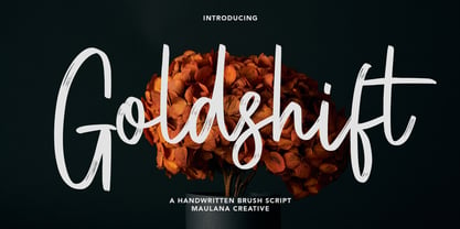 Goldshift is a modern handwritten brush script font, With a rough brush stroke and fun characters. It has Opentype features of ligatures and extra swash, makes it a perfect choice for branding and digital designs. Use this font for logos, social media, websites, blogs, instagram, social media, business cards, branding, and more! Goldshift font support multilingual more than 100+ language. and good pair for your secondary text font with sans or serif. Make a stunning work with Goldshift handwritten brush script font. Cheers, MaulanaCreative