6,021 search results
(0.02 seconds)
- Regina by Laura Worthington,
$25.00 Regina is a broad, welcoming, and highly legible script. Its languorous letterforms are a reminder of an era when people took the time and care to share beautifully penned thoughts by hand. Regina shines when used in display or text settings on letters, invitations, and menus. See what’s included! http://bit.ly/2bOqfVW
 - Peppercorn by Elemeno,
$25.00Peppercorn seems to have been thickly painted on a rough surface. Comes in regular and a spattered Black version. Based on the font Hubbub, which compliments it well. - Wakeup Today by Gassstype,
$23.00 Wakeup Today - Slab Rough Brush Font Club Strong Brush Font is a Authentic brush Font that is written casually and quickly. Every glyphs are made with Procreate. Then trace down into a vector format, and carefully crafted into a typeface. That is why Wakeup Today has rough, authentic and strong characteristic more natural look. You can activate Ligature OpenType panel. Wakeup Today Perfect for designs,branding projects, Logo design, Quotes product packaging and another Project thet require cool strong brush font.
 - Bellmounts by Maulana Creative,
$15.00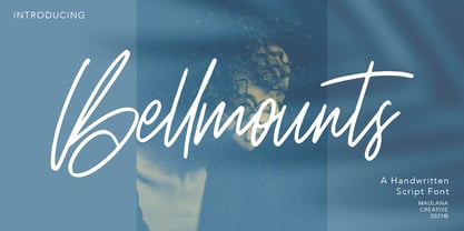 Bellmounts is a handwritten script font, with a rough stroke like a stamp effects, slanted and fun characters. It has Opentype features of ligatures, makes it a perfect choice for branding and digital designs. Use this font for logos, social media, websites, blogs, instagram, social media, business cards, branding, and more! Bellmounts font support multilingual more than 100+ language. and good pair for your secondary text font with sans or serif. Make a stunning work with Bellmounts rough stroke script font. Cheers, MaulanaCreative
 - Peacher by Edignwn Type,
$12.00 The Peacher perfectly represents crafted stuff of vintage script. This project was inspired by beautiful old labels. The product includes 4 styles (regular, rounded, rough and textured). This matches applies in some designs such as the logotype, poster, label, badge, packaging, branding, quotes and more custom design. Peacher includes : 4 style typefaces (regular, rounded, rough and textured) Uppercase, lowercase, numeral, punctuation and symbol 7 sets of alternates and swashes 25 ligatures Multilingual PUA Encoded Thank you for your support and choosing us.
 - Hughes by Larin Type Co,
$12.00 Hughes is a stylish and original multi-functional font, made in 6 styles (regular, rough, pressed, bold, bold rough, bold pressed), he fits perfectly for both modern and vintage design. With it, you can create beautiful logos, labels, templates, signs, highlight text, use it for outdoor advertising, branding, and much more. Also in this font there are stylistic alternates and swashes that will make your design even more attractive and interesting. It is easy to use and has OpenType features.
 - Jostern by EMME grafica,
$14.99 Jostern is the first font designed by EMME Grafica. It's a simple bold, all caps, grunge, eye-catcher font, particularly suitable for titling, branding and typographic amusements. The unevenness of Jostern does not affect the heavy and cubital aspect of the font, but gives it the right roughness to be able to convey a slightly rough and harsh impression, like that of Jos Stern, the bitter character who will be the protagonist of a multimedia project currently under development at EMME Grafica.
 - MVB Diazo by MVB,
$59.00 Mundane information—the sort you might ignore—often appears in the form of very simple, utilitarian lettering, devoid of personality, the sort of industrial lettering you find on old blueprints, park restrooms, and electrical boxes. MVB Diazo is such a thing. It looks like lettering done earnestly with a plastic template. The monoline caps—constructed from straight lines and simple curves—have rounded details as if rendered by a blunt pen on a topographical survey or by a router on a rustic campground sign. The MVB Diazo fonts are compact, available in two widths: Condensed and Extra Condensed. Each width offers four weights from Light to Black. The fonts are perfect for wherever plain and boring letterforms are required. All widths and weights are also available in two distressed textures (#1 and #2) that accentuate the industrial character of the design. Rough #1 is gritty, with finer texture for use at larger sizes. Rough #2 exhibits more damage, the roughness apparent when used at smaller sizes. The Rough fonts include alternates of a number of glyphs so that variation of texture is possible when letters repeat in a word.
 - Rotunda by TipoType,
$24.00 Rotunda blends the best of three worlds: it’s geometric, humanist and grotesque. But, far from being a tasteless hybrid, it has a strong personality and British undertones that turn it into a stylish and sober classic font face. Thanks to its ample character set and many variables, it stands as a versatile, all-terrain font. Strong and elegant, modern and classic, firm and humanistic. It truly is a 21st Century classic. It includes a very thorough coverage for a wide variety of Latin alphabet-based language families.
 - Another Shabby by Zetafonts,
$39.00 Another Shabby is a script typeface family. Its shapes are defined by rough, wide brushstrokes, slightly rounded in corners to mimic the feel of a real handwritten casual script.
 - Jackdaws by Bogstav,
$17.00 A rough, yet legible version of my handwriting. Comes with contextual alternates that makes your text look even more cool! Also with loads of international letters! Viva multilingual support!
 - Xylo Sans by PintassilgoPrints,
$19.00 Xylo Sans letterforms are based on a typeface from Miller & Richard type foundry, from circa 1911. They are presented here with a rough wood texture, in two xylographic flavors.
 - Scraper by Graffiti Fonts,
$29.99 This rough and bold style uses detail and motion to create text with gritty character. These fat letters mimic a paintbrush or palette knife in a simple graff style.
 - Beatster by MuSan,
$19.00 Beatster is handmade modern vintage textured display typefaces. It includes Regular, Outline, Grunge, Rough (with complete uppercase, lowercase, and numerals), and Letterpress (uppercase only). All weights have multilingual characters.
 - Messcara by SparkyType,
$19.00Drawn very small with a brush-tipped felt pen, Messcara has qualities of freedom, toughness, with a few girly loops thrown in for good measure. A true handwriting workhorse. - Butcher by RodrigoTypo,
$25.00 Butcher is a Rough font with 2 styles, a medium and a black to play with the weights, it contains the Greek and Cyrillic alphabet, special for action titles
 - Chantego by Patria Ari,
$15.00 Chantego is a playful hand drawn display typeface with rough marker shapes. This font suit for apparel, branding, logo, social media posts, advertisements, product packaging, product designs, illustration, etc.
 - P22 Bagaglio by P22 Type Foundry,
$24.95 A mysterious 1930s Italian luggage tag inspired Bagaglio. Given its historical and geographical origin, this rough-hewn font could be considered a cousin to the P22 Il Futurismo font.
 - Paula by Autographis,
$39.50 Paula is a non-joining rough brush script with traces of the brush's backstroke that give it that typical look. Paula is an open script with very good readability.
 - Nexa Slab by Fontfabric,
$35.00 Nexa Slab is a geometric slab serif font whose design is based on the already popular best-seller Nexa . The font family contains 3 basic forms: italics, obliques and uprights, each of which has 8 different weights. This visual richness makes it the ideal slab serif font family for the web as well as for print, for motion graphics, logos, t-shirts and so on. It is also great for headings, fitting nicely with both small and large typesetting text blocks. Nexa Slab draws from the rich traditions of the classic Neo-Grotesque slab serif fonts such as Lubalin Graph, Rockwell and Memphis, which conceal the richness of typesetting text in its crucial advertising function. Just like these fonts, it’s design is subject to rational, carefully thought-out, thick and thin bars with a low contrast between them. The letters are characterized by the strict geometry and square proportions of the original, extra-fortified by suitably balanced slab serifs. Nexa Slab is serious without being rigid and inflexible, finished and lacking in nothing, systematic without being monotonous, and though it may seem at first glance to be more suitable for short, direct messages; in the hands of a master designer... it can build and create exquisite and harmonic designs. Open Type Features: Lining figures (proportional and tabular) The “f” ligature set Alternate characters (a, g, y) Automatic fractions Automatic numerators Automatic denomerators Automatic subscript and superscript Automatic ordinals Extended language support (most Latin-based scripts supported)*
 - DIVERGENT, a unique font crafted by the designer known as SpideRaY, embodies a standout style that clearly sets it apart from the plethora of typefaces available. This distinctive font captures the e...
- MattsDinosaurStencils by Ingrimayne Type,
$11.95 This typeface is mostly composed of images of dinosaur skeletons drawn by Matthew Schenk and used as stencils for decoration. I thought they would also make a nice typeface. Check the key map—some of the very large critters are cut into pieces and put on several keys—this may help printing in some situations.
 - Sitting Duck by Kitchen Table Type Foundry,
$15.00 I have no particular affection for ducks, nor do I keep them, but I thought it was about time someone named a font after them! Sitting Duck is a jolly comic/kids font. Handmade (of course), cute and useful. Comes with extensive language support and a cool alternative asterisk in the shape of a duck.
 - Semiautonomous Subunit Clade by Megami Studios,
$34.95 Based on a weird thought of medieval monks hunched over PCs in an abbey on the moon, Semiautonomous Subunit Clade (SSC) is an attempt to find a medium between blackletter and sci-fi fonts. SSC is ideal for those looking for a unique touch in their typography...or who just want that cyber goodness.
 - Happy Serif - Personal use only

- Happy Sans - Personal use only

- PetalGlyph - Unknown license

- Amberday by Richarts,
$4.99 Amberday is a modern display serif typeface to be used more than just as a header font. When I was creating this typeface my first though was to create a light font but strong enough to stand as a header font. Amberday is a perfect typeface to use for logo design, webdesign, header design, typedesign, posters and many more. Amberday family includes eight weight starting with Thin and ending with a Heavy style. Each style includes kerning, ligatures and alternates.
 - Spoon by Dharma Type,
$19.99 Spoon is a fresh and contemporary sans-serif that can be used in wide range of project. Its skeleton of letterform is geometrically-based and minimal but the body was designed with a touch of humanistic outlines as though they were handwritten. This not only make the font clean, legible and functional, but also make it possible to give natural, friendly and soft impressions. Spoon comes in seven weights with matching italics and includes diacritics for most European in each weight.
 - Linotype Bariton by Linotype,
$29.00Linotype Bariton is part of the Take Type Library, chosen from contestants of Linotype’s International Digital Type Design Contests of 1994 and 1997. Designer Alexej Chekoulaev designed his font in one weight to mirror the Zeitgeist of the early 1930s. The characters of this extremely bold font are based on the form of a rectangle though its rounded edges soften its look a bit. Linotype Bariton should be used only in larger point sizes in headlines which should really catch the eye. - Another Hundred People by The Ampersand Forest,
$25.00 Inspired by the iconic modernist letterforms in the poster for Stephen Sondheim's 1972 musical Company, Another Hundred People is a gleeful set of solid geometric glyphs — as though a set of Colorforms decided to express itself in words. In addition to its lowercase and caps (which don't share a baseline with the lowercase, but hang below it), Another Hundred People has solid alternates (for those who don't like the divided letterforms) and overlapping ligatures! Part of the Ampersand Forest's Sondheim Series.
 - Balder by Linotype,
$29.99Linotype Balder is a part of the Take Type Library, winners of Linotype’s International Digital Type Design Contest. Designed by Lutz Baar, Balder is reminiscent of advertisement and poster typefaces of the 1950s and 1960s. It is composed of only capital letters, making it perfect for initials and headlines. Balder looks as though it were written with a broad tipped pen. Its light serifs at the tops of the characters and the slant of some of the strokes give Balder a dynamic feel. - Linotype Bariton Paneuropean by Linotype,
$92.99Linotype Bariton is part of the Take Type Library, chosen from contestants of Linotype's International Digital Type Design Contests of 1994 and 1997. Designer Alexei Chekulayev designed his font in one weight to mirror the Zeitgeist of the early 1930s. The characters of this extremely bold font are based on the form of a rectangle though its rounded edges soften its look a bit. Linotype Bariton should be used only in larger point sizes in headlines which should really catch the eye. - Trinculo by Scriptorium,
$12.00Trinculo is a cursive font which combines traditional letter forms with ridiculously ornate embellishments and flourishes. It's rather like what an 18th century clerk might have done with his lettering if he was bored to distraction with writing the same old letters again and again. The upper case characters are more complex with simpler versions of the same characters in the lower case. Trinculo is a lot of fun, though if you use it too much it may become overwhelming. - Callisto by Groteskly Yours,
$8.00 Callisto is a classic serif stencil fonts that is a stencil font like no others. Elegant curves are paired with great legibility and wide range of available glyphs. While stencil fonts are generally thought of as too masculine and rough, Callisto is very feminine and soft, which makes it perfect as a logo font for those who seek to further emphasise their brand's identity. Despite being a display font, Callisto looks great at smaller sizes, so short headlines and headers will look natural and email legible even in smaller sizes. Callisto comes in two styles —Regular and Half —which can easily be combined within the same body of text. Regular is a more minimal style, with wider and more open apertures, while Half is a hybrid between a serif and stencil font that still has longer strokes and stems. Each style consists of 415 glyphs, ranging from fractions to diacritics. There are a number of glyphs with cool stylistic alternatives (which is awesome for branding), lots of punctuation and OpenType features. Callisto is a great font for designers and artists who need a feminine font with a really strong character.
 - Quiet Night by PizzaDude.dk,
$20.00 Quiet Night is my scribbled art deco font. Despite it's slightly jumpy and rough apperance, the font is super legible - even at smaller sizes. Comes with ligatures for double letters.
 - Norca by Holis.Mjd,
$10.00 Norca is a typeface available in 4 types of styles, regular/clean, round, rough and textured. Available in all caps mode, suitable for designs with classic, vintage, and retro styles.
 - Squarity JNL by Jeff Levine,
$29.00Squarity JNL is an ultra-bold font derived from Jeff Levine's Yorso Square JNL. Use the font at large point sizes to emphasize messages with power, punch, strength or toughness. - Lento by Etewut,
$22.00 Introducing Lento monoline script with happy end! 5 styles are included: regular, double, rough, display and bold. - Basic latin - Extended latin - Ligatures - Alternative symbols - Initial and Final symbols Enjoy Lento!
 - Ducatus by Scriptorium,
$12.00We wanted to make an ultra-thin, tall font with a rough, hand-drawn look and ended up with more than we bargained for. To get the font we wanted we started by developing a source font for the basic letter shapes and we ended up with a whole bunch of variations of the basic style. Thus was born the new Ducatus family of fonts, starting with Ducatus Light which developed into the Medium and Heavy versions, and the Medium weight was ultimately used as the basis for the Ducatus Rough font, which was the goal of the project in the first place. Ducatus Rough was created by modifying Ducatus Medium in Photoshop using Gallery Effects and several other filter packages, and then redoing the outlines from scratch in Fontographer. A lot of work, but the result is just what we wanted.


