7,284 search results
(0.012 seconds)
- Silkscreen - Unknown license

- Hando Soft by Eko Bimantara,
$24.00 Hando Soft is a variant of Hando neo grotesk sans family. Each letter on Hando Soft has curve strokes end, which gives a soft and more ease-looking letterforms. Hando offers a wide range of usage possibilities. It's low x-height and variety of light size options make it a good choice for reading, it's tenuous white spaces in the counter letterforms make it legible enough to be recognized remotely. It's curved tensions on the circular letterforms gave a futuristic impression. It's sleek and simple strokes make it perfect for a broad range design purposes. Hando consists of 10 styles from Hairline to Black with each matching oblique. Contains more than 440 glyphs that support a broad latin language. Also some Opentype features e.g. stylistic alternates, variation of figures, e.t.c
 - Obti Sans - 100% free

- Wood Type Calendar JNL by Jeff Levine,
$29.00 Wood Type Calendar JNL is a set of components for making monthly calendar pages. Based on a set of vintage wood type numbers, the dates 1 through 31 are found on the "A-Z" and "a-e" keys; the 23/30 and 24/31 ligatures are on the "f" and "g" keys. On the "h" and "i" keys are blank outline and solid blocks for balancing the calendar layout. The "j" through "u" keys have the names of the months, and the "1" through "7" keys contain the days of the week.
 - Reverse Calendar Blocks JNL by Jeff Levine,
$29.00 Reverse Calendar Blocks JNL is the third typeface from Jeff Levine that allows the user to create a vintage-style calendar. Other versions available are Calendar Blocks JNL and Monthly Calendar JNL. The layout for the font is as follows: Numerals for displaying a year are on the 0-9 keys The 1-31 dates are located on the A-Z and a-e keys The combination dates of 23/30 and 24/31 are located on the f and g keys Days of the week (Sunday through Saturday) are on the keys h though n Months are found on the o through z keys A blank box (for balancing out layouts) is on the period key
 - Salom by Schriftlabor,
$44.00 Salom was designed by Austrian type designer Igor Labudovic during his year at Reading University. Besides Latin, it originally included Arabic and Hebrew. The peaceful coexistence of both writing systems in his fonts led him to combine the words Salaam and Shalom to the font family name. Salom’s sibling, Salom Sans, features the same letter proportions and therefore allows a rich spectrum of diverse typography, yet keeping the harmony between all styles. The sans has an additional light weight, while the serif comes with an expressive stencil style.
 - Correspond by Create Big Supply,
$17.00 Create beautiful invitations, eye-catching logos, engaging social media posts, and more with Correspond. Its seamless integration of uppercase and lowercase characters, along with its extensive range of numbers and punctuations, ensures a harmonious and cohesive look throughout your design. One of the key features of Correspond is its multilingual support, allowing you to express your creativity in various languages and reach a global audience. No matter the project, Correspond has you covered with its wide array of characters and symbols. Unlock the full potential of Correspond with its PUA encoding, granting you easy access to a wealth of alternate glyphs and ligatures. This enhances your design possibilities and lets you add your personal touch to every project. Experience the power of Correspond Script Font and elevate your typography game. Its seamless curves and elegant flourishes make it a timeless choice for any design. Discover the beauty of Correspond and let your creativity shine.
 - Fontenay Fancy - Personal use only

- Shelf Tags JNL by Jeff Levine,
$29.00 Before the mid-to-late 1970s, when retailers started to embrace UPC (universal price code) technology on a grand scale, pricing merchandise took on many forms. One method especially popular with variety stores (such as Woolworth's, McCrory's, Kress, etc.) were pre-printed price tags that came in small pads and were inserted into metal holders. Shelf Tags JNL recreates a vintage price tag based on examples seen online, and allows the user different ways to create their own vintage-style price tags. You can either utilize the round pen nib style numbers and price marks to place on any size or type tag, or type out prices using the reversed characters (white on black) along with the two end caps provided to form a complete tag unit. For the more adventurous, a complete blank tag is also provided in case the desire is to print a solid color tag background and [using the regular numbers] crate prices in custom colors. Two sets of smaller number (for "floating" cents prices) are also provided in regular numbers and reverse panels. As an extra bonus, there is a set of 1 through zero, dollar sign, cents sign and decimal point individual black-on-white outlined panels for making individual pricing numbers. The keyboard layout for the various characters is as follows: asterisk key - regular cents sign (no panel) dollar sign key - regular dollar sign (no panel) period key - regular decimal point (no panel) left and right parenthesis keys - panel end caps (to form price tags) colon key - reverse decimal point on black panel 1 thru 0 keys - regular numbers (no panels) A through J keys - small regular numbers (no panels) K and L keys - truncated [shorter width] end caps M through Y keys - individual price numbers (black on white with black border a through j keys - reverse numbers on black panels k key - reverse dollar sign on black panel l key - reverse cents sign on black panel m through v keys - reverse small numbers on black panels w through z keys - blank rectangular panels of varying widths equal sign key - full black panel price tag hyphen key - blank rectangular black panel based on the width of most number panels
 - Deco Donut by Just My Type,
$20.00 On the very northern edge of South Tucson lies an Old Pueblo institution, Le Caves Bakery, Home of the Vegetable Donut. That’s what they were called when Le Caves opened; now you’d say Vegan Donut, or No Animal Products Used. Radical concept in the Brave New World of 1935. I started with the letters from their sign and extrapolated the rest of the font from those. Deco Donut Fat is extrapolated from Deco Donut. If you want a donut, type a 0 (zero).
 - Gorgo - Unknown license

- Pricing Labels JNL by Jeff Levine,
$29.00Pricing Labels JNL gives you a set of digital price gun labels in fifty-one of the most common store departments, plus an untitled title label on the lower case ‘z’ key. Additionally, numbers for creating prices are on the standard keystrokes (for dollar amounts), and smaller numbers/underscores (for cents amounts) are on the shift key groupings for the number keys. The dollar and cents sign are on the left and right brackets, the decimal point is on the period key and the words “each” and “for” [set sideways] are on the greater and lesser keys. - Obti Sans Neue - 100% free

- XChessterton by Ingrimayne Type,
$5.00 XChessterton has two whimsical chess fonts. The key layout is a bit complicated; see the key guide for detailed information on how to position pieces correctly.
 - Flagstaff JNL by Jeff Levine,
$29.00Flagstaff JNL takes the lettering from Roma Initial Caps JNL and gives them the movement of an unfurled banner. For added effect, there are flagpoles facing in either direction on the lesser and greater keys. Left and right flag ends are placed on the parenthesis keys; a wide blank flag panel is on the left brace key and a narrow blank flag panel is on the right brace key. Letters only; no punctuation or extended characters. - Silkscreen Expanded - Unknown license

- Silkscreen - Unknown license

- Lilla Letter Lover by Letterground Foundry,
$11.99 "Lilla Letter Lover" is a captivating font designed specifically for children's books. This delightful typeface brings an element of playfulness to reading, while also enhancing phonemic awareness. The font's remarkable strength lies in bridging the gap between handwritten and printed letters. For early readers, this transition can be challenging, but "Lilla Letter Lover" simplifies the process. It merges the familiar aspects of handwritten letterforms with the clarity of printed text, providing a seamless reading experience. This feature ensures that children can comfortably navigate both forms of writing, enhancing their overall literacy skills. The whimsical charm of "Lilla Letter Lover" instantly captures young readers' imaginations. Each letter is thoughtfully designed with basic shapes and simplicity in mind, for an experience where letters come to life, fostering a love for reading and storytelling. Additionally, "Lilla Letter Lover" offers a unique opportunity for sight-based spelling learning. The visually distinctive presentation of words helps young readers to develop a strong visual memory of spelling patterns. This visual association enables them to recognize and recall words with ease, strengthening their reading and writing proficiency. In summary, "Lilla Letter Lover" is not just a font; it is an enchanting gateway to make reading a joyous adventure for children of all ages.
 - Nassim Latin by Rosetta,
$60.00 Nassim is a contemporary typeface for multilingual text-setting. With its lively texture and balanced rhythm, Nassim is a proven workhorse for a vast array of applications, from literature to the sciences, scholarly publications to contemporary news. Nassim Latin is stout in colour and resolute in its construction, standing up to the demands of long-form reading. But the heartiness that keeps it going is balanced with lively details: the asymmetric serifs and calligraphic modulation allude just enough to broad-nib flourishes to keep the reader alert and looking for what comes next. Nassim has always been ahead of the curve, bridging the distinct typographic traditions of Arabic and Latin without forcing the typographer into compromise. Nassim Latin offers upright and true italic styles across five weights, supporting more than 110 languages, and designed to pair harmoniously in multi-script settings with Nassim Arabic. Beyond that, it is equipped with smart OpenType features like small caps, case-sensitive punctuation, and a full palette of ranging numerals, fractions, and superior and inferior figures ensure that Nassim Latin is up to any task, be it print publications or delivering late-breaking online news.
 - Custer RE by Font Bureau,
$40.00 A book in the library of University of Wisconsin caught David Berlow’s attention. It was set in a clear text face - a predecessor of Bookman, cast by the Western Type Foundry who called it Custer. Upon noting how well the typeface worked in 6 and 7 points, he developed it into a member of the Reading Edge series specifically designed for small text on screen. Custer RE was a broad and approachable typeface drawn large on the body with a tall x-height to maximize its size when set very small.
 - Darrel Allura by Piece of Cake Typework,
$19.00 Hello World, Introducing, Darrel Allura is a beauty script font suitable for your design project needs, such as; wedding themes, social media posts, quotes, overlays on images, tagline logos, posters, print needs, website banners, and more. Features A set of uppercase and lowercase glyphs Number, symbol, and punctuation Multilingual Support Some Swashes and Ligatures So Easy to Use Access Swashes by keyboard key bracket left ' [ ' to feature beginning swash 1 key brace left ' { ' to feature beginning swash 2 key plus ' + ' to feature middle swash 1 key equal ' = ' to feature middle swash 2 key bracket right ' ] ' to feature ending swash 1 key brace right ' } ' to feature ending swash 2 For Example type [darrel+allura] Thank you a million times for downloading and using this font for your projects. Enjoy this font and happy creating!
 - Hi Maria by Piece of Cake Typework,
$17.00 Hello World, Introducing, Hi Maria is a beauty script font suitable for your design project needs, such as; wedding themes, Christmas themes, social media posts, quotes, overlays on images, tagline logos, posters, print needs, website banners, and more. Features A set of uppercase and lowercase glyphs Number, symbol, and punctuation Multilingual Support Some Swashes and Ligatures So Easy to Use Access Swashes by keyboard key parenleft ' ( ' to feature beginning swash 1 key bracketleft ' [ ' to feature beginning swash 2 key plus ' + ' to feature middle swash 1 key equal ' = ' to feature middle swash 2 key parenright ' ) ' to feature ending swash 1 key bracketright ' ] ' to feature ending swash 2 For Example: type [love+you] Thank you a million times for downloading and using this font for your projects. Enjoy this font and happy creating!
 - Soundtrack by PintassilgoPrints,
$24.00 Simple and charming, Soundtrack is a lively all-caps font that brings two versions for each letter. Make your choices by simply typing the upper or lower case keys or switch on the Contextual Alternates feature on any OpenType savvy program to instantly alternate between lettershapes. Versatile, Soundtrack comes in two weights and is suited for a wide range of display applications, doing great also for small chunks of text. Handy dingbats are included in both versions. Pick them using a glyphs palette or character map or just turn on the OpenType ornaments feature for accessing them directly from your keyboard. Let music sound!
 - Pollen by TypeTogether,
$49.00 This typeface finds a perfect balance between technical excellence, careful design of letter forms for extended reading, and a measured dose of charm and personality. Its informal feel allows for successfully typesetting a wide range of applications, from magazines and fiction books to advertising and websites. Calligraphy, be it done with the broad-edge pen, brush, or other tools, has been fundamental in the development of Pollen. Its influence is clearly visible in the construction of the top serifs contrasting the curved bottom serifs and the fluid aspect of terminals and tails, such as on “g” and “r”. The shapes of the diagonal letters are based on a less formal calligraphic model, but still uses the broad edge pen. The letters were then subject to a further process of pencil drawing and digital re-interpretation, which gave them the final shape. The designs of “e” and “c” are derived from drawings made with only one continuous line, with the pencil always touching the paper. The letters “g” and “y” express the intention to bring informal elements to a typeface intended for long text reading, usually characteristic of casual writing. Pollen consists of 3 basic styles with an extended OpenType Pro character set and large language support, perfectly serving the most common typographic needs.
 - KG Defying Gravity by Kimberly Geswein,
$5.00 Use the [ and ] key to create a unique flag ending on your words. Use alternating lowercase and uppercase with the Bounce version to create a bouncy look. To create a solid space instead of an empty space, use the bar key | which shares a key with the \ backslash on my keyboard. Your keyboard may vary.
 - Tuna by Ligature Inc,
$49.00 Tuna is simply a contemporary body text font. It is contemporary, meaning the merge of charming broad-nibbed calligraphic style with optimized readability on screen – showing that the roots of writing and typesetting are still in charge when reading “Anna Karenina” on your Kindle till 4 o’clock in the morning. Tuna has a natural fit for cross-media use because the design is based on forms characterized by different conditions of constancy, stability and good readability. Well-defined shapes and distinctive details only become apparent when used in larger sizes, making Tuna a true all-rounder. With more than 700 glyphs in 10 styles created with a maximum of consideration, it has all the qualities of a modern OpenType font serving the needs of today's communication. If you would like to read more about the Typeface please visit our promo site.
 - XSeeder Chess by Ingrimayne Type,
$5.00 The two XSeederChess fonts are two modernistic chess fonts. The key layout is a bit complicated; see the key guide for detailed information on how to position pieces correctly.
 - Gather Serif by wearecolt,
$14.00 Gather Serif - The Modern Classic Let your creativity flow with Gather Serif. Beautifully crafted letterforms and ligatures to give your type a modern touch of elegance. Gather Serif is packed with extra ligatures and stylistic alternative glyphs. Ligatures: CH CO DO EH EA EO IJ KA KO LA LE LH OC OO QO QU RA RC RH RI RO RS RU TH TT Th ZO fl ffl fi ffi st Language Support for: Western European, Central European, South Eastern European, South American, Esperanto.
 - Filmstar by Solotype,
$19.95When you use this font, be sure to look for the two different sets of end and spacing pieces, one with stars, one without. The ends are on the Bracket and Brace keys, and the spaces are on the Vertical Bar and Backslash Key. There are also a couple of "torn" end pieces on the Plus and Equals key. - Silkscreen Expanded - Unknown license

- XChessNut by Ingrimayne Type,
$5.00 XChessNut contains two chess fonts that resemble actual chess pieces. The key layout is a bit complicated; see the key guide for detailed information on how to position pieces correctly.
 - Kanji OC by Okaycat,
$29.95 Kanji OC is a latin font with a kanji character in place of each letter. The key chart in the gallery section shows the relationship between keyboard keys and kanji.
 - High Table by SAMUEL DESIGN,
$39.00 The key words for this font are taste, elegance, storytelling, and a little bit of dynamism. HIGH TABLE family have exquisite details and great quality. We believe that only high quality and unique details can move people more than exaggerated shapes. Fonts are so powerful, they tell a moving story. The PACE typeface was chosen to tell a story quietly but with dynamism. Readers are delighted and relaxed when they see this font family, and colleagues read the story with respect. A brand needs a story, and a brand’s story needs the most appropriate font to carry it.
 - ITC Juanita by ITC,
$29.99 ITC Juanita is the work of Argentinian-born designer Luis Siquot and was inspired by a text set only with woodcuts which he was reading during a long international flight. ITC Juanita is a series of six distinct typefaces which Siquot sees as a personal reinterpretation of designs that originated in the 1930s and 40s and were still popular during his childhood in the 1950s. For me, Juanita is like a toy, charming, expressive, and also dramatic," says Siquot. The ITC Juanita series offers designers a range of variations based on similar structures, each variation with its own look."
 - Keystoned by TypeArt Foundry,
$45.00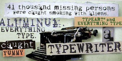 Typewriter with problem keys.
 - Gooey - Unknown license

- Display Uncanny by Gerald Gallo,
$20.00 Display Uncanny is a display font not intended for text use. It was designed specifically for display, headline, logotype, branding, and similar applications. The same A to Z characters are located under the shift+character set and character set keys with the ones under the character set keys reduced in size. There are numbers and punctuation located under their respective keys.
 - Dash Wisher by PizzaDude.dk,
$15.00 The name Dash Wisher is a wordplay. The letters of the font are also quite playful - you never know what comes next, when typing. There is no exact x-heigh, the baseline is jumpy, the descender and ascender are messed up...there are no real rules for Dash Wisher! But with all that in mind, it comes out surprisingly legible, which means it does have a wide range of use. Let your fantasy and imagination break the boundaries and Dash Wisher do the rest - or maybe the other way around! :) I've added both ligatures to substitute double letters and a set of alternate letters as well.
 - IMPuzzled by Ingrimayne Type,
$9.00 IMPuzzled uses the OpenType feature of Contextual Alternatives to alternate two sets of characters. The sets are on two puzzle pieces that tessellate, that is, fit together to fill the plane with no gaps or overlaps. Empty pieces are on the brace keys and can be used to fill spaces. The black or solid style is designed to be used in a layer under the regular style, though it can be used alone if adjacent pieces are given different colors. This unusual font has limited uses but may be appropriate when the topic is related to the broad areas of puzzles, puzzled, and fitting pieces together.
 - Initial Seals JNL by Jeff Levine,
$29.00 Initial Seals JNL was created by utilizing the typeface from Gummed Letters JNL and one of the decorative dingbats from Miscellany JNL. On the capital A-Z keys, the letters are black on a white on black seal design, while the lower case a-z keys have a seal version in solid black with white letters. Corresponding blank versions of the seals are on the left and right parenthesis keys, and the period key has a fill oval for overlaying background colors onto the black and white set.


