7,370 search results
(0.022 seconds)
- Pantera by Lián Types,
$39.00 ROARRR! THE STYLES -Pantera Pro is the most complete style, and although its default look is mono-rhythmic it gets really playful and crazy like the examples of the posters by just activating the Decorative Ligatures button in the Open-type Panel of Adobe Illustrator. However, I recommend using also the Glyphs Panel because there you'll find much more variants per letter. Pantera Pro is in fact, coded in a way the combination of thicknesses will always look fantastic. -Pantera Black Left, and Pantera Black Right are actually “lite” versions of Pantera Pro: They have very little Open-Type code, so what you see here is what you get. Pantera Black Left has its left strokes thick, while Pantera Black Right has its right strokes thick. -Pantera White is a lovely member in this family that looks lighter and airy, hence its name. With the feature Standard Ligatures activated (liga) the font gets very playful. -Pantera Caps is based on sign painters lettering and since it follows the same pointed brush rules as the other styles, it matches perfectly. -Pantera Claws like its name suggests, is a set of icons that were done by our dear panther. THE STORY It is said that typography can never be as expressive as calligraphy, but sometimes it can get close enough. I tend to think that calligraphic trials, in order to work well as potential fonts, need first to go through very strict filters before going digital: While calligraphy is synonym of freedom (once its rules are mastered), type-design, in the other hand, has its battlefield a little tighter and tougher. When I practice pointed brush lettering, there are so many things happening on the paper. And most of them are delicious. The ones who know my work may see that although many of my fonts are very expressive, my handmade brush trials are much more lively than them. With that in mind, this time I tried to go further and rescue more of those things that are lost in the process of thinking type when first sketches are calligraphic. I wondered if I could create something wild, hence its name Panther, by understanding the randomness that sometimes calligraphy conveys and turning it to something systemic: With Pantera, I created an ordered disorder. Like it happens a lot in many kinds of lettering styles, in order to enrich the written word the scribe mixes the thickness of the strokes and the width of the letters. Like one of my favorite mentors say (1), they make thoughtful gestures Some lively strokes go down with a thick, while some do that with a thin. Some letters are very narrow, meaning some of them will need to be very wide to compensate. Why not?. The calligrapher is always thinking on the following letters, and he/she designs in his head the combination of thicks and thins before he/she executes them. He/she knows the playful rhythm the words will have before writing them. It takes time and skill to master this and achieve graceful results. Going back to the font, in Pantera, this combination of varying thicknesses and widths of letters were Open-Type coded so the user will see satisfactory results by just enabling or disabling some buttons on the glyphs panel. I'm very pleased with the result since it’s not very easy to find fonts which play with the words' rhythm like Pantera does, following of course, a strong calligraphic base. I believe that if you were on the prowl for innovative fonts, this is your chance to go wild and get Pantera! NOTES (1) Phrase by Yves Leterme. In fact, it’s the title of a book by him. EPILOGUE Esta fuente está dedicada a mi panterita
 - Ah, LT Funk by LyonsType is like a fresh breeze in the bustling city of typography, bringing with it a vibe that's both retro and deliciously modern. This font dances between the lines of funk and fu...
- Sure thing! Feathergraphy Decoration is an artistic marvel in the realm of fonts, conceived and created by Måns Grebäck, who is renowned for his proficiency in typography and script design. This font...
- Like Butterflies by Bogstav,
$10.00 Now here's a font that is named Like Butterflies, but has got nothing to do with butterflies! What? Why? Well, I recently heard the song "Even flow" by Pearl Jam and took a trip down memory lane - back to my early twenties. I remember how the lyrics affected me, and had an impact on how my life changed the years to follow. Maybe the style of the font does not reflect the inner meaning of the song, but it does reflect a look back in time for me - and the change that took place. Nevertheless, I hope you enjoy the somewhat simple, handmade style of Like Butterflies and the 4 versions that works very well together! Please notice that each letter has got 5 slightly different versions to choose from!
 - Gamon by Eko Bimantara,
$19.00 Gamon is an innovative and daring unicase display font that is a perfect example of modern typography. The absence of traditional lowercase letters and the integration of multiple glyphs in the uppercase letters create a distinct and captivating design. The uniform size of the letters adds to the font’s appealing appearance, making it an ideal choice for large display layouts, branding, posters, and titles. Gamon’s typography is perfect for designers who are looking for a fresh and unusual aesthetic. It can transform any digital or print design stand out from the rest. Gamon’s versatility makes it suitable for a broad range of design applications, including logos, packaging, and marketing materials. Gamon’s boldness and uniqueness make it an excellent choice for designers who want to break free from the conventional design constraints. With Gamon, designers can create designs that are not only visually appealing but also memorable and impactful.
 - Godwit by yasireknc,
$19.00 Godwit is an experimental high-contrast serif font. The piece screams creative freedom and exploration, as the color literally breaks through the boundaries of the original type. The final piece is really fluid as each letter links smoothly into the next and you can feel the real natural ink paths. This is a benefit of Godwit and the most powerful-distinguishable feature, as most standard fonts wouldn’t allow for this fluidity, especially a serif font. The Aphorism: The main idea comes from being fluent and smooth-spoken natural ink shapes. As we go into the details, the organic shape of the body makes the font a unique piece. The collection lends itself to the design, packaging, and advertising of everything with a romantic feel like liquid love potion; weddings, greetings, cosmetics, lingerie, book covers, and too many more to mention! This font is a great place to begin getting that tone.
 - Calluna by exljbris,
$- Calluna was born more or less by accident. When I needed a little break from designing Museo I was just fiddling around a bit to see if maybe a full slab serif would be something to have a look at. The first thing I did, of course, was to put slab serifs on the stems of Museo. When I did, something nice happened. Slab-serifs with a direction! I ended up using the idea for something I always wanted to do: making a rather serious text face. The goal was to make a text font, but one with enough interesting details. In the end it all came down to finding the balance in a typeface between the robustness needed to function as a text face and enough refinement to look good as a display font. Check out Calluna Sans™ which is a great pair for Calluna™.
 - Bourton Hand by Kimmy Design,
$10.00 Bourton Hand is a new typeface by Kimmy Design. It’s the hand drawn version of Bourton and a sans-serif cousin to Burford. In addition to a new look, it boasts more layering options, stylistic alternatives, graphic extras and even comes with its own script font! Okay...so here’s everything you get with Bourton Hand: • 6 Base Layer Fonts (Base, Inline, Marquee, Stripes A, Stripes B, Stripes C, Sketch A, Sketch B) • 6 Top Layer Fonts (Base Drop, Dots, Line Light/Medium/Bold, Outline Light/Medium/Bold) • 6 Extrude Fonts (Extrude, Outline, Shadow, Extrude Outline) • 5 Drop Shadow Fonts + 5 solo styles (Drop Shadow, Drop Extrude, Drop Line, Drop Stripes A, Drop Stripes B) • 2 Line Fonts for secondary text (Line Medium, Line Bold) • Bourton Hand Script Light • Bourton Hand Script Bold • Bourton Hand Extras - Ornaments, banners, frames, borders, flags and line break • Bourton Hand Extras - Flourishes Happy Creating!
 - Complements by Ingrimayne Type,
$9.00 In the typeface family "Complements" two sets of characters complement each other, so much so that they work together much better than they work separately. The two sets are designed to alternate and this alternating is done automatically in applications that support the OpenType feature Contextual Alternatives. Complements is purely for show and display; it is a horrible choice for text. The spacing is very tight, which works well for very large point sizes. At smaller point sizes the user may want to increase character spacing. The typeface is monospaced. If the spacing between words is too large, substitute the non-breaking space (or the underscore) for the space character. Complements is geometric, bizarre, and hard to read, all characteristics that catch the reader's attention. Complements comes in two styles, regular and outline. The outline style was designed to be used in a layer over the regular style.
 - Saigon by The Paper Town,
$25.00 Saigon is a minimalist condensed serif family. With clean lines and tight curves, its personality dwells in its simplicity making it a timeless editorial typeface. As the italic breaks with the traditional strokes and embrace a more modest yet modern look, it blends in nicely with its upright sister, thus creating an harmonious rhythm which emphasis the minimalist approach of Saigon. The low contrast serif is created to look great in both display and text. Whether it’s bold headlines of descriptive paragraphs, Saigon aims to be as versatile and functional as possible. It supplies 6 weights from thin to bold allowing you to elevate your typography designs in a minute while keeping it simple. Cause great design should be simple. The type family supports major Latin-based languages along with opentype features such as fractions, old style numerals, ligatures, case sensitive punctuation, stylistic alternates symbols and more.
 - Wintanceastre by Hanoded,
$25.00 I am a HUGE fan of Bernard Cornwell’s ‘The Saxon Stories’. Ever since a television series has been made, the series of books is also know as ‘The Last Kingdom’. I have read them all, at break-neck speed and I can’t wait for the next book!! Wintanceastre (Winchester) is based on a 10th century Latin manuscript. I have tried to stay close to the original letters, but since Latin does not have all modern glyphs, I found myself designing the missing ones. So, before you scold me for having made a font that is historically inaccurate: it was never meant to be an exact replica, nor would anyone want an exact replica, as it would be useless for modern texts and designs. Wintanceastre comes with a whole bunch of ligatures and alternate glyphs. Use it for any design that needs a little ‘Dark Ages’ look!
 - Cvltre Dope by IKIIKOWRK,
$19.00 Proudly present Cvltre Dope - Funky Brush Font, created by ikiiko. Where bold script meets funky in a stylish letters! This brush font is a rebellious celebration inspired by the vibrant pulse of street culture. Imagine a font that's as daring as your streetwear style – it's not just a font, it's a statement! Cvltre Dope is the wild offspring of graffiti vibes and urban flare, giving your phrases a streetwise edge. This font screams attitude with every stroke, making it the ideal complement for any streetwear business looking to break the stereotype. Bold, funky, and ready to conquer the streets, the font that doesn't just speak; it shouts in style! This font is very suitable for making a streetwear brand, poster, magazine layout, fashion design, quotes, or simply as a stylish text overlay to any background image. What's Included? Uppercase & Lowercase Numbers & Punctuation Ligatures Multilingual Support Works on PC & Mac
 - Ah, the Edo font by Vic Fieger, you say? Imagine if a brush, after a night out drinking with its inky pals, decided to take a stroll across the canvas, leaving behind a trail filled with personality,...
- Ah, COM (sRB) by sRB-Powers, a true enigma wrapped in a digital font file. Imagine if a group of pixels woke up one day, decided to become fonts, and then went on a wild, adventurous spree guided by ...
- The font "Gilgongo Kaps" by Apostrophic Labs is a unique and quirky display typeface that captures the essence of playfulness and innovation. Apostrophic Labs, known for their inventive approach to t...
- Soap by Typodermic,
$11.95 Hey there! Are you on the hunt for a new typeface that’s cool and laid-back? Well, look no further because Soap is here to sweep you off your feet! This typeface is the epitome of chill, taking the classic Cooper Black and smoothing it out even more. Soap’s unicase letterforms are so soft and inviting, you’ll feel like you’re sinking into a warm bath. And let’s talk about the spacing—it’s so tight you could bounce a quarter off of it. And here’s the best part: Soap is versatile enough to use for both headlines and body copy. That’s right, this typeface can do it all! Plus, with an alternate lowercase-style T available in OpenType adept applications, you’ll have even more creative freedom. But wait, there’s more! Soap comes in not just one, but three unique styles: Clean, Soap Stamp, and Soap Spraypaint. The latter two are perfect for adding a touch of grime and edginess to your designs, with straggly letter variations that prevent any boring repetition. So if you want to add some laid-back coolness to your next project, give Soap a try. It’s the perfect blend of classic and contemporary, and it’s sure to make a splash! Most Latin-based European writing systems are supported, including the following languages. Afaan Oromo, Afar, Afrikaans, Albanian, Alsatian, Aromanian, Aymara, Bashkir (Latin), Basque, Belarusian (Latin), Bemba, Bikol, Bosnian, Breton, Cape Verdean, Creole, Catalan, Cebuano, Chamorro, Chavacano, Chichewa, Crimean Tatar (Latin), Croatian, Czech, Danish, Dawan, Dholuo, Dutch, English, Estonian, Faroese, Fijian, Filipino, Finnish, French, Frisian, Friulian, Gagauz (Latin), Galician, Ganda, Genoese, German, Greenlandic, Guadeloupean Creole, Haitian Creole, Hawaiian, Hiligaynon, Hungarian, Icelandic, Ilocano, Indonesian, Irish, Italian, Jamaican, Kaqchikel, Karakalpak (Latin), Kashubian, Kikongo, Kinyarwanda, Kirundi, Kurdish (Latin), Latvian, Lithuanian, Lombard, Low Saxon, Luxembourgish, Maasai, Makhuwa, Malay, Maltese, Māori, Moldovan, Montenegrin, Ndebele, Neapolitan, Norwegian, Novial, Occitan, Ossetian (Latin), Papiamento, Piedmontese, Polish, Portuguese, Quechua, Rarotongan, Romanian, Romansh, Sami, Sango, Saramaccan, Sardinian, Scottish Gaelic, Serbian (Latin), Shona, Sicilian, Silesian, Slovak, Slovenian, Somali, Sorbian, Sotho, Spanish, Swahili, Swazi, Swedish, Tagalog, Tahitian, Tetum, Tongan, Tshiluba, Tsonga, Tswana, Tumbuka, Turkish, Turkmen (Latin), Tuvaluan, Uzbek (Latin), Venetian, Vepsian, Võro, Walloon, Waray-Waray, Wayuu, Welsh, Wolof, Xhosa, Yapese, Zapotec Zulu and Zuni.
 - Anselm Sans by Storm Type Foundry,
$63.00One of the good practices of today’s type foundries is that they release their type families as systems including both serif and sans serif type. Usually, the sources of inspiration need to be well tried with time and practice, since production of a type family is such a laborious and complex process. From the beginning, it needs to be clear that the result will be suited for universal use. Such systems, complete with the broad, multi-lingual variations permitted by the OpenType format, have become the elementary, default instrument of visual communication. Non-Latin scripts are useful for a wide scope of academic publications, for packaging and corporate systems alike. And what about outdoor advertisement designated for markets in developing countries? Cyrillics and Greek have become an integral part of our OpenType font systems. Maybe you noticed that the sans serif cuts have richer variety of the light – black scale. This is due to the fact that sans serif families tend to be less susceptible to deformities in form, and thus they are able to retain their original character throughout the full range of weights. On the other hand, the nature of serifed, contrasted cuts does not permit such extremes without sacrificing their characteristic features. Both weights were drawn by hand, only the Medium cut has been interpolated. Anselm Ten is a unique family of four cuts, slightly strengthened and adjusted for the setting in sizes around 10 pt and smaller, as its name indicates. The ancestry of Anselm goes back to Jannon, a slightly modified Old Style Roman. I drew Serapion back in 1997, so its spirit is youthful, a bit frisky, and it is charmed by romantic, playful details. Anselm succeeds it after ten years of evolution, it is a sober, reliable laborer, immune to all eccentricities. The most significant difference between Sebastian/Serapion and Anselm is the raised x-height of lowercase, which makes it ideal for applications in extensive texts. Our goal was to create an all-round type family, equally suitable for poetry, magazines, books, posters, and information systems. - Rufina by TipoType,
$16.00 Rufina was as tall and thin as a reed. Elegant but with that distance that well-defined forms seem to impose. Her voice, however, was sweeter, closer, and when she spoke her name, like a slow whisper, one felt like what she had come to say could be read in her image. Rufina’s story can only be told through a detour because her origin does not coincide with her birth. Rufina was born on a Sunday afternoon while her father was drawing black letters on a white background, and her mother was trying to join those same letters to form words that could tell a story. But her origin goes much further back, and that is why she is pierced by a story that precedes her, even though it is not her own. Maybe her origin can be traced back to that autumn night in which that tall man with that distant demeanor ran into that woman with that sweet smile and elegant aspect. He looked at her in such a way that he was trapped by that gaze, even though they found no words to say to each other, and they stayed in silence. Somehow, some words leaked into that gaze because since that moment they were never apart again. Later, after they started talking, projects started coming up and then coexistence and arguments, routines and mismatches. But in that chaos of crossed words in their life together, something was stable through the silence of the gazes. In those gazes, the silent words sustained that indescribable love that they didn’t even try to understand. And in one of those silences, Rufina appeared, when that man told that woman that he needed a text to try out his new font, and she saw him look at her with that same fascination of the first time, and she started to write something with those forms that he was giving her as a gift. Rufina was as tall and thin as a reed, wrote her mother when Rufina was born. Photo (Fragilité): Karin Topolanski / Post: Raw (www.raw.com.uy) - María Pérez Gutiérrez
 - Anselm Serif by Storm Type Foundry,
$63.00 One of the good practices of today’s type foundries is that they release their type families as systems including both serif and sans serif type. Usually, the sources of inspiration need to be well tried with time and practice, since production of a type family is such a laborious and complex process. From the beginning, it needs to be clear that the result will be suited for universal use. Such systems, complete with the broad, multi-lingual variations permitted by the OpenType format, have become the elementary, default instrument of visual communication. Non-Latin scripts are useful for a wide scope of academic publications, for packaging and corporate systems alike. And what about outdoor advertisement designated for markets in developing countries? Cyrillics and Greek have become an integral part of our OpenType font systems. Maybe you noticed that the sans serif cuts have richer variety of the light – black scale. This is due to the fact that sans serif families tend to be less susceptible to deformities in form, and thus they are able to retain their original character throughout the full range of weights. On the other hand, the nature of serifed, contrasted cuts does not permit such extremes without sacrificing their characteristic features. Both weights were drawn by hand, only the Medium cut has been interpolated. Anselm Ten is a unique family of four cuts, slightly strengthened and adjusted for the setting in sizes around 10 pt and smaller, as its name indicates. The ancestry of Anselm goes back to Jannon , a slightly modified Old Style Roman. I drew Serapion back in 1997, so its spirit is youthful, a bit frisky, and it is charmed by romantic, playful details. Anselm succeeds it after ten years of evolution, it is a sober, reliable laborer, immune to all eccentricities. The most significant difference between Sebastian/Serapion and Anselm is the raised x-height of lowercase, which makes it ideal for applications in extensive texts. Our goal was to create an all-round type family, equally suitable for poetry, magazines, books, posters, and information systems.
 - Blueberry Spring by Balpirick,
$15.00 Blueberry Spring is a Handwritten Font. Our handwritten font takes inspiration from the fluidity and uniqueness of human handwriting, ensuring that each letter carries a sense of character and charm. With its graceful curves and delicate strokes, this font adds an intimate and personal feel to your written words. Perfect for creating notes, memos, journal entries, or beautiful quote designs, our handwritten font elevates your messages with a sense of authenticity and warmth. It transforms your ordinary words into a beautiful composition, breathing life into your writing. This font only has allcaps letters. - also multilingual support Enjoy the font! Feel free to comment or feedback! Thank you!
 - BD Micron Robots by Typedifferent,
$8.00 The BD Micron Robots variable dingbats font features 52 Microns – micro-tiny robot characters with 5 mutations. The variable font technology helped breathing live into the BD Micron Robots See them in action. The Muta1 version of the font shows the Micron Robots in its original shape. Muta5 is the final stage of the Micron Robots mutations. The Variable version of the Micron Robots font is a variable font and you can determine the grade of the mutation between Muta1 and Muta5 by yourself. By the way: The BD Micron Robots perfectly fit together with the BD Micron Font, also available here at MyFonts.
 - Validity Script by Mans Greback,
$29.00 Validity Script is a cute, outlined handwriting font family. The typeface was drawn and developed by Måns Grebäck and Misti Hammers during 2019. With swirly letters and charming wilderness it is perfect for a crafty project or an invitation with a personal touch. It comes in three weights and each weight as Italic, totaling in six styles: Thin, Thin Italic, Regular, Regular Italic, Bold, Bold Italic. Each font of this family is of high-quality and contains OpenType features. The fonts have extensive ranges of glyphs; they support all Latin-based European languages, contain numbers as well as all symbols and characters you'll ever need.
 - Chocolate Buttons by Balpirick,
$15.00 Introducing by Balpirick Studio Chocolate Buttons is a Handwritten Font. Our handwritten font takes inspiration from the fluidity and uniqueness of human handwriting, ensuring that each letter carries a sense of character and charm. With its graceful curves and delicate strokes, this font adds an intimate and personal feel to your written words. Perfect for creating notes, memos, journal entries, or beautiful quote designs, our handwritten font elevates your messages with a sense of authenticity and warmth. It transforms your ordinary words into a beautiful composition, breathing life into your writing. - also multilingual support Enjoy the font! Feel free to comment or feedback! Thank you!
 - Quache Variable by Mans Greback,
$59.00 Quache is a flexible sans-serif, created by Måns Grebäck between 2018 and 2020. It has unique, stylish curvatures and is clear, legible and sharp with open letter forms. This is a variable font. It is only one font file, but this file contains multiple styles. Use the sliders in Illustrator, Photoshop or InDesign to manually set any weight and width. This gives you not only the 28 predefined styles, but instead 1000 times 1000 options to customize the type to the exact look your project requires. It supports Latin-based languages, and contains numbers and all symbols you'll ever need. More info about Variable Fonts: https://mansgreback.com/s/About_Variable_Fonts.pdf
 - Duck & Tiger by Balpirick,
$15.00 Introducing by Balpirick Studio Duck & Tiger is a Handdrawn Quotable Font. Our handwritten font takes inspiration from the fluidity and uniqueness of human handwriting, ensuring that each letter carries a sense of character and charm. With its graceful curves and delicate strokes, this font adds an intimate and personal feel to your written words. Perfect for creating notes, memos, journal entries, or beautiful quote designs, our handwritten font elevates your messages with a sense of authenticity and warmth. It transforms your ordinary words into a beautiful composition, breathing life into your writing. - also multilingual support Enjoy the font! Feel free to comment or feedback! Thank you!
 - FEELING CHILL by Lone Army,
$17.00Introducing "Feeling Chill" - a captivating modern brush sans serif font designed to breathe life into your creative projects. With smooth brush strokes and a contemporary flair, this font exudes elegance and versatility, making it perfect for logos, branding, headlines, and more. The inclusion of ligatures and swashes adds an artistic touch, creating visually appealing compositions that leave a lasting impact on your audience. Unlock the potential of your designs with "Feeling Chill" - a font that seamlessly blends modern aesthetics with timeless charm, empowering you to craft stunning, stand-out creations. Embrace the chill vibe and infuse your work with creativity and sophistication. Get ready to impress with "Feeling Chill"! - TG Neuramatica by Tegami Type,
$25.00 Neuramatica is a low contrast sans serif font. Simple letter form makes that this font has a high level of legibility. Thus making Neuramatica look very modern. Neuramatica has five different weights, ranging from Light, Regular, SemiBold, Bold and Black. This font is highly recommended for use as a bodytext or headline, because it has good legibility. Design with a swiss style is perfect to use this font because it gives the impression of a modern and simple but still able to read well.
 - Grand Haven by pentagonistudio,
$21.00 Grand Haven Is An Vintage Display Font Inspired By Nostalgic Characters. SOFTWARE REQUIREMENTS : Fonts and alternate : No special software required they may be used in any basic program /website apps that allows standard fonts That's it folks! You can go ahead and get cracking :) Follow My Shop For Upcoming Updates Including Additional Glyphs And Language Support. And Please Message Me If You Want Your Language Included or If There Are Any Features or Glyph Requests, Feel Free to Send me A Message. Have a Good Day !
 - FF Marselis Slab by FontFont,
$62.99 Danish type designer Jan Maack created this slab FontFont in 2013. The family has 8 weights, ranging from Light to Black (including italics) and is ideally suited for advertising, packaging, logo, and branding as well as web and screen design. FF Marselis Slab provides advanced typographical support with features such as ligatures, alternate characters, case-sensitive forms, fractions, super- and subscript characters, and stylistic alternates. It comes with a complete range of figure set options – oldstyle and lining figures, each in tabular and proportional widths.
 - Scalter by Dirtyline Studio,
$25.00 SCALTER was designed in the early April and published in July 2020. Scalter Serif is inspired by the characteristics American vintage sign then the sans serif it’s combination retro typeface. All shape of this typeface is make strong and more contrast, giving a more dynamic and retro feel. Scalter are available in 5 Widths (Condensed – SemiCondensed – Normal – SemiExpanded – Expanded) with matches 4 style (Serif – Semi Serif – Sans Bold- Sans Black - Script) with a total 42 Styles. Also includes support for 26+ Latin (Extended) Languages.
 - Jaque PS by pentagonistudio,
$19.00 Jaque Is A Vintage Serif Character Inspired By Stylish and Retro Style. SOFTWARE REQUIREMENTS : Fonts and alternate : No special software required they may be used in any basic program /website apps that allows standard fonts That's it folks! You can go ahead and get cracking :) Follow My Shop For Upcoming Updates Including Additional Glyphs And Language Support. And Please Message Me If You Want Your Language Included or If There Are Any Features or Glyph Requests, Feel Free to Send me A Message. Have a Good Day !
 - Kuano by pentagonistudio,
$19.00 Kuano Is Classy Display Serif Character Inspired By Modern and Ligature Characters. SOFTWARE REQUIREMENTS : Fonts and alternate : No special software required they may be used in any basic program /website apps that allows standard fonts That's it folks! You can go ahead and get cracking :) Follow My Shop For Upcoming Updates Including Additional Glyphs And Language Support. And Please Message Me If You Want Your Language Included or If There Are Any Features or Glyph Requests, Feel Free to Send me A Message. Have a Good Day !
 - Marlone PS by pentagonistudio,
$19.00 Marlone PS Is A Display Typeface Inspired By Retro and Vintage Style. SOFTWARE REQUIREMENTS : Fonts and alternate : No special software required they may be used in any basic program /website apps that allows standard fonts That's it folks! You can go ahead and get cracking :) Follow My Shop For Upcoming Updates Including Additional Glyphs And Language Support. And Please Message Me If You Want Your Language Included or If There Are Any Features or Glyph Requests, Feel Free to Send me A Message. Have a Good Day !
 - Joyfish by pentagonistudio,
$19.00 Joyfish Is An Lovely Serif Font Inspired By Luxury and Feminine Character. SOFTWARE REQUIREMENTS : Fonts and alternate : No special software required they may be used in any basic program /website apps that allows standard fonts That's it folks! You can go ahead and get cracking :) Follow My Shop For Upcoming Updates Including Additional Glyphs And Language Support. And Please Message Me If You Want Your Language Included or If There Are Any Features or Glyph Requests, Feel Free to Send me A Message. Have a Good Day !
 - Gracias PS by pentagonistudio,
$19.00 Gracias Is A Vintage Display Typeface Inspired By Blackletter Characters. SOFTWARE REQUIREMENTS : Fonts and alternate: No special software is required they may be used in any basic program /website app that allows standard fonts That's it, folks! You can go ahead and get cracking :) Follow My Shop For Upcoming Updates Including Additional Glyphs And Language Support. And Please Message Me If You Want Your Language Included or If There Are Any Features or Glyph Requests, Feel Free to Send me A Message. Have a Good Day!
 - Tempestua by Sharkshock,
$115.00 Beauty….Style…. Sophistication…. Tempestua is a very chic display font suitable for a variety of purposes. This typeface is defined by wispy thin lines paired alongside broad strokes for maximum contrast. Some of the lowercase letters feature shaved off serifs as well as flattened tops. Elegant curves will keep eyes moving throughout ensuring viewers will be stopped in their tracks. Use Tempestua for a luxury brand logo, magazine, or movie title. This family is equipped with Basic Latin, Extended Latin/ diacritics, kerning, italics, and support for Polish.
 - Kugile by pentagonistudio,
$19.00 Kugile Is An Classy Serif Font Inspired By Luxury and Elegant Character. SOFTWARE REQUIREMENTS : Fonts and alternate : No special software required they may be used in any basic program /website apps that allows standard fonts That's it folks! You can go ahead and get cracking :) Follow My Shop For Upcoming Updates Including Additional Glyphs And Language Support. And Please Message Me If You Want Your Language Included or If There Are Any Features or Glyph Requests, Feel Free to Send me A Message. Have a Good Day !
 - Quaro by pentagonistudio,
$19.00 Quaro Is Modern Display Sans Inspired By Stylish Round Font. SOFTWARE REQUIREMENTS : Fonts and alternate : No special software required they may be used in any basic program /website apps that allows standard fonts That's it folks! You can go ahead and get cracking :) Follow My Shop For Upcoming Updates Including Additional Glyphs And Language Support. And Please Message Me If You Want Your Language Included or If There Are Any Features or Glyph Requests, Feel Free to Send me A Message. Have a Good Day !
 - Glister PS by pentagonistudio,
$19.00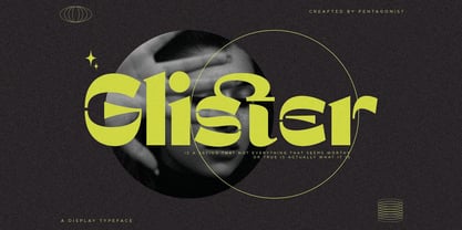 Glister Is An Stylish Display Character Inspired By Cheek Style. SOFTWARE REQUIREMENTS : Fonts and alternate : No special software required they may be used in any basic program /website apps that allows standard fonts That's it folks! You can go ahead and get cracking :) Follow My Shop For Upcoming Updates Including Additional Glyphs And Language Support. And Please Message Me If You Want Your Language Included or If There Are Any Features or Glyph Requests, Feel Free to Send me A Message. Have a Good Day !
 - Linotype Afroculture by Linotype,
$29.99Like the name suggests, the pi font Afroculture from typeface designer Boule Yvan depicts symbols and figures from African folk art. Stylized masks with different expressions and a number of sculptures lend variety to this font. The figures are consciously simple but shown from different perspectives. The black and white surfaces contrast with another and suggest the interplay between shadow and light. The figures of Afroculture are perfect for illustrating texts in a related context and their details come through best in larger point sizes.