10,000 search results
(0.046 seconds)
- Talesian by Viaction Type.Co,
$15.00 Talesian is in an original handwriting style, and looks very natural and beautiful. It is suitable for boutique brand, photography, magazine, quote, business card, logo, poster and many more. There are two weights: regular and bold, script is equipped with OpenType features such as ligatures and multilingual support. I hope you enjoy and thank you.
 - Smyrna by Ahmet Altun,
$19.00 Smyrna is a hand-drawn font family comes in two weights; light and regular. Thanks to its randomize effect, you can write 4 options for each letter. When the Smyrna Font used in OpenType-savvy applications, its Stylistic Alternates feature produce a random-like effect on the terminal points of the letters. So, typing is no longer monotony; it's returning full of fun. The name "Smyrna" comes from the city I live, Izmir. Smyrna is the name of the ancient city located at modern Izmir.
 - Adelle Sans by TypeTogether,
$45.00 The Adelle Sans font family by José Scaglione and Veronika Burian provides a more clean and spirited take on the traditional grotesque sans. As is typical with TypeTogether typefaces, the most demanding editorial design problems were taken into consideration during its creation. The combination of lively character and unobtrusive appearance inherent to grotesque sans serifs make it an utterly versatile tool for every imaginable situation. Whether for global branding, screens, signage and advertising, or UI, the keyword behind Adelle Sans’s use is flexibility. To save space and keep legibility high, Adelle Sans is available in eight weights with matching italics and includes a condensed width of seven weights with their matching italics. Each of these 30 styles hits the perfect tone as a headline punch or subdued background hum, and the condensed widths are adept at setting short texts while retaining the expected personality. Rooted in the belief that broad language support is crucial to modern global type design, the Latin-matching variants are yet another push in TypeTogether’s ongoing multilingual efforts. The Latin script may have been first, but Adelle Sans has thus far been expanded into an exhaustive nine script family with extensive language support. Careful research and close collaboration with type experts yielded typographic consistency, legibility, and cultural awareness among all scripts, as well as filling the need for quality editorial typefaces in Arabic, Armenian, Chinese, Cyrillic, Devanagari, Latin Extended, Greek, and Thai, with more planned for the future. In addition to the 30 Latin styles, all other scripts have between seven and fourteen styles, each of which has been engineered to optically match the proportions of its counterparts. And each script comes bundled with the Latin script to ensure an harmonious fit amongst any two or more Adelle Sans families in the same block of text. The full Adelle Sans family delivers consistent, flexible, and personable results in multilingual documents, in apps, and multicultural branding worldwide. Its wide character set includes typographic niceties, small caps, several sets of figures, icons, and support for over 245 Latin-based languages. Be sure to check out the companions for Adelle Sans: Adelle, for a versatile and authoritative slab serif with no shortage of personality; and Adelle Mono, a two-width family flexible enough for developers and graphic designers alike.
 - MarkerFinePoint-Plain - Unknown license

- NeedlePointSew-Plain - Unknown license

- Ian - Unknown license

- Juliet - Unknown license

- Cupertino - Unknown license

- OregonDry-Plain - Unknown license

- Walrod - Unknown license

- John Sans by Storm Type Foundry,
$49.00 The idea of a brand-new grotesk is certainly rather foolish – there are already lots of these typefaces in the world and, quite simply, nothing is more beautiful than the original Gill. The sans-serif chapter of typography is now closed by hundreds of technically perfect imitations of Syntax and Frutiger, which are, however, for the most part based on the cool din-aesthetics. The only chance, when looking for inspiration, is to go very far... A grotesk does not afford such a variety as a serif typeface, it is dull and can soon tire the eye. This is why books are not set in sans serif faces. A grotesk is, however, always welcome for expressing different degrees of emphasis, for headings, marginal notes, captions, registers, in short for any service accompaniment of a book, including its titlings. We also often come across a text in which we want to distinguish the individual speaking or writing persons by the use of different typefaces. The condition is that such grotesk should blend in perfectly with the proportions, colour and above all with the expression of the basic, serif typeface. In the area of non-fiction typography, what we appreciate in sans-serif typefaces is that they are clamorous in inscriptions and economic in the setting. John Sans is to be a modest servant and at the same time an original loudspeaker; it wishes to inhabit libraries of educated persons and to shout from billboards. A year ago we completed the transcription of the typefaces of John Baskerville, whose heritage still stands out vividly in our memory. Baskerville cleverly incorporated certain constructional elements in the design of the individual letters of his typeface. These elements include above all the alternation of softand sharp stroke endings. The frequency of these endings in the text and their rhythm produce a balanced impression. The anchoring of the letters on the surface varies and they do not look monotonous when they are read. We attempted to use these tricks also in the creation of a sans-serif typeface. Except that, if we wished to create a genuine “Baroque grotesk”, all the decorativeness of the original would have to be repeated, which would result in a parody. On the contrary, to achieve a mere contrast with the soft Baskerville it is sufficient to choose any other hard grotesk and not to take a great deal of time over designing a new one. Between these two extremes, we chose a path starting with the construction of an almost monolinear skeleton, to which the elements of Baskerville were carefully attached. After many tests of the text, however, some of the flourishes had to be removed again. Anything that is superfluous or ornamental is against the substance of a grotesk typeface. The monolinear character can be impinged upon in those places where any consistency would become a burden. The fine shading and softening is for the benefit of both legibility and aesthetics. The more marked incisions of all crotches are a characteristic feature of this typeface, especially in the bold designs. The colour of the Text, Medium and Bold designs is commensurate with their serif counterparts. The White and X-Black designs already exceed the framework of book graphics and are suitable for use in advertisements and magazines. The original concept of the italics copying faithfully Baskerville’s morphology turned out to be a blind alley. This design would restrict the independent use of the grotesk typeface. We, therefore, began to model the new italics only after the completion of the upright designs. The features which these new italics and Baskerville have in common are the angle of the slope and the softened sloped strokes of the lower case letters. There are also certain reminiscences in the details (K, k). More complicated are the signs & and @, in the case of which regard is paid to distinguishing, in the design, the upright, sloped @ small caps forms. The one-storey lower-case g and the absence of a descender in the lower-case f contributes to the open and simple expression of the design. Also the inclusion of non-aligning figures in the basic designs and of aligning figures in small caps serves the purpose of harmonization of the sans-serif families with the serif families. Non-aligning figures link up better with lower-case letters in the text. If John Sans looks like many other modern typefaces, it is just as well. It certainly is not to the detriment of a Latin typeface as a means of communication, if different typographers in different places of the world arrive in different ways at a similar result.
 - Browar by Spacemotion,
$35.00 Browar is a display Grotesk typeface which has Latin & Cyrillic scripts. It comes in 1 weight and it contains 416 characters. Browar includes extended language support (+ Cyrillic), fractions, tabular figures, arrows, ligatures and more. Perfectly suited for graphic design and any display use. It could easily work for web, signage, corporate, newspaper, display, magazines, game ui as well as for editorial design.
 - Aether by Sryga,
$18.00 I'm thrilled to introduce Aether, a seriously cool typeface. Picture this: a sans grotesk vibe with some artsy inktraps and a dash of diamond-cut feature on certain letters. It's like mixing timeless human warmth with a touch of edgy-modern style. Perfect for adding that extra oomph to anything you're creating. Give Aether a spin and let your creativity run wild!
 - Kruda Handcrafted Sans by Akufadhl,
$29.00 Kruda is a Handcrafted display sans with 3 widths and 5 weights with accompanying slanted version. inspired by a vintage grotesk on a worn out signs and this was an initial sketch for our typeface Naratif, but it went too far. so we completed the language support for LATIN, CYRILLIC, and GREEK. and decided to take the risk to release it.
 - VTC Bad DataTrip - Unknown license

- VTC Anglika Bent - Unknown license

- Moire by Microsoft Corporation,
$39.00Moire™ Regular is a block-style sans serif font designed by Jim Ford in the spirit of typefaces popular during the 1950's. The Moire Regular font is slightly more streamlined for a more contemporary voice than its predecessors. Moire Regular is useful for all modern display settings in signs, publications, reports and presentations. The Moire Regular font will also reproduce well in on-screen uses from User Interfaces to web graphics. Character set: Latin 1. - KellyAnnGothic - Unknown license

- LaurenScript - Unknown license

- PerryGothic - Unknown license

- Best Choice Demo - Personal use only

- Basic Map - Personal use only

- Jekatep by ActiveSphere,
$30.00 Jekatep is a sans-serif display font and works best in text and display applications, such as posters, headline, magazine, logos, titles, product branding, corporate branding and publishing. Jekatep font has three weights; light, regular, and bold, each available in italic, making a total of six styles. Each style has a full upper and lower-case, accents, punctuation and a selection of monetary symbols. Currently Available for Mac and PC, in Open Type, PostScript or TrueType.
 - Mouvere by Fikryal,
$18.00 Mouvere – Old Style Serif Family, comes with four types of typefaces, Regular, Italic, Bold, and Bold Italic. This font is very suitable to be applied in various aspects of design, and your branding. It’s perfect for logos, branding, title, social media posts, advertisements, product packaging, product designs, label, photography, watermark, special event, magazine, web designs, etc. Features : Multilingual Support If you have any questions please don’t hesitate to contact me follow my Instagram: @fkryall Thank you
 - Sometimes by Almarkha Type,
$30.00 Sometimes is a fancy signature font with 2 styles: regular and slant. It is inspired by luxury and branded items. It is perfect for logos, branding, photography, invitations, watermarks, advertisements, product designs, stationery, wedding designs, labels, product packaging, special events or anything that need hand-writting taste. Thanks for checking it out, and feel free to drop me a message if you had any queries! Oh, and come and say hello over at email : almarkhatype@gmail.com ~ Almarkha Type
 - Quamila by Sensatype Studio,
$15.00 A Modern Luxury Serif font that we created special for elegant branding needs, with unique shape will be ready to add value of your brand. And specially for Legacy font, We prepared any characters to help you create unlimited variations for your creative needs. Quamila Modern Luxury Serif Font ready with: Ready with Regular and Bold version Preview as a inspirations that you can do with Quamila font Ready with Lowercase and Uppercase characters Wish you enjoy our font. :)
 - Keretro by RagamKata,
$12.00 Get ready to groove with our latest creation, Keretro font! Keretro transports you to the golden era of the past, evoking a sense of nostalgia that resonates with pop culture enthusiasts. Seamlessly blending boldness and authenticity, they captivate the hearts of your audience, adding a unique and irresistible touch to your brand identity. Keretro has 2 widths: Regular and Outline so can be perfect for any retro project like logotype, branding, title, packaging, and many more.
 - AT Move Bulky by André Toet Design,
$39.95 BULKY is the 19th Font of André Toet. It’s Unusual, it’s Heavy, it’s Irregular, it’s Rough, it’s Stripy, it’s Angular, it’s BULKY. But it has character and extremely useful for headings, posters and even logotypes. Just-Use-It! Concept/Art Direction/Design: André Toet © 2017
 - Black - Unknown license

- Station 232 - Unknown license

- Erasure - Unknown license

- Weimar - Unknown license

- Yerk by That That Creative,
$15.00 Yerk is another modern Y2K inspired font. This retro font comes in 3 styles regular italic and slanted. Its bold weight, squared-off letters with slightly rounded corners make it perfect for adding big impact and a bit of personality to your design. It is perfect for logos, branding, magazines, Instagram, and whatever project you are looking for.
 - Bulgatry by Hishand Studio,
$15.00 Elegant look font of Bulgatry. a modern serif font family that drawn inspiration from the elegant of Bali, classy, modern but classic at the same time. just have a look at this beautiful handcrafted serif typeface. Perfect logo, branding, invitations, stationery, wedding designs, social media posts, and much more. Complete with - ligatures - alternates - regular - italic - icon - kerning - multilingual support
 - Blicalon by Tanincreate,
$24.00 Blicalon is a geometric sans serif font with modern look and good legibility. Blicalon aims to be a universal, it works great in headlines, short and long texts, high-end branding, logo designs, magazines, product packaging & invitations. It comes in 2 different styles - regular and italic and is equipped with an extended character set, supporting most European languages.
 - Bricola by K-Type,
$20.00 Bricola (rhymes with Nicola) is a condensed display face that contrasts soft curved outlines with sharp cuts and counters. Sturdy and idiosyncratic, Bricola is an eye-catching blend of functional and funky, appropriate for headlines, labels and branding. The licensed family includes Regular and Bold weights that both pack a punch, and also two handy italics (obliques).
 - Bohemik by Lemonthe,
$12.00 Bohemik is a delightful bouncy script font that adds a playful touch to any design. With its charming curves and energetic strokes, it brings joy and liveliness to your projects. Comes with regular and outline styles. Perfect for logos, quotes, social media posts, invitations, and creative branding materials, this font infuses your work with a cheerful and dynamic spirit.
 - Avegas Royale by Java Pep,
$15.00 Avegas Royale font is modern sans serif font that is made in 4 styles regular, italic, bold, and bold-italic. The shape is made to contrast curves and lines between light and thick so that it looks more stylish and stands out. This font that perfect for logo, headline, advertising, quote text, invitation card, branding identity, and more.
 - Yenthida by RCKY Studio,
$15.00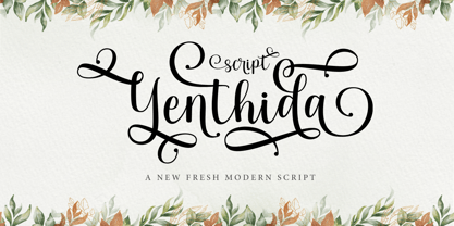 Yenthida Script is a modern calligraphy design, including Regular. This font is casual and beautiful with strokes. Can be used for various purposes. such as logos, product packaging, wedding invitations, branding, headlines, signage, labels, signatures, book covers, posters, quotes, and more. Yenthida Script includes changes in OpenType stylistics, binding, and international support for most Western languages.
 - Boldblaster by Sign Studio,
$12.00 Boldblaster brings vintage themes into the modern era. Neatly arranged lowercase characters are needed for writing a brand or logo. With regular and italic styles, the Boldblaster family can be used together in one display and can support each other in your designs. Supporting font on preview : HEXI ( https://www.myfonts.com/fonts/sign-studio/hexi/ ) Thank You


