10,000 search results
(0.408 seconds)
- Breaker Rockin by Nathatype,
$29.00 Two is better than one, right? With Breaker Rockin, you will not have problems in terms of lack font options. It is a versatile font duo that brings your design result vintage looks. The display font comes all in uppercase characters makes this font easy to read, while the script font shows bold and curvy strokes. You can mix and match this harmonious font duo to make gorgeous result in your design. Even more, this font duo has fascinating features that allows you maximize your design. Features: Stylistic Sets Ligatures Multilingual Supports Numerals and Punctuations PUA Encoded It can be used for many design projects, such as poster, logo, book cover, branding, heading, printed product, merchandise, quotes, social media campaign, etc. Learn more about how to use it by seeing the font preview. Thank you for purchasing our fonts. Please don’t hesitate to contact us, if you have any further question or issues. We’re happy to help. Happy Designing.
 - Straight Line by K-Type,
$20.00 Straight Line is essentially an outline Modern, but drawn without any curves whatsoever. Thin horizontals and thick verticals provide the classic look of a Didone, updated and enhanced by clean, minimalist geometry. In addition to the Straight Line font itself, the package includes Straight Line Solid with matching spacing and kerning. The Solid font can be used solo, or layered with the outline font to provide a colour background. Straight Line is an excellent display face for contemporary, eye-catching headings and sub-headings, and the fonts contain a full complement of Latin Extended-A characters. The typeface was inspired by a 1930s experimental alphabet by the British artist, Percy J Smith.
 - Korner Display by Max.co Studio,
$15.00 Korner Display is a vintage stylish serif font with a unique alternates and ligatures, a high contrast and light font perfect for feminine logo signs, fashion heads & editorial designs, branding projects, Clothing Branding, packaging, magazine headings, advertising, T-shirts, postcards and much more. Korner Display features 691 glyphs. 202+ alternates characters, 260+ ligatures and multiple language support. To enable the OpenType Stylistic alternates, you need a program that supports OpenType features such as Adobe Illustrator CS, Adobe Indesign & CorelDraw X6-X7. You can also enable the OpenType Stylistic alternative, using Character Map (Windows), Nexus Font (Windows), Font Book (Mac) or a software program such as PopChar (for Windows and Mac). Thank you...
 - Northeast Oregon by Nathatype,
$29.00 Are you looking for a handwritten font? Do you dream of creating headings that stand out and inspire creativity, imagination, and endless fun? Wait no more, we will give you the best choice. Northeast Oregon-A Handwritten Font Northeast Oregon is a elegant designed with a modern vibe. It brings charming curves and satisfying patterns This handwritten font is perfect for anything beautiful and neat.. A real head-turner for your presentation, designs, branding, quotes, invitation, website illustrations, and much more. Our font always includes Multilingual Support to make your branding reach a global audience. Features: Ligatures Stylistic Sets PUA Encoded Numerals and Punctuation Thank you for downloading premium fonts from Din Studio
 - ED Laurentsa by Emyself Design,
$9.00 Introducing - ED Laurentsa is a classic serif font family consisting of 9 Weights (Thin, ExtraLight, Light, Regular, Medium, Semibold, Bold, ExtraBold, and Black). Try DEMO Version : https://emyselfdesign.gumroad.com/l/pgtit ED Laurentsa has a classic minimalist look with a condensed style and has a wide variety from thin to black to suit your needs. This font is perfect for your design needs, such as logo design, branding, apparel, headings, web, etc. This font can also be easily combined with other fonts to create the perfect typography. Bold fonts are perfect for displays such as logos, or in-text headings. while the font with a thin style is suitable for covers, posters, or social media posts.
 - Skater Squad by Din Studio,
$29.00 Hi, Everyone! Have you been looking for a graffiti font? Do you dream of creating headings that stand out and inspire creativity, imagination, and prominence style? Introducing Skater Squad- A Grafiti Font Skater Squad is a bold and angular with a distinct street vibe. This font can be used for a host of different content needs and projects. Create gorgeous printed quotes, standout packaging, or beautiful t-shirts! You can even use it to create amazing headings, logos, menus, and social media graphics. Our font always includes Multilingual Support to make your branding reach a global audience. Features: Alternates Standart Ligatures Multilingual Support PUA Encoded Numerals and Punctuation Thank you for downloading premium fonts from Din Studio
 - Arzachel by CAST,
$45.00 Arzachel is a humanistic sanserif with a big x-height and a specific organic look. Its design is scientifically sharp and efficient in small type sizes as well as rugged and dramatic in headlines. Arzachel’s essential feeling comes from several features: all the letters are slightly sloped, stem terminations are flared at the top, and the terminals in letters a, c, e, f… are widening with the inside parts completely flat. The stroke contrast is low in the regular weight while it increases in the black; finally the capitals have an inscriptional flavor. Despite being a sanserif (thus a product of recent typography) Arzachel’s roots stretch back to the Renaissance tradition: Olocco took inspiration from some of the early and rather weird types cut in Venice in the 15th century. Arzachel was conceived during Olocco’s MA in Reading to provide a companion for his Zenon for use in small type sizes. But instead of expanding the Zenon family with optical sizes, the designer decided on a sans with its own personality rather than a sanserif version of Zenon with chopped-off serifs.
 - Frambuesa by Sudtipos,
$39.00 Organic versus geometric are two different universes that converges on nature systems and has its reflection on this new sans serif typeface. Frambuesa is a half humanist-half geometric sans that merges decorative curves with straight lines looking for a balance. The result: a solid but somewhat romantic, nostalgic type program that go ahead harmoniously, dancing to the rhythm of a naturally imperfect melody. Frambuesa can’t hide its family genetics. Structure and proportions come from Elisetta, her older sister they so both have a really good text performance. Regular variables and italics feel comfortable in a lot of contexts and are useful for little words or big title compositions. All seven weights are carefully adjusted to achieve soft transitions between one and the other resulting in high readability levels on program combinations and complex uses. This new font family name is a tribute to Lucia’s childhood, a very happy one. Frambuesa honors this sweet intense red fruit that her grandpa’s Coco gave to his grandchildren every Sunday in the summer.
 - Afrobeat Light by Resistenza,
$39.00 Inspiration The pounding tribal rhythms of Afrobeat music is expressed through this psychedelic brand new font, Afrobeat. Every letter becomes art as every letter is elegantly placed side by side, like music notes, creating music for the eyes. Afrobeat is a musical style performed by many African artists such as Fela Kuti, Femi Kuti, Antibalas and many more, which is a fusion of jazz,funk, and psychedelic rock, originating from the 60s and was based on the political movements of Nigeria. The Font This font is perfect for when you want to use eye-catching big texts for anything from posters and flyers for concerts, events, parties, to CD covers, advertisements, and art, but it´s especially striking for printed projects. Afrobeat Light thinks green Think green. With Afrobeat light you save up to more than 35% of your ink toner. Being green in no longer a luxury, but an an essential. By using Afrobeat light you openly demonstrate that your company integrates the 3 Ps into its operations: People, Planet. Profit. Go ahead - be green! Check out also the original ‘Afrobeat’
 - Acuta by Anatoletype,
$27.00 Acuta is a new all-purpose text serif with a good readability and a contemporary, robust look thanks to its low-medium contrast. The differences between thicks and thins are less strongly marked than in oldstyle text faces; yet the diagonal stress needed to facilitate reading is partly provided by the letter shape itself: sharp angles and italic construction give the right dynamism to the text. Acuta becomes very distinctive as a headline, while its big x-height makes it suitable for texts at rather small sizes too. The family consists of seven weights & correspondent italics, with a large character set. The Book and Medium weights, relatively close to each other, can both be used as “plain” weight depending on the size of the text, background color or backlighting. Small caps, oldstyle and tabular figure alternates, superiors and inferiors and ligatures are available in all styles through OpenType features. The real italics include unobtrusive swash alternates to emphasise the written feeling. Please find a specimen of Acuta (PDF) in the Gallery section.
 - Reina Neue by Lián Types,
$29.00 Hey! See Reina Neue in action here! INTRODUCTION When I designed the first Reina¹ circa 2010, I was at the dawn of my career as a type designer. The S{o}TA, short for the Society of Typographic Aficionados, described it as complex display typeface incorporating hairline flourishes to a nicely heavy romantic letterform². And it was like that; that’s what I was pursuing at that time since I was very passionate about ornaments and accolades of Calligraphy. Why? I felt that Typography, in general, needed more of them. These subtle flourishes could breathe life into letters. Maybe, I thought it was the only way I could propose something new into the field of type. However, after some years, I came across a very interesting quote: –Beautiful things don’t ask for attention– Wow! What did this mean? How could something be attractive if it’s not actually showing it. Could this be applied to my work? Sure. I think every type-designer goes through this process (aka crisis) regarding his or her career. At the beginning we love everything. We are kind of blind, we only see the big picture of a project. And that’s not because we are lazy. We actually can’t see the small mistakes nor the subtleties that make something simpler beautiful. We are not able. But, the small subtleties… They are actually everything: With experience, one puts more attention into the details and learns that every single decision in type has to be first meticulously planned. Here I am now, introducing a new Reina, because I felt there was a lot of it that could be improved, also the novelty of Variable Fonts caught my attention and I had to take that to my type library. THE FONT A thing of beauty is a joy forever Now, a decade later, I’m presenting Reina Neue. This font is not just an update of its predecessor: –A thing of beauty is a joy forever– is the first line of the poem ‘Endymion’ by John Keats, and despite the meaning of “beauty” may vary from person to person, and even from time to time (as read in the last paragraph), with Reina I always wanted to bring joy to the eye. In 2010, and now, in 2020. I believe the font is today much better in every aspect. It was entirely re-designed: Its shapes and morphology in general are much more clean and pure. The range of uses for it is now wider: While the old Reina consisted in just one weight, Reina Neue was converted into a big family of many weights, even with italics, smallcaps and layered styles. The idea behind the font, this kind of enveloping atmosphere made out of flourishes, is still here in the new Reina. This time easier to get amazing results due to the big amount of available alternates per glyph and also more loyal from a systemic point of view. However, and as read in the introduction -Beautiful things don’t ask for attention-, if none of the flourishes are activated the font will look very attractive anyway. Reina Neue is ready to be used in book covers, magazines, wedding cards, dazzling posters, storefronts, clothing, perfumes, wine labels and logos of all kind. Like it happened with the previous Reina, I hope this new font satisfies every design project around the world if used, and can be a joy forever. SOME INSTRUCTIONS Before choosing the right style for your project, hear my advice: -Reina Neue Display was meant to be used at big sizes. If you plan to print the font smaller than 72pt, I suggest using Reina Neue, not Display. Otherwise, if the font will be BIG or used on a digital platform, Reina Neue Display should be your choice. For even smaller sizes, use Reina Neue Small. This style was tested and printed in 12pt with nice results. (Note for variable fonts: Print them in outlines) -Reina Italic is not a slanted version of the roman, and this means some flourishes are different between each other. The Italic version has other kind of swirls. More conservative, in general. -All the styles of Reina Capitals have Small Capitals inside. -Reina Capitals Shine should be used/paired ONLY with Reina Capitals Black. The engraved feeling can be achieved if Reina Capitals Black and Reina Capitals Shine are used as layers, with the same word. Variable fonts instructions: -For more playful versions, choose Reina Neue VF, Reina Neue Italic VF or Reina Neue Capitals VF: With them you can adjust between 3 axes: Weight (will change the weight of the font) – Optic Size (will thicken/lighten the thin strokes and open/close the tracking) – Accolades (will modify the weight of the active flourishes). SOME VIDEOS OF REINA NEUE VF https://youtu.be/8cImmT5bpQM https://youtu.be/1icWfPmKAkg https://youtu.be/YC9GkJDL1a8 NOTES 1. The original Reina, from a decade ago: https://www.myfonts.com/fonts/argentina-lian-types/reina/ 2. In 2011, Reina received an honourable mention by S{o}TA. “Great skill is shown in the detailing, and an excellent feel for the correct flow of curves and displacement of stroke weight.” https://www.typesociety.org/catalyst/2011/ Reina was featured in the “Most Popular Fonts of the year” in MyFonts in 2011 https://www.myfonts.com/newsletters/sp/201201.html In 2012, the font was also selected in Tipos Latinos, the most prestigious competition of type in Latinoamerica. https://www.tiposlatinos.com/bienales/quinta-bienal-tl2012/resultados Also, chose as a “Favorite font of the year” in Typographica. https://typographica.org/typeface-reviews/reina/
 - Reactor A1 - Personal use only

- JD Gina - 100% free

- Parsnip NF by Nick's Fonts,
$10.00Will Ransom designed the exemplar for this series for Barnhart Brothers & Spindler in the early 1900s. The typeface was originally named "Parsons", after the advertising director of a Chicago department store (evidently a very BIG customer of BB&S). Both versions of this font contain the Unicode 1252 (Latin) and Unicode 1250 (Central European) character sets, with localization for Romanian and Moldovan. - Lille Snemand by Hanoded,
$15.00 Lille Snemand, in Danish, means Little Snowman - like the Little Mermaid, but then colder… Lille Snemand is kin to the original Snemand font, which is an all caps typeface, but unlike its big brother, Lille Snemand comes with lowercase glyphs. It is a very legible font and has that 'unevenish' look - making it a great typeface for packaging and books.
 - Van Condensed Hebrew by Vanarchiv,
$40.00 The original version from this display sans-serif typeface was Van Condensed, published during 2004 (Latin, Greek and Cyrillic). Van Condensed Hebrew is the last script update, where the Hebrew characters follow the same design approach from the Latin characters (geometric structure, round corners). The only big difference between the Latin and Hebrew characters is the contrast, Hebrew letterforms contain reverse contrast.
 - Moony by Brave Lion Fonts,
$9.99 Moony combines edgyness with softness and was made to look elegantly strong. The typeface is great for big headlines and impressive titles. Yet a reduced sans serif font, Moony brings it own character with it. With eight styles in different weights you can easily combine it with other typefaces, like scripts. Use Moony to bring a statement in neutral designs.
 - Wangi by Ergibi Studio,
$20.00 Wangi - Display Font, a stencil style typeface perfect for any type of logo, packaging, fashion, magazine, etc. Mantovans is cleanly designed. This is the best choice with more than 130+ alternative characters, so you can show more variations for the completion of your design If there is a problem, question, or anything about my fonts, don't hesitate to ask! Big Thanks Ergibi Studio
 - Royal Street by XO Type Co,
$40.00 Royal Street is a sleek, condensed sans family of six typefaces, from ExtraLight to ExtraBold, designed and built to be big and brash. Royal Street has an extended Latin character set tuned for 87 languages, and is designed with several common and discretionary ligatures, as well as case-sensitive punctuation. All features are accessible with CSS as well as in print.
 - Madison Squared NF by Nick's Fonts,
$10.00Theater posters of the 1930s were often exuberant exercises in Art Deco lettering sensibilities, and the handiwork which inspired this typeface is no different. Big, bold and oddly elegant, this face is an excellent choice for enticing and commanding headlines. Both versions contain the complete Latin 1252, Central European 1250, Turkish 1254 and Baltic 1257 character sets, with several language-specific localizations. - White Sign by Ergibi Studio,
$20.00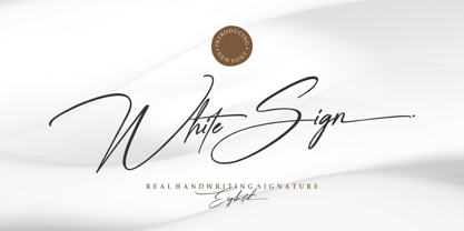 White Sign is Real Handwritting font presentation from Ergibi Studio. Inspired by beautiful writing that has a luxurious feel with additional swash lines perfect for branding, photography, invitations, quotes, watermarks, advertisements, product designs, social media posts, stationery, labels, and more! I hope you enjoy this font. If you have any questions please don't hesitate to drop me a message :) Big Thanks ~ Ergibi Studio
 - Hockeynight Serif Brush by XTOPH,
$25.00 "Hockeynight Serif Brush" is the handwritten version of my "Hockeynight Serif". It's a contemporary college-sports font with the little twist – that its a brush font. With its detailed brushmarks it is designed to go big and bold. "Hockeynight Serif Brush" is an uppercase font and it offers alternate glyphs as lowercases. It pairs perfect with my other "Hockeynight" Fonts – Check it out!
 - Hockeynight Sans Brush by XTOPH,
$25.00 "Hockeynight Sans Brush" is the handwritten version of my "Hockeynight Sans". It's a contemporary college-sports font with the little twist – that its a brush font. With its detailed brushmarks it is designed to go big and bold. "Hockeynight Sans Brush" is an uppercase font and it offers alternate glyphs as lowercases. It pairs perfect with my other "Hockeynight" Fonts – Check it out!
 - Thunderbird by Image Club,
$29.99Thunderbird is an old American-style typeface. It is based on the kinds of big wood type that were popular in old Wild West advertising, which is evident through its ornate serifs, and the pointy flares that pop in and out of the centers of each stroke. Thunderbird is an all caps font and is best used in very large sizes. - Cardin by Flavortype,
$19.00 We're introducing Cardin, A Big, Bold, Juicy script paired with bold serif. A captivating duo that effortlessly combines the bold playfulness of script with the timeless elegance of serif. With two distinct styles, this font set offers the perfect blend of contemporary trends and a touch of vintage allure, resulting in a harmonious balance that is both visually striking and versatile.
 - Synopsis by Vasava Fonts,
$45.00 Synopsis draws inspiration on the classic proportions and letterforms of old romans. In addition to this a new modern twist has been infused to it, giving it a dimensional double stroke or virtual inline that makes the round parts twist in and out. Specially gorgeous in big sizes it brings the best from the past merging it with new ideas.
 - Keybies by Aah Yes,
$0.35Keybies is a font that produces an octave of a piano keyboard, with several variations. Type K or k repeatedly into the textbox above to see. The complete instructions are provided in the download file. One use is to print it in grey and draw big black dots on the relevant keys for chord diagrams, to help children or beginners. - Blandit by Webhance,
$18.00 Blandit - Display & Logo Font family Blandit is a Display font family for design of minimalistic logos. The fonts are very much suitable for creating wordmarks, titles, taglines,Film Posters, headlines, Block letter, Subheading, Logo Designs, Big Banners. Classic & Decorative Typography Web Designs. Upper / lowercase glyphs Multilingual Support Webfonts included Free updates and feature additions Font Designed and Crafted by Webhance Studio.
 - Arum Sans by Australian Type Foundry,
$40.00 A humanist sans-serif family which displays subtle influences of the edged writing tool. Inspired by modern faces such as Chaparral and Enigma, Arum Sans is versatile enough to be used for high-end text setting as well as display purposes. A full international glyph set, extended for European use, allows Arum Sans to play on the field with the big boys.
 - Crem Slab by LomoHiber,
$- Crem is a big Slab Serif font family with gentle minimalistic forms. Variability of styles allows you to experiment very widely with moods Crem reflects. Perfect for use in magazines, posters, logotypes, quotes, invitations, flyers, greeting cards, product packaging, book covers, etc. Crem Slab consists of 14 styles total, has wide language support and dozens of ligatures. Hope you'll enjoy using Crem Slab!
 - Pecot Outline Bold - Unknown license

- Pecot Upper Outline - Unknown license

- Pecot Lined Jewel - Unknown license

- Pecot Outline Oblique - Unknown license

- Border Base Future - Unknown license

- Librum Sans by Hackberry Font Foundry,
$24.95 This is the companion sans family to make the Librum serif families work as well as they do. By companion, I do mean stylistically compatible. But mainly, they have the same vertical metrics. So they work very well for run-in heads, inline character styles, and all the rest of the needs in large books with complex formatting. They are designed for use in InDesign, and they work very well in that environment. The fonts use the same OpenType feature files as the rest of the Librum families. The feature files for the italic and bold are more limited—as I have rarely used things like that [over the past 20+ years]. The character shapes are a bit whimsical. The original ancestor of this book design sans was a very playful font I released as Aerle. It’s been calmed down a lot but is still loose and friendly. For a great deal, see Librum Book Design Group , for a package containing all fifteen fonts!
 - Zoya by MireyDesign,
$10.00 Zoya is a humanist sans serif typeface, a versatile font family that stands out with it's warm and natural feel. Humanist sans serifs have roots in calligraphy, their round, dynamic, open forms have higher stroke contrast than the other sans serif classifications. Can be used by any organization that wants to appear simultaneously modern, approachable, active and professional. FEATURES Four weights + Bold Outline / Italics / Numbers & Punctuation / Extensive Language Support / Long term support, free features and bug fixes The font family includes 10 fonts Zoya Light - delicate and edgy Zoya Bold - strong but approachable Zoya Regular and Semi Bold are the balance between the two Zoya Bold Outline - engaging + Italics USE Strong capitals and a smooth, open lowercase are effective in a variety of applications. This font is perfectly suited for headlines, posters, branding, packaging, presentations, logo, quotes, titles, magazines headings, web layouts, advertising, invitations, packaging design, books, and nearly any creative design.
 - Velino Compressed Headline by DSType,
$50.00 Velino is one of our most complete type families. The serif version comes in two packages with three widths: Velino, Velino Condensed, and Velino Compressed. The display package contains high-contrast typefaces, with a modern flair—very feminine but with plenty of character, specially designed for fine print in big text sizes. The text package was designed for any running text. Its proportions and colors make it ideal for text, even in very difficult conditions such as newspaper printing. We also designed the perfect companion to this enormous type system: Velino Poster, a slab serif typeface with only one weight and its respective italic, but with plenty of muscle, for every time some extra strength is needed, such as setting very big text, magazine covers or newspapers’ special sections. Finally, we designed Velino Sans and Velino Sans Condensed to perfectly match the weight and proportions of Velino, all with matching italics.
 - Velino Sans Condensed by DSType,
$55.00 Velino is the most recent of our Premium Typefaces. The serif version comes in two packages with three widths: Velino, Velino Condensed and Velino Compressed. The Display package contains high contrast typefaces, with a modern flair, very feminine but with plenty of character, specially designed for fine print in big text sizes. The Text package was designed for any running text. It’s proportions and colors make it the ideal for text, even in very difficult conditions such as newspaper printing. We also designed the perfect companion to this enormous type system: Velino Poster, a Slab Serif typeface with only one weight and it’s respective italic, but with plenty of muscle, for every time some extra strength is needed, like setting very big text, magazine covers or newspaper’s special sections. Finally we designed Velino Sans and Velino Sans Condensed to perfectly match the weight and proportions of Velino, all with matching italics.
 - Velino Condensed Headline by DSType,
$50.00 Velino is one of our most complete type families. The serif version comes in two packages with three widths: Velino, Velino Condensed, and Velino Compressed. The display package contains high-contrast typefaces, with a modern flair—very feminine but with plenty of character, specially designed for fine print in big text sizes. The text package was designed for any running text. Its proportions and colors make it ideal for text, even in very difficult conditions such as newspaper printing. We also designed the perfect companion to this enormous type system: Velino Poster, a slab serif typeface with only one weight and its respective italic, but with plenty of muscle, for every time some extra strength is needed, such as setting very big text, magazine covers or newspapers’ special sections. Finally, we designed Velino Sans and Velino Sans Condensed to perfectly match the weight and proportions of Velino, all with matching italics.


