10,000 search results
(0.033 seconds)
- Bomboloni by Goodigital13,
$20.00 will be great for any projects including : branding, logo, stationery, business card, signage, flyer, brochure etc. Almost all industries will be match for this typeface: wedding, events, rmakeup artist, travel, hotel, musician etc, food
 - Longtime by Sinfa,
$10.00 Longtime is drawn with thick font with a retro style and includes several swash characters. Longtime is suitable for product logos and labels, in cafes, restaurants, magazine titles, business cards, invitations, and product branding.
 - Amberlight by Get Studio,
$25.00 Introducing Amberlight Script - a new fresh & modern script with a sweet calligraphy style, decorative characters, and a dancing baseline! So beautiful on invitations like greeting cards, branding materials, business cards, quotes, posters, and more!
 - Christmas Weather by Letterafandi Studio,
$14.00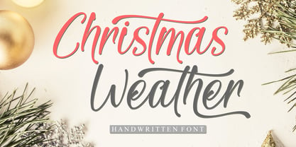 Christmas Weather is a stylish and incredibly elegant script font. It looks stunning on wedding invitations, thank you cards, quotes, greeting cards, logos, business cards and every other design which needs a handwritten touch.
 - Wooden Okadio by Maulana Creative,
$16.00 Wooden Okadio Serif is a single weight black serif, modern casual typeface perfect use for headline, logo, magazine, and any editorial design needs also readable body text. I hope you like it, keep awesome!
 - With Christmas by Yoga Letter,
$18.00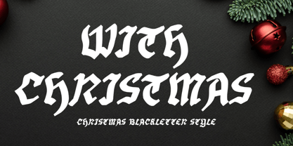 “With Christmas” is an elegant and professional blackletter font. This font is equipped with uppercase, lowercase, numerals, punctuation, and multilingual support. Very suitable for Christmas, Halloween, business branding, promotions, logos, banners, posters, and others.
 - Donattio by Subectype,
$12.00 Donattio is a signature font with a textured style. The basis if this gorgeous font it’s simplicity. It’s perfect for photography, signatures, branding, and every other designs which needs a simple, yet strong typeface.
 - PIXymbols Signet Oldstyle by Page Studio Graphics,
$29.00Create old style initials, evoking traditional printers' marks for stylish business or personal stationery. Includes 37 borders, each accessed by a single keystroke, which will automatically line up with the letters in the monogram. - Melanie Shanon by Selvia Design,
$14.00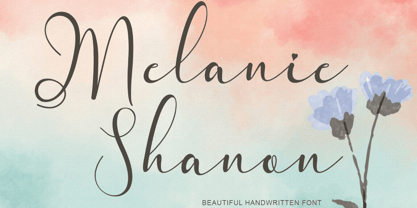 "Melanie Shanon" is a beautiful and elegant handwritten font. This font is equipped with uppercase, lowercase, ligatures, numerals, punctuations and multilingual support. It is suitable for weddings, photography, invitations, branding, logos, business and others.
 - Glaudusa by Bosstypestudio,
$12.00 Glaudusa is a new calligraphy font which is fresh, funny, interesting and with a cute heart that can be connected. It is suitable for greeting cards, branding materials, business cards, quotes, posters, and more!
 - Aparcero JNL by Jeff Levine,
$29.00 Vintage sheet music with the title of "Aparcero" lettered in a bold, Art Deco sans is the basis for Aparcero JNL. The title is a Spanish word that translates to "tenant farmer" or "sharecropper".
 - Freeform 721 by Bitstream,
$29.99Auriol font was the basis for the lettering used by Hector Guimard for the entrance signs to the Paris Metro. Bitstream’s Freeform 721 with his brush stroke look, is well-suited to display settings. - Guardian by OtterType,
$20.00 Guardian is an outstanding narrow display font. You can use it for a variety of design projects like posters, business cards, invitations, games, covers, social media posts, quote photos, branding, editorials, and much more.
 - Butter Carney by Zeenesia Studio,
$16.00 Introducing Butter Carney, Butter Carney is handwritten font with a modern calligraphy feel, Looks amazing on wedding invitations, thank you cards, quotes, greeting cards,tshirt design, mugs, logos, business cards and any other design.
 - Arcato by Stefano Giliberti,
$15.00 Arcato is a font family shaped from spherical curves inspired by celestial bodies. It supports 114 languages, features a total of 508 glyphs and includes an italicized version for each of the 5 weights.
 - Misslena by Din Studio,
$29.00 Have you been looking for a serif font? Do you sometimes have an appetite for a bit more wholesome typography? Do you dream of creating headings that stand out and inspire creativity, imagination, and endless fun? Wait no more, we will give you the best choice. Misslena-A Serif Font One of the most elegant, exquisite yet strong fonts. Misslena is made to bring out a modern and stylish view of what you make. This font contains upper & lowercase characters, all punctuation, and numerals. Also features ligatures and alternates characters to help the text flow naturally and add a custom-made feel. Its lighter weights are well-suited for body text. The available stylistic alternates offer a number of different characters that give your logo or business card a unique look. Misslena includes Multilingual Support to make your branding reach a global audience. Inspire your audience, clients, or guests with this beautiful, statement font. Features: Ligatures Alternates PUA Encoded Numerals and Punctuation Thank you for downloading premium fonts from Din Studio
 - Plantin by Monotype,
$29.99 Plantin is a Renaissance Roman as seen through a late–industrial-revolution paradigm. Its forms aim to celebrate fine sixteenth century book typography with the requirements of mechanized typesetting and mass production in mind. How did this anomalous design come about? In 1912 Frank Hinman Pierpont of English Monotype visited the Plantin-Moretus Museum in Antwerp, returning home with “knowledge, hundreds of photographs, and a stack of antique typeset specimens including a few examples of Robert Granjon’s.” Together with Fritz Stelzer of the Monotype Drawing Office, Pierpont took one of these overinked proofs taken from worn type to use as the basis of a new text face for machine composition. Body text set in Plantin produces a dark, rich texture that’s suited to editorial and book work, though it also performs its tasks on screen with ease. Its historical roots lend the message it sets a sense of gravity and authenticity. The family covers four text weights complete with italics, with four condensed headline styles and a caps-only titling cut. Plantin font field guide including best practices, font pairings and alternatives.
 - AS-VELASCA - Personal use only

- Tenderness - 100% free

- Easter Joy - Personal use only

- Deco Blocks - Unknown license

- Quintus LeadedGlass - Unknown license

- Gear Proportion - Unknown license

- Nonserif - Unknown license

- Vaporbyte - 100% free

- Paper Cut - Personal use only

- Discrdive 3D - 100% free

- ChrisMaster - Personal use only

- Generis Slab by Linotype,
$29.00The idea for the Generis type system came to Erik Faulhaber while he was traveling in the USA. Seeing typefaces mixed together in a business district motivated him to create a new type system with interrelated forms. The first design scheme came about in 1997, following the space saving model of these American Gothics. Faulhaber then examined the demands of legibility and various communications media before finally developing the plan behind this type system. Generis’s design includes two individually designed styles; each of with is available with and without serifs, giving the type system four separate families. Each includes at least four basic weights: Light, Regular, Medium, and Bold. Further weights, small caps, old style figures, and true italics were added to each family where needed. The Generis type system is designed to meet both optical criteria and the highest possible measure of technical precision. Harmony, rhythm, legibility, and formal restraint make up the foreground. Generis combines aesthetic, technical, and economic advantages, which purposefully and efficiently cover the whole range of corporate communication needs. The unified basic form and the individual peculiarity of the styles lead to Generis’ systematic, total-package concept. The clear formal language of the Generis type system resides beneath the information, bringing appropriate typographic expression to high-level corporate identity systems, both in print and on screen. The condensed and aspiring nature of the letterforms allows for the efficient setting of body copy, and the economic use of the page. A range of accented characters allows text to be set in 48 Latin-based languages, offering maximal typographic free range. This previously unknown level of technical and design execution helps create higher quality typography in all areas of corporate communication. Optimal combinations within the type system: Generis Serif or Generis Slab with Generis Sans or Generis Simple. - Generis Serif by Linotype,
$29.00The idea for the Generis type system came to Erik Faulhaber while he was traveling in the USA. Seeing typefaces mixed together in a business district motivated him to create a new type system with interrelated forms. The first design scheme came about in 1997, following the space saving model of these American Gothics. Faulhaber then examined the demands of legibility and various communications media before finally developing the plan behind this type system. Generis’s design includes two individually designed styles; each of with is available with and without serifs, giving the type system four separate families. Each includes at least four basic weights: Light, Regular, Medium, and Bold. Further weights, small caps, old style figures, and true italics were added to each family where needed. The Generis type system is designed to meet both optical criteria and the highest possible measure of technical precision. Harmony, rhythm, legibility, and formal restraint make up the foreground. Generis combines aesthetic, technical, and economic advantages, which purposefully and efficiently cover the whole range of corporate communication needs. The unified basic form and the individual peculiarity of the styles lead to Generis’ systematic, total-package concept. The clear formal language of the Generis type system resides beneath the information, bringing appropriate typographic expression to high-level corporate identity systems, both in print and on screen. The condensed and aspiring nature of the letterforms allows for the efficient setting of body copy, and the economic use of the page. A range of accented characters allows text to be set in 48 Latin-based languages, offering maximal typographic free range. This previously unknown level of technical and design execution helps create higher quality typography in all areas of corporate communication. Optimal combinations within the type system: Generis Serif or Generis Slab with Generis Sans or Generis Simple. - Generis Simple by Linotype,
$39.00The idea for the Generis type system came to Erik Faulhaber while he was traveling in the USA. Seeing typefaces mixed together in a business district motivated him to create a new type system with interrelated forms. The first design scheme came about in 1997, following the space saving model of these American Gothics. Faulhaber then examined the demands of legibility and various communications media before finally developing the plan behind this type system. Generis’s design includes two individually designed styles; each of with is available with and without serifs, giving the type system four separate families. Each includes at least four basic weights: Light, Regular, Medium, and Bold. Further weights, small caps, old style figures, and true italics were added to each family where needed. The Generis type system is designed to meet both optical criteria and the highest possible measure of technical precision. Harmony, rhythm, legibility, and formal restraint make up the foreground. Generis combines aesthetic, technical, and economic advantages, which purposefully and efficiently cover the whole range of corporate communication needs. The unified basic form and the individual peculiarity of the styles lead to Generis’ systematic, total-package concept. The clear formal language of the Generis type system resides beneath the information, bringing appropriate typographic expression to high-level corporate identity systems, both in print and on screen. The condensed and aspiring nature of the letterforms allows for the efficient setting of body copy, and the economic use of the page. A range of accented characters allows text to be set in 48 Latin-based languages, offering maximal typographic free range. This previously unknown level of technical and design execution helps create higher quality typography in all areas of corporate communication. Optimal combinations within the type system: Generis Serif or Generis Slab with Generis Sans or Generis Simple. - Generis Sans by Linotype,
$29.00The idea for the Generis type system came to Erik Faulhaber while he was traveling in the USA. Seeing typefaces mixed together in a business district motivated him to create a new type system with interrelated forms. The first design scheme came about in 1997, following the space saving model of these American Gothics. Faulhaber then examined the demands of legibility and various communications media before finally developing the plan behind this type system. Generis’s design includes two individually designed styles; each of with is available with and without serifs, giving the type system four separate families. Each includes at least four basic weights: Light, Regular, Medium, and Bold. Further weights, small caps, old style figures, and true italics were added to each family where needed. The Generis type system is designed to meet both optical criteria and the highest possible measure of technical precision. Harmony, rhythm, legibility, and formal restraint make up the foreground. Generis combines aesthetic, technical, and economic advantages, which purposefully and efficiently cover the whole range of corporate communication needs. The unified basic form and the individual peculiarity of the styles lead to Generis’ systematic, total-package concept. The clear formal language of the Generis type system resides beneath the information, bringing appropriate typographic expression to high-level corporate identity systems, both in print and on screen. The condensed and aspiring nature of the letterforms allows for the efficient setting of body copy, and the economic use of the page. A range of accented characters allows text to be set in 48 Latin-based languages, offering maximal typographic free range. This previously unknown level of technical and design execution helps create higher quality typography in all areas of corporate communication. Optimal combinations within the type system: Generis Serif or Generis Slab with Generis Sans or Generis Simple. - Tuffy - 100% free

- Tuffy - 100% free

- The Sherloks by Dikas Studio,
$15.00 Sherlock have 4 Style : Regular, Oblique Regular, Vintage and Oblique Vintage with hand drawn character and opentype feature its very helpfull to get Vintage design. Suitable and applicable to create vintage design, branding, logos, product packaging, invitation, quotes, t-shirt, label poster etc. Caps Only Fonts.
 - Pixeloza 01 by Fontsphere,
$12.00 Pixeloza 01 is a pixel-style, grid-based, display typeface. Pixeloza 01 is available in two complementary options: Pixeloza 01 Regular and Pizeloza 01 Skewo Regular. It is distinguished by its simplicity and original form. It gives a lot of possibilities in creating unconventional, creative, unique projects.
 - Jatayu by Khurasan,
$10.00 Jatayu is a fun bold script font, with a fresh and modern style. Jatayu has two different styles, regular and extrude. You can combine regular and extrude to get amazing results. Jatayu is suitable for logos, branding, greeting cards, posters and any design that you create.
 - Heavy Boxing by Vozzy,
$10.00 Introducing a vintage look label duo font named "Heavy Boxing". This family includes regular bold and strong font and cute handwritten script font. Regular font have different small and capitali letters. This font will good viewed on any retro design like poster, t-shirt, label, logo etc.
 - MuX1ne by Machine Cult,
$14.00 A geometric-ish font family that's a bit off-kilter, offering three families: Regular, Rounded and Hatch as well as the bonus Noise, catchwords and dingbats for some occasions. Each font comes in Light, Regular and Bold styles. Complete latin character set with a range of ligatures.
 - Lucida Fax by Monotype,
$40.99Lucida is a family of fonts with one basic design, but offered in two variations. It has both serif and sans serif characters. Lucida is suitable for books/text, documentation/business reports, posters, advertisement, multimedia.


