10,000 search results
(0.017 seconds)
- ITC Zapf Book by ITC,
$29.99 Zapf Book font is the work of German designer Hermann Zapf, a blend of the characteristics of Walbaum, Melior and the contrasting weights of Bodoni. It is a typical Zapf font, distinction without eccentricity and superb sensitivity and letterfit, and clearly demonstrates his concern that an alphabet work not just as a collection of single letters, but also have a sense of unity in itself.
 - BB book B by bb-bureau,
$65.00 A font family in continuation of the bb-book A , also kicking up weight, width and contrast, but upside down. 4 styles: condensed, regular, expanded and ultra-expanded.
 - Banks and Miles by K-Type,
$20.00 K-Type’s ‘Banks & Miles’ fonts are inspired by the geometric monoline lettering created for the British Post Office in 1970 by London design company Banks & Miles, a project initiated and supervised by partner John Miles, and which included ‘Double Line’ and ‘Single Line’ alphabets. The new digital typeface is a reworking and extension of both alphabets. Banks & Miles Double Line is provided in three weights – Light, Regular and Dark – variations achieved by adjusting the width of the inline. Banks & Miles Single Line develops the less used companion sans into a three weight family – Regular, Medium and Bold – each with an optically corrected oblique. Although the ‘Banks & Miles Double Line’ and ‘Banks & Miles Single Line’ fonts are based on the original Post Office letterforms, glyphs have been drawn from scratch and include numerous adjustments and impertinent alterations, such as narrowing the overly wide Z and shortening the leg of the K. Several disparities exist between the Post Office Double and Single Line styles, and K-Type has attempted to secure greater consistency between the two. For instance, a wide apex on the Double Line’s lowercase w is made pointed to match the uppercase W and the Single Line’s W/w. Also, the gently sloping hook of Single Line’s lowercase j is adopted for both families. The original Single Line’s R and k, which were incongruously simplified, are drawn in their more remarkable Double Line forms, and whilst the new Single Line fonts are modestly condensed where appropriate, rounded letters retain the essentially circular form of the Double Line. Many characters that were not part of the original project, such as @, ß, #, and currency symbols, have been designed afresh, and a full set of Latin Extended-A characters is included. The new fonts are a celebration of distinctive features like the delightful teardrop-shaped bowl of a,b,d,g,p and q, and a general level of elegance not always achieved by inline typefaces. The Post Office Double Line alphabet was used from the early 1970s, in different colours to denote the various parts of the Post Office business which included telecommunications, counter services and the Royal Mail. Even after the Post Office was split into separate businesses in the 1980s, Post Office Counters and Royal Mail continued use of the lettering, and a version can still be seen within the Royal Mail cruciform logo.
 - BB book A by bb-bureau,
$65.00 bb-book A — breaking rules typeface Expressive book serif (triangular and curved) kicking up weight, width and contrast — in 4 styles: light, regular, medium and bold.
 - Date Book JNL by Jeff Levine,
$29.00 The pen lettered opening credits for the 1937 film “The Awful Truth” inspired Date Book JNL, which is available in both regular and oblique versions. A hybrid of both Art Nouveau and Art Deco influences, this casual type design is perfect for any project that wants to convey its message in a pleasant, informal manner.
 - Mantika Book Paneuropean by Linotype,
$67.99Mantika Book expands the Mantika super family: a contemporary serif font with a soft, yet robust character and a classic lookMantika Book, an Antiqua, is the third member of the Mantika super family, which consists of the Mantika Sans and Mantika Informal. Designer Jürgen Weltin has gone back to the roots of his font, which he had originally derived from a Renaissance Antiqua. These origins are recognizable in the first member of the Mantika family, Mantika Sans, in the form of carefully suggested line use and a contrast in the weights that recalls the Antiqua. This solid sans serif, optimized for use in text, also has a particularly energetic and dynamically designed italic. Mantika Informal also brings to mind a cursive font at first glance; ultimately, however, it is not easily categorized. Its light, organic shapes combine the informally flowing style of cursive handwriting with the open and airy form and contrast of a humanist sans serif. The shapes in the serif Mantika Book are also based on the Renaissance Antiqua, just like the other members of the Mantika super family. However, the contrast in the weights is somewhat stronger than is conventional for this genre, and the serifs are characteristically asymmetrical, with slanted ends. Lightly grooved stems with an implied curvature in the lower-case letters as well as dots whose shape flirts with a fountain pen lend the Mantika Book a dynamic and particularly friendly character. Details like the open "g" or the contoured foot of the "k" emphasize this dynamism. The letters of Mantika Book have the same large x-height as the other members of the super family, but are equipped with somewhat longer ascenders and descenders. - Monkton Book Condensed by Club Type,
$36.99 Packing more copy in a narrow space is the main reason for using a condensed type. Characters with a more ovular shape tend to be less wide than their circular counterparts and will allow for more letters per line. In narrow columns for example, this typeface can provide up to 25% more copy than the regular typeface in the same space. Another reason is when a larger type size is called for — used sparingly it is useful for headings or headlines. For emphasis, narrower letters can provide a stark contrast in the flow of reading, creating impact while retaining typographic character. Condensed types can specially useful in tables and charts because typically both use few words in each block. If space now allows, you may think about the luxury of a larger point size. This optimizes space while keeping your typography more easily legible.
 - BB book Text by bb-bureau,
$65.00 bb-book text is a text version of bb-book A and bb-book B . language: all latin glyphs
 - BB book Contrasted by bb-bureau,
$65.00 bb-book contrasted is a display and contrasted version of bb-book A .
 - Stinky School Book by Nerfect,
$15.00Stinky School Book was created to letter the adventures of a particular Mr. Stinky the Elf, but you can use it for that informal look when used for body copy or as a display face for headlines. - Lettering Book JNL by Jeff Levine,
$29.00 A circa-1940s textbook for the Esterbrook Drawlet Pens (similar to Speedball pens) offered numerous samples of lettering that could be obtained by following the simple directions and using the book as a guide. One example was a classic Art Deco design made with a round nib pen, and it has been redrawn digitally as Lettering Book JNL in both regular and oblique versions.
 - A Cut Above The Rest - Unknown license

- No Harmony Left Side Cut - Unknown license

- GARFIELD the CAT - Personal use only

- Cul De Sac - Personal use only

- Crushed Out Girl - Unknown license

- Cup and Talon - Unknown license

- VTC Krinkle-Kut - Unknown license

- VTC Krinkle-Kut - Unknown license

- Ben Cat Normal - Unknown license

- VTC Krinkle-Kut - Unknown license

- VTC Krinkle-Kut - Unknown license

- Cacophony Out Loud - Unknown license

- Boldly Go Out - Unknown license

- Out of sight - Unknown license

- Bad Black Cat - Unknown license

- VTC Krinkle-Kut - Unknown license

- Supervixen Honeyed Out - Personal use only

- Cub Reporter JNL by Jeff Levine,
$29.00 In the 1934 edition of the American Type Foundry’s “Book of American Type” is a selection of letterpress fonts which emulate typewriter faces. One design named “Bulletin Typewriter” served at the model for Cub Reporter JNL, and is available in both regular and oblique versions. The font has been monospaced in order to add a more traditional typewriter look to any project.
 - Decked Out NF by Nick's Fonts,
$10.00Inlines that go over, under sideways, down! Deck out your headlines in grand style with this unusual inline face, based on Dektiv, a seventies-style classic from "Homage to the Alphabet." Both versions include the complete Latin 1252, Central European 1250 and Turkish 1254 character sets, as well as localization for Moldovan and Romanian. - Evening Out JNL by Jeff Levine,
$29.00 Based on an example of [circa] 1950 Finnish embroidery lettering, Evening Out JNL is a classic Art Deco design with contrasting thick and thin lines. This elegant and stylish typeface is available in both regular and oblique versions.
 - LDJ Cool Cat by Illustration Ink,
$3.00This stylin' font is one cool cat! It's great for that groovy layout. - Hot Cup Cake by Olivetype,
$18.00 Hot Cup Cake is a relaxed, fashionable and delicate script font. It looks beautiful on a variety of designs requiring a personalized style, such as wedding invitations, thank you cards, weddings, greeting cards, logos and so on. Hot Cup Cake font contains is supporting 66 languages, which includes: Afrikaans Albanian Catalan Danish Dutch English Estonian Finnish French German Italian Norwegian Portuguese Spanish Swedish Zulu.
 - The Cats Whiskers by Hanoded,
$15.00 Ok. Another font with cats in it. I asked my son, Sam (age 4), to draw some cats and I have to say: I'm very proud of what he created. The tiger I asked him for became a spinosaurus mom with her baby and I also got some happy hearts thrown in for good measure. The Cat's Whiskers is a very legible hand made font. Nice and loose, not too messy and with just a hint of childishness. Comes with a litter of diacritics. Oh… and a big thank you to Jakob from pizzadude.dk for suggesting I should post more pics of cats on FB - which eventually led to the name of this font.
 - Like A Cat by PizzaDude.dk,
$20.00 As a kid I used to write my favourite football teams name with 3D letters over and over again. I spent hours doing this - often to find out I had the colors wrong, or I had made a spelling error or two - but now, several years after, I have created the "Like a cat" font - so that you can make "handmade" headlines or funny quotes or even your favourite football teams name in a swoosh! If you get the colors wrong, or you make a spelling error, it's fast and easy to correct! :) Like a cat comes with substitution characters for double letters!
 - Cute Christmas Monogram by AEN Creative Studio,
$18.00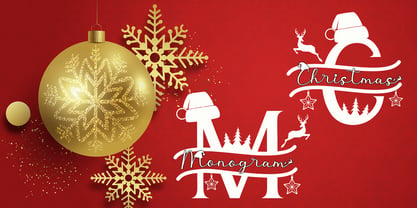 Cute Christmas Monogram is a joyful and festive duo font (decorative + script). It is ideal for Holiday-themed greeting cards and for any crafting project. This font is PUA encoded which means you can access all of the glyphs and swashes with ease!
 - Spread Out NF by Nick's Fonts,
$10.00Here's another gem from perennial Speedball penmaster Ross F. George, originally called Split Caps. George's original design has been enhanced with the addition of lowercase characters, borrowed from another of his alphabets, and adapted to the style of the caps. This font derives its name from one of the catchphrases of the estimable Stooge-in-Chief, whose signature hairdo can be found in place of the Section mark. Both versions of the font include complete Latin 1252, Central European 1250 and Turkish 1524 character sets, with localization for Moldovan, Romanian and Turkish. - The Maggie Nut by Hydric Design,
$10.00 The Maggie Nut is a font with a retro style made to make your designs look more attractive. The Maggie Nut has 2 styles, namely Light (shining) and Regular, It will be very easy to use and will save you time on designing. The Maggie Nut also has many opentype features such as ligature, and alternate. This will be very suitable for use as a logo, poster, packaging, merchandise, social media & greeting cards.
 - Dining Out JNL by Jeff Levine,
$29.00 A 1940s ad flier for the Los Angeles restaurant “Lucca Paris Inn” had its name hand lettered at the top of the page in a condensed Art Deco slab serif with some stylized characters. Given a more uniform look, the end result became Dining Out JNL and is available in both regular and oblique versions.
 - Uncanny Cat PB by Pink Broccoli,
$16.00 Inspired by the 1977 anthology horror film called "Uncanny", Uncanny Cat PB captures all the awkward fun of the film's titling sequence. Feline revenge has never looked so good. This typeface was oodles of fun to flesh out, and is true to that purposefully awkward appeal that a lot of Pink Broccoli fonts are imbued with. Loaded with a collection of ligatures that combine and nest letters against each other, lending to the unique typesetting of this "uncanny" font.


