10,000 search results
(0.039 seconds)
- Magola by Andinistas,
$39.95 Magola is a creamy flavor font family whose purpose is to season with emotions the reading of words and phrases formed by puffy glyphs coated with a caramel of empty spaces external and internal. Independently or in groups, members of the family serve to decorate and organize packaging or advertising material in letters apparently crafted for food or entertainment contexts. Its starting point was to draw letters like a ballon fish evolved into a black version with empty areas and microscopic contrasted with colorful inflated and filled areas. Then the challenge was based on the sum transferred between full and empty into a lighter caliber. In that vein, its overall design adapted skeletons of italics and Roman calligraphy. Therefore, its regular, bold and black files have great height "x" with upwards and downwards extremely short and large internal counterblocks to facilitate reading. In this regard, to strengthen its objective and capture the reader's attention, its kind of contrast and simulated auctions flat tip brush strokes, and amount of contrast between thick and thin in the black version is slightly inverted. Its sizes, smooth strokes and irregular lines reinforce its traditional spirit, so it is favorable to shine the information on posters or large-format media. In short, its optical conformation based on a non-literal way, in metrics similar in all family members to be easily exchanged without changing the ìxî height. It is therefore a striking and versatile tool, that besides being useful in large sizes, can be used in small sizes as well. And more importantly, its general concept is more profitable when its members are mixed to nest headings, subheadings and short paragraphs, designed according to size, position, color and location in logos, covers, posters, ads and flyers.
 - Lotus Heart by Putracetol,
$28.00 Lotus Heart - Classy Ligature Font Lotus Heart is a stunning and luxurious display font that exudes sophistication and elegance. This font is the perfect choice for those looking to add a touch of class to their design projects. The idea behind the creation of Lotus Heart was to capture the essence of luxury and elegance in a typeface. Its classic and timeless style is perfect for high-end product branding, fashion, beauty, logos, book covers, posters, and flyers. Lotus Heart is a versatile typeface that can be used in a variety of design projects. It's a perfect match for any project that requires a touch of luxury and elegance, such as high-end product branding or fashion. This font is perfect for creating logos, book covers, posters, and flyers that will stand out and make a statement. The font comes with various features, including uppercase and lowercase letters, alternates, and ligatures, which can be accessed using OpenType technology. Additionally, this font includes number, punctuation, and symbols, making it suitable for a wide range of design projects. It also supports multiple languages, making it accessible to users from different regions. In the package, you will receive three different formats of the font, including OTF, TTF, and WOFF. This means that you can use Lotus Heart across a range of digital design platforms, including Adobe Photoshop, Illustrator, and InDesign. Lotus Heart is a classy and elegant ligature font that is perfect for adding a touch of sophistication to any design project. Its versatility, along with its classic and timeless style, makes it an excellent choice for product branding, fashion, beauty, and many more design projects. With Lotus Heart, you can create stunning designs that will leave a lasting impression on your audience. Choose Lotus Heart today and elevate your design projects to the next level with its luxurious and sophisticated style.
 - Asian Railway JNL by Jeff Levine,
$29.00 A poster for the 1932 film “Shanghai Express” starring Marlene Dietrich has the films name is a semi-Asian lettering style. This bold poster font is now available as Asian Railway JNL in both regular and oblique versions.
 - Andarillo by Franklin Veiga,
$10.00 Andarillo is a display typeface inspired by vintage travel posters and magazines. The complete glyph set contains uppercase, small caps, numerals, punctuation, ligatures and multilingual support. Andarillo is perfect for logotypes, magazines, titles, posters, advertising and branding communication.
 - Hapshash by K-Type,
$20.00 Hapshash is an all capitals font inspired by the 1960s psychedelic posters of British designers Hapshash and the Coloured Coat (Michael English and Nigel Waymouth), in particular their 1968 poster for the First International Pop Festival in Rome.
 - Evil Eye by Goodigital13,
$20.00 Suitable for various media, posters, banners, brochures, and various merchandising such as t-shirts, totte bags, stickers and much more perfect for display such as label, apparel, fashion, sticker, books, poster, and many more! Complete with OpenType features.
 - Prosaic Std by Typofonderie,
$59.00 A Postmodern vernacular sanserif in 8 fonts Prosaic designed by Aurélien Vret is a Postmodern typographic tribute to the french vernacular signs created by local producers in order to directly market their products visible along the roads. These signs drawn with a brush on artisanal billboards do not respect any typographic rules. The construction of these letterforms is hybrid and does not respect any ductus. Nevertheless the use of certain tools provokes a certain mechanism in the development of letter shapes. It’s after many experiments with a flat brush, that’s these letterforms have been reconstructed and perfected by Aurélien Vret. This is the starting point for the development of an easily reproducible sanserif with different contemporary writing tools. From non-typographical references of Prosaic towards readability innovation The influence of the tool is revealed in the letterforms: angular counterforms contrasting to the smoothed external shapes. This formal contrast gives to Prosaic a good legibility in small sizes. These internal angles indirectly influenced by the tool, open the counterforms. In the past, to deal with phototype limitations in typeface production, some foundries modified the final design by adding ink traps. In our high resolution digital world, these ink traps — now fashionable among some designers — have little or no effect when literally added to any design. Should one see in it a tribute to the previous limitations? Difficult to say. Meanwhile, there are typeface designers such as Ladislas Mandel, Roger Excoffon, and Gerard Unger who have long tried to push the limits of readability by opening the counters of their typefaces. Whatever the technology, such design research for a large counters have a positive impact on visual perception of typefaces in a small body text. The innovative design of counter-forms of the Prosaic appears in this second approach. Itself reinforced by an exaggerated x-height as if attempting to go beyond the formal limits of the Latin typography. It is interesting to note how the analysis of a non-typographical letters process has led to the development of a new typographic concept by improving legibility in small sizes. Disconnected to typical typographic roots in its elaboration, Prosaic is somewhat unclassifiable. The formal result could easily be described as a sturdy Postmodern humanistic sanserif! Humanistic sanserif because of its open endings. Sturdy because of its monumental x-height, featuring a “finish” mixing structured endings details. The visual interplay of angles and roundness produces a design without concessions. Finally, Prosaic is Postmodern in the sense it is a skeptical interpretation of vernacular sign paintings. Starting from a reconstruction of them in order to re-structure new forms with the objective of designing a new typeface. Referring to typographic analogy, the Prosaic Black is comparable to the Antique Olive Nord, while the thinner versions can refer to Frutiger or some versions of the Ladislas Mandel typefaces intended for telephone directories. Prosaic, a Postmodern vernacular sanserif Prosaic is radical, because it comes from a long artistic reflection of its designer, Aurélien Vret, as well a multidisciplinary artist. The Prosaic is also a dual tone typeface because it helps to serve the readability in very small sizes and brings a sturdy typographic power to large sizes. Prosaic, a Postmodern vernacular sanserif
 - Green Mexican by Vozzy,
$10.00 Introducing a vintage look label font named "Green Mexican". You can see all available characters in the posters. This font has 4 styles. This font will look good on any retro design like poster, t-shirt, label, logo etc.
 - Slovenia by Garisman Studio,
$20.00 Introducing Slovenia Callygraphy Slovenia very perfect for logos, wedding invitations, posters, business cards, headlines, Instagram stories, youtube stories, book cover, poster promotion and many more! Includes many ligatures and opentype features, also Stylistic Sets with end & start love swashes.
 - Mystyline Decorative by Struvictory.art,
$14.00 Mystyline is a modern thin line condensed font inspired by hipster aesthetics. The letters are decorated with lines and dots. Mystyline is suitable for contemporary typographic posters (event design, movie posters, advertising, music production, photo overlays), hipster design etc.
 - Lions Den by Jesse Tilley,
$19.95 A font inspired by 40s movie posters. Enjoy!
 - Starring by Jesse Tilley,
$19.95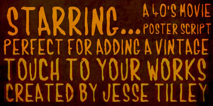 Another font inspired by 40s movie posters. Enjoy!
 - Sancoale Slab by insigne,
$32.00 The contemporary feel of the Sancoale superfamily takes a bolder turn with this futuristic slab. Built from Sancoale's successfully simple geometry, Slab's serif elements and tall x-height give the face an energetic, yet clean figure that easily complements its cousins: Sancoale Softened--a sans with blunted terminals; Sancoale Narrow; and, of course, the original Sancoale itself. The weights of each member have been balanced carefully to ensure compatibility with the others, and when used together, the combination creates a powerful design that is easy to identify. With weights ranging from the classier Thin to the authoritative Black, Slab opens the door to a range of applications. Used in different text sizes, its tech image is legible and neutral enough for longer bodies of copy--both in print and on the web. Have a more prominent need? The web font also stands out well in a headline or even as a display face. Slabís great personality puts a strong foot forward without giving its reader a kick in the teeth. Whatever the task, this font's one to capture the Zeitgeist into your work. All Insigne fonts are fully loaded with OpenType features. Sancoale Slab is also equipped for complex professional typography, including alternates with stems, small caps and plenty of alts, including "normalized" capitals and lowercase letters. The face includes a number of numeral sets, including fractions, old-style and lining figures with superiors and inferiors. OpenType-capable applications such as Quark or the Adobe suite can take full advantage of automatically replacing ligatures and alternates. You can find these features demonstrated in the .pdf brochure. Included are small caps, fractions, old-style and lining numbers, scientific superior/inferior figures, complete ordinal and inferior alphabet, and a set of symbols and arrows. The Sancoale family also includes the glyphs to support a wide range of languages, including Central, Eastern and Western European languages. In all, Sancoale Slab supports over 40 languages that use the extended Latin script, making the new addition a great choice for multi-lingual publications and packaging.
 - Stinger by Zetafonts,
$39.00 Since their first appearance as Italians on the pages of the 1821 William Caslon type specimens, reverse contrast typefaces have been typography's best loved quirky outcasts. Subverting the traditional relationship between thick verticals and thin horizontals made them perfect for eye-catching advertisements. The unexpected contrasts and the thick slabs produced by reverse-contrast serifs became ubiquitous in period posters, and synonymous with wild west and circus iconography. In designing Stinger, the Zetafonts design team composed by Maria Chiara Fantini, Andrea Tartarelli and Francesco Canovaro and orchestrated by Cosimo Lorenzo Pancini decided to marry this subversive tradition with the workhorse approach of modernist sans serif typefaces like Univers, developing a super-family with four widths, each in five different weights, from thin to heavy. This gives the designer a full range of options for type setting, with the Normal and Fit widths providing two different text-sized alternatives, the wide width adding display and titling options and the Slim ready to deal with the space-saving necessities of extremely long texts. True italics have been added developed for all weights and variants, bringing the Stinger family to a total of 40 fonts, with a latin extended + Russian Cyrillic character set covering over 200 languages, and open type features including positional numbers, stylistic sets and alternate forms. In the crowded panorama of contemporary grotesque typefaces, all aiming to stark geometric perfection, Stinger stands out with its bold choices and strong personality. From the calligraphy-inspired terminals in the thin weights to the logo-ready sculptural approach in the heavy weights, each variant manages to look striking without forgetting the readability and flexibility lessons of modern reverse-contrast classics like those designed by Excoffon or Novarese. A variable version is included with the full family, allowing maximum flexibility and control for the designer over the wide range of expression capabilities of the Stinger super family.
 - LT Festive Medium - 100% free

- Obcecada Serif - Personal use only

- Miso - 100% free

- MKorsair - 100% free

- Rosetta Tones - Unknown license

- M+ 1m - Unknown license

- Sammy Boy by Hanoded,
$20.00 Sammy Boy is sweet and cuddly when he wants to, but also loud and boisterous. Sammy Boy keeps you awake at night, but smiles at you in the morning. Sammy Boy can speak most languages. Sammy Boy is amazing.
 - 21 Emmerson by Deniart Systems,
$20.00 A bit grungy, a bit stern, 21 Emmerson is a tribute to my birthplace and was designed with punky headline posters in mind. The simple lines of this font are angular and sharp - great for party posters, invitations, labels, etc.
 - Laillie Dream by Midvel,
$11.00 This is our new font, Laillie Dream is playful handwritten typeface. Laillie Dream comes with three weight, include uppercase, lowercase, number, punctuation, multilingual. This font is suitable to design especially poster, logo, book cover, greeting card, quotes, advertising poster, and anymore
 - Turman Grotesk by Chank,
$99.00 Turman Grotesk is inspired by the hand-drawn painterly letterforms poster artist Adam Turman uses in his poster designs. Each character uppercase and lowercase has contextual alternates that can be used to give your type a more natural, handmade feel.
 - Nagotire by HafisHidayat,
$20.00Introducing the elegant and fashionable Nagotire handwritten font, which looks like a signature, this font is purposely made with a quirky alternative. Nagotire is suitable for greeting cards, product packaging, news, invitations, posters, blog posters, branding, business cards, logos, etc. - Emirose by Ergibi Studio,
$16.00 Emirose consists of 4 weights: Thin, Light, Regular and Bold, all equipped with many ligatures and alternative letters that look cute and classy. They work very well for your work such as logos, brands, packaging, posters, invitations, headlines, posters, and more.
 - Qubo by Hoftype,
$49.00 Qubo, a new forcefully drawn monoline face. Its clear graphics create its appeal and give it distinctive characteristics. The slightly squared round elements make for an open and elegant look; subtle details refer to humanistic models. Qubo is a neutral, cool and very versatile typeface. It works superbly both in print and on the web. Qubo is well-equipped for ambitious typography. The Qubo family consists of 14 styles, comes in OpenType format with extended language support for more than 40 languages. All weights contain ligatures, proportional lining figures, tabular lining figures, proportional old style figures, lining old style figures, matching currency symbols, fraction- and scientific numerals.
 - Askan Slim by Hoftype,
$49.00 Askan Slim has the same design features as Askan , cap-height, x-height, descenders and ascenders. It is a moderately condensed version of Askan and works superbly as an addition to Askan or as independently for space saving applications. It is the perfect complement of the Askan family. Like Askan, Askan Slim consists of 18 styles and is well equipped for advanced typography. It comes in OpenType format with extended language support. All weights contain small caps, ligatures, superior characters, proportional lining figures, tabular lining figures, proportional old style figures, lining old style figures, matching currency symbols, fraction- and scientific numerals, matching arrows and alternate characters.
 - Epoca Classic by Hoftype,
$39.00 Epoca-Classic, designed in 2012, is the contrasted sister of Epoca, also suited for text and display. As is the case with Epoca, Epoca-classic has economical proportions, a neutral appearance and a discreet elegance. It is fresh, crisp and distinguished. Its well-balanced proportions result in an even text flow which allows for pleasant reading even with large amounts of text. Epoca-Classic comes in twelve weights, in OpenType format and with extended language support for more than 40 languages. All weights contain small caps, standard ligatures, proportional lining figures, tabular lining figures, proportional old style figures, lining old style figures, matching currency symbols, fraction- and scientific numerals.
 - Gemulai by Prioritype,
$19.00 Gemulai - Modern Sans Serif Font. A modern and simple sans serif font to give your designs a more attractive appearance. Great for branding, logos, covers and more. Features: Uppercase, Lowercase, Numeral, Punctuation, Multilingual, Ligatures & Alternates. Multilingual contained: Afrikaans, Albanian, Asu, Basque, Bemba, Bena, Breton, Catalan, Chiga, Cornish, Danish, Dutch, English, Estonian, Filipino, Finnish, French, Friulian, Galician, German, Gusii, Indonesian, Irish, Italian, Kabuverdianu, Kalenjin, Kinyarwanda, Luo, Luxembourgish, Luyia, Machame, Makhuwa-Meetto, Makonde, Malagasy, Manx, Morisyen, North Ndebele, Norwegian Bokmål, Norwegian Nynorsk, Nyankole, Oromo, Portuguese, Quechua, Romansh, Rombo, Rundi, Rwa, Samburu, Sango, Sangu, Scottish Gaelic, Sena, Shambala, Shona, Soga, Somali, Spanish, Swahili, Swedish, Swiss German, Taita, Teso, Uzbek (Latin), Volapük, Vunjo, Zulu. Thanks!
 - BDRmono 2021 by Typedifferent,
$15.00 Büro Destruct’s «BDR mono» typeface has a long tradition in the font library of typedifferent. Initially designed by Lopetz as a single weight, monospaced Mac PostScript Type 1 font way back in 1999, it got a first update as a little family with light, regular and bold weights, plus an extended glyphs set in Opentype format during 2006. With this 2021 update the typeface received a second rounded family and a complete glyphs set with all needed characters used in the north, east, south and west of Europe. The «BDR mono 2021» serves great in signage, routing people, architecture, technical plans, manuals, or even science and fiction related communications.
 - QR by T-26,
$29.00QRc is based on a 2-D, space-saving optical code widely used in Japan. The code was originally intended for use in factories but quickly crossed into the consumer sector. With an enabled handset, a QR code -- which can appear on an ad, postcard, or almost anywhere else -- can be instantly interpreted to reveal its underlying message. QR contains 219 images. You can use the QRc font to accurately encode the letters you type, or just use it to create fields of lovely, semi-random pixel texture! The counterpart font, QR Type, is also a celebration of entropic pixelation, but the formations are alphabetic and human-readable. - Cherla by Prioritype,
$21.00 Cherla is a modern serif typeface with a pretty and unique touch. Accompanied by several alternative characters to beautify. Suitable for logo design and branding. Features: Uppercase, Lowercase, Numeral, Punctuation, Multilingual & Alternates. Multilingual contained: Afrikaans, Albanian, Asu, Basque, Bemba, Bena, Breton, Catalan, Chiga, Cornish, Danish, Dutch, English, Estonian, Filipino, Finnish, French, Friulian, Galician, German, Gusii, Indonesian, Irish, Italian, Kabuverdianu, Kalenjin, Kinyarwanda, Luo, Luxembourgish, Luyia, Machame, Makhuwa-Meetto, Makonde, Malagasy, Manx, Morisyen, North Ndebele, Norwegian Bokmål, Norwegian Nynorsk, Nyankole, Oromo, Portuguese, Quechua, Romansh, Rombo, Rundi, Rwa, Samburu, Sango, Sangu, Scottish Gaelic, Sena, Shambala, Shona, Soga, Somali, Spanish, Swahili, Swedish, Swiss German, Taita, Teso, Uzbek (Latin), Volapük, Vunjo, Zulu. Thanks!
 - Shandon Slab by Hoftype,
$49.00 Shandon Slab adds a new colour to the prominent family of serif-dominant typefaces. A distinctive look with its slightly flowing characteristics sets it apart from most members of the category. The contrasting italic styles add a vivid accent. Shandon Slab is predestined for editorials, headlines, and eye-catching text applications. The Shandon Slab family consists of 18 styles. It comes in OpenType format with extended language support for more than 40 languages. All weights contain standard and discretionary ligatures, proportional lining figures, tabular lining figures, proportional old style figures, lining old style figures, matching currency symbols, fraction- and scientific numerals, matching arrows and alternative characters.
 - Sirichana Thai by Linotype,
$40.99Sirichana is a monolinear Thai typeface with Light and Bold weights. The modern design is characterized by its traditional proportions but with almost geometric construction. Originally released by Linotype for digital photocomposition, it is now in OpenType format. This makes it possible to dynamically and precisely position the various levels of superscript and subscript vowel signs and tonal marks. In addition to this, the complete Unicode page range for Thai is covered to ensure flawless conversion between other OpenType fonts using Unicode. The accompanying Latin design matches well in scale and texture and supports most Western European languages making it ideal for setting bilingual texts. - Silver Thread JF by Jukebox Collection,
$32.99 Silver Thread is a hairline thin geometric sans serif font with both art deco and 1970s elements to it. Perfect for any project that needs a typeface which evokes elegance and sophistication. Digitally revived from an older photo-typositing face, Silver Thread is named after a waterfall in eastern Pennsylvania. The font contains alternate versions of B, Q, W, &, a, e, k, n, s, t, u, w, y and 4 for added variety. They can be found under the Stylistic Alternates OT feature. Jukebox fonts are provided in OpenType .otf format and all fonts contain basic OpenType features as well as support for Latin-based and most Eastern European languages.
 - Quant by Hoftype,
$49.00 Quant is a contrasted typeface with a fresh and well-reasoned appearance. It owes allegiance to classical structure but is a free design and does not refer to any historical model. Although it has strong qualities as a reading type, its distinct and powerful ductus makes it superb for headlines and in display sizes. Quant is well-equipped for ambitious typography. The Quant family consists of 8 styles, comes in OpenType format with extended language support for more than 40 languages. All weights contain small caps, proportional lining figures, tabular lining figures, proportional old style figures, lining old style figures, matching currency symbols, fraction and scientific numerals.
 - Olive & Citrus by Prioritype,
$19.00 Olive & Citrus is a modern, classic and elegant serif typeface. It is suitable for branding designs, logos, magazines and social media posts. Features: Uppercase, Lowercase, Numeral, Punctuation, Multilingual, Alternates, Ligatures & PUA Encoded. Multilingual contained: Afrikaans, Albanian, Asu, Basque, Bemba, Bena, Breton, Catalan, Chiga, Cornish, Danish, Dutch, English, Estonian, Filipino, Finnish, French, Friulian, Galician, German, Gusii, Indonesian, Irish, Italian, Kabuverdianu, Kalenjin, Kinyarwanda, Luo, Luxembourgish, Luyia, Machame, Makhuwa-Meetto, Makonde, Malagasy, Manx, Morisyen, North Ndebele, Norwegian Bokmål, Norwegian Nynorsk, Nyankole, Oromo, Portuguese, Quechua, Romansh, Rombo, Rundi, Rwa, Samburu, Sango, Sangu, Scottish Gaelic, Sena, Shambala, Shona, Soga, Somali, Spanish, Swahili, Swedish, Swiss German, Taita, Teso, Uzbek (Latin), Volapük, Vunjo, Zulu. Thanks!
 - Adams by Canada Type,
$24.95 Adams is a revival and major expansion of Dolf Overbeek's Studio typeface and Flambard, its bold counterpart, originally published by the Amsterdam Type Foundry in 1946 and 1954. This digital version adds small caps and a new light weight. Adams is a simple upright, flat brush script, with stroke angles carefully designed to give the same color in all sizes. It is reminiscent of the sign lettering commonly found in the 1930s and 1940s. The Adams fonts are available in all popular font formats, and the character sets cover a wide range of codepages, including Central and Eastern European languages, Esperanto, Turkish, Baltic, Celtic/Welsh.
 - Excalibur Sword by Comicraft,
$19.00 The Sword has been Drawn! The Quest for the Holy Grail has begun! When Arthur took the mighty sword of Excalibur from the Lady of the Lake, little did he know of the stories that would be spun, the myths that would be built around him, the Legend of Camelot and the Knights of the Round Table! And The Font. Merlin might have been King Arthur’s sage advisor, a font of wisdom and magicks, but never was Merlin available in postscript, truetype and opentype formats, nor was Lancelot, Arthur’s First Knight suitable for Celtic Display Lettering! See the families related to Excalibur Sword: Excalibur Stone.


