7,897 search results
(0.021 seconds)
- Roos ST by Canada Type,
$39.95 Roos ST is a special version of the Roos family, engineered specifically for science writing. It is equipped with SciType, a combination of additional characters and OpenType programming included in the fonts to help with typesetting science text. For more information about SciType, please consult the SciType FAQ available in the Gallery section of this page. The Roos design is the Dutch classic made by S. H. de Roos during the years of the second World War, and subsequently used for a special edition of the Dutch Constitution on which Juliana took the oath during her inauguration as the Queen of the Netherlands. This design is widely regarded as de Roos's finest, and has one of the most beautiful italics ever drawn. Aside from the SciType additions, all the Roos ST fonts contain OpenType features for ligatures, ordinals, automatic fractions, and seven kinds of figures. For details about the functionality of Roos ST, please consult its Access Chart PDF available in the Gallery section of this page.
 - Forgotten Melody by Anmark,
$12.00 I’m pleased to introduce new handwritten font Forgotten Melody. Forgotten Melody comes in two styles: Regular and Extras. This font includes ligatures and a full set of lowercase alternates to make your text as close to a natural handwritten script as possible. Forgotten Melody Regular is an elegant, modern, feminine font. Uppercase letters are ideal for your wedding monograms and logos. Use this font for wedding invitations, branding, packaging, magazines, letterpress address, social media, restaurant menus, greeting cards, headers and so on. Forgotten Melody Extras is a symbol font (includes 62 hand drawn musical and floral elements). You can use these characters either separately or in combination with Forgotten Melody Regular (or any other fonts). The symbols are perfect for creating your own logo, greeting cards, photo overlays, scrapbooking, writing letters and just for fun! The font has extensive language support, it includes English and European latin-based languages: French, Italian, Spanish, Portuguese, German, Swedish, Norwegian, Danish, Finnish and others.
 - Lovely Brought Dreams script by Nk Studio,
$15.00 Lovely Brought Dreams Script and Sans are beautiful and romantic writing fonts. Looks amazing on wedding invitations, thank you cards, quotes, greeting cards, logos, business cards and other designs. This font is PUA encoded which means you can access all the glyphs and sweeps easily! This font includes OpenType features with alternative styles, ligatures, and multiple language support. To enable the OpenType Stylistic alternative, you need a program that supports OpenType features such as Adobe Illustrator CS, Adobe Indesign & CorelDraw X6-X7, Microsoft Word 2010 or later. There are additional ways to swap/swap, using Character Map (Windows), Nexus Fonts (Windows), Font Book (Mac) or software programs like PopChar (for Windows and Mac). How to access all alternative characters, using Windows Character Map with Photoshop: https://www.youtube.com/watch?v=Go9vacoYmBw How to access all alternative characters using Adobe Illustrator: http://youtu.be/iptSFA7feQ0 How to use the stylish font set in Microsoft Word 2010 or later versions: https://youtu.be/x1A_ilsBsGs Happy Designing!
 - Ascender Uni by Ascender,
$197.99Ascender™ Uni is a proportionally spaced comprehensive Unicode-compatible font with support for the Unicode Standard, v2.1 (supporting most major code pages and character sets in modern use). Ascender Uni is a 39MB TrueType (TTF) font with approximately 53,000 glyphs. The Latin and related glyphs (designed by Steve Matteson) are Sans Serif, with Gothic ideographs drawn in Japanese style, and complementary styles for other scripts. There are also versions of Ascender Uni that provide localized support for Korean, Simplified Chinese and Traditional Chinese. OpenType layout support is included for Arabic (initial, medial, final, isolate, and required ligature forms, as well as basic mark positioning), and vertical writing for CJK locales (consisting mostly of Latin, symbol, punctuation, and kana glyph variants). Character Set: Latin-1, WGL Pan-European (Eastern Europe, Cyrillic, Greek and Turkish), Chinese, Japanese, Korean, Thai, Vietnamese, Hebrew, Arabic. NOTE: Not all applications provide complete support for all the glyphs in this Unicode font. - M Banquet P PRC by Monotype HK,
$523.99 M Banquet is a humanistic script written by a Chinese restaurant owner, which the name ‘Banquet’ comes from. It is a calligraphic style that always being seen in traditional Chinese banquet menu. Incorporated a feeling of masculinity, fill with strength and energy and attracts eyeballs of customers. It was written with a thin ball pen in a unique, personal and expressive writing style, such that it is realistic, natural and masculine. Contrast of strokes is low and the text is visible and eye-catching. Its light to medium stems (豎) make it suitable for small text to subheading with little conglutination. All strokes are irregular, inconsistent, irregularly oriented and tightly coupled. Spatial distribution, positioning, size and relative proportion of radicals fully reflect a natural and personal style. It is one of the few proportional-width font in a full scale. It is best suited for casual lively atmosphere, illustrations, set upright (non-slanted), non-condensed.
 - La Villette by Create Big Supply,
$15.00 Experience the elegance and beauty of La Villette, a captivating handwriting script font that adds a touch of sophistication to your designs. With its flowing calligraphy writing style, La Villette offers a seamless and graceful look, making it ideal for logos, labels, magazines, books, greeting cards, packaging, and more. The combination of uppercase and lowercase letters in La Villette creates a harmonious balance, allowing you to achieve a natural and handcrafted feel. Express your creativity and bring a personal touch to your projects with this versatile font. La Villette caters to a global audience with its multilingual support, ensuring that your message resonates with diverse communities. From numbers to punctuation, this font provides a comprehensive set of characters to enhance the legibility and versatility of your designs. Unlock endless possibilities with ligatures, which effortlessly connect letters and bring a seamless flow to your typography. Additionally, La Villette features PUA (Private Use Area) Encoding, granting you access to special characters and glyphs, further expanding your design options.
 - Melya by Stripes Studio,
$12.00 Melya Script, a modern hand writing, I hope you are interested in this font. It can be used easily and simply because there are a lot of features in it and contains a complete set of letters in lower and uppercase, assorted punctuation, numbers, and multilingual support. It also contains several ligatures and alternate style stylistic characters. To enable the OpenType Stylistic alternates, you need a program that supports OpenType features such as Adobe Illustrator CS, Adobe Indesign & CorelDraw X6-X7, Microsoft Word 2010 or later versions. And there are additional ways to access alternates/swashes, using Character Map (Windows), Nexus Font (Windows), Font Book (Mac) or a software program such as PopChar (for Windows and Mac). How to access all alternative characters using Adobe Illustrator: https://www.youtube.com/watch?v=XzwjMkbB-wQ How to access all alternative characters, using Windows Character Map with Photoshop: https://www.youtube.com/watch?v=Go9vacoYmBw Melya Script has given PUA unicode. Thank you for your purchase!
 - M Banquet P HK by Monotype HK,
$523.99 M Banquet is a humanistic script written by a Chinese restaurant owner, which the name ‘Banquet’ comes from. It is a calligraphic style that always being seen in traditional Chinese banquet menu. Incorporated a feeling of masculinity, fill with strength and energy and attracts eyeballs of customers. It was written with a thin ball pen in a unique, personal and expressive writing style, such that it is realistic, natural and masculine. Contrast of strokes is low and the text is visible and eye-catching. Its light to medium stems (豎) make it suitable for small text to subheading with little conglutination. All strokes are irregular, inconsistent, irregularly oriented and tightly coupled. Spatial distribution, positioning, size and relative proportion of radicals fully reflect a natural and personal style. It is one of the few proportional-width font in a full scale. It is best suited for casual lively atmosphere, illustrations, set upright (non-slanted), non-condensed.
 - Tatty by Scrowleyfonts,
$- Tatty is a sans serif, monoline font that is distinguished by the gentle, rounded, backward curves on the ascenders. I created it because I had a picture in my mind of a font that I wanted to use when designing images and logos for clients' websites but I could never find one that was just exactly right. Many years ago I worked for a sign-writing company. My job was to copy and enlarge letter sets from printed copy and then cut masks for airbrushing. One morning I arrived at my desk to find that the airbrush artist had written on a rough, rubbed out, scribbled on drawing of the letter ‘a’ - “make a letter happy, make it beautiful”. That was the brief I set myself in the design of Tatty - to make every letter happy and beautiful. The result is a flowing, elegant yet simple type which I believe works particularly well for poetry.
 - Amika by Craceltype,
$39.00 Amika™ is a rational geometric sans serif with an engaging personality and a contemporary profile. The large x-height, minimal contrast and the double storey 'a' makes Amika™ a highly legible typeface suited for any kind of text applications, from display poster type to massive text layouts. Amika™ has 22 styles and it's a workhorse type system. Versatile and reliable, it covers 230+ languages, including extended Latin, Cyrillic and Greek writing systems. With over 1280 glyphs per style, its Opentype features include alternative shapes, small caps, standard and discretionary ligatures, localized forms in Latin and Cyrillic, case sensitive forms, numerators and denominators, proportional and tabular figures, slashed zero, fractions and more. With a tectonic touch, Amika™ is a prototypical sans serif of the New Media age that, due to its extensive set of features, conveys a great choice for a wide range of applications, from branding to broadcast.
 - Harsh language AC - Unknown license

- Greek House Fathouse - Unknown license

- Madani by NamelaType,
$49.00 Madani is a geometric sans serif consisting of 9 weights ranging from Thin to Black and matching Oblique. With a touch of character choice, adding tails to some glyphs on the stylistic set 1 and pointing joined at some of the tapered characters in the stylistic set 2, suitable for display and body text font.
 - Sanzibar Script by ArtyType,
$29.00 Sanzibar Script is a classically styled, single weight typeface, complete with alternate style settings. A multi-functional all-rounder, ideal for both body copy and headline use. The third offering in the Sanzibar range following the earlier standard & Schreef sets, the Script variant adds warmth and further versatility to the ever expanding ArtyType collection.
 - Glamure Serif by Fauzistudio,
$15.00 Glamure Serif is inspired by the Myriad font which has often been used by technology companies and governments since the 1990s. Glamure Serif is a clean, sleek and versatile font, using geomatrices to make this font more modern and elegant. Glamure Serif can function as a title, logo, body copy, subtitle, headline and others.
 - Kwadrat by Malgorzata Bartosik,
$19.00 Kwadrat is a modern unusual typeface. Some of the letters have surprising shapes, so it can be used mainly for display purposes, but also as body text. It's available in 4 weights: Light, Regular, Medium, Bold and as a variable font. It's multilingual - contains Latin alphabet with Western, Central and South Eastern European diacritics. Enjoy!
 - DyeLine by The Northern Block,
$12.80 A modern geometric typeface influenced by architectural reproduction drawings such as blueprints and dyelines. The concept was to create a font that displays a simple elegance at large scale and would also be able to produce great legibility for body text. Details include 5 weights, a complete character set, manually edited kerning and Euro symbol.
 - Love Bubble by Mazkicibe,
$10.00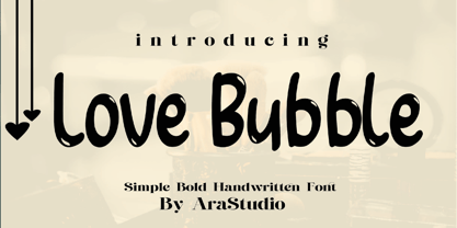 Love Bubble Font is a handwritten and modern font that combines a sweet touch and beautiful curves in every letter. using a touch of soft body curves so that it is pleasing to the eye Love Bubble Font is great for: Wedding invitations, Birthday invitations, fashion magazines, logos, signatures and is great for watermark photography.
 - Budrick BB by Blambot,
$8.00 Budrick BB is a slick, clean body copy font family that's just a bit rounded. It is available in four weights: Regular, Italic, Bold, and Bold Italic. (And those Italics have some slightly different letter forms than the plain versions!) To top it all off, Budrick BB has a hefty collection of European characters.
 - Quimby by Match & Kerosene,
$25.00 Quimby is a retro inspired design marrying love for wedge serifs with grotesque fonts. Inspiration comes from various signage in Detroit, MI. Great for headlines, displays, logos, and short bodies of text. Quimby comes in two styles, and features true small caps, lining numerals for both cap heights, catch phrase words, fractions, and alternates.
 - Suorva by Sign Studio,
$15.00 Suorva from the sans serif family is made for display needs. Each side of his body is well-measured and consistent. Has a Stylistic Alternate Set ( S, Y, a, e, g, k, y) and also Discretionary Ligatures (uppercase). All Glyphs have PUA Encoded which will make it easier to use in general editor software.
 - Borgis Pro by RMU,
$45.00 Borgis Pro is a robust Clarendon-style font family, intended for use in body texts even on rough papers as well as in web design. All styles include small caps and oldstyle figures. Users who want to type in the Serbian language and take the Italic style should activate the OT feature Stylistic Alternatives.
 - Astera by ParaType,
$25.00A set of astronomical signs (symbolic representation of the Sun, the Moon, planets and other celestial bodies as well as zodiacal constellations, phases of the Moon, etc), signs of Chinese Zodiac and several ornamental symbols. Designed by Andrey Belonogov. The typeface (under the name Astra) was awarded a Diploma of TypeArt’05 Design Contest. - Neues Haus by S6 Foundry,
$80.00 Neues Haus is a typeface with legible characters for maximum readability and legibility — perfect for a modern and stylish contemporary design, characterized by more generous oval proportions and slightly more open terminals. This font family can be used as a headline or as a body copy typeface, and also includes a useful icon set.
 - Gritlen by Owl king project,
$39.00 Introducing the Gritlen font, a family of serif fonts that includes 18 styles including italics. Gritlen is designed to give a very minimalist and elegant impression, this font works very well for titles or short sentences, Gritlen can also be used as body text, for logos and types of designs that are minimalist in style.
 - Glamure by Fauzistudio,
$10.00 Glamure was inspired by the Myriad font which has been frequently used by technology companies and governments since the 1990s. Glamure is a clean, sleek and versatile font, by applying geomattric shapes to create a fantastic, modern and humanistic font. Glamure can function as a title, logo, body copy, subtitle, headline and so on.
 - Briery by HeadFirst,
$16.99 Briery is a unique san serif family, crafted for both display & body copy use — Available in 5x weights. It is a blend of original & functional, with a range of alternative characters created to inspire your design imagination. Designed by Morice Kastoun this typeface incapsulates his commitment, craft and expertise in typeface design for over 20years.
 - Quickstep Sans by Holland Fonts,
$30.00A 'quick' font, originally made for the 25th anniversary of SSP Printing Co. in Amsterdam. First used for an intro spread in Wired Magazine (#3.05, May 1995): "The problem with computers is that they don't have enough Africa in them. What's pissing me off is that they use so little of my body" (Brian Eno). - Intropol by The Northern Block,
$18.00 A modern journalistic style typeface. The subtle condensed characters create great economy of space best suited to brochure, editorial and magazine layouts. Also using the contrasting weights you can add great dimension across headline and body copy. Details include 6 weights with italics, an extended European character set, manually edited kerning and Euro symbol.
 - It Lives In The Swamp BRK - 100% free

- ALS Direct by Art. Lebedev Studio,
$63.00 ALS Direct is an open and dynamic typeface with clear-cut letterforms that make it instantly readable. It lends text a neutral, yet agreeable and modern feel. Direct has nine font styles convenient for the purposes of navigation signage. Regular-style letterforms are rather wide, because direction signs are likely to appear before readers at an angle, so the type needs to withstand perspective distortions. And as signs and boards may vary in size, Direct was developed to include several width variations. Condensed fonts can be used where horizontal space is limited, allowing you to keep proper height and readability of the characters. A signage typeface must be easily readable from some distance away and have simple letterfoms with clear-cut features to quickly identify characters. Designing a type for a potentially wide range of purposes calls for a universal approach. If not destined to be used for navigation in a particular building, it shouldn’t incorporate any peculiar elements to agree with certain design or architecture. All of the above determined our choice of a sans serif with large apertures and definite features allowing readers to instantly recognize letters. Descenders are made compact not to interfere with the line below. And the low contrast between thick and thin strokes renders all elements equally perceptible. The x-height is significant, close to the cap height, which inhances readability of the lowercase type. There are two reasons why directions must not be set in all caps. Firstly, lowercase letters are more diverse and include ascenders and descenders identifying some of the letters in the line. And secondly, having learned to read, people recognize word shapes rather than individual letters, which makes lowercase text more readable. With Direct being a signage typeface, first to be developed were its width variations, and different weight styles and italics were added later. Another thing to be kept in mind was that signs often use dark background colors, and black type on a white background appears smaller than white type on a black background. Direct is the first Cyrillic typeface created for navigation purposes. Before that, designers could use the Cyrillic version of Frutiger (Freeset) developed by Adrian Frutiger for the Paris Charles de Gaulle International Airport, and a number of other, mostly body copy, neutral sans serif types. However, signs and boards were dominated by Arial, which Direct would be glad to replace offering elegance and lucidity of form instead of type bluntess. Direct was designed as a signage typeface, but its neutral style and clear-cut letterforms suggest various other ways of application.
 - Power Grotesk by Power Type,
$15.00 Power Grotesk is a sans serif typeface with details that give typography that has its own characteristics from the thinnest to the thickest that is slightly widened. The goal is to create a typeface with legibility and good contrast between black and white so that it is suitable for different sizes. The typeface has a special feature that aids in reading and reproducing, trapping the right-sized ink for the text to work. The geometric shapes and structures reflect the inspiration and influence of medieval typography. Power Grotesk moves between the vast historical material that makes up modern typography, combining contemporary details with classic styles.
 - Hando by Eko Bimantara,
$24.00 Being one of the most popular font style; Neo Grotesk, Hando offers a wide range of usage possibilities. It's low x-height and variety of light size options make it a good choice for reading, it's tenuous white spaces in the counter letterforms make it legible enough to be recognized remotely. It's curve tensions on the circular letterforms gave a futuristic impression. It's sleek and simple strokes make it perfect for a broad range design purposes. Hando consist of 10 syles from Hairline to Black with each matching oblique. Contain more than 440 glyphs that support a broad latin languages. Also some Opentype features e.g. stylistic alternates, variation of figures, e.t.c
 - Spotlight by ITC,
$29.99Spotlight was created by British designer Tony Geddes in the tradition of the bold serif fonts of early 19th century England. It too is a robust alphabet exhibiting extreme stroke contrasts, however, Geddes gave his font a more relaxed feel by not filling in the strokes completely. Long white rays break up the otherwise dark black strokes, following the form of the outer contours and giving the figures a three dimensional look. Spotlight is also reminiscent of the decorative advertisements of the 1930s and of the glamorous revues and shows of this time. Spotlight is perfect for headlines and display in larger point sizes. - Limited Appeal JNL by Jeff Levine,
$29.00 The cover of a 1950s-era catalog for the Freedman Novelty Company (of San Francisco California) had the word "Novelty" hand-lettered in an unusually angular type style against various geometric shapes somewhat resembling balloons. While the lettering was quirky enough to warrant re-drawing as a digital font, the shapes would have presented a visual nightmare in design and spacing, so simple black rectangles were substituted and the letters appear in white. Since novelty lettering of this type would never become "standard" in use, its function became the font's name, Limited Appeal JNL. There is just a simple A-Z and 1-0 character set along with basic punctuation.
 - Evergreen by Sudtipos,
$39.00 Evergreen is Koziupa and Paul going all Zeitgeist after a few Malbec drinks. Two fonts praise nature from when the lights go out to the crack of dawn, and vice versa. That's 24/7/365 of wild leafy Kumbaya. Even butterflies and flowers were mystified so much they had to get in there. Evergreen is local, organic, and certified free trade. At some point we wrote down the name of the jungle where it originated, then lost the parchment in the hot springs a few hours later. But that's immaterial. Crank up your Deep Forest sound, prep your Earthtone and Foliage palettes, and get into the big herbal.
 - Sonny Gothic Vol 2 by W Type Foundry,
$25.00 Sonny Gothic Vol 2 is an extension of our popular font Sonny Gothic. All corners have been softened to get a friendlier and fluffy visual language. As Sonny Gothic, this typeface has ligatures inspired by the incredible work of Herb Lubalin, chiefly Avant Garde. We designed carefully Sonny’s Vol 2 ligatures, and we also created new ones to control the whites formed between softened characters such as FL, FB, FD, FE, FF, FH, FI, FK, FN, and FR. Developed with powerful OpenType features in mind. Each weight includes alternate characters, ligatures, fractions, special numbers, arrows, extended language support, small caps, and many more. Perfectly suited for graphic design advertising.
 - Fun Signs JNL by Jeff Levine,
$29.00 Fun Signs JNL comprises twenty-six humorous signs from a 1930s-era sales list of products manufactured by the Koehler Sign Company of St. Louis, Missouri. Koehler manufactured a large line of stock cardboard "Blue Signs" (presumably blue backgrounds with white lettering) and alongside the many standard phrases used by various businesses was a list of funny sayings. Such placards were bought by merchants to either evoke interest in their services (such as in a bar or restaurant, or jokingly comment on their business policies (as in credit billing). These novelty signs are a fun addition to a flier, ad, web page or announcement and will leave your readers smiling.
 - Monterey Pop by K-Type,
$20.00 Monterey Pop oozes 1960s freedom and optimism, and is based on Tom Wilkes’s poster lettering for the Monterey International Pop Festival in June 1967, the event which heralded the legendary Summer of Love. The fonts include a newly-designed lowercase and a full complement of Latin Extended-A characters. In addition to the normal font, Outline and Thinline versions with matching spacing and kerning are supplied for use separately or overlapped with the regular font for bicolor effects. The Outline font is best for darker lines, and the Thinline font is designed for white and tinted outlines which can tend to halo and appear slightly bolder.
 - Trade Gothic Display by Monotype,
$42.99 It’s a colorful world. Don’t limit yourself to black and white. The Trade Gothic® Display designs take advantage of color to create lively and compelling statements, making the designs ideal for advertising, branding, poster and publication projects. Based on the powerful Trade Gothic Condensed Heavy typeface, Monotype Studio designer Lynne Yun, created the fonts necessary to set both “beveled” and “embossed” characters in any color. Trade Gothic Display 1 (embossed) generates striking highlighted type, while Trade Gothic Display 2 (bevel) produces powerful shadow and outline effects. The designs are natural additions to the Trade Gothic Next family, and stand on their own as formidable display typefaces.


